pretty paper. true stories. {and scrapbooking classes with cupcakes.}

lovely to meet you Twitter Facebook Pinterest YouTube

Take a Scrapbooking Class

online scrapbooking classes

Shop Shimelle Products

scrapbook.com simon says stamp shimelle scrapbooking products @ amazon.com shimelle scrapbooking products @ amazon.co.uk

Reading Material

travel

jenni bowlin studio Category

Washi Tape Frames: taking scrapbooking inspiration from Wendy's tutorial

washi tape frame tutorial by Wendy Sue Anderson @ shimelle.com
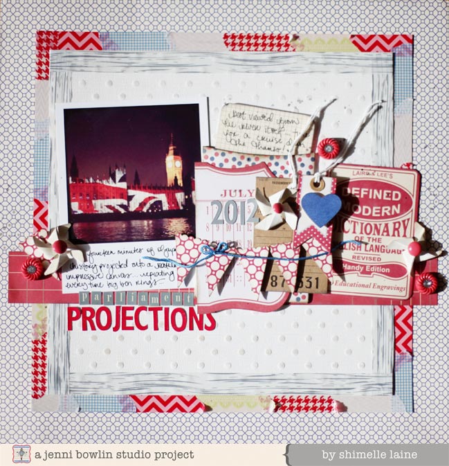
Not that long ago, Wendy Sue Anderson shared a tutorial here for a washi tape frame, so this picture might look familiar. It was this image that flashed into my head when I found the new washi tapes by Jenni Bowlin Studios in my hands: how lovely all the different coloured prints would work for the patchworked layer, topped by the elegant whitewashed woodgrain tape that is my favourite in the entire collection.

scrapbook page with washi tape frame by shimelle laine @ shimelle.com
This was the result, and it’s a look I can see myself repeating now and then for a colourful twist on the square page design I like to use when I need a creative kickstart. It includes all six designs from Jenni’s tape collection, then I started digging through all my JBS supplies pulling out anything that caught my eye in red, blue, or grey. Two of Jenni’s punches went into the embellishment too: the pinwheel and the banner flag. There’s a heart punch in there too, to make it coordinate with the page that sits opposite this in my album.

(Oh, and do excuse my excitement over those harsh shadows on this page. While they aren’t the loveliest thing in photography ever, they are evidence of the fact that we have experienced some bright sunshine in London lately! That’s reason enough to pitch up a flag and pack a picnic, I do believe.)

scrapbook page by shimelle laine @ shimelle.com
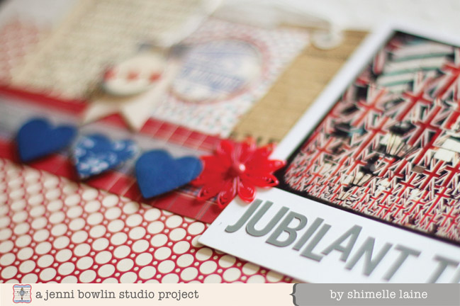
Here’s a little look at that facing page, with all the blueprint hearts in the design. You can see the full project and pick up another quick tip for using your washi collection on the JBS inspiration blog.

If you have tried Wendy’s washi tape frame idea, do share your results with us! If you’re thinking about it, you can find that tutorial here, ready to be customised to any colour and style of page you so desire.

Happy scrapping!

CHA Winter 2013 :: Jenni Bowlin Studio

CHA Winter 2013 :: Jenni Bowlin Studio
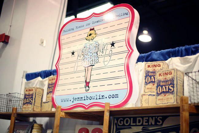
And CHA is open for Winter 2013! I’m here in Anaheim for the big trade show in the craft industry. Hundreds of companies are here to debut their collections for 2013, and part of my lovely press duty is to share all that goodness with you. I’m starting with one of my all-time favourites: Jenni Bowlin Studio.

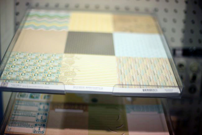
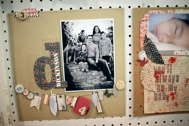
I have two top picks at the JBS booth this time: a new line called Modern Mercantile designed by Lisa Dickinson and Jenni’s new stamps – but actually there are lots of lovely new embellishments throughout this JBS release.

CHA Winter 2013 :: Jenni Bowlin Studio
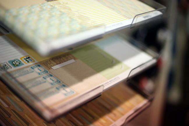
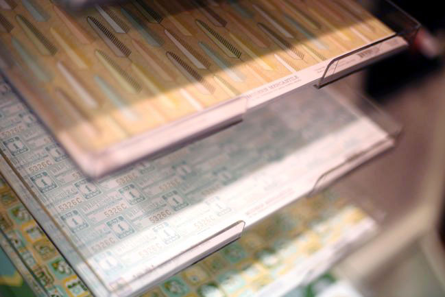
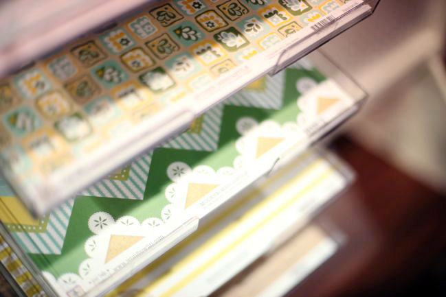
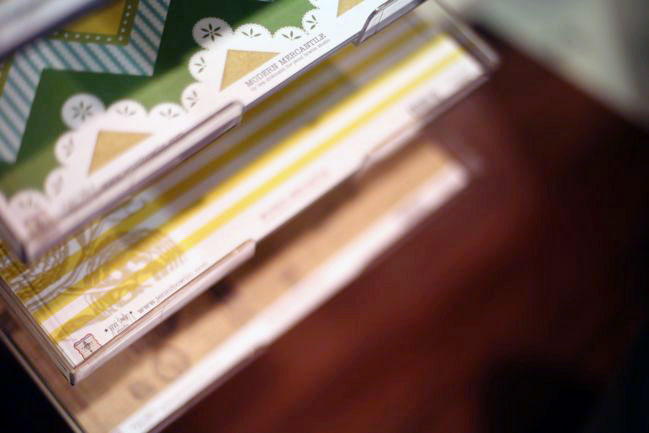
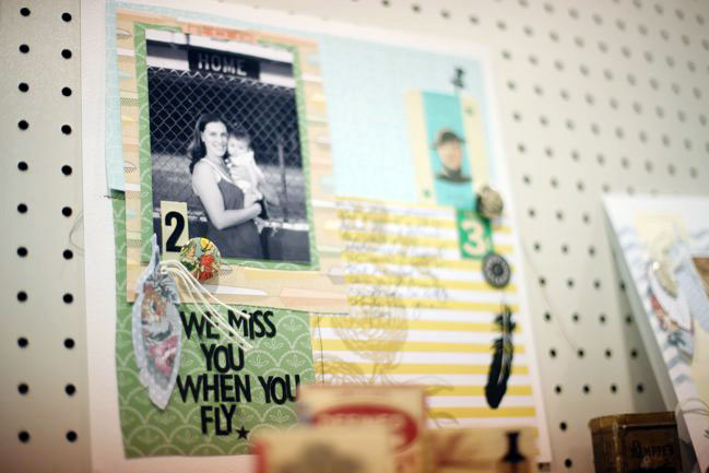
Modern Mercantile is a lovely new twist on Jenni’s vintage style, with some brighter spring colours and a mix of current trend motifs like feathers with the ephemera style we know from Jenni’s ticket stubs and ledgers.

CHA Winter 2013 :: Jenni Bowlin Studio
Cut-apart cards are perfect for journaling boxes on a 12×12 page or for the small pockets of divided page protectors, of course.

CHA Winter 2013 :: Jenni Bowlin Studio
All the papers are double-sided, cardstock weight paper. (I have a video to come with the lovely Lisa telling us a bit about her design inspiration, but I’ll have to find a better internet connection so I can share them!)

CHA Winter 2013 :: Jenni Bowlin Studio
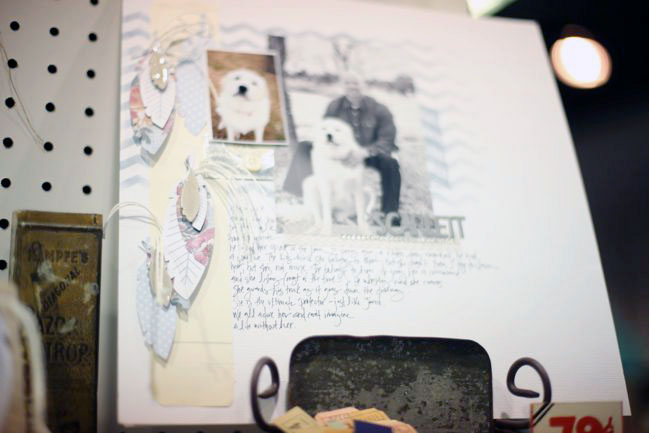
Some design inspiration for the Modern Mercantile papers, plus some of Jenni’s new embellishments – including more paper feathers.

CHA Winter 2013 :: Jenni Bowlin Studio
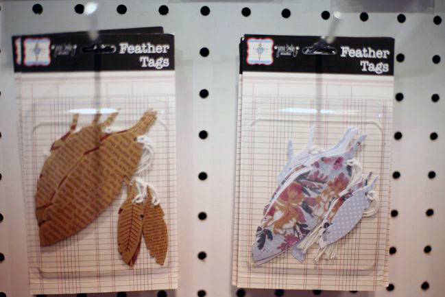
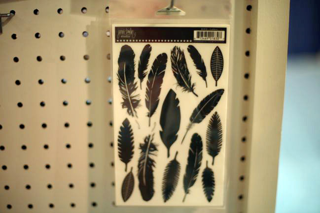
And here are those new paper feathers – the last release of these were very popular (Glitter Girl is a big fan too). This time there are kraft feathers with text and other small patterns plus a colourful floral set.

CHA Winter 2013 :: Jenni Bowlin Studio
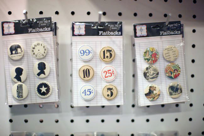
Flatbacks are Jenni Bowlin’s new flair or badge style embellishments – perfect for adding dimension in a flash. They come in three different packs, all with a classic vintage style. I definitely have my eye on the set on the left.

CHA Winter 2013 :: Jenni Bowlin Studio
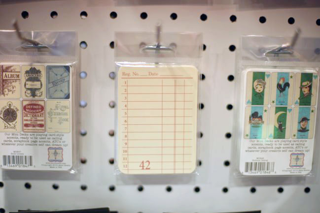
And new mini card sets – great for layering and a good size for cards, scrapbook pages, and other projects.

CHA Winter 2013 :: Jenni Bowlin Studio
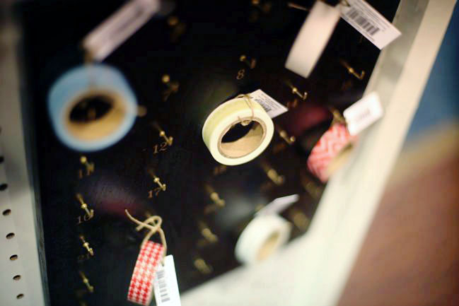
Plus brand new tape! These are really rich colours and versatile patterns, but there is one in particular that has my heart:

CHA Winter 2013 :: Jenni Bowlin Studio
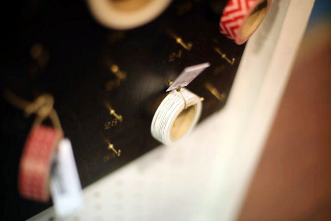
…sigh. Whitewashed woodgrain washi tape. Seriously, just typing that sounds so pretty it’s almost a song lyric.

CHA Winter 2013 :: Jenni Bowlin Studio
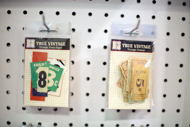
New additions in the True Vintage offerings include price signs and tickets. These are real vintage pieces, so each pack is unique, all sourced from Jenni’s adventures in the antique world.

CHA Winter 2013 :: Jenni Bowlin Studio
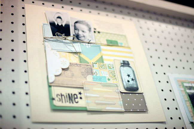
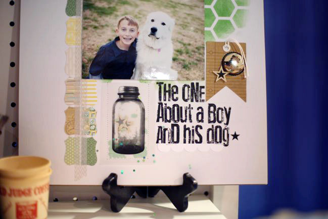
JBS rub-ons are always such high quality (I may have stocked up on a lifetime supply of those beautiful large butterfly rub-ons with no regret!) and there are new designs including feathers and jars. That jar can do something rather beautiful for an embellishment, by the way:

CHA Winter 2013 :: Jenni Bowlin Studio
…stamped on vellum with a pocket of stars and sequins inside, then stitched onto the project. So pretty!

CHA Winter 2013 :: Jenni Bowlin Studio
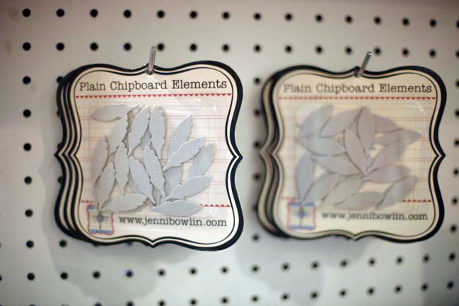
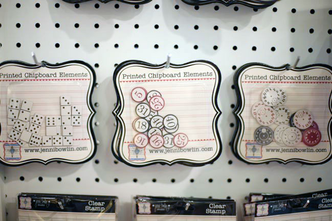
New chipboard packs include bare feathers and leaves read to be customised and printed dominoes, bingo chips, and clock faces.

CHA Winter 2013 :: Jenni Bowlin Studio
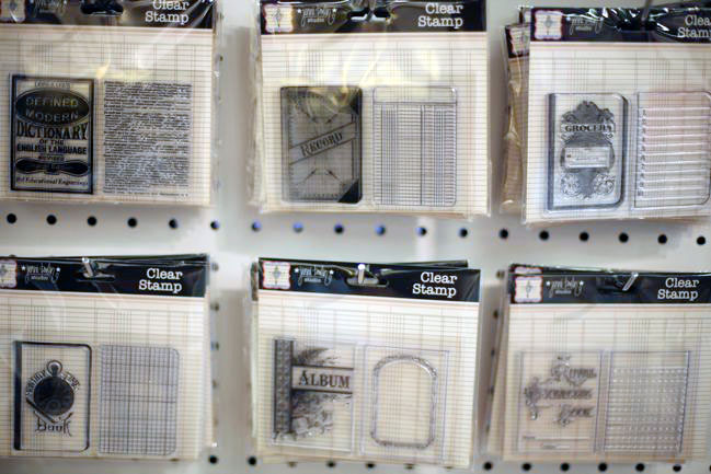
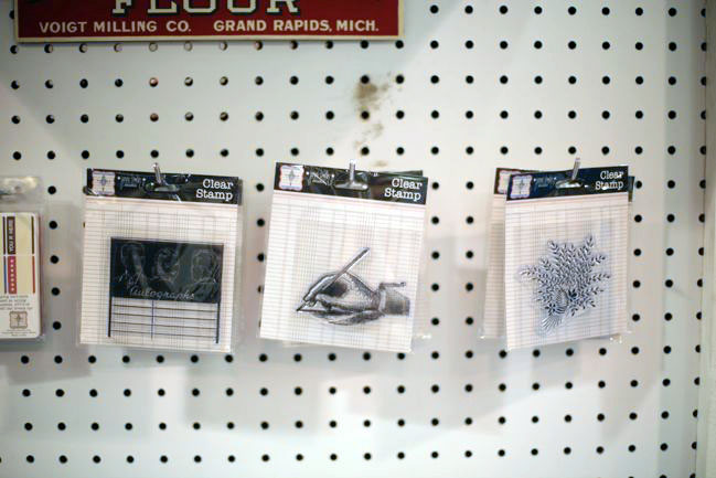
And these are my second pick from the JBS booth: the new clear stamps, all in sets of two to make little books or perfect for creating journaling cards for pages or pocketed page protectors.

CHA Winter 2013 :: Jenni Bowlin Studio
They stamp so beautifully, and would create such lovely gift wrap tags, especially dressed up with a photo in the frame stamp a bit like a paper locket.

CHA Winter 2013 :: Jenni Bowlin Studio
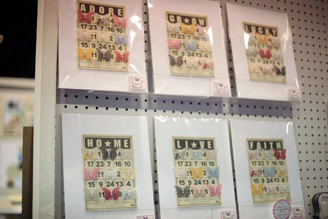
Taking a look around the rest of the booth, there are some lovely twists like combining the vellum butterflies with the bingo cards. As a product, this is a great idea for those who sell completed crafts rather than just supplies, but if you have these items in your stash, there’s your inspiration for a great gift or something to dress up your own wall.

CHA Winter 2013 :: Jenni Bowlin Studio
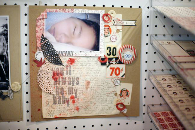
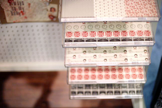
And of course, it wouldn’t be Jenni Bowlin without some red and black to grace the booth!
CHA Winter 2013 :: Jenni Bowlin Studio
This is the mid-release Red and Black collection from just a month or two ago. You can find this in stores now. (There’s a sheet from this collection in my January picks for the Best of Both worlds kit.)

New releases from Jenni Bowlin Studio will ship to stores in February!
Click here to shop for current Jenni Bowlin products
and check out JBS Mercantile for Jenni’s kit club and a full range of classic JBS products.

By the way: at the end of CHA on Tuesday, I’ll take all the comments and throw them in a hat for a few prize drawings. Just something informal, but I’ll just mention it now and catch up with you about that with some winners on Wednesday, if that sounds good!

Jenni Bowlin Studio Halloween Treats Blog Hop

jenni bowlin studio halloween treats blog hop
quick & easy halloween papercrafts by shimelle laine @ shimelle.com
Oh, Halloween! I haven’t had a trick or treater at my door in years… but I do love a bit of Halloween crafting and any excuse for pumpkins and sweets is completely up my street. Today Jenni Bowlin Studio brings you an entire treat bag full of Halloween goodies with a blog hop – and a chance to win some JBS craftery at each stop.

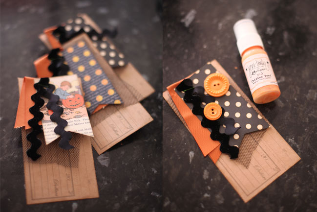
ideas for adding orange accents to halloween crafts
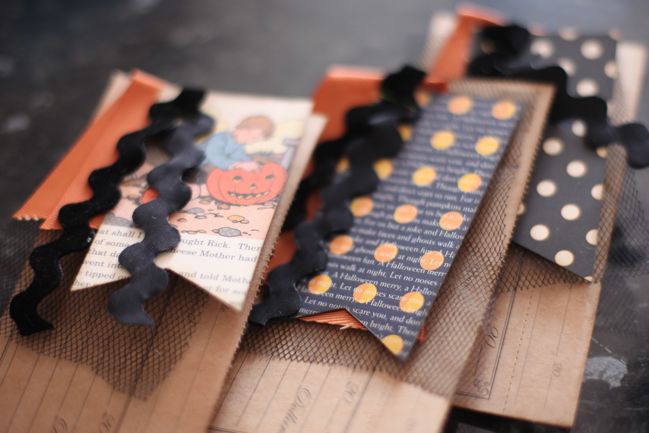
This little Halloween treat project is so quick and easy and perfect to do with scraps of paper. Start with the die-cut papers in kraft, add netting and ribbons and some of Jenni’s Halloween paper cut to two inch wide pennants. Staple all the layers in place. Attach it to a gift bag or card or use as an embellishment on a scrapbook page. And of course you can dress it up even more with your favourite orange embellishments: buttons, pearls or butterflies.

JBS halloween blog hop
At every stop on the JBS blog hop, you can have a chance to win! To enter, simply leave a comment on this post. One lucky commenter will win the October shapes to use with your own digital cutter. Entries close at the end of Saturday night, UK time.

Your next stop on the hop is Tina Walker, so click on over after you leave your comment to enter.

mega kits on sale at JBSmercantile.com
Everyone loves a crafty bargain, right? So it’s worth taking a look at JBS Mercantile for the new mega kits to stock up on your favourite type of supplies at a big discount. (Or send that link to the significant other with a note saying what you want for Christmas!) You can also find Jenni’s own Halloween house kit for a spooky bit of crafting.

Sketch to Scrapbook Page with a JBS Summer Games Twist

Sketch to Scrapbook Page with a JBS Summer Games Twist
scrapbook page
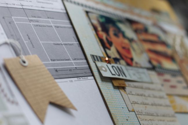
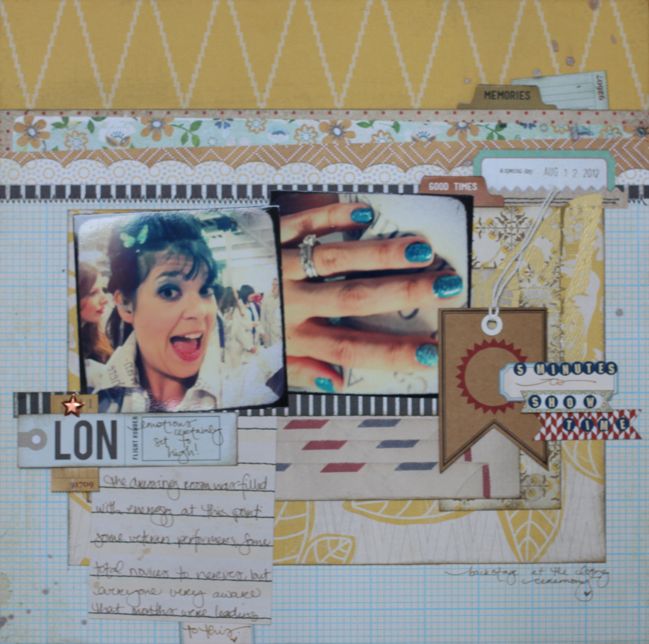
Just as I’m trying to get back to my real post-Olympic life, here comes an interesting challenge: make a page from a sketch, she says. It’s really simple and geometric, she says. It’s a diagram of a tennis court, she says. A TENNIS COURT? Yes. And there you have a new sketch to scrapbook page project with a twist, for the JBS Summer Games – something that is still ongoing and still has time to win some amazing prizes.

So yes: this page starts with a tennis court diagram as the design sketch, and by the end it looks… pretty much nothing like that. But have a look anyway!


For this project, I used pieces from the JBS Mercantile August kit plus a few other JBS supplies – some label stickers, a butterfly rub-on and one of the new flag tag embellishments in kraft.

scrapbook page
I know that photo is ridiculously cheesy, but it was so perfect for all the crazy energy of that moment so I make no apologies for the cheese. In fact, I’m planning to scrapbook it more than once, as I’m thinking this page will go in my regular yearly album and I’ll also include it in my upgrade album all about my experience with London 2012. (Upgrade album? I promise it’s not mumbo-jumbo: it’s what I call any album on a specific topic that deserves its own book in a whole and thought-out way. It’s something I talk about at a ridiculous length in Cover to Cover, if you find it intriguing!)

JBS summer games
Several JBS designers took on this tennis court challenge, so do check out the projects by Megan Klauer, Waleska Neris, Doris Sander, Leah Farquharson, Jill Sprott, Louise Nelson and Betsy Sammarco. There are three amazing prize packages up for grabs in the JBS Summer Games, and entries are open until the 2nd of September (details here), so grab a bit more summer inspiration and a picture of a tennis court and get crafting! (To enter, use either a JBS Mercantile kit or at least three Jenni Bowlin Studio products on your project.) I’d love to see what you create!

By the way, if you love Jenni Bowlin Studio products, there is a rare opportunity right now to apply for the brand’s design team, the JBS Ambassadors. Find all the details here. The call ends on the 16th of September. Good luck!

xlovesx

CHA Summer 2012 :: Jenni Bowlin Studio

CHA Summer 2012 :: Jenni Bowlin Studio
CHA Summer 2012 is officially open for business, so I’m going to jump right in with booth-by-booth coverage for the next couple days, starting with my favourite in the scrapbooking world: Jenni Bowlin Studio.
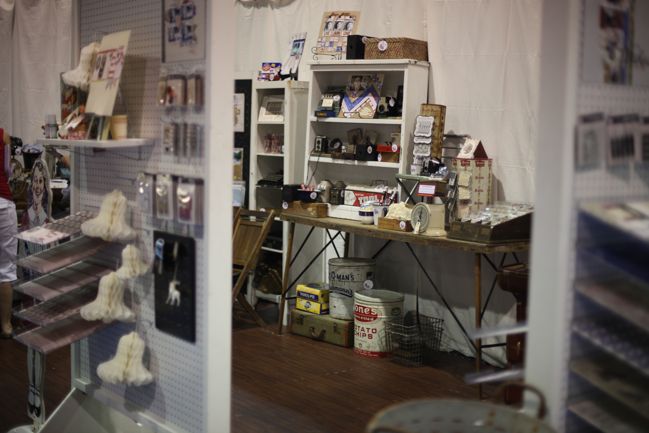
CHA Summer 2012 :: Jenni Bowlin Studio
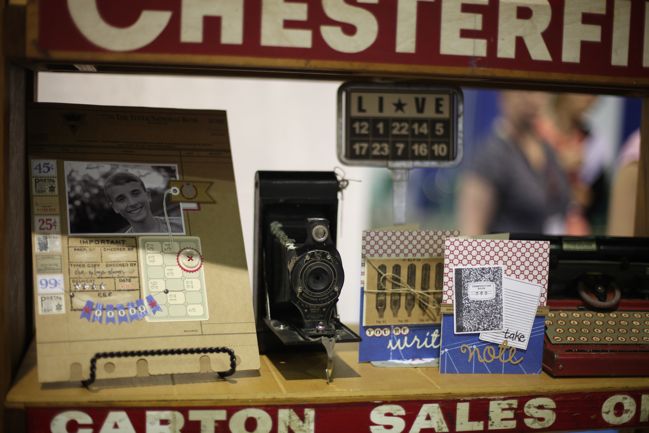
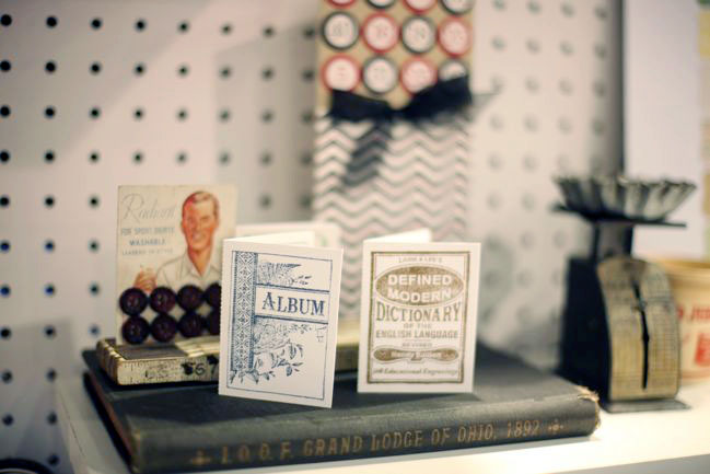
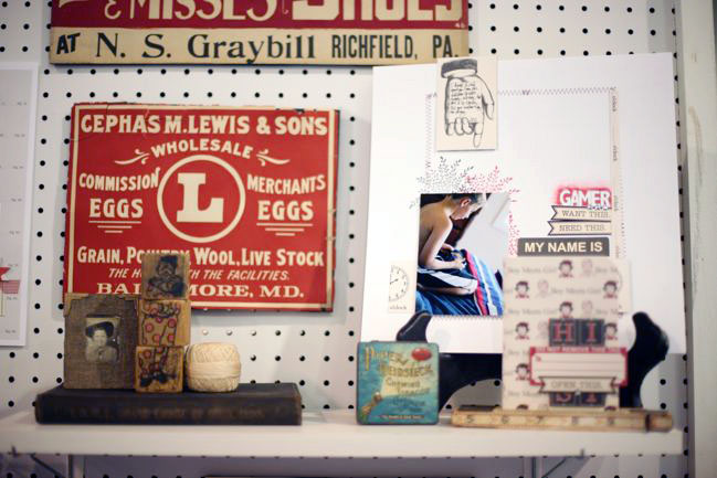
I always love how Jenni displays all the supplies and samples with her beautiful vintage finds. It’s like a little treasure trove and no one else has this kind of vintage detail to their styling. But let’s look at the products, shall we?
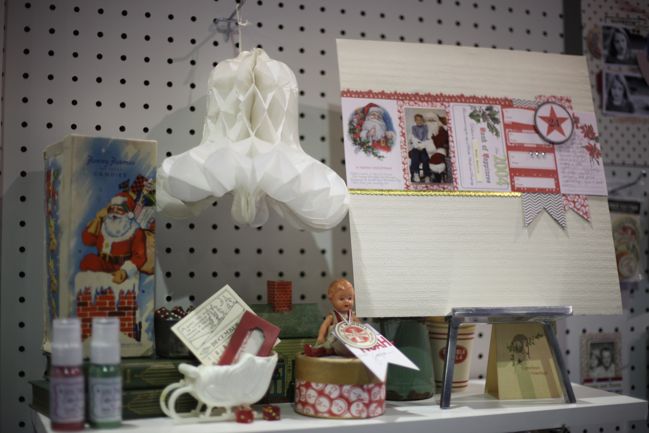
CHA Summer 2012 :: Jenni Bowlin Studio
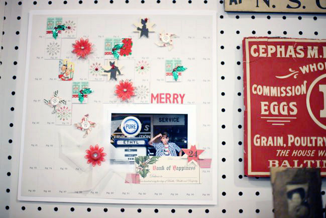
Some Christmas gorgeousness to start! If you haven’t created a page with a row of JBS journaling cards, put it on your to-do list now. It always looks so delicate and perfect!
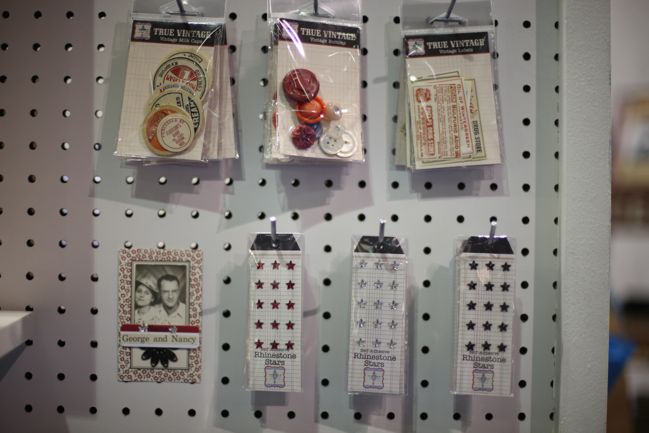
CHA Summer 2012 :: Jenni Bowlin Studio
Two groups of tiny things that I love: the True Vintage collection at the top – small packs of actual vintage goods including milk caps, buttons and labels. Then in the non-vintage side, tiny adhesive rhinestone stars in three colours. Definitely need these for my Christmas journal this year, and probably for everything else too.
CHA Summer 2012 :: Jenni Bowlin Studio
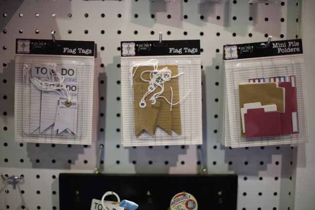
New paper embellishments include the flag tags in white and kraft (to coordinate with the tags and pockets released earlier this year) and mini file folders, complete with tiny coordinating labels.
CHA Summer 2012 :: Jenni Bowlin Studio
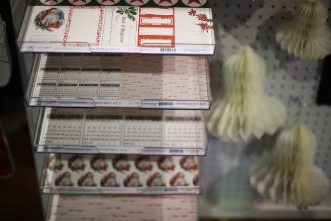
The Christmas 2012 papers include a cut-apart sheet with journaling cards, a sheet with 6×6 patterns on a 12×12 sheet, a page of December 2012 calendars (perfect for journal accents or for cardmaking), and full-page 12×12 designs.
CHA Summer 2012 :: Jenni Bowlin Studio
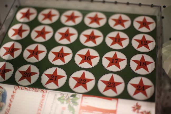
The top of the journaling card sheet has countdown numbers for Advent. Love these bold stars!
CHA Summer 2012 :: Jenni Bowlin Studio
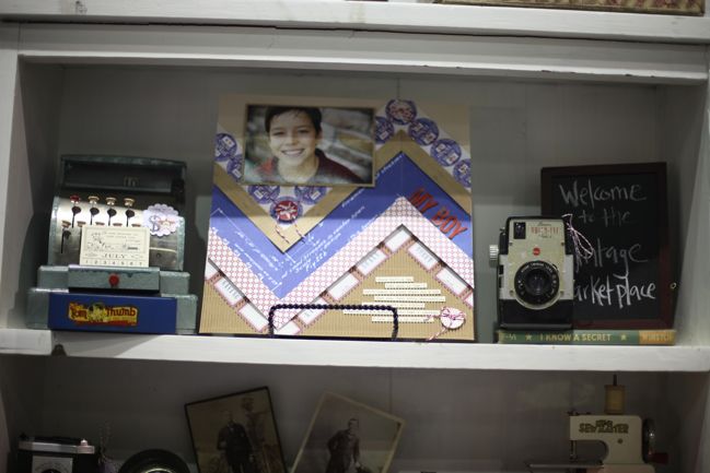
See what I mean about the detail in Jenni’s styling? Gorgeous pages from the design team, gorgeous scenes for the display. Sigh.
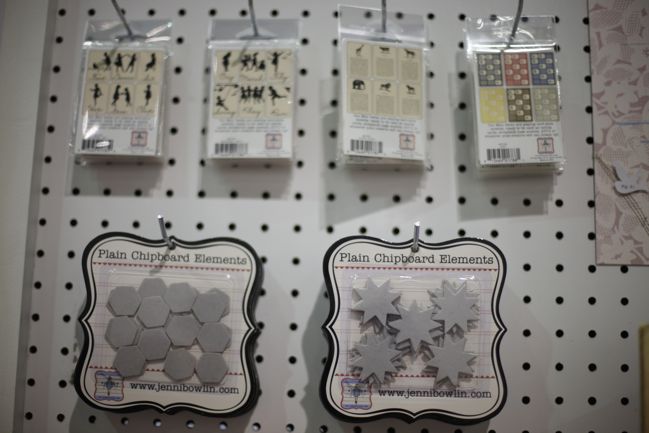
CHA Summer 2012 :: Jenni Bowlin Studio
Four new mini card packs and two new chipboard shapes: hexagons (to match the stickers released earlier this year) and eight-pointed stars.
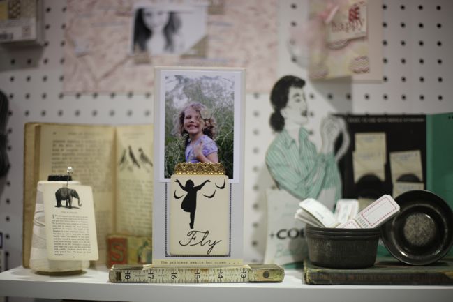
CHA Summer 2012 :: Jenni Bowlin Studio
Here are the mini card designs actually in focus!
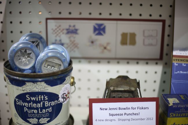
CHA Summer 2012 :: Jenni Bowlin Studio
Jenni has also added four new Fiskars punches to the line-up, all in the squeeze variety this time around.
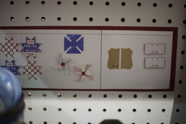
CHA Summer 2012 :: Jenni Bowlin Studio
The designs include that same star in the chipboard, a split square that makes perfect pinwheels, an artisan label and an index card. Keep in mind these are small designs – perfect for tiny details.
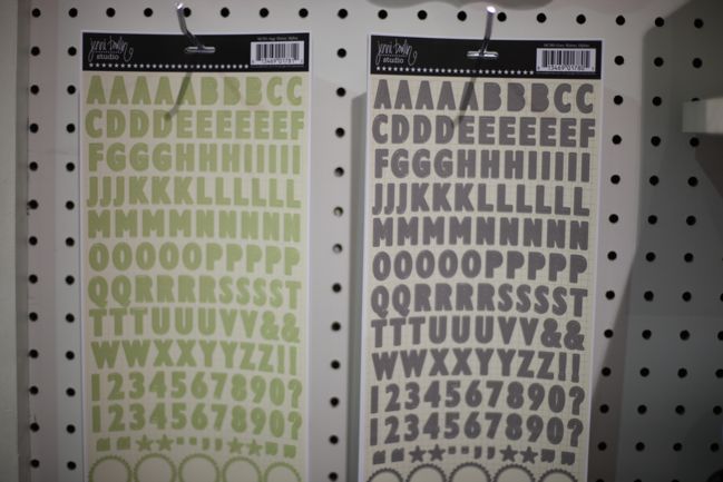
CHA Summer 2012 :: Jenni Bowlin Studio
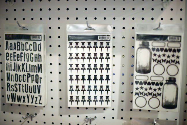
But you know it is sometimes the simplest things that make me the happiest, which is why I gasped in delight at this: grey JBS letter stickers!
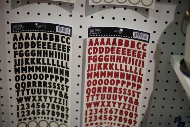
CHA Summer 2012 :: Jenni Bowlin Studio
Also in red and black, of course. Love these. Great size, they include numbers and they have cute labels at the bottom of the sheet. Sold.
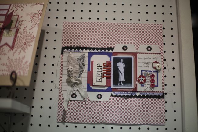
CHA Summer 2012 :: Jenni Bowlin Studio
I can’t add commentary to this. It’s just so very pretty.
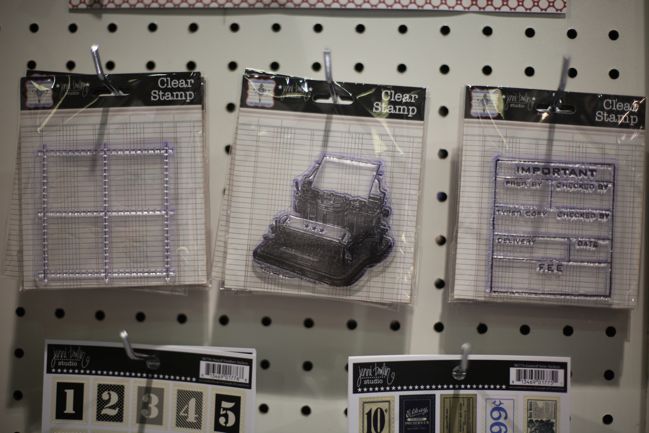
CHA Summer 2012 :: Jenni Bowlin Studio
New stamps include this stitched grid (amazing for adding your own tiny embellishments inside), a typewriter and an important memo.
CHA Summer 2012 :: Jenni Bowlin Studio
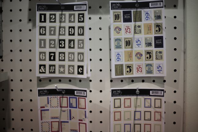
A new shape to Jenni’s sticker line-up: postage stamps! In four designs. Love the airmail look of the red and blue.
CHA Summer 2012 :: Jenni Bowlin Studio
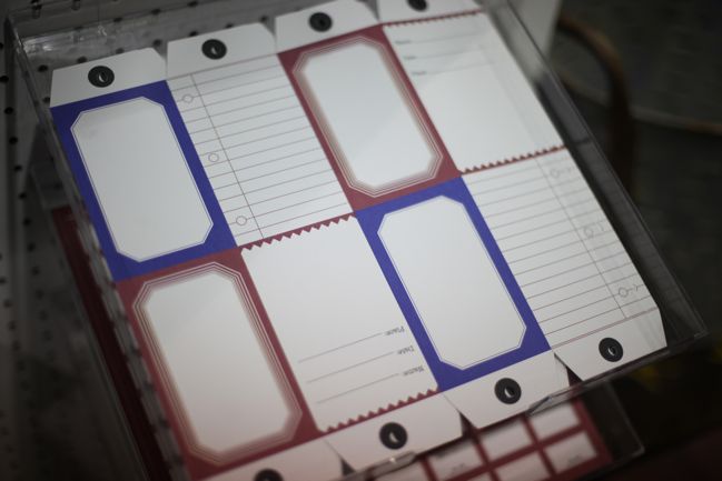
Here’s the paper from that pretty page above. It’s a red and blue print in the die-cut paper line. Cut it apart or keep it together and fold it up to create a mini project. Can’t really go wrong with this – very classic and clean in design.
CHA Summer 2012 :: Jenni Bowlin Studio
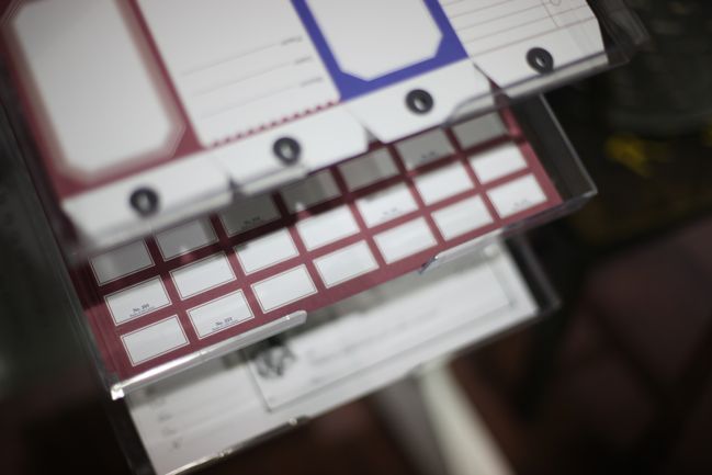
Love the red label sheet in the die-cut paper line too. An entire sheet of labels to embellish anything that will sit still. Sounds good to me!
CHA Summer 2012 :: Jenni Bowlin Studio
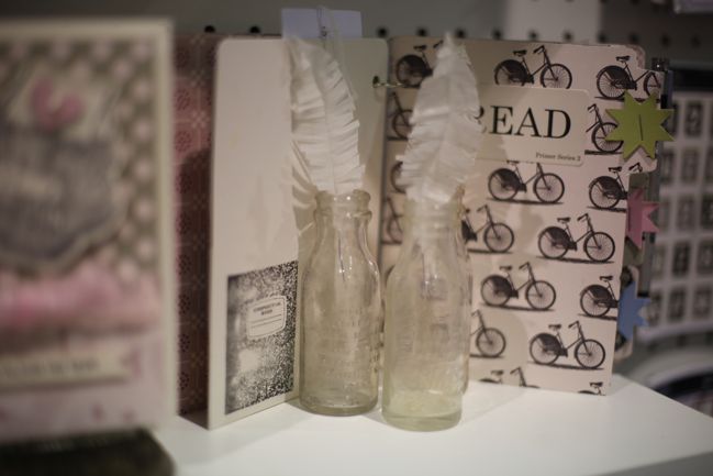
Pretty paper feathers!

CHA Summer 2012 :: Jenni Bowlin Studio
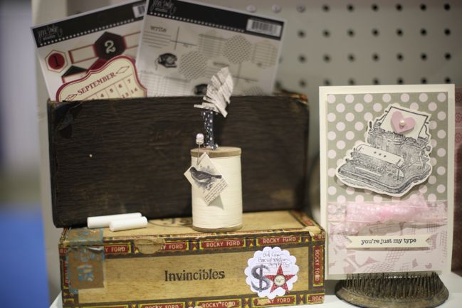
Love that typewriter stamped – doesn’t take much to go from that stamped image to a perfectly finished card.
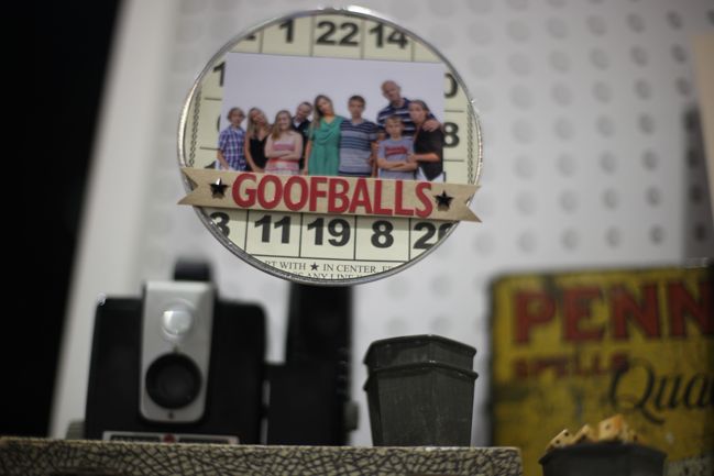
CHA Summer 2012 :: Jenni Bowlin Studio
This made me giggle in its fabulousness: a photo displayed in the flashbulb of an old camera! Love it.
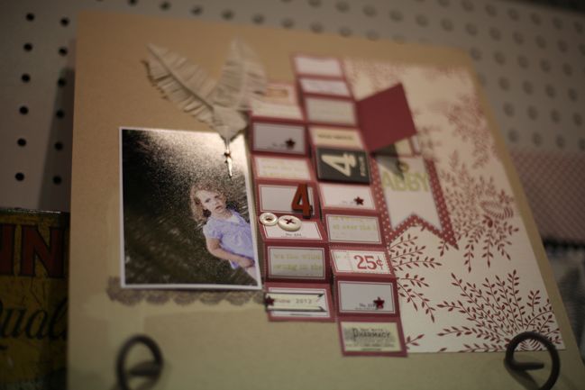
CHA Summer 2012 :: Jenni Bowlin Studio
A look at those red perforated labels in use, with plenty of pop dots.
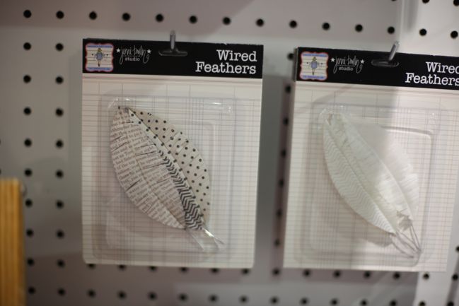
CHA Summer 2012 :: Jenni Bowlin Studio
The paper feathers look like this up close – in prints or plain.
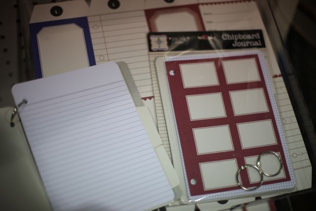
CHA Summer 2012 :: Jenni Bowlin Studio
There are lots of new journal products on the show floor, and Jenni has one too: the chipboard journal comes as a pack with chipboard covers, tabbed index pages and paper pages in a variety of lines, ledgers and grids. Plus the two rings to hold it all together.
CHA Summer 2012 :: Jenni Bowlin Studio
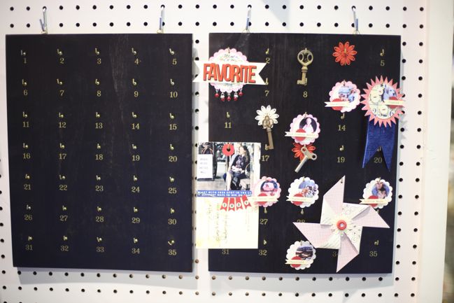
This hotel key holder was released at the winter show but just started appearing in stores and it’s so pretty, I figured I could show you again!

One stand down, a bunch more to go… what’s your favourite item from Jenni’s new release?

Click here to shop for Jenni Bowlin Studio products or here to join Jenni’s monthly kit club, JBS Mercantile.

xlovesx
Scrapbooking Starting Point :: The Colour of Matsuri Days

Scrapbooking starting points
scrapbook starting points
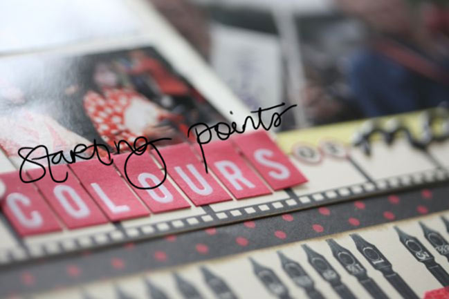
I’ve started this week drawn to red and black, so I’ve pulled out some always lovely red and black patterns from Jenni Bowlin and added a little splash of yellow from the Studio Calico Heyday collection.

scrapbooking starting points
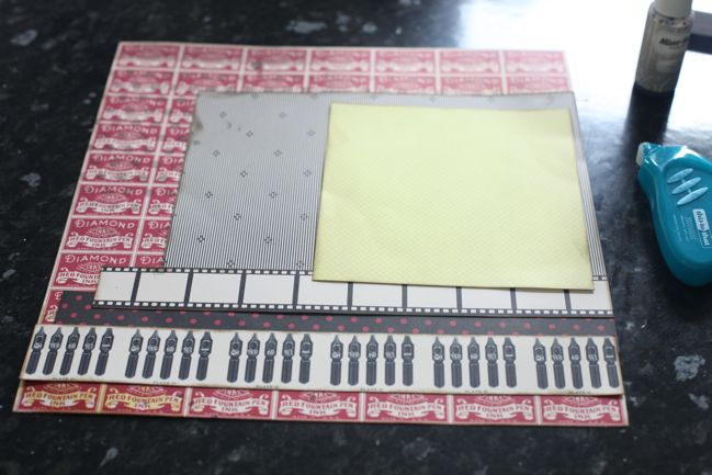
I started by masking and misting that red patterned background, and I covered up what I didn’t like and left what I did like on show (the polka dots at the top left, misted in Pinstripe Mister Huey spray). Then I just started at the bottom of the page and piled toward the top – three border strips, one large block and a contrasting 6×6 paper on top of the stack. Everything is edged in a dark brown, to be a bit less harsh than black ink.

scrapbooking cropped photos
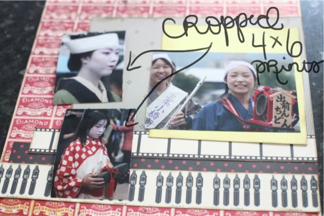
And now for a little tangent: I get a great many questions about why I don’t include more photos per page, and the most direct answer is just because I don’t like it. I like my photos at 4×6, and for the most part I like one to three of them per 4×6 page. I have plenty of exceptions to that, but that size is what works best for me. I have two connotations with page designs that really focus on including lots of images: my eyes can’t take them all in with so many images per page, which makes me feel a bit uneasy (even with significantly less embellishment than usual) and it reminds me of the sort of scrapbooking that involved a triangle of paper in the corner and competing for how many pages you could complete at a crop. I know that is fun for some scrappers – I’ve seen them relish it! It is not fun for me. It is stressful and foreign and uncomfortable for me. Just like ink droplets might make you twitch or covering up most of a layer of patterned paper might make you shout at me through your computer screen, too many photos on a page can just make my head spin because it’s not what I love. And I’m not going to make things I don’t love for the sake of a blog post or a video – so I’m afraid you’re stuck with a hefty dose of pages featuring one to three 4×6 prints! Since I print pretty much everything at 4×6, I have had a few commenters follow up the multi-photo discussion with the idea of cropping those 4×6 pictures. I rarely do, and today I tried it just to see if it would work. It didn’t, so this works perfectly to explain.

I knew I wanted to use that landscape 4×6 print with the smiling girls, but I also wanted to include some other photos from this same festival parade in Kyoto. They were all 4×6 landscape prints and there was no cute way to feature all three at full size with this starting point, so I needed to change something. I tried cropping those two images, and cut them so they were not only smaller, but now a portrait orientation, taller than they are wide. Especially with the top photo, it seems like this is a sensible solution because she’s the only person in focus in the picture, and the landscape image has lots of ‘wasted’ space to either side of her face. The cropped version is a disaster to me: losing that calming space to either side of her made the image harsh and awkward. It doesn’t look natural or fluid, and in both pictures it makes the people look somewhat out of proportion. These cropped images were not going to make me happy in the slightest, so I went back to the original files and printed them in their horizontal style with the original cropping of the image, but just at a smaller size. Immediately the images appeared calmer, more natural and gave a more honest depiction of the memory in my mind.

End of tangent, I promise.

scrapbook page
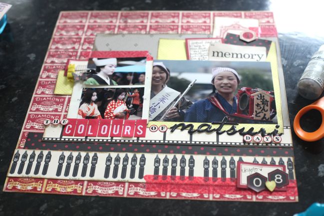
Here’s the finished version, with those two photos printed in their original orientation but at 2×3 inches instead of 4×6, and I’m much happier with that. I built the embellishment at the top right first, then replicated many of those layers over to the left, but also added a felt bow clip for dimension and texture and a little butterfly to keep it from being too boxy with all those squares and rectangles. The bottom right corner came last and it’s far more minimal, with the hexagon numbers for the date and a little punched heart, which is allowed both because I really do love Japan and because it was our honeymoon. As if you need permission to use a heart punch. Heart punches are always allowed in my world.

Other supplies include Jenni Bowlin stickers, Dear Lizzy and Heidi Swapp letter stickers, and My Mind’s Eye washi tape.

scrapbook pages
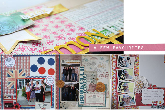
And a few favourite pages from the last starting point, which created all sorts of multi-photo pages, by the way. For a closer look at these pages, check out the posts from Kelly, Jacky, Alison and Katja.

If you give this starting point a try, I’d love for you to share your work – you might find your layout in the favourites next time!


Scrapbooking Sketch of the Week :: Scrapbooking with Transparencies

scrapbooking sketches and scrapbook page ideas
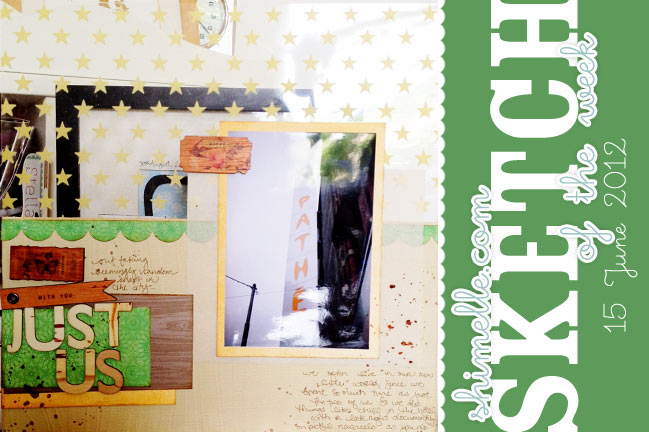
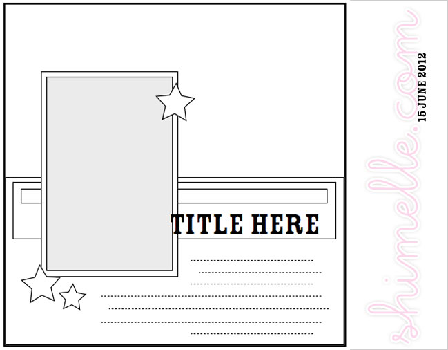
scrapbook page sketch
I know: calling it scrapbooking sketch of the week at this point is entirely too cheeky. But I don’t know what to change the graphics to say, so for the moment let’s just say I have a really creative definition of a week. Or something.

This time around, I had a few bits and pieces left over from working with the May papercrafting kit from JBS Mercantile, including most of a printed transparency sheet. I love transparencies but don’t love just layering them all the time – sometimes I like keeping the transparent element in the album, but that takes a little thought about what can go on the back of that page, else it can end up pretty awkward as you turn the pages. So this sketch was designed with a transparency in mind, with a simple design to the rest of the page so it can be repeated on the back to keep that transparent element in the album. Of course, that works best with a pattern that works from both the front and back of the page! Stars, chevrons, lines, checks, polka dots, clouds and all sorts of geometric patterns work better for that than anything with text!

scrapbooking sketch
Of course, you don’t have to use a transparency to use the sketch. You could simply piece together the background layer with two pieces of cardstock or two patterned papers. Easy enough! But if you do have a transparency kicking around that needs to be put to use, consider this your challenge!


(Oh, and I may have posted things in a different order to what I expected, so that starting point is already live for you! Find it here.)

As this goes live, a few each of both the main kit and the dime store kit are still available. You can find the main kit here and the dime store kit here, and you don’t have to subscribe to order either kit.

scrapbook pages
I loved the absolute variety of page themes posted for the last sketch. Here are four favourites: one, two, three and four. Give them a look to see each page in more detail and meet the scrappers who created them!

Sketch of the Week (or whenever!) is always just for fun, and you’re invited to join in with some photos of your own. Grab any supplies you want to use, create a page and share it with us via an online page gallery or your blog. We would all love to see where this sketch takes you on your scrapbooking adventures!


Scrapbooking Starting Point

scrapbooking starting points
scrapbook starting points
Good morning! Kicking off the new week with a new scrapbook starting point, and something a little different this time – one area of the page already more embellished than the rest. This is my final layout to finish from this JBS Mercantile kit, mixed with the minibook kit. But of course you can select any supplies you fancy!

scrapbook starting point
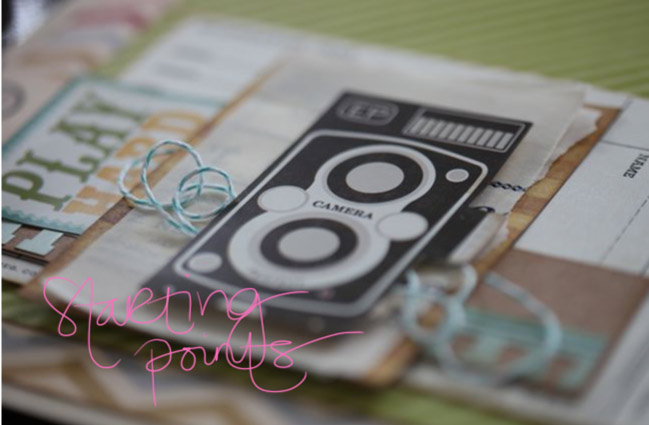
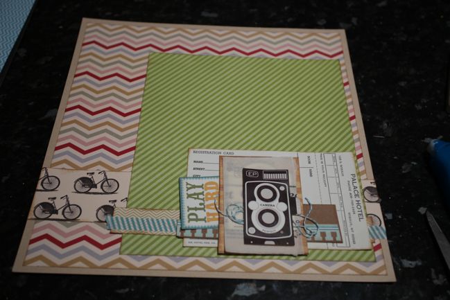
I started by trimming a half inch from two sides of the chevron patterned paper and attaching that to the middle of a sheet of kraft cardstock. Then a patterned border across the whole page, about three inches from the bottom, topped with an 8×10 portrait piece of patterned paper. Then to start this area of embellishment! Working from the bottom layer to the top, it is: a strip of patterned paper, washi tape, a vintage hotel registration card, some dark kraft cardstock, part of a border sticker with a notebook paper edge, a sticker, a journaling card, a few layers of vellum, some baker’s twine and a big sticker right on the top!

scrapbook page
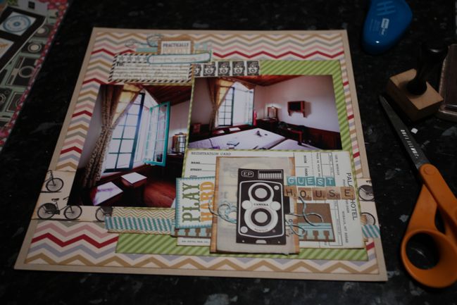
I finished this scrapbook page with two 4×6 photos – one portrait, one landscape – and a smaller area of layered embellishment with the writing at the top left. Most of the pieces included there are repetition from the starting layers – the large camera repeated with a few smaller cameras in the same style, the rest of a border sticker first used at the bottom right, and so on. So although there are plenty of layers, it’s actually pretty kind on the supplies as most things can work as a little here, a little there. And I liked that there was still enough room for a title in some smallish letter stickers.

scrapbook pages
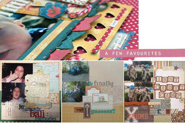
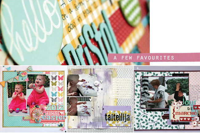
So many lovely pages were shared from the last starting point. Here are a few favourites. Click the corresponding link to take a closer look and get to know the scrappers behind these pages: one, two, three and four.

If you use this week’s starting point to create a scrapbook page of your own, I’d love for you to share it here! (By the way, I’m always looking for a nice detail shot for the round-up!)