Scrapbooking Starting Point :: The Colour of Matsuri Days

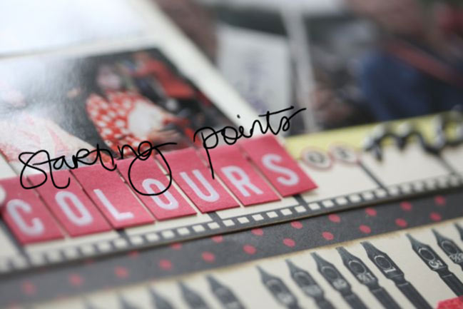
I’ve started this week drawn to red and black, so I’ve pulled out some always lovely red and black patterns from Jenni Bowlin and added a little splash of yellow from the Studio Calico Heyday collection.
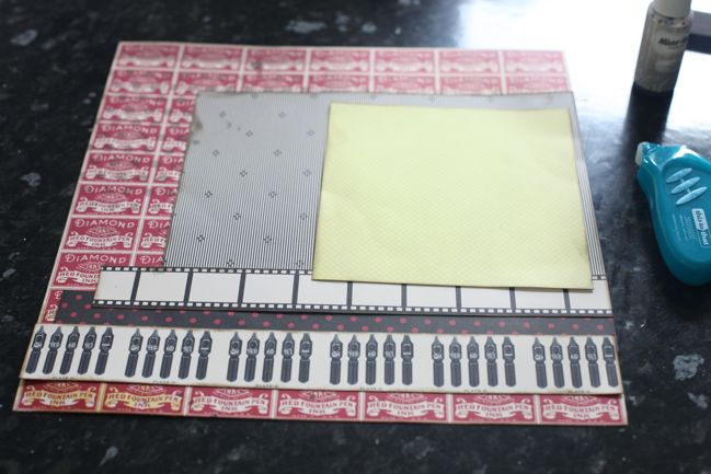
I started by masking and misting that red patterned background, and I covered up what I didn’t like and left what I did like on show (the polka dots at the top left, misted in Pinstripe Mister Huey spray). Then I just started at the bottom of the page and piled toward the top – three border strips, one large block and a contrasting 6×6 paper on top of the stack. Everything is edged in a dark brown, to be a bit less harsh than black ink.
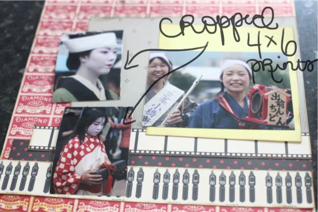
And now for a little tangent: I get a great many questions about why I don’t include more photos per page, and the most direct answer is just because I don’t like it. I like my photos at 4×6, and for the most part I like one to three of them per 4×6 page. I have plenty of exceptions to that, but that size is what works best for me. I have two connotations with page designs that really focus on including lots of images: my eyes can’t take them all in with so many images per page, which makes me feel a bit uneasy (even with significantly less embellishment than usual) and it reminds me of the sort of scrapbooking that involved a triangle of paper in the corner and competing for how many pages you could complete at a crop. I know that is fun for some scrappers – I’ve seen them relish it! It is not fun for me. It is stressful and foreign and uncomfortable for me. Just like ink droplets might make you twitch or covering up most of a layer of patterned paper might make you shout at me through your computer screen, too many photos on a page can just make my head spin because it’s not what I love. And I’m not going to make things I don’t love for the sake of a blog post or a video – so I’m afraid you’re stuck with a hefty dose of pages featuring one to three 4×6 prints! Since I print pretty much everything at 4×6, I have had a few commenters follow up the multi-photo discussion with the idea of cropping those 4×6 pictures. I rarely do, and today I tried it just to see if it would work. It didn’t, so this works perfectly to explain.
I knew I wanted to use that landscape 4×6 print with the smiling girls, but I also wanted to include some other photos from this same festival parade in Kyoto. They were all 4×6 landscape prints and there was no cute way to feature all three at full size with this starting point, so I needed to change something. I tried cropping those two images, and cut them so they were not only smaller, but now a portrait orientation, taller than they are wide. Especially with the top photo, it seems like this is a sensible solution because she’s the only person in focus in the picture, and the landscape image has lots of ‘wasted’ space to either side of her face. The cropped version is a disaster to me: losing that calming space to either side of her made the image harsh and awkward. It doesn’t look natural or fluid, and in both pictures it makes the people look somewhat out of proportion. These cropped images were not going to make me happy in the slightest, so I went back to the original files and printed them in their horizontal style with the original cropping of the image, but just at a smaller size. Immediately the images appeared calmer, more natural and gave a more honest depiction of the memory in my mind.
End of tangent, I promise.
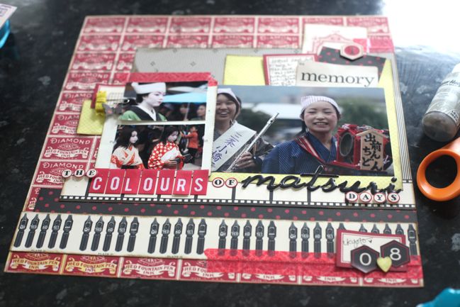
Here’s the finished version, with those two photos printed in their original orientation but at 2×3 inches instead of 4×6, and I’m much happier with that. I built the embellishment at the top right first, then replicated many of those layers over to the left, but also added a felt bow clip for dimension and texture and a little butterfly to keep it from being too boxy with all those squares and rectangles. The bottom right corner came last and it’s far more minimal, with the hexagon numbers for the date and a little punched heart, which is allowed both because I really do love Japan and because it was our honeymoon. As if you need permission to use a heart punch. Heart punches are always allowed in my world.
Other supplies include Jenni Bowlin stickers, Dear Lizzy and Heidi Swapp letter stickers, and My Mind’s Eye washi tape.
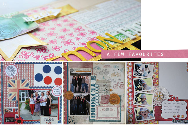
And a few favourite pages from the last starting point, which created all sorts of multi-photo pages, by the way. For a closer look at these pages, check out the posts from Kelly, Jacky, Alison and Katja.
If you give this starting point a try, I’d love for you to share your work – you might find your layout in the favourites next time!
![]() Read more about: scrapbook-starting-points jenni-bowlin-studio
Read more about: scrapbook-starting-points jenni-bowlin-studio
Next post: 10 Things :: July (10 Signs the Olympics are coming to London)
Previous post: Scrapbooking with Studio Calico :: Twisty Slide


