pretty paper. true stories. {and scrapbooking classes with cupcakes.}

lovely to meet you Twitter Facebook Pinterest YouTube

Take a Scrapbooking Class

online scrapbooking classes

Shop Shimelle Products

scrapbook.com simon says stamp shimelle scrapbooking products @ amazon.com shimelle scrapbooking products @ amazon.co.uk

Reading Material

travel

Circular scrapbooking inspiration

Circular scrapbooking inspiration by ashli oliver

Please welcome special guest Ashli Oliver, with a scrapbooking style I positively admire! Ashli always makes me think she must be having the most fun when she crafts. I hope you agree!

I am never one to turn down a creative way to use a circle, and this post by Melissa Mann had me itching to try something similar!

I just love how a simple circle can be turned into such a fun feature on a page with just a few little touches.

Circular scrapbooking inspiration by ashli oliver

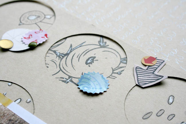
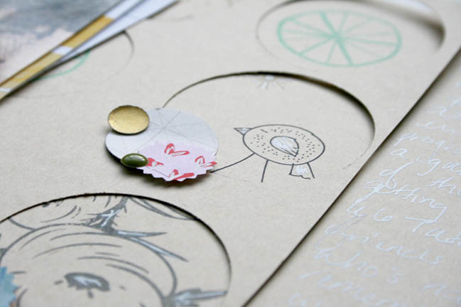
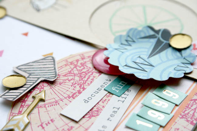
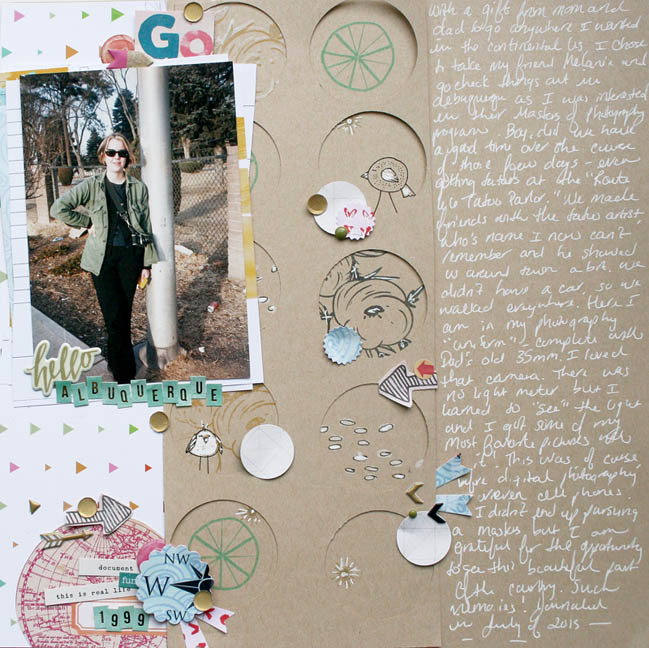
In order to leave ample room for journaling, I chose to keep my circles confined to just my area of embellishment, as opposed to the entire background Melissa did on her gorgeous page. Using a stand-by favorite of stamping on kraft, I pulled out some often forgotten stamps and had the best time playing! Please have a look…

Circular scrapbooking inspiration by ashli oliver

When I came across this old photo, I just knew I wanted to tell a story. And, this trip down memory lane was so much fun, thanks to this awesome inspiration!

So, the next time you aren’t sure where to start with your layout… grab some punches and have some fun with circles, or whatever your chosen shape may be!

Circular scrapbooking inspiration by ashli oliver

Your turn now! We challenge you to create a new scrapbook page with circles as your inspiration. How you use the circles is completely up to you, but circles it is. We’d love to see what you make, so please share with us!


Today’s guest artist: Ashli Oliver loves scrapbooking, gardening, and knitting. You can find more from Ashli on Instagram, YouTube, and her blog.

Gallery inspired frames for a scrapbook page

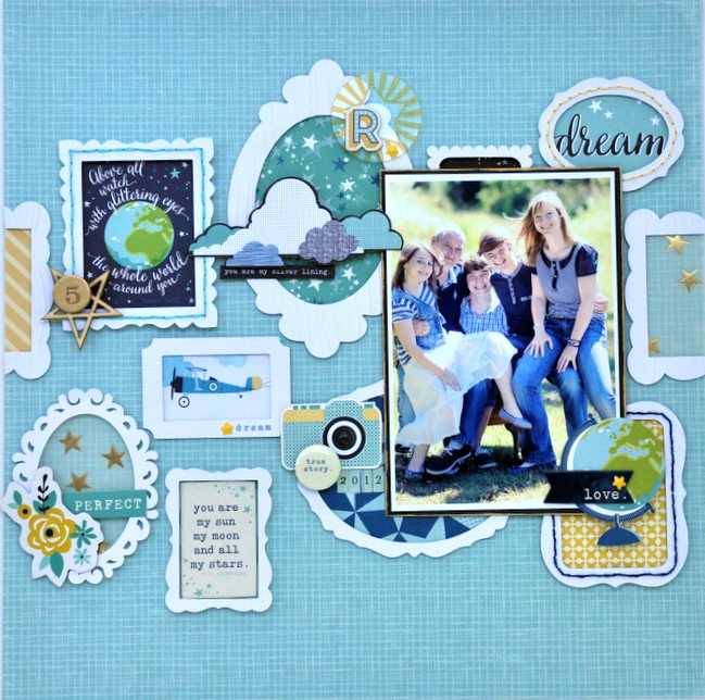
gallery inspired frames by sheena rowlands @ shimelle.com

Time for a project from one of our contributing designers! Sheena Rowlands is here with a new layout and an interesting source of inspiration for your next challenge.

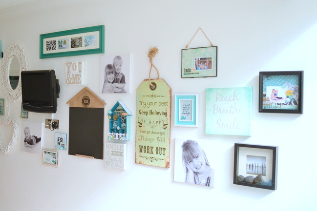
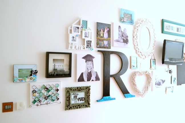
When I hear the word portraits, I immediately think of art galleries and museums and remember numerous visits over the years to see painted portraits of the famous and not so famous. I was also reminded of some photos shared by a friend (scrapbooker and fellow Hey Little Magpie designer) Niki Rowland, showcasing a wall she had decorated in her new kitchen where she had created her own personal gallery wall of her family.

gallery inspired frames by sheena rowlands @ shimelle.com

gallery inspired frames by sheena rowlands @ shimelle.com

The mix of shapes and frames on her wall had me thinking this would be perfect as a starting point for my page. I sketched up a few ideas using frames as a background and once I was happy I got started.

gallery inspired frames by sheena rowlands @ shimelle.com

First I gathered supplies to use with my photo. It’s an informal family portrait we had taken a few years ago now, but I’ve not scrapped it before. I printed it at a standard 4×6 so it could take centre stage but also leave plenty of space for the framing work.

gallery inspired frames by sheena rowlands @ shimelle.com

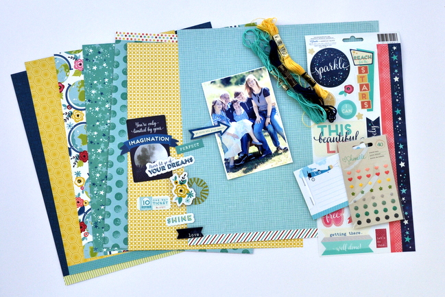
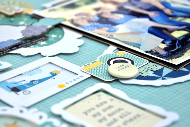
I tend to find that I’m colour led when choosing stash to use and this time was no exception as I pulled out supplies of blue, teal, yellow, and navy from the Starshine collection plus some embellishments and threads to go with them.

gallery inspired frames by sheena rowlands @ shimelle.com

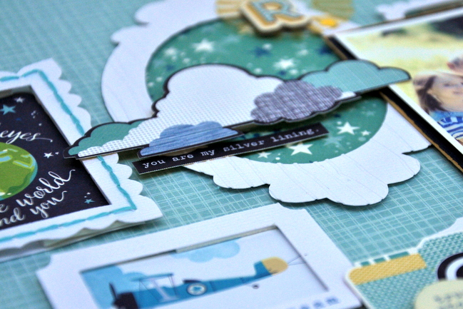
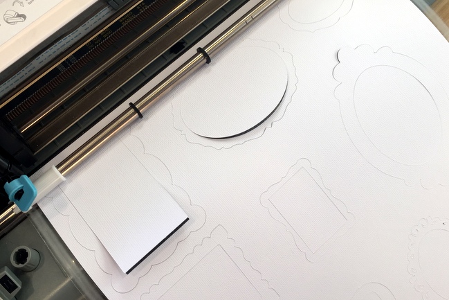
I am lucky enough to be able to die cut a selection of frames from white cardstock, but handcut frames or purchased frames would work equally as well when making this background.

gallery inspired frames by sheena rowlands @ shimelle.com

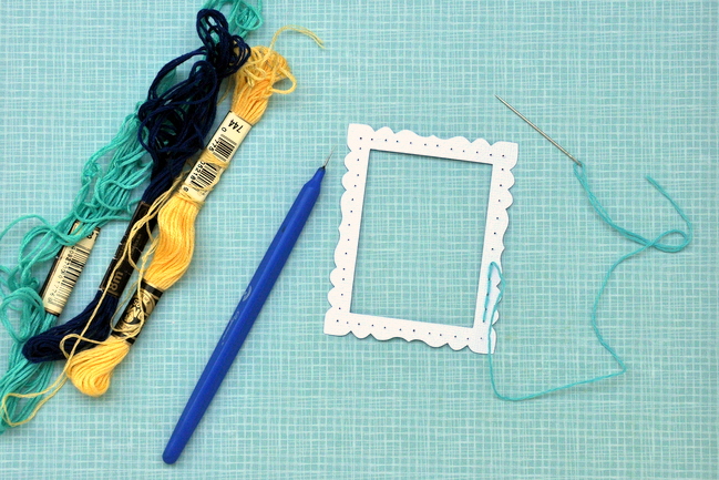
To add interest and texture to some of the frames, I backstitched around a few using some of the large supply I have of embroidery threads from my cross-stitch days and also embossed a couple using a woodgrain folder and my trusty Sizzix machine.

gallery inspired frames by sheena rowlands @ shimelle.com

The best part of layout making for me is the fiddling about. I like adding layers and embellishments, then moving them around till I find the perfect spot for them. Sometimes I take some quick snaps on my phone as I do this so I can see how the page looks and the ideas that I’ve tried. As you can guess, I’m not a quick scrapper but that doesn’t bother me, it’s the process that I love!

I used vellum, patterned papers, die cuts, and chipboard to back the frames, which were added using foam pads for dimension. When I was happy with the placement of the frames I adhered them down before adding my photo with more foam pads.

When I look back to Niki’s gallery wall I can see how it influenced the flow of my design, the colour scheme used, and I’ve even included our initial like she did, to create my own little family work of art.

Now it’s your turn! Create a scrapbook page inspired by a wall of frames (Niki’s or another wall you admire!) and share it with us. What you scrap and what colours and techniques you use are totally up to you, and we can’t wait to see your framing work in action.


Design ideas for scrapbooking larger photos

Design ideas for scrapbooking larger photos

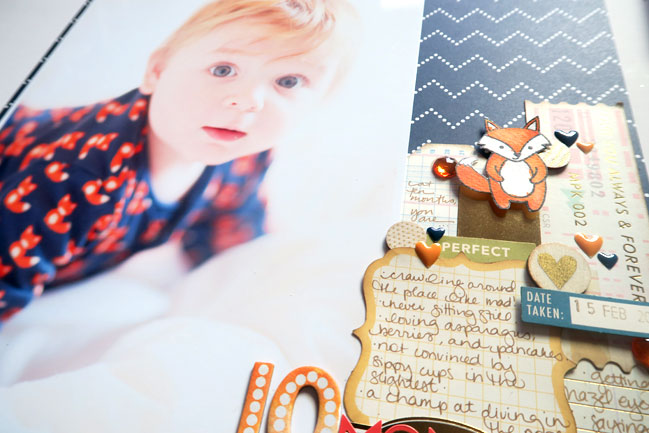
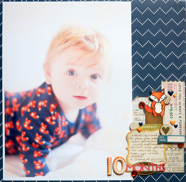
If you haven’t caught up with Glitter Girl recently, her latest adventure is a big one – oversized photos! She’s been helping me with this ongoing addition to that first year baby book: one 12×12 page each month with a photo printed at A4 size. I love how this changes the pace of all the tiny pockets in that book and lets me include those favourite portraits to chart his growth over the first year.

The photos were all taken with the same set up and the first six months went really well! I have the first six framed on the wall because they look so lovely together (in my opinion, anyway!) because he would happily lay on the duvet and look at the camera without much moving. There’s no fancy photo backdrop or anything – the walls in the room are white and there’s a white duvet on the bed and a big window to open the curtains for good light! I actually tried a bunch of different cute settings the day he turned one month, including props and my beloved rocking chair and all sorts of things that would give scale to him growing, but they were so much work to set up that I realised I would never have the stamina to reset the props and get it just right every month for an entire year! Making the bed was a lot easier. All the white makes it less about stuff and more about him anyway, which is why I love the pictures. But from month seven, things got very complicated as he wouldn’t sit still for a second! The second half of the year is hit and miss in terms of photographic brilliance, but the whole set makes me happy and this one is a definite favourite.

Design ideas for scrapbooking larger photos

I love how big, gorgeous photos almost make the page themselves, but the space remaining still gives you plenty of potential. I’ve put together a special Pinterest board just for scrapbook pages with big photos, so do give it a look if you’d like to find something that works with your picture and style.

Then I asked special guest Karen Moss to join us with a big photo of her own! Please give Karen a warm welcome.

design ideas for scrapbooking larger photos - scrapbook page by Karen Moss

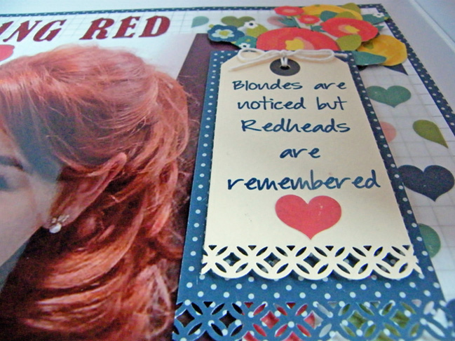
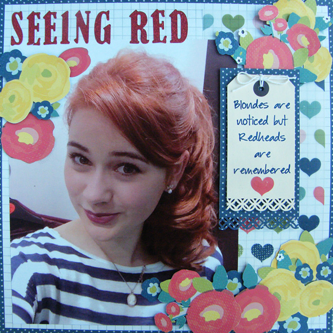
My daughter had her hair dyed auburn as a post exam treat and I loved how different it made her look. The only photos I had were the ones I ‘swiped’ from her Facebook page and particularly loved this one. The majority of my pages have a single photo and although this photo was not very good quality it was worthy of being printed at 8×10 to showcase her new ‘red hot’ look.

design ideas for scrapbooking larger photos - page by Karen Moss

design ideas for scrapbooking larger photos - page by Karen Moss

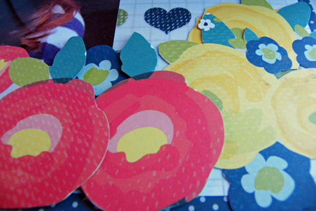
I am a big fan of detail cutting and foam pads, and the grey floral paper from True Stories I chose was ideal for this. I used two sheets as I wanted to use the polka dot b-side for part of my base and cut out the flowers from the a-side for my embellishments.
-Karen

Now it’s your turn! Choose a photo you love and scrap it in a big way. Anything else is totally up to you.


Today’s Guest Artist: Karen Moss loves family, foam dots (by the million), and new experiences. You can find more from Karen on Instagram, Facebook, and her blog.

Scrapbooking older photos with a monochromatic colour scheme

Scrapbooking older photos with a monochromatic colour scheme by Shimelle Laine

The results for the recent monochromatic turn of our weekly challenges really gave my face the human version of the heart-eyes emoji. Seeing all those layouts in just one dominant colour each made for such a happy grid of inspiration! And when we set that challenge, I was convinced I would go into vastly familiar territory and create in shades of pink or turquoise.

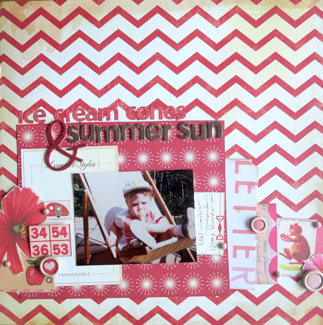
Then I found this photo and decided against being predictable. (This is The Boy at just a few months older than Wonder Boy is now. Obviously that fills my creative heart with glee. And more heart-eye emoji faces.) Red it is!

Scrapbooking older photos with a monochromatic colour scheme by Shimelle Laine

But red is such a bold colour that even as I pulled out a desk full of red supplies, I could see the photo fading into some lost dimension. I tried a few things to see if I could find a good ground of compromise between the ideas of ‘I heart this photo!’ and ‘All The Red!’ and some worked, some didn’t, and some are up for debate.

What didn’t work: crisp white. It just didn’t work with this photo and it felt sterile to me. I know, I know, how many times will I pull out white cardstock for a background because it looks beautiful all over the internet and then put it away because it doesn’t look beautiful on my own desk? Apparently that number is somewhere near infinity.
Also: overloaded embellishment. I probably pulled out three times as much as what is here. But I just got to a point where I pulled a bunch back and sighed a very zen sigh and took it as a sign that this is how much was meant to me there, no more. It does mean it’s a bit simpler than some of my pages, but there is room for that!

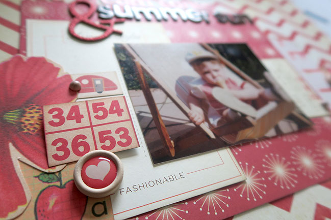
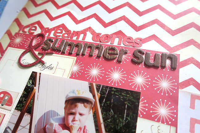
What did work: distressed off-white and cream. That chevron background (from Crate Paper) was where I started with choosing the vintage tones and then just found whatever had bright reds but not bright whites, and that ended up being Cosmo and Sassafras. I’m starting to see a theme with that lately.
Also: less embellishment and bringing in brown, which I started thinking was a total cheat but I liked the look and the more I looked at it, I realised the brown is really just a shade of the distressed off-white (albeit at the extreme ends of that shade card) and that means this is not a monochromatic layout at all now. Well, hmpf. But I wouldn’t have ended up here if I hadn’t started by aiming to make it a monochromatic layouts, so I think that’s still in the spirit of the challenge, if not the letter. I am totally good with that if ever happens with your own challenge projects, by the way!

What is up for debate: the red letter stickers. I really like elements that you have to look closely to see, and I find when I’m filming videos I have to keep asking myself if it will be clear on camera. Just because I can see it with my own eyes in person doesn’t mean it will show up with that same clarity when photographed, of course. The red letters are exactly that sort of thing: I know they are subtle but I am sure some of you would quickly say that choice is not one you would make in your own album. Totally cool. My thought was that the giant glittery ampersand makes you realise that the brown letters are probably not all of the title, so you’ll look back if you miss the red letters on first glance. But I totally accept that easy to read titles are a better choice for some! So although all of this design stuff is clearly up for debate really and you’re welcome to prefer crisp white to distressed off-white any day of the week, I think the monochromatic letter stickers are probably the thing worth thinking about whether you would personally like or dislike in your album – and then if you dislike it, you’ll never waste time or supplies on trying it!

Scrapbooking older photos with a monochromatic colour scheme by Shimelle Laine

Since we just had a challenge a couple weeks back to make a monochromatic layout, that part is optional. Your real challenge here is to scrapbook an older photograph. You can decide what is ‘older’ in your photo library! But probably not something from the past week. Any style and any interpretation welcome – just let us see what you’re making!


We're bringing colour blocking back

Modern colour blocking for scrapbook pages

Yep, that title line is horrible and I love it anyway. Please sing it at least once if that song is now in your head. Thank you. But onward to some actual scrapbooking! I asked Cheryl from Scrapstorian to revive an old scrapbooking technique and she pulled out a page template designed to colour block a scrapbook page. While I never owned the exact one she used, I did have plenty similar items! Maybe twelve years ago I was teaching workshops using the Deluxe Cuts colour blocking templates – please put your hands up if you remember those or still have them in your stash. The idea of colour blocking takes me back to that phase…
Modern colour blocking for scrapbook pages

…and also to this phase! This was my scrapping style circle 2000, and in fact this layout was in the CK Hall of Fame book in 2001 (bonus points for anyone who is reading this who is actually too young to remember 2001, scrapbooking or otherwise). It was a time when I had basically no access to patterned paper and all of my pages were made with solid cardstock. I got to a point where I did a lot of experimenting with randomly wide open spaces, and it all went a bit Mary-Quant-gone-wrong sometimes but it was a phase that helped me find what did and did not work in terms of design. But it was almost always colour blocking, even if I didn’t know to call it that.
Modern colour blocking for scrapbook pages

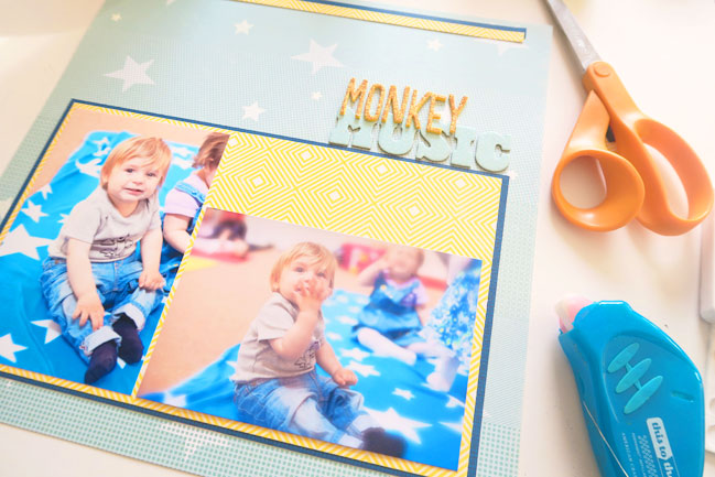
Back to 2016 and trying to figure out how I can mix that old school technique with my current style and have it actually be useful and enjoyable! The first big difference for me is to swap all that solid cardstock for patterned paper. I keep very little solid cardstock on hand these days compared to patterned paper. Patterned paper is definitely what feels right to me, and there’s no reason why it can’t be used in the same way. My usual practice is to use the more subtle patterns for the bigger expanses of the page if I’m scrapbooking more than one photo on that layout. I started with that blue paper in the background from Starshine and added a dark blue crosshatch (a Starshine b-side) and the yellow print from an older October Afternoon collection (Midway, I think).

In terms of making things useful, colour blocking is a brilliant way to work with that combination I so often try to avoid: one landscape and one portrait photo. These are both printed at 4×6 and if you look at everything at this stage of putting things together, there’s a lot in common with that older layout! Multiple photo mats that are square and even. No angles on anything. Straight lines in the open space (the stitching on the far right on the old layout; the strips of paper at the top of the new layout). But then I got to the point where I wanted to bring it up to date with how I scrapbook today!
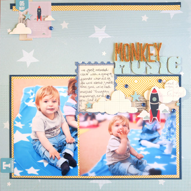
Modern colour blocking for scrapbook pages

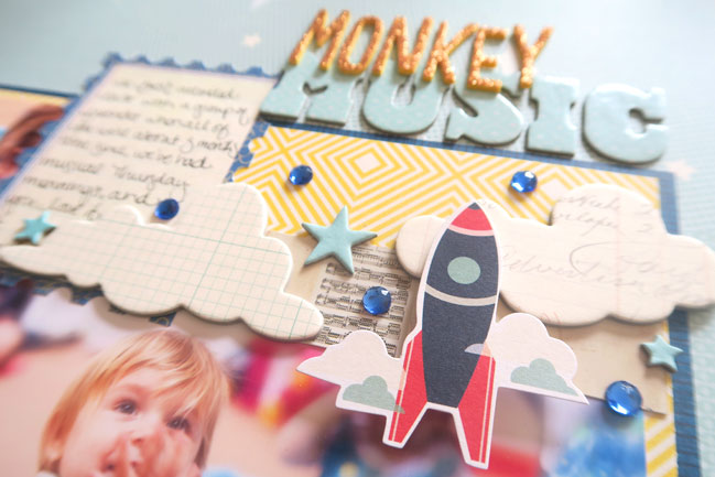
This felt like shaking off the things I don’t love about colour blocking. Now there is some movement, with curved shapes and slight angles and overlapping layers. But there’s also purpose. Wonder Boy’s friend in the background of the landscape photo was having a momentary unhappy face, and I have much happier photos of her on other pages in my album. I’m okay with using a bit of embellishment to cover that bit of the photo and that gives a softer line to the top right of that photo – so it’s blocked underneath all that, but not just blocks on the surface. (Also I was really happy I could use that rocket die-cut because it matches the rocket on his shirt, which I made with the same drawing, but that is really not a requirement of scrapbooking and I do not expect you to fire up your lightbox to customise baby clothes to match die cuts. I said I’m not expecting it but I don’t disapprove either.)

Does it still count as colour blocking? I’m voting yes. If nothing else, it is definitely an old page inspiring a new one! But what would Cheryl do with her trusty page template that started all this?
Modern colour blocking for scrapbook pages

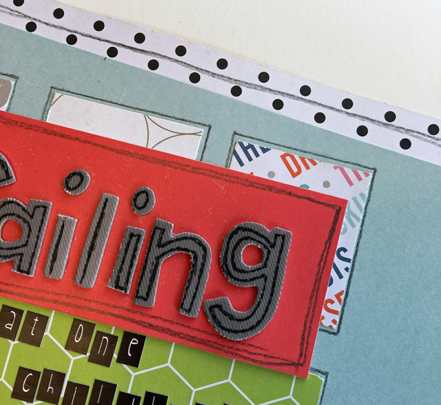
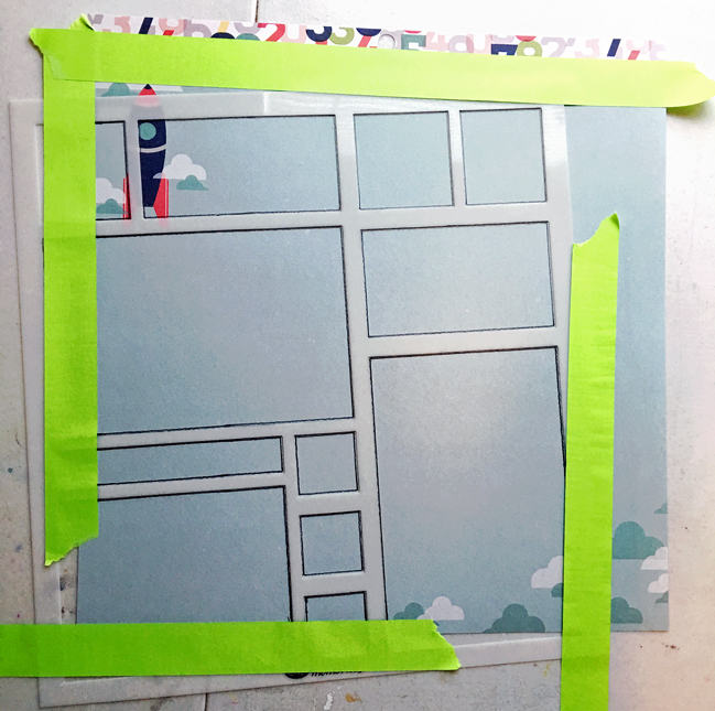
No matter how many times I go through my supplies and “de-stash” or donate items, my Creative Memories page template stays. I’m sure it’s been around for 10 years. It’s purpose used to be to fit as many photos on a page as possible, but since that’s not what I needed here, I had to rethink it.
Modern colour blocking for scrapbook pages

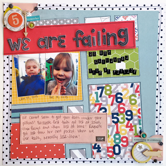
I wanted lots of colour, so a modified grid design was the answer. Each square of the template became a home for a different patterned paper. It was an easy way to dress up the Shimelle True Stories background.
Modern colour blocking for scrapbook pages

I loved the pencil lines (and what tool is older than a pencil?) so I doodled around the edges of each paper piece. A vibrant, carefree page is the perfect home for this silly story. Now, if only I was as good at keeping track of teeth as I am photos.

Okay, your turn now! Cheryl and I challenge you to colour block your next page! With or without a template, create a page with blocks of colour or pattern. You can scrap lift either of our pages or come up with something totally your own. You maintain all artistic freedom here, of course! We’d love to see what you make!


Today’s Guest Artist: Cheryl loves to play with paper, sing in the car, and lift heavy stuff. You can find more from Cheryl on Instagram, Twitter, Facebook, and her blog.
Project Life Baby Book update

Project Life Baby Scrapbook by Shimelle Laine

Nearly two years ago, I started working on this much-anticipated (by me!) bit of documentation – a Project Life baby book to record so much about Wonder Boy’s first year. I wrote that first post with everything thought through in my head and tried to develop a system even though I’m not usually an entirely systematic crafter at all.

Then one year ago, I was nowhere near done with the album, but I wrote again and I still had a working system. And a few months later, I did a video series with ten updates on how I was making some progress card by card. And now we’re in March 2016, which means next month Wonder Boy will be two and it’s time for me to say I am still nowhere near done with that album. In many ways, it would seem I am not even halfway there.

But I’m okay with it!

Project Life Baby Scrapbook by Shimelle Laine

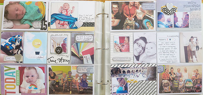
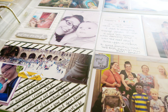
I am so grateful I decided to have a system even though I normally don’t. I guarantee if I hadn’t had a system in place, this project would be collecting dust on my shelf, no matter what my intentions. Instead, it looks like it’s not even halfway because I’m only on week fifteen of completed layouts like this. But that system has actually let me have a lot more that is already done even if the pages are not complete.
-The photos are printed up to the point where I ran out of Design A page protectors and the remaining photos are all organised in folders by what size they should be printed and what week they are for, and that is backed up in more than one digital place for safety. So that’s a big job done for the entire year of that book.
-The notes that accompany those photos are in two places (a notebook where I wrote by hand and a note taking app on my phone for when that was more convenient) and that big job is done for the entire year too. I just refer to those two sources of journaling when I’m putting weekly layouts together.

So really all I have left is the crafty part and I think it’s perfectly okay to take my time with that. Maybe I should aim to have it finished in a year or two, before he is old enough to realise how slow I am, but sarcastic offspring aside, I’m okay with it. And the biggest reason I’m okay with it is this album has taught me exactly how much I love 12×12 pages.

Project Life Baby Scrapbook by Shimelle Laine

Don’t get me wrong: I love many things about the pocket page system. I love that you can make it totally easy and if I wanted to convert those photos and notes to a finished album with no further embellishment, I could grab a core kit and do it in an evening basically. I love that this option exists if embellishment and the crafty side is not your interest. …but it is totally my interest. I love it. And that makes me want to treat every little pocket like a full layout. And that makes me wonder where I ever thought I was going to get an infinite amount of scrapping time. Yeah, I have not found that just yet. I would rather be slow with a project and enjoy it than rush it and have it not feel like my own. (Interestingly, I know I’m not the only person feeling this way, because it is the very topic of a recent Scrap Gals podcast!)

But I also love the amount of detail I can include in that book with the weekly set up and all its little pockets. In no way am I going to record that style of information with all those specifics on my 12×12 pages. The way I have written things in this book is very different – all the things we did and places we went and people we saw rather than three paragraphs about my thoughts on one lovely afternoon. I love that I have all those details for his first year. But it’s not something that would feel true to my personal scrapbooking process in the bigger scheme of things. After one, there’s a shift to everything on full 12×12 pages and that journaling is right in line with the way I found my happiness in scrapping. I think the two can definitely coincide – one is a project where the end result will be so valuable to me (he might not care at all and I am okay with that, always!) and the rest is my ongoing creative process that has just as much value as I make the page as when I fill an album. I enjoy them both, but for different reasons.

It’s one of those feelings that leaves me thinking ‘I hope this all makes sense’.

So he’s fifteen weeks in this album now and at the same time, I’m plotting out a train-themed toddler party for next month. And I am completely content with that!

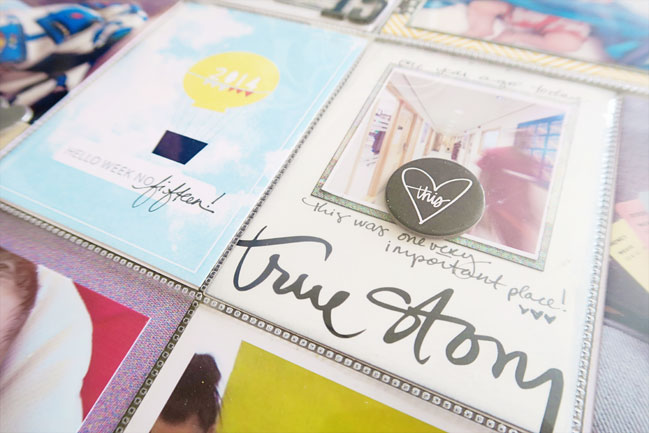
This was my answer to the mix old and new products challenge, with some older things like the cloud print paper from BasicGrey Soleil and those journaling cards that are preprinted as 2014 so they clearly can’t be that new! But the chipboard and some of the other cards are from an Ali Edwards story kit that I bought via a Facebook group to give it a try (that is a way I love to try out kits from other countries, and it works out well to give one month a try when a subscriber decides that particular kit is not her cup of tea). Some old favourites out of the stash and into the album and some fun using some new things that made me think differently! I loved that diagonal stripe card and really like how the writing turned out on those lines framed by the panoramic photo.

Okay, less of me waxing philosophical about scrapbooks and more about inspiring you to get making! Your challenge, should you choose to accept it, is to create something that has value to you, whatever that may be. And share it with us. How’s that for a totally open challenge? I can’t wait to see how you respond to that idea.


Welcome to the {Scrapbooking} Party!

online scrapbooking challenges open until 14 march 2016

Good morning and welcome to an entire weekend of scrapbooking fun! From 8am to 4pm UK time, both today and tomorrow, you’ll find a new scrapbooking challenge here every two hours. But don’t worry if that time zone doesn’t work for you – all the challenges stay open until the end of next weekend and you don’t need to be here at any specific time. I hope your schedule finds a match sometime between now and then!

Now throughout the weekend, you’ll see a variety of challenges plus some videos, special guests, plenty of new projects, and a surprise or two! But all the challenges are quite open for interpretation so you can make new pages that will feel right at home in your albums, no matter your style. The only guideline for all the fun is that the challenges are for new pages created from now on, not for existing layouts made before now. Easy enough!

I always believe in starting with a warm-up, so challenge one is the easiest of the ten – or is it? You’ll have to make a decision! Since we started the recent weekly challenges here every Monday, we’ve had selfies, hearts, mixing old with new, monochromatic colour schemes, and the current challenge of maps and globes. To start, choose one or more (or all?) of those challenges to create your next page! Simple… once you’ve made your decision, anyway!


See you in two hours with your next challenge… and enjoy the warm up until then! So happy to see you here this weekend.

Scrapbooking with symbolism and sketches

Scrapbooking with Symbolism and Sketches by Leigh Odynski

Today I am so happy to welcome contributing designer Leigh Odynski with her insight into getting more from your patterns and favourite pages! I also have an exciting announcement about this weekend (as in tomorrow!) at the end of this post, but first of all, Leigh!

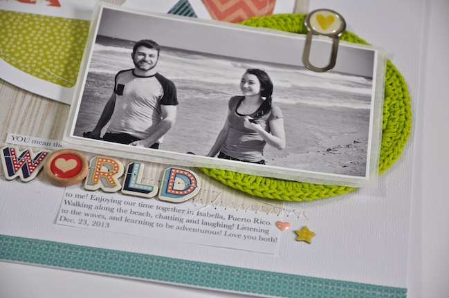
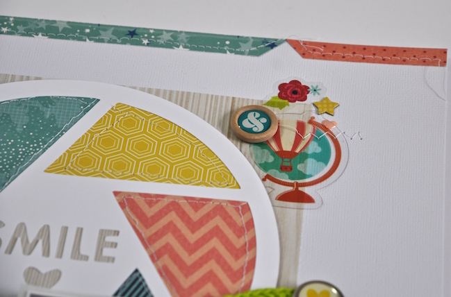
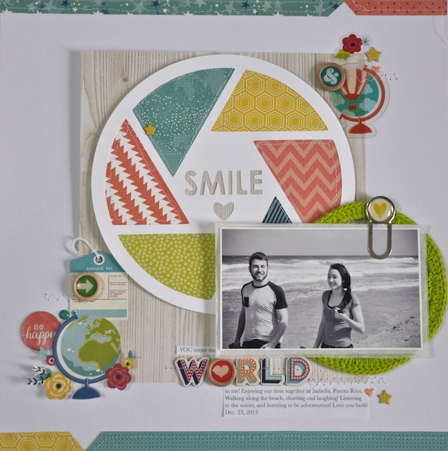
While perusing the beautiful papers in Shimelle’s new Starshine line with American Crafts, I was really drawn to the globe paper. This design not only works wonderfully with travel themes, but also with layouts about anyone and anything you love! Thinking about the world kept leading me back to the thought that my kids mean the world to me. Of course, this could be anything that means the world to you. The little globe and flower motif on the patterned paper was just begging to be detail cut, so detail cut I did! Adding more globe shapes in the other embellishment areas and circles to continue the repetition of shape rounded out my design. What means the world to you? What do maps and globes inspire you to create?

Scrapbooking with Symbolism and Sketches by Leigh Odynski

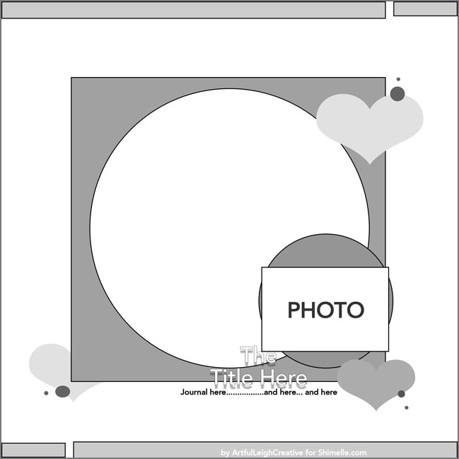
An easy way to get your scrapbook page layout together quickly can be to start with a sketch, or to look at layouts you’ve already created and love! That’s what I did with this page, starting with a fave layout I created last fall with the True Stories line. One way to use the same design but create layouts that look very different is to vary the geometric shapes that take up the space on the page.

scrapbook page sketch by ArtfulLeighCreative

In that original layout, I used a cut file with a honeycomb design of several hexagons and matted my photo with a crocheted flower, but when I converted it to a sketch, I simplified those shapes to circles. That meant I could approach this new layout with the same page design but a new look. I could use this sketch yet again with a very different look by using just one very busy patterned paper for the large circle rather than the mosaic look to the circle with all the different paper scraps that I went with this time. And of course things would look different still if the smaller circle was made from paper, vellum, transparency, or fabric rather than the crocheted mat! (If you prefer a PDF to make the sketch easy to print, you can find that here.)

Scrapbooking with Symbolism and Sketches by Leigh Odynski

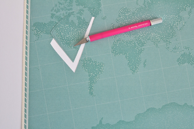
Speaking of that big circle, start with any cut file and any paper you like (I used this cut file and white cardstock), then add different patterns behind it. I cut around the negative shapes left on the mat with an X-acto Knife. Love that the Starshine line has so many great patterns to choose from! This technique is a great one for getting more from your scraps or from a favourite 6×6 paper pad.

Scrapbooking with Symbolism and Sketches by Leigh Odynski

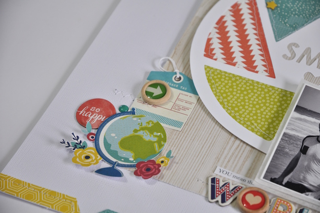
Adding the light woodgrain paper from Amy Tangerine’s Rise and Shine collection behind the cut file softened and grounded the shape in the overall design. Then I could use the remaining space for embellishment, thinking about that ‘means the world’ symbolism and having fun picking adorable embellishments like these Starshine chipboard stickers and Starshine ephemera, which includes pieces in transparency as well as printed cardstock.

I’d love to share my process with you here, if you have a moment to watch and relax!

Scrapbooking with Symbolism and Sketches by Leigh Odynski

I love to use the patterned paper in a way that is meaningful to me, and for each of us that will be different. Look at your patterns and think about what story it can help you tell. What patterns have a symbolic meaning to you in this same way? Of course those globes could work for travel pages, but there are definitely other ways to interpret them. Don’t you love when you see other designers and memory keepers work and think, “Oh I never thought of that!”. I know I do. I love the infinite possibilities, and endless creativity this hobby offers. Here’s to telling your stories, creatively!


Now about that announcement: this weekend includes Mothering Sunday here in the UK, and whether that applies to you or not, I’m hoping you have some crafting time this weekend. If so, please join us for an online scrapbooking weekend! Starting Saturday morning at 8am UK time and running until Sunday evening, there is a full schedule of ten different scrapbooking challenges with new projects, videos, downloads, and all kinds of fun. There are some prizes, some special guests, and maybe an announcement or two! All you have to do is show up and join in as you can. We’d love to see you! Happy scrapping indeed!