paper: pretty paper. true stories. {and scrapbooking classes with cupcakes.}

lovely to meet you Twitter Facebook Pinterest YouTube

Take a Scrapbooking Class

online scrapbooking classes

Shop Shimelle Products

scrapbook.com simon says stamp shimelle scrapbooking products @ amazon.com shimelle scrapbooking products @ amazon.co.uk

Reading Material

travel

Scrapbook Page Designs for Larger Photos
scrapbook page designs for larger photos by shimelle laine @ shimelle.com
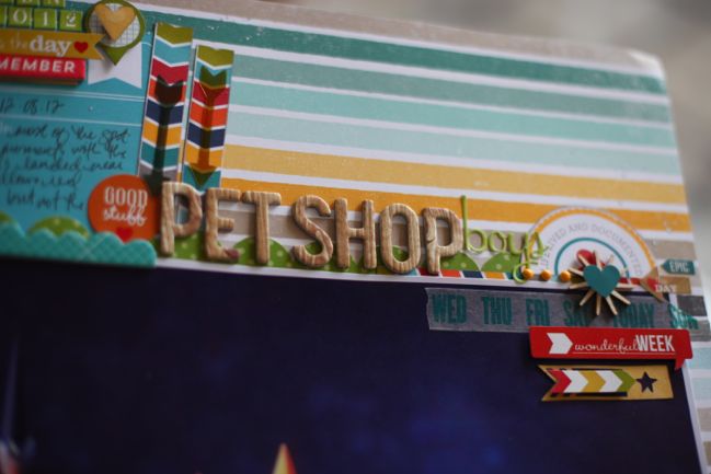
While the vast majority of my scrapbook pages feature photos printed at 4×6 or perhaps 4×4, there is a special place in my heart for big photos. I’d love to print a photo as wall paper for our home, but I can never decide which photo. Instead, I order big prints and frame them all over the flat. But I also love the look of a big photo on a scrapbook page. Today I’d love to share a few page design tips for scrapbooking with larger pictures, both from my albums and some guest pages made just for today.
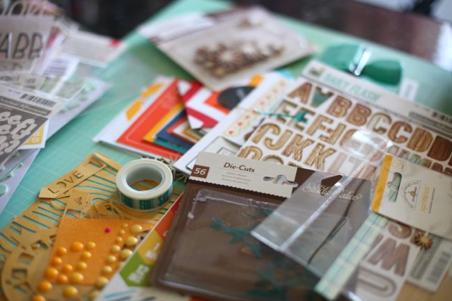
scrapbook supplies - January 2014 Best of Both Worlds Kit @ shimelle.com
And a little side note: for those of you who follow the Best of Both Worlds kits, this first example is made with the January 2014 kit.

Tuck things behind the photo
When I looked at all my pages with larger photos, I noticed I have more portrait photos framed, but there are more landscape images in my albums! Go figure. But I think that may be down to one of my favourite page designs: creating a page with a landscape image placed in the lower two-thirds of the page, then tucking elements behind the top of the photo. It’s a great place to add journaling cards, your title, or just something pretty if that’s a better match for the tone of your page.


(I know it’s shocking, but sometimes – just rarely – I scrapbook right side up. Don’t let it throw you too much.)
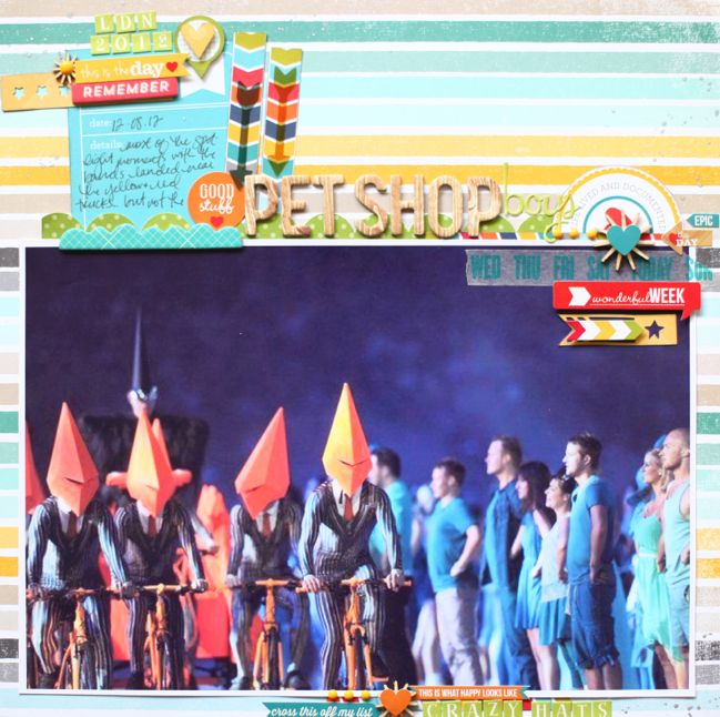
scrapbook page designs for larger photos by shimelle laine @ shimelle.com
Tucking the journaling card behind the photo makes it easier to customise the size of the writing space, and this is the perfect spot for something like that circle at the top right, which was never actually a full circle! It was printed on the edge of the card, and when cut out and placed on a page rather than in a pocket, it looks best if that straight edge can be either hidden like this or aligned with the side of the layout.
scrapbook page designs for larger photos by Diane Payne @ shimelle.com

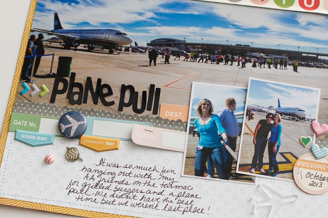
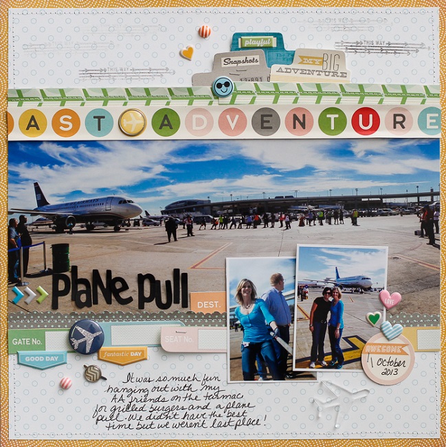
Guest artist Diane Payne has a similar treatment at the top of the photo, but also uses the space below her picture to add more coordinating embellishments.
scrapbook page designs for larger photos by Diane Payne @ shimelle.com

Diane says: I love using oversized photos on my page for a big impact. It is perfect for documenting unique experiences or exceptional photos. An oversized photo was perfect for highlighting the unique experience of working with my peers to pull a plane faster than our counterparts and hanging out on the tarmac eating grilled burgers. It is definitely not your everyday experience and a fun, memorable afternoon. It was especially fun doing this with my good friend whom I don’t see that often anymore.

Adjusting the size of her print gave Diane room to tuck embellishments in at the top of the photo while still having ample space for her title, writing, some additional small photos, and those finishing embellishments in the bottom third of the page. This is a design to bookmark for those photos that have lots of sky or ground space when the day isn’t amazingly vibrant and the grass not completely beautiful: zoom in on that more central subject to emphasise what’s there and give yourself more space on the page to tell the story.
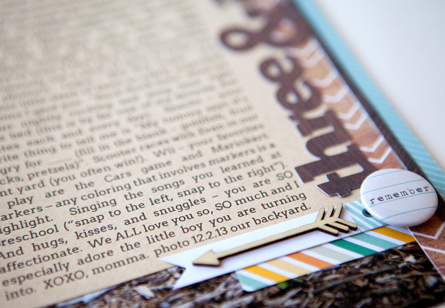
scrapbook page designs for larger phoos by susan weinroth @ shimelle.com
Add words to the empty space

Sometimes a photo looks beautiful big, but this creates some empty space in the picture: the sort of thing that isn’t the actual subject of the photo and doesn’t add a huge amount of meaning. It’s the background stuff of life. While most photo subjects benefit from enough breathing room around the important elements, in a scrapbook sense you can layer elements right on top of the photo in that empty space. When it comes to words, this can even help connect your story to the image, like this example by Susan Weinroth.
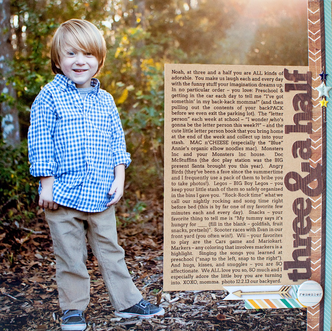
scrapbook page designs for larger photos by susan wenroith @ shimelle.com

Susan says: I love that the focus of my page is the photo and journaling – something that’s easily accomplished by using a 12×12 photo as my page base instead of paper. I want to remember these cute little details about my kids at each age, and love being able to record it all on one “update” style page like this.

See that gorgeous ray of sunlight coming into the frame at the top right? While that’s not the primary subject of the photo, of course, it’s a beautiful detail. Instead of running the title above the journaling and covering that bit of loveliness, the title works well on the vertical. Simple enough to do but something it’s easy to forget is an option, so make a mental note so you’ll remember the next time you’re worried that there isn’t enough space for your title.

scrapbook page designs for larger photos by shimelle laine @ shimelle.com

Of course you don’t have to print at a full 12×12 size to find you have empty space in a photo. I love 12×12 prints, but I have to order them from a lab since I don’t have a wide format printer at home. I can print an image up to A4 on a whim, however, which is what I did with this photo.

scrapbook page designs for larger photos by shimelle laine @ shimelle.com

In this case, there is plenty of room at the bottom of the page for journaling, but the blurred foreground at the bottom of the photo was pretty substantial. Bringing the title and the journaling onto the photo itself frames the subject of the photo rather than feeling as distant at it would in that bottom border of the page. If you want to make sure the atmosphere of the photo is still apparent, choose title options that let you see between the letters, like stickers or writing on vellum.
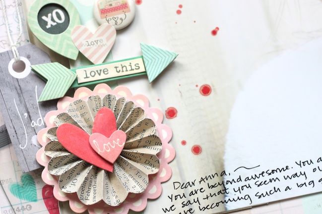
scrapbook page designs for larger photos by Stephanie Bryan @ shimelle.com
Embellish in the empty space

Of course, if you can journal or title your page in the empty space of the photo, you can also opt to use that space for embellishment, like this delicately beautiful page from Stephanie Bryan.
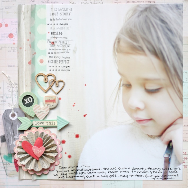
scrapbook page designs for larger photos by stephanie bryan @ shimelle.com

Stephanie says: I love adding enlarged photos to any projects, but especially layouts. The large photos tell the story and become the main focus of a layout. For this project, I chose a recent photo of my daughter. I knew I wanted to add a few embellishments, stamps and journaling down one side of my photo, so I cropped my image to the far right. This left me plenty of space to add some fun pops of color, stamps and ink splatters on my page.

I love how Stephanie proves a page doesn’t need a bold title – or perhaps a title at all – to capture your attention. It’s also colour that makes this layout work so well – rather than heaps of contrast, there is a similarity of all the shades here, with just a tiny pop of that saturated pink. That mix of colours makes everything far more delicate than if the background paper here was a hot pink, for example.
scrapbook page designs for larger photos by shimelle laine @ shimelle.com

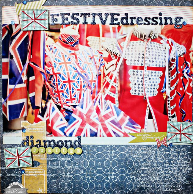
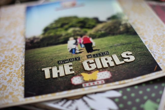
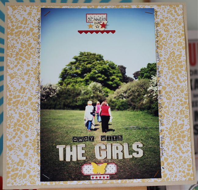
Sometimes I do scrapbook the portrait photos, I promise! And sometimes there is room for both title and embellishment right on top of the photo.
scrapbook page designs for larger photos by shimelle laine @ shimelle.com

Here a centrally-aligned page design keeps all the page elements (except the background paper) right on top of the photo itself. The trick with a central page design is often to keep the wider element at the bottom of the page and something smaller and more narrow at the top, a bit like imagining things in a stack or on a shelf, even though there there is quite a lot of space between the top and bottom elements. (The smaller, narrower embellishments at the bottom can be viewed as pretty little things hanging below the shelf, if that helps your thinking process!) If you feel the pages in an album are starting to get a little too busy, a page design like this can do wonders for giving the eye somewhere to rest as you turn from page to page.
scrapbook page designs for larger photos by shimelle laine @ shimelle.com

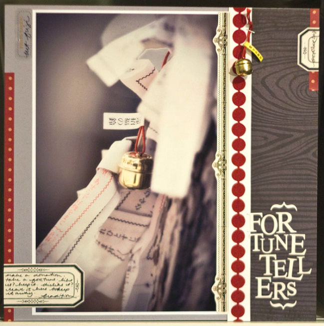
Put border embellishments to work

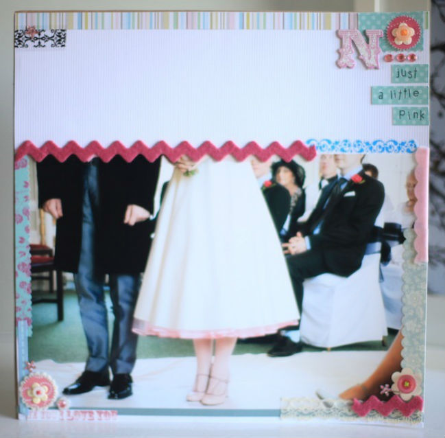
Hands up if you have plenty of border stickers, paper strips, and scalloped chipboard pieces waiting for you in your stash. How about a border punch? Don’t worry: my hands are up too, I promise. Pairing border embellishments with these larger photos is a great way to add flourish without needing to put things on top of your actual photograph. That may help some of you breathe a little easier! I promise you could do this page design without needing the label on top of the photo – just move the journaling to right side of the page perhaps.
scrapbook page designs for larger photos by shimelle laine @ shimelle.com
If your border stash is somewhat shorter – literally – put those pieces together to create a frame for your photo. The photo print itself is certainly the most expensive thing on the page, since everything else is pieced together from tiny scraps of paper and offcuts of ribbon, and even a letter sticker from a sheet that had no vowels left to spell anything useful!

scrapbook page designs for larger photos by shimelle laine @ shimelle.com

Frame with your favourites

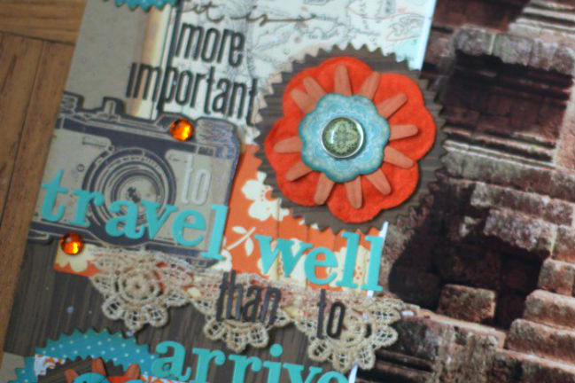
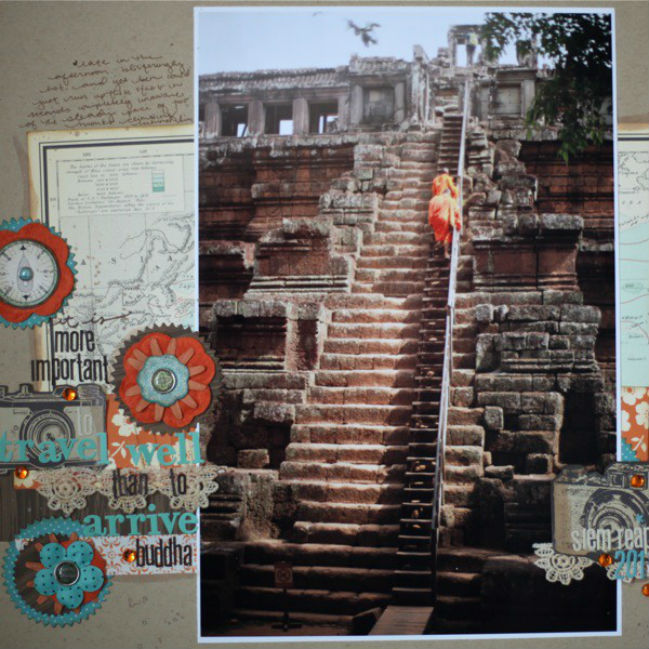
Speaking of frames, you may find that big photos give you plenty of room to embrace your favourite larger embellishments. I love stacks like this but this size of stack could overwhelm a 4×6 print. With a big picture, I can use multiple stacks in that large size!
scrapbook page designs for larger photos by shimelle laine @ shimelle.com

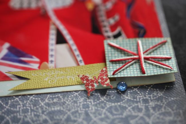
I do find it works well to frame the photo with those elements, so there’s a camera print on the left and also on the right, for example. It also helps that all the colours appear on both sides of the photo, to help guide your eye across the page.
scrapbook page designs for larger photos by shimelle laine @ shimelle.com

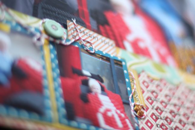
If your photo is really quite busy, you can use the same technique but with smaller, simpler embellishments. It’s a great place for tiny details like stitching or stamping.

scrapbook page designs for larger photos by shimelle laine @ shimelle.com

Quite a bit of this page relies on framing, actually – the patterned paper cut away to give a corner frame, the three repeat embellishments form a sort of frame around the outside of the picture, and the trios of gems around each area of embellishment.
scrapbook page designs for larger photos by shimelle laine @ shimelle.com

Pair your larger photo with some small images

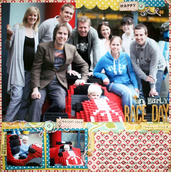
Even though it’s a giant photo, it doesn’t have to be a single photo page! Sometimes having one or two smaller photos can be a perfect balance to tell more of the story while still showcasing one image centre stage.


This particular page is made with a sketch and one of last year’s Best of Both Worlds kits.

scrapbook page designs for larger photos by shimelle laine @ shimelle.com

This layout works with quite a boxed out, linear page design, while Diane’s earlier example adds a bit more angle and overlapping for a freer design. Either can work! And you can always add curved embellishments like hearts or twine or even just circles to a linear design to give it a bit more energy, if you’re nearly done and it feels too static to your eye. Just remember that with angles, a little goes a long way, so start small and work up to what feels best for your particular page.

Now… what photo are you going to supersize on a page?

Today’s contributors
Diane Payne lives in Texas with her husband, two teenage kids and two dogs. She balances her career training flight attendants for a major airline with extra-curricular activities with her teens and spending time in her craft room. She loves to work with vintage photos and plenty of colour. Diane designs for A Flair for Buttons, Come On Get Crafty, Lily Bee and write. click. scrapbook, and blogs at Color Me Happy.

Stephanie Bryan lives in North Carolina with her husband and two children. She started out with memory keeping through Project Life in 2011 and has not looked back yet. Stephanie currently serves on design teams for Two Peas in a Bucket, Crate Paper, Glitz Design, Gossamer Blue, Jot Magazine, My Mind’s Eye and write.click.scrapbook. She shares her adventures in scrapbooking on her blog at Stephanie makes and on Instagram.

Susan Weinroth lives in Ponte Vedra Beach, FL with her husband of 12+ years and their two little boys. She works as a photographer in addition to her crafty endeavours, including a newfound love of Project Life. You can follow Susan on her blog and Instagram.


Best of Both Worlds: My Scrapbooking Product Picks for March 2014

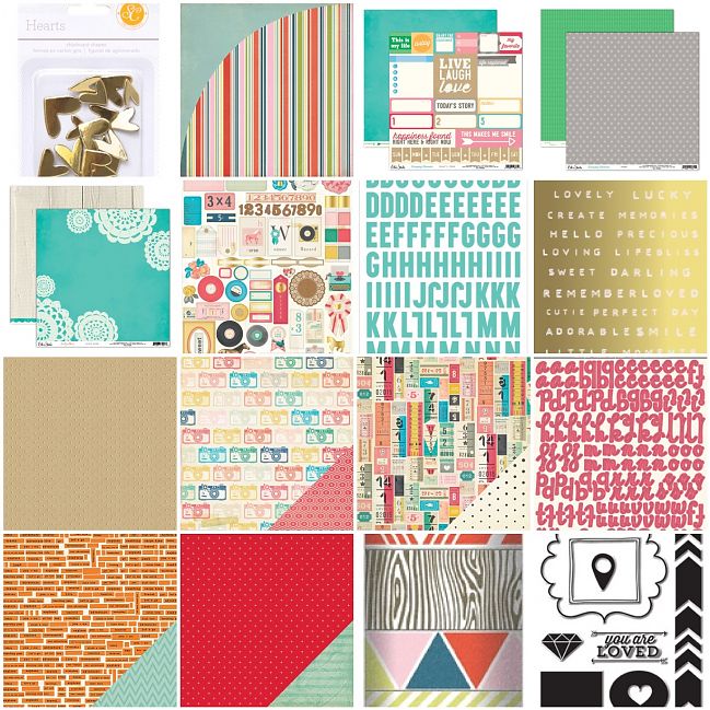
March 2014 Best of Both Worlds Scrapbooking Kit @ shimelle.com

For March, I wanted to embrace the rainbow, I suppose! I was looking at all the different scrapbooking products hitting the store while sitting through day after day of grey rain, and then one sunny day reminded me that all that rain can come with its fair share of rainbows, and that’s how this month’s Best of Both Worlds scrapbooking kit came together: a little grey, a little gold, and a lot of the rainbow!

Click here to shop for the March 2014 Best of Both Worlds Scrapbooking Kit.

This kit mixes some brand new releases with a few great bargains in the sale. The stamps, tape set, and a couple papers are 25% off, making it possible to also include some fancy new things like kraft card stock with gold finish, a big pack of ephemera, and both flat letter stickers and Thickers. If you’re digging the rainbow feel and want to carry that through in the lettering too, you might try the Bon Ami letter sticker sheet for something brand new or this rainbow alphabet for something that’s on sale.

And let’s talk gold embellishments for a moment. I will warn you: the gold label stickers have been really popular in the shop this week so there are not all that many left. If you’re coming to this list by the time they are sold out, please don’t panic! There are actually lots of really lovely gold embellishments in the store, and you can choose one that is just your style, assuming you like gold! Have a look here if you want to replace it with something else. (There is also the option to swap the chipboard hearts for chipboard stars that show up near the top of that list, in case hearts are just not your thing!)

Flair… well, today is the first of March and as of the time I’m writing this, the March flair hasn’t appeared in the store just yet. As it’s the weekend, I’m guessing these will appear in the store on Monday, but I didn’t want to leave this any longer to post since I do try to make sure it’s always here for you on the first! If you’re a big fan of flair, then you may want to wait until Monday if you’d like some badges to coordinate, but you can always wait and add them to your next order too if that’s better for your needs.

If you’re new to the Best of Both Worlds concept, every month I post a list of products I really love together on the first. There is no subscription and there’s no requirement to buy everything on the shopping list. If you want to use it as a starting point for your shopping, then make changes, you can! You’re not locked in to paying for something you already have or wouldn’t use. Likewise, if there’s one item you know you would use multiple times, you can add more than one. You decide your budget and you can add more to the kit or bring it down a bit to fit how much you want to spend, how much scrapping you plan to do, and how much ‘stuff’ suits your personal scrapping style.

Each month in 2014, a guest artist gets the kit for the month and shares five projects she makes with it. You can see the January guest post and the February guest post currently, and this kit is on its way to the March guest artist right now! I also have new videos coming your way Sunday and Monday sharing projects I have made with recent kits. (Some, though not all, items from the January and February kits are still available.)

If you opt to spend a bit more shopping while you’re there, the March shipping discount code is TQTBEX, which is good for $10 off US shipping and $5 off international shipping on orders that include at least $50 of physical, non-clearance product.

I think that’s everything! After a several very exhausted days in a row, I’m enjoying getting new videos and articles lined up, so I hope you’ll stop by for a good week ahead. You know… the kind of week where we embrace rainbows and naps and you can celebrate fancy things in your life like sleeping more than an hour without waking up for the loo. Maybe. I promise not to get jealous. Well, not very much, anyway.

Thanks so much for your continued support, and don’t forget you can always come back to this post later and add a link to the comments to share what you have made with the March 2014 Best of Both Worlds scrapbooking kit!

Crafting with Alice:: Envelope Cushion Tutorial

crafting with alice:: envelope cushion and @ shimelle.com

It’s Saturday again which mean its time for another project from me! This week I’ve gone for a more technical tutorial, which means my beloved sewing machine gets some use! I got my first and only sewing machine when I was sixteen and told no one about it as it wasn’t the ‘hip’ thing to have. However, now I can definitely say I am proud to own a sewing machine and I hope you all feel the same about yours! So, let’s put them to good use with a comforting, retro looking envelope cushion.

crafting with alice:: envelope cushion and @ shimelle.com

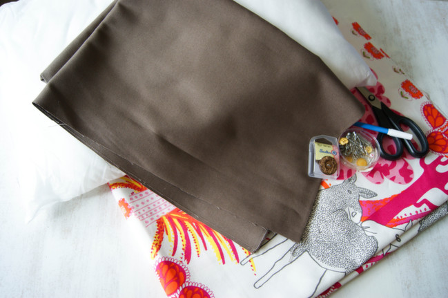
For this project you shall need two different fabrics measuring one metre each, paper to make your template, one button, ribbon if prefered and the standard sewing essentials (pins, ruler, fabric pen, scissors, etc.). Oh, and the all important cushion! My cushion size is 40cm (L) X 60cm (W). One fabric shall be the outer cushion, the other for your lining inside.

crafting with alice:: envelope cushion and @ shimelle.com

crafting with alice:: envelope cushion and @ shimelle.com

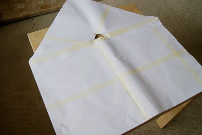
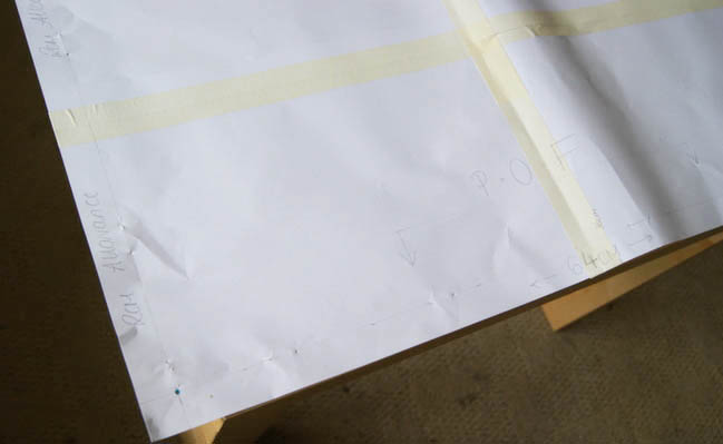
To make this template, I simply stuck pieces of paper together until they measured 42cm X 64cm. You need to make sure you have a 2cm seam allowance, hence why the dimensions are bigger than the cushion. I drew in the seam allowance and made sure to write any little notes down that would be useful, such as the P.O.F (place on fold).

crafting with alice:: envelope cushion and @ shimelle.com

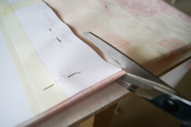
Place your template on each fabric, one at a time. Pin in place and cut. Fabric scissors are much better to use as you get a straighter, neater cut. Separate scissors for scrapping and fabric are a good idea!

crafting with alice:: envelope cushion and @ shimelle.com

crafting with alice:: envelope cushion and @ shimelle.com

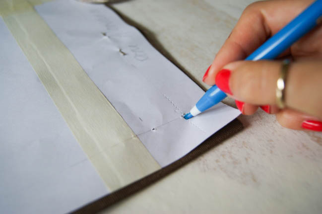
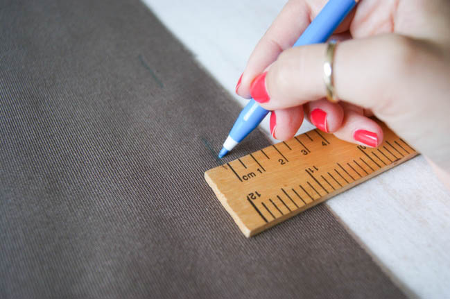
You shall only need to put in a seam allowance for the lining fabric as this is what you shall see whilst sewing the fabrics together. Before removing the template, pin holes through the template which will help you join up the seam allowance and simply mark with the fabric pen.

crafting with alice:: envelope cushion and @ shimelle.com

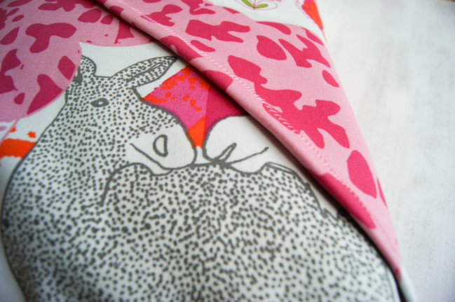
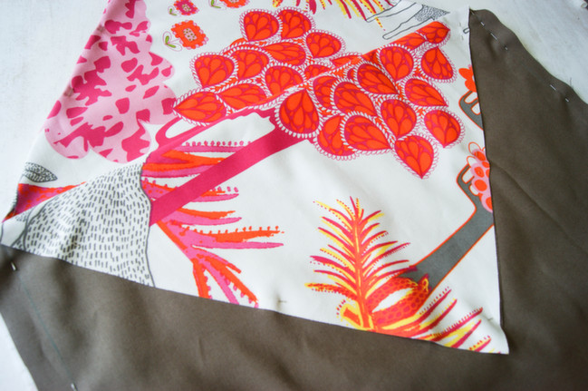
Now to put your pieces together! Basically, you want your outer fabric inside your lining. If your outer fabric is patterned, then you need to make sure the right sides are facing together so it looks like its inside out (as shown). You will have two pointy triangles, fold one of them down as shown, as this will go inside. This gives the inside edge a neat look. With me so far? I hope so! Pin in place on your seam allowance marks and you should now be ready to start sewing!

crafting with alice:: envelope cushion and @ shimelle.com

crafting with alice: envelope cushion and @ shimelle.com

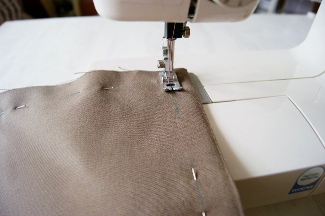
I used a zig zag stitch with the tension set at number two. Once you’ve sewn around the square shape (not the triangle) Snip off the corners. This will give you nicer corners once folded the right way out.
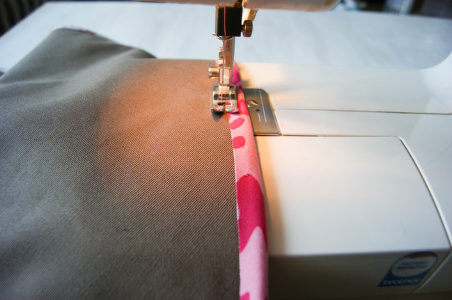
Fold the triangle edges in at about 1cm & sew all the way round still using the zig zag stitch.

crafting with alice:: envelope cushion and @ shimelle.com

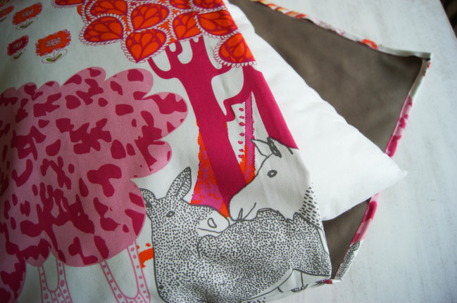
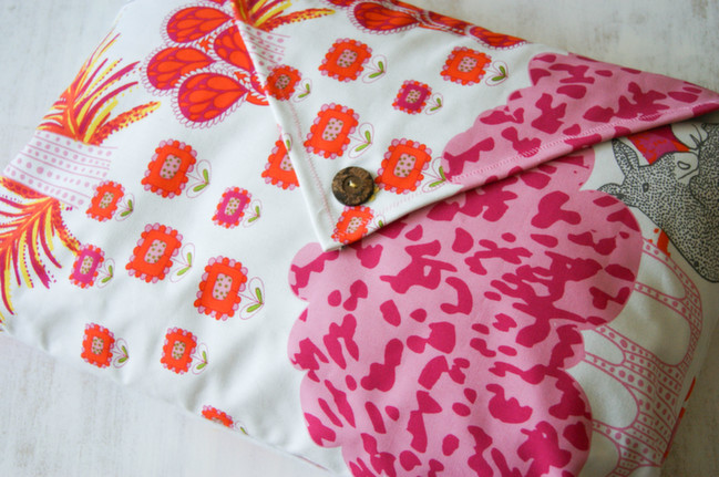
Now all the stitching is out of the way, you can fold it the right way out! And if all went well, your lining should now be inside! Place your cushion in, check your happy with the fit and close it like an envelope! Next part is the button hole.

crafting with alice:: envelope cushion and @ shimelle.com

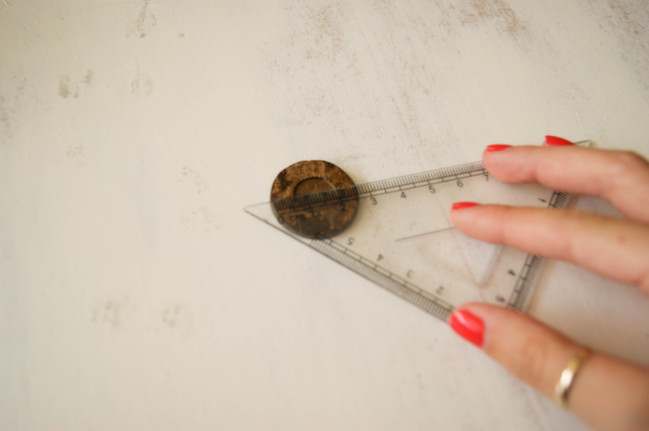
Measure your buttons diameter as this will determine how big your buttonhole needs to be. In my case, it was about 2.7cm so I rounded it up to 3cm.

crafting with alice:: envelope cushion and @ shimelle.com

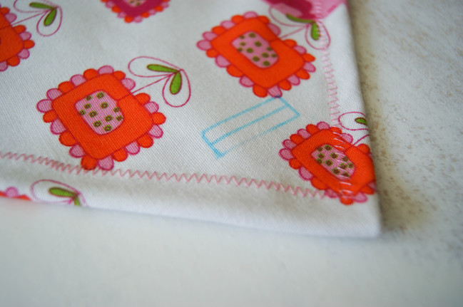
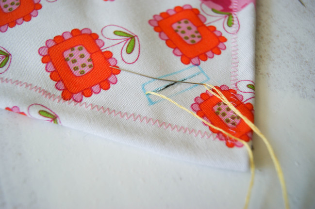
Draw up your buttonhole. The middle line is where your button shall slip through. The lines on the side measure 1cm and you shall need to join it altogether. Unfortunately, it wasn’t until I got to this stage I remembered you needed a buttonhole zipper foot for your sewing machine (which, annoyingly, I don’t own) so it went to plan b – hand sewing!

crafting with alice:: envelope cushion and @ shimelle.com

Cut the middle line to make a an open slit. The stitch I did for this was a blanket stitch. I made sure the stitches were close together making it much more secure.

crafting with alice:: envelope cushion and @ shimelle.com

Sew your button underneath and hurrah: a retro, beautiful and refreshing cushion! I hope you have enjoyed this more technical tutorial this week and have managed to make some wonderful creations and I would most love to see your homemade cushions!


Alice Partridge is a young designer-maker from southeast England. She hopes to make a living doing what she loves, and spends most of her free time reading blogs, drinking tea, or stitching with a needle in her hand. In addition to working behind the scenes at shimelle.com, her recent work includes Kirsty Neale’s recent craft book, Hoop-La: 100 Things to do with Embroidery Hoops. She blogs when she can on
Alices Homemade Studio and you can follow her on pinterest.

Five Ideas from May Flaum with the February 2014 Best of Both Worlds Kit

five ideas with from may flaum with the february 2014 best of both worlds kit

Hello! May Flaum here – excited to be working with this month’s best of both worlds scrapbooking kit! When I pulled this kit out I saw so many lovely things and possibilities.

five ideas from may flaum with the february 2014 best of both worlds kit @ shimelle.com

To start off with – I made this page with just the kit. I’m not usually a heavy patterned paper user – so it was a fun challenge to use nothing but patterned paper. I wanted to give it a bits & pieces kind of a look, so I used small strips, stitching, and stickers to bring it all together.

five ideas from may flaum with the february 2014 best of both worlds kit @ shimelle.com

five ideas from may flaum with the february 2014 best of both worlds kit @ shimelle.com

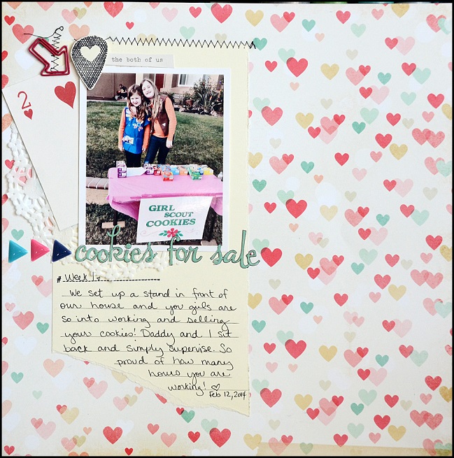
With the kit officially cut into (and isn’t that the hardest part?!) and feeling warmed up I decided to scrapbook a story happening right now. It is Girl Scout cookie season, and I’m so in love with how hard my girls are working so I knew this kit with all the hearts and lovely details would be perfect to do a layout about our cookie selling booth.

After re-organizing all of my layouts (thirteen years worth!) what I have found is that I really like the pages about very specific ‘right now’ type events. Whether small like today we sold cookies at our house, or big like the details of a major holiday – I cherish the pages that feature facts and details that might be forgotten.

five ideas from may flaum with the february 2014 best of both worlds kit @ shimelle.com

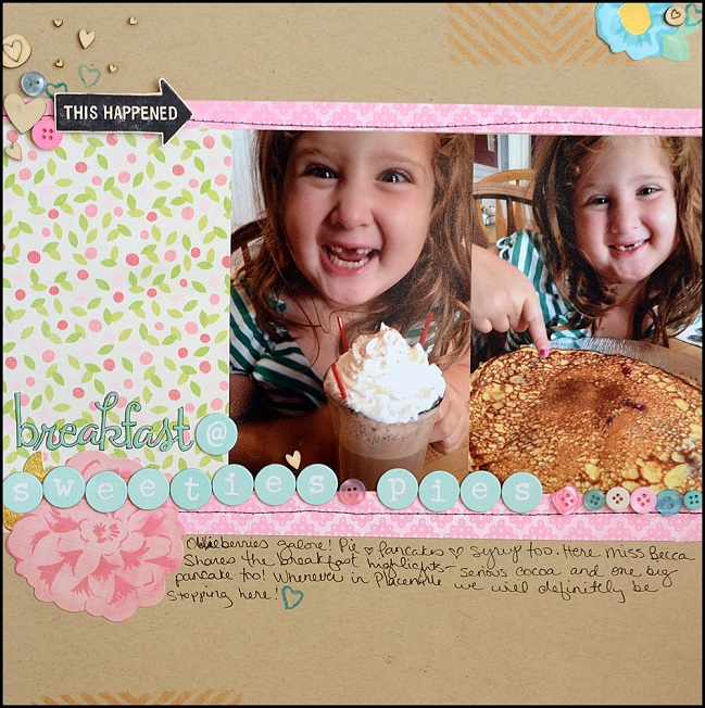
With this in mind, I happened to find some photos of a breakfast that was pretty darn epic – and our first time at what is sure to be many visits back to a little restaurant in a small town not too far from home. I added in some buttons for color and texture, as well as some Maggie Holmes die cuts that go so beautifully with this kit. The heart stamp in the kit is a favorite – I have already used it many times!

Looking around my stash of “scrap me now” photos and stories, I did not find another that I wanted to tell that worked really well with these kit papers at the moment. So, rather than do more layouts that would be ‘because I’m Shimelle’s guest’ or try to make it happen, I used some scraps to make a few cards instead!

five ideas from may flaum with the february 2014 best of both worlds @ shimelle.com

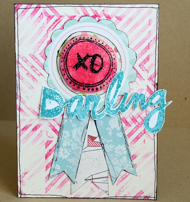
Inspired by the ‘darling’ stamp, I made myself a messy background and then inked (and cut out) the word darling. I also stamped and glittered (hooray for glittery things!) the round element in the center of my rosette. I love how messy and fun this card was to create.

five ideas from may flaum with the february 2014 best of both worlds @ shimelle.com

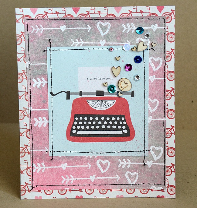
I love the typewriter graphic on one of the sheets of patterned paper – but I knew this would be a piece that would not make it onto a scrapbook layout. When I run into products or papers I know that I won’t likely scrapbook with – I make cards! This makes me feel good about using up my stash, as well as making cards that I can have ready to mail at any time.

With five projects made, I still have quite a few pieces of this kit still to play with. My plan is to bag it up (in a clear bag) and keep it on my desk so that as I sit to scrapbook should a story pop up needing to be told that will go well with this kit – I’ll be ready to go. I hope that you’ve enjoyed my projects – and that you get some creative time for yourself in the near future as well. If you’d like to check out my site, blog, or perhaps take an on-line class from me please feel free to come check out my website at Craft with May.

Happy Crafting!


When it comes to crafting May Flaum has one rule: it’s gotta make her happy. She’s not afraid to get super grungy or work with bright colors, dabble in lace and doilies then make something more splattered and wild. If she’s not in her studio (aka ‘the bat cave’) then she’s probably out running around having fun with her family or cooking up a storm. May has been working in the Scrapbooking industry for a decade and currently blogs her crafty adventures, teaches online classes, and works with amazing companies sharing her projects and ideas. If she has one piece of advice to share, it’s always to be true to your creative heart.

Mini Books:: A Scrapbook Tutorial by Lucia Barabas

mini books:: a scrapbook tutorial by lucia barabas @ shimelle.com

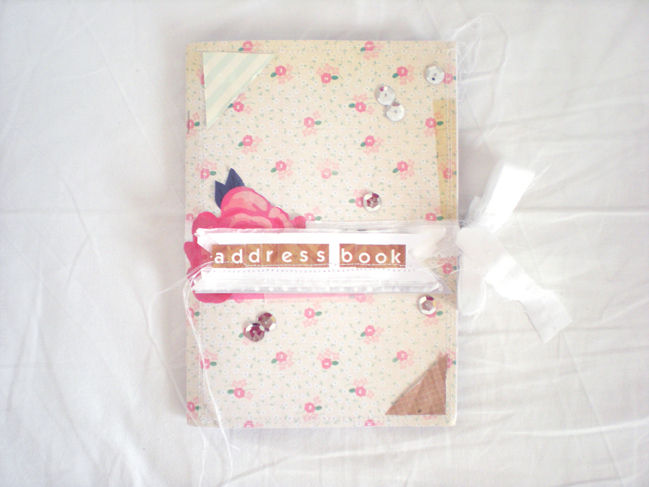
Creating notebooks and all sorts of mini books is my little obsession. At the same time I love when things are pretty AND useful. I knew I wanted to make a tutorial about something beautiful – and while thinking about what I could create – or better, what kind of mini book I could create – I realized I had my address book since I was about 13! Yes, I LOVE snail mail and as my old address book was full of addresses that were out-of-date, creating a new one was pretty useful.
As you can see in the video, I did’t really measure anything. I’ve used folded A4 sheets for my book but you can choose really any size. And please forgive me the spelling mistake, ‘ve eventually added the missing “d” in the word “address”.

I hope this tutorial inspires you to create something pretty AND useful. Maybe your old cookbook needs a remake? Thank for joining me and have fun with your projects! :)

mini books:: a scrapbook tutorial by lucia barabas @ shimelle.com


Lucia is a scrapbooker, designer and a “dream follower”. She comes from Slovakia but had been travelling around Europe for the past 9 years. She then decided to return to her hometown to pursue a design career. She is starting a new business adventure and hopes that designing pretty logos, blogs, patterns and stationery will allow her to pay the bills one day. Her hobby 1 is crafting and
scrapbooking and she sometimes puts the two things together, the result: digital paper packs that can be found in her Etsy shop or clear stamps in her own language – the first of a kind in her country! You can find her on her blog, facebook page or watch more videos on her youtube channel

Crafting with Alice :: Heart Felt Moments Tutorial

heart felt moments tutorial by alice partridge @ shimelle.com

Alice is here today with a little project for your weekend! Enjoy!

I love going through all my photos. Time and time again I do it and it never gets boring. Every time I look at a photo, I get the same feeling I did the first time I saw it! With all this ‘lovely dovey’ talk in Valentine’s week, plus some behind the scenes work on an upcoming article that’s a little bit ‘Scrapping your Significant Other’, I felt this project would be best shared with that in mind.

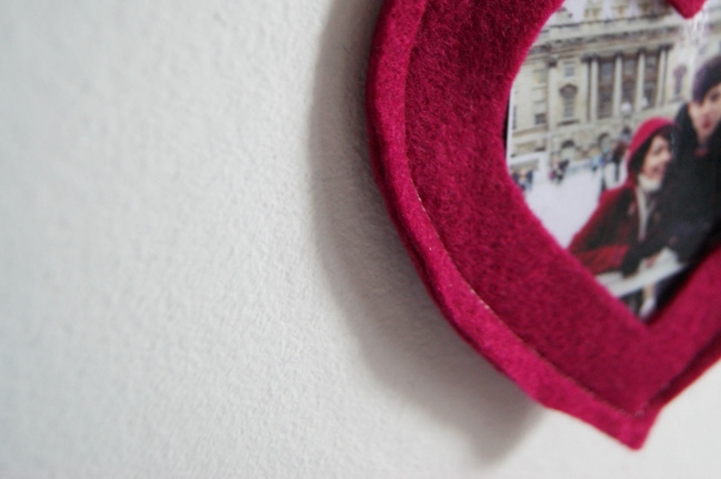
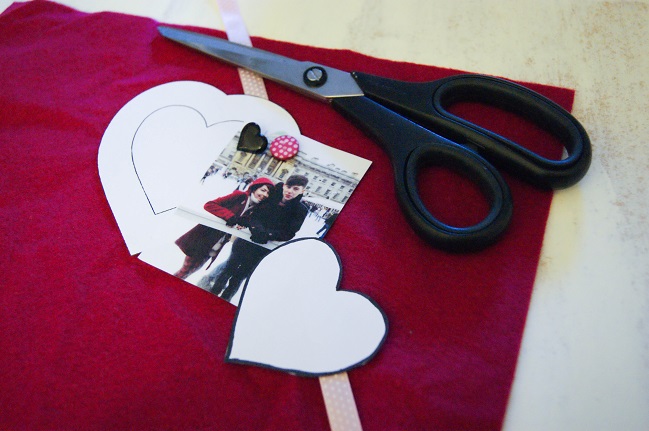
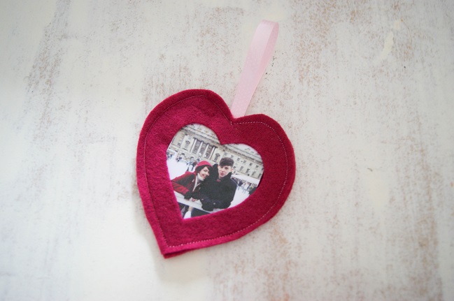
The photo I’ve used for this was taken at Christmas last year, when I went ice skating with the boyfriend’s family at Somerset House. Now I have to say, ice skating is not my most favourite thing to do, however it didn’t take away the magical atmosphere! This is one of my favourite photos of him and me as it very much was a memorable day (unfortunately due to the fact I nearly cried the whole way round the rink).

Anyway, let’s get cracking with showing off those heart felt moments! (I hope you like my little play on words!)

heart felt moments tutorial by alice partridge @ shimelle.com

For this you shall need: one photo, felt in a colour of your choice, ribbon, embellishments you wish to add, sewing utensils and standard supplies e.g. scissors. Oh, and a heart stencil! If not you can easily make one in a word document. I found mine on Pinterest. When choosing your heart, remember to keep in mind the size of your photo. My photo is wallet size, so I chose a heart template a bit bigger than that.

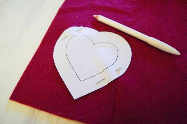
heart felt moments tutorial by alice partridge @ shimelle.com

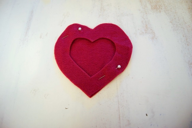
Once you’ve found the template you wish to use, print it, pin onto your fabric and draw around. I drew around mine with a little bit of room, in case I needed to trim off any bits, however that choice is yours! You’ll need to cut two hearts from the felt.

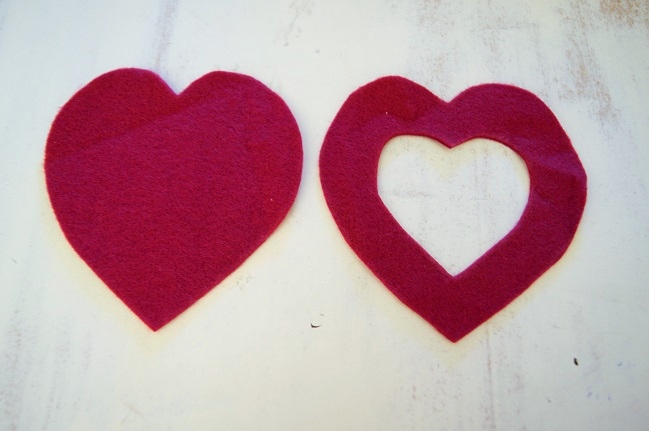
heart felt moments tutorial by alice partridge @ shimelle.com

When you’ve finished cutting out your two hearts, you will need to cut out a smaller heart of one your pieces. If you don’t wish to do this freehand, either print out a smaller version of your heart or find a stencil with the heart already inside, just like mine. Nevertheless, if you’re feeling brave, go ahead and draw a heart freehand! It will work whatever technique you use!

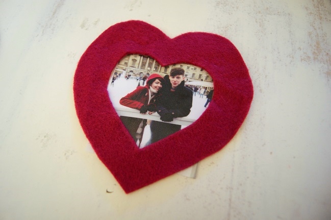
heart felt moments tutorial by alice partridge @ shimelle.com

Pin down the two hearts, and cut your photo to size. For the photo, I printed it out wallet size. Obviously the bigger the photo, the bigger the heart will need to be, so always keep that in mind!

heart felt moments tutorial by alice partridge @ shimelle.com

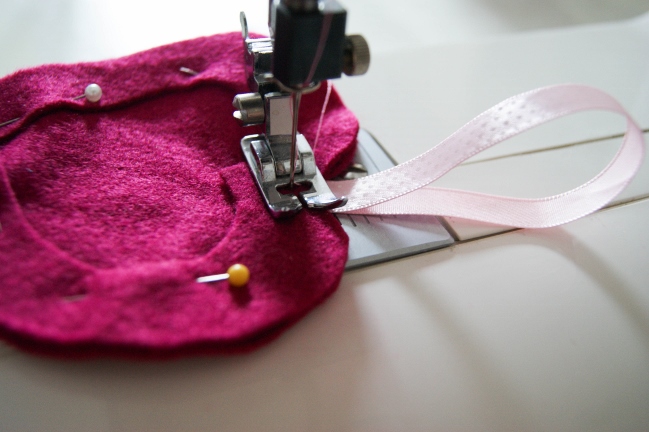
Remove your photo at this stage and pin your hearts together. Making sure the full heart is at the bottom and the open heart on top. When you’re pinning, place your pins closer to the inner edge. This will give you more room to work with when it comes to sewing. At this stage, get your ribbon, fold in half and tuck the edges at the top of your heart. Pin it down! Annoyingly, I forgot to take a photo of this stage, so do forgive me!

heart felt moments tutorial by alice partridge @ shimelle.com

Place under your sewing machine! You want the tension to roughly be on about 1.5 or 2, most likely, though your machine may vary. It’s completely up to you what stitch you wish to use, whether it be tiny and straight like mine or zig-zag!

heart felt moments tutorial by alice partridge @ shimelle.com

Once you’ve tidied up everything, you should be left with a cute heart photo frame! It’s such a quick, simple project- you could make many and use them for gift wrapping or a banner. If you’re up for a challenge, why not make a heart photo frame chain? Continue sewing hearts and attach them together via the ribbon, making such a cute gift for someone or wall feature. Dress it up by securing the hearts to each other with buttons or bows. Of course, if red love hearts aren’t your thing, the entire idea is easily switched to any motif you care to cut from felt! It could even work with a lettered banner – place your photos in the centres of letters that have a window (A, B, D, O, and so on) and spell out a name or phrase adding in the rest of the letters as just cut from felt or fabric. How would you customise this project?

Happy Belated Valentine’s to all you wonderful readers and happy sewing!

And a P.S. If my boyfriend reads this – Happy fourth Valentine’s to us and hopefully many more!


Alice Partridge is a young designer-maker from southeast England. She hopes to make a living doing what she loves, and spends most of her free time reading blogs, drinking tea, or stitching with a needle in her hand. In addition to working behind the scenes at shimelle.com, her recent work includes Kirsty Neale’s recent craft book, Hoop-La: 100 Things to do with Embroidery Hoops. She blogs when she can on
Alices Homemade Studio and you can follow her on pinterest.

Getting Personal:: A Scrapbook Page by Kirsty Smith

Getting Personal:: A Scrapbook Page by Kirsty Smith @ shimelle.com

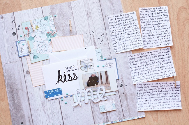
One of my 2013 New Year’s Resolutions was to find Mr Second Date (Mr Right was looking like a long shot) and so it was with no small amount of trepidation that I signed up to online dating. And therein lay the first hurdle: I had to describe myself in detail so that people would, y’know, fall in love with me and whisk me off on that second date.
I’m nothing if not methodical, and not content with blurting out random information in haphazard order, I spent some time writing my profile on my computer and editing it to my satisfaction before I launched it on an unsuspecting internet. A year later looking back on that written profile, it is fascinating to see how I described myself: what was important to me, my tastes and interests and what I thought would make me sound like a good date.

Getting Personal:: A scrapbook page by kirsty smith @ shimelle.com

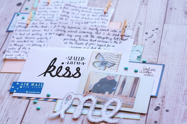
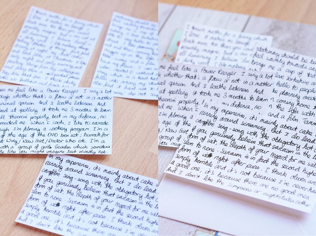
And so in true scrapbooker style, I decided to scrapbook it. I jotted out my profile on little slips of paper and arranged them on a page. Although that journaling was online for all the world to see, to me it’s personal and something I feel a little self-conscious about. I wanted the handwritten journaling to be a clear design element, but I didn’t really want it all to be read quite that easily. The truly interested reader of my scrapbook album is going to have to delve deeper to get to the full details.
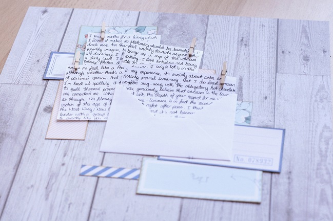
To achieve the slightly-hidden journaling look, I organised the journaling blocks to overlap; once happy with their placement, I added a little clothes peg to the corner of each one and glued just the peg into place. The pegs will hold the journaling fast, but the paper can be unclipped to read more easily as it’s not adhered to the page. I’ve always been a prolific (or should that be excessive?) journaling-writer, but if the quantity seems overwhelming or you’re simply not as self-involved as I am, then you can create the same effect with typed journaling, book-pages or patterned paper.

Getting Personal:: A Scrapbook Page by Kirsty Smith @ shimelle.com

I constructed the rest of the design around those journaling blocks. Some elements went underneath and some were layered on top, but the most important thing when structuring a page like this is that if you have paper, photos or embellishments that will sit on top of the journaling, don’t adhere them fully to the page. Make sure you leave enough of those elements unstuck so that the journaling can slide in behind them. A few pencil marks outlining where the journaling is going to go can really help with this process.

Getting Personal::  A Scrapbook Page by Kirsty Smith @ shimelle.com

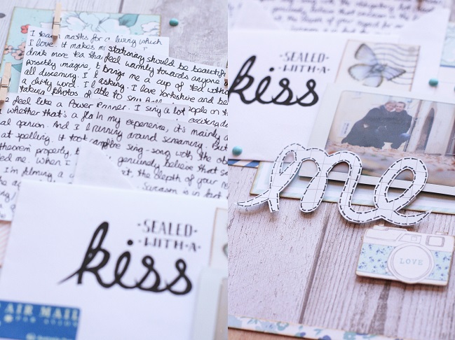
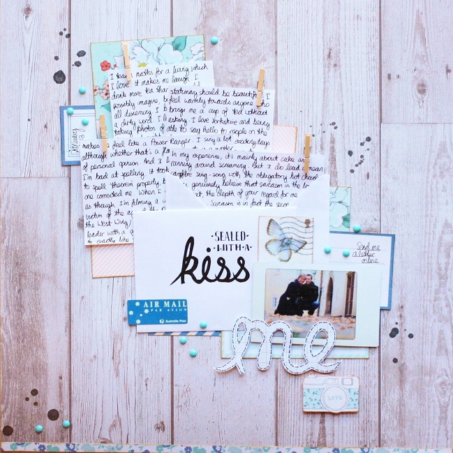
I used the idea of letter-writing to inspire the rest of the design, using an envelope to slide one of the journaling cards into, and another to dress up with some pretty writing and a couple of stamps. I finished the page with my photo, a hand-cut title, a camera snipped from a sheet of patterned paper and some of those wonderful and universally popular enamel dots.

Getting Personal:: A scrapbook page by kirsty smith @ shimelle.com

The finished page gives an appearance of a letter just opened with the contents tumbling out, and this is an idea I’ve been playing with a lot lately. But this layout can be deconstructed and you can read about me in (slightly excruciating) detail.

Getting Personal:: a scrapbook page by kirsty smith @ shimelle.com

P.S. In case you’re curious, I lined up three dates with three different guys in January 2013. The first two were both disappointing. And the third guy? Well we just celebrated our first year together as a couple.


Kirsty is a maths teacher by day and many other things by night. After several years, she is still wildly excited about living in London mainly because there’s so much to do and see and visit and experience. She takes her camera with her so that she can scrap about her adventures, and then she drinks tea and blogs about it all over at journalofcuriousthings.co.uk

The Important Pages :: a scrapbook page to capture a childhood memory

scrapbook page by shimelle laine @ shimelle.com
Although I’ve never been the type of scrapbooker who could focus and work through twenty pages at a crop (I’m afraid I spend way too much time talking and snacking to make that happen!) I would still consider myself pretty prolific. Prolific scrapping combined with fifteen years of scrapbooking makes for a great deal of pages and a great deal of albums. I have nearly seventy 12×12 albums, and I treasure them – I don’t mind how much space they take up at all, and they live in my craft space, so no one else really gets to comment on the space they take up. But I would never feel like there should be some sort of obligation for anyone to take seventy albums when my time here is up, much less the many more I hope to make in the future! It’s something I’ve discussed with a few scrappers over the past year or so, when some crafters said this was the biggest reason they were walking away from the hobby: that the albums had become a burden.

Please forgive the slightly morbid tone of this thought, but in this house, we’ve discussed the scenario of what I would want to happen, and my answer was that I would just appreciate it if, whenever the timing felt right, that The Boy and whomever else felt compelled to do so would flip through my albums and have one look through everything (which I realise is asking a lot when it’s so many books) and then select whatever they feel are the highlights they want to keep and to feel zero guilt in letting the rest go. I imagine that would take things down to one or two albums of the absolute highlights, and we’ve also talked about a couple albums that might stay intact, like our wedding album and the books of our epic backpacking trip, because these really focus on telling our story in a different way from the page-by-page randomness of any given annual album.

Something that came up in this conversation was but which pages would you feel were the most important? and that was something I hadn’t really devoted much thought to in the past. With a bit of distance from the conversation, it started to feel like a real challenge for this year of focusing on why I scrapbook, so my goal is to identify about fifty Important Pages that would create some sort of story of my life. I haven’t sat down and figured out all fifty at once. That means they may not go in any sort of order as I write about them. Some are relatively new, some are old, some will truly document the evolution of my creative style, and I’m fine with all that. And so, on to the first page I’ve picked to get that capital letter treatment: one of The Important Pages.

scrapbook page by shimelle laine @ shimelle.com
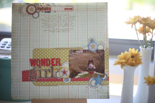
Originally created in May 2011 and shared in this post that marked my first effort at raising funds for girls through the charity Plan. I think that gives this page two levels of meaning to my heart – one about the photo and the memory itself and another about what making the page symbolised and all the thoughts that went through my mind while making it that were so far removed from the memory of exactly what was in that photo, and the sheer thrill of that first big donation I was able to make combined with knowing that I’ve continued to be able to work for that cause through a love of craft. But it’s the photo and the memories that I want to focus on here.

This photo was taken, as far as I know, in the back yard of the first house I remember. I believe there was an apartment when I was a teeny baby, if I’ve pieced the stories together correctly, but by the time I was old enough to remember the visuals, we lived here, and there was grass in the front and the back, and the back yard was fenced to keep the dogs in, in theory, though there was one who had a habit of following us to the post office. There was at least one big whisky barrel style dog house that I loved to climb until the day I took a tumble from the top. I still have a funny white scar on my knee from that day. I have no idea if the fall actually made me stop climbing, and I’m inclined to believe it didn’t, as in elementary school I had developed an obsession with another female super hero – She-Ra, Princess of Power – and would climb to the top of the jungle gym to fly off the top, if only I believed I could. Of course, gravity had other thoughts, and I would go plummeting to the ground every time, only to dust myself off and think that I would have to believe harder the next time. It is seriously a miracle that I didn’t break every bone in my body during recess that year.

But back to the time of this exact photo… I remember what I think is this particular summer that the temperatures soared and the paddling pool actually melted past a point of all recognition. I remember being this age and loving to eat Ruffles potato chips from the bag, having meals on an Incredible Hulk melamine plate, and watching Hart to Hart and the Muppet Show in the living room from a tiny brown arm chair. My Anglophile stage wouldn’t begin for another few years, so these early memories are some of the things I truly remember in an American nomenclature, which would slowly fade away over the years.

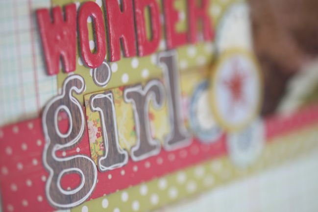
Then there is also how this page starts to capture the influence of superhero culture and how I grew up. There is a little confusion you might pick up between the photo and the title here: that swimming attire is most certainly Supergirl influenced, not Wonder Woman. I promise it all makes sense in my head: too little to read at this time, so my superhero influences came almost entirely from TV. I watched Wonder Woman and thought she was amazing. Again, a female superhero who could fly! (Seriously, I am still searching eBay for an invisible plane, because that would just be useful, assuming it stays in good repair.) I didn’t really know who Supergirl was until the movie came out and that was a few years after this picture. To my untrained eye, this outfit was very much Wonder Woman and I don’t remember anyone correcting me. If they did, I might have been a brat about it and told them they were wrong. I’m not too sure, but I can believe it. I remember more correcting adults as a child than I really care to admit, but thankfully there weren’t too many people in my little world who believed in the ‘children should be seen and not heard’ school of thought, so I managed to survive to adulthood unscathed, and probably learned more about keeping my mouth shut when one can’t win an argument during university lectures with those kinds of professors who have been teaching the same class every term for longer than you’ve been alive. The Wonder Woman obsession stayed around for a long time, and there is another page in my album that documents how I only wanted a Wonder Woman birthday cake at least three years running, despite my wonderfully-meaning grandmother thinking I would surely be bored of that by now and want something else. I think she still has the cake pan. If I ever end up in Kansas around my birthday again, well… it would never surprise me. And I would probably cry a lot of happy tears about it.

(By the way, when Supergirl did finally hit my radar, the fact that her first name was the same as my cousin may have made me think she was the coolest person on the planet. Frankly we should have been invincible and able to leap tall buildings, but we mostly have epic skills in eating black olives off our fingers and finishing off the potatoes at family gathering, and let me tell you, I do not think these are super powers that should be underestimated, because they are ridiculously rewarding. If you disagree, you are eating the wrong potatoes.)

Even the silly ball in this photo reminds me of other things, and it’s just one of those dime a dozen bouncing balls that would be in a big cage at the end of the aisle at K-Mart or TG&Y. (I could probably also write an entire paragraph on why I miss TG&Y, which was the best bargain hunt of a store in my youth, but I fear it is really one of those ‘you had to be there’ things and there isn’t a true way to explain an appreciation of the five and dime.) From this photo, I clearly had at least one as a little girl. But as a teenager, there was another – with the same exact print and from another metal cage – that my high school speech team carried to forensics tournaments, and at the end of each weekend we would take a Sharpie to the ball and record any wins from the week. The rest of the time it served as distraction during the down time of a tournament, waiting for postings and results, and had a hand in a few warm up games we would do to start the day. More than once, I had to cram it in my locker quickly when someone would throw it to me in the hall from the classroom. I often skated a very fine line with being a bit too ‘lively in the halls’ when speech team stuff was concerned and there was one member of staff who always seemed to turn up at just the moment. We never really did get along. But I am thankful for the teacher who actually led that team and how he would give those little troubles a bit of a wink and move on, because when I was my most disheartened with all things academic and truly wanted to throw in the towel, he would throw me something that would keep me there. He also made me fall in love with Shakespeare after another teacher had made me truly believe that old texts were the most lifeless words thrown together in a blender of boring. After he made me perform a few monologues, I returned to the dusty copy of the complete works on my shelf at home and I read them all, in order, usually in whispers in the middle of the night, which is all a little Dead Poets Society without the boarding school, but still: that was the truth, and I get all that rushing back just from that silly bouncy ball in the back yard, aged three.

And all that makes this a pretty important page indeed.

Admittedly, I feel this series of posts is going to lead to a stack of journaling that isn’t included in my album. I’m thinking I may add these posts to my albums next to the highlighted pages in a smaller page protector (like 6×12), but if I don’t get that bit of added writing into my albums, I am happy that it at least exists here.