pretty paper. true stories. {and scrapbooking classes with cupcakes.}

lovely to meet you Twitter Facebook Pinterest YouTube

Take a Scrapbooking Class

online scrapbooking classes

Shop Shimelle Products

scrapbook.com simon says stamp shimelle scrapbooking products @ amazon.com shimelle scrapbooking products @ amazon.co.uk

Reading Material

travel

tutorials Category

Snowy Scrapbooking with Karlla Dauer

Snowy Scrapbook Page with Karlla Dauer @ shimelle.com

Please welcome our next guest artist, Karlla Dauer! She’s joining us today to sprinkle some colour into your next scrapbooky snow day, and also breathing some new life into one of my older Best of Both World page designs. A disclosure reminder that the supplies are linked with affiliate links that make this project possible. Enjoy! -Shimelle

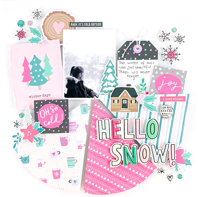
Hello everybody. Karlla here, and I’m very happy to share this project with you. I love working with a sketch or scraplifting an inspiring work to make it my own. I was in no doubt that lifting one of Shimelle’s pages would work. She is always so cheerful and this is reflected in her layouts.

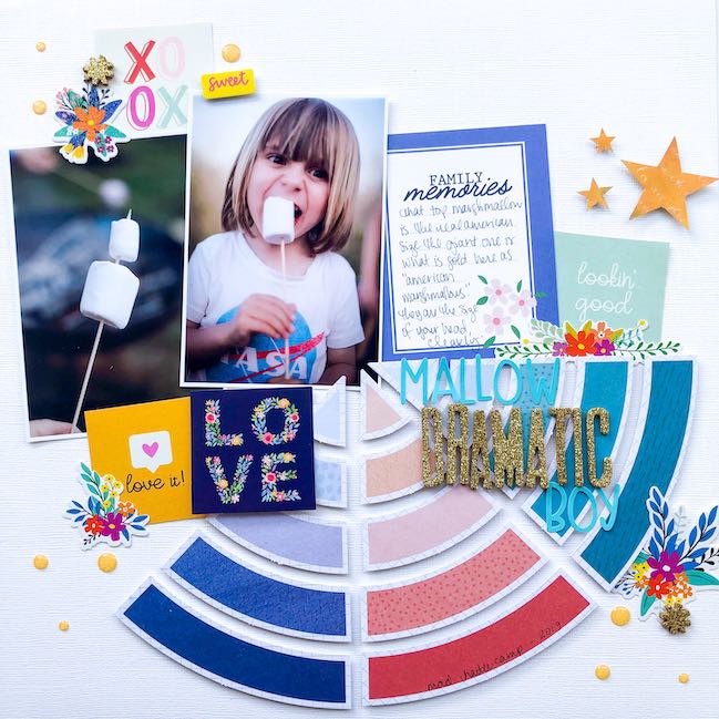
Camping Scrapbook Page with video by Shimelle

I love geometric shapes for my designs, and when I saw this Shimelle layout with a huge circle I fell in love. Shimelle used the die cut paper from her Field Trip collection.
The nice thing about projects like this, is that you can bring several patterned papers to the layout and enjoy working with the different looks in one collection. I used the Feelin’ Frosty collection from Simple Stories for this page, but the same page design would look unique with any collection of your choice.

Snowy Scrapbook Page with Karlla Dauer @ shimelle.com

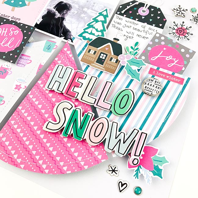
I confess that I’m taking risks in journaling. I need to practice writing more, and tags are great for short sentences. I loved how she used the decorative elements. As I love to add height to my work, a project rich in embellishments is great for this. You can highlight each detail in a unique way. To give it a standout and a delicate touch, I added the machine-made sewing on the card and on the “pizza slices” in the circle. I think it’s so beautiful.

Snowy Scrapbook Page with Karlla Dauer @ shimelle.com

I like to work with a white background when I use collections with a lot of prints, especially when I want a delicate result. The combination of white with the collection’s color scheme creates a truly harmonious design.

I hope you enjoyed my re-reading of Shimelle’s beautiful layout. It’s an honor to be able to contribute as a scrapper that I really admire. A day full of love for you.

Hi, my name is Karlla Dauer, I am 34 years old. I’m Brazilian, but I have lived for fie years with my husband and son in Dallas, Texas. I got to know scrapbooking in 2005 and I’m sure it was an eternal love. Today I’m a full-time mother, wife, and housewife… and in the middle of it all, I’m also a scrapper. I don’t think I have a style of my own, but I love playing with roles and I try to take a little risk in mixed media. You can see more of my work on my Instagram.

Scrapbooking with a Title Cut File by Andrea Lake

Scrapbooking with a Title Cut File by Andrea Lake @ shimelle.com

A fresh new year and a few new projects to go along with it. One of my biggest goals for 2022 is to share as much love as I can across the scrapbooking community. Yes, that sounds corny. Hi, have we met? Corniness aside, I mean things like sharing the work of talented crafters who you may or may not already know. I’m still scrapbooking, but I’ve also been scrapbooking a very long time, and if I can use this space to highlight fabulous ideas from other crafters too, then I’m game. The plan is to share projects from two guest artists a week, and it starts today! Please note these posts contain affiliate links for the supplies where possible. Shopping through these links doesn’t change the price for you but the retailer sends me a commission. Those commissions are making this series of guest posts possible, as I am a big believer in paying artists for their hard work in actual money, so every guest artist you see in this series for 2022 gets paid. Yay. Also the end of each post includes where you can find more work from each artist so you can follow them on Instagram, YouTube, or wherever else. I hope you will follow some new favourites and share that crafty love!

I think that’s enough introduction so I hand you over to our first guest, Andrea, who walks you through her process for scrapbooking with a title cut file to kick off this festival of scrappy inspiration! I hope you enjoy! -Shimelle

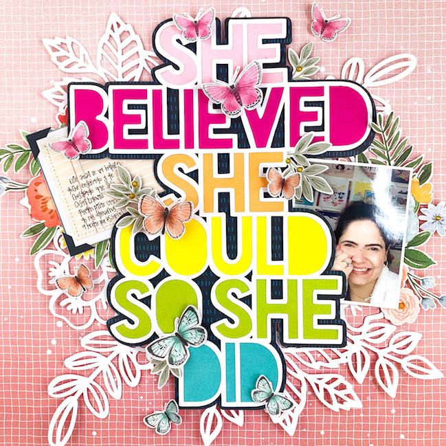
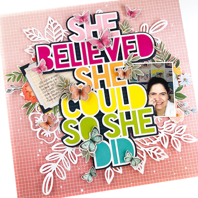
Hi Friends! My name is Andrea Lake and I am sharing one of my favorite layouts I’ve ever made with you today. Yes, this is definitely one of my favorite pages because it combines many of my favorite things and techniques altogether. First, I would like to confess that I sometimes feel overwhelmed when I sit down to create a layout. I think it is the fear of not exactly knowing how is it going to turn out in the end, especially since we are talking about projects that normally take a few hours to put together. That is one of the reasons why I try to plan my pages in advance and I think of different techniques I feel comfortable applying as well as working with products I LOVE. That sometimes means I am working with a single collection and sometimes I am mixing and matching my favorite ones. I also love vibrant colors, so, as long as I include these in my projects, I am confident it is going to turn out well.

Scrapbook page by Andrea Lake @ shimelle.com

One of my favorite techniques when working on any paper crafting project is layering. I love the texture I get and I love dimension. Layering is a great resource to achieve both of those things. I love seeing a layout and finding new and hidden elements every time. I like to create pages that make you want to touch them and feel them. So let’s talk about all the layers on this page. Also, this is one of those projects in which I mixed collections and manufacturers to achieve the results I wanted.

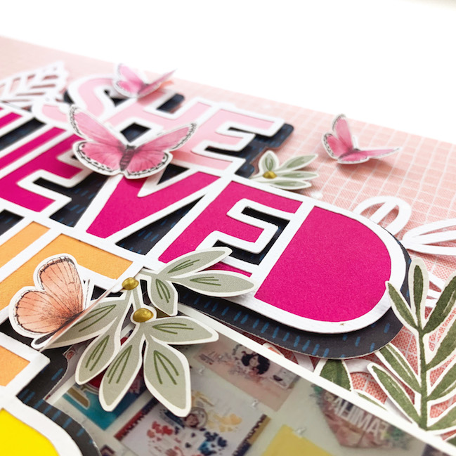
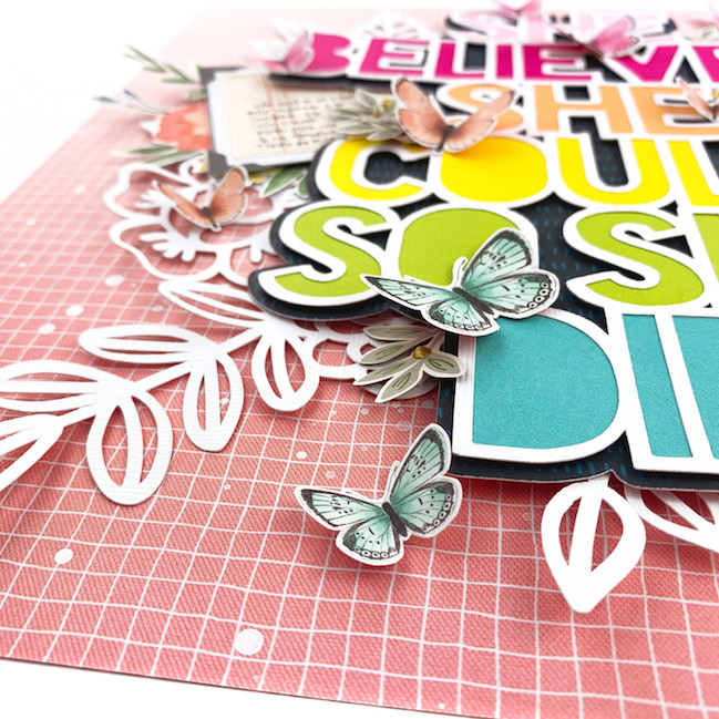
I started by choosing one of my favorite patterned papers from the Bungalow Lane Collection by Paige Evans with American Crafts for my background. I knew from the beginning I wanted to use a title cut file by Paige Evans as the focal point of my page. Our photo or the story behind it don’t always have to be the focal point of our layouts. I wanted the title to give you a hint of what the page is about, then you’ll be directed to the photo, and after that, you’ll read the story. I backed my cut file with colorful Simple Stories cardstock sheets in rainbow order. I then off set it and printed a solid piece on a much darker paper to create some contrast between the actual cut file and the patterned paper from the background.

Scrapbooking with a Title Cut File by Andrea Lake @ shimelle.com

It is now time to start peeling the layers of this onion one by one. I first added some white splatters directly onto the background with white acrylic paint watered down and a brush. While my splatters were drying, I cut a second cut file. This one is a floral bunch cut file also by Paige Evans. I did not back this cut file, I just want it to peek through the title and photo. I machined stitched the centre of the flower cut file to the background and did not add any adhesive to the rest. I then adhered the title cut file to the page using some foam adhesive. At this point, with only those few elements, we have created a lot of dimension already. I placed my photo on one side of the cut file and the journaling piece on the opposite side to keep my layout balanced. I fussy cut a few floral clusters from a Carta Bella patterned paper and a few leaves from a patterned paper from the Jen Hadfield Peaceful Heart collection and spread them out throughout the page adhering them down with regular glue and adhesive foam squares to create depth and different effects.

I finish my layout by adding a few Cocoa Vanilla Studio detail cut butterflies on different spots. I placed them also in rainbow order and had them match the colors of the letters from my title. I love how the page turned out. Using elements such as cut files, die cuts, and detail cut shapes, you can create a vibrant and dimensional page that ends up telling more than just the story of the photo. This page is about remembering the day I finished decorating my current craft room. It is a tiny space but it looks exactly the way I want and it allows me to be happy and creative. The title is also a reminder for myself that I am here to chase my dreams and work hard to make them come true.

Scrapbooking with Andrea Lake @ shimelle.com

I hope this inspires you to work on your own pages and use some of the techniques and tips I shared today. Please let me know if you have any questions. I am happy to provide clarification and share more details if you need/want them.

My name is Andrea Lake, I am a Venezuelan-Argentine crafting lover currently living in Denver, Colorado, with my family. I have always enjoyed coloring and all kinds of papercrafts. I have been recording memories in different ways for many years now. I am a big fan of creating mini albums, DIY projects, and more recently, scrapbook layouts. I am a full-time Sales and Catering Manager at a full-service hotel during the day and a passionate crafter at night. You can also add wife, stepmom, and dog mom as my titles. You will always find me dreaming of my next projects, setting goals to achieve them, and recording the process. Here are a few things you may or may not know about me: I have to write everything down in my planner. If it’s not there, we didn’t even talk about it. I LOVE to wear socks. I wear them every day, all day. And, you might hear me say “I need a Happy Hour” at least three times a day. What that really means is that I need to get in my craft room and be happy for at least one hour each day. You can see more of my work on my Instagram, Facebook, and my Youtube Channel.

Lovehearts don't have to be red: A scrapbooking tutorial in textures and layers

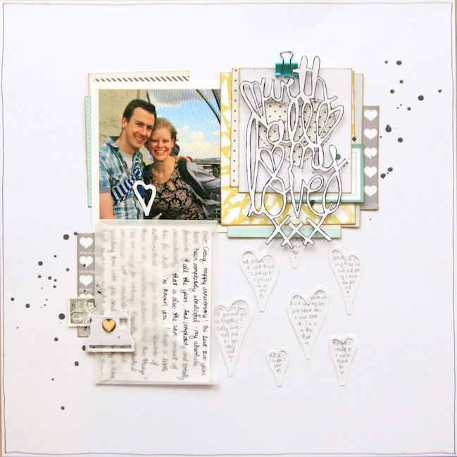
Lovehearts don't have to be red: A scrapbooking tutorial in textures and layers by Kirsty Smith @ shimelle.com

Today, please welcome contributing designer Kirsty Smith, with her delicate and handmade take on a Valentine of a scrapbook page. Thank you, Kirsty!

As Valentine’s Day approaches, it’s nice to be able to scrapbook about the people in our lives that we love. But while pages about loved ones are topical at this time of year, and there’s lots of great inspiration around, we don’t have to document these feelings with giant pink hearts. So today, I’m going to share with you a page that is personal and heartfelt, but takes a look at the theme of love from a different design perspective.
Don’t get me wrong: I love pink as much as the next person and I use a heart icon on almost all my pages as a heart is a universal way to indicate that you like something, or someone. But it’s nice to mix things up sometimes.

I wanted to make a page about my relationship with my partner, documenting some of the letters I’ve written to him over the last few years. I loved the idea of recording the things that I have written so that I can look back on them at some point.

Lovehearts don't have to be red: A scrapbooking tutorial in textures and layers by Kirsty Smith @ shimelle.com

I used a photo as the starting point for this page, and drew the colours of blue, grey, yellow and teal from the picture. I wanted the page to have a soft, romantic feel with plenty of space, but to still have plenty of detail. To me, this means a clean, white background, and lots of detail in layers.

Lovehearts don't have to be red: A scrapbooking tutorial in textures and layers by Kirsty Smith @ shimelle.com

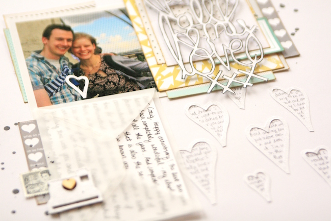
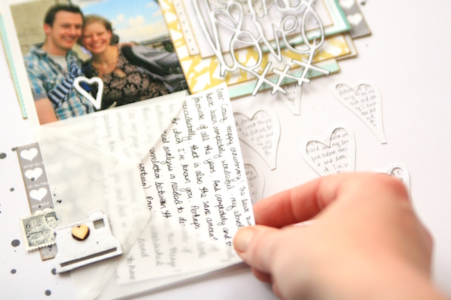
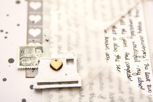
I pulled my supplies together and found I had three key elements to the page. First the picture, which influenced the colour choices. Next came the journaling. I wrote my journaling out onto little sheets of writing paper and folded them to fit into a vellum envelope. I find vellum to be a wonderful material for journaling like this: it’s just dusky enough to hide the details of more private words from casual eyes, but it’s transparent enough to let my handwriting show through. I always aim to include my handwriting on my pages in one way or another; our handwriting is something that is unique to each and every one of us, and it’s a nice way to add your own twist to a design.

Lovehearts don't have to be red: A scrapbooking tutorial in textures and layers by Kirsty Smith @ shimelle.com

Lovehearts don't have to be red: A scrapbooking tutorial in textures and layers by Kirsty Smith @ shimelle.com

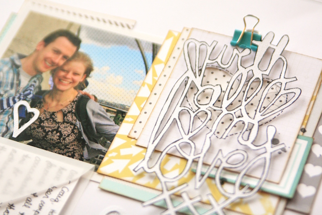
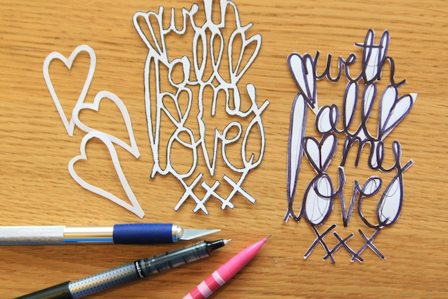
I also created a title that would reflect the letter-writing idea of the page. I wrote out my phrase on scrap paper in a thick, black marker pen, making sure all the words were touching and adding a heart here and there both to tie in with the design and link the phrase together more securely. I cut out the phrase to make a template, and then traced around it onto cardstock. To complete the title, I cut out the cardstock title with a craft knife. I’ve used this technique a lot lately, and if you use a die cutting machine, it’s probably much quicker and you will achieve the same effect. But I enjoy the process, and I have been loving the lacy, delicate look titles like this produce.

Lovehearts don't have to be red: A scrapbooking tutorial in textures and layers by Kirsty Smith @ shimelle.com

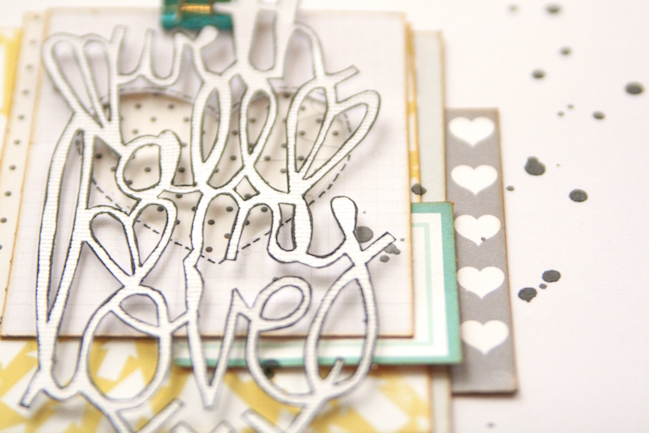
My only concern with the title was that it wouldn’t stand out or be legible, so I outlined it in black pen for emphasis, and stacked the title on coordinating scraps of patterned paper. The layers add detail without being overwhelming, and raising the title up on foam squares makes it a real feature of the page.

Lovehearts don't have to be red: A scrapbooking tutorial in textures and layers by Kirsty Smith @ shimelle.com

With the three parts of my page ready – photo, journaling and title – I was ready to put my design together. The three elements together nicely filled three points of a 2×2 grid design. Grids are wonderful starting points for scrapbook pages, but I didn’t want anything too rigid or blocky in style which might clash with the softer feel of this page. So I opted to create a background design on the white cardstock to give the illusion of the fourth square in the grid, and to add additional layers of texture to the page.

Lovehearts don't have to be red: A scrapbooking tutorial in textures and layers by Kirsty Smith @ shimelle.com

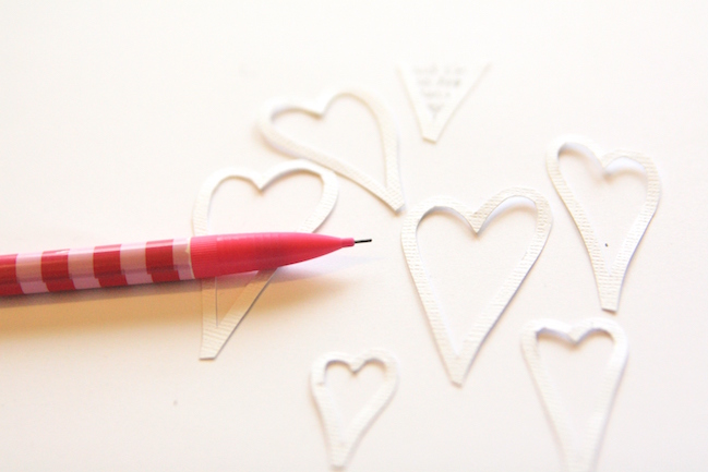
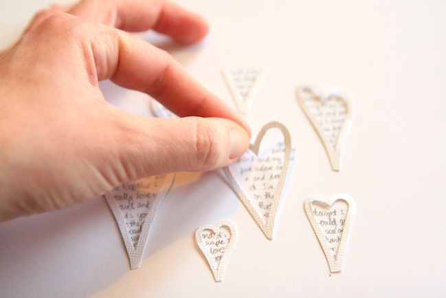
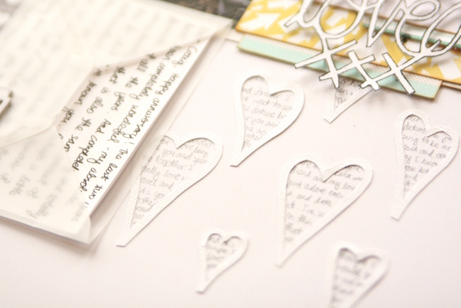
To create a background design, I sketched out a few slightly wonky heart shapes, and cut them out with scissors (although punches or die cuts would work equally well!). I arranged them on the page and in pencil, filled in the middle with a few words drawn from my journaling. The grey of the pencil tied in nicely with colour scheme and meant the contrast with the background was less severe than the black journalling pen.

Lovehearts don't have to be red: A scrapbooking tutorial in textures and layers by Kirsty Smith @ shimelle.com

Then I adhered my hearts to the page with a trusty clear glue, and the background was complete!
Making a background like this is a great way to add detail to a page. It adds layers and texture through the use of text, but because the design is white on white, it won’t draw attention away from the main focus of the page.

Lovehearts don't have to be red: A scrapbooking tutorial in textures and layers by Kirsty Smith @ shimelle.com

This page is a layout of contrasts. It’s a Valentine’s day page without pink; it’s a simple grid design with lots of detailed letters; it has hidden journaling in plain sight and there are four square blocks with only three of them filled. For me, it works and this is a page I hope I can keep adding too, tucking future letters and sentiments away into the envelope to look back on one day.

Of course we’d love to see what you create inspired by Kirsty’s techniques! But which will you pick? Are you going to try the hand lettering or maybe writing in a tiny heart frame? Or the white on white colour scheme? Decisions, decisions!

Crafting with Alice :: Heart Felt Moments Tutorial

heart felt moments tutorial by alice partridge @ shimelle.com

Alice is here today with a little project for your weekend! Enjoy!

I love going through all my photos. Time and time again I do it and it never gets boring. Every time I look at a photo, I get the same feeling I did the first time I saw it! With all this ‘lovely dovey’ talk in Valentine’s week, plus some behind the scenes work on an upcoming article that’s a little bit ‘Scrapping your Significant Other’, I felt this project would be best shared with that in mind.

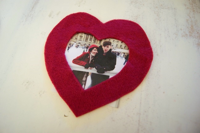
The photo I’ve used for this was taken at Christmas last year, when I went ice skating with the boyfriend’s family at Somerset House. Now I have to say, ice skating is not my most favourite thing to do, however it didn’t take away the magical atmosphere! This is one of my favourite photos of him and me as it very much was a memorable day (unfortunately due to the fact I nearly cried the whole way round the rink).

Anyway, let’s get cracking with showing off those heart felt moments! (I hope you like my little play on words!)

heart felt moments tutorial by alice partridge @ shimelle.com

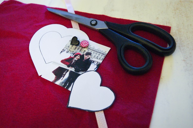
For this you shall need: one photo, felt in a colour of your choice, ribbon, embellishments you wish to add, sewing utensils and standard supplies e.g. scissors. Oh, and a heart stencil! If not you can easily make one in a word document. I found mine on Pinterest. When choosing your heart, remember to keep in mind the size of your photo. My photo is wallet size, so I chose a heart template a bit bigger than that.

heart felt moments tutorial by alice partridge @ shimelle.com

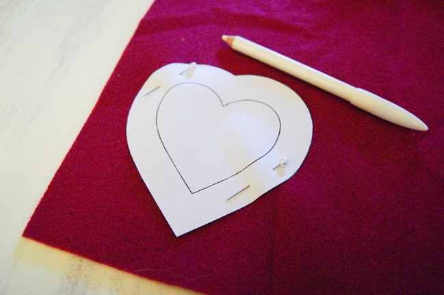
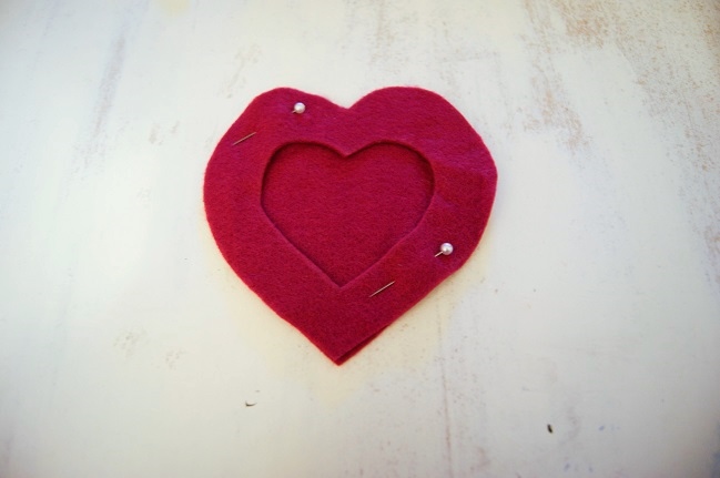
Once you’ve found the template you wish to use, print it, pin onto your fabric and draw around. I drew around mine with a little bit of room, in case I needed to trim off any bits, however that choice is yours! You’ll need to cut two hearts from the felt.

heart felt moments tutorial by alice partridge @ shimelle.com

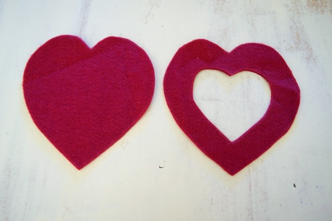
When you’ve finished cutting out your two hearts, you will need to cut out a smaller heart of one your pieces. If you don’t wish to do this freehand, either print out a smaller version of your heart or find a stencil with the heart already inside, just like mine. Nevertheless, if you’re feeling brave, go ahead and draw a heart freehand! It will work whatever technique you use!

heart felt moments tutorial by alice partridge @ shimelle.com

Pin down the two hearts, and cut your photo to size. For the photo, I printed it out wallet size. Obviously the bigger the photo, the bigger the heart will need to be, so always keep that in mind!

heart felt moments tutorial by alice partridge @ shimelle.com

Remove your photo at this stage and pin your hearts together. Making sure the full heart is at the bottom and the open heart on top. When you’re pinning, place your pins closer to the inner edge. This will give you more room to work with when it comes to sewing. At this stage, get your ribbon, fold in half and tuck the edges at the top of your heart. Pin it down! Annoyingly, I forgot to take a photo of this stage, so do forgive me!

heart felt moments tutorial by alice partridge @ shimelle.com

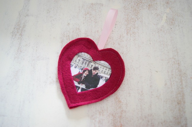
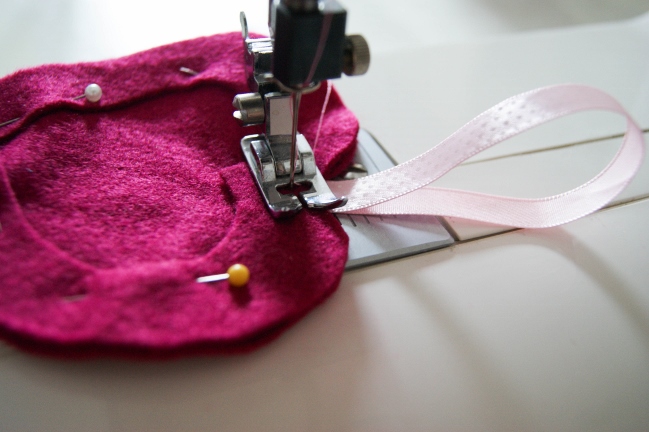
Place under your sewing machine! You want the tension to roughly be on about 1.5 or 2, most likely, though your machine may vary. It’s completely up to you what stitch you wish to use, whether it be tiny and straight like mine or zig-zag!

heart felt moments tutorial by alice partridge @ shimelle.com

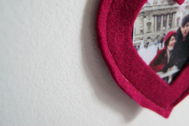
Once you’ve tidied up everything, you should be left with a cute heart photo frame! It’s such a quick, simple project- you could make many and use them for gift wrapping or a banner. If you’re up for a challenge, why not make a heart photo frame chain? Continue sewing hearts and attach them together via the ribbon, making such a cute gift for someone or wall feature. Dress it up by securing the hearts to each other with buttons or bows. Of course, if red love hearts aren’t your thing, the entire idea is easily switched to any motif you care to cut from felt! It could even work with a lettered banner – place your photos in the centres of letters that have a window (A, B, D, O, and so on) and spell out a name or phrase adding in the rest of the letters as just cut from felt or fabric. How would you customise this project?

Happy Belated Valentine’s to all you wonderful readers and happy sewing!

And a P.S. If my boyfriend reads this – Happy fourth Valentine’s to us and hopefully many more!


Alice Partridge is a young designer-maker from southeast England. She hopes to make a living doing what she loves, and spends most of her free time reading blogs, drinking tea, or stitching with a needle in her hand. In addition to working behind the scenes at shimelle.com, her recent work includes Kirsty Neale’s recent craft book, Hoop-La: 100 Things to do with Embroidery Hoops. She blogs when she can on
Alices Homemade Studio and you can follow her on pinterest.

Using a Polaroid frame stamp on a scrapbook page

scrapbook page by shimelle laine @ shimelle.com
Oh, how I love it when inspiration comes along at just the right time. That beautiful scrapbook page tutorial by Kirsty Smith went live at just the same time when the Dear Lizzy 5th & Frolic stamps were sitting on my desk. I’d been using the word stamps in that set a lot more than the image stamps in this set, so Kirsty’s page quickly reminded me how easy it would be to make something lovely with the Polaroid-style frame. I put it together with a sheet of kraft cardstock and scraps from my February Best of Both Worlds kit.
scrapbooking tutorial by shimelle laine @ shimelle.com
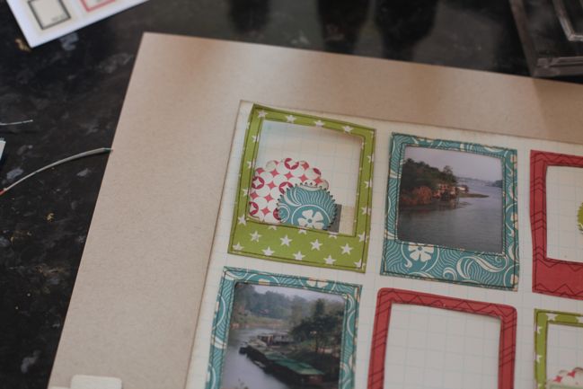
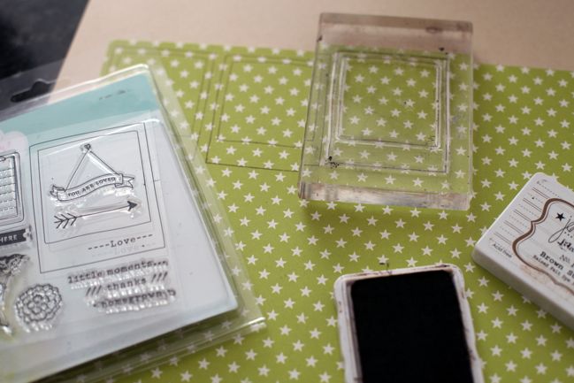
First I stamped the Polaroid frame in brown dye ink…
scrapbooking tutorial by shimelle laine @ shimelle.com
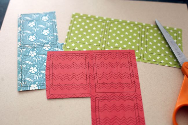
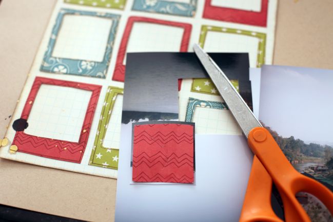
…three times on each of three patterned papers, for a total of nine frames.
scrapbooking tutorial by shimelle laine @ shimelle.com
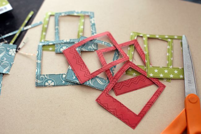
Then cut out all those frames with scissors. Easy enough.
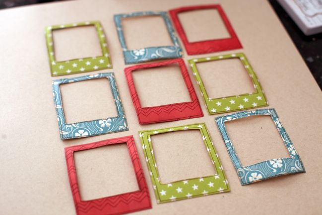
scrapbooking tutorial by shimelle laine @ shimelle.com
Spend twenty minutes moving the patterns around in a grid until finally settling on this arrangement. Then spend the next twenty minutes wondering why that took twenty minutes to decide. This is a slippery slope.
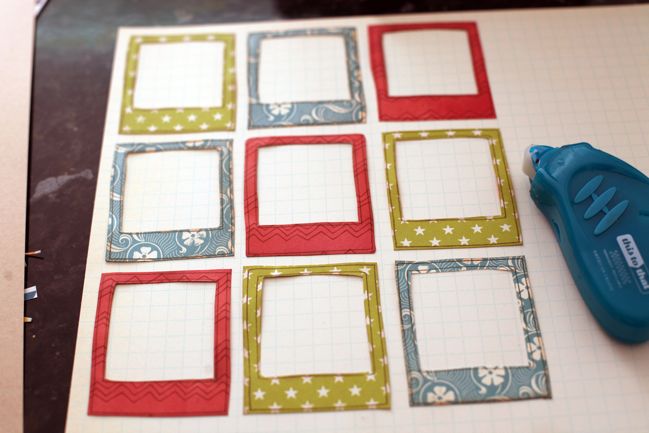
scrapbooking tutorial by shimelle laine @ shimelle.com
Transfer the frames – in that much pondered order – to a sheet of neutral patterned paper. Kirsty’s pages often remind me to use all that grid paper in stash. Attach with adhesive that allows for things to be moved about – or just be way more graceful than I am and not knock the frames onto the floor six times while you’re trying to figure out the rest of the design. Your choice.
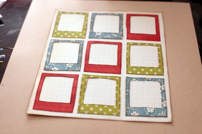
scrapbooking tutorial by shimelle laine @ shimelle.com
Cut the grid paper to frame the frames, ink the edges, and attach it to the centre of the kraft cardstock background. Exhale happily that this step had significantly fewer opportunities to derail for another twenty minutes.
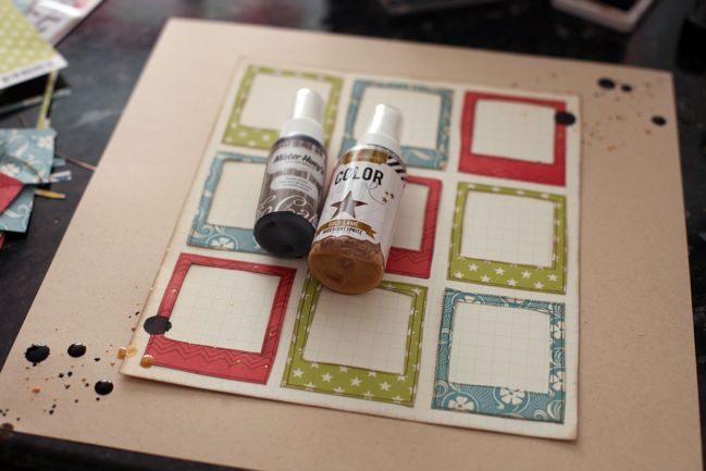
scrapbooking tutorial by shimelle laine @ shimelle.com
Use the spray tube and an eye dropper to splatter mist on two corners of the page to form a diagonal line. I used gold lame color shine spray by Heidi Swapp and Studio Calico Mister Huey’s spray in Dark Calico (that one is on sale at the moment if you’re looking for a dark neutral shade, by the way). Be completely impatient and refuse to wait for the larger droplets to dry, and enjoy the feeling of living dangerously throughout the rest of the creative process as a result.
scrapbooking tutorial by shimelle laine @ shimelle.com
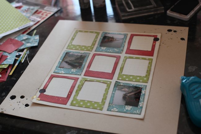
Use the scraps from cutting out the centre of the stamped frames to cut three photographs to a size that will sit nicely behind three frames. I picked photos that had some nice details that were otherwise lost in a larger image when printed at 4×6.
scrapbooking tutorial by shimelle laine @ shimelle.com
Realise it might be simplest to make all the red frames match, all the green frames match, and all the turquoise frame match. Spend another twenty minutes deciding which colour would be best for the photographs. Eventually choose turquoise. Live the rest of my entire life wondering if this was the right decision.
scrapbooking tutorial by shimelle laine @ shimelle.com
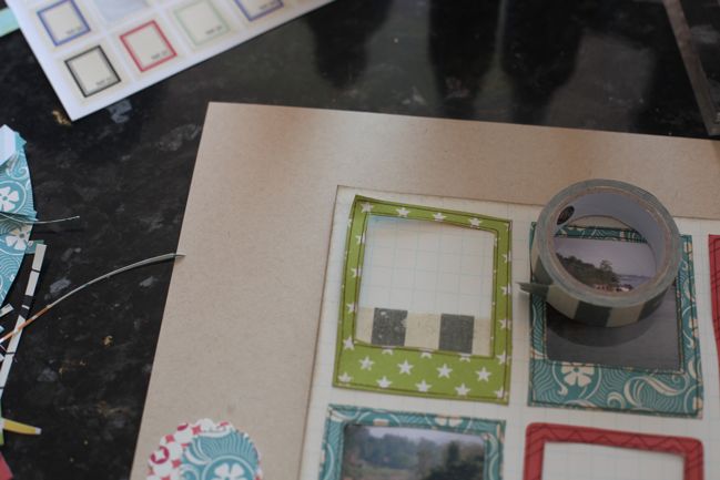
Start the green frames with a stripe of tape inside the window.
scrapbooking tutorial by shimelle laine @ shimelle.com
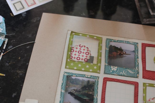
Then a punched circle in the corner…

scrapbooking tutorial by shimelle laine @ shimelle.com
…and a smaller punched circle over the top. Feel like I just won house points for Hufflepuff by managing to get all three patterned paper colours into this embellishment grouping.
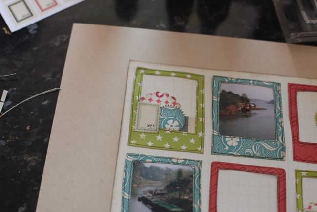
scrapbooking tutorial by shimelle laine @ shimelle.com
Top with a postage stamp sticker from Jenni Bowlin Studio.
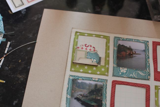
scrapbooking tutorial by shimelle laine @ shimelle.com
Add dimension with a wood veneer file tab by Studio Calico.
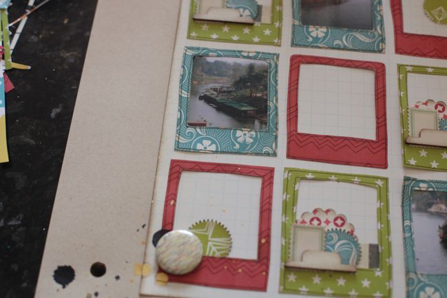
scrapbooking tutorial by shimelle laine @ shimelle.com
Realise the red frames are now looking very naked by comparison. On the two corner frames, add a punched circle and a Studio Calico badge embellishment. Ten points to Hufflepuff for the group of three formed by the circle shapes in the punched piece, the badge, and the closest large droplet of ink, all overlapped.
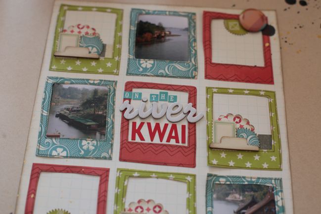
scrapbooking tutorial by shimelle laine @ shimelle.com
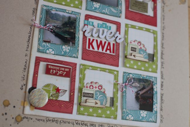
Title gets the centre square. The white woodgrain Thickers and the red Jenni Bowlin letters are both from the kit, plus those tiny turquoise letter stickers are an older set in my stash by Cosmo Cricket. Congratulate self that ‘Kwai’ fits so perfectly in the frame, since I didn’t think to check that before this step.
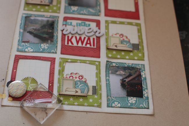
scrapbooking tutorial by shimelle laine @ shimelle.com
Use the arrow stamp in brown ink on top of the wood veneer tabs, mostly because I’ve fallen in love with the look of stamped veneer. Point the arrows toward the nearest photo to help direct the eye to the photos, which is extra helpful with the combination of small photos and plenty of embellishment.
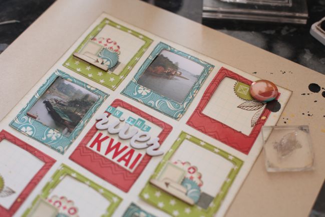
scrapbooking tutorial by shimelle laine @ shimelle.com
Add some leaf stamps to the corners of the two red frames.
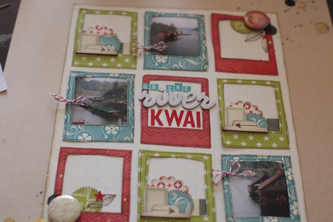
scrapbooking tutorial by shimelle laine @ shimelle.com
And some little red star stickers too. Then I noticed the turquoise frames started to feel too plain, so I added red baker’s twine to the edges. Award ten points to whatever house baker’s twine belongs to for its amazing ability to be a perfect little detail on pretty much anything.
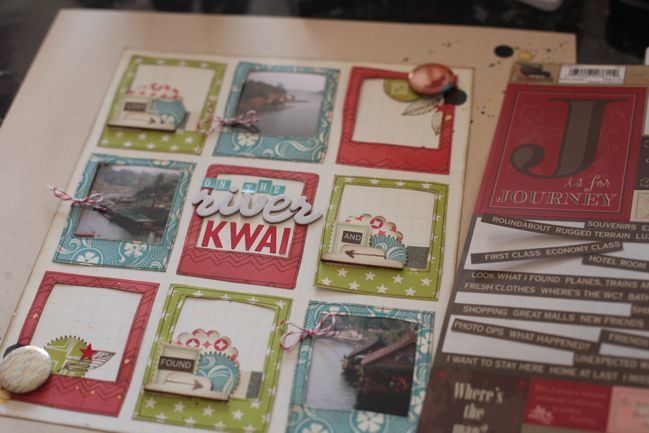
scrapbooking tutorial by shimelle laine @ shimelle.com
At this point, I headed to my ‘use it or lose it’ box. I constantly go through supplies and try to clear out the things I will not use. Sometimes I end up with items that I still like but they are old enough that I haven’t been using them as much and I need a little push to grow up and choose a side: use them or lose them. I write a deadline somewhere on the product and whatever I don’t use by that date heads to the donation box. Right now there are a few sheets of these 7gypsies stickers, which are fab for cutting into little word blocks…
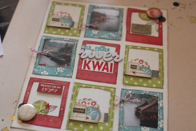
scrapbooking tutorial by shimelle laine @ shimelle.com
…and also has a few labels with phrases that will fit this page.
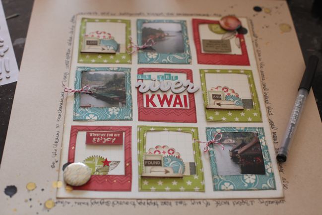
scrapbooking tutorial by shimelle laine @ shimelle.com
Then finish with writing around the grid paper, and make a serious note to self that Kirsty’s layered page idea would allow for significantly more writing than this.
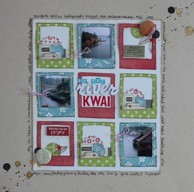
scrapbooking tutorial by shimelle laine @ shimelle.com
Award Kirsty at least fifty house points for her inspiration that lead to this new page whilst feeling a sudden urge to go through my entire basket of scrap papers and stamp them all with Polaroid frames.

Decide that would take way, way too long.
Scrapbooking tutorial :: Hot Pink Hoopla

hot pink hoopla scrapbook page with cosmo cricket upcycle
scrapbook page with cosmo cricket upcycle
Oooh, I do love a little hot pink. It can brighten up the greyest of days, and once someone said something that really stuck with me: ‘I think the reason I always think you look younger is because you wear hot pink’. Ladies, someone only has to say that to you once to make you a believer, right? Hot pink it is. Also, I just really like the word ‘hoopla’ because it is fun to say and I will find any reason to throw it into a conversation. Sometimes that’s the only reason you need.

Today’s bit of hoopla in hot pink includes the chance to win a prize pack of Cosmo Cricket scrapbooking supplies! And I tried to meet a challenge from SJ, who suggested I try to scrap in a 7×7 square on the 12×12 page. Find out how well I stuck to that rule! Watch the video to see this page come together.

To enter the challenge, you need to create a project somehow inspired by this scrapbook page. It can be very similar or quite different, as you could use the entire layout as inspiration or you could pick just one thing – a hot pink background, using the Upcycle collection, starting with a 7×7 square, misting the background, scrapping that one photo that doesn’t go with anything else… or anything else that caught your attention!

Create your page and upload it to your blog or a scrapbook page gallery like Two Peas or UKScrappers. Then leave a link to that page (not your main blog address) in the box below. One entry will be chosen to win a prize pack of Cosmo Cricket scrapbooking supplies! (Please follow Cosmo on Facebook or Twitter to help say thanks!) Entries close this Sunday (21st August 2011) at midnight UK time.
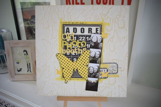
Scrapbooking tutorial :: Bingo Cards and Butterflies

scrapbooking tutorial :: bingo cards and butterflies
scrapbooking tutorial
As promised, a little something special to continue throughout this week, and I hope the video fans will enjoy! Each day this week, stop by to see a new video with a layout tutorial, then enter for a chance to win a prize pack of goodies from some of your favourite manufacturers. Today’s video features products by Jenni Bowlin Studio and I have a JBS prize pack to send to one lovely scrapbooker!

To enter the challenge, all you have to do is create something inspired by the video. It can be very similar to the page if you like, or you can take inspiration from any element you like – the colours, the photo placement, any technique – whatever takes your fancy. Then upload your project to your blog or a page gallery like Two Peas or UKScrappers and leave a link to the post (not your blog’s main page) in the box below.

Deadline is next Sunday (21st August 2011) at midnight UK time!

From Sketch to Scrapbook Page

from sketch to scrapbook page
travel scrapbook page
In what has quickly become a week about charity and scrapbook sketches for some reason, here is the page I wanted to show you yesterday afternoon, but the powers of the internets decided we needed to wait until this morning because they didn’t want to go as fast as I hoped. Just in time for the weekend though – crafty time central!

travel scrapbook page from sketch
To create this layout, I started with the same sketch set as a challenge for the contestants and anyone playing along with the UKScrappers Scrap Factor contest. It’s this sketch I shared yesterday. You can see the contestants pages from the sketch here. I know some members prefer to vote for the page that grabs them from the small image, but I really enjoy reading the commentary written by the contestants, explaining the creative choices they made in their details. So I thought I’d share my process for making this page, from the sketch to the finished scrapbook page.

travel scrapbook page
Anyone is welcome to join in the Play Along with Scrap Factor challenge at any time. If you’re not already a member of UKScrappers, you can join for free. The challenges end on Sunday evenings, so you have a couple days left if you would like to participate in this round. There’s a prize each week for one paper layout, one digital page and one hybrid page. Some weeks we don’t have any hybrid entries! ‘Hybrid’ just means a mix of digital and paper scrapping, so if you print out a journaling card printable and include it on a paper page, that’s hybrid. Easy! And next week’s challenge is already posted – a layout inspired by film or television. Play Along entries for that challenge are due the following Sunday – 12th of June.

And there are two posts today because the weekend giveaway goes live this evening – and goodness, it’s a good one this week!

xlovesx