Lovehearts don't have to be red: A scrapbooking tutorial in textures and layers
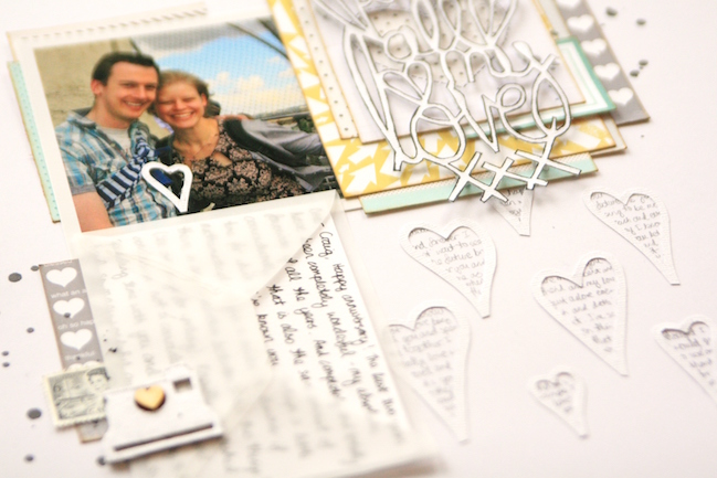
Today, please welcome contributing designer Kirsty Smith, with her delicate and handmade take on a Valentine of a scrapbook page. Thank you, Kirsty!
As Valentine’s Day approaches, it’s nice to be able to scrapbook about the people in our lives that we love. But while pages about loved ones are topical at this time of year, and there’s lots of great inspiration around, we don’t have to document these feelings with giant pink hearts. So today, I’m going to share with you a page that is personal and heartfelt, but takes a look at the theme of love from a different design perspective.
Don’t get me wrong: I love pink as much as the next person and I use a heart icon on almost all my pages as a heart is a universal way to indicate that you like something, or someone. But it’s nice to mix things up sometimes.
I wanted to make a page about my relationship with my partner, documenting some of the letters I’ve written to him over the last few years. I loved the idea of recording the things that I have written so that I can look back on them at some point.
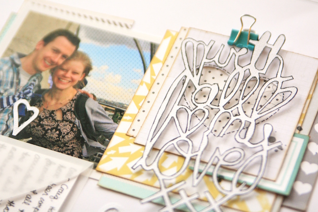
I used a photo as the starting point for this page, and drew the colours of blue, grey, yellow and teal from the picture. I wanted the page to have a soft, romantic feel with plenty of space, but to still have plenty of detail. To me, this means a clean, white background, and lots of detail in layers.
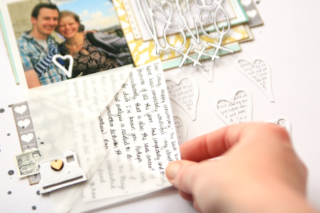
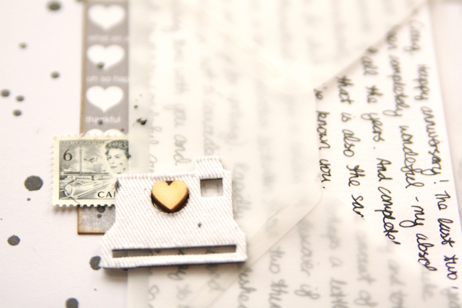
I pulled my supplies together and found I had three key elements to the page. First the picture, which influenced the colour choices. Next came the journaling. I wrote my journaling out onto little sheets of writing paper and folded them to fit into a vellum envelope. I find vellum to be a wonderful material for journaling like this: it’s just dusky enough to hide the details of more private words from casual eyes, but it’s transparent enough to let my handwriting show through. I always aim to include my handwriting on my pages in one way or another; our handwriting is something that is unique to each and every one of us, and it’s a nice way to add your own twist to a design.
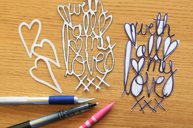
I also created a title that would reflect the letter-writing idea of the page. I wrote out my phrase on scrap paper in a thick, black marker pen, making sure all the words were touching and adding a heart here and there both to tie in with the design and link the phrase together more securely. I cut out the phrase to make a template, and then traced around it onto cardstock. To complete the title, I cut out the cardstock title with a craft knife. I’ve used this technique a lot lately, and if you use a die cutting machine, it’s probably much quicker and you will achieve the same effect. But I enjoy the process, and I have been loving the lacy, delicate look titles like this produce.
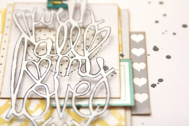
My only concern with the title was that it wouldn’t stand out or be legible, so I outlined it in black pen for emphasis, and stacked the title on coordinating scraps of patterned paper. The layers add detail without being overwhelming, and raising the title up on foam squares makes it a real feature of the page.
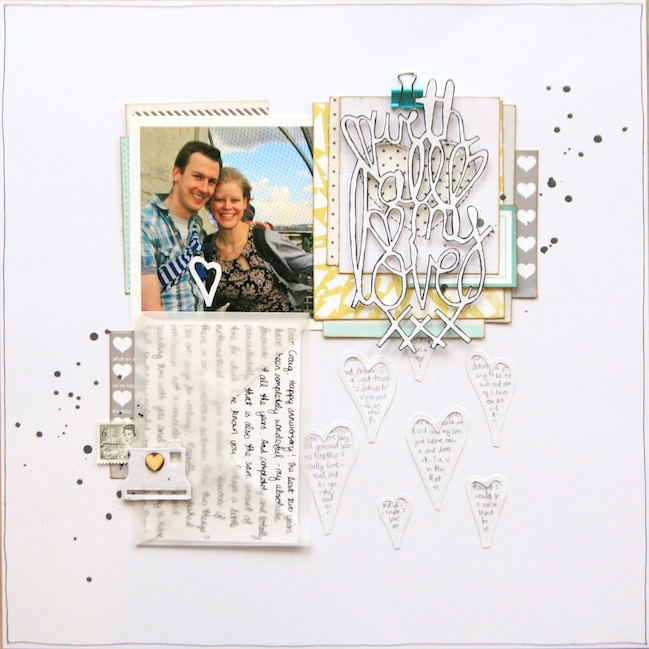
With the three parts of my page ready – photo, journaling and title – I was ready to put my design together. The three elements together nicely filled three points of a 2×2 grid design. Grids are wonderful starting points for scrapbook pages, but I didn’t want anything too rigid or blocky in style which might clash with the softer feel of this page. So I opted to create a background design on the white cardstock to give the illusion of the fourth square in the grid, and to add additional layers of texture to the page.
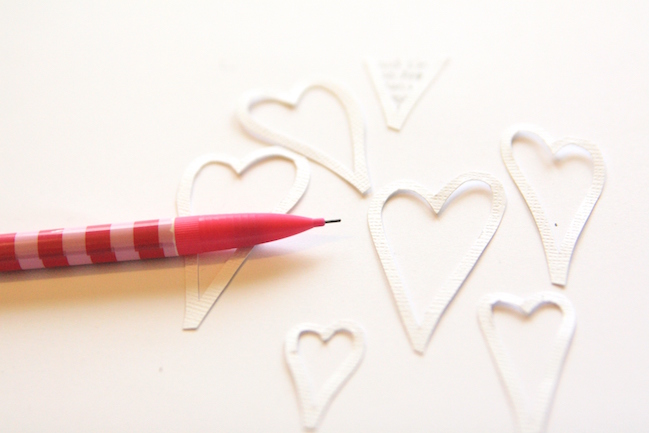
To create a background design, I sketched out a few slightly wonky heart shapes, and cut them out with scissors (although punches or die cuts would work equally well!). I arranged them on the page and in pencil, filled in the middle with a few words drawn from my journaling. The grey of the pencil tied in nicely with colour scheme and meant the contrast with the background was less severe than the black journalling pen.
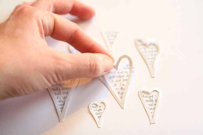
Then I adhered my hearts to the page with a trusty clear glue, and the background was complete!
Making a background like this is a great way to add detail to a page. It adds layers and texture through the use of text, but because the design is white on white, it won’t draw attention away from the main focus of the page.
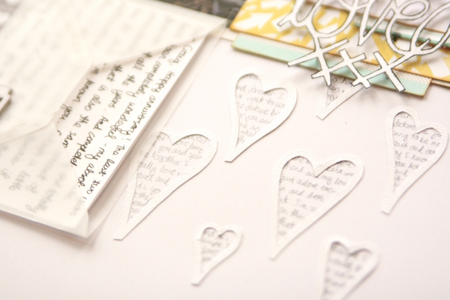
This page is a layout of contrasts. It’s a Valentine’s day page without pink; it’s a simple grid design with lots of detailed letters; it has hidden journaling in plain sight and there are four square blocks with only three of them filled. For me, it works and this is a page I hope I can keep adding too, tucking future letters and sentiments away into the envelope to look back on one day.
Of course we’d love to see what you create inspired by Kirsty’s techniques! But which will you pick? Are you going to try the hand lettering or maybe writing in a tiny heart frame? Or the white on white colour scheme? Decisions, decisions!
![]() Read more about: tutorials
Read more about: tutorials
Next post: Scrapbook Journaling for Childhood Memories
Previous post: Glitter Girl Adventure 128: Old Stash Simplification


