paper: pretty paper. true stories. {and scrapbooking classes with cupcakes.}

lovely to meet you Twitter Facebook Pinterest YouTube

Take a Scrapbooking Class

online scrapbooking classes

Shop Shimelle Products

scrapbook.com simon says stamp shimelle scrapbooking products @ amazon.com shimelle scrapbooking products @ amazon.co.uk

Reading Material

travel

Sketch to Scrapbook Page :: Adding an angle
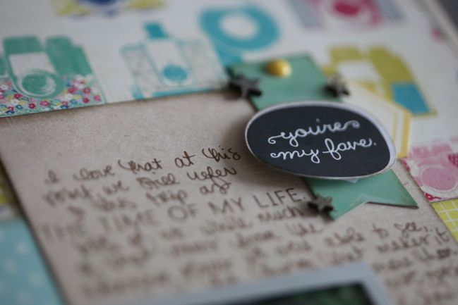
scrapbook page by shimelle laine @ shimelle.com
Having successfully managed the spelling of Hong Kong, I may have rediscovered a bit of creative energy and furthered this quest to get up to date with all my sketch and kit pages! Catching up feels pretty rad… as long as I only focus on the things where I’m making progress and don’t turn around and realise there are eleventy other elements in life that need some catching up too. Right? Onward, at any speed.
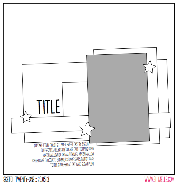
scrapbooking sketch @ shimelle.com
This sketch was designed for one portrait 4×6 photo, but I changed that slightly for my page. The idea here is to take a group of paper boxes that are layered in a nice and orderly fashion, then take the whole lot and angle it ever so slightly to create a different look. Easy enough, and perfect for the last 12×12 sheet I’ve been saving (that pretty camera print by Maggie Holmes for Crate Paper) and a stack of scraps cut down to nice box shapes instead of the random off-cuts they had become.


Again the products for this page are from my May Product Picks, and I think that makes for six layouts from the May kit so far. I’m now out of full sheets for the backgrounds, but I have paper scraps, letter stickers, and embellishments remaining, so I’ll mix those with some additional papers to finish off the May kit. I’ve also done a few cards with this kit, as out of character as that may seem!
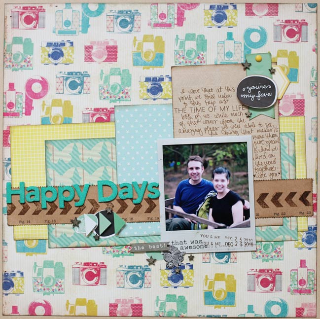
scrapbook page by shimelle laine @ shimelle.com
This is one of those pages where the journaling becomes more reflective – not trying to tell the story of what happened in that photo, but reflecting on that occasion from the present point of view. Recently The Boy and I were in a discussion and someone asked us about our backpacking adventure in the sort of way that implied it was one of those things you would be happy to have over and done with and not want to return to living from a library bag once we had reacclimatised to living in one place. That’s really not our perspective at all and we both wish it was something we could do all the time, so please excuse the slightly mushy journaling!
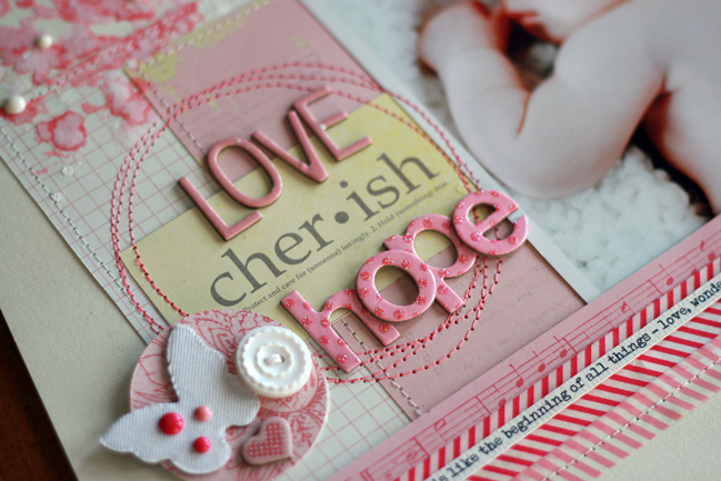
scrapbook page by lisa dickinson @ shimelle.com
Today I’m humbled by the gorgeous page Lisa Dickinson has created from this sketch. Lisa’s work is always beautiful, but this page has me in total awe! Lisa, can I scrapbook like you when I grow up?
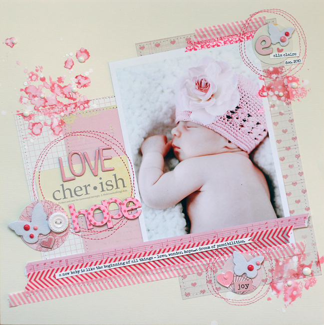
scrapbook page by lisa dickinson @ shimelle.com
The large photo takes center stage in this sketch and knew it would be a great design to feature one of the many newborn portraits I had taken of my niece. I printed mine at 5×7 (slightly larger than the photo in the sketch) and then gathered lots of pink supplies, everything from soft pink to brighter fuchsia. I used larger blocks of paper behind my photo, layering strips of wash tape at the top and bottom of the tilted design. Three embellishment clusters form a visual triangle around my photo and I added circles of stitching to reinforce their groupings. Because there was some empty space above the title, I splattered on pink and white inks. I added additional, smaller ink splatters to form another triangle. Once the ink dried, a few white enamel dots add dimension to these accents. Rather than block my journaling below the design, I incorporated it into a journaling strip that I adhered atop the washi tape.


Lisa Dickinson is a graphic designer living in Colorado with her husband, Mike, and children, Hayden and Riely. She started scrapbooking in 1998 and it grew from a part-time hobby to a full-time job. Her scrapbook pages have been published in various magazines and she is the author of the ebook Design Workshop from Ella Publishing. In addition to being a Garden Girl at Two Peas in a Bucket, Lisa also designs for Jenni Bowlin, Basic Grey, and Lily Bee Design. You can catch up with her at Gettin’ By, where she blogs about scrapbooking, motherhood, running, and her deep-seated hatred for the Comic Sans font. .


Sketch to Scrapbook Page :: A Twist on Patterned Paper Quadrants

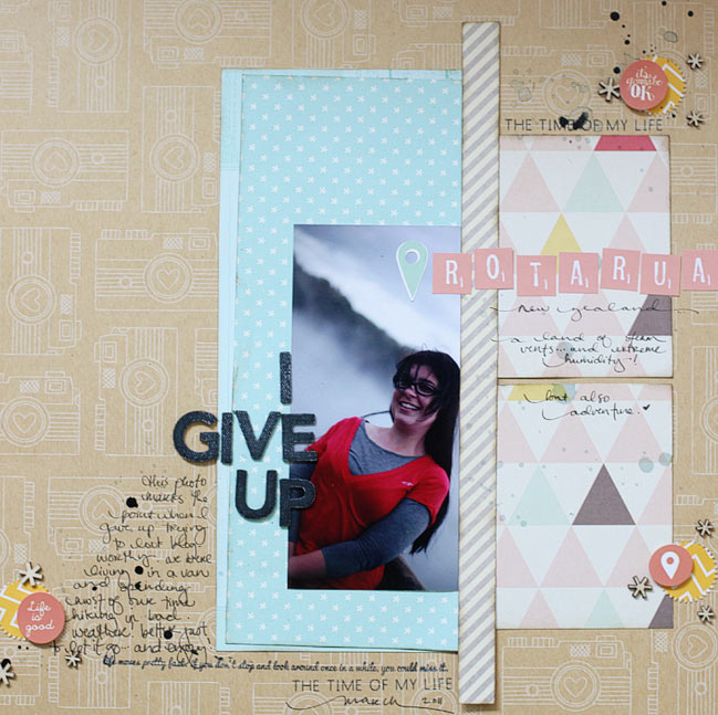
scrapbook page by shimelle laine @ shimelle.com
Trying another travel page, and this time with a location I may have a better chance of spelling correctly. One can hope. (I’ve fixed the Rotorua layout and issued an apology to all of New Zealand on Twitter and Facebook, if it helps. I need to take a new picture and edit the post. Darned spelling upside down!)

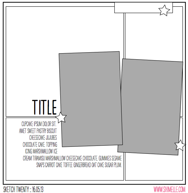
scrapbooking sketch by shimelle laine @ shimelle.com
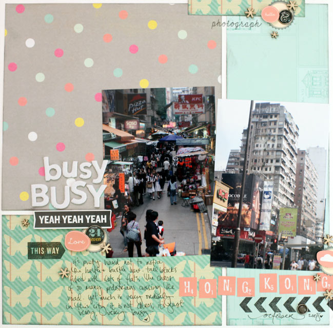
This sketch is a twist on quadrant design: instead of dividing the page into four equal quadrants, it’s divided into four boxes that are different sizes, with the join of the papers covered by two portrait photographs. I used standard 4×6 prints.


The supplies are all from my May product picks with the exception of the Simple Stories brads I added right at the end to finish the embellishment, and a sheet of white cardstock for the background.

scrapbook page by shimelle laine @ shimelle.com
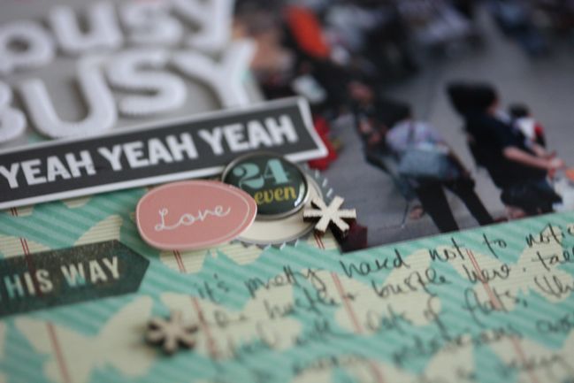
I’m hoping some of you will try this sketch with a similar look but adding mats to the photos. I like pictures both matted and unmatted, but I am in such a habit of two portrait photos side by side sharing one photo mat that I felt I needed to change it up a bit, so that’s what I added to the sketch and this layout. The photos are from 2008, on a short stay in Hong Kong. (It’s not from the backpacking trip so no need for the kraft cardstock in the background. The album for this trip started well before I thought of such simple ideas as having a colour in common throughout the entire book!)

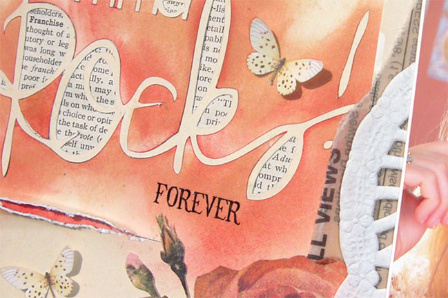
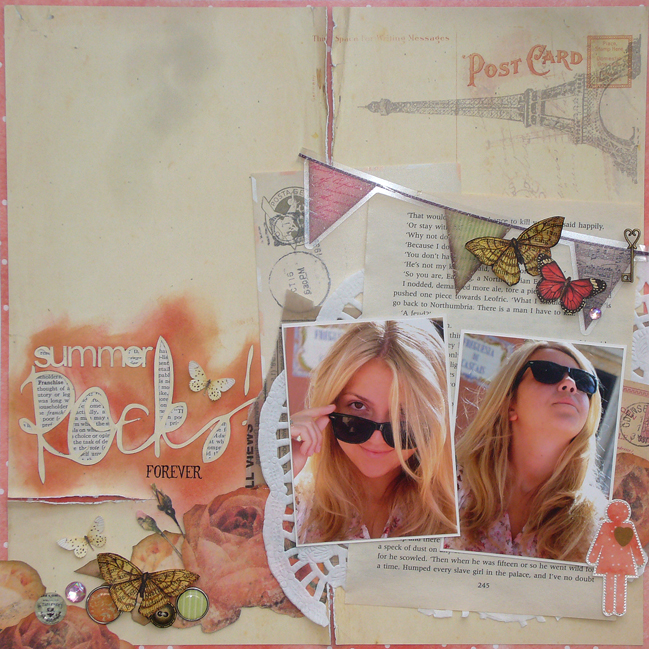
scrapbook page by Sam Ball @ shimelle.com
Today I’m delighted to welcome UK Scrapper Sam Ball to share her interpretation of the sketch. And don’t you know that in the video I say you could use this design with two, three, or four patterned papers in the background… and Sam made it work beautifully with one! The thought never even entered my mind. Now you know why I invite guests!

scrapbook page by Sam Ball @ shimelle.com
Staying fairly true to the sketch, I was keen to repeat the grid background element. But as a scrapper whose style is more eclectic than graphic, I distressed cut lines to reveal slithers of the dotty paper from Glitz, along with other papers and embellishments from Prima, Websters and My Mind’s Eye.

Guilty of always leaving the title until last, I’ve recently invested in a Silhouette Cameo. Now my title is committed to from the start and the layout evolves around it rather than me finishing a layout and wondering where best to site it!

The photos, taken last year on holiday are of my middle stepdaughter as we enjoyed one of the last days of our Mediterranean cruise.


Having tried her hand at many other crafty hobbies, including stained glass, pottery and needlecraft, Sam Ball discovered scrapbooking in 2007 and has never looked back! “Nothing has gripped me as much as scrapbooking has” says Sam “and over the years I’ve made many, many friends, who like me share this passion for paper.” Her style could be described as arty eclectic and Sam loves nothing more than taking a piece of paper and cutting out the intricate elements to layer in pages.
Over the years she has had her work published by magazines in the UK and has been a DT member of both the successful scrapbooking kit company ScrapaGoGo, the Pencillines sketch team and Scrapbook Inspirations. She currently teaches at the popular GoGoGetaway.
For more of Sam’s work, be sure to check out her blog.


Five Ways to Show off those Special Moments by Naomi Atkins

Five Ways to Show Off Those Special Moments by Naomi Atkins @ shimelle.com

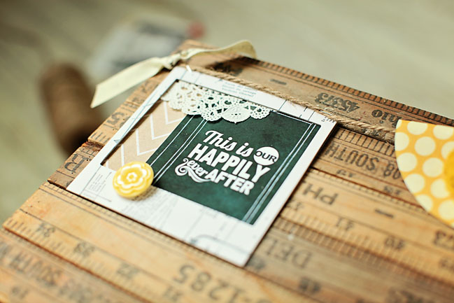
Today we are going to be talking about five ways to use those great little polaroid frames that are so trendy right now in your projects! I’m a photographer, so I have an extra special soft spot for these frames. And anyone who scrapbooks or makes projects loves pictures, right? These little frames are so versatile and plan to show you some fun ways to use them! I have two home décor projects that use the frames in a variety of ways as well as a scrapbook layout to share with you. There are several types of frames on the market right not. Some companies, such as Crate paper, have added them to their paper lines in a variety of colors and styles. They can be chipboard, die-cut and flat, or even canvas. Many manufacturers are also making them for sale as die-cuts for your silhouette or other cutting machine and they often have fun wording and styles. You can also pick up plain white ones that are made of a very sturdy cardboard but not quite as thick as chipboard from craft stores. I will be using several of these as well because they can be easily altered!

Five Ways to Show off those Special Moments by Naomi Atkins @ shimelle.com

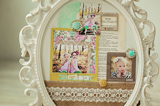
Canvas Frame backed with Patterned Paper and a Photo.
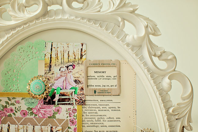
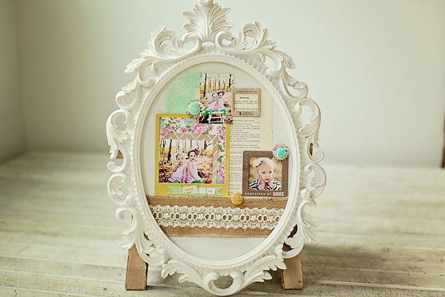
First, I made a home décor project out of a scatter frame I picked up from Hobby Lobby. I had three small photos. I cut a sturdy piece of cardboard to fit the size of the frame, and then a piece of cream card stock to cover it for the background. I misted a doily and added it to the above left. I also added small picture to the back of a chipboard frame. Both of these are from Crate paper. I added a piece of Burlap and lace ribbon that I got from Hobby Lobby as well to the bottom of the design and stitched it.

Five Ways to Show off those Special Moments by Naomi Atkins @ shimelle.com

Five Ways to Show off Those Special Moments by Naomi Atkins @ shimelle.com

Chipboard Frame Used to Highlight Words.
I love old dictionary paper. I have several old dictionaries that I love to use on my projects and layouts. I like to find a page where the heading is a word that I want to use to describe my layout. The word I wanted to highlight was “memory”. I simply added the Crate chipboard frame to surround the word at the top of the paper and stitched around it for extra emphasis. I also like to use things in patterns of 3 for visual emphasis. This project just wouldn’t be the same without the frames and I love the dimension they add.

Five Ways to Show off those Special Moments by Naomi Atkins @ shimelle.com

Five Ways to Show off those Special Moments by Naomi Atkins @ shimelle.com
Filling Chipboard Frames with Glitter on a Layout.
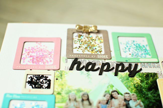
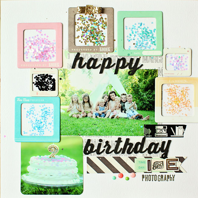
I really wanted this layout to be colorful and convey a celebration. My business partner and I were celebrating our 2 year anniversary and we did a photo shoot with all of our children and a cake smash to celebrate. I bought a pack of variety iridescent sequins and glitter from Martha Stewart. I loved all of the colors and they matched all of the colorful sprinkles on our cake. I simply modge podged the frames around my photo in various colors, modge-podged the insides and sprinkled a thin layer of the glittery sequins. I was really happy with the result and it made for a fun layout! These chipboard frames are also from Crate paper and they are some of my favorite ones. I simply added some Thickers for the title and my page was complete!

Five Ways to Show off those Special Moments by Naomi Atkins @ shimelle.com

Five Ways to Show off those Special Moments by Naomi Atkins @ shimelle.com

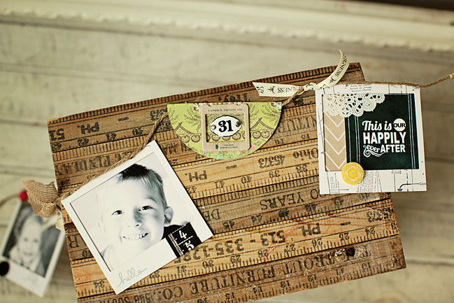
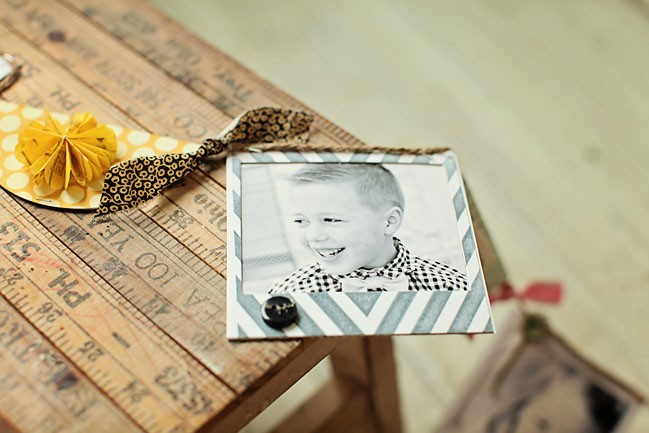
Stamping Plain Chipboard Frames and Adding Photos for a DIY banner!
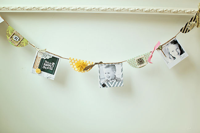
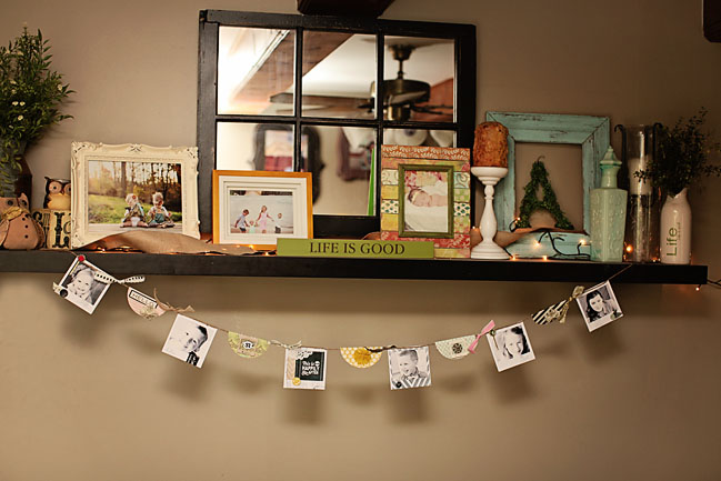
I had so much fun stamping these plain white frames for my banner. I made this banner for my living room as a home décor project. I knew I wanted to add something to the frames besides the photos and I have several large wooden stamps. I simply inked the whole stamp and stamped over the frame which made a cool masked effect. Some of the frames I did not want to add as much to, so I used some small Ali Edwards stamps from Technique Tuesday to add words to the bottom of my polaroid frames. I then inserted the photos into all of my frames and added extra embellishments such as buttons and die-cuts.

Fie Ways to Show off those Special Moments by Naomi Atkins @ shimelle.com

Five Ways to Show off those Special Moment by Naomi Atkins @ shimelle.com

Backing Polaroid Frames with Quotes and Paper for DIY Banners.
I knew I wanted to add some more to my banner besides the frames filled with the photos, so I decided to add a few frames with quotes (a “chalk it up” journaling card) and patterned paper. I put these in between my photo frames for something extra. I also cut circles from patterned paper, folded them in half and added some embellishments to them. I used Studio Calico tissue paper flowers for a few of my circles and I love the dimension it added. I then added ribbons and some more buttons in between my frames and I was done!

I honestly use these frames in almost every project lately. My gallery at Two Peas showcases several more layouts where I have used these frames in different ways (housing titles, embellishments and more) at Two Peas in Bucket.


Naomi is a wife to Jonathan, mama to five, and co-owner of Inspired and Enchanted Photography. She loves scrapbooking, quilting, baking and DIY projects!! She currently designs for Crate paper, Freckled Fawn, Kerri Bradford Studios and Gossamer Blue Kit Club. She has been published many times in Scrapbook Trends, and you can follow her on Facebook at Inspired and Enchanted Photography or on her blog at inspiredandenchantedphotography.

Sketch to Scrapbook Page :: A design for photo booth strips

getting more from your patterned paper @ shimelle.com
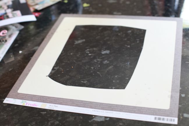
I’ve had a few discussions recently about something known by the delicate name of ‘paper gutting’. It’s rare that I show paper gutting in my videos, because I don’t think it makes very riveting viewing and I had – wrongly perhaps! – assumed if you wanted to gut your paper you were already on top of that and didn’t need me to show you what that was.

It turned out there were a few of you left completely confused when we discussed this on the Paperclipping Roundtable, so this week I wanted to share the simple process of paper gutting so you don’t find yourself with such a sharp intake of breath the next time I layer two papers on my page to show just a quarter inch border of your favourite patterned paper of all time.

Just cut a big section out of the middle and leave the edges intact. You can use a trimmer and make it all nice and tidy; I tend to opt for quick and untidy by using scissors. It doesn’t matter, since you’re going to cover it up anyway!

making a scrapbook page @ shimelle.com
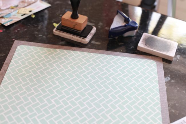
Then place your smaller-than-12×12 paper over the top and adhere around the edges so you’re not just gluing that top sheet straight to your table. Presto: the glory of the second colour peeking around the edge of the page without the heart attack of using a full 12×12 sheet for it. If you’re scrapping on a budget or trying to get the most from a kit or you just love a paper but only have one sheet of it, this can come in terrifically handy so you can add embellishment or photo mats in the same pattern as your outside frame.

scrapbook page by shimelle laine @ shimelle.com
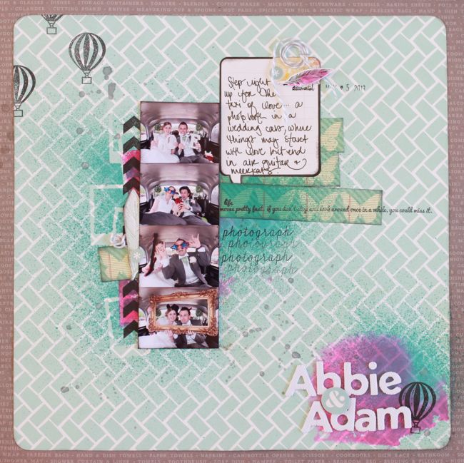
But then all measure of sensibility went out the window and I put together something entirely devoid of the idea of neat and tidy. I really wanted a splash of bright colour, and this seemed to be one way to get it: hot pink ink applied to the page with the acrylic block rather than a stamp. Everything here aside from the inks, mask, and twine is from the May Best of Both Worlds kit. I’ve actually already scrapped these photos in black and white for the wedding album, but I had them in colour too and wanted to give them a try with a messier look. I’m not convinced with the stark black and white of the journaling block, but there are other details I really like and want to rework on future pages too.

scrapbook page sketch by shimelle laine @ shimelle.com
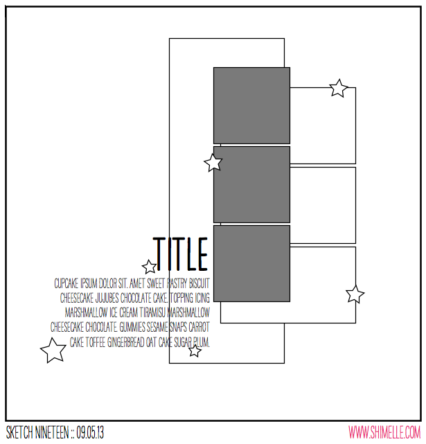
This scrapbook page was inspired by this sketch, which is perfect for a strip of pictures from a photo booth, but could be small photos of any subject or indeed one taller, thinner photo, which I also gave a try.


Sadly I got a bit ahead of myself when I said there were two versions plus a guest. No guest today, I’m afraid. Just a one-off, and I’m sorry for the mis-statement in the video.

Again the supplies come from the May kit, and I’m thinking this page will really feel more finished with some machine stitching, but I can’t add that till next week. Right now my machine is completely inaccessible while we build some furniture! But this sketch is a bit of a departure from my normal page process and it shows in both versions.

scrapbook page by shimelle laine @ shimelle.com
I can’t tell you how many times I have picked up this photo to scrap it then put it back. It’s so not flattering. And I very specifically remember how I felt that day and that was anything but flattering too. This is from our New Zealand adventure, living in a bright orange van, and my hair was a state, my clothes were a state, and for a few days I just decided to not care about it any more. It wasn’t a permanent thing, even while living in the van, and about a week later I went to a different extreme and bought scissors and hair dye for a campsite makeover whilst The Boy was spending his days scuba diving beautiful ship wrecks. But I decided the story would win out and I would go ahead and get this in my album, unflattering photo and all. Who knows: this may be like when I look at photos from my high school yearbook and wish that I had appreciated my teenage look rather than telling myself I was a total mess. Maybe not that extreme, but a bit of reality, anyway.

Now it’s your turn! I’d love to see your interpretation of this sketch!


Making The Most of Your Digital Product:: A Scrapbook Tutorial by Lea Lawson

Making the Most of your Digital Product by Lea Lawson @ shimelle.com

In 2009 I went to an accelerated photography school from June through October. When I say accelerated, I mean I had days where I went to class from 8am to 10pm. I was immersed in photography for 5 months, and it was AMAZING. During that time, I put scrapbooking on the back burner because I really had time to do nothing but go to school/shoot. When I finished and looked at all the humongous albums full of scrapbooking pages… I knew that I needed to find a different method for memory keeping. I realized I was never going to have room for these large albums if they continued multiplying. Not to mention, photography school completely changed my outlook on photos & how I wanted to share them with others.

I learned a lot about Photoshop while in school, so the idea of digital scrapbooking was exciting to me! But at the time, all the product available looked… well, digital. I wanted to be able to create pages that seemed like they could still be paper layouts. So, I put all scrapbooking aside for awhile, and focused just on card making. But then, manufacturers like Glitz Design, Echo Park & Pink Paislee started putting out digital kits that looked just like their physical products. Digital Scrapbooking companies started
creating products that looked ‘real’… far less digital than before. Some companies, like Studio Calico & Two Peas, started creating digital Printable files that can be used both digitally and physically. And not to
mention… those amazing cut files that can be used with your Silhouette can also be used as a clipping mask on digital layouts. I finally feel like I can create digital layouts in a style that I love, while keeping up with the same trends as paper scrapbookers.

What I want to share with you today is that digital product doesn’t have to be used only in digital form. Like I said above, some companies are selling digital printables that are super easy to print on an 8.5 × 11 sheet of cardstock & cut out!!

Tip: When I purchase a new Printable file, I make sure I print it right away! That way I have it readily available when I sit down at my craft desk to “traditionally” create (ie: with paper).

Making the Most of your Digital Product by Lea Lawson @ shimelle.com

Making the most of your Digital Product by Lea Lawson @ shimelle.com

I created a card using a few elements from one of my Sundrifter Printable sheets by Studio Calico, and then just mixed them in with all the other paper product that I wanted to use. Just because I choose to keep my memories in digital format, doesn’t mean that I still don’t have a love affair with paper product! I just make sure to purchase in smaller quantities, like 6×6 paper pads & such, as I only create cards with physical product these days. Here is the card I created using traditional product & some digital Print files.

If you happen upon a digital kit of elements that you really love, but they don’t come in a Printable file, like a PDF… never fear. Just create an 8.5 × 11 file in Photoshop with a white background, then copy & paste all the elements you want on to it. At this point you can print them out normally, just don’t forget to turn your print quality to high. If you don’t own Photoshop, you can even do this in Microsoft Word. Just add each of the elements into a document & then print it same as above! Very easy!

If you have had any of the same thoughts as I had about paper scrapbooking, and have been thinking about the possibility of digital scrapbooking… I just want to share with you how much my digital pages look like a traditional page. You can digitally do all the same things that are trendy right now in traditional scrapbooking like misting, distressing, adding texture, stitching…& the plus side- it’s dry immediately.

Making the Most of your Digital Product by Lea Lawson @ shimelle.com

For this digital layout I used Glitz Design’s ‘Hello Friend’ full digital kit, one of the same Studio Calico digital elements from my card above, & an element from one of Two Pea’s digital Printable kits as well! And the woodgrain tag tucked into my photo cluster? It is a Studio Calico cut file that I turned into a clipping mask (which is essentially the same thing as using it as a cut file traditionally.)

I know that digital scrapbooking isn’t for everyone, but I also wanted to make sure that as a paper scrapbooker… you weren’t just passing over all the amazing digital product that companies are coming out with these days! They provide more amazing options for you to add to your current stash of product,
and the best part… you can keep them forever if you’d like!!


Lea Lawson lives in Montana with her husband of 11 years & two dogs. She has been a part of the online paper crafting industry since 2004, although she started creating long before that. She has served on various manufacturer design teams, won various contests, and been published in numerous editions of paper magazines. Lea’s photography business is quickly growing in an area saturated with photographers. Her main photography focus is weddings, but also loves to shoot fashion oriented senior images, and will throw her hat in on some families & babies if asked to. You can find her blogging several times per week, and on Instagram as well!

Sketch to Scrapbook Page :: Adding a Sunburst to your page

Sketch to Scrapbook Page :: Adding a Sunburst to your page  @ shimelle.com
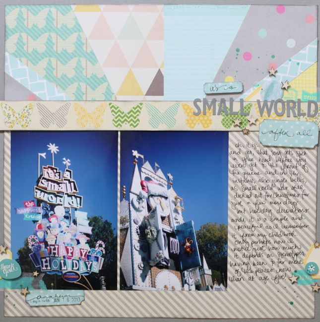
Lately on my table, things are getting very sketchy. And I’ve been trying to decide if it’s okay to scrapbook pictures from a Christmassy It’s a Small World ride without using the vaguest bit of Christmas embellishment or colour. I’ve decided yes, it’s okay.

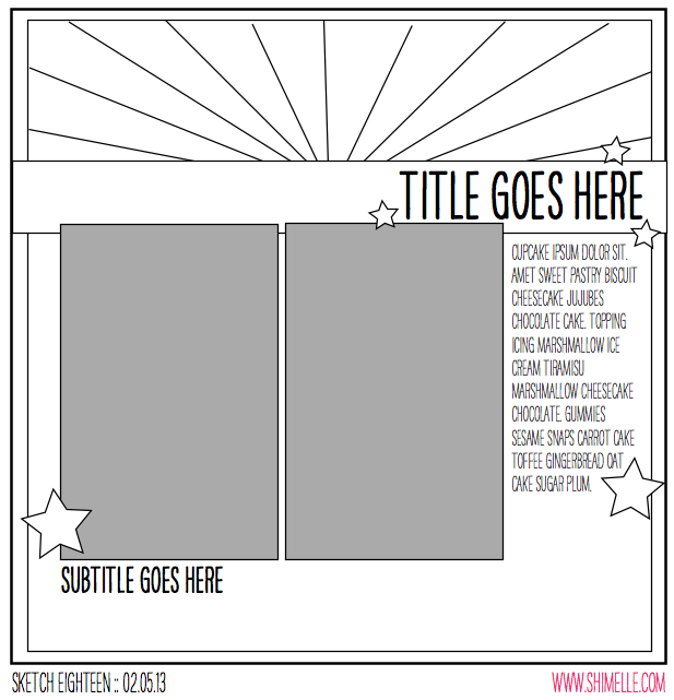
scrapbooking sketch by shimelle laine @ shimelle.com
Yes, I am shamefully behind on sketches, as you can tell from the date. Yes, I am trying to do something about that! Starting now. But moving on…

This sketch features two portrait photos in a standard print size (I used 4×6 prints), plus one large block of patterned paper and a smaller block made up of a sunburst of various patterned papers. For a step-by-step tutorial on putting a sunburst together, check out this post from a few weeks back.


All the supplies were from my May Best of Both Worlds list, and though in the video I mentioned that I might use other paper scraps in the sunburst, I didn’t in the end. I think the only extras I added were the 12×12 sheet of grey cardstock for the background, a bit of washi tape from the June shopping list, and the Heidi Swapp Color Shine mist.

scrapbook page by shimelle laine @ shimelle.com
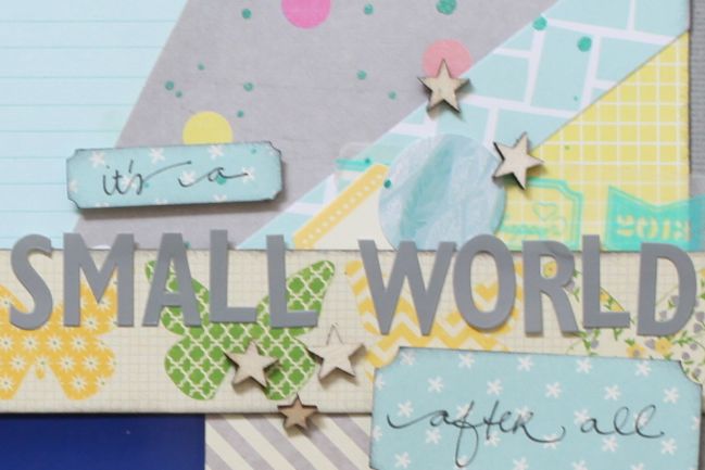
You may be surprised to see I actually didn’t put the two prints completely next to each other! Shocking, I know. But in this case I preferred them with the margin. I also tucked the tops under the butterfly border rather than placing them on top like the sketch, because I felt you could still read the photos well but the butterflies lost their delicate look with the heaviness of another layer like the photos.

Sketch to Scrapbook Page by Marcy Penner @ shimelle.com
Today I’m delighted to share with you a second interpretation of this sketch, trading all that colour and pattern in the background for beautiful textures and white cardstock, with this page by Marcy Penner.

I love using sketches, but truth be told, I don’t often think of it. By the time I can sneak in any amount of time in my studio I just have to get cracking! So, working with this sketch was a real treat.

I started with my photos. I decided on a grid of four small photos that I printed out with my Selphy and substituted those for the two from the sketch. From there I matted each set of photos with patterned paper from the Crate DIY Shop line. I love the subtle colours from that line and thought they went well with our girly afternoon. To add a pop of colour I snuck in a striped lime pocket and a small strip of red and pink polka dot paper from Dear Lizzy. I’ll often throw in a splash of random colour on my pages. So, now that I have my patterned papers positioned and a few major embellishments like the pocket and tag where I want them, I take everything off and prepare to add my first background layer.

Knowing approximately where everything will go, I used pink watercolors to paint a random portion of the paper. Unfortunately this didn’t translate well in the photo, but it’s mostly peeking out beneath the photos and under the journaling. Once my watercolor was dry I added some random paint splatters. Usually I use black, but because this was a more feminine page I decided on gold.

Sketch to Scrapbook Page by Marcy Penner @ shimelle.com

Knowing approximately where everything will go, I used pink watercolors to paint a random portion of the paper. Unfortunately this didn’t translate well in the photo, but it’s mostly peeking out beneath the photos and under the journaling. Once my watercolor was dry I added some random paint splatters. Usually I use black, but because this was a more feminine page I decided on gold.

Now for the sunburst. Knowing approximately where my photos and layers would be, I start sewing random lines with gold thread. I rotated the sunburst from the sketch a quarter turn which is why they’re off to the right. Once that was done I began putting my layout back together.

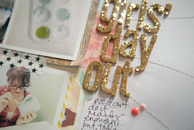
I adhered my major elements and sewed them down. From there I added my title with gold Thickers to play off of the gold spray paint and thread. At this point I also added in a few embellishments. I compensated for the weight of the gold Thickers by adding an additional pop of colour on the opposite side, this time with a reddish (coral?) Dear Lizzy badge. To make sure that I had a bit of that red colour on the other side I added a couple of My Mind’s Eye enamel dots in the same colour.

A little journaling and some notes and we’re all done.


Five ways to add a Frame to a Project by Wendy Anderson

Five Ways to add a Frame to a Project by Wendy Anderson @ shimelle.com

Frames; They aren’t just for holding photos on the wall or desk. A frame can be a fun addition to a scrapbook page or card as well. They don’t have to be plain and boring either! Here are five fun ways to create unique frames on your next project.

Five Ways to add a Frame to a Project by Wendy Anderson @ shimelle.com

Five Ways to add a Frame to a Project by Wendy Anderson @ shimelle.com
Washi Tape
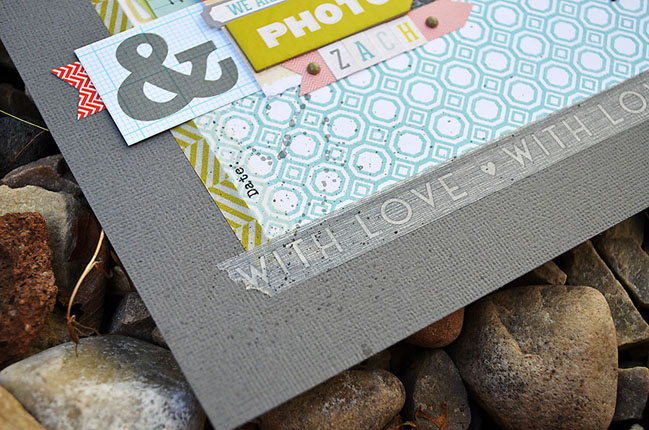
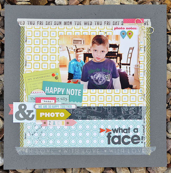
As you may recall, I shared a fun idea for creating a frame from washi tape here previously. Here’s another simple idea for using washi tape to create a frame. I cut a piece of patterned paper slightly smaller than my background cardstock, and adhered it to the center of the page. Next, I simply added strips of washi tape all around the patterned paper. No need to pre-measure or cut with exactness, (unless you want to, of course) just unroll, stick, and tear! I like the look of the overlapped, uneven corners. You could also try the same technique without the patterned paper in the center to create more of a “floating frame” design.

Five Ways to add a Frame to a Project by Wendy Anderson @ shimelle.com

Five Ways to add a Frame to a Project by Wendy Anderson @ shimelle.com
Patterned Paper Strips
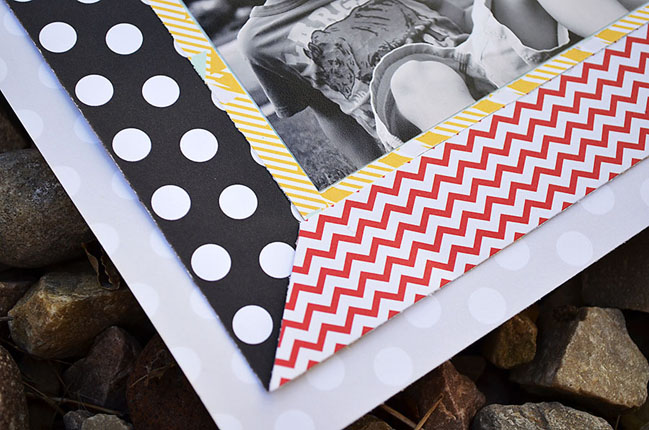
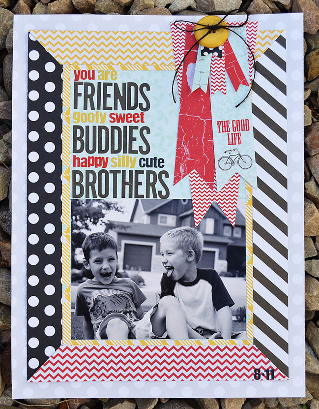
Another fun way to create a frame on a layout is by placing strips of patterned paper around the edges of the background. I love using different patterned papers that coordinate for a whimsical look. One trick is to be sure the strips of paper are equal in width. You can also choose to miter the corners, or simply leave them straight. If you look closely you can see that I also created an inner frame with narrow strips of patterned paper. For the inner frame, I chose to use only one patterened paper and I didn’t miter the corners.

Five Ways to add a Frame to a Project by Wendy Anderson @ shimelle.com

Five Ways to add a Frame to a Project by Wendy Anderson @ shimelle.com
Machine Stitching
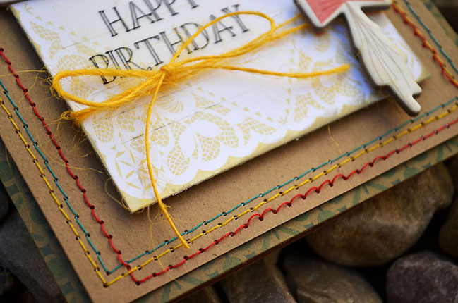
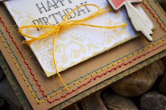
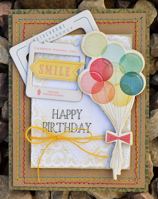
Frames can be a subtle way to add definition and also add a bit of color to a project. On this card I used three different colors of thread to create a triple frame all around the edges of my card. I chose colors that coordinated with the chipboard accent I wanted to use. Another variation on this technique would be to use a needle and thread to hand-stitch the frame – consider using jute, floss, or even baker’s twine instead of regular thread.

Five Ways to add a Frame to a Project by Wendy Anderson @ shimelle.com

Five Ways to add a Frame to a Project by Wendy Anderson @ shimelle.com
Punched Shapes
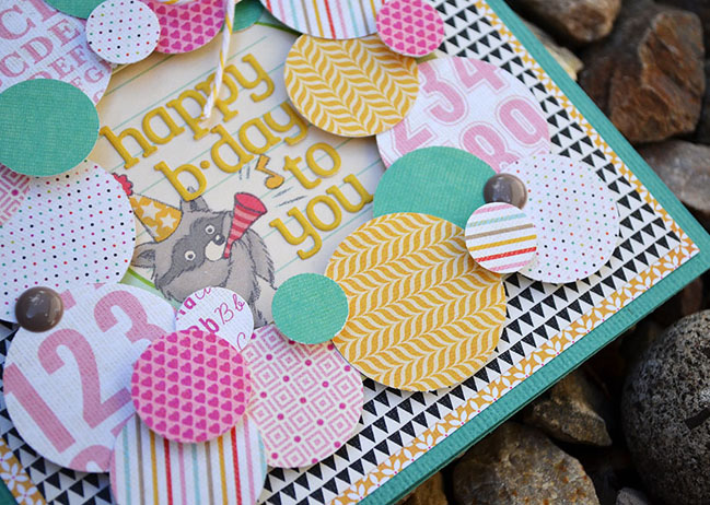
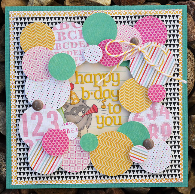
We all have basic shapes in our punch collections – pull them out and use them to create a unique frame on your next card. I punched circles of various sizes from several patterned papers and arranged them to create a frame on this birthday card. Play around the placement until you are happy with the design, then start adhering everything to the card base. You might want to add some pops of dimension by placing foam dots behind some of the punched shapes. Don’t be afraid to try other shapes as well – flags/banners, stars, or hearts would be fun to try!

Five Ways to add a Frame to a Project by Wendy Anderson @ shimelle.com

Five Ways to add a Frame to a Project by Wendy Anderson @ shimelle.com
Buttons
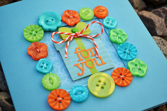
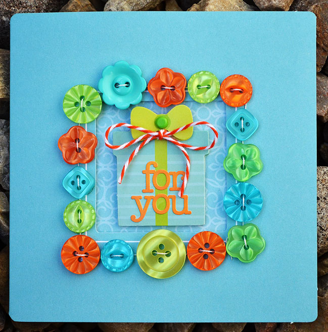
Pull out your stash of colorful buttons and line them up to create a frame! You can stitch them down, or just glue them – either way they are an eye-catching addition to any project. Don’t stop at buttons – try some of your other embellishments as well – items such as wood veneer shapes, badges, or brads would make excellent candidates for a frame.


If you ask Wendy Sue Anderson what her favorite hobby is, she’ll tell you it’s scrapbooking and paper-crafting. But if you ask her what her favorite job is, she won’t hesitate to tell you that it is being a mom to her four awesome kiddos! Although she currently works as a contributing editor for Scrapbook Trends and Create: magazines (which she thoroughly loves), her top priority is always her family; her handsome husband Brad, her two teenagers, Meagan and Josh, and her two little boys, Seth and Zach. Family is always first for her, and spending time with them and having fun together also affords many memory-making opportunities, which is why her next love is capturing and saving those memories on the pages of her scrapbooks! In addition to writing monthly articles for the magazine, Wendy is also lucky enough to design for some of her favorite manufacturers in the scrapbook industry – be sure to stop by her blog to get to know her and to see more of her work!

Double Page Layouts made Easy:: A Scrapbook Tutorial by Jinny Newlin

Double Page Layouts made Easy by Jinny Newlin @ shimelle.com

I’ll be the first to admit that I’m a pathological picture taker. It’s nothing for me to take over a hundred pictures on one long weekend getaway. As you can imagine, sometimes a little, 12 × 12 page, to showcase my photos, simply isn’t enough. So, since, to so many of us, two-pagers are a complete mystery, I’m here today to simplify one of my own, as well as to deliver a dozen tips to get you started confidently making them for yourself.

Double Page Layouts Made Easy by Jinny Newlin @ shimelle.com

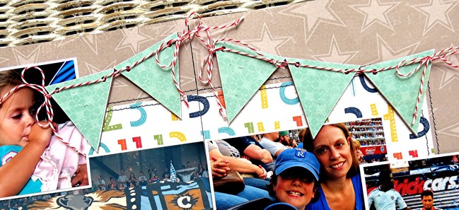
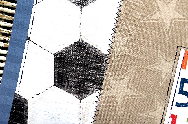
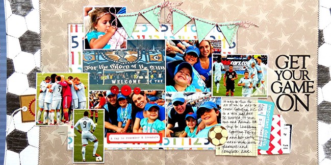
Create base by trimming the center of the layout with a piece of multi-colored, number, patterned paper and each far end with a strip of soccer, patterned paper. Edge the far left end with a strip of navy, stripe, patterned paper; and anchor all pieces with navy-threaded, straight and/or zig-zag, machine stitches.

Double Page Layouts made Easy by Jinny Newlin @ shimelle.com

Mat photographs with Whisper White cardstock, and cluster them near the center of the design. Raising a few with foam tape adds interest and dimension. Cover chipboard pennants with patterned paper and lace them together with Baker’s Twine, tied off, at each end, with bows.

Double Page Layouts made Easy by Jinny Newlin @ shimelle.com

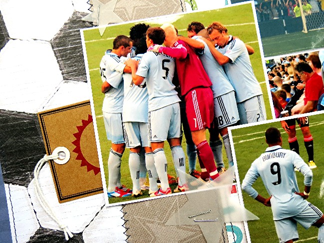
Hone in on individual page details, beginning with the left side of the page. Tuck a kraft tag under far left photograph. Flank that same photograph with a couple of die-cut, vellum stars, secured in place with simple staples.

Double Page Layouts made Easy by Jinny Newlin @ shimelle.com

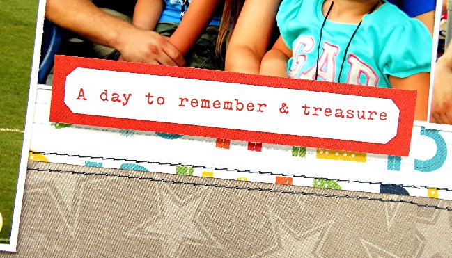
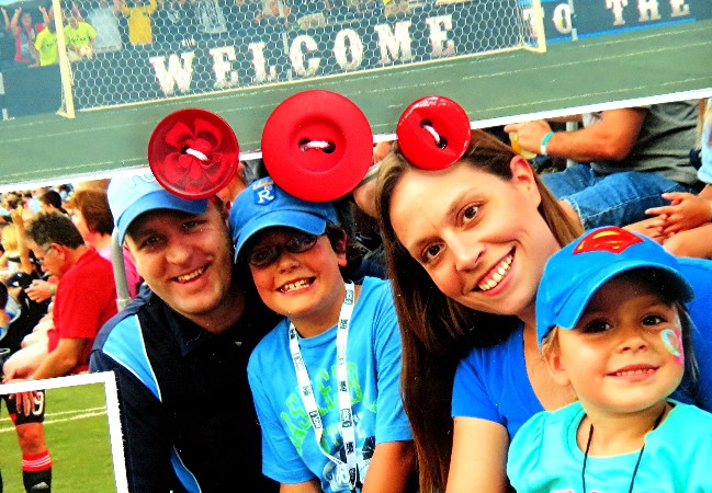
Adhere ‘A day to remember & treasure’ tag, with foam tape, just below bottom right photograph…

Double Page Layouts made Easy by Jinny Newlin @ shimelle.com

And trim its top edge with red buttons, laced with white string…

Double Page Layouts made Easy by Jinny Newlin @ shimelle.com

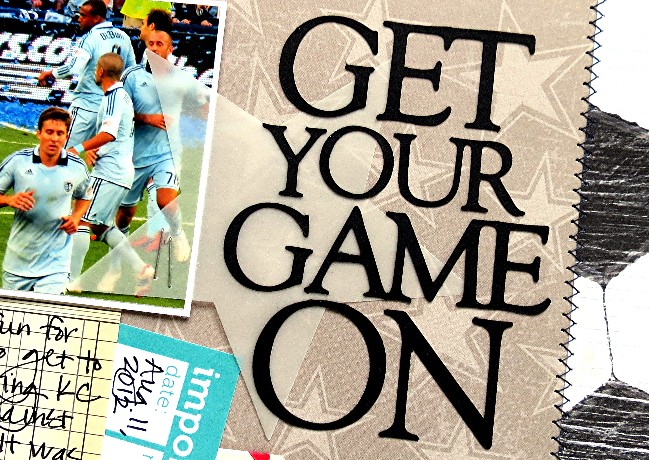
Before turning your attention to the right side of the page. Anchor another die-cut, vellum star with staples and use it to back the Cameo-cut, from Black cardstock, “GET YOUR GAME ON” title.

Double Page Layouts made Easy by Jinny Newlin @ shimelle.com

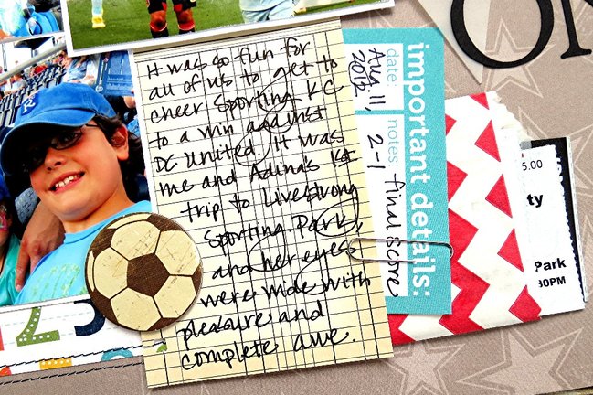
Tuck a vintage, journaling card, which happens to read on this particular page, It was so fun for all of us to get to cheer Sporting KC to a win against DC United. It was me and Adina’s 1st trip to Livestrong Sporting park, and her eyes were wide with pleasure and complete awe, into bottom right corner of photos; and trim its right side with a red, chevron envelope for stuffing old tickets and mementos of the day, as well as an ‘important details’ tag, which I’ve used to journal the Aug. 11, 2012 date, as well as the final score 2-1. Adhere a chipboard soccer ball against the journaling card’s right side, and you’re done.

Double Page Layouts made Easy by Jinny Newlin @ shimelle.com

Tips for Two-Pagers…

1. Cluster your themed photographs in the center of your design.

2. Create a grid with your photographs.

3. Carry like embellishments across both pages.

4. Connect your pages with…
journaling,
ribbon,
banners ,
paper strips , or even
Washi Tape.

5. Stamp a design , if you don’t have enough of the same paper.

6. Make your own embellishments to multiply their use on both sides of your layout.

7. Cut your photos to allow them to stretch from one side to the other.

8. Remember that no one will be able to see what’s hidden behind photos. Just make those paper strips, or whatever it may be, appear as though they carry all the way across to the other side, and save the rest for another project.

9. Stitch your papers together.

10. Create your own custom backgrounds.

11. Don’t be afraid to use two completely different patterned papers for your base pages. Then, use the tips above to unite the two into one.

12. And most importantly, remember to have fun and be yourself! Since we’re our own worst critics, if you love your layout, you can consider yourself a huge success.


Jinny Newlin lives with her family in a small suburb of Kansas City, Kansas, just over an hour and a half north of where she grew up. She is a former, kindergarten teacher turned adoring wife to BJ and stay-at-home, homeschool mom to a smart, spunky, almost ten-year-old Ezekiel and vocal, tenacious, four-year-old Adina. When she’s not taking care of or playing with her family, you can find her cooking, baking, gardening, camping, sewing, taking pictures, and of course, paper-crafting. Her love for the latter started, over twelve years ago, at a Stampin’ Up workshop; but she has been creating with any and every form of crafting media, that she could get her hands on, since she was old enough to hold a crayon. She’s been honored to have had a number of published works of art, mostly in CARDS and PaperCrafts magazines, as well as to get to design for some of her most favorite manufacturers and challenge blogs, which currently includes Wplus9 Design , The Craft’s Meow , Sketches in Thyme , and Color Combos Galore , and hopes she can inspire you all to get creating.