pretty paper. true stories. {and scrapbooking classes with cupcakes.}

lovely to meet you Twitter Facebook Pinterest YouTube

Take a Scrapbooking Class

online scrapbooking classes

Shop Shimelle Products

scrapbook.com simon says stamp shimelle scrapbooking products @ amazon.com shimelle scrapbooking products @ amazon.co.uk

Reading Material

travel

sketch of the week Category

Sketch to Scrapbook Page :: A design for photo booth strips
getting more from your patterned paper @ shimelle.com
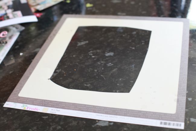
I’ve had a few discussions recently about something known by the delicate name of ‘paper gutting’. It’s rare that I show paper gutting in my videos, because I don’t think it makes very riveting viewing and I had – wrongly perhaps! – assumed if you wanted to gut your paper you were already on top of that and didn’t need me to show you what that was.

It turned out there were a few of you left completely confused when we discussed this on the Paperclipping Roundtable, so this week I wanted to share the simple process of paper gutting so you don’t find yourself with such a sharp intake of breath the next time I layer two papers on my page to show just a quarter inch border of your favourite patterned paper of all time.

Just cut a big section out of the middle and leave the edges intact. You can use a trimmer and make it all nice and tidy; I tend to opt for quick and untidy by using scissors. It doesn’t matter, since you’re going to cover it up anyway!
making a scrapbook page @ shimelle.com
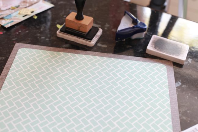
Then place your smaller-than-12×12 paper over the top and adhere around the edges so you’re not just gluing that top sheet straight to your table. Presto: the glory of the second colour peeking around the edge of the page without the heart attack of using a full 12×12 sheet for it. If you’re scrapping on a budget or trying to get the most from a kit or you just love a paper but only have one sheet of it, this can come in terrifically handy so you can add embellishment or photo mats in the same pattern as your outside frame.
scrapbook page by shimelle laine @ shimelle.com
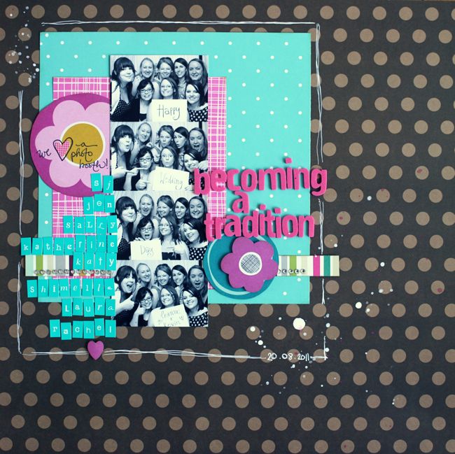
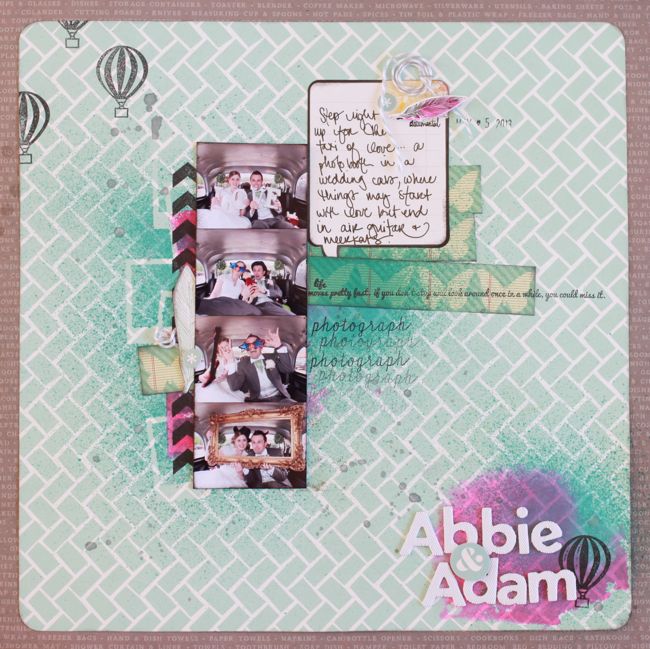
But then all measure of sensibility went out the window and I put together something entirely devoid of the idea of neat and tidy. I really wanted a splash of bright colour, and this seemed to be one way to get it: hot pink ink applied to the page with the acrylic block rather than a stamp. Everything here aside from the inks, mask, and twine is from the May Best of Both Worlds kit. I’ve actually already scrapped these photos in black and white for the wedding album, but I had them in colour too and wanted to give them a try with a messier look. I’m not convinced with the stark black and white of the journaling block, but there are other details I really like and want to rework on future pages too.
scrapbook page sketch by shimelle laine @ shimelle.com
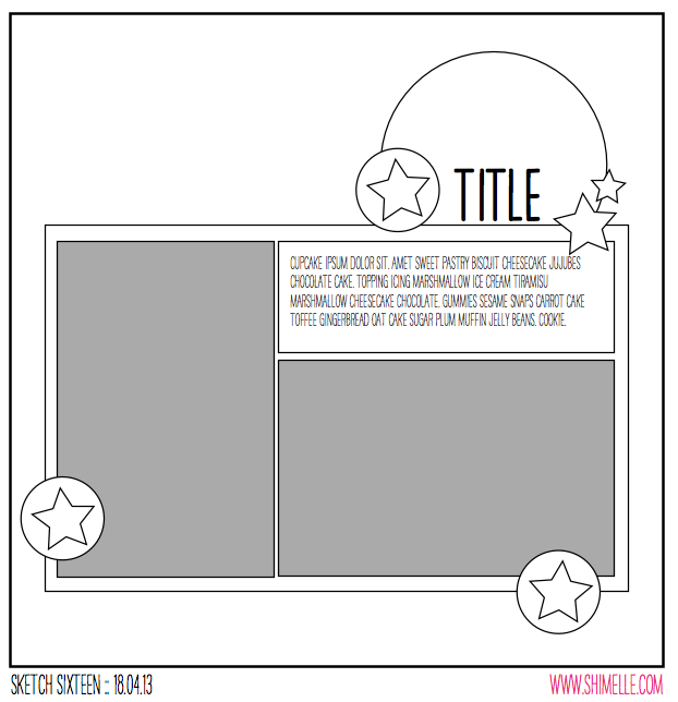
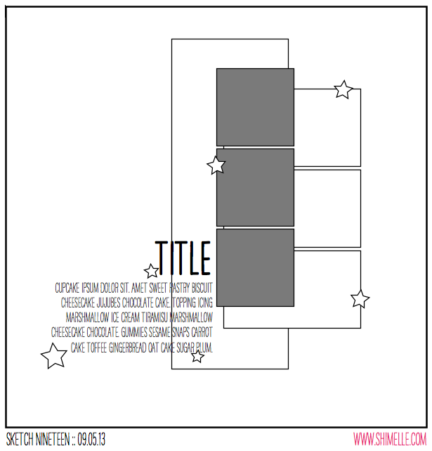
This scrapbook page was inspired by this sketch, which is perfect for a strip of pictures from a photo booth, but could be small photos of any subject or indeed one taller, thinner photo, which I also gave a try.


Sadly I got a bit ahead of myself when I said there were two versions plus a guest. No guest today, I’m afraid. Just a one-off, and I’m sorry for the mis-statement in the video.

Again the supplies come from the May kit, and I’m thinking this page will really feel more finished with some machine stitching, but I can’t add that till next week. Right now my machine is completely inaccessible while we build some furniture! But this sketch is a bit of a departure from my normal page process and it shows in both versions.
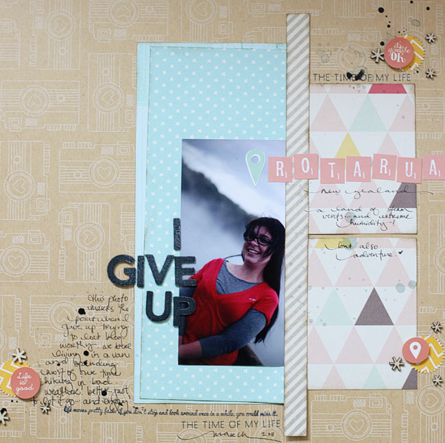
scrapbook page by shimelle laine @ shimelle.com
I can’t tell you how many times I have picked up this photo to scrap it then put it back. It’s so not flattering. And I very specifically remember how I felt that day and that was anything but flattering too. This is from our New Zealand adventure, living in a bright orange van, and my hair was a state, my clothes were a state, and for a few days I just decided to not care about it any more. It wasn’t a permanent thing, even while living in the van, and about a week later I went to a different extreme and bought scissors and hair dye for a campsite makeover whilst The Boy was spending his days scuba diving beautiful ship wrecks. But I decided the story would win out and I would go ahead and get this in my album, unflattering photo and all. Who knows: this may be like when I look at photos from my high school yearbook and wish that I had appreciated my teenage look rather than telling myself I was a total mess. Maybe not that extreme, but a bit of reality, anyway.

Now it’s your turn! I’d love to see your interpretation of this sketch!


Sketch to Scrapbook Page :: Adding a Sunburst to your page

Sketch to Scrapbook Page :: Adding a Sunburst to your page  @ shimelle.com
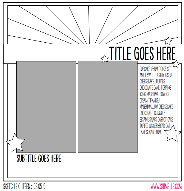
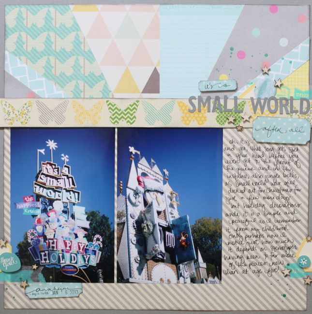
Lately on my table, things are getting very sketchy. And I’ve been trying to decide if it’s okay to scrapbook pictures from a Christmassy It’s a Small World ride without using the vaguest bit of Christmas embellishment or colour. I’ve decided yes, it’s okay.

scrapbooking sketch by shimelle laine @ shimelle.com
Yes, I am shamefully behind on sketches, as you can tell from the date. Yes, I am trying to do something about that! Starting now. But moving on…

This sketch features two portrait photos in a standard print size (I used 4×6 prints), plus one large block of patterned paper and a smaller block made up of a sunburst of various patterned papers. For a step-by-step tutorial on putting a sunburst together, check out this post from a few weeks back.


All the supplies were from my May Best of Both Worlds list, and though in the video I mentioned that I might use other paper scraps in the sunburst, I didn’t in the end. I think the only extras I added were the 12×12 sheet of grey cardstock for the background, a bit of washi tape from the June shopping list, and the Heidi Swapp Color Shine mist.

scrapbook page by shimelle laine @ shimelle.com
You may be surprised to see I actually didn’t put the two prints completely next to each other! Shocking, I know. But in this case I preferred them with the margin. I also tucked the tops under the butterfly border rather than placing them on top like the sketch, because I felt you could still read the photos well but the butterflies lost their delicate look with the heaviness of another layer like the photos.

Sketch to Scrapbook Page by Marcy Penner @ shimelle.com
Today I’m delighted to share with you a second interpretation of this sketch, trading all that colour and pattern in the background for beautiful textures and white cardstock, with this page by Marcy Penner.

I love using sketches, but truth be told, I don’t often think of it. By the time I can sneak in any amount of time in my studio I just have to get cracking! So, working with this sketch was a real treat.

I started with my photos. I decided on a grid of four small photos that I printed out with my Selphy and substituted those for the two from the sketch. From there I matted each set of photos with patterned paper from the Crate DIY Shop line. I love the subtle colours from that line and thought they went well with our girly afternoon. To add a pop of colour I snuck in a striped lime pocket and a small strip of red and pink polka dot paper from Dear Lizzy. I’ll often throw in a splash of random colour on my pages. So, now that I have my patterned papers positioned and a few major embellishments like the pocket and tag where I want them, I take everything off and prepare to add my first background layer.

Knowing approximately where everything will go, I used pink watercolors to paint a random portion of the paper. Unfortunately this didn’t translate well in the photo, but it’s mostly peeking out beneath the photos and under the journaling. Once my watercolor was dry I added some random paint splatters. Usually I use black, but because this was a more feminine page I decided on gold.

Sketch to Scrapbook Page by Marcy Penner @ shimelle.com

Knowing approximately where everything will go, I used pink watercolors to paint a random portion of the paper. Unfortunately this didn’t translate well in the photo, but it’s mostly peeking out beneath the photos and under the journaling. Once my watercolor was dry I added some random paint splatters. Usually I use black, but because this was a more feminine page I decided on gold.

Now for the sunburst. Knowing approximately where my photos and layers would be, I start sewing random lines with gold thread. I rotated the sunburst from the sketch a quarter turn which is why they’re off to the right. Once that was done I began putting my layout back together.

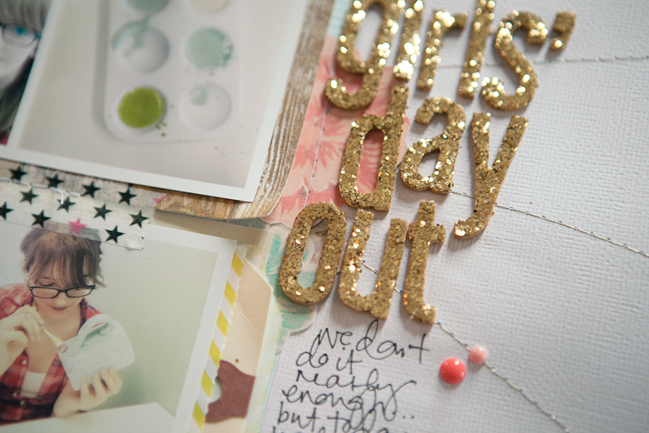
I adhered my major elements and sewed them down. From there I added my title with gold Thickers to play off of the gold spray paint and thread. At this point I also added in a few embellishments. I compensated for the weight of the gold Thickers by adding an additional pop of colour on the opposite side, this time with a reddish (coral?) Dear Lizzy badge. To make sure that I had a bit of that red colour on the other side I added a couple of My Mind’s Eye enamel dots in the same colour.

A little journaling and some notes and we’re all done.


Scrapbooking smaller photos

scrapbook page by shimelle laine @ shimelle.com
I suppose I could just be a big crafting contradiction, but I try to write it off as a need for variety: for as much as I love 4×6 prints for the majority of my photos, it can be rather fun to mix in smaller photos too. And I do love a strip from a photo booth!

scrapbook page by shimelle laine @ shimelle.com
Apparently I love a photo strip so much that I’ll also make one when it doesn’t come from a photo booth! Just printing a set of phone snaps in a row works in much the same way, and while it’s quite easy to do in Photoshop or other editing programmes, you can actually do this in a word processor and just drop them onto the page and pop them into a line then print!


This is one of my favourite small photo pages. The basic design can be used with one or two larger photos too, but the idea of plenty of small embellishments plus a grouping of small photos just keeps everything delicate and detailed.

Scrapbooking Sketch by Shimelle Laine @ shimelle.com
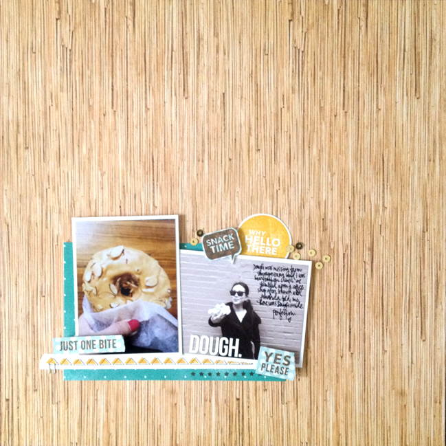
For this challenge, I set guest artist Kelly Purkey the task of using this page sketch, which she interpreted in her own style by taking it to a smaller scale.

Scrapbook Page by Kelly Purkey @ shimelle.com
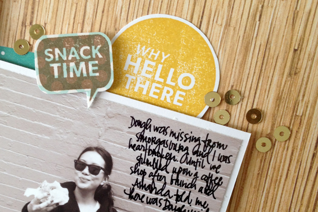
My mindset has been in smaller photos lately since I’ve been in Project Life mode and the size I use is 3×4. So I picked out two photos I had printed and made them work for Shimelle’s fun sketch. I created the same type of cluster but on a smaller scale and anchored down at the bottom of the page. I used her three groups of accents to guide me for adding some stamped words. The stamps that I used on the layout are all from my new Kelly Purkey release at Simon Says Stamp as well as the stickers and the sequins. If you are ever in New York City, I highly recommend tracking down a Dough doughnut – you won’t be sorry!

Scrapbook Page by Kelly Purkey @ shimelle.com


Kelly Purkey is a graphic designer who has recently launched her own line of paper crafting products at SimonSaysStamp.com. Her products strive to help you create projects that are bright and trendsetting with top notch designs. You can find Kelly at KellyPurkey.com and on Twitter, Instagram, and Pinterest as ‘kellypurkey’.

Your twentieth challenge is to scrapbook smaller photos! Entries close at the end of next Sunday, the 12th of May. Please check back on the 14th of May to see if you have won a prize.


Line up small embellishments on your scrapbook page

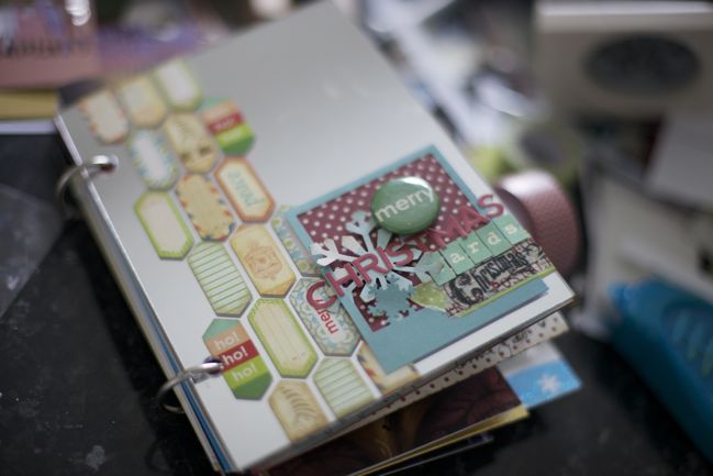
christmas card album by shimelle laine @ shimelle.com
The rhyme may go ‘pretty maids all in a row’, but in scrapbooking design terms, I tend to think it’s ‘pretty embellishments all in a row’, especially with those tiny bits and pieces we collect for our pages. Gathering them together in a row gives them more purpose and impact, so they don’t get lost!

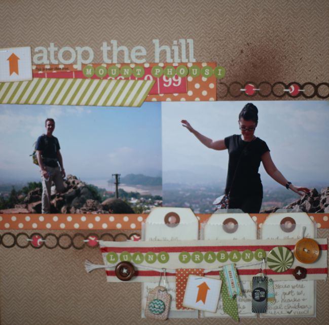
scrapbook page by shimelle laine @ shimelle.com
Of course, gathering small embellishments in a line needn’t be restricted to orderly, grid-based designs! Banners allow that same idea to be a bit more freeform and organic, and they are perfect for using a collection of somewhat random embellishments.


Glitter Girl agrees with that idea of gathering things for a banner – and also believes in gathering ideas from the gallery and stringing those different ideas together to come up with a new page whenever the dreaded ‘scrapper’s block’ kicks in! (See this page for more details on this Glitter Girl Adventure.)

Sketch to Scrapbook Page by Lisa Truesdell @ shimelle.com
For a twist on this challenge, I also sent guest artist Lisa Truesdell this sketch – which also can be used to line up several small photos as well as the embellishments – but you’ll see that’s not necessarily required!

Sketch to Scrapbook Page by Lisa Truesdell @ shimelle.com
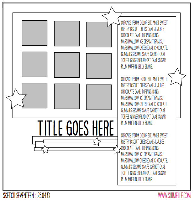
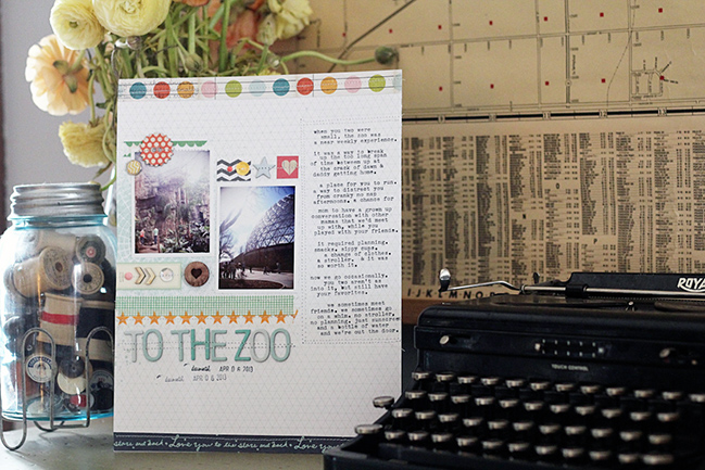
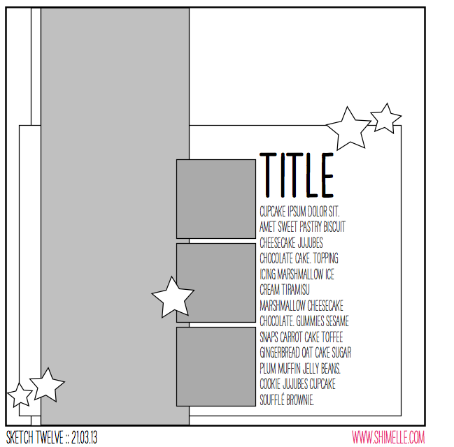
I have to be honest – I have a love/hate relationship with sketches. I love the idea of having a framework laid out for me, but I hate when I get so tied up in those guidelines that I lose sight of letting the page go where it needs to go. Before I started this page, I opened up the sketch image, and took in the main elements. A vertical block of journaling along the right, a grid of squares to the left, and a title underneath. And then I closed it and got to work. This method, as you can imagine, invites a little more wandering than if I referred back to the sketch to make sure I was staying on track.

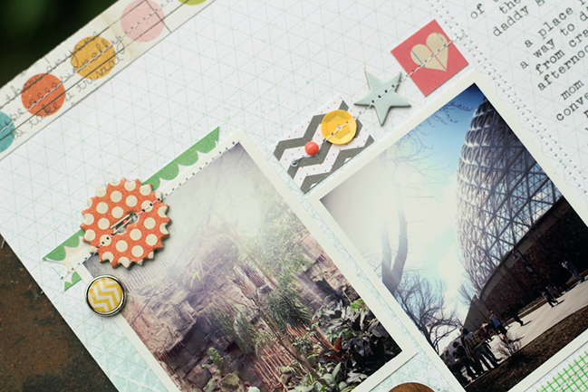
I started with a piece of patterned paper from Studio Calico, stuck it in my typewriter, and began typing. Once I’d said all I wanted, I had a nice tall column of text, and I reinforced it by stitching around it. I then turned to the grid of squares. I tried a more literal take on the sketch by building a photo mat out of squares of patterned paper, but it really wasn’t working for me. I pushed the squares around for a bit and then abandoned them for a more imperfect grid made from two staggered photos, and bits of patterned paper and embellishments from Studio Calico, My Mind’s Eye and Cosmo Cricket. From there, I added a bit of washi tape and a title and called it done. While the elements of my page don’t really match the original sketch, you can see their similarities. The three main elements on my page carry the same visual weights as in the sketch, but the looser grid is more in keeping with my own scrapbook style.

Sketch to Scrapbook Page by Lisa Truesdell @ shimelle.com
About the Artist
Lisa Truesdell lives in Omaha, NE, in a midtown neighborhood filled with big trees and old houses. She has been married to Matthew for 15 years and is a drive them all over town mom to their three boys – Alex, Ben and Sam. When she’s not making pages or chasing her boys, she is slowly making progress on a never ending list of home projects. She subscribes to too many magazines and is useless from the moment she starts a new book until she finishes it.

Eight years ago, she fell in love with a craft that allowed her to experiment with color & patterns, words and photographs. She is now thrilled to be able to immerse herself in paper + glue on a daily basis as a Creative Team member and Education Coordinator for Studio Calico.

Your fifteenth challenge is to line it up! Using the sketch is optional – do whatever inspires you most, of course! Entries close at the end of next Sunday, the 12th of May. Please check back on the 14th of May to see if you have won a prize.


Scrapbook page sketches to get you creating

Sketch to Scrapbook Page by Diana Waite @ shimelle.com
Strangely, Glitter Girl sounds a little hoarse lately, and I’ve wound up down for the count. Instead of coming to you not-quite-live from the camera in my studio, I come to you propped up on a zillion pillows and ready to be over this already. But I’m not. Trust me to go all winter without succumbing to a cold and then doing so in a royal fashion once spring arrives.

I am mostly upset that I am currently missing Pink Tree Week as frankly, this is not acceptable.

But to get back to the point of all things crafty, I really want to share these sketches and guest interpretations with you even though I’m not quite up to crafting just yet. I’m hoping soon. Very soon. To sweeten the deal until then, I have two sketches for you, with pages by Diana Waite and Amy Tan, and a special discount code for a very limited time, all here for you today.

sketch to Scrapbook Page By Diana Waite @ shimelle.com
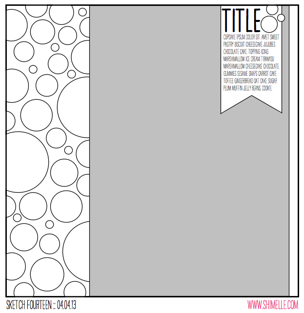
This sketch might remind you a little of a layout from years ago that I reposted just yesterday in that discussion of what to do with scraps. Except then I used it with 4×4 photos, and here the idea of lots of circles is matched with an oversized photo. Or at least that was what I imagined in my head… it’s not exactly what spoke to Diana, however!

Sketch to Scrapbook Page by Diana Waite @ shimelle.com
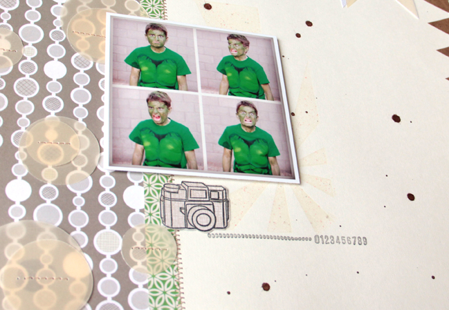
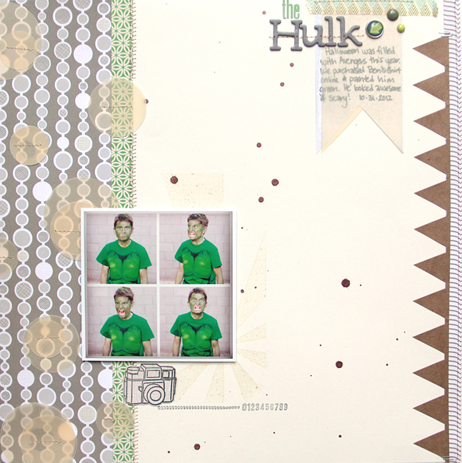
I really liked the clean lines of the sketch. I had a few goals in mind: add some techniques I don’t normally use, try something I haven’t done while using up my stash! One of the techniques I decided to try was adding vellum to my page. I’ve had vellum in my stash for a long time and have been afraid to use it! Using my 3 different sized circle punches I punched out circles and added those to the side of my layout generally following the circles found there. I carefully sewed those pieces of vellum down for my adhesive. I also added a piece of vellum to top of my journaling—and I like the look! I also added mist which isn’t a new technique, I just don’t use my mist very often. I wanted to highlight one last technique that I have always thought was magic; heat embossing. Using a versa mark ink I stamped behind where I knew I was going to place my photo, then I covered the ink with clear embossing ink. I used clear embossing powder because I wanted my layout to stay in a monochromatic tone so that the green in the pictures would pop! I mentioned before that liked the clean lines of the sketch I wanted to keep that “feeling” while multiple photos in a four inch square. I kept them small so that the viewer’s eye would really focus on the hilarious faces my son was making. Of course being a boy there were noises as well!

The photos were taken on Halloween right as the sun was setting which meant that my son was REALLY wanting me to be quick so he could go trick or treating! Within about 5 minutes I had the perfect ANGRY pictures of the Hulk.

Diana Waite lives in Arizona. She has realized that not only is scrapbooking a creative release but a joyful way to reconnect with her family. One of the best rewards is to catch the kids pulling out their albums and looking at them. Diana has been published in Creating Keepsakes, and Scrapbook Trends Magazines. She is currently designing for American Crafts and Scrapbook Circle. When Diana isn’t paper crafting she is enjoying time with her family, reading, eating chocolate, and exercising. You can find more of Diana’s work on her blog.

Sketch to Scrapbook page by Amy Tan @ shimelle.com
No, thank you, Amy. (No really, that’s actually funny to me in this current state. I’ve just laughed for three minutes and then felt quite sheepish that I thought I was funny at all, much less that funny. Anyway. Forgive me. Let’s get away from my bad humour and back to something relevant, shall we?)

Sketch to Scrapbook Page by Amy Tan @ shimelle.com
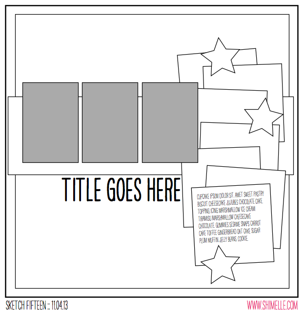
I do love a stack of papers all spread out like that, but this sketch was inspired more specifically by a previous Sketch to Scrapbook Page design, found here. (That one does include a video, by the way!) But I wanted to repeat a similar feel but a different finished structure to the design. If you compare those pages to what Amy made, you’ll see just how varied you can get with such a similar exposition!

Sketch to Scrapbook Page by Amy Tan @ shimelle.com
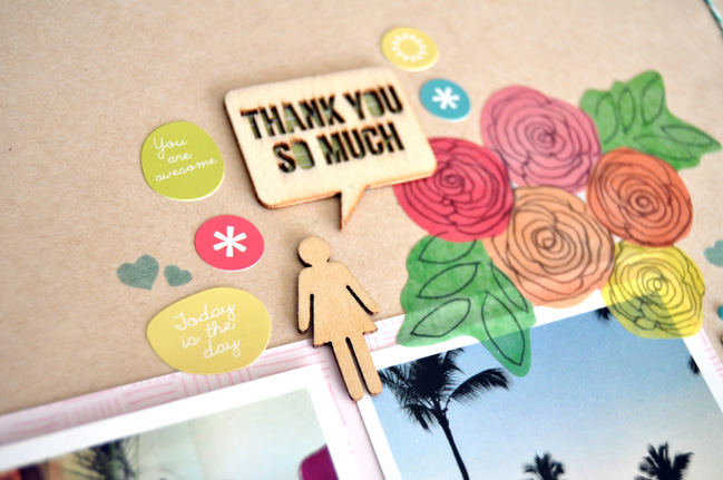
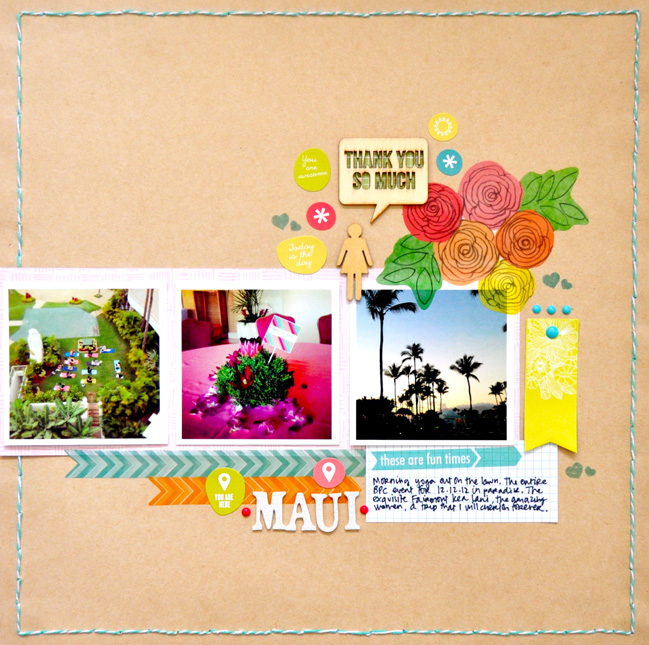
My mind was full of ideas when I first saw this sketch. I thought about stacking various patterned papers and embellishments along with 3 photos together. Then I got a bit overwhelmed at the thought of it, so I decided to start with some kraft cardstock by American Crafts. To follow the outside line of the sketch, I poked holes around the entire border and back-stitched using baker’s twine. Then I decided to use 3 square photos (3×3” Instagrams from Persnickety Prints) instead of the rectangular photos, and mounted them on a sheet of Studio Calico patterned paper. Embellishments like stickers and wood veneer are some of my favorite things, so I decided to sprinkle them along the side. For journaling, I used an Elle’s Studio tag. I stamped some hearts with Hero Arts Shadow Ink and placed some enamel dots as a finishing touch.

Amy Tan loves creating, leisurely bike rides and relaxing in her little Venice Beach apartment, which she shares with her boyfriend, JC, and her two Jack Russell Terriers, Buster and Bamboo. She’s been working on perfecting what she likes to think of as the “art of truly living,” which includes working smarter instead of harder; globetrotting; achieving balance in daily life; and collaborating with other creative people. You can see what she’s up to at her blog.

SPECIAL OFFER
Amongst other things, Amy Tan designs with Studio Calico, and just for fun we have a special discount code if you’ve been considering a kit club description. Code Shimelle30 is good for 30% off a new scrapbook kit subscription starting with the current kit, Spencer’s. But it is for a very limited time, and the offer ends at midnight (Studio Calico time) on Saturday (the 20th of April). Click here, select the subscription button, and enter the code at check out to claim your discount.

Thank you Amy and Diane for sharing your beautiful pages, though it is making me want to get up and paste things together even more! Soon, soon!!

Sketch to Scrapbook Page :: Scrapbooking with three 4x6 photos

scrapbook page by shimelle laine @ shimelle.com
In case you haven’t noticed by now, I love coming back to a few old standby designs and just changing a few small elements to the general outline of the page to make something new. This sketch is one of those examples.

It’s also an example of having zero problem with taking my page titles from Saturday Night Live sketches. (I’ll give you a topic.)

scrapbooking sketch by shimelle laine @ shimelle.com
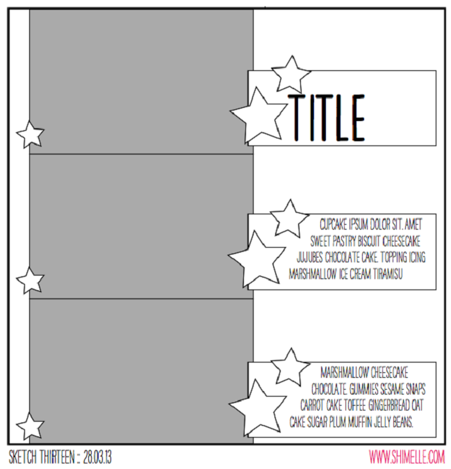
This sketch is designed for three 4×6 photos all facing the same direction, making it particularly useful for action shots in a sequence, but I’ve used the all-in-a-row concept for plenty of pages that just happen to include three portraits or three landscapes too. In fact, there’s a whole video from the 4×6 Photo Love series just about scrapping three photos, and that was the basis for the most recent Glitter Girl Adventure too. This time, instead of running a long border to connect the three photos, the sketch uses three separate elements to fill the page with repetition, providing plenty of room for journaling and embellishment.


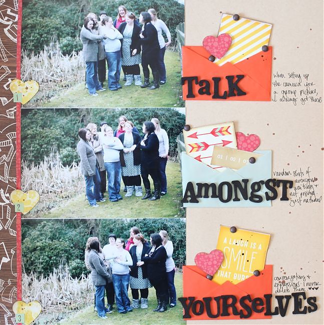
The supplies here are a bit of a mix: the embellishments come from the March Best of Both Worlds product picks, but the papers include a sheet of kraft cardstock and scraps of the two non-kit papers I used for this page, which is the facing page in the album. And just a bit of that yellow patterned paper that forms the background of that page, stolen with a punch from the part that is covered by another layer. There is also some dark brown Mister Huey’s ink and some brown candy dots by Pebbles – they are much like the enamel dots but with a matte finish instead of glossy.

I know that’s a bit of a liberal use of the kit but almost all of us have other things in our stash aside from what we order one month, right? This month it turned out that I used my papers quicker than my embellishments, so I have a few more things to share with you about how I got to the end of the March kit!

scrapbook page by shimelle laine @ shimelle.com
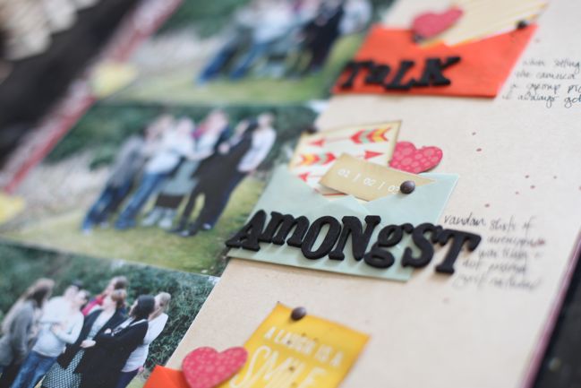
These photos are the type of pictures I find on my camera when I’ve been setting up a shot – the sort of thing where everyone gets in the right spot, but someone has to set up the camera to frame it and get the focus, then click the self-timer and run into the shot just in time. I always just tell people to talk amongst themselves while I’m messing with the camera, but secretly I love these shots because they are always so natural and show everyone just being themselves and interacting as they really would, like the camera isn’t even there. So I never delete pictures like this really – and I like how they can sit on the facing page in my album to show a behind-the-scenes glimpse at getting an ‘official’ group picture. There’s a slightly more extended version of this idea shown here, with a much bigger group of crafty girls too. Too many shots there to fit into this sketch though!

Scrapbook Page by Kristina Nicolai-White @ shimelle.com
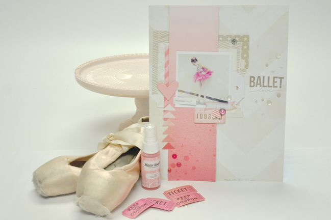
Today’s guest creates beautiful scrapbook pages, but almost always in the 8.5×11 size, so I was interested to see what Kristina Nicolai-White would do with a sketch that is so mathematically aligned to the 12×12 page. I love her result, with a delicate page and a single square photo, and really enjoyed hearing what she had to say about her creative process in getting from the sketch to her finished scrapbook page.

Scrapbook Page by Kristina Nicolai-White @ shimelle.com
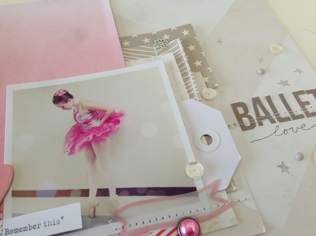
As busy as my life is these days – with three active teenage kids – I don’t find a lot of time to actually scrapbook. But when I do, it is usually about a moment. A brief moment in time that I don’t want to forget. I don’t take a lot of time to record the “firsts” or main events anymore. Because of this, I don’t usually have more than one photo that I want to actually use on a page, if any at all. However, this sketch is obviously made for three photos. I weighed out repeating my photo three times and popping up the middle for emphasis, or putting a layer of vellum over two of the three. I am an 8.5×11 scrapbooker, rather than a 12×12, so this also makes it more difficult for three 4×6 photos, unless they are smaller than a standard 4×6 print. In the end I decided to use the grey area in the sketch as more of a composition guideline rather than a rule for where the photos should lie in the composition. The grey area became the main design area for me, and instead of it being a stack of photos I used one wide piece of paper and took it from the top to the bottom as seen in the sketch. Within this area I placed my photo with the idea that my title would lie approximately in the same space shown on the sketch, in the right upper 1/3 of the composition.

I really wanted to emphasise the pink in this photo, but in trying not to take it too over the top, I used a cream/white wide chevron paper (from this pack by Crate Paper) as the background and left most of it as free space. I used a pink ombre paper from Dear Lizzy for that main greyed area where the sketch intends to be photos. The rest of the patterned papers and scraps that I used to lift up and create focus around the photo are shades of white and gray. I wanted to create a more dreamy quality to the layout as it already exists in the photo. I had edited this photo previously with several layers of filters and bokeh treatments. I really wanted the colors and papers to further convey the dreamy love feeling in the layout. The direction of the layout is almost all leading down, my daughter in the photo is looking down at her pointe shoes, the pink ombre paper is going from light to dark while the white chevron is pointing down. And then the pink triangle stack on the left side is leading up to the heart. I used few embellishments, only some Studio Calico Mister Huey mist to add depth to the pink ombre paper, a few die cuts thrown in to the paper layers, a single brad, some white sequins and a few enamel dots from My Mind’s Eye. I finished this layout with a simple title using bot letter stickers and a pen, and a date stamp.


Kristina Nicolai-White has been scrapbooking and memory keeping in various forms for most of her life. Founding and owning the online scrapbooking company Two Peas in a Bucket has kept her active and part of the scrapbooking industry for more than 15 years. Kristina loves using her iPhone to document the craziness of her everyday life with three active teenage children, two giant dogs and her high school sweetheart husband. Her work is usually full of color, products and blurry photos. You can find more of Kristina’s work in her Two Peas gallery, of course.

And now it’s your turn! Create a page in your style with this sketch, post it online, and share it with us. You can upload to your blog or to a scrapbooking gallery like Two Peas or UKScrappers, then just follow the steps to link to your project wherever it can be found online!


Sketch to Scrapbook Page :: Scrapbooking with both square and standard photos

scrapbook page by Shimelle Laine @ shimelle.com
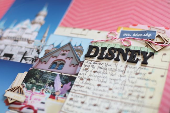
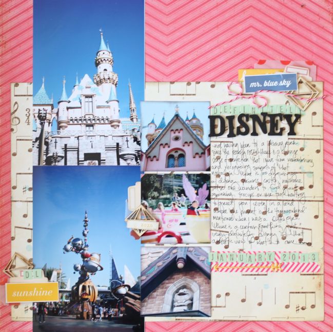
Time to return to Disneyland photos! And still not a Mickey Mouse embellishment in sight. I know some of you may be smashing your head against the desk for that, but my train of thought is that I don’t own any licensed products like that and I would really like to scrapbook these photos without adding products to my pages that are so far removed from what I use on most of my layouts – so just like I haven’t used Harry Potter products on my Harry Potter scrapbook pages, I’m not planning to use Disney products on my Disney scrapbook pages. I hope that seems sensible – to use what I have and love – and if you love patterned papers and embellishments with the Disney characters, then I would be right there cheering for you to use them! (Which leads me a bit to a recent treatise I wrote on scrapbook storytelling here, which leads to what is often my overwhelming cheer to the scrapbooking world: All hail variety!)

scrapbooking sketch by shimelle laine @ shimelle.com
This page sketch was originally designed with a panoramic portrait photo in mind – a 4×12 inch column taken from a single image. But the truth is I always have grand ideas for prints like that but actually have thousands of 4×6 prints to hand and little motivation to print special sizes like 4×12! So I used two portrait photos stacked to create that column, then three smaller square photos. On the sketch they are more like two inches square, and I imagined this as a good way to mix ‘proper’ photos with phone photos, but in truth I didn’t take any phone pictures at Disneyland and instead cropped the squares from standard prints, choosing a few nice details from photos that I didn’t feel fabulous enough to warrant their own pages in my album.


This page uses mostly supplies taken from my March Best of Both Worlds product picks, but I added a sheet of pink chevron by Crate Paper for the 12×12 background and some pink baker’s twine.

scrapbook page by Shimelle Laine @ shimelle.com
If you’re just reading and not watching the video, I can tell you I already know that embellishment grouping in the middle of the photos is going to be a love/hate choice. On the sketch, it’s a much simpler, smaller embellishment, and I think it would be less jarring that way, but I chose to make it almost as heavy in weight as the other two embellishment groupings, and it is a little unexpected in the middle of the page. I decided to go with it anyway and lightened it by using a small bit of text cut from a larger sticker instead of the same size rectangle as the other two clusters. I’m also okay with it because I looked carefully at what I was covering up on the photos and there is nothing covered that I really wanted to be visible. This is a prime example of when I decide to just try something on camera and see what I think. Is it my favourite embellishment of all time? No. But it didn’t upset me either: I’m quite happy with how it gives the page quite a whimsical look, like it’s not taking Disney too seriously. And now you know exactly how much I over-analyse my design choices!

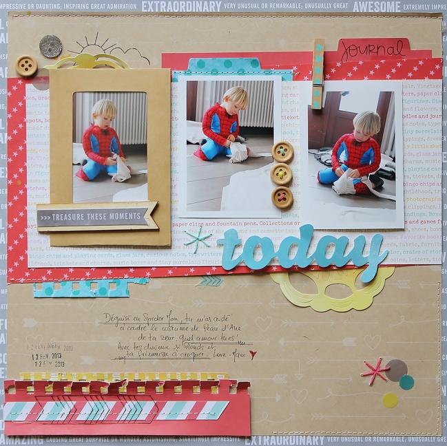
scrapbook page by Sophie Crespy @ shimelle.com
Today’s guest artist, Sophie Crespy, has a less literal interpretation of the sketch, and a beautiful page to share with you. I hope it sparks your creativity!

scrapbook page by Sophie Crespy @ shimelle.com
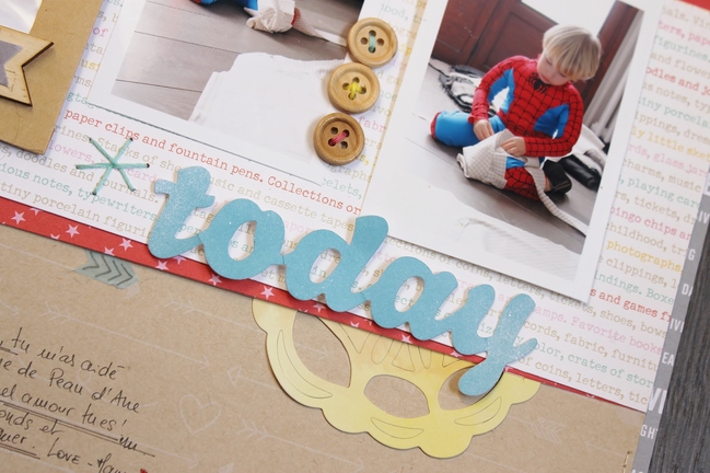
I love this sketch because of its simple lines and multiple photos: typically my type of design! I changed the square photos for a rectangle one and turned the sketch around into a horizontal layout: that way the vertical photos are balanced by the horizontal pieces of patterned papers. I love the visual triangle created by the stars on the sketch: it brings balance to the page. A visual triangle is a design tactic I use often: you can find a visual triangle on my layout created by the colours? I placed three yellow elements on my page: can you spot them? The two pieces of doily and the piece of yellow paper on the bottom left. It helps the eyes to travel on the page, from the photos to the journaling. I also replaced the stars by some stitched elements on my page, created with the new Amy Tangerine Embroidery Stencil kits. It matches the theme of my photos: my son helping me to sew a costume for his sister. I like to mix textures on my layouts: here and there is hand and machine stitching, rub-ons and buttons. The kraft envelope adds interest and creates a frame for the first photo. The photos are mounted on dimensional adhesive and the peg also adds depth to the overall design.


Sophie is a part-time teacher from France. She lives in the Alps with her husband and two children. She started scrapbooking five years ago in order to document her daily life. During those years, her style changed tremendously until she found her own style: fresh, bold and colorful, clean with a whimsical twist!
She is currently a member of American Crafts and Crate Paper design teams. She also writes articles for French and International magazines such as Entreartistes magazine. She writes about her creative adventures on her blog.

And now it’s your turn! Create a page in your style with this sketch, post it online, and share it with us. You can upload to your blog or to a scrapbooking gallery like Two Peas or UKScrappers, then just follow the steps to link to your project wherever it can be found online!


Sketch to Scrapbook Page :: Scrapbooking on the diagonal

scrapbook page by shimelle laine @ shimelle.com
Those of you who subscribe over on YouTube got an earlier glimpse of three Sketch to Scrapbook Page videos this week. I’m almost caught up to the dates on the sketches, and when I really do reach that point I may dance around my studio in joy! But now it’s far time for me to get these sketches on the blog so you can see not just the videos, but also the sketches, pages, and unique interpretations by the sketch guests. First up is a two photo layout to document a recent weekend away with friends.

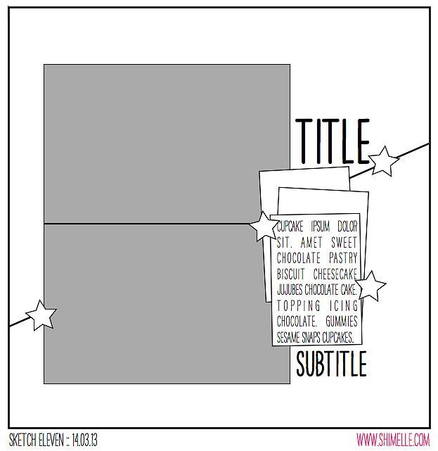
scrapbooking sketch by shimelle laine @ shimelle.com
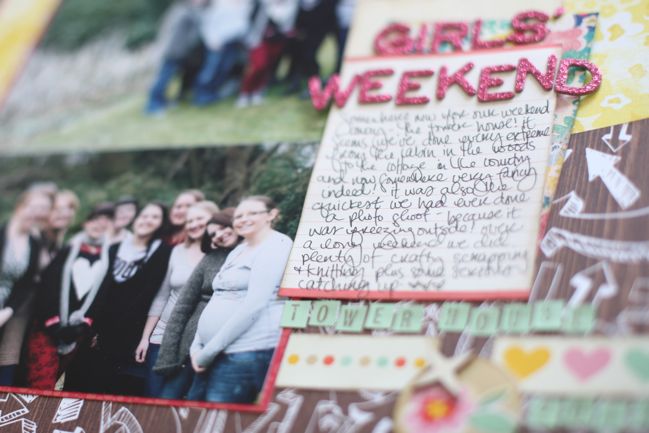
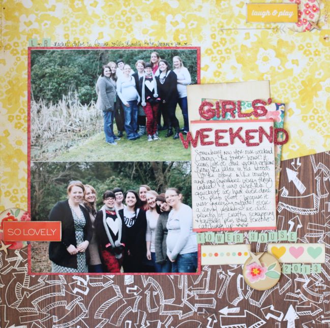
This sketch is designed for my favourite combination of photos – two standard 4×6 prints in the same direction. This time, that’s landscape. Then two patterned papers to make up the background, with one cut on the diagonal to add a quick and easy twist on a really simple page design. I just cut the diagonal with my paper trimmer, angling the paper on its side instead of lining up all tidy like normal. I’m sure there’s some amazing way you can measure this and work it out if there is an exact angle you want to achieve across your page, but I was just going for an angled line and didn’t need to be precise about that.


Most of the supplies here are from my March Best of Both Worlds product picks, but I added in the woodgrain arrow paper and some red patterned paper for the photo mat.

scrapbook page by shimelle laine @ shimelle.com
These photos were actually taken at the beginning of March, but it was freezing and definitely felt like the middle of winter. We always have a group photo session when we go away for a weekend now and then, but this one was finished in record time because we couldn’t wait to get back inside to the warm. They will forever make me laugh because I was so cold, I didn’t bother to tie my shoes for wasting time once the door was open. I love these getaways with such lovely and creative girls I’m so lucky to call friends, and I tend to scrap most of the photos we take on our little escapes – so you’ll see a page soon that goes opposite this one in my 2013 album.

scrapbook page by Leslie Ashe @ shimelle.com
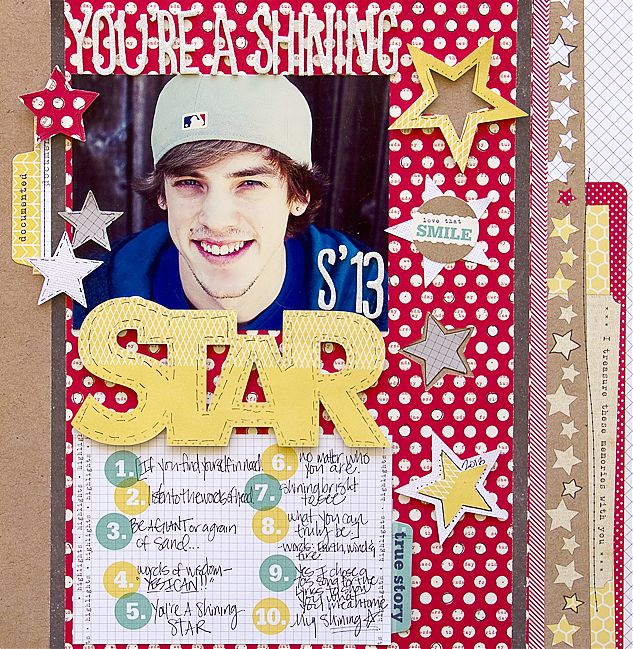
Today’s guest, Leslie Ashe, has a different twist on this sketch, having taken her inspiration from different parts of the design that what I first noticed. If the diagonal line isn’t your thing or you don’t want to use two landscape photos, check out how Leslie took her inspiration from the two stacked elements on the left and the stars as embellishments.

scrapbook page by Leslie Ashe @ shimelle.com
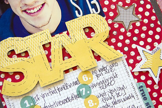
This sketch was so fun! It let me be creative in my own way, with keeping with some of the details of the sketch itself. I decided to stay with the rectangle shape by using a 4×6 photo and a journaling card. I wanted to separate the two, so I cut a title with my Silhouette Cameo and placed as a border. I used that as my main title and my subtitle is my note card with numbers and journaling. I love stars so of course I had to use them on this layout about my sweet son! I was inspired by the Elle’s Studio paper and tags (from the Day To Day collection) I used and built my layout from there. Punching several stars to embellish my title really made my project stand out and draw you to my subject.


Leslie Ashe is a born & bred Texan girl who loves to create memories with her family & put them on paper to remember always. She began scrapbooking over sixteen years ago after going to a craft party with friends. She’s blessed to have work published in Scrapbook Trends, Cards, Simply Handmade, Create: Idea Books, and Creating Keepsakes magazines. She designs for American Crafts, Pink Paislee, Lily Bee Design, Prima and Noel Mignon Kit Club. You can see more of her work on her blog, or follow her on Twitter, Facebook, Pinterest or Instagram.

And now it’s your turn! Create a page in your style with this sketch, post it online, and share it with us. You can upload to your blog or to a scrapbooking gallery like Two Peas or UKScrappers, then just follow the steps to link to your project wherever it can be found online!