Sketch to Scrapbook Page :: Scrapbooking with three 4x6 photos
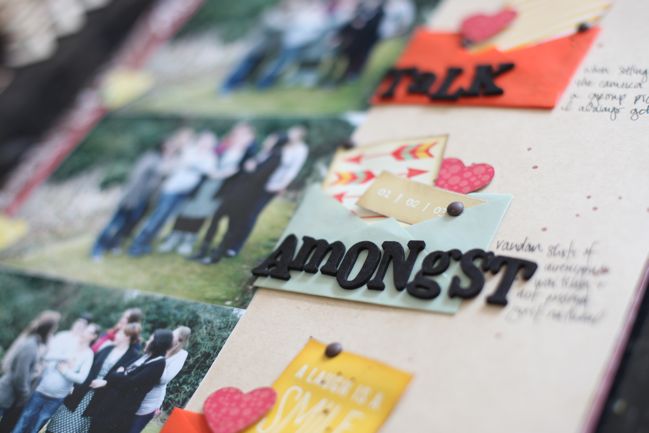
In case you haven’t noticed by now, I love coming back to a few old standby designs and just changing a few small elements to the general outline of the page to make something new. This sketch is one of those examples.
It’s also an example of having zero problem with taking my page titles from Saturday Night Live sketches. (I’ll give you a topic.)
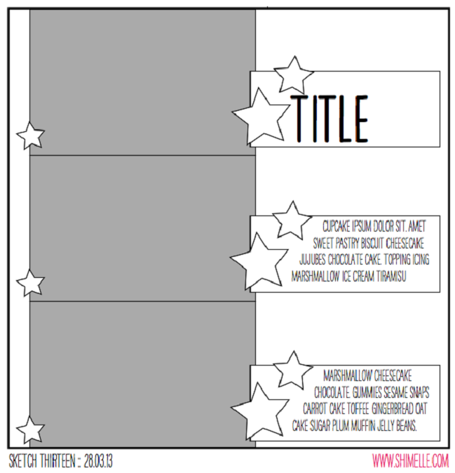
This sketch is designed for three 4×6 photos all facing the same direction, making it particularly useful for action shots in a sequence, but I’ve used the all-in-a-row concept for plenty of pages that just happen to include three portraits or three landscapes too. In fact, there’s a whole video from the 4×6 Photo Love series just about scrapping three photos, and that was the basis for the most recent Glitter Girl Adventure too. This time, instead of running a long border to connect the three photos, the sketch uses three separate elements to fill the page with repetition, providing plenty of room for journaling and embellishment.
The supplies here are a bit of a mix: the embellishments come from the March Best of Both Worlds product picks, but the papers include a sheet of kraft cardstock and scraps of the two non-kit papers I used for this page, which is the facing page in the album. And just a bit of that yellow patterned paper that forms the background of that page, stolen with a punch from the part that is covered by another layer. There is also some dark brown Mister Huey’s ink and some brown candy dots by Pebbles – they are much like the enamel dots but with a matte finish instead of glossy.
I know that’s a bit of a liberal use of the kit but almost all of us have other things in our stash aside from what we order one month, right? This month it turned out that I used my papers quicker than my embellishments, so I have a few more things to share with you about how I got to the end of the March kit!
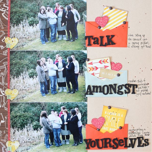
These photos are the type of pictures I find on my camera when I’ve been setting up a shot – the sort of thing where everyone gets in the right spot, but someone has to set up the camera to frame it and get the focus, then click the self-timer and run into the shot just in time. I always just tell people to talk amongst themselves while I’m messing with the camera, but secretly I love these shots because they are always so natural and show everyone just being themselves and interacting as they really would, like the camera isn’t even there. So I never delete pictures like this really – and I like how they can sit on the facing page in my album to show a behind-the-scenes glimpse at getting an ‘official’ group picture. There’s a slightly more extended version of this idea shown here, with a much bigger group of crafty girls too. Too many shots there to fit into this sketch though!
Today’s guest creates beautiful scrapbook pages, but almost always in the 8.5×11 size, so I was interested to see what Kristina Nicolai-White would do with a sketch that is so mathematically aligned to the 12×12 page. I love her result, with a delicate page and a single square photo, and really enjoyed hearing what she had to say about her creative process in getting from the sketch to her finished scrapbook page.
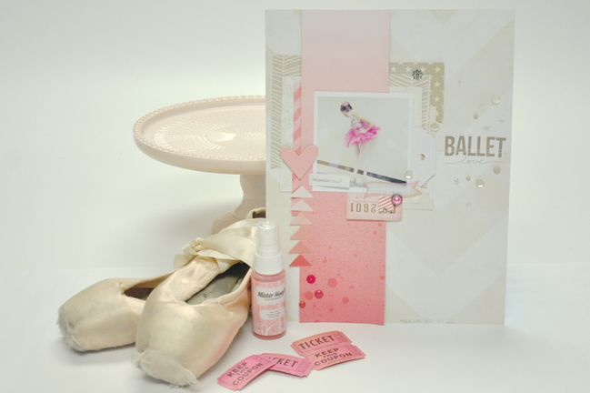
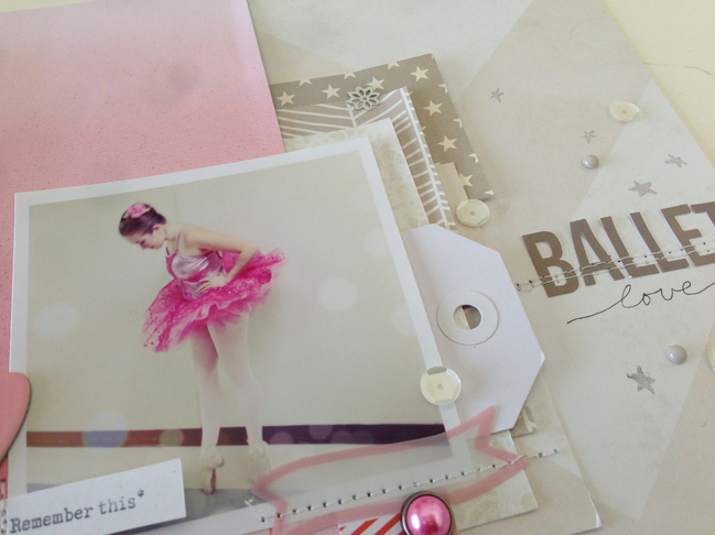
As busy as my life is these days – with three active teenage kids – I don’t find a lot of time to actually scrapbook. But when I do, it is usually about a moment. A brief moment in time that I don’t want to forget. I don’t take a lot of time to record the “firsts” or main events anymore. Because of this, I don’t usually have more than one photo that I want to actually use on a page, if any at all. However, this sketch is obviously made for three photos. I weighed out repeating my photo three times and popping up the middle for emphasis, or putting a layer of vellum over two of the three. I am an 8.5×11 scrapbooker, rather than a 12×12, so this also makes it more difficult for three 4×6 photos, unless they are smaller than a standard 4×6 print. In the end I decided to use the grey area in the sketch as more of a composition guideline rather than a rule for where the photos should lie in the composition. The grey area became the main design area for me, and instead of it being a stack of photos I used one wide piece of paper and took it from the top to the bottom as seen in the sketch. Within this area I placed my photo with the idea that my title would lie approximately in the same space shown on the sketch, in the right upper 1/3 of the composition.
I really wanted to emphasise the pink in this photo, but in trying not to take it too over the top, I used a cream/white wide chevron paper (from this pack by Crate Paper) as the background and left most of it as free space. I used a pink ombre paper from Dear Lizzy for that main greyed area where the sketch intends to be photos. The rest of the patterned papers and scraps that I used to lift up and create focus around the photo are shades of white and gray. I wanted to create a more dreamy quality to the layout as it already exists in the photo. I had edited this photo previously with several layers of filters and bokeh treatments. I really wanted the colors and papers to further convey the dreamy love feeling in the layout. The direction of the layout is almost all leading down, my daughter in the photo is looking down at her pointe shoes, the pink ombre paper is going from light to dark while the white chevron is pointing down. And then the pink triangle stack on the left side is leading up to the heart. I used few embellishments, only some Studio Calico Mister Huey mist to add depth to the pink ombre paper, a few die cuts thrown in to the paper layers, a single brad, some white sequins and a few enamel dots from My Mind’s Eye. I finished this layout with a simple title using bot letter stickers and a pen, and a date stamp.
| Kristina Nicolai-White has been scrapbooking and memory keeping in various forms for most of her life. Founding and owning the online scrapbooking company Two Peas in a Bucket has kept her active and part of the scrapbooking industry for more than 15 years. Kristina loves using her iPhone to document the craziness of her everyday life with three active teenage children, two giant dogs and her high school sweetheart husband. Her work is usually full of color, products and blurry photos. You can find more of Kristina’s work in her Two Peas gallery, of course. |  |
And now it’s your turn! Create a page in your style with this sketch, post it online, and share it with us. You can upload to your blog or to a scrapbooking gallery like Two Peas or UKScrappers, then just follow the steps to link to your project wherever it can be found online!
![]() Read more about: sketch-of-the-week best-of-both-worlds-kit
Read more about: sketch-of-the-week best-of-both-worlds-kit
Next post: What I made with the March scrapbooking kit
Previous post: Sketch to Scrapbook Page :: Scrapbooking on the diagonal


