pretty paper. true stories. {and scrapbooking classes with cupcakes.}

lovely to meet you Twitter Facebook Pinterest YouTube

Take a Scrapbooking Class

online scrapbooking classes

Shop Shimelle Products

scrapbook.com simon says stamp shimelle scrapbooking products @ amazon.com shimelle scrapbooking products @ amazon.co.uk

Reading Material

travel

sketch of the week Category

Sketch to Scrapbook Page :: Starting with mist
scrapbook page @ shimelle.com
After a few sketches that focused on bringing square and rectangular photos together on the same scrapbook page, it was time to move on to something else, and the next four sketches all have something in common: they start with mist.
scrapbooking sketch @ shimelle.com
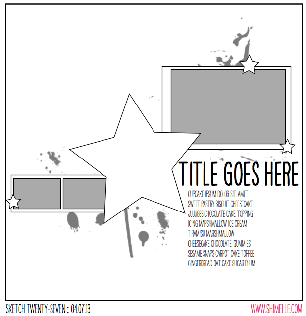
Of course there is no way to accurately depict the random splatters of mist on a sketch! So do please excuse my artistic limitations when it comes to drawing things like this, but the general idea of where to aim with droplets of mist is there somewhere! In this case, it also comes with a large embellishment in the middle of the page as a bit of a different design to what we’ve tried so far.


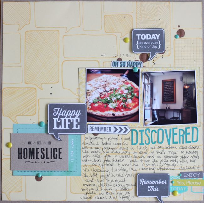
The supplies for this page came from the June Best of Both Worlds product picks, plus two shades of mist, some enamel dots, and a date stamp.
scrapbook page by shimelle laine @ shimelle.com
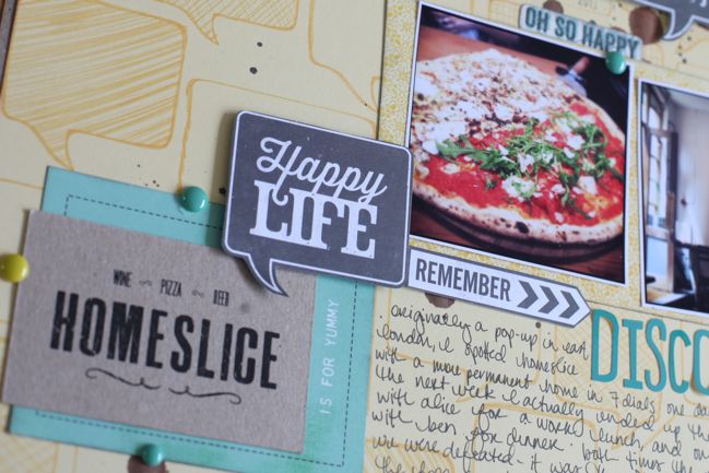
Early in 2013, I made a conscious decision to start scrapbooking more about the places we eat. I’ve photographed food off and on for quite a while, but one thing I liked seeing pop up in friends’ Project Life albums was the record of going out to eat somewhere lovely. I don’t necessarily want to record every place like that, and if I tried to make a page from everywhere I’ve photographed the food, I would be looking at a very long to do list. Instead I wanted to focus on the stories of these places, and I’ve found this to be quite a rewarding addition to my albums this year. I’ve recorded our appreciation for the unique flavour choices at our favourite ice cream gelato place, documented my habit of going to three specific places nearby whenever I decide to make the trip to the far side of town to visit my favourite coffee shop, and on this page I wanted to tell the story of a place we discovered just before it was discovered by the media, and how we managed to go there and walk right up to a table, no problem, and a week later there was an hour long wait because it had been featured with great reviews in all the papers. I read a lot of those reviews, and it’s a pretty rare occasion to just stumble upon a great find before it’s well and truly found by everyone. So that seemed story enough!
scrapbook page by Ewa @ shimelle.com
Please welcome a very talented lady who goes by just one name! Ewa comes to us from Norway, and I love her bold and artistic style, perfect for showing us what we can really do with a sketch that starts with mist.
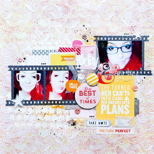
scrapbook page by Ewa @ shimelle.com
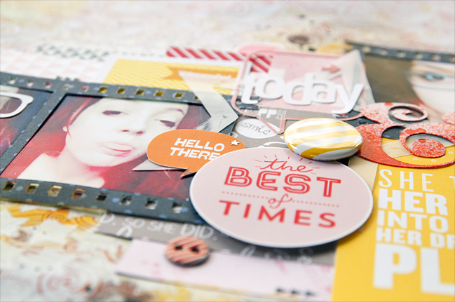
When I start to work with a sketch I like to take it seriously. I try to imitate what I see in the sketch with what I see on my work. I also love to throw in a lot of embellishments, tags, and additives, so I usually go beyond what is in the sketch. These photos allude to my first glasses, which I started wearing a few days ago so I tried to make this theme in different ways.

I started working on this scrapbook page by making a choice of photos and paper background. Then I chose the rest of the papers, which I looked through making sure that the colors fit together. When I have selected all the papers which I wanted to use on my work and I had the initial composition I prepared a background. In this work I used gesso and star mask from The Crafter’s Workshop. I cut the title, film strip frame, and the ampersand with a Silhouette Cameo, which I splashed with Overdue Mister Huey’s mist. I decided to gently cover up the main star from the sketch so that it was not the main element of the layout and I decided to do that with vellum. When I glued all the papers I looked through all my embellishments and chose anything to fit. I tried to create a lot of interesting places on the page which catch the eye – including My Mind’s Eye’s buttons, star-shaped mistable Thickers, flair badges and printable journaling cards from Studio Calico, and washi tape. At the end I splashed the whole page with different shades of Mister Huey’s mist, and added some yellow paints and stamps from Scrapperin, called ‘Form & Feder’.

I encourage you to experiment with the amount of additives – do not be afraid of extra embellishments – they look much better at work than on the bottom of your drawer!


Ewa currently living in Oslo, Norway with her husband. She is a kindergarten teacher who loves all things crafty but scrapbooking forever stole her heart. She began scrapbooks in 2011 because of her love for paper and cute embellishments. She creates mainly layouts, and 12 × 12 inch is an ideal working size for her. Ewa’s style is bright with lots of colors and embellishments. She has been on several design teams and now she currently serves on teams at Sketchbook365 and Scrap It Now. You will find her at her blog.


Sketch to Scrapbook Page :: Scrapbooking with a favourite patterned paper

scrapbook page @ shimelle.com
I’ll be honest: my scrapbooks as a whole are certainly about the stories. I refer back to my albums as I make each and every page to see how the story unfolds, and that is my long-term love with this craft. But my short term love is patterned paper, and when I find a design I love, I don’t always want to cover it with other page elements. I fall back to a handful of designs that work as some sort of compromise between those two points – room to tell a story, but also a place to include much of a pretty paper design.

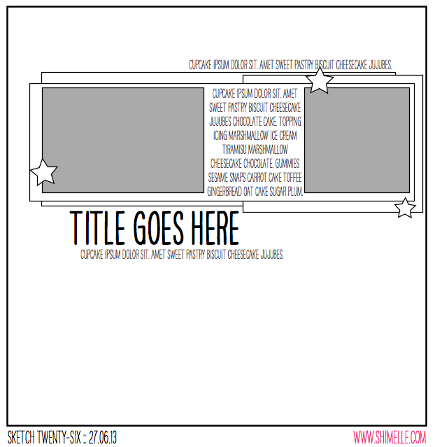
scrapbooking sketch @ shimelle.com
This sketch is another intended to mix a rectangle and square photo, but this time at 4×6 and 4×4, so it could work well for two photos that both started at 4×6 and one just looked better cropped to a square. This design also works perfectly for patterned papers you don’t really want to cover entirely, as there is plenty of open space to let a pretty pattern appear without interfering with your photos.


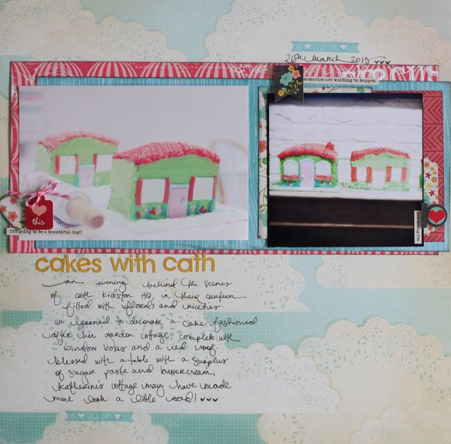
The supplies for this page come from the June Best of Both Worlds kit, and I’m still a little amazed at how much I like this title with just small, flat letter stickers and not Thickers. My love for Thickers has not gone away, but given the challenge, I like how this title is a bit more delicate and understated, though not in any way script or fancy.

scrapbook page by shimelle laine @ shimelle.com
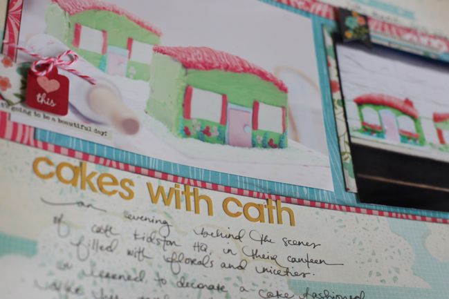
And yes, this page is about making cottage-inspired cakes at Cath Kidston headquarters! Workshops are something new at Cath Kidston, and something tells me this was a bit of a research and rehearsal opportunity for their upcoming flagship store on Regent Street, reported to include a classroom space. I’m saving my pennies now, because I’m not sure how often I’ll be able to say no to crafting and baking workshops in the land of pretty fabric and flowers.

scrapbook page by Mendi Yoshikawa @ shimelle.com
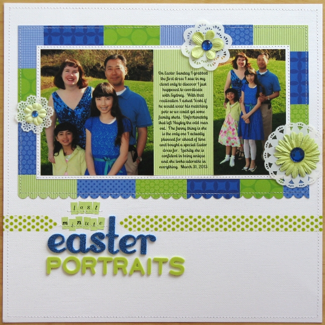
Please welcome Mendi Yoshikawa as today’s guest. Mendi has some great ideas for adapting a sketch to work with your photos when they don’t fit the design exactly, and she was able to make that journaling-between-the-photos element work too.

scrapbook page by Mendi Yoshikawa @ shimelle.com
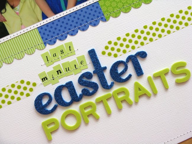
As soon as I saw this great sketch I immediately thought of some recent family photos my family had taken this past Easter. Unfortunately when pulling them out I realized unlike the sketch my photos were vertical and square. With a little creativity I was able to alter the design to fit my needs by enlarging my square photo and making my vertical photo the same height. In the sketch the mats which framed the photos in varying sizes inspired me to cut small strips of Doodlebug papers in a fresh blue and green color scheme to compliment my photos. In my planning I had originally planned for this to be a border made up of washi tape, but in the end my tapes weren’t quite the right hue and I went in a different direction. To add a bit of frill and softness to my intense color palette I decided to cut some doilies from KI Memories Doily Transparency sheet using them in place of the stars in the sketch to form my visual triangle. For my title, it somehow felt like it was floating out there all alone so in an effort to ground it I created a washi tape border cut into pointed arrow tips to tie it all together. To complete my layout I stitched a simple white on white border around the perimeter of my page for a small subtle finishing touch.


Mendi Yoshikawa lives in Washington state with her husband and two girls. She has a passion for using sketches, loves linear designs and brightly colored tone-on-tone patterned papers, and has a self-described addiction to her sewing machine. You can find her at her blog , pinterest , and see more of her work at her online gallery at Two Peas In A Bucket.


Sketch to Scrapbook Page :: Scrapbooking with a title on the photo

scrapbook page @ shimelle.com
Since making the transition into sharing most of my pages through video, I’ve found I get feedback on things in a slightly different way, since it’s easier to see what I was thinking when I made a decision to add this here or that there. Maybe before it was more likely to look at something unexpected on a page and just say What was she thinking? but now it’s all there, readily explained! One thing I didn’t realise was just how many scrappers squirm at the idea of putting anything on top of a photo. On my own pages, it’s been rare for me to not have some element of the page overlap a photo somewhere in the design. Sometimes more, sometimes less, but it’s always a stylistic choice of how to connect the different parts of the page and have less separation between paper and pictures. I like the flow of one to the other, without a straight line of division between the two. I understand the idea of wanting the entire photo on show and I wouldn’t start sticking pop dots on top of a one-of-a-kind photo from a hundred years ago, but maybe digital photos have just made me brave! But with this next sketch, I decided it was time to just embrace the over-the-photo idea in a pretty direct way.

scrapbooking sketch @ shimelle.com
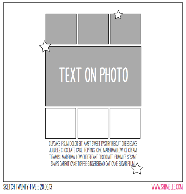
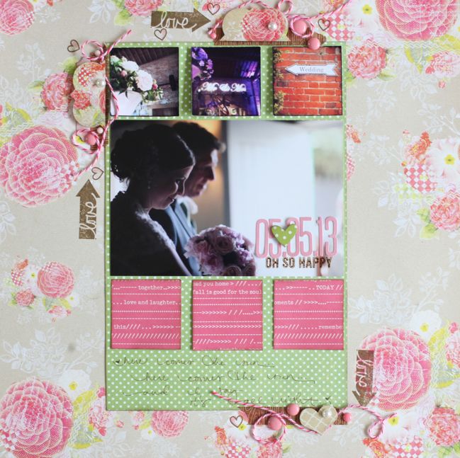
This sketch is another that can be used with a mix of square and rectangular photos – so the square photos are from my phone and the 4×6 photo is from my standard camera. The squares below the photo are shown as patterned paper, but if you had additional square photos, you could add them here. Likewise, this sketch could be followed directly with just the one photo in the centre and all the boxes from paper.


The supplies for this page are mostly from the June Best of Both Worlds product picks. If you haven’t seen other pages from this album, Glitter Girl’s Wedding Album Answers episode covers the set-up for this book, including picking the colour scheme and supplies.

wedding scrapbook page by shimelle laine @ shimelle.com
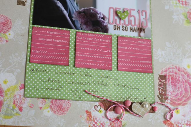
One thing I think I would do with this sketch in a second interpretation is to dress up those three squares of patterned paper. Perhaps keeping the embellishment around the edges simpler, this would be a great place to stack up layers of punches and labels or add something dressy like flowers, but with the smaller details and textures included in those three areas of embellishment around the edge, I felt extra embellishment on the squares would just be too much, especially for the feel of this particular album. But I do like the lettering right on top of the photo, and pictures that have space for that like this image work really well. I can also imagine placing the title in the centre of a 4×6 photo of a beautiful sky, surrounded by six square snaps from a hike perhaps. What type of image would you be happy to use as a base for the title?

Sketch to Scrapbook Page:: Angular Squares by Shanna Noel @ shimelle.com
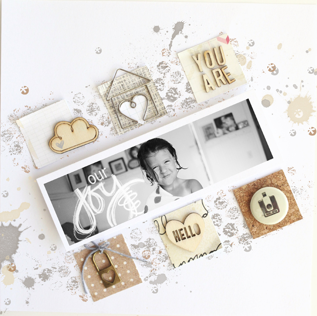
Please welcome Shanna Noel as today’s guest artist. I love how she added an unexpected twist to this sketch, and the more varied embellishment she included has such lovely detail.

Sketch to Scrapbook Page:: Angular Squares by Shanna Noel @ shimelle.com
I have a difficult time working in graph designs and always look forward to pushing myself to work ‘outside the box’ and work in ways that I wouldn’t naturally. Many of you might feel very comfortable working in graph designs and if that is the case I challenge you to find a way to mix it up a bit to work outside your box! To get started, I got out my square punch and punched six squares from random papers in my stash. I found myself going for some browns and greys and decided to continue that theme throughout the layout. From there I laid the squares on my layout and decided on my photo size from there. I work mostly with 8 × 8 pages and chose a long and lean photo space. Gathering some of my favorite products from around the room, I paid attention to texture and weight of my elements I was adding, making sure to keep it all as balanced as needed. I like that the alpha, cloud, and heart are all wood and form a triangle on the page. I then added some metal with the locket and metal paper clip, and I finished off that triangle with a piece of flair. At this point I decided that straight on design was just not cutting it for me and this layout, so I decided to put it all on an angle. Now that I had the bones of my layout, I wanted to add some mess to it! I made the base of my layout in Photoshop using some elements from CD Muckosky and Amy Martin to match the colors I had already put together. I love how paper and digital elements come together in such a customizable way! I can’t wait to see what you all do with the sketch.


Shanna Noel lives in Northern California with her high school sweetheart and husband of 14 years. They are loving having a house full of laughter that includes their two children Jaden (11) and Addison (6). She discovered digital scrapbooking when she was pregnant with Addison and just loved capturing her families memories in such a creative way. In June 2011 she ordered her first paper kit, and never looked back! You can now find her work in the gallery at Studio Calico as well as a peek into her daily life on her blog and instagram.


Sketch to Scrapbook Page :: Scrapbooking with 4x6 and square photos

scrapbook page by shimelle laine @ shimelle.com
Does your calendar tell you today is called Sunday? This week it’s wrong: today is called Sketchday! All day today I’ll be sharing new scrapbooking sketches, pages, and videos right here. I hope you enjoy!

scrapbooking sketch @ shimelle.com
Several of these sketches include ways to mix square and 4×6 photos on the same layout, perfect if you find you have photos on your phone and your ‘proper’ camera from the same event. Of course you can really crop photos from any camera to any size you want, but I know my photos often fall into those two categories – rectangles from my camera, squares from my phone. I’d like to use them together more often.


For this page, I used a couple sheets of older Sassafras papers and some current Cosmo Cricket papers, plus Doodlebug letter stickers, Junebug Thickers, Amy Tangerine stamps, and tapes from October Afternoon, Glitz, and Freckled Fawn. (Not to worry if you’re looking for pages with Best of Both Worlds supplies – there are those coming up today too.)

scrapbook page by shimelle laine @ shimelle.com
On choosing supplies for this page, I found I have really started to associate a few paper collections with specific people, and this is one of those cases. Several pages featuring this particular friend and her family feature Sassafras papers, and the more I looked at different papers, the more Sassafras just felt like it was right for continuing that story! (It may be influenced by the fact that the friend in the photos also scrapbooks and is a Sassafras fan.) Do you have any paper collections that you connect with the people in your photos? I’m thinking I have a few more of these connections, but as I hadn’t really thoguht about it before this page, I’m not sure to what extent I’ll find this in my books. I’ll be sure to report back with empirical evidence, obviously!

scrapbook page by Tara Anderson @ shimelle.com
I’m delighted to welcome our guest artist Tara Anderson to share the beautiful page she created with this sketch. I may have given her something out of her comfort zone on purpose: I wanted to find out what happened when an artist known for beautiful layers and soft edges went to work with a sketch as boxy and linear as this. I love what she created, and I hope it inspires you too.

scrapbook page by Tara Anderson @ shimelle.com

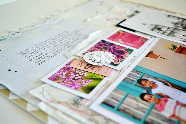
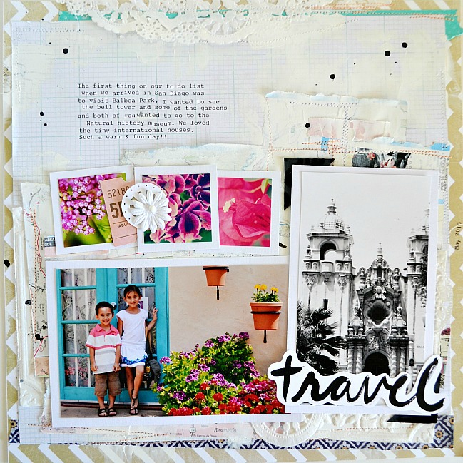
I’ll admit that initially upon seeing this sketch, the straight lines were completely intimidating for me. I’ve always viewed straight lines as too formal for me. So, after a bit of playing with the arrangement of the photos, I found that by slightly off centering them, it gave my layout a more casual and collage type feel – which I really loved! It was one of those “a-ha” moments, and then the sketch became totally do-able and a lot of fun to quickly pull together. Since this page was about traveling, I really wanted to somehow include map pages but quickly realized that the bright map colors were too distracting, so I chose to tone them down by ‘white-washing’ them with a little gesso. I also created a visual triangle, although it’s quite subtle, using pieces of a paper doily. You’ll notice that all of my accent papers were light and or white. This way I was able to layer many papers together and still keep the focus on the five vacation photos I used!


Tara Anderson resides in Arizona with her family. She has been a designer and challenge coordinator for various manufacturer design teams, and contributed to scrapbook publications from around the globe but is more widely known for her colour combinations. Tara’s scrapbooking style is full of mixed media, combining a love of vintage paper products with traditional scrapbook products and a few art supplies to create a layered, eclectic style. She loves spending time in the classroom during the school year tutoring math and summers spent traveling with her kids, taking photos with an antique Anscoflex camera and creating new memories. You can find her blog here & make your way around her Etsy shop here.


Sketch to Scrapbook Page :: Mixing 'proper' photos and phone photos

scrapbook page by shimelle laine @ shimelle.com
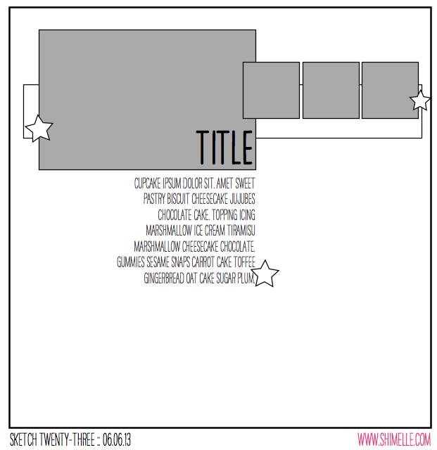
The next four scrapbooking sketches in this series all mix what I call ‘proper’ photos with phone photos – 4×6 prints and square prints – though really you can take 4×6 photos with your phone and you can crop photos from your ‘proper’ camera to a square, obviously. What I do know is that I often find myself with a mix of these sizes now, as I will use both my camera and my phone to take photos during the same day. I can’t be the only one, so a few scrapbook page sketches dedicated just to that seems like something more useful than unpacking your craft shopping only to find that discount offer of 100 tiny sewing needles might have been because there was no seal on the packaging. Never in my life have I so regretted that I brought my own bag. I digress.

scrapbooking sketch by shimelle laine @ shimelle.com
So yes: one 4×6 landscape photo, three small square photos! I printed mine at 1.5 inches square, and left a tiny white border on the smaller images.


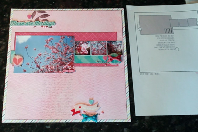
Most of the supplies for this page come from the Echo Park Here & Now collection, plus a bit of paper and a stamp set by Kesi-Art, with embellishments by Crate Paper and American Crafts.

scrapbook page by shimelle laine @ shimelle.com
Here’s a quick look at how that page looked by the end of the video. A bit more reserved than Glitter Girl’s crazy embellishment last week!

Sketch to Scrapbook Page:: Slanted Elements by Anne Jo Lexander @ shimelle.com
Please welcome today’s guest, Anne Jo Lexander, who has a brilliant take on this one large + three small idea – place everything on an angle!

Sketch to Scrapbook Page:: Slanted Elements by Anne Jo Lexander @ shimelle.com
Personally I think that the more plain and simple a sketch is, the more inspiring it is. Why? It allows my brain to automatically start pondering about the possibilities, instead of locking myself in all the details that’s supposed to be in a sketch. I’m fond of telling my brain: It’s not like it’s a technical blueprint! The purpose of a sketch is rather to be a kicker for your brain to start make it your own, but I can’t help it – the more detailed, the more obligated I feel to stick to it somewhat.

Here’s a tip for you if you feel like you struggle with a sketch: Study it for a little bit, then put it away and just think of the main lines you want to add to your project. If you really struggle – ask yourself why you do this to yourself – it’s supposed to be fun, no? Ditch the sketch then!

I knew right away I wanted to do slanted elements with this particular sketch. While the ColorConspiracy-papers used here are fairly new, I’m particularly satisfied about incorporating three really “old” scrapbooking-products – the KI memory epoxy sticker from the Love, Elsie line, and the transparency, and rub-ons (it’s funny how happy it makes you – finding out that old rub-ons still works) both from Hambly Screenprints. I’m fighting hoarding one small step at a time!


Living at an island right outside the west coast of Norway, Anne Jo Lexander alternates between telling other people’s stories as a local newspaper journalist by day and telling her own story in the evenings through the use of fancy paper, embellishments and photos. She’s quite fond of creating layouts, cards, and boxes, and having scrapbooked since 2005, she’s definitely learned this one thing: You never tire of pretty paper and cute embellishments!

These days she is designing for Maya Road, Craft Origine and ColorConspiracy, and you’ll find her at her blog , her resume blog , on instagram or TwoPeas gallery.


Sketch to Scrapbook Page :: A Corner Gathering

scrapbook page by shimelle laine @ shimelle.com
Can I start with something almost entirely random for this post? I haven’t taught local (or local-ish) workshops for years. I think the last time I was doing that with any sort of regularity was when the Craft Barn was still open, and that’s been a while. This morning I’ve just had a possibility present itself, and I could teach workshops for eight to sixteen people (I’m thinking the smaller end of that scale would be more comfortable in the space, but it might take a bit of trial to see) in London. It wouldn’t be immediately, as it would take some planning and so forth! But it would be lovely to judge if this is something any of you would want to attend. Could you let me know if London-based scrapbooking workshops would be something you would put in your diary? Thanks!

scrapbooking sketch @ shimelle.com
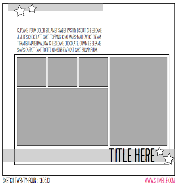
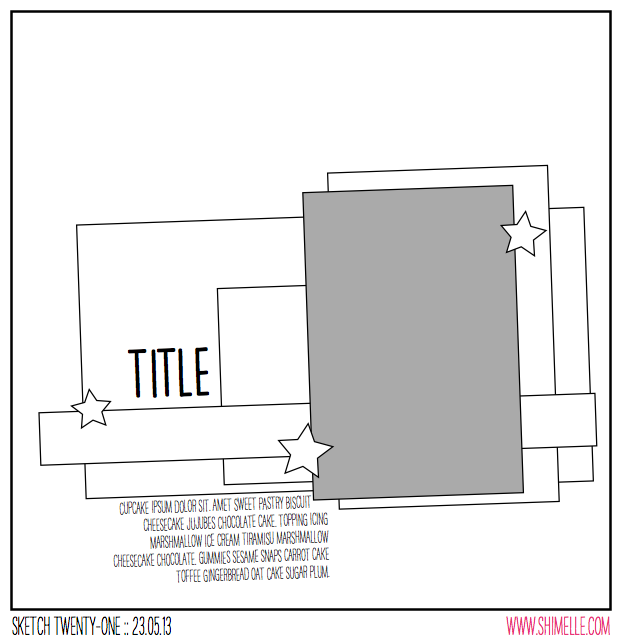
And then to less random: the next sketch! (Look how close that date is to getting caught up! SO CLOSE!) This sketch is designed to feature one landscape photo and two patterned papers, perfect for setting a colour scheme, as you can have two bold blocks of those colours, then plenty of space elsewhere to work with various shades, lighter or darker. I’ve drawn it as a 4×6 photo, but it could easily be a 5×7 or swapped for something else you have in mind.


Taking a break from the May kit, I headed back to the wedding album supplies I set aside to create an album filled with the photos from my sister-in-law’s wedding. You can find more details on all those supplies here, along with Glitter Girl’s tips for starting and planning a wedding album. The camera stamp is from this set by Allison Kreft for Webster’s Pages, which is on sale right now. These stamps are red rubber with cling foam already attached and cut out, ready to stick to your acrylic block. They stamp so beautifully!

scrapbook page by shimelle laine @ shimelle.com
I must say creating this album is a little twist for me in terms of journaling! I have plenty of stories to write on my own wedding pages, and I do have quite a few things I want to write for this wedding too, but those stories mostly don’t seem to match the more formal photos – they match the more relaxed snaps from getting ready and the reception. So for now, some of the more formal photos are accompanied by just names, and I’m ready to start working on some pages with more writing soon to achieve a bit of balance!

scrapbook page by Stephanie Howell @ shimelle.com
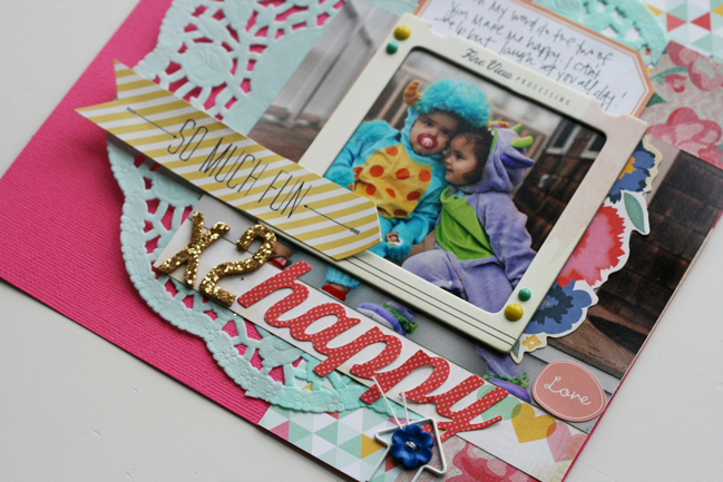
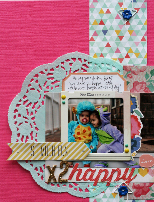
Today I’m delighted to share a second interpretation of this page, by talented scrapper Stephanie Howell. Stephanie worked her magic on this sketch in an 8.5×11 format, and I love how she used a slide frame with a photo without cropping the picture. Definitely remembering that as a note to self!

scrapbook page by Stephanie Howell @ shimelle.com
I was so excited when Shimelle asked me to do a guest post for her blog. I haven’t had the opportunity to use a sketch in a really long time, and this could not have been a more perfect assignment at this point in my life. You see… I’m preparing my family of six for a big international move to Italy! This doesn’t leave me much time to scrapbook. And I miss it. But my time is extremely minimal, to say the least.

So this sketch was perfect! I kind of just followed it exactly. Hey! What can I say? I’m short on time and my imagination is seriously depleted. The only change I made is that I switched this to an 8 1/2 × 11 layout instead of the 12 × 12 in the sketch. I replaced the big square of paper with a doily. Because I have to put doilies on everything. I can’t help it. It’s a sickness.

The 4 × 6 photo had a distracting background so I used a Crate Paper chipboard frame to draw the focus to my two little monsters. I also put some pop dots under the ‘So Much Fun’ arrow embellishment from MME. The layout just needed a little visual interest.


Stephanie is the social media director and design team coordinator for My Mind’s Eye. She lives in Rhode Island, where she spends most of her days chasing her four maniac daughters and losing her mind. You can follow her adventures on her blog


Sketch to Scrapbook Page :: Adding an angle

scrapbook page by shimelle laine @ shimelle.com
Having successfully managed the spelling of Hong Kong, I may have rediscovered a bit of creative energy and furthered this quest to get up to date with all my sketch and kit pages! Catching up feels pretty rad… as long as I only focus on the things where I’m making progress and don’t turn around and realise there are eleventy other elements in life that need some catching up too. Right? Onward, at any speed.

scrapbooking sketch @ shimelle.com
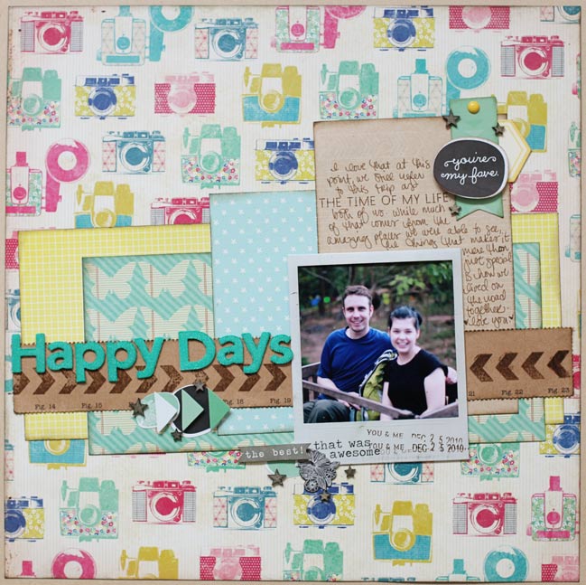
This sketch was designed for one portrait 4×6 photo, but I changed that slightly for my page. The idea here is to take a group of paper boxes that are layered in a nice and orderly fashion, then take the whole lot and angle it ever so slightly to create a different look. Easy enough, and perfect for the last 12×12 sheet I’ve been saving (that pretty camera print by Maggie Holmes for Crate Paper) and a stack of scraps cut down to nice box shapes instead of the random off-cuts they had become.


Again the products for this page are from my May Product Picks, and I think that makes for six layouts from the May kit so far. I’m now out of full sheets for the backgrounds, but I have paper scraps, letter stickers, and embellishments remaining, so I’ll mix those with some additional papers to finish off the May kit. I’ve also done a few cards with this kit, as out of character as that may seem!

scrapbook page by shimelle laine @ shimelle.com
This is one of those pages where the journaling becomes more reflective – not trying to tell the story of what happened in that photo, but reflecting on that occasion from the present point of view. Recently The Boy and I were in a discussion and someone asked us about our backpacking adventure in the sort of way that implied it was one of those things you would be happy to have over and done with and not want to return to living from a library bag once we had reacclimatised to living in one place. That’s really not our perspective at all and we both wish it was something we could do all the time, so please excuse the slightly mushy journaling!

scrapbook page by lisa dickinson @ shimelle.com
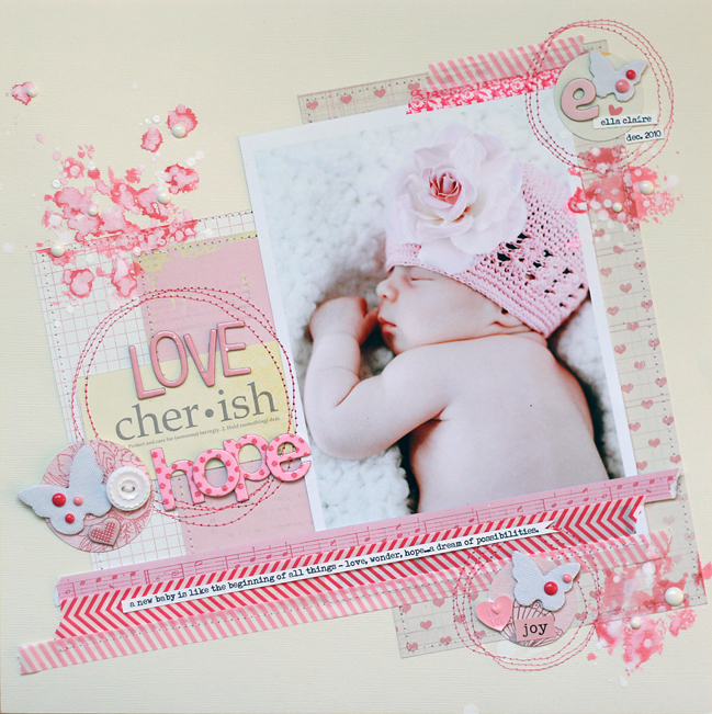
Today I’m humbled by the gorgeous page Lisa Dickinson has created from this sketch. Lisa’s work is always beautiful, but this page has me in total awe! Lisa, can I scrapbook like you when I grow up?

scrapbook page by lisa dickinson @ shimelle.com
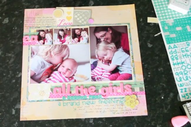
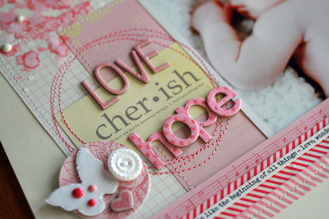
The large photo takes center stage in this sketch and knew it would be a great design to feature one of the many newborn portraits I had taken of my niece. I printed mine at 5×7 (slightly larger than the photo in the sketch) and then gathered lots of pink supplies, everything from soft pink to brighter fuchsia. I used larger blocks of paper behind my photo, layering strips of wash tape at the top and bottom of the tilted design. Three embellishment clusters form a visual triangle around my photo and I added circles of stitching to reinforce their groupings. Because there was some empty space above the title, I splattered on pink and white inks. I added additional, smaller ink splatters to form another triangle. Once the ink dried, a few white enamel dots add dimension to these accents. Rather than block my journaling below the design, I incorporated it into a journaling strip that I adhered atop the washi tape.


Lisa Dickinson is a graphic designer living in Colorado with her husband, Mike, and children, Hayden and Riely. She started scrapbooking in 1998 and it grew from a part-time hobby to a full-time job. Her scrapbook pages have been published in various magazines and she is the author of the ebook Design Workshop from Ella Publishing. In addition to being a Garden Girl at Two Peas in a Bucket, Lisa also designs for Jenni Bowlin, Basic Grey, and Lily Bee Design. You can catch up with her at Gettin’ By, where she blogs about scrapbooking, motherhood, running, and her deep-seated hatred for the Comic Sans font. .


Sketch to Scrapbook Page :: A Twist on Patterned Paper Quadrants

scrapbook page by shimelle laine @ shimelle.com
Trying another travel page, and this time with a location I may have a better chance of spelling correctly. One can hope. (I’ve fixed the Rotorua layout and issued an apology to all of New Zealand on Twitter and Facebook, if it helps. I need to take a new picture and edit the post. Darned spelling upside down!)

scrapbooking sketch by shimelle laine @ shimelle.com
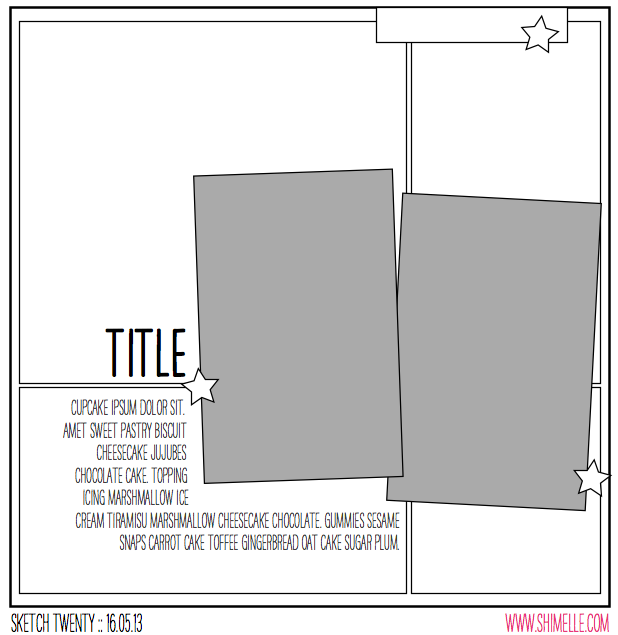
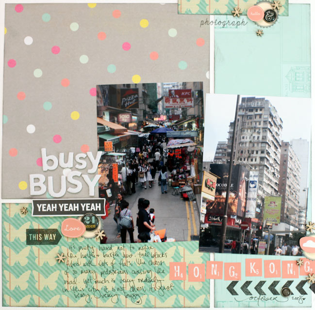
This sketch is a twist on quadrant design: instead of dividing the page into four equal quadrants, it’s divided into four boxes that are different sizes, with the join of the papers covered by two portrait photographs. I used standard 4×6 prints.


The supplies are all from my May product picks with the exception of the Simple Stories brads I added right at the end to finish the embellishment, and a sheet of white cardstock for the background.

scrapbook page by shimelle laine @ shimelle.com
I’m hoping some of you will try this sketch with a similar look but adding mats to the photos. I like pictures both matted and unmatted, but I am in such a habit of two portrait photos side by side sharing one photo mat that I felt I needed to change it up a bit, so that’s what I added to the sketch and this layout. The photos are from 2008, on a short stay in Hong Kong. (It’s not from the backpacking trip so no need for the kraft cardstock in the background. The album for this trip started well before I thought of such simple ideas as having a colour in common throughout the entire book!)

scrapbook page by Sam Ball @ shimelle.com
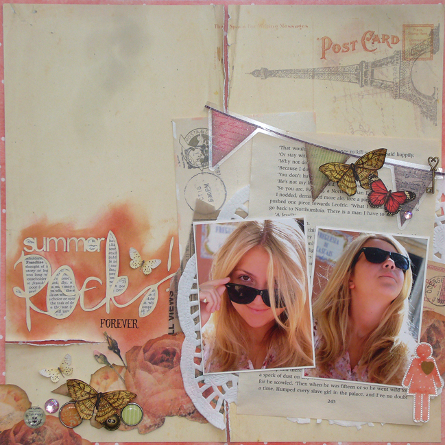
Today I’m delighted to welcome UK Scrapper Sam Ball to share her interpretation of the sketch. And don’t you know that in the video I say you could use this design with two, three, or four patterned papers in the background… and Sam made it work beautifully with one! The thought never even entered my mind. Now you know why I invite guests!

scrapbook page by Sam Ball @ shimelle.com
Staying fairly true to the sketch, I was keen to repeat the grid background element. But as a scrapper whose style is more eclectic than graphic, I distressed cut lines to reveal slithers of the dotty paper from Glitz, along with other papers and embellishments from Prima, Websters and My Mind’s Eye.

Guilty of always leaving the title until last, I’ve recently invested in a Silhouette Cameo. Now my title is committed to from the start and the layout evolves around it rather than me finishing a layout and wondering where best to site it!

The photos, taken last year on holiday are of my middle stepdaughter as we enjoyed one of the last days of our Mediterranean cruise.


Having tried her hand at many other crafty hobbies, including stained glass, pottery and needlecraft, Sam Ball discovered scrapbooking in 2007 and has never looked back! “Nothing has gripped me as much as scrapbooking has” says Sam “and over the years I’ve made many, many friends, who like me share this passion for paper.” Her style could be described as arty eclectic and Sam loves nothing more than taking a piece of paper and cutting out the intricate elements to layer in pages.
Over the years she has had her work published by magazines in the UK and has been a DT member of both the successful scrapbooking kit company ScrapaGoGo, the Pencillines sketch team and Scrapbook Inspirations. She currently teaches at the popular GoGoGetaway.
For more of Sam’s work, be sure to check out her blog.