paper: pretty paper. true stories. {and scrapbooking classes with cupcakes.}

lovely to meet you Twitter Facebook Pinterest YouTube

Take a Scrapbooking Class

online scrapbooking classes

Shop Shimelle Products

scrapbook.com simon says stamp shimelle scrapbooking products @ amazon.com shimelle scrapbooking products @ amazon.co.uk

Reading Material

travel

Weekly Challenge :: Take Inspiration from a Colourful Border
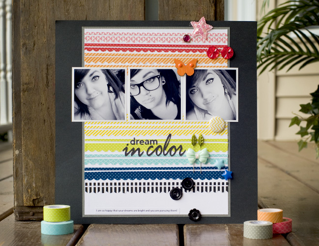
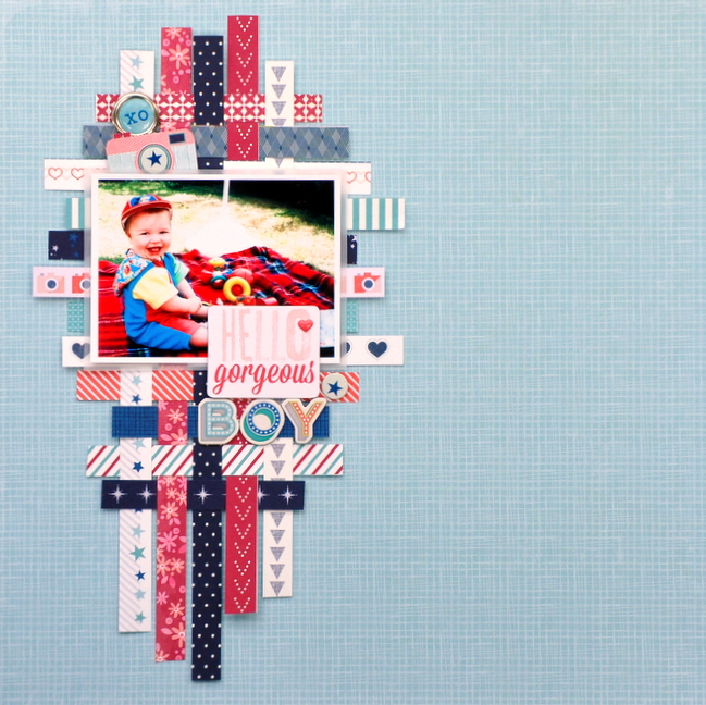
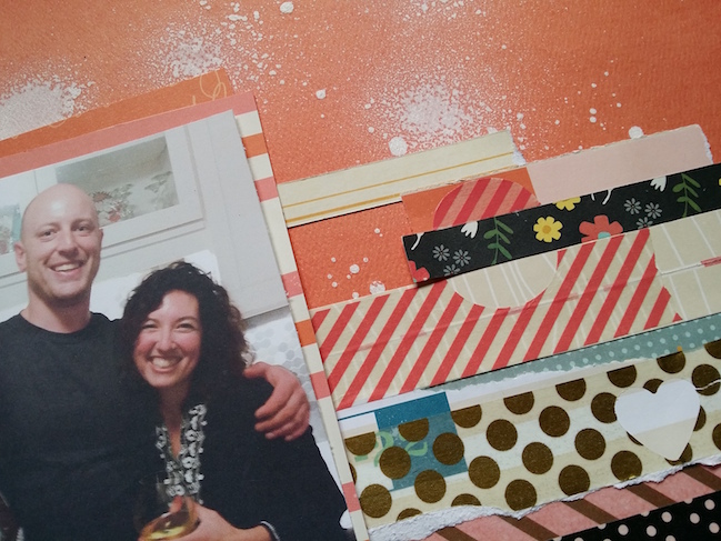
weekly challenge: take inspiration from a colourful border // scrapbook page by Tegan Skwiat

This week’s scrapbooking challenge comes from one of my favourite guests posts in our archives: a washi technique from Tegan Skwiat. While Tegan shares steps for creating the look above, this is a challenge that allows for following directions or going off on a complete artistic tangent.

This week, I challenge you this week to take inspiration from those colourful borders. Follow the same look or just let the idea take on its own format on your own desk. To get you started on this week’s challenge, take a look at these examples from contributing designer Gina Lideros and guest artist Anna Bradshaw.
weekly challenge: take inspiration from a colourful border  // scrapbook page by Gina Lideros

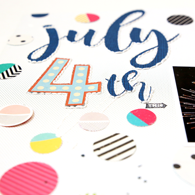
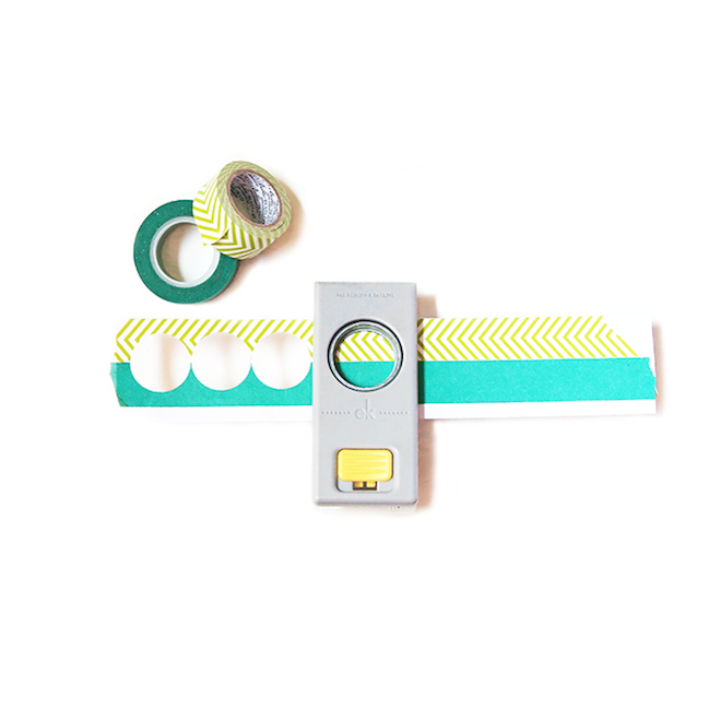
I’m excited to share my challenge project with you today! I chose to take my inspiration from the supplies rather than keeping it contained to a border. This is a great way to give new life to your tapes and punches. To create my project first, I picked out an assortment of decorative tapes that coordinated well with the papers and embellishments that I wanted to use.
weekly challenge: take inspiration from a colourful border  // scrapbook page by Gina Lideros

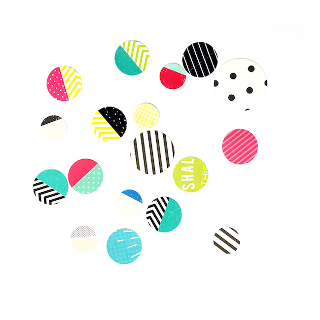
Then I tore two pieces of decorative tape and adhered them to a scrap of white cardstock in a horizontal pattern. Next I punched out circles using a one inch circle punch. This is the fun part where you can get creative – I repeated this step and punched out different washi designs using an assortment of patterns. I also punched out an assortment of patterned papers using different sized circle punches.
weekly challenge: take inspiration from a colourful border  // scrapbook page by Gina Lideros

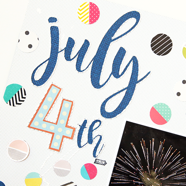
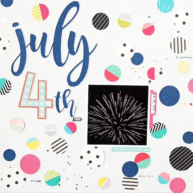
Once all of my shapes were punched, I adhered them to a pattern paper background. I used stamps, ink, paint, and hand embroidery around the title to complete my page.
weekly challenge: take inspiration from a colourful border  // scrapbook page by Gina Lideros

Tip – don’t limit yourself to just red, white, and blue when working with Fourth of July layouts. Fireworks are colorful so your projects can be too! Instead of working with just one collection, I chose to bring in coordinating papers and elements from three of Shimelle’s collections.
weekly challenge: take inspiration from a colourful border  // scrapbook page by Gina Lideros

I hope this challenge allows you to get creative with decorative tape and get creative with your punches too, whether you create a border, an embellishment, or an explosion of color across your page.
- Gina
weekly challenge: weekly challenge: take inspiration from a colourful border  // scrapbook page by Anna Bradshaw

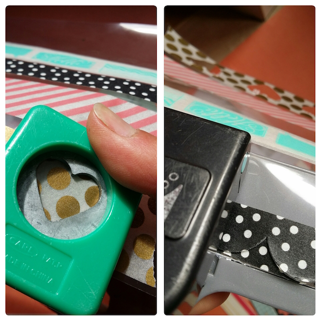
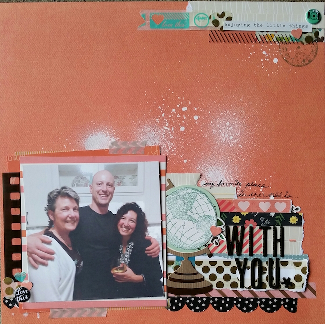
After a recent washi-swap, I came home with a clear but now colorful acetate sheet of shared tape strips, and, while staring at a handful of manufacturer’s branding strips that happened to be lying near my photo, inspiration struck; I could use a few manual punches to create some custom embellishments with meaningful-to-me layers on this page documenting a recent road trip with my family.
weekly challenge: weekly challenge: take inspiration from a colourful border  // scrapbook page by Anna Bradshaw

Alternating branding strips from the Simple Stories’ I Am collection with WeR Memory Keepers aptly named Road Trip, and even a few from Shimelle’s first delightful line of papers, I also punched some sentimentally appropriate hearts in a variety of sizes from a wide gold polka dot pattern of tape and the new We Are Family washi tape strips, also from Simple Stories. A popular EK Success border punch with a thinner black and white polka dot washi pattern grounds that busy block at the bottom of my page. It’s awesome when we can use those tried and true tools and still get excited, no?
weekly challenge: weekly challenge: take inspiration from a colourful border  // scrapbook page by Anna Bradshaw

In Tegan’s example she used plain paper to back her tape before punching, and I’ll be honest, the clear acetate sheet as a punching mount did not give me a clean look – but I’m okay with that. Just like using ephemera and products with brand names that relate to my story, having a bit of the imperfect represented on this layout reminds me more of my “why” for celebrating this fun day alongside my mom and brother with a place in my scrapbook. It was our first road trip together, just the three of us, in ages, and I enjoyed it so much. The bouts of unrestrained laughter, seeing my brother trying not to enjoy making greeting cards and shopping for scrapbooking supplies, the unwanted advice-giving…yep, these are the perfectly imperfect moments that I want to remember in my family’s (many, many) albums.
- Anna


You have a week to complete the challenge and share a link – but of course you’re welcome to set your own time schedule. Whatever keeps you happy and creative!

Today’s Guest Artist: Anna Bradshaw loves where she lives, teaching, and being with her biggest source of inspiration: family. You can find more from Anna on Instagram, Twitter, YouTube, and her blog.

Summer scrapbooking with patterned paper

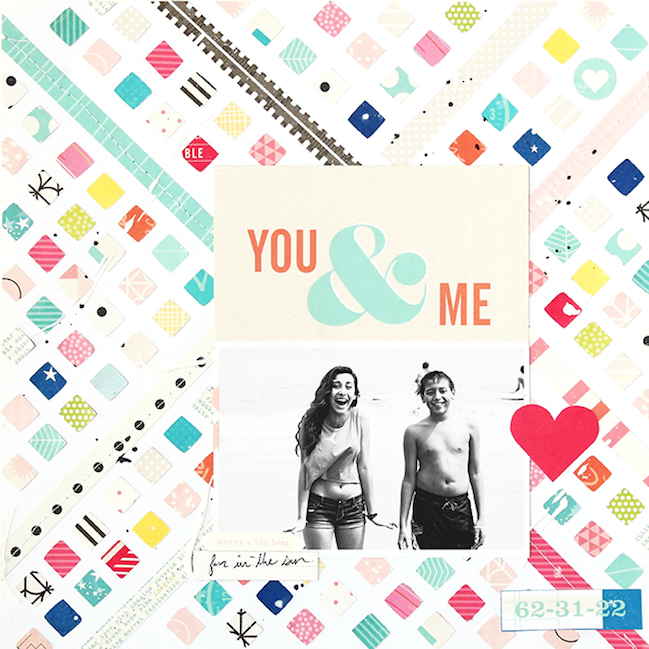
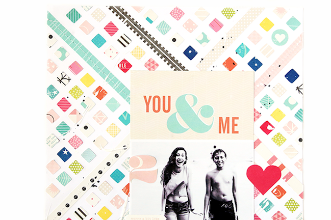
Summer scrapbooking with patterned paper // scrapbook page by Gina Lideros

Please say hello to contributing designer Gina Lideros! She’s ready to get true summer memories into her scrapbook, and has challenged herself to work just with patterned papers rather than pre made embellishments. Always a great challenge!

Every summer as soon as school is out, we head to the beach. One of my favorite things about living in California is that there are plenty of beaches to visit. A favorite beach of ours is Santa Cruz beach. They have a boardwalk with plenty of rides, attractions, tons of great food (hello garlic fries) and free concerts.

Summer scrapbooking with patterned paper // scrapbook page by Gina Lideros

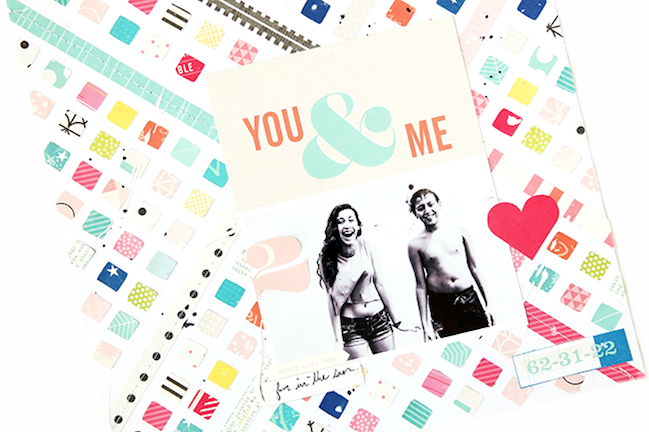
The inspiration for my layout came from the colorful rides on the beach boardwalk. I also made sure to add lots of beach themed colors as well, such as aqua, turquoise, coral, sand and navy. I wanted my photo to be the main focus on my layout, so I started by printing it out in black and white. Then, I created my background out of patterned papers. One of my favorite techniques to do is creating patterned pieced backgrounds.

Summer scrapbooking with patterned paper // scrapbook page by Gina Lideros

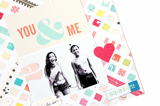
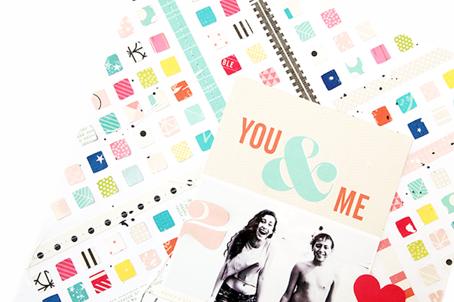
Because the background of my page was already busy, I challenged myself to work only with patterned papers (no embellishments). Even though this seemed like a tough challenge at first. I love the result. To achieve this I got creative and fussy cut several shapes out of patterned papers from Shimelle’s various collections.

Summer scrapbooking with patterned paper // scrapbook page by Gina Lideros

The vibrant colors of the patterned papers really make the background pop and bring out the contrast in my black and white photo. I also added a bit of machine stitching and little pops of ink and paint across my page.

Summer scrapbooking with patterned paper // scrapbook page by Gina Lideros

I hope that my layout has inspired you to play with patterned papers and limit your embellishments. We’d love to hear your ideas for scrapping beach photos! Have a craft-filled and happy weekend.

Weekly Challenge :: Scrapbook with Split Complementary Colours

weekly challenge: scrapbook with split complementary colours

It’s been a while since we’ve had a specifically colourful challenge, and it’s also been a while since I’ve seen much other than a grey, grey sky. I’m ready for summer colour! I’ll take it only scrapbook pages if I can’t find outside my window. How about you?

free printable colour wheel

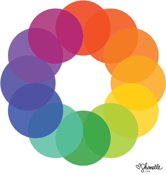
This colour wheel may come in quite handy this week, and you can find a larger version to print if you would like one for your desk. A colour wheel is definitely not required for scrapbooking and scrapbooking collections tend to have carefully considered colour schemes anyway, so you can choose a mix of colours from a paper or embellishment and they will certainly look beautiful together. But it can be fun to start from scratch and take control of the colour and even know a little about why we’re drawn to certain tones together, and that’s where the colour wheel comes in useful.

We’ll talk more about colour in some other posts this week too, but for now, let’s start with just the challenge! This week, I challenge you this week to scrapbook with split complementary colours. Split complementary means choosing one colour to start, then going straight across the wheel to the opposing colour and instead of that central colour, choosing the one either side. If you started with red, you’d go across the wheel and have yellow-green and blue-green. If you started with yellow, you’d pair it with blue-violet and red-violet. You can start with any colour you like, go across and choose the two either side and they will always work well together, but they are colour combinations we don’t always head toward for scrapbook pages. Everything else about your page design is completely up to you, so you can take your inspiration in any direction you like! To get you started on this week’s challenge, take a look at these examples from contributing designer Meghann Andrew and guest artist Daphne Wuenn Rihm.

weekly challenge: scrapbook with Split Complementary Colours // scrapbook page by Meghann Andrew

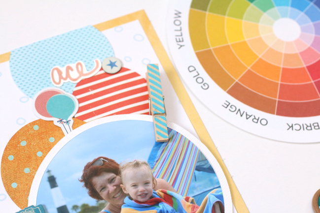
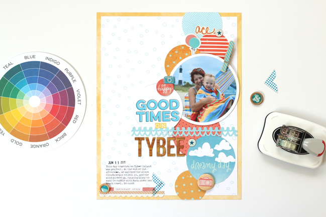
I always find it easy to work with a chosen color scheme when those colors are apparent in the photo- the photo and the product I’ve selected just work together seamlessly that way. As soon as I saw this photo of my mother and daughter sitting on the beach, under a brightly colored beach towel, I immediately saw the split complementary color scheme (meaning the two colors adjacent to the complement of a given color) in the blue, reddish-orange and yellow-orange stripes in the towel.

weekly challenge: scrapbook with Split Complementary Colours // scrapbook page by Meghann Andrew

Armed with my trusty color wheel, I got to work choosing product based upon those colors.

weekly challenge: scrapbook with Split Complementary Colours // scrapbook page by Meghann Andrew

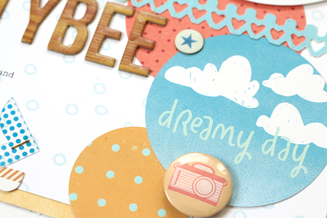
Instead of working with a complementary color scheme, which allows for two colors, this color scheme offers three colors and an interesting variation from the typical blue and orange combination. All of the product on this page reinforces my color scheme, down to the golden-toned woodgrain alpha that I used in my title, and everything works to support the colors found in my photo, creating a harmonious page, documenting a great day on the beach.
- Meghann

weekly challenge: scrapbook with Split Complementary Colours // scrapbook page by Daphne Wuenn Rihm

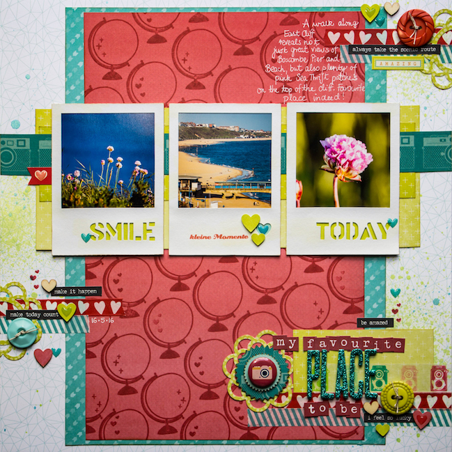
I am a big fan of bold colours combined with great patterns – this always makes my heart beat a bit faster! No change for this layout. I chose three colours from the split complementary colour scheme as a starting point: pinkish-red, turquoise-blue and greenish-yellow.

weekly challenge: scrapbook with Split Complementary Colours // scrapbook page by Daphne Wuenn Rihm

The inspiration to pick these bold colours came from the photos, which are from a recent walk along the cliff top in the South of the UK, just about 10 minutes from where I currently live.

weekly challenge: scrapbook with Split Complementary Colours // scrapbook page by Daphne Wuenn Rihm

I started building up my layout with a geometrical-patterned background, layered the turquoise and the red on top, with the green strips behind the three polaroid-style photos. When I first put the papers together, the red seemed too overwhelming on its own, so I looked out for a stamp which I could use to create my own patterned paper. Shimelle’s globe stamp from the Starshine collection was the perfect candidate for this purpose!

The three embellishment clusters are scattered with hearts in different shapes and appearances, I even found this paper washi tape with hearts in my stash!

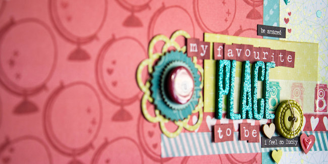
I also wanted to include my love for photography and added some cameras: The strip behind the photos is from True Stories and the little camera badge next to the title is from Starshine.

weekly challenge: scrapbook with Split Complementary Colours // scrapbook page by Daphne Wuenn Rihm

The journaling found its way onto the layout, just before I added some ink sprinkles and scattered tiny epoxy hearts.
- Daphne


You have a week to complete the challenge and share a link – but of course you’re welcome to set your own time schedule. Whatever keeps you happy and creative!

Today’s Guest Artist: Daphne Wuenn Rihm loves frothy cappuccinos, walking along the beach for hours, and maths. You can find more from Daphne on Instagram, Twitter, Youtube, and her blog.

A style for scrapbooking sporty kids

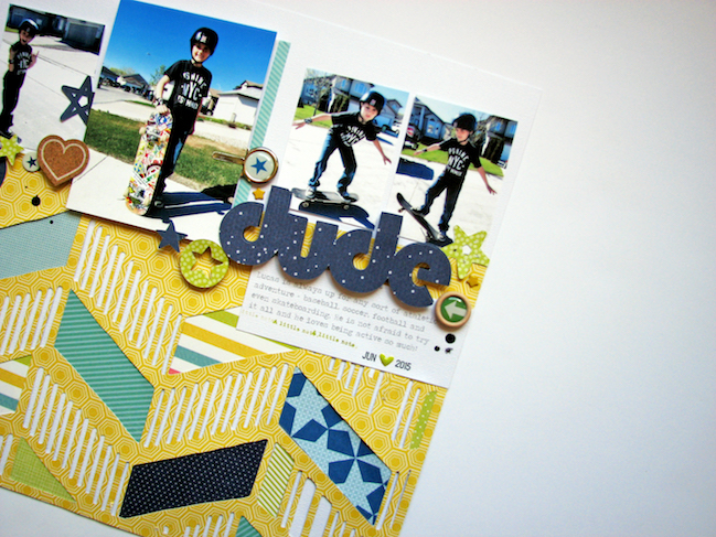
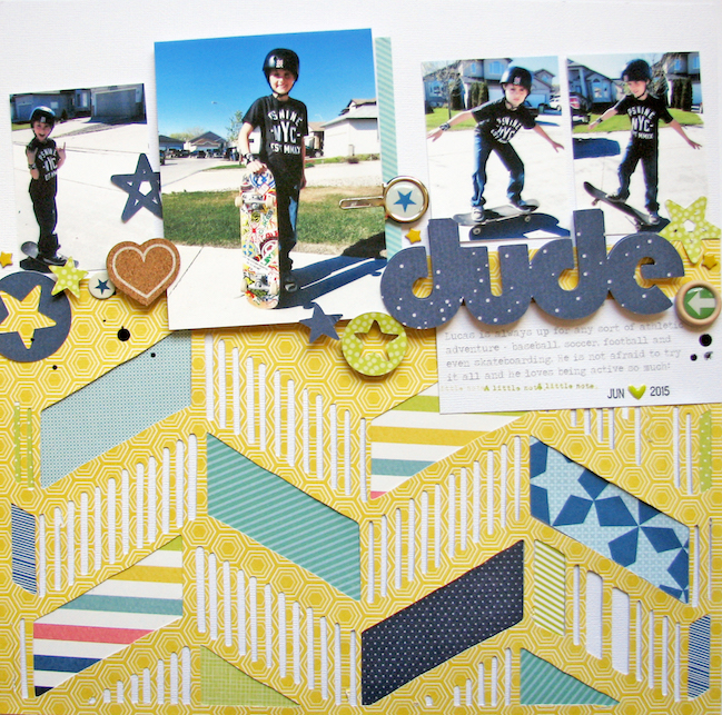
a style for scrapbooking sporty kids // scrapbook page by Nicole Nowosad
With this half of the world spending more time in the pursuit of outdoor fun, I hope you’ll enjoy this project from contributing designer Nicole Nowosad. Enjoy the ball game!

Lately I’ve wanted to make an effort to pull out some photos of my boys that I normally have trouble scrapbooking. My boys are both quite active and into sports. I have stockpiled quite a few action or sport photos. Truth is, at least for me, action photos can be difficult to scrapbook. Often you have way too many, or some could be blurry and out of focus.

a style for scrapbooking sporty kids // scrapbook page by Nicole Nowosad

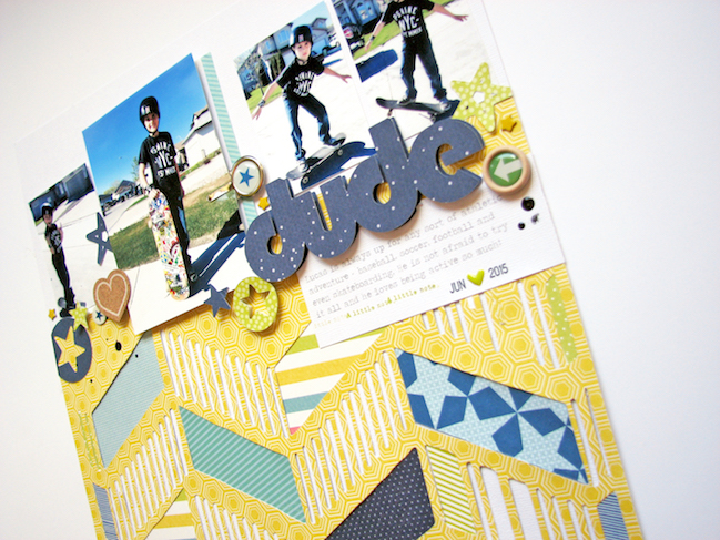
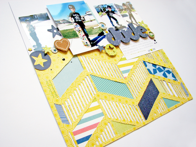
I had way more photos than I used, I decided to choose just the right ones from the set of photos that were the most clear and depict a series of actions. I feel like the photos really show how much fun my son is having playing around on his skateboard and putting the photos in a slight angled line across the page gives the photos some movement on the layout.

a style for scrapbooking sporty kids // scrapbook page by Nicole Nowosad

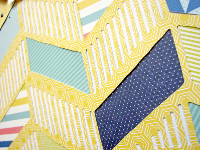
Once I had my photos sorted, I dove into how to best create a page that was masculine but not too young at the same time. I find that I tend to gravitate to my more girly side and sometimes I get blocked with how to scrapbook about my boys. I decided to use a grapic diecut background by JustNick that felt masculine, then pulled some papers from Starshine and let that colour palette be my guide for the page.

a style for scrapbooking sporty kids // scrapbook page by Nicole Nowosad

I started with a yellow colour and then added in several different shades of blue, which seems almost natural for a masculine page. I think the mix of the blues with the buttery yellow colour is perfect for a boyish page, and there is even a small hint of pink in the striped paper which embraces my girly side too!

a style for scrapbooking sporty kids // scrapbook page by Nicole Nowosad

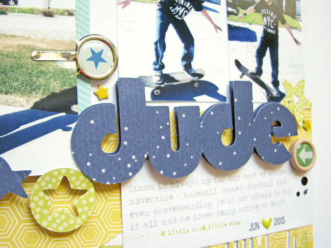
For me, there are lots of go-to shapes I like to use for masculine pages – take arrows and stars for example. For boy pages, I like to grab embellishments that are a little “harder” like the cork sticker, metal paperclip and even wood veneers.

a style for scrapbooking sporty kids // scrapbook page by Nicole Nowosad

I hope you are inspired to get a lot more of those boy photos you may have set aside to paper! Have a creative weekend!

Weekly Challenge :: Scrapbook using just a third of the page

weekly challenge: Scrapbook using just a third of the page // scrapbook page by shimelle laine

Welcome to a new week and a new challenge! Have you been scrapping much recently or could you do with a push to get a page off the ground? This week’s challenge is a great one for finally putting a paper you love into your album, because you won’t have to worry about covering it too much with everything else.

I challenge you this week to scrapbook using just a third of the page. Imagine your page divided into a 3×3 grid, like a # symbol, then choose just one row or one column. Vertical and horizontal both work. Everything else is completely up to you, so you can take your inspiration in any direction you like! The design above is shown in more detail with a video, if that’s useful help. It uses about a third of the page, though you’ll notice some elements do extend and that’s okay, of course! Make it work for your style and your albums. To get you started on this week’s challenge, take a look at these examples from contributing designer Sheena Rowlands and guest artist Antonia Sherlock.

weekly challenge: Scrapbook using just a third of the page // scrapbook page by Sheena Rowlands

Here in England we never get as many sunny days as we would like, but when we do we tend to make the most of them, spending time in our gardens, eating picnics, and having barbecues.

weekly challenge:  Scrapbook using just a third of the page // scrapbook page by Sheena Rowlands

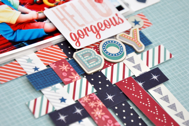
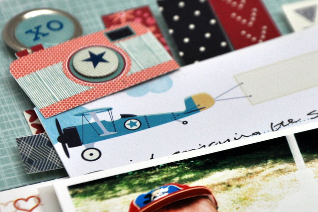
For this page I wanted to emulate the blanket shown in this photo of my eldest son eating al fresco. I used many of the branding strips from both the Starshine and True Stories collections, and wove them together to create a large mat for my photo and title on just the left third of the page

weekly challenge:  Scrapbook using just a third of the page // scrapbook page by Sheena Rowlands

As I felt this page was already busy enough, I created a little vellum pocket behind my photo to hold journalling with the date and place details, which can be viewed using the clip and camera as its tab.
- Sheena

weekly challenge: scrapbook using just 1/3 of the page // scrapbook page by Antonia Sherlock

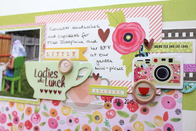
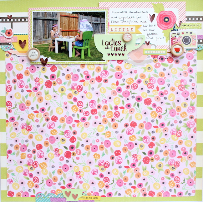
This photo of my daughter having cream tea with her best friend in our back garden last summer captures such a special memory of a perfect day and I really wanted to do justice to it on my layout. I knew I wanted to use a floral paper for the background, but I was worried about the photo getting completely drowned out by the busy pattern. So I used a trick I picked up from this Glitter Girl video. I chose the B side of the Exploration paper from the Starshine collection to counterbalance the business of the floral paper.

weekly challenge: scrapbook using just 1/3 of the page // scrapbook page by Antonia Sherlock

I worked across the top third of the page. As the space I was using was limited, I put the photo, title, and journaling next to each other, overlapping at times. I arranged the embellishments (the teacups, epoxy buttons, and the word stickers) to form jagged horizontal lines to allow the eyes to travel from photo to title to journaling. I used my Silhouette and Minc machines to create the larger teacup with the foiled title, and then incorporated it into the embellishment.

I could have left it at that, but the layout felt quite top-heavy, so I added a small embellishment cluster to the bottom of the page for balance.
- Antonia


You have a week to complete the challenge and share a link – but of course you’re welcome to set your own time schedule. Whatever keeps you happy and creative!

Today’s Guest Artist: Antonia Sherlock loves spending time with her family, scrapping the memories, and having cream tea (well, coffee). You can find more from Antonia on Instagram, and Pinterest.

Designing scrapbook pages with strong horizontal lines

Designing scrapbook pages with strong horizontal lines // scrapbook page by Shimelle Laine

Working on more pages for existing albums in preparation for The Scrapbook Process class has given me an even longer list of pages I want to make – not just for the topics and how they fit into those stories, but to work with different design techniques that haven’t been on my radar recently. Things like what different ways can I… and then ten different ways to finish that sentence! So for today, what different ways can I create with strong horizontal lines?

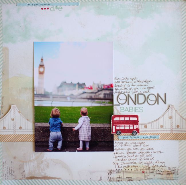
I love that ‘strong’ in design doesn’t have to mean shoutingly obvious. The bridge in the layout above gives a definite horizontal flow across the page, especially with the patterned paper strip below the bridge and the red bus to catch your eye just past the photo. A motif like that stamped image can certainly create a horizontal line – think border stamps or designs cut from patterned paper and placed in a horizontal line across the full page!

Designing scrapbook pages with strong horizontal lines // scrapbook page by Shimelle Laine

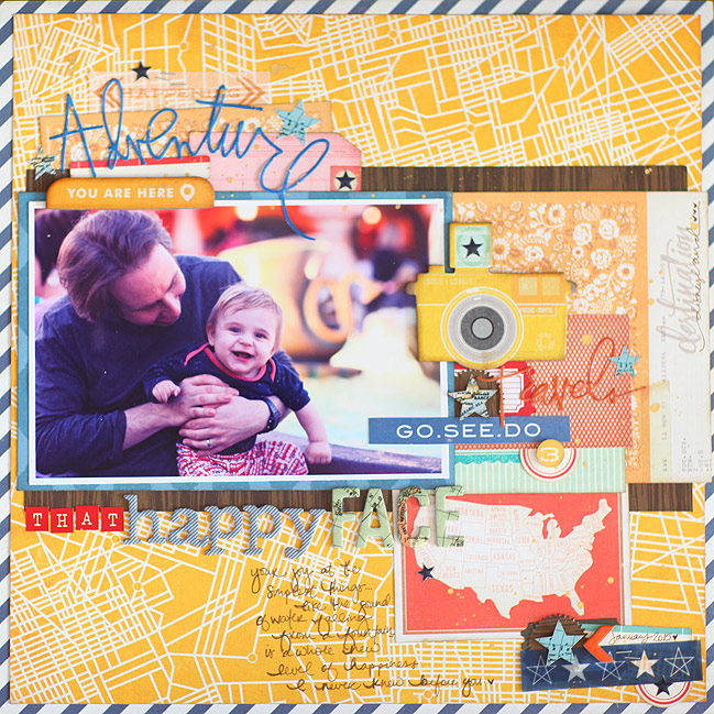
Horizontal flow can also come from how you cut and place any number of elements on your page. In this case, it’s blocks of paper, all anchored with the darkest paper of the bunch as the larger layer right across the middle. There are lines going every which way on this page! Diagonals in outside frame, map chaos in the yellow background, but nearly every block of paper runs horizontally, from that big woodgrain block to the tags at the top left and the labels at the bottom right.

Of course horizontal lines can come directly from the paper itself, like in this example from guest artist Katrina Hunt:

strong horizontal lines // scrapbook page by Katrina Hunt

I love patterns and I usually let the pattern papers tell me how my page should flow. With stripes, well it’s easy, I will either have a mostly vertical design or a mostly horizontal design.

strong horizontal lines // scrapbook page by Katrina Hunt

I loved the green striped paper in the Shimelle Starshine collection and knew it was the perfect starting point for my page.

strong horizontal lines // scrapbook page by Katrina Hunt
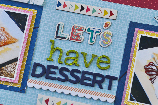
And scrapbook those food pictures, because you know you take them!

Designing scrapbook pages with strong horizontal lines // scrapbook page by Shimelle Laine

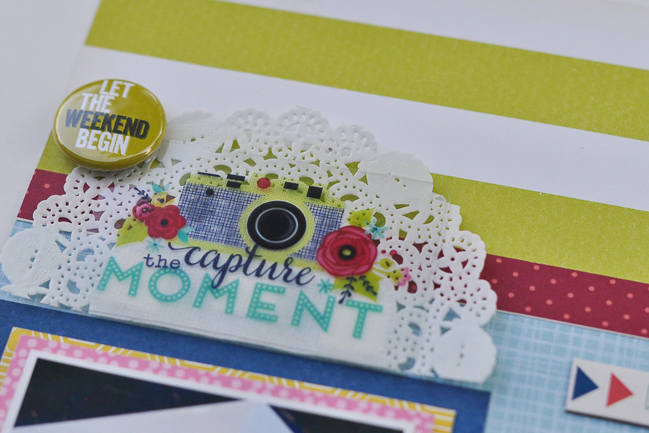
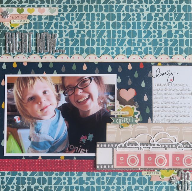
And if all those individual techniques can create horizontal lines across a page, you can definitely mix them together! The background paper here is a horizontal pattern even though it’s made from numbers rather than stripes. The cloud die-cut has a similar result to the stamped bridge – a shape that is anchored on a horizontal line. Border-punched strips and washi tape run on the horizontal line along with the blocks of paper, and you can even find a few more horizontal patterns hiding in there, like the coffee cups! (There’s a video for this page here if you fancy a watch.)

What pages have you loved making with strong horizontal elements? Share with us in the comments – we’d love to see!

Today’s Guest Artist: Katrina Hunt loves dogs, doilies and scrapbooking. You can find more from Katrina on Instagram, Facebook, and her blog.

Weekly Challenge :: Take Inspiration from a Scrapbook Page Sketch

weekly challenge: Take Inspiration from a Scrapbook Page Sketch // older scrapbook page by Shimelle Laine

Since February, each week’s challenge has gone out in advance to one of the eight contributing designers and one guest artist. Then I have the exciting part of opening their emails to see what they made! But this week’s really made me chuckle. I had guessed which direction they would go and I was so wrong! Their layouts are brilliant but very different to where my mind went with this challenge. So now I’m extra curious to see where you’ll take this challenge!

scrapbook page sketch by shimelle laine

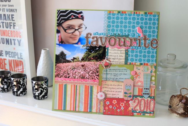
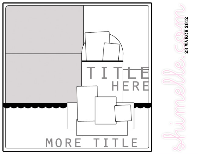
This week, we’re working with something from the archives. I challenge you this week to take inspiration from this scrapbook page sketch. There’s a video and two sample pages in that post, if that gives you a bit of extra help. How you take inspiration is completely up to you, so you can go in any direction you like! Will you work with the idea of a list of favourites or focus on the design elements? To get you started on this week’s challenge, take a look at these examples from contributing designer Sheena Rowlands and guest artist Heidi Cocca.

weekly challenge: Take Inspiration from a Scrapbook Page Sketch // scrapbook page by Sheena Rowlands

weekly challenge: Take Inspiration from a Scrapbook Page Sketch // scrapbook page by Sheena Rowlands

I’ve always been a fan of sketches & I particularly liked the layered shapes on the right of the photo in this sketch. I thought it would be perfect to use lots of the die cut shapes, stickers, and journaling cards from both the Starshine and True Stories ranges to complement my photo choice.

weekly challenge: Take Inspiration from a Scrapbook Page Sketch // scrapbook page by Sheena Rowlands

I used a 6×4 portrait photo instead of two landscape and gathered all the elements to it allowing more of the lovely background paper to show. The die cuts provide a subtitle for my photo and I’ve written my journalling on the back of this layout as I feel there is enough going on on the front.
- Sheena

weekly challenge: Take Inspiration from a Scrapbook Page Sketch // scrapbook page by Heidi Cocca

weekly challenge: Take Inspiration from a Scrapbook Page Sketch // scrapbook page by Heidi Cocca

When new supplies arrive, I group them into small layout kits, including the photos, so I don’t forget what I had intended when I purchase it. But then what? This is where a sketch can come in handy, helping me pull together the materials that I’ve selected with the photo or photos that I want to include on the layout. The best part about sketches is that they are completely reusable, as two layouts using the same sketch will never look the same.

weekly challenge: Take Inspiration from a Scrapbook Page Sketch // scrapbook page by Heidi Cocca

In Shimelle’s layout, Thai Style, she started with two landscape 4×6 photos, but I decided to go with a portrait 5×7 photo. Similar to Shimelle’s layout, I had one block of patterned paper that included all of the colors of the layout, and then brought those colors out in the embellishment cluster that runs through the middle of the page. As a nod to the 2013 style of the original page, I did round my corners and inked the edges of the patterned papers, but then I put a more modern spin on it by including some ink splashes and faux enamel dots.
- Heidi


You have a week to complete the challenge and share a link – but of course you’re welcome to set your own time schedule. Whatever keeps you happy and creative!

Today’s Guest Artist: Heidi Cocca loves her two boys (well three, if you count her husband too!), coffee and traveling anywhere and everywhere. You can find more from Heidi on Instagram, and Twitter.

Scrapbooking Children's Artwork

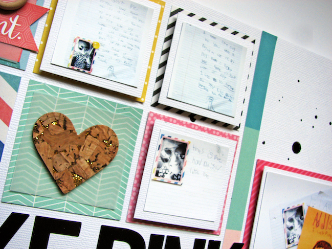
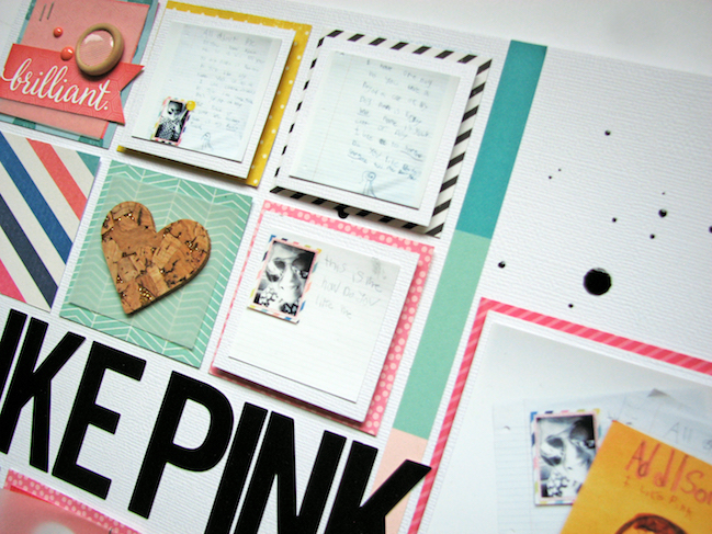
Scrapbooking Children's Artwork // scrapbook page by Nicole Nowosad

Today I’m delighted to highlight something beautiful and practical from contributing designer Nicole Nowosad. I already have a big stack of kid art and just a two year old in this house! It’s going to get worse, so I’ll take all the ideas I can get. I hope you enjoy!

When it comes to some of my most precious possessions, I don’t think of the electronics or jewelry I own. I think of the other “stuff” that we keep for later in my life. Mostly, it is photos but lately, it is a lot of children’s artwork. I know that one day I will reflect back on these items as some of my most precious possessions indeed. The sad thing is that some of the stories that come with the stacks of my kid’s artwork I have tucked away won’t always be remembered.

Scrapbooking Children's Artwork // scrapbook page by Nicole Nowosad

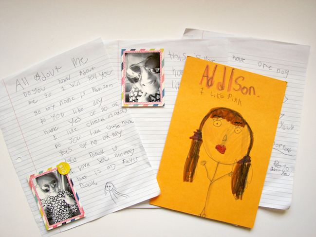
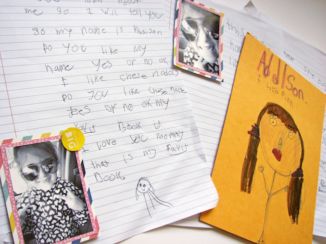
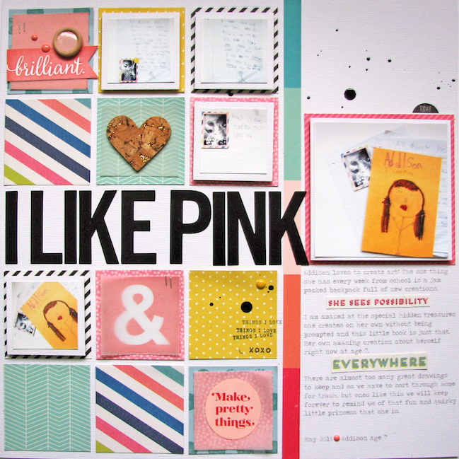
I have decided to document some of those more special pieces by scrapbooking about each of them starting with this project by my seven year old. My daughter is a natural born crafter and I came across the sweetest little book she started about herself.

Scrapbooking Children's Artwork // scrapbook page by Nicole Nowosad

I took apart the pages and took photos of each page to add to my project. I really wanted to capture my daughter’s handwriting as it really is one of the best parts of this project she made. I wanted to keep track of just how she wrote the questions in her book in the handwriting she used at this age, as I know that will soon change.

Scrapbooking Children's Artwork // scrapbook page by Nicole Nowosad

I did keep the book after all, but now that I have this very precious possession documented with a little story about it – when room gets tight in our storage bin, it will be easier to sort through which projects are keepers and which we can eventually let go.

Scrapbooking Children's Artwork // scrapbook page by Nicole Nowosad

Once the project was photographed, I printed out smaller sized photos for the small pages and one larger one for the main page of her about me book. Next time I do this, I will make the photos a bit larger as I would like to be able to read just what she wrote, but in this case, I will add the journaling to the back of this scrapbook layout for later.

Scrapbooking Children's Artwork // scrapbook page by Nicole Nowosad

We’d love to hear your ideas for scrapping children’s artwork in the comments! Have a craft-filled and happy weekend.