Weekly Challenge :: Scrapbook with Split Complementary Colours
It’s been a while since we’ve had a specifically colourful challenge, and it’s also been a while since I’ve seen much other than a grey, grey sky. I’m ready for summer colour! I’ll take it only scrapbook pages if I can’t find outside my window. How about you?
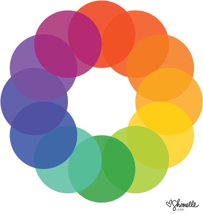
This colour wheel may come in quite handy this week, and you can find a larger version to print if you would like one for your desk. A colour wheel is definitely not required for scrapbooking and scrapbooking collections tend to have carefully considered colour schemes anyway, so you can choose a mix of colours from a paper or embellishment and they will certainly look beautiful together. But it can be fun to start from scratch and take control of the colour and even know a little about why we’re drawn to certain tones together, and that’s where the colour wheel comes in useful.
We’ll talk more about colour in some other posts this week too, but for now, let’s start with just the challenge! This week, I challenge you this week to scrapbook with split complementary colours. Split complementary means choosing one colour to start, then going straight across the wheel to the opposing colour and instead of that central colour, choosing the one either side. If you started with red, you’d go across the wheel and have yellow-green and blue-green. If you started with yellow, you’d pair it with blue-violet and red-violet. You can start with any colour you like, go across and choose the two either side and they will always work well together, but they are colour combinations we don’t always head toward for scrapbook pages. Everything else about your page design is completely up to you, so you can take your inspiration in any direction you like! To get you started on this week’s challenge, take a look at these examples from contributing designer Meghann Andrew and guest artist Daphne Wuenn Rihm.
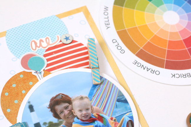
I always find it easy to work with a chosen color scheme when those colors are apparent in the photo- the photo and the product I’ve selected just work together seamlessly that way. As soon as I saw this photo of my mother and daughter sitting on the beach, under a brightly colored beach towel, I immediately saw the split complementary color scheme (meaning the two colors adjacent to the complement of a given color) in the blue, reddish-orange and yellow-orange stripes in the towel.
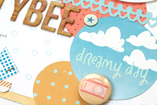
Armed with my trusty color wheel, I got to work choosing product based upon those colors.
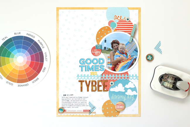
Instead of working with a complementary color scheme, which allows for two colors, this color scheme offers three colors and an interesting variation from the typical blue and orange combination. All of the product on this page reinforces my color scheme, down to the golden-toned woodgrain alpha that I used in my title, and everything works to support the colors found in my photo, creating a harmonious page, documenting a great day on the beach.
- Meghann
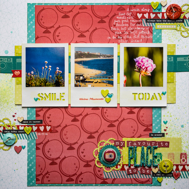
I am a big fan of bold colours combined with great patterns – this always makes my heart beat a bit faster! No change for this layout. I chose three colours from the split complementary colour scheme as a starting point: pinkish-red, turquoise-blue and greenish-yellow.

The inspiration to pick these bold colours came from the photos, which are from a recent walk along the cliff top in the South of the UK, just about 10 minutes from where I currently live.
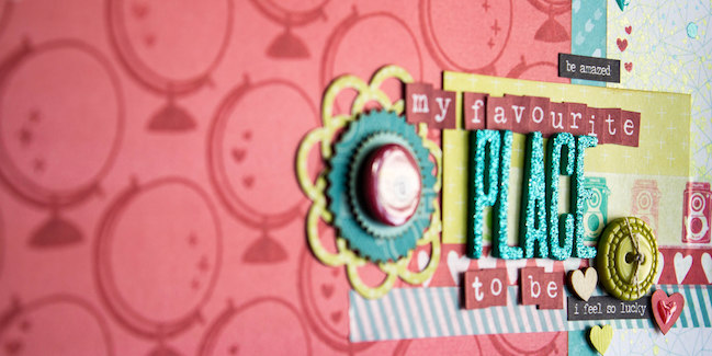
I started building up my layout with a geometrical-patterned background, layered the turquoise and the red on top, with the green strips behind the three polaroid-style photos. When I first put the papers together, the red seemed too overwhelming on its own, so I looked out for a stamp which I could use to create my own patterned paper. Shimelle’s globe stamp from the Starshine collection was the perfect candidate for this purpose!
The three embellishment clusters are scattered with hearts in different shapes and appearances, I even found this paper washi tape with hearts in my stash!
I also wanted to include my love for photography and added some cameras: The strip behind the photos is from True Stories and the little camera badge next to the title is from Starshine.

The journaling found its way onto the layout, just before I added some ink sprinkles and scattered tiny epoxy hearts.
- Daphne
You have a week to complete the challenge and share a link – but of course you’re welcome to set your own time schedule. Whatever keeps you happy and creative!
Today’s Guest Artist: Daphne Wuenn Rihm loves frothy cappuccinos, walking along the beach for hours, and maths. You can find more from Daphne on Instagram, Twitter, Youtube, and her blog.
![]() Read more about: scrapbooking-challenges
Read more about: scrapbooking-challenges
Next post: Weekly Challenge :: Take Inspiration from a Colourful Border
Previous post: Weekly Challenge :: Scrapbook using just a third of the page


