Sketch to Scrapbook Page :: Making a Banner with Photos
I’ve been meaning to discuss a little something with all of you about how my philosophy has changed since so much of my teaching now comes in the form of videos. There is one really big idea I hope you will take on board: some times I try things so you don’t have to. I scrap so much and I share almost all of it with the world in some way or another – either in blog posts, in Glitter Girl videos at Two Peas, or in my class content for those of you who sign up for my online scrapbooking workshops. In the past year, I can count the pages I have kept to myself on a single hand.
That doesn’t bother me in the slightest: it is my choice to share with all of you, and if I didn’t want to, then this would not be the right job for me! But it does mean that there isn’t a nice, safe, secluded place for me to go through random ideas without sharing it with you as it happens. If I make every page in a style that’s too similar, you’ll get bored, and some will let me know. If I make every page wildly different from the rest, I won’t be happy with my albums and those of you who like the style I’ve shown you up to now may not be big fans, and some will let me know. So I try different things and I show you right there on the video as it goes. Sometimes I find a real win; sometimes I get the page to a point where I’m happy with it, but I make a big note to self about whatever particular element I probably won’t try again.
When you watch, you can make that decision from what you see, and if you want, you can essentially learn from that in the same way that you learn from a mistake. If I run my title up the side of the page and you don’t like it, you know not to run your title up the side of your page – and you don’t have to go through the stress of moving your title and trying not to ruin your letter stickers to figure it out. Maybe you look at my layout and think you don’t like that patterned paper. Perfect: don’t buy or use that patterned paper. What you see that you don’t like can be just as useful as what you do. But whatever you see? I like it for me and I’m happy to have it in my album – or I would keep working on it or start over!
With this sketch and video, I wanted to really demonstrate what I mean by this process. I wanted to take an idea I have used many times and try it in a way that I hadn’t used before and I wasn’t completely sure would work. I gave it a try and I kept working on the page until I got to a point where I was happy with the layout – but now I know the difference between the way I used this technique on this page and the way I’ve used it before, and I know what I will take forward from there. You can simply look and see what you like and take that forward for your own process without the frustration of discovering it for yourself. I think that’s what I mean. Of course, I also know some of you are stubborn like me and will want to try it for yourself. That’s totally okay too.
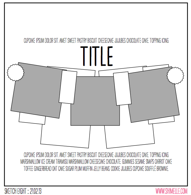
Getting on with it then, here’s the sketch. It’s a bunting-inspired banner design across the whole page, on a quite large scale. I’ve used this idea in the past but always on a much smaller scale for the banner, and this time I wanted to use it as a big element that would take up most of the page. Of course, that makes it quite different from the usual way I start my pages with a bunch of different boxes of patterned paper in the background!
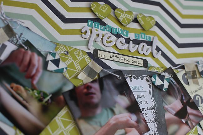
This page was made with supplies from the February Best of Both Worlds kit. (And the next sketch video moves to the March kit, by the way.) Of course you can try it with any papers you like! I added some eyelets and twine too, and for those of you who have requested eyelets on pages – I’m afraid this is pretty much the only time I use them these days. I passed my giant jar of eyelets to another scrapper many years ago and haven’t looked back. I just prefer brads, rhinestones, enamel dots, and other simple little embellishments like that to the extra steps of eyelets. But they do add a lovely bit of polish to banners!
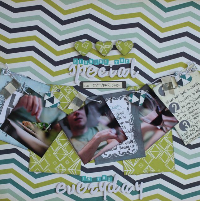
Here’s my resulting layout with the idea of banners gone big! But how does it compare to when I’ve used banners on a smaller scale? You can see three different examples in videos when I’ve used them as a smaller part of the page: the Glitter Girl episodes on breaking through scrapper’s block and using scenic patterned paper designs, plus this video when I guested for Studio Calico. But I ask you that in a way that it’s useful for you to figure out for your style! I’m happy with all four layouts in my albums and they all have a different look. If you like one more than the others, then you might want to remember that if you use this sketch but in your own style. All part of the learning process, and drawing those conclusions for yourself can be really important in defining your own style, if that’s something that interests you.
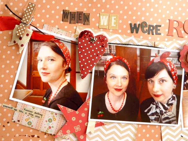
But of course I’m also delighted to include another version from this same page so you can compare already and keep those notes to self in your own mind. So much good stuff with this page by Julie Kirk!
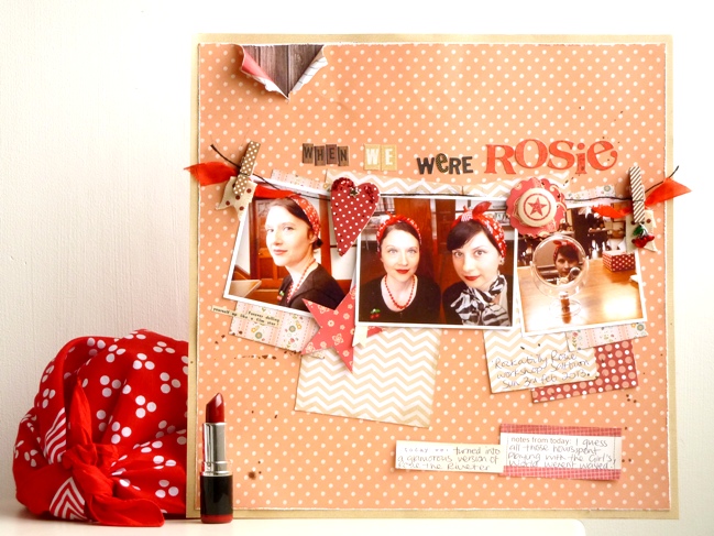
If scrapbook sketches can feel theatrical then this one, with its title taking centre stage and the photos stretched out like a banner, certainly fits the bill making it easy for me to decide which photos to use with it. My sister and I recently spent the day at a ‘Rockabilly Rosie’ workshop where we tried out glamorous vintage-style make up, hairstyles and dance steps. Not all at the same time I might add … although we would have had fun trying! And the retro results seemed just perfect for this style of sketch.
I adapted a few things to help me tell this particular tale such as adding a narrow frame around my background paper as a way to pull in another colour which, like all the shades of papers I chose, was drawn from the colours within the photographs. I also added in a few vintage themed touches like the rip in the top corner and a snippet of text [beneath the left hand photo] which I cut from a 1950s magazine. I couldn’t settle on a way to write my journaling across the page, like the sketch, so I just used a couple of journaling blocks instead. But overall, looking back at my version I realise I’ve stuck fairly closely to the original, which is a bit surprising really as I didn’t think I was that obedient!
Julie Kirk documents everyday stories through her scrapbooking often in combination with vintage supplies and lots of patterned paper. She is regular designer for Papercraft Inspirations and Creativity! Magazines and contributes to the 3DJean design team blog. Through her own blog, ‘notes on paper’ and her Facebook page she shares creative projects, hints and tips, stories, and anything which might raise a smile. Meanwhile she shares her love of vintage supplies through her Etsy shop.
And now it’s your turn! Create a page in your style with this sketch, post it online, and share it with us. You can upload to your blog or to a scrapbooking gallery like Two Peas or UKScrappers, then just follow the steps to link to your project wherever it can be found online!
![]() Read more about: sketch-of-the-week best-of-both-worlds-kit
Read more about: sketch-of-the-week best-of-both-worlds-kit
Next post: Twine Twirling: A Scrapbook Tutorial by Laura Craigie
Previous post: Using a Polaroid frame stamp on a scrapbook page


