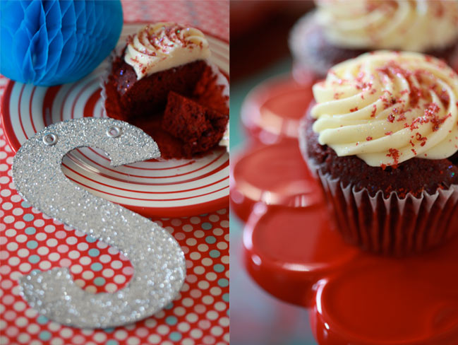
This article was originally printed in volume one of the Scrapbook Inspirations Ideas Book, which is now out of print. It was probably my favourite column to work on over the years and I’m thinking it’s about time to bring it back and write more about colour stories here on the blog. So I’m going to start with this from the archives, and you’ll find a challenge at the end of this post, of course. And please let me know if you think this is something that should appear here more often. Oh, and it was for a spring issue, so do excuse the few references to winter ending and spring coming to life!
It’s only right to start with red: it’s the colour that means so much and can never be ignored. When I was a little girl, I always chose the red crayon first. In my precious box of sixty-four shades, burnt sienna and ultra green stayed perfectly intact indefinitely while red’s wrapper was torn down to nearly nothing from being sharpened time and time again. I chose red for my school bag and my sneakers and bows in my hair. Its allure so many years ago is a mystery, and I have strayed to other favourites over the years, but red is that constant: always there, always ready to pack a punch. As a teenager, I paired red with black to seem a bit rebellious. My first car was a very faded red Ford Escort. I dyed my hair to include streaks of red that were far closer to a red crayon than any hair colour ever created by nature. Eventually I grew up enough to embrace red as something a little less riotous and a bit more sentimental: red velvet cake, Christmas cards and perfect little love hearts.
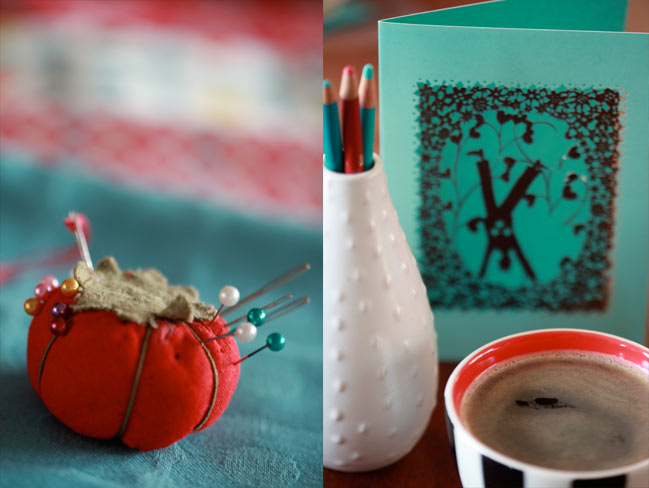
Aqua is something a little more new. It was never the favourite crayon (though it wasn’t ignored either) and it has never appeared on my personal top five list at any point in my life and yet I am in love with its perfectly crisp balance to red. Blue but not blue, and lovely in shades from rich turquoise to a pale hint of summer sky and everything in between. It’s the colour of the sea in those magical places most of us see more often in travel brochures than with our own eyes. Between sea and sky, it’s certainly a dreamy colour. For every bit of warning symbolism that comes from the red of stoplights and danger signs, aqua offers a calm alternative. Red says panic, aqua says forget about it and head to the spa.
Then there’s white: the colour that gets ignored. We see it constantly throughout the day but we rarely discuss it as a design choice. I don’t think I’ve ever known someone to say white was their favourite of all the colours. I think we rebel against white cardstock in the scrapbooking world sometimes. Many of us were introduced to scrapbooking with just one option for the background: plain white cardstock. When we discovered other papers — colours and patterns that could also become the background — we stepped away from the white cardstock and so rarely head back. I’ll admit I still don’t like white cardstock unless it has a texture — just a little something to make it special. Despite all this, white has its own meanings that are pretty important — things like innocence and purity make white our obvious choice for baby clothes and wedding dresses, but its neutral perfection also gives it that stark look of an empty canvas waiting to be filled. I love the look of white floor boards topped with white furniture, a popular look in Scandinavian homes to maximise the light while also making it easy to change the decor by just making changes to accessories.
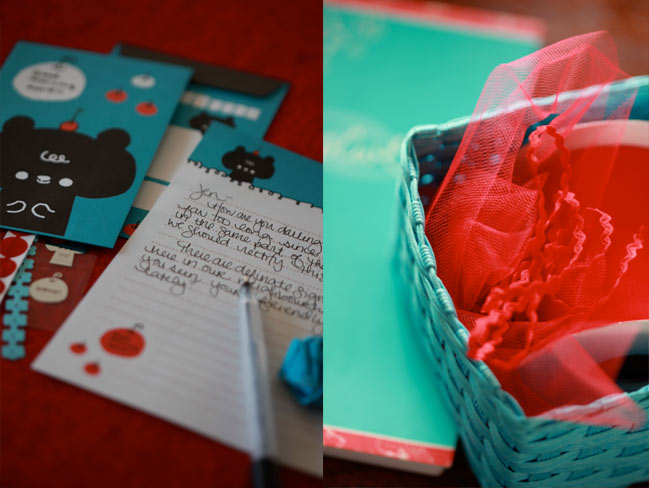
Red, white and aqua together make a whimsical twist on patriotic colours. If the red, white and blue of the Union Jack or the Stars and Stripes can be regal and official, then red, white and aqua becomes playful and youthful and reminds us to embrace a bit of our childhood with our creativity. This combination seems like a way to bend the rules without the out and out breaking them attitude of dark red and black. Three colours that say life is full and happy and not to be taken too seriously.
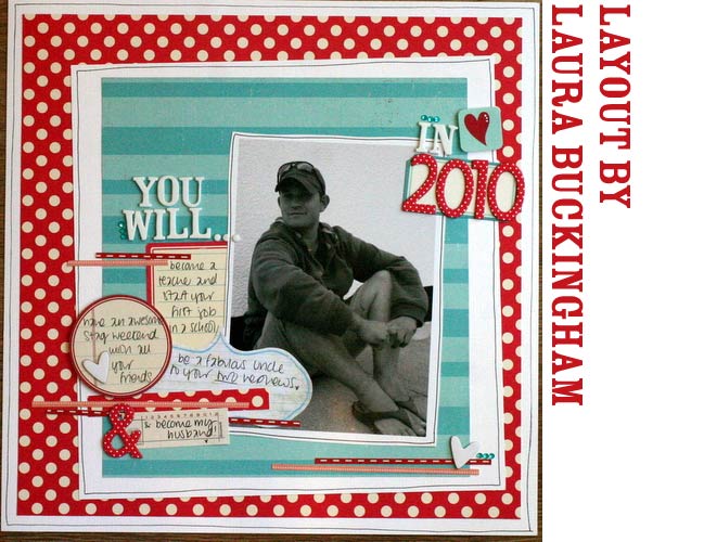
How does that translate to paper? Without any further instruction, I asked Laura to scrapbook anything she wanted in red, white and aqua. The resulting page includes that balance I had in mind — life is full of good things, like how she is looking forward to her wedding and how her husband-to-be will start a new career at the same time, but of all the other things she could mention in the journaling, she also includes his upcoming stag weekend as a planned highlight for the year! I blame the aqua: it’s almost like that striped paper reminded her to embrace some of life’s crazy-fun times as well as those big universal milestones.
 Yes, that page is creased and damaged. It’s totally my fault, as it was in a box of ‘these need to be sorted into albums’ pages for months. At least it wasn’t totally destroyed. But seriously: I am loving putting pages straight into albums now. Can’t say it enough. Right, back to the article.
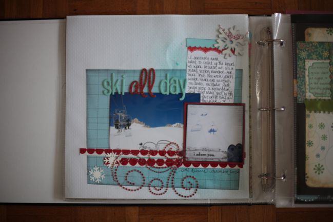
Heading off to mountains of white snow and skies filled with aqua is quite possibly my favourite week of each year. I pack a small camera in the pocket of my jacket so I can take pictures and the occasional movie of our time on the slopes, but I soon realised that meant most of our skiing photos look very similar and there are only so many times I can scrapbook my awe of mountains and my amazement when I come home intact. I decided I would start scrapping these photos before I decided what angle the journaling would take, and put that red, white and aqua colour palette to work. While I was finding little bits and pieces in my scrapbooking stash to bring it all together, I realised the reason I look forward to these trips so much is because it is such a release from our daily lives when we both work more hours than we care to admit and are constantly driven by deadlines and things that need to be done. Even when we do have a day off or a holiday, we don’t switch off from the real world in the same way that we do when we head up the mountain. Things look differently there and work differently there and we adapt to forget all about any routine other than catching the first lift in the morning. Red and aqua strikes again: acknowledge that life is full of serious stuff, but we also have to take some time to just play now and then.

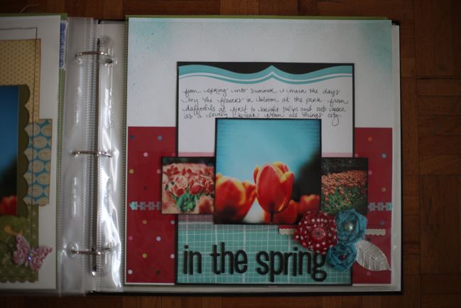
As we move away from this very cold winter and into a hopeful spring, my notebook is filled with flowers too. Predictable, I suppose, but charming nonetheless. I’m scrapping a few flower shots that remind me it os the time of year when things happen quickly and it’s important to get out there to see the world in bloom. This spring is all about flowers that seem just a bit special and surreal — twisted and stitched from fabrics, ruched and brightly coloured from paper. Beaded, pearled, buttoned and bedazzled in a way that takes something that looks so special occasion and make it perfectly acceptable for the every day. The return of fabric papers to the scrapbook world after an absence of a couple years made me break out those older sheets and try something new. Ripping away the adhesive backing leaves a fabric that is printed like a quilting cotton but with a very different texture. I tried folding it softly into flowers to no avail, since the fabric just seemed too course to ever relax in quite the right way. A bit of play with taking that rigidly folded and wrapped fabric flower and essentially destroying it with the iron creates a look I love: that very same fabric now relaxed with frayed edges and stitches to hold in place. The same technique works with regular fabrics to create a similar but calmer look like the red flower here.

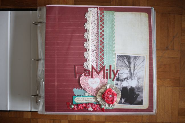
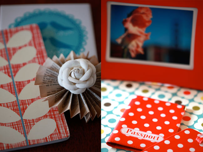
Of course, it only takes the slightest change to create a completely different mood when it comes to colours. Replace the crisp white with a softer vintage cream and it tells an entirely different story. This family photo predates me, but I can still see so much that I do know in that picture. I’m not sure exactly when it was taken, but it reminds me of spring, with the combination of trees that are still missing their leaves with warmer weather that encourages short sleeves and putting cardigans away for a few months. Warming the colours with cream and off-white always works with older photographs, and I love the mix of that same trendy ribbon flower with something older in the pinwheel backing made from folding old book pages into tiny accordions and gluing them together in a circle. Something a little modern in the satin ribbons, something a little older in the crocheted lace. One thing I come back to often in my notebook is balance — how to have just enough of this and still have time for that and so forth. But making a single page is about balance too — a little pattern, a little plain, a little room for embellishment, a little room to breathe.

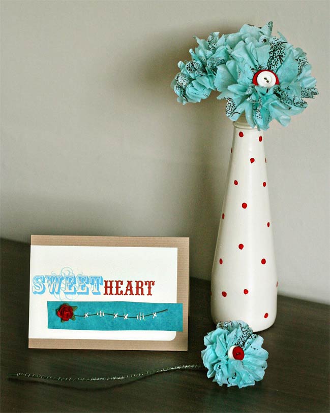
I’m not the only one thinking flowers recently. I asked Kirsty what red, aqua and white would inspire in her creative work and she came back with the sweetest of notecards and a bouquet of paper flowers topped with buttons. Perfect for spring and no green thumb required — and she’ll even show you how to make them. Find the paper flower tutorial from Kirsty here.
 So now your challenge might be obvious!
 Create a project in red, white and aqua!
One entry will be selected to win a prize pack of assorted scrapbook goodies. Entries close at midnight next Sunday (21st August 2011).
Feel free to use the comment section to chat about this challenge, as the entries should go in the linky widget!
![]() Comment [9]
Comment [9]






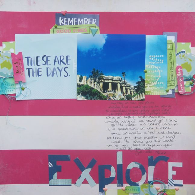
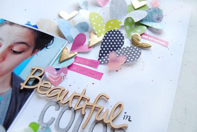
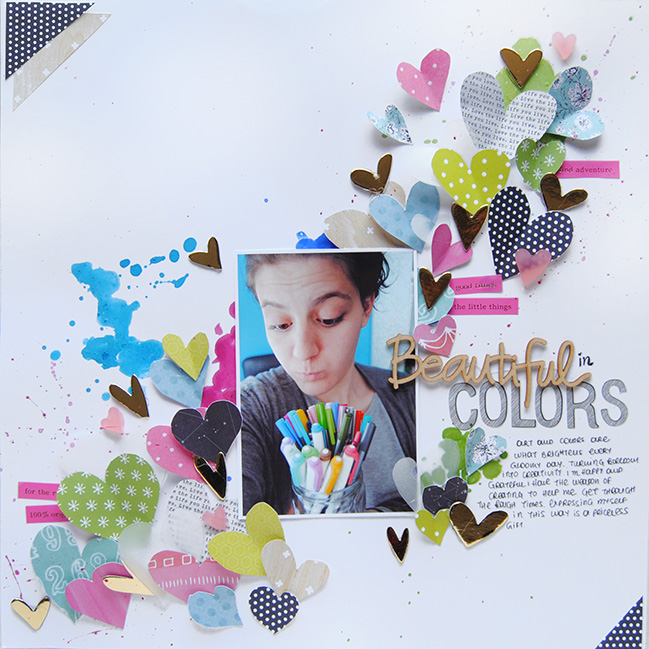
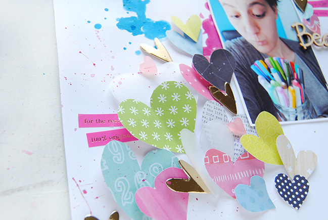
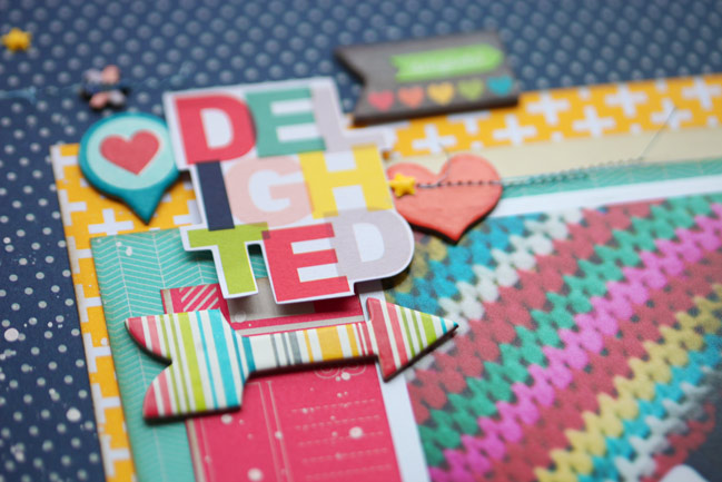
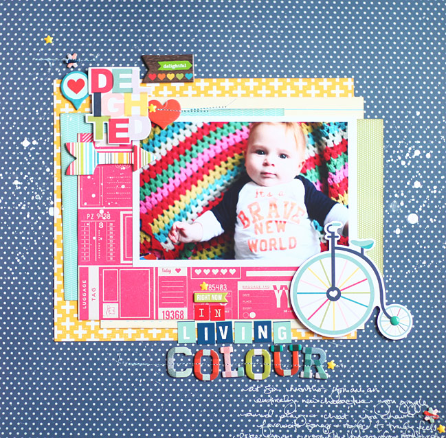
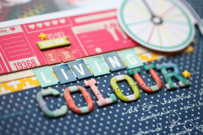


 Yes, that page is creased and damaged. It’s totally my fault, as it was in a box of ‘these need to be sorted into albums’ pages for months. At least it wasn’t totally destroyed. But seriously: I am loving putting pages straight into albums now. Can’t say it enough. Right, back to the article.