Scrapbooking with pink and red
Are you feeling the lovey-dovey vibe with your scrapbooking this week or do you prefer to opt out of all things Valentine? I had to laugh when I looked back at my photo library for what we did for Valentine’s Day 2015 – we set the table properly and ate lunch during nap time. That’s all. And it was awesome and should definitely go in my scrapbook. But in crafty days, I love Valentine’s as an excuse to mix pink and red together. Truly pink is just red with white added, so they certainly go together in a monochromatic sort of way, but it’s not a combination we see everywhere and it feels just a little extra special and maybe even rebellious to me.
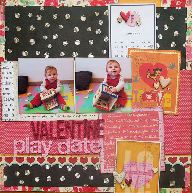
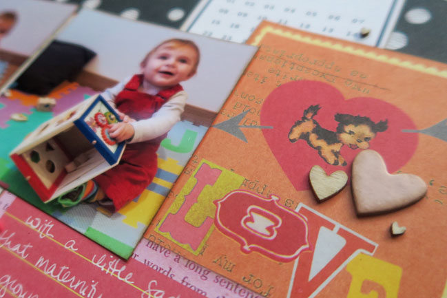
I threw orange into the mix today as well, and I wasn’t really planning that. But that Sassafras Valentine cut-apart sheet included orange and it made sense. In colour wheel terms, red-red/orange-orange all in row makes them analogous colours, so there’s a harmony there. A bit like blue and green feeling like the sky and the grass, red and orange feels like the colours of the horizon at sunset! But I had pulled out so many patterns, with all the hearts and text and that bold floral in the background, and I knew those two square photos would get a bit lost, so I blocked out a big section of the page in black. Solid black would work, but I just prefer more pattern! This dot is more subtle in terms of my pattern selections, and adding brown ink around the edges toned it a bit more in line with that vintage floral background. Or so I’d like to think, anyway!
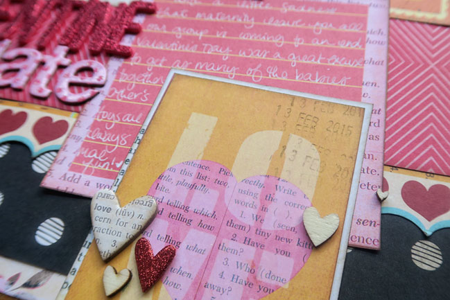
In design terms, I did something a little different – no triangle of things surrounding the pictures! There are still three areas of more embellishment with the chipboard and wood veneer hearts, but they are all in that column on the right. I think their placement brings more attention to the cuter of the two photos (the one on the right) but that photo on the left might be a bit lost. Not enough for me to change anything, but it’s nice to look back and evaluate sometimes. I think the lighter bits of the patterned papers, like the calendar, the text behind the photos and the frame around the orange card at the bottom are really key in this mix of so much stuff. That off-white tone helps it from being too dark and heavy, and those do create a triangle that surrounds the photos, so I’ve not gone full on rebel or anything.
Today I’ve also asked guest artist Karla Yungwirth to take on the pink and red challenge, and she obliged with a Project Life style!
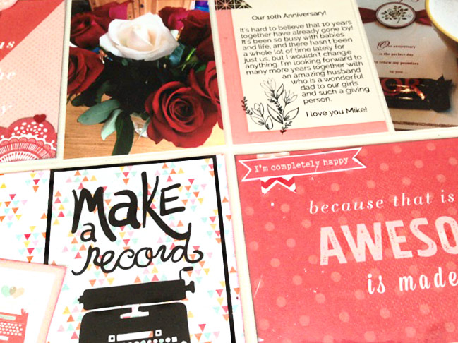
Not too long ago, my husband and I celebrated our tenth wedding anniversary! It was such a special day, and I wanted this page to really focus on our love for each other. I looked for red and pink pieces in my scrapbook supplies and was surprised at how many ‘love’ themed papers and ephemera I actually had!
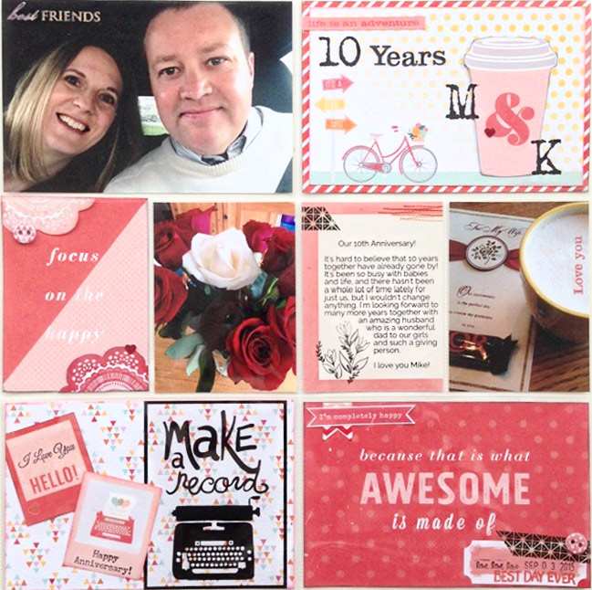
I pulled papers from Shimelle’s True Stories collection and a Fancy Pants paper pad as well as using stickers, stamps, rub-ons and some My Mind’s Eye accessories to complete my pocket page. With eight pockets but just three photos, I made sure my pictures were the size of the full pockets so they wouldn’t get lost, but I still had plenty of room for my journaling and to play with embellishments in the pink and red colour scheme for a monochromatic look.
-Karla
Karla and I would love to see anything you’ve created with both red and pink, be it a scrapbook page or a Valentine greeting. Share it in the comments if you like! Happy crafting, no matter what subject you’re scrapping today.
Today’s Guest Artist: Karla Yungwirth loves family craft sessions, organizing and, of course, scrapbooking. You can find more from Karla on Instagram, Facebook, and her blog.
![]() Read more about: colour
Read more about: colour
Next post: Weekly Challenge :: Mix old scrapbooking stash with new favourites
Previous post: My take on scrapbooking with hearts


