pretty paper. true stories. {and scrapbooking classes with cupcakes.}

lovely to meet you Twitter Facebook Pinterest YouTube

Take a Scrapbooking Class

online scrapbooking classes

Shop Shimelle Products

scrapbook.com simon says stamp shimelle scrapbooking products @ amazon.com shimelle scrapbooking products @ amazon.co.uk

Reading Material

travel

colour Category

Writing in colour

scrapbook page
Supplies: cardstock by Bazzill Basics, patterned paper by Cosmo Cricket, stickers by 7gypsies, So Happy Together kit by Erica Hernadez, Vintage Photo Tool Kit by Rhonna Farrer, brown pen by American Crafts and one very ancient sun punch from EK Success.

The American Crafts precision pen in .03 is my writing implement of choice. So much so that I buy them two dozen at a time…but always in black. And recently this has seemed very wrong. Perhaps something brought about by a month of colour.

Okay, I haven’t gone far from the black but I feel I must announce publically that the precision pen in brown is just as fabulous. It’s not too pale to read like many a brown pen I have tried. It’s just like a black pen…only brown. Why that has been so difficult to find over the years, I do not know. Perhaps I was looking in entirely the wrong place.

I’m not ready to jump entirely into autumn any time soon, so for now I’m mixing my browns with rainbow brights, like the So Happy Together kit by Erica Hernadez. That’s what makes the printed circles, stars and labels in this paper layout, but it works digitally too:

digital scrapbook page
Supplies: So Happy Together kit by Erica Hernadez, Wishing for Sunshine papers by Holly McCaig, page template by Ali Edwards from the Songbird Avenue charity kit.

This template already had the title coloured, but easy enough to switcheroo with the ‘replace colour’ function, so now it matches the papers.

digital scrapbook page
Supplies: So Happy Together kit by Erica Hernadez, Rich Bohema Solid Papers by Tia Bennett, Strokes and Splatters and Vintage Photo Tool Kit by Rhonna Farrer, and Butterfly Elements by Michelle Underwood.

And the journaling typed one line at a time here so the words could be in the same colour as the labels…except that yellow that was too hard to read!

Today’s colour challenge?
Write in colour! Get out some coloured pens, pencils or markers and put some colour back in your penmanship. It can be a layout, a card, a note, a grocery list, the text of a blog post—whatever you fancy as long as it includes words in colours other than black and white!

Upload it somewhere online and link it up here in the comments by 11:59pm on the 30th of June and one lucky winner will receive a set of stamps!

{And if you missed yesterday’s post, there is a free download plus a give away that just requires a comment, so don’t miss that one!}

xlovesx

Some colourful inspiration for you

free download art print
©Tia Bennett. Click to download.

Need a colourful motto to keep you going on days that are a bit…grey?

The lovely Tia Bennett has made this just for you. It’s free to download and will print out at a bit size for framing. Hang it on your wall, frame it on your desk, or print a small version to keep in your wallet for happy inspiration! I absolutely love the energy behind this sentence.

And as if that freebie wasn’t enough, I’ve got more! Everybody likes something for nothing, right? Just leave a comment on this post (no challenge or link required today—just a comment) and I’ll draw one name from all the comments for a prize. I’ll hook up the winner with their choice of any kit from Tia’s digital designs, which are great for digital or paper scrappers and crafters. Entries close at 11:59pm London time on the 30th of June.

Enjoy—and leave a comment to win! Have a fabulous – and colourful – weekend.

{Kindly note that the free download above is for your personal use—use it as much as you like on your scrapbook pages, your wall, your fridge, etc. Just don’t sell it, make advertising with it or distribute it. Know someone who might like it? Just send ‘em over here to download it! Thanks.}

xlovesx

The mood of muted colours

scrapbook page
©twopeasinabucket.com Supplies: Delightful Day free digital kit by Chelsea Parsons, patterned paper from BasicGrey’s Wisteria collection, stickers from Little Yellow Bicycle and 7gypsies, supercute pennant-topped pins by Making Memories, American Crafts Thickers, little letter stickers My Little Shoebox, the scallop sentiment border punch by Fiskars and a lovely white pen to finish things off.

Muted colours, to me, are daydreamy and a bit glacial, like the colours of ice and stone. And no one does those colours quite like Chelsea Parsons does with her digital designs. But why do I tell you this today? Well, aside from it being a month of colour, Chelsea also has a free kit available for download here and well, you didn’t think I could not draw your attention to something free, could I?

Wait. Even better: use this free kit and there’s a chance you can get paid! Check out today’s challenge here and make something with the free kit for a chance to win free shopping money.

But wait! Don’t get distracted by free things and prizes just yet! Let’s talk more about muted colours before you go to do that. Check out the gorgeous colours Chelsea uses in her layouts here—so magical. Although it’s far from my usual scrapping, I love this look with the greys, whites and chilly blues. It makes me think of Iceland.

Oh Iceland. The place I love and yet photographed so poorly. Have I told you the story of my stupidity in Iceland? We went there two three summers ago, in the height of summer. It doesn’t make it warm by the standards of anywhere else in the world, but it has one definite summer trait: pretty much non-stop daylight. This is a dream for your camera, right? Beautiful sweeping landscapes of green hills, volcanic rock, rivers and glaciers, all with light, all the time. Fabulous.

Except the night before we left, I shot something in the dark. So I had pushed the ISO on my camera as high as it could go.

And somehow in my excitement, I didn’t realise this until day eight of a ten day trip.

Let me tell you, that is what I call learning the hard way. I now have my camera default set to 100ISO to force me to dial it up if needed. So anyway…the photos are pretty, but covered in grain. Lots and lots of grain. And as much as I like to use it as an excuse to go back, really it was a serious moment of palm to face.

digital scrapbook page
Supplies: Telling Time and You & Me kits by Chelsea Parsons, Matilda kit by Kitschy Digitals, Peachy Keen Brush set by Rhonna Farrer, Spool of Stitches by Tia Bennett.

But back again to muted colours. I adore this page by Chelsea. It’s beautiful and so unlike a scrapbook page to me. So I gave it a try…and for these photos, I think this may be the perfect answer. I’ll keep you posted. But so far, I have found new love for all things muted. Thanks Chelsea!

Now don’t forget—you can find today’s challenge here—and it ends soon rather than the end of the month, so hop to it! Or if you miss that deadline, make something with the free kit anyway and share it here!

xlovesx

A colourful guest post :: Kirsty parties it up with pajamas

Holy blood sugar Batman: I think Kirsty may have graced us with the cutest project ever. Enjoy!

Mission: Really Quite Possible

Your project, should you choose to accept it

Use colour to makeover a pair of plain white summer pyjamas, or other plain-with-potential item from your wardrobe. Extra mission-points given for solving colour-related dilemmas along the way.

handmade pajamas

Dilemma: Red and green are a great combination, but it’s tricky to use them without things beginning to look at least a little like Christmas.

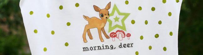
Solution: Adjust the quantities of each colour. By focussing on green, especially a lighter or more acidic shade, and adding just a few small touches of red as an accent, the festive feeling vanishes.

Project notes:

Get some extra value from your digital scrapbooking elements by printing them on to t-shirt transfer paper and ironing on to clothing. The deer design is from Kitschy Digitals and you can download the fun, cross-stitch style font here.

Create your own polka-dot print with fabric paint (or fabric-friendly ink), applied with the eraser-end of a pencil. You can also colour solid areas, such as a waistband, with the same paint and a small brush.

To make mini pockets, hem two rectangles of fabric, then stitch them in place on either side of your shorts.

Paper not PJs? Print the deer design onto cardstock, adding your own message, then stamp dots of ink over the remainder of the card.

handmade pajamas

Dilemma: Combining more than two or three shades with confidence, or finding new and unusual colour schemes.

Solution: Use the colours in patterned fabric or paper as a guide. You can pull out the shades yourself, but it’s also worth checking the edge of the paper or the selvedge on fabric for the row of dots which act as a quick colour guide. Whether you include the fabric or paper as part of your finished project, or just use it as inspiration, is up to you.

Project notes:

Iron a piece of fusible webbing to the back of a bold-print fabric (this one is from Amy Butler’s Belle range) and cut around one of the motifs. Peel away the backing and iron on to your vest top for a super-fast and easy appliquéd patch.

Pick out gems or buttons which match the colours in the fabric and fix on top.

Create a scalloped edge by cutting out circles of fabric and snipping them in half. Line up in a row and stitch a length of ribbon across their length to secure the upper edges in place.

Add colour to the straps of your vest, by brushing on fabric paint or try snipping off the existing straps and replacing them with ribbon.

Paper not PJs? Try cutting motifs from sheets of gift-wrap or scrapbooking paper and decorating with gems to make cards or embellish layouts.

handmade pajamas

Dilemma: Basic primary colours can sometimes look harsh or garish used together in their truest shades.

Solution: Picking fabric or paper with a small, simple print, instead of using a plain colour, helps break up the harsh ‘blockiness’, and mixing media/materials to add texture stops them looking flat or dull.

Project notes:

For a relaxed, imperfect look, cut your fabric pieces out freehand. Scrunch each one into a ball between your hands to fray and roughen the edges, then iron flat before fixing in place.

Parallel lines of simple running stitch are an unusual, but surprisingly effective, way of adding a small block or band of colour.

Small felt shapes provide a softer alternative to buttons stitched all over your shorts!

Paper, not PJs? Create a flag-inspired holiday layout or mini-book, using patterned scrapbooking papers.

handmade pajamas

Dilemma: When you start to combine prints and patterns in different colours, it can end up looking messy and confusing.

Solution: If you’re using an analogous colour scheme, you can pretty much mix prints to your heart’s content, but with patterns which include multiple colours, it’s harder. Try picking out just one of the shades from a large or bold print and choosing fabric or paper with a smaller pattern in that same colour.

Project notes:

Cut a long, narrow piece of fabric and fold the edges over, ironing in place. Slide a buckle about a third of the way along the strip to create a faux belt. Stitch the ends of the fabric to either side of your shorts to fix in place.

Gather up a length of contrasting fabric to make a frill at the neck-edge of your vest (or cheat like I did and snip an existing frill off a pretty charity-shop shirt!). Pin the gathers in place to make sure you’re happy with the way it looks before stitching.

To re-colour a piece of white or cream lace, add a small amount of water to some fabric paint, then brush or sponge on to the surface of the lace. Leave to dry before stitching a strip to the bottom of each shorts-leg.

Sew on a cluster of vintage buttons in a coordinating shade to add detail in a subtle way (using a mixture of colours will give a more striking look, if you’d prefer).

Paper, not PJs? Give scraps of lace a colour-makeover, using either watered-down paint or an ink pad, then use them to embellish cards and layouts.


Kirsty Neale is a freelance writer and maker. She mostly writes children’s books and makes things from paper, fabric and paint. She lives in London and her favourite colour is green. Read her blog, Ginger and George, here and check out The Copy and Paste Project as well, something she works on with Julie Kirk.


Your colour challenge today? Follow any of Kirsty’s suggestions for paper or pjs! Leave a comment here and one commenter will win a set of Banana Frog stamps!

ETA: Turning comments off because oh my, do the spammers love this post!

Colours of a journey

photos to scrapbook from our hawaii trip

We are back from warm, sunny Hawaiian islands to our own isle with longer days but cooler temperatures. And I think I am now post-jet-lag, which would be fabulous.

Haven’t edited a single photo yet, but posted twenty-five of my favourites here and am so excited to order prints and get scrapping.

Just need to sort a few more little coming-home things and then I’ll be back this afternoon with a supercute guest post!

xlovesx

Playing with paint :: a quick tutorial with stamps

stamping tutorial

Inspired by Jane’s use of acrylic paints in her guest post, here’s a little something to try to get a new look from paints and stamps in your collection. You’ll need a paper tag, a stamp, embossing ink and powder, and a heat gun. It’s easy-peasy:

If your tag is white, add ink in pale brown shades to add depth. You may want to omit this step if your tag already has colour.

stamping tutorial

Use Versamark or a clear embossing ink to stamp the woodgrain background all over the tag.

stamping tutorial

Cover in clear or light brown embossing powder and set with a heat tool.

stamping tutorial

Apply acrylic paint in the colour of your choice. I used Chocolate from Making Memories.

stamping tutorial

Remove the paint from the embossed areas with a baby wipe or a sponge. Let this dry while you go clean your paint brush.

stamping tutorial

Add to your next page or card and embellish right over the top!

Today’s challenge? Make something with acrylic paint—in any colour—and share a link with us. Every day this week I’ll be giving away a set of Banana Frog stamps! Today I have a set of Backgrounds to send to a lucky winner—including this woodgrain stamp. Entries close at the end of June!

xlovesx

A colourful guest post :: Jane Dean talks art journals

This morning Jane Dean joins us to talk about her colour process for her art journal! Enjoy.

art journal pages
©Jane Dean

After a couple of years of collecting books and internet site links for art journals I decided to start one of my own. I just go with whatever my thoughts are at the time of playing with my art box and have no order to my journal at all. I like it that way, no rules, no dates, no times to stick to, just doing what I feel like when I feel like. A perfect project for the disorganised, easily distracted, free spirit that is me.
This page was built on a story of colour. A close friend asked my advice on decorating his living room, a cream blank canvas. He told me that he would really like to have one wall painted terracotta and asked what I thought. After looking at the colours in his furnishings I suggested a particular shade of blue. He didn’t get it. “Blue is a cold colour and terracotta is warm he said. They won’t go.” I tried to explain but I couldn’t convey the picture in my head so I painted a background to show him the colours together. He still is not convinced and has yet to change the cream walls while I live in hope that one day he will believe that I am a goddess of colour and do as I say.

art journal pages

Visit Jane’s blog here and see her work in Scrapbook Inspirations Magazine!

xlovesx

A day for cool pastel crafting

scrapbook page

To finish off our week of colour-themed crafting, today is all about the cool tones or the pastels—use both or either.

Add a link to your project for a chance at today’s prize!

Next week we’re up to a whole new set of themes for A Month of Colour!

xlovesx