pretty paper. true stories. {and scrapbooking classes with cupcakes.}

lovely to meet you Twitter Facebook Pinterest YouTube

Take a Scrapbooking Class

online scrapbooking classes

Shop Shimelle Products

scrapbook.com simon says stamp shimelle scrapbooking products @ amazon.com shimelle scrapbooking products @ amazon.co.uk

Reading Material

travel

colour Category

A day for earth toned crafting

scrapbook page

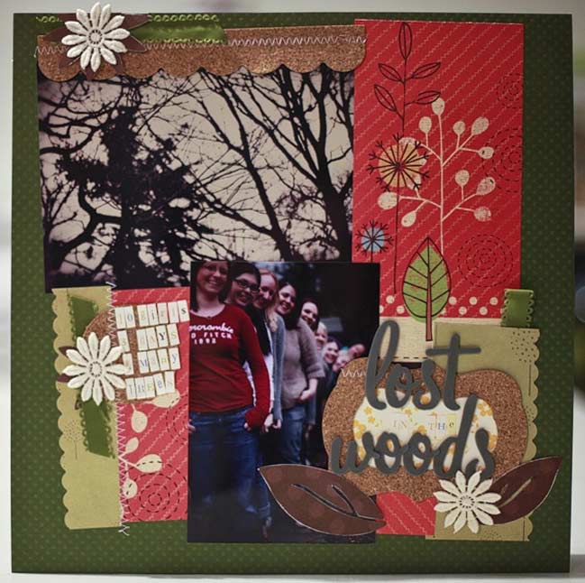
Happy weekend to you! Maybe time for some crafty goodness! This weekend, we’ll stick with our same colour combinations from last week…which means today is for anything made with earth tones!

Make a layout, a card, a tag, whatever you fancy as long as it features earthtones. Upload it and link it up in the comments here for a chance at today’s prize – your choice of an online class. Entries close at the end of the month!

xlovesx

Finding color everywhere…a guest post from Kristina Werner

scrapbook and papercraft colour challenge

The lovely Kristina Werner is here with us today! Thanks so much for joining us for A Month of Colour! -S.

I’ve never been good with color—at least I never considered myself good at color. What I am good at is looking at pre-existing color combinations. For example, I’ll be out shopping and see a particularly nice display in a window. I like the colors. I like the feeling it evokes. As discreetly as possible, I’ll take my phone out of my purse and snap a photo so that I can remember the colors later.

Great color combinations are everywhere you look!

Sometimes the hardest part is making the connection between the colors you see around you and the way they can be combined in a paper project. It’s often hard to look at a beautiful flower and pick out the specific colors that make it beautiful. But it’s infinitely easier to see the color combination possibilities when it’s a bedroom comforter or a shirt.

When it comes to finding color inspiration for papercrafting, some things translate better than others. Or in other words, when you look at the color of certain items, it’s not too far of a leap to see them on a papercrafting project.

Some of my favorite color inspiration go-to items are clothing, home décor, and paper items like stationary and notebooks. Now that I think about it, the common denominator with all these things is pattern. Clothing, home décor, and other paper items often use patterns.

It is easier to see a color combination when it is grouped together in a pattern.

Try looking for patterns and you will find them everywhere! And if you’re like me and sometimes struggle with grouping colors, it’s easier to do so when someone else has grouped them for you! There’s nothing like a cute pattern to get your color juices flowing. J

Now for a Color Inspiration Challenge…

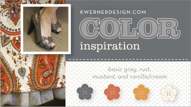
Here are the colors for this week’s challenge, and they come from my boss’ skirt! She was wearing this adorable skirt (which unfortunately she couldn’t remember where she bought), and I had to stop her so that I could take a picture. And check out those shoes! So cute!

Anyway, I want to invite everyone to participate in this challenge. For those new to the challenge, this is how it works: Just create something using the colors above as a springboard for your project. Post your creation somewhere on the internet—your blog, a photo gallery like Flickr, or at a papercrafting website/gallery. Then make your way over to my blog to leave a link so we can see it, too! Just follow the instructions there to paste your link.

For further instruction, please check the Color Inspiration Frequently Asked Questions. You have until Wednesday, June 24, 2009 to submit your link. Links will be closed at 7:00 pm Mountain Time.

After the deadline, I’ll go through all the projects and just pick out a few that are my favorites. There’s no prize or anything—I just like to show everyone your projects! And it’s a chance to spotlight some of the challenge participants. For an example of a Color Inspiration Challenge Roundup, click here.

So, join us! You’ll love it!

Click here to see the challenge at K Werner Design Blog and leave your link. You can also see all the other submissions there as well.


Kristina Werner, a graphic designer by profession, was bit by the scrapbook and cards bug back in 2005. A year later, she started her blog and it’s been a labor of love since. K Werner Design Blog is home to regular features such as the popular video series Make a Card Monday, the (nearly) weekly Color Inspiration Challenge, and the TwoPeasInABucket-affiliated video series Finally Friday. You can find her work at her blog and also in the Designer Garden at TwoPeasinABucket.com.

A day for all things light...crafting

scrapbook page
click for supplies

Two things for you this morning…first, today’s colour challenge involves whites or light colours! Create something with shades of white and cream, make a page with a white background, scrap the photos you took for last week’s matching photo challenge…or whatever you fancy in light colours!

Second, our Month of Colour flickr group is coming to life—check it out to see more month of colour projects from all over the world.

Check back later today—there’s a guest post on the way this evening! Happy Friday!

xlovesx

A day for blue...crafting

digital scrapbook page
©twopeasinabucket.com …click for supplies, album full of pages and info on how they were created

Today’s colour brings us back to blue – so we’re on to blue crafty goodness. The album linked up there started as yellow but I turned it blue (click on the image for more info and samples) or you can just start with your blue photo from last week or your favourite blue supplies.

Whatever you make in your blue crafting, link it up here and share! One commenter will win an online class—entries close at the end of the month like all the rest of the colour challenges!

Happy blue crafting!

xlovesx

A day for grey, shadows and black...crafting

digital scrapbook page
©twopeasinabucket.com

Moving right along in our colour patterns, today brings us to crafting with grey or black! Post what you make and link us up in the comments so we can have a look.

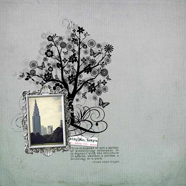
One little tip for shadows on digital scrapbook pages—yes, Photoshop can add nifty shadows to elements in your layout, but you can create a different look with any brush. Stamp the brush design once in a light shade, then make a new layer and stamp the same brush in the same size in a darker colour. Slightly offset the two layers so you can see both and you’ll have a new shadow effect. That’s how I added some depth to the tree in this layout. Super easy!

So what will you make today? A paper page, a digi page, something stitched, something painted…? Whatever you make, enjoy!

xlovesx

Colourful Guest Post :: Scrapping with Atypical colour combos

So happy that Miss Julie Kirk is joining us today for a look into her colourful creativity. Hope you enjoy Julie’s guest post!
-Shimelle
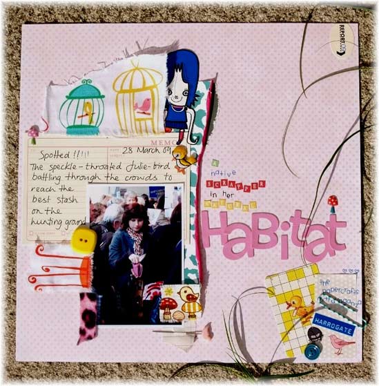
scrapbook page

Hi there, I’m Julie and, as anybody who has ever read my blog Notes on Paper will know, I have several main creative obsessions including: writing, scrapbooking and playing with colours. Anything which combines any of these brings me ridiculous amounts of pleasure … so you should probably imagine me smiling right now.

Whether it’s decorating my layouts, my home or myself through my clothes and accessories, I truly love to co-ordinate, combine, and clash colours trying to find interesting and unexpected combinations. At times I receive comments such as: “I’d never have combined those colours” or “those colours shouldn’t work together … but they do!”. Even when I was one of the Best of British Scrapbooking winners 2008, the judge described my colour choices being “right – but unexpected”. So, with all this in mind I thought I’d share the method I‘ve used when adding colour to my pages, the method which has acquired me comments such as those, which I’m almost 100% sure are meant to be complimentary! [Aren’t they?].

I attribute the success of some of my atypical colour combinations to two things:

always drawing upon the colours which already coexist within the photograph and
the subsequent repetition of these colours across the layout to achieve a varied yet cohesive colour-scheme across the page.

This photo, showing me battling through a crowd of fellow paper fanatics at a paper-craft show earlier this year, was the starting point for the colours I went on to use in the layout which I’ve photographed at various stages of development to show how I gradually built up a wide ranging colour scheme.
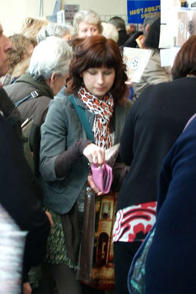
photo for a scrapbook page

1. I drew out the colour of the purse I’m clutching by using pink as my base colour and adding the pink vinyl ‘Rootbeer Float’ Thickers to the centre of my page. These matched the purse so utterly perfectly that they made this colour-matching obsessive very happy indeed!
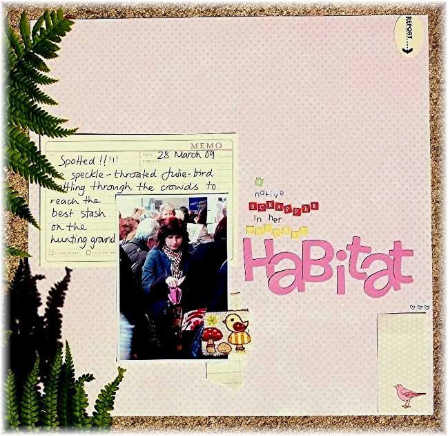
scrapbook page

2. The bird-watching theme of my journaling led me to add the pink bird detail at the bottom of the page along with the snippet of bird / mushroom fabric. Seeing as this introduced several new colours to the page, I repeated the yellow and red in the tiny Adornit’s alpha stickers.

3. I’d now added three main colours to my page pink, red and yellow and while this may seem like plenty of shades for some … I always feel a little naked [or rather, I feel my pages are a little naked!!] until I’ve added at least one more. Which is where the bright teal came in:
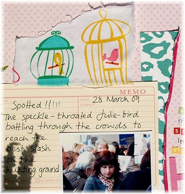
scrapbook page

4. The strip of American Crafts ‘Teacher’s Pet’ was an indispensable addition which brought several elements together. Not only did it reflect the shade of teal from my bag strap and the birdcage fabric I’d included, its bright cerise reverse helped lift it from the pale pink backing and its leopard print design mirrored that of my scarf. A touch of animal print is welcomed both my wardrobe and my scrapbooking so it made an ideal paper choice for me!
5. The bird cage fabric had introduced more yellow which I balanced out with the further yellow touches of the button and the Sassafras Lass ‘Paper Whimsies’ duckling card. At this point the scheme was happily cohesive … but I wanted to push it a little bit further!
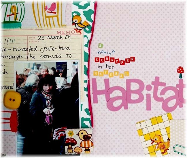
scrapbook page

6. I drew out yet another colour from the photo and do bear with me because this is an odd one. When I looked at the original photo, one colour that leapt out at me was the royal blue at the top right which, now I’ve had a closer look, appears to be a banner advertising Nestabilities dies! To satisfy my need for royal blue, I cut a cute little character from some Jon Burgerman designed wrapping paper and tucked her behind the fabric at the top then harmonised this with a strip of blue Dymo tape and blue Doodlebug ‘Simply Sweet’ alpha rub-ons in the bottom corner.
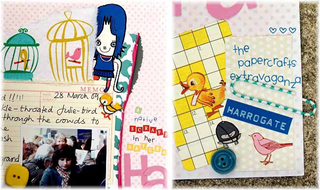
scrapbook page

7. Finally I grounded my colour scheme by adding two tiny touches of grey [one beneath the American Crafts paper and the other just above the teal button] to replicate the darker colours in the photo … in particular the grey of my jacket ..and here’s at how it all worked out:

scrapbook page

Yes there’s a bit of everything on there, yes some of the colours are less obvious choices than others …but it works for me. This is mainly due to the way in which many of the colours are drawn from the original photograph which is, after all, the main feature of the page. Then, as all of those colours were then repeated, no single item appears to be stranded or out of place.

Maybe next time you’re trying to find a colour combination for a layout you’ll give this method a try. If you’re already confident using colour, or are as obsessive as me, you could have great fun co-ordinating and clashing using your entire photo as your colour palette. If you’re not as convinced then perhaps select two or three colours initially and focus on repeating them until you achieve a balance across the page.
If you try this, and if your work starts attracting comments like ‘those colours really shouldn’t work …but they kind of, sort of do” then do give me a shout … us colour-crazies really should stick together!

Julie

A day for red, rose and pink...crafting

digital scrapbook page
©twopeasinabucket.com
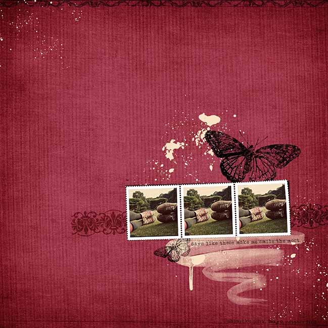
Supplies: Old Boris papers, Naked Stamp Sheets, Strokes and Splatters, Peony Place borders, Peony Place Floral Fantasy embellishments all available at Two Peas.

Today’s colour challenge…craft with red, rose or pink. Scrap one of the photos you took last week or work on something completely different! But craft it up in shades of red and leave a link here to be entered for a chance to win.

Have a fabulous day! And check back later today for a colourful guest post!

xlovesx

A day for green...crafting

Kilauea Volcano

Forgive the late start to Monday…I’ve been a bit distracted by a volcano, it would appear. This picture has absolutely nothing to do with this post…I just couldn’t wait to share. Moving right along then…

This week we’ll be following the colour patterns we set last week with photographs…but this week we’ll be making things! And every day there is a challenge to make something in that particular colour or colour combination for a chance to win a prize. This week, each winner will get their choice of an online class.

monday felt green

Today’s craft colour challenge? GREEN. Use a lot, use a little, use some green pixels or use all the green papers you can find, but make sure it has something prominently green! Upload your project to your blog, your page gallery or flickr and link it up in the comments below for a chance to win. Entries close at the end of the month.

More to come throughout the week…with a few surprises thrown in for good measure!

xlovesx