Scrapbooking older photos with a monochromatic colour scheme
The results for the recent monochromatic turn of our weekly challenges really gave my face the human version of the heart-eyes emoji. Seeing all those layouts in just one dominant colour each made for such a happy grid of inspiration! And when we set that challenge, I was convinced I would go into vastly familiar territory and create in shades of pink or turquoise.
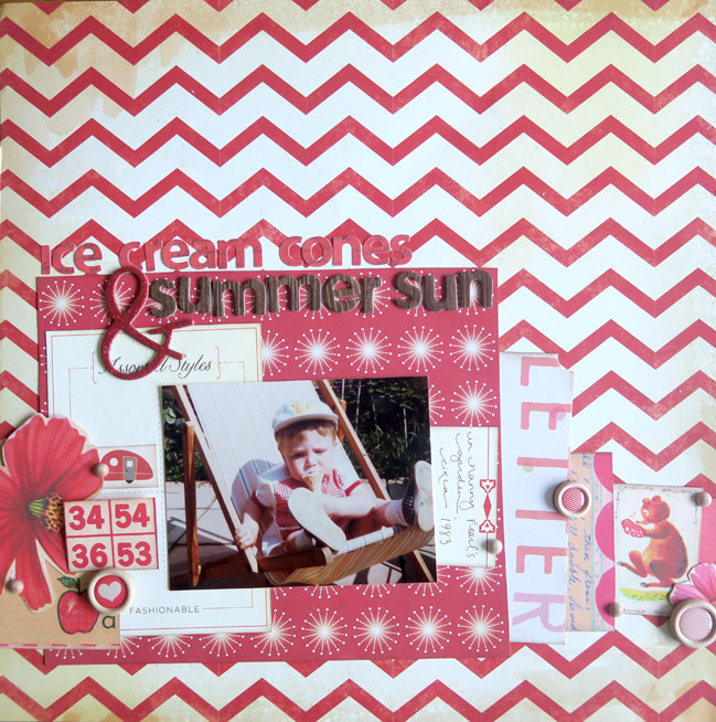
Then I found this photo and decided against being predictable. (This is The Boy at just a few months older than Wonder Boy is now. Obviously that fills my creative heart with glee. And more heart-eye emoji faces.) Red it is!
But red is such a bold colour that even as I pulled out a desk full of red supplies, I could see the photo fading into some lost dimension. I tried a few things to see if I could find a good ground of compromise between the ideas of ‘I heart this photo!’ and ‘All The Red!’ and some worked, some didn’t, and some are up for debate.
What didn’t work: crisp white. It just didn’t work with this photo and it felt sterile to me. I know, I know, how many times will I pull out white cardstock for a background because it looks beautiful all over the internet and then put it away because it doesn’t look beautiful on my own desk? Apparently that number is somewhere near infinity.
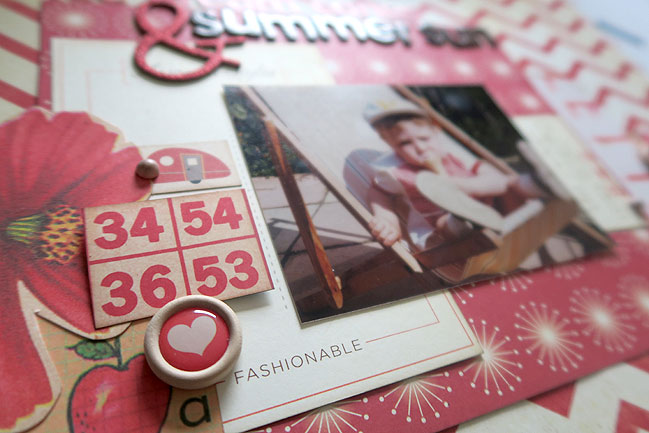
Also: overloaded embellishment. I probably pulled out three times as much as what is here. But I just got to a point where I pulled a bunch back and sighed a very zen sigh and took it as a sign that this is how much was meant to me there, no more. It does mean it’s a bit simpler than some of my pages, but there is room for that!
What did work: distressed off-white and cream. That chevron background (from Crate Paper) was where I started with choosing the vintage tones and then just found whatever had bright reds but not bright whites, and that ended up being Cosmo and Sassafras. I’m starting to see a theme with that lately.
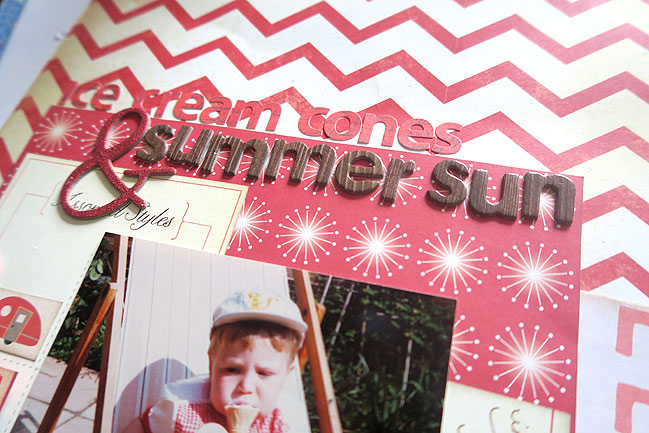
Also: less embellishment and bringing in brown, which I started thinking was a total cheat but I liked the look and the more I looked at it, I realised the brown is really just a shade of the distressed off-white (albeit at the extreme ends of that shade card) and that means this is not a monochromatic layout at all now. Well, hmpf. But I wouldn’t have ended up here if I hadn’t started by aiming to make it a monochromatic layouts, so I think that’s still in the spirit of the challenge, if not the letter. I am totally good with that if ever happens with your own challenge projects, by the way!
What is up for debate: the red letter stickers. I really like elements that you have to look closely to see, and I find when I’m filming videos I have to keep asking myself if it will be clear on camera. Just because I can see it with my own eyes in person doesn’t mean it will show up with that same clarity when photographed, of course. The red letters are exactly that sort of thing: I know they are subtle but I am sure some of you would quickly say that choice is not one you would make in your own album. Totally cool. My thought was that the giant glittery ampersand makes you realise that the brown letters are probably not all of the title, so you’ll look back if you miss the red letters on first glance. But I totally accept that easy to read titles are a better choice for some! So although all of this design stuff is clearly up for debate really and you’re welcome to prefer crisp white to distressed off-white any day of the week, I think the monochromatic letter stickers are probably the thing worth thinking about whether you would personally like or dislike in your album – and then if you dislike it, you’ll never waste time or supplies on trying it!
Since we just had a challenge a couple weeks back to make a monochromatic layout, that part is optional. Your real challenge here is to scrapbook an older photograph. You can decide what is ‘older’ in your photo library! But probably not something from the past week. Any style and any interpretation welcome – just let us see what you’re making!
![]() Comment [9]
Comment [9]





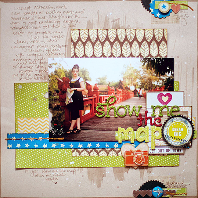

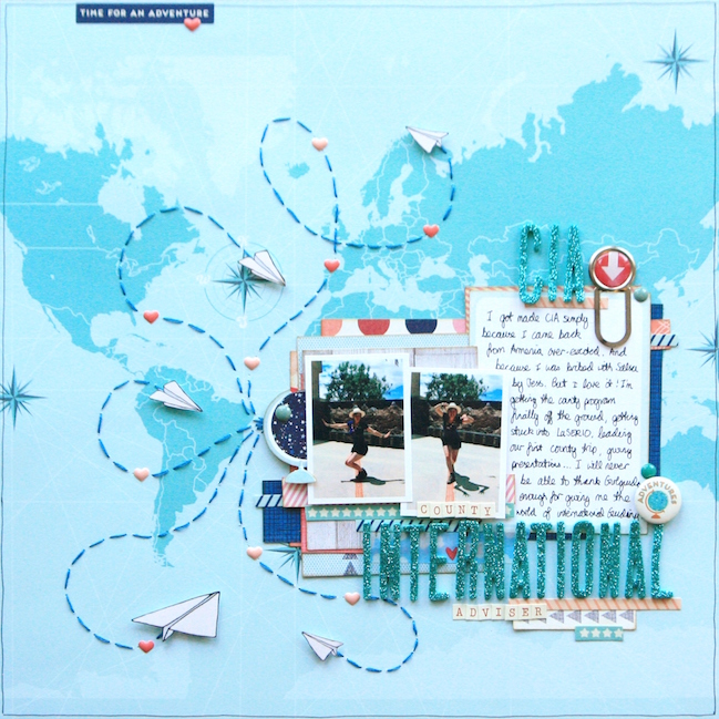
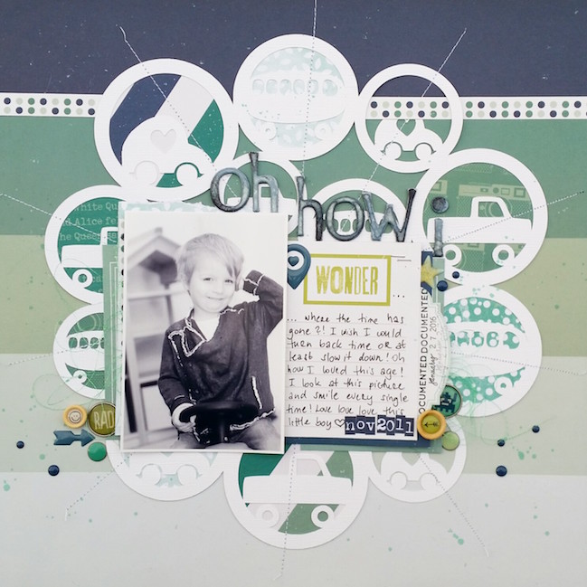
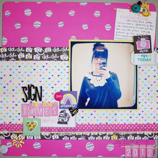

 {full page by contributing designer}
 Full page