paper: pretty paper. true stories. {and scrapbooking classes with cupcakes.}

lovely to meet you Twitter Facebook Pinterest YouTube

Take a Scrapbooking Class

online scrapbooking classes

Shop Shimelle Products

scrapbook.com simon says stamp shimelle scrapbooking products @ amazon.com shimelle scrapbooking products @ amazon.co.uk

Reading Material

travel

Being honest with Project Life
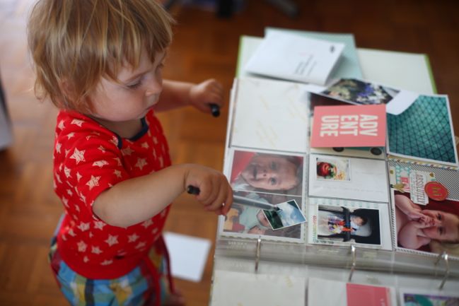
catching up on Project Life @ shimelle.com

Oh hello. It seems like forever, but I finally have something to share. Let’s focus on that positive and not on how I haven’t managed to clear the dining table in weeks, shall we?

For years, the reason I absolutely love scrapping out of order (though I keep my pages in chronological order in their albums) is the complete freedom. Zero pressure. I don’t do the whole concept of staying ‘caught up’ because I have no hope in ever doing so, and I enjoy the hobby more when I jump around from story to story with whatever is inspiring me on a given day.

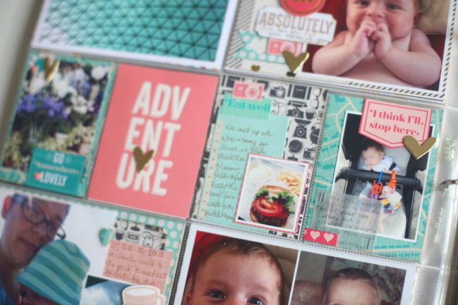
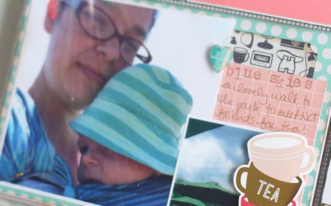
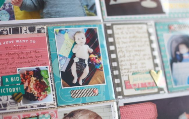
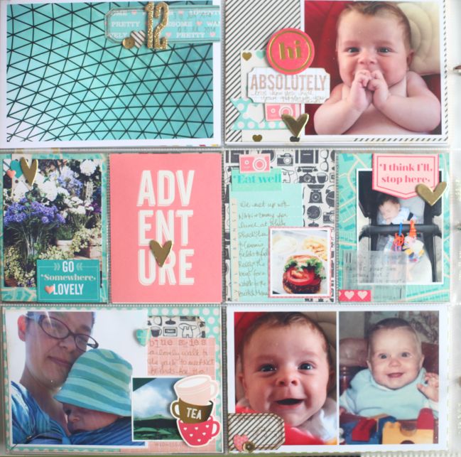
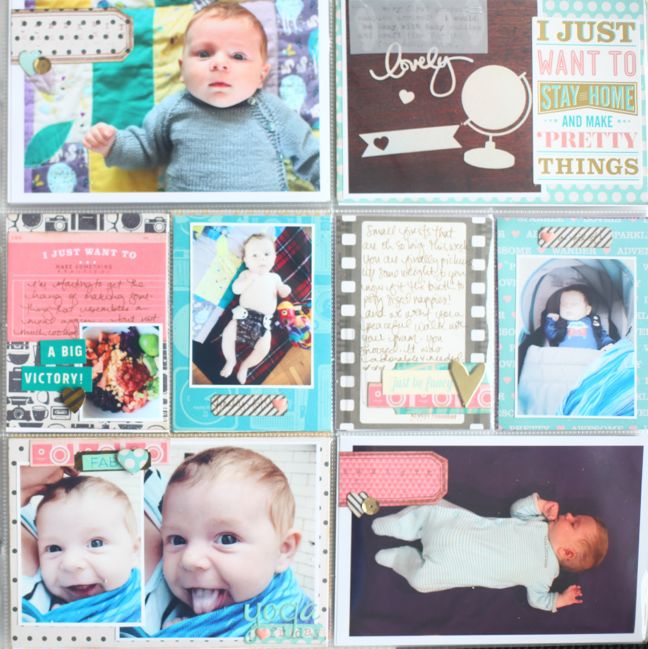
That said, I am starting to understand why many scrapbookers feel there is a pressure to stay caught up. Not that I am changing my philosophy! But I look at that baby book I started for Wonder Boy and I understand the pressure. It has ten or so weeks fully finished. The others have the photos slipped into the pockets with reference notes here and there but nothing else. I’m pleased I stayed on top of that part, but I really love how those finished weeks look and I long for the rest to go alongside, so it becomes an album like the rest of my library that I am happy for anyone to pull off the shelf and see. I also find I’m reminding myself of why I chose the Project Life format for this album in the first place: because I could work in tiny little pieces, a few minutes at a time, and still make progress. Wonder Boy is old enough now that I have the few minutes while he is engrossed in something (not many minutes, just a few) and while I could probably use those minutes to clear the dining table, dare I say I might find working on this album a little more rewarding? As a result, I’ve set myself a challenge this August to work in this album a few minutes every day and film it to share as well. My plan is to share those short, individual videos as soon as I can on my YouTube channel, then whenever I finish a full two page spread, I’ll post it all here in a sort of omnibus style, so you can choose to watch day by day or all at once. In this first week, I managed to stay on top of the create-every-day part of the challenge, but fell down with editing the videos on some days, but overall it was an enjoyable experience, so I think I’m okay to keep going, assuming you’d still like to see!
catching up on Project Life @ shimelle.com

catching up on Project Life @ shimelle.com

catching up on Project Life @ shimelle.com

catching up on Project Life @ shimelle.com

catching up on Project Life @ shimelle.com

catching up on Project Life @ shimelle.com

catching up on Project Life @ shimelle.com

catching up on Project Life @ shimelle.com

That’s another week done and a challenge kept! I realise I’m not working so quickly as to make great strides in August, but something is better than nothing in this case, and I don’t want to sacrifice enjoying the process for getting more pages done, if that makes sense. I guess I feel the pressure to catch up just a little, not a lot! But I do want to get these memories down on paper before they become fuzzy, and I’m already working more than a year behind now, so a little progress sounds good to me.

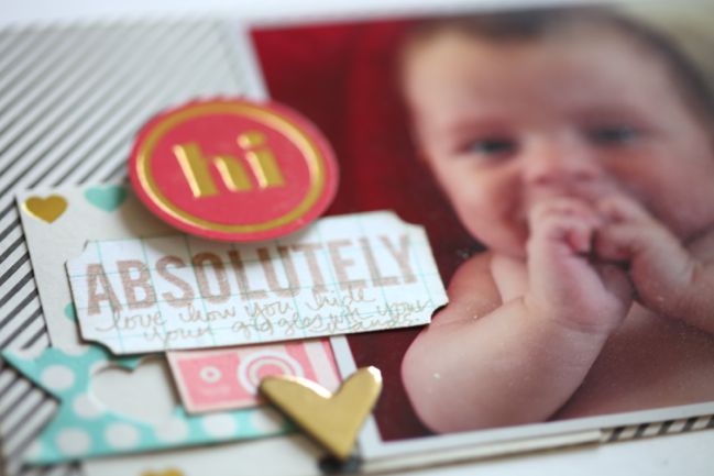
Supplies for this project include the Project Life ‘Lovely’ mini kit, which is no longer available in print form but is available digitally within the Project Life app for the iPhone, if that’s any help, or in a digital kit for your computer. I also used items from the Shimelle collection (my first collection with American Crafts), including the 6×6 paper pad, stamp set, word stickers, sticker book, and gold Fitzgerald Thickers, and word stickers and enamel dots from the True Stories collection. Also some gold sequins, patterned vellum, and gold chipboard hearts from Studio Calico, letter stickers from October Afternoon, and two punches by EK Success. I think that’s just about everything! I’m still embracing old and new together, so there are some items that would no longer be in stock, but you might have something similar in your own collection if by chance it reminded you to pull out your own pack of small chipboard shapes or some vellum. You can find my American Crafts products at Blue Moon Scrapbooking, scrapbook.com, and Amazon US or UK. (Shopping through those affiliate links costs you the same amount but helps support this site. Thanks.)

Have a beautiful Saturday and thanks for sticking with me through my radio silence! Happy scrapping.

As it Happens scrapbooking video :: A Collage of Embellishments for Father's Day

scrapbook page by shimelle laine @ shimelle.com - process video in post
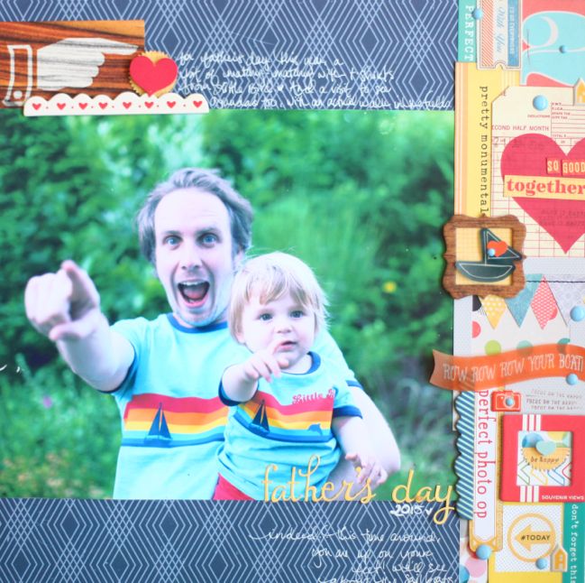
We have taken really goofy pictures for many years now. Having a child now makes this socially acceptable. WHY DID NO ONE TELL ME THIS? I have no better or more flowery way to express this sentiment. Just know, we continue to embrace goofy photos. I think you need a warning about that before you scroll down and see the full scrapbook page and all its goofy photo glory.

scrapbook page by shimelle laine @ shimelle.com - process video in post
It’s also been a while since I created a page that takes a little longer, with lots of embellishments that come together in a collage, bit by bit. I don’t plan out what supplies I’m going to use and just let each step guide me to the next basket of stickers or bowl of die cuts. That process is definitely in my ‘makes me feel alive’ level of crafting techniques. I get such enjoyment from discovering that a punched shape fits in a chipboard frame matches the colour of an enamel dot and so on. I feel like that’s admitting something secret and shameful, but you like paper. You understand. I hope. And now, moving on to a really long video with that goofy photo!


This time around, my train-of-thought bother comes from descending letters and hybrid handwriting that is neither print nor cursive. Riveting, I tell you.

scrapbook page by shimelle laine @ shimelle.com - process video in post
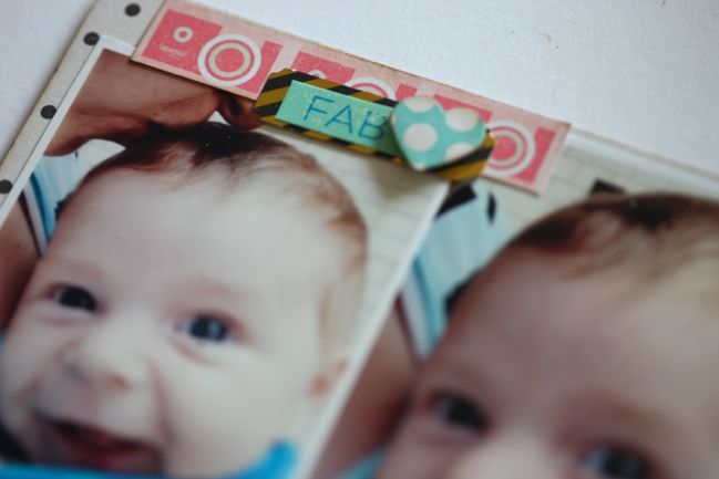
Supplies in this page are a true mix of new and old, and I tried to mention the brand of everything in the video as I went. The background paper, word stickers, polaroid-style frame paper and sticker, dotty paper, phrase stamp, and ticket and heart die cuts are all from my True Stories collection, the ‘2’ at the top right is from the 6×6 paper pad in the first Shimelle collection. Other supplies include tags from Cosmo Cricket, chipboard and letter stickers from October Afternoon, enamel dots from Doodlebug, vellum shapes from Studio Calico, journaling card, fabric and puffy stickers from Amy Tangerine, stickers from Dear Lizzy, label from My Mind’s Eye, sticker from MAMBI, stitched die-cut from Crate Paper. Adorably cheesy matching t-shirts are by Little Bird at Mothercare!

If you create a page with one side all filled with embellishments (or if you have already created one that is online somewhere), I’d love for you to share a link in the comments. What embellishments – new or old – are making you happy recently?

scrapbook page by shimelle laine @ shimelle.com - process video in post
Have a beautiful weekend and may it have some time to craft. Bonus if it has time to craft with red love hearts, of course.

Scrapbooking with old and new supplies

scrapbooking with old and new supplies @ shimelle.com

Following on from those stages of grief, one thing that has helped me grapple with the acceptance stage has been the freedom to use absolutely anything on a page without thinking about whether it would be in stock or on sale or anything like that. Admittedly, one of the reasons I liked designing for Two Peas was that we didn’t have strict rules on what we needed to use. I think I would really struggle to hold a long-term commitment to design with the same kit or anything like that really. I’ve not done it, so maybe I am wrong. But while we had the freedom to use whatever we liked, it’s hard to earn a commission on an item that isn’t available, of course. So there were times when companies closed or collections phased out and I would put them aside and not pass them to my sparkly alter-ego.

But now? Anything goes. Which means vintage Sassafras is basically my new black. It’s been liberating, really! Bring on the colour.

scrapbooking with old and new supplies @ shimelle.com

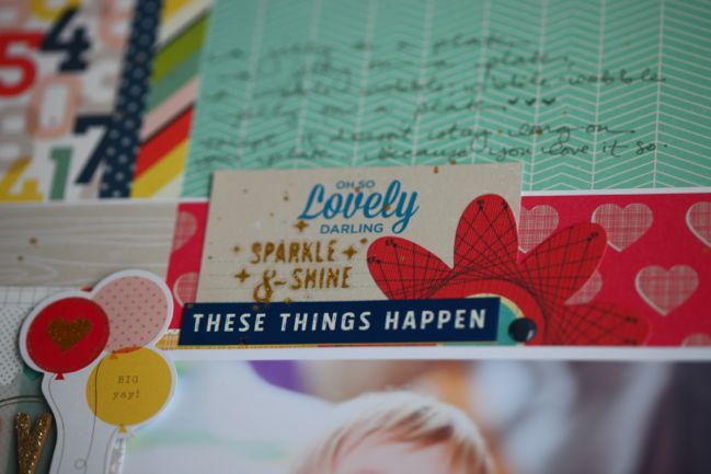
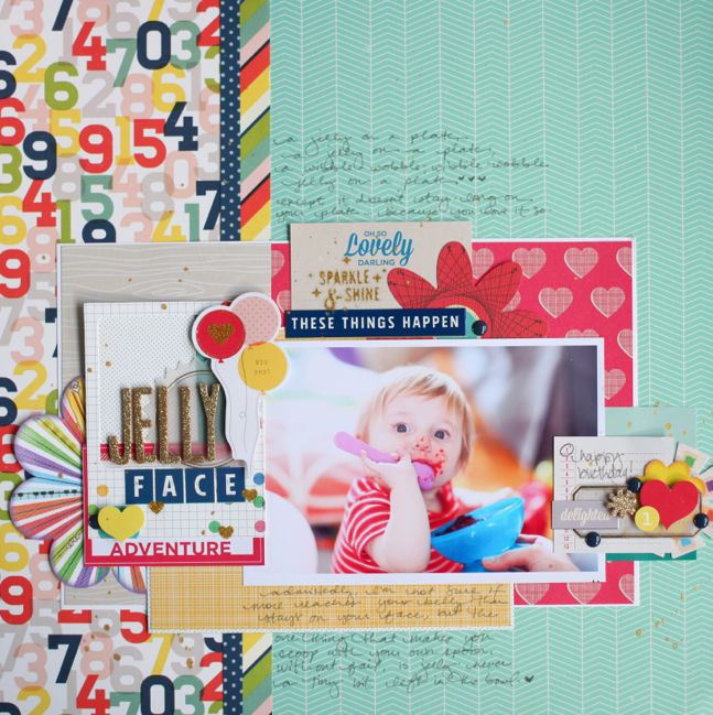
Of course, the collections I’ve done with American Crafts are not shy when it comes to colour either. The Sassa fits right in with both the original Shimelle collection and True Stories. And there are ways those two collections fit together so you don’t have to phase anything out! Those glittery gold rub-ons from the first collection? We made the balloon die-cut piece just the right size so that glittery heart and circle layer right over the top. The teal in True Stories is also a more saturated version of the aqua in the first collection, so the papers work together easily too. (The numbers, dots, and stripes to the left are True Stories; the aqua to the right is the older paper.)

scrapbooking with old and new supplies @ shimelle.com

I haven’t added this to the journaling here but I should probably document it somewhere, so here is as good a place as any: I grew up so enamoured with the idea of England that most of the spellings and phrases that are different here didn’t come as a surprise. (There may have been one very awkward moment when I realised I missed a key bit of knowledge and had no idea why 10 Downing Street was such an important address, but that was quickly resolved with minimal fallout.) Colour and favourite and the importance of not reverting to the American ‘pants’ when you mean the British ‘trousers’ was all fine. Jelly on the other hand, totally threw me. Obviously I’ve had a few years to adjust to the idea, but if this is all new to you, gelatine – the wobbly, fruit-flavoured, and brightly coloured dessert – is basically known by the brand name Jell-O in the states, but in the UK, that brand only exists as a fancy-schmancy import (at a truly ridiculous price, I tell you) and is instead called jelly and sold under a few brand names. Which is mostly just confusing because jelly in America is more like jam, and jam is a word used in both countries for the same thing, so we finally get to something that makes sense to everyone. (I grew up thinking the difference between jelly and jam was that jam had actual pieces of fruit in it while jelly was smooth. It was only as an adult that I learned that jam was made with the whole fruit while jelly was made with just the juice.) To add more confusion to the jelly mystique, the packet size is roughly the same in both countries, but if you open a box of Jell-O, it’s a powder. All the jelly I’ve purchased in the UK is already gel – like a super concentrated version of the final dessert that you dissolve and then reset. I have absolutely no idea why on this entire earth I find this entire situation so compelling. I know it’s not, and yet my mind continues to wander through the mysterious etymology of jelly.

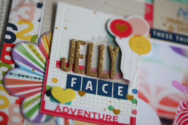
Meanwhile, Wonder Boy just really likes it when birthday parties have jelly and spoons, and the more jelly he eats, the less accurate his spoon aim. The first time he ate jelly was at a friend’s birthday, where he didn’t have a spoon. He tried it with his hands and decided it was too sticky for his liking, but he still wanted to eat more. When all the other party-goers were distracted by cake and blueberries and other such things, he crawled over to the plate and purposely planted his face in the jelly in a stealthy move that even ninjas have not mastered. He really does not care what it is called. Win some, lose some.

Oh. Yes. Scrapbooking, that thing I’m meant to be discussing. Ahem.

scrapbooking with old and new supplies @ shimelle.com

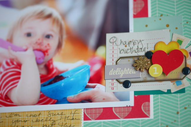
I always reach for 12×12 papers and I’m trying to remind myself that I have a bit of a 6×6 stash now too. The cut-aparts scaled down to that smaller size really have my heart, and they layer well with stickers. In this little grouping, from the back there is a True Stories sticker with the navy blue strip cut away, a rainbow starburst Sassa die-cut, a journaling cut-apart from the 6×6 size, a yellow Sassa flower, a vellum and gold foil label from Crate Paper, a True Stories word sticker, an asterisk from the gold Fitzgerald Thickers, three navy enamel dots, and the red heart and yellow number from the True Stories sticker book. Plus some gold Color Shine mist! Bringing those Sassa layers back to my table has made me smile so much. Sometimes you just love a product and you could use it for years… or at least I seem to be doing that at any rate!

Blue Moon Scrapbooking has quite a bit of both collections, including big discounts on some of the items. Sassafras, on the other hand, may require some searching. Unless you are like me and have it all saved in a special drawer that may or may not sing a little song when you open it.

The scrapbook page that took me a year to finish

The scrapbook page that took me a year to finish @ shimelle.com
I found this page a few weeks ago, in pieces, sitting in a tray I had moved from my desk to a shelf to a drawer to a cupboard, pushing it further and further from my sight in hopes it would also be out of mind, I suppose. This is the layout I was working on when I received the email that Two Peas was closing. That was a year ago today.

Don’t worry, the date isn’t marked in my mind that dramatically. Timehop reminded me, of course.

The scrapbook page that took me a year to finish @ shimelle.com
That day wasn’t particularly nice and the days that followed had a fair amount of confusion. What is it that the kids say today? ‘All the feels?’ Yes. That’s what I had. It was a store and a job and yet I went through that whole disbelief, denial, bargaining, guilt, anger, depression stages of grief process, which from a distance is a little ridiculous. But I wasn’t from a distance. I was up close. Like finishing a Glitter Girl video close.

The scrapbook page that took me a year to finish @ shimelle.com
This time, when I came upon that nearly-finished layout on that tray, I didn’t push it further away and decided to complete it and get it into the album, so I guess that means I have reached the acceptance stage now. I still miss it. I miss the energy of the community and how I could pretty much always find something that appealed to the problem-solving side of my mind on the forums (hence the original format of the Glitter Girl episodes!) and I miss the inspiration of working with the team. Talented women in so many ways, from their beautiful pages to their unique perspectives on life and a great mix of humour and knowledge and just… that good stuff is what I choose to remember.

The scrapbook page that took me a year to finish @ shimelle.com
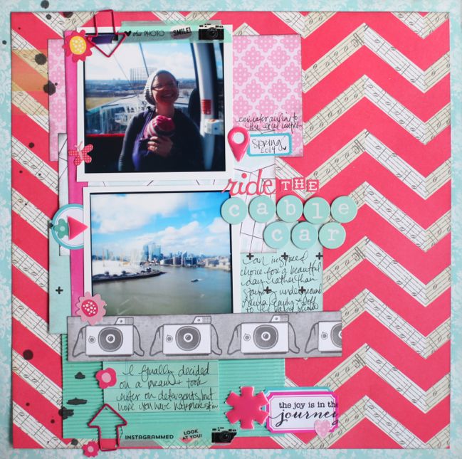
Outside of the Two Peas experience, this page made me laugh because the journaling was already in place. We took the cable car to attend the London Baby Show, my friend Laura with her baby and me with a giant bump, and I had done a lot of research about detergents that day. Random, I know, but I have heaps of trouble with reacting to detergents and it took me years to find a good system and I wanted to be as prepared as possible in case his skin was as sensitive as mine, but I kept hoping, quite vocally, that he would not inherit this trait and would laugh at my cupboard of carefully chosen soaps and shampoos.

Of course he inherited that. Of course he did. His skin is so sensitive, I have thermometers in every room because his skin gets upset if the temperature changes. I’m pretty sure he could break out over the wrong nursery rhyme. But hey, I can give you a mean monologue on surfactants should you ever need to know, and one day I’ll have to explain to him that he really isn’t the only child in the world who was allergic to bubble baths. I should probably get scripting that particular speech soon really. Maybe one day he’ll go through his own stages of grief at inheriting the worst of my genes, and I’ll cross my fingers that it ends in acceptance some time.

And yes, those are the two random thoughts in my mind that collided with this page that took me a year to finish, but hurrah: it is in my album now. Finally. Onward and upward we go.

How to use letterpress plates with the Big Shot (and a travel layout process video!)

scrapbook page with letterpress plates @ shimelle.com
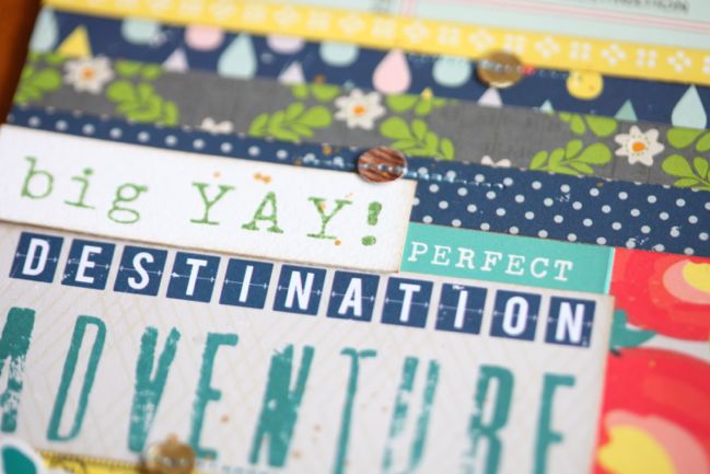
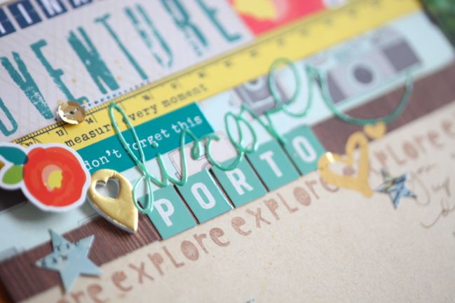
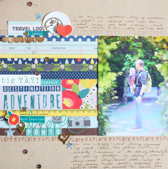
It seems absolutely ages since I pulled out the kraft cardstock to scrapbook some travel photos, since I feel pretty spoilt for choice with baby photos these days. With a week away (part work, part play) last month, it seemed time to bring the two together, and kraft cardstock feels like an old friend I haven’t seen in years, yet the conversations start just where they left off. I’m tempted to say the rest of the scrapbooking world can keep all that white cardstock for their backgrounds and I’ll just stick to patterns and kraft. It’s a happy combination.

travel scrapbook page by shimelle laine @ shimelle.com
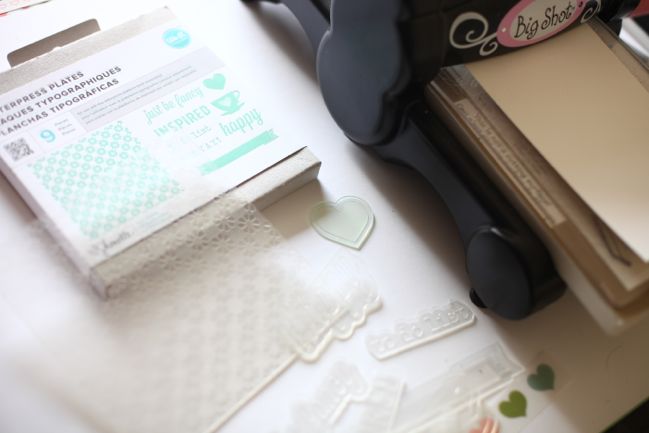
I was also really excited to use a new product we added in the True Stories collection – letterpress plates. WeR Memory Keepers has had these for a while and they have a special tool system that makes it all work beautifully, but… I do not have that tool system. I have a Big Shot that I use for my die-cutting and if I could make the plates work with what I already had, then that would make me very happy. It was actually far simpler than I imagined, and I love the look. Admittedly it is a look that is very difficult to show the detail in a photo, but I love it in person and it is definitely worth the extra step to just stamping, especially when it turned out to be so simple. Scroll down for those steps – the video covers the layout and then the letterpress plates are below with step by step photos.


It’s an ‘As It Happens’ video, so who knows what random tangent will turn up this time! Pretty sure I made it through without any grammar debates today.

scrapbook page with letterpress plates @ shimelle.com
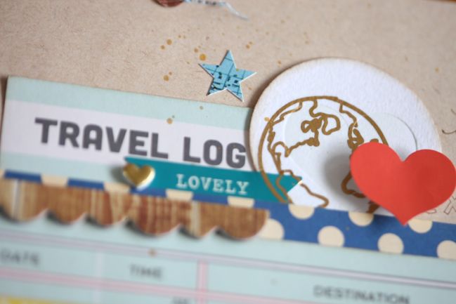
All these pieces of patterned paper came from my scrap basket, which always feels like an accomplishment! It’s a mix of paper from True Stories plus October Afternoon (Travel Girl and 5 & Dime) and an old Studio Calico woodgrain. The embellishments include True Stories ephemera and stickers, Heidi Swapp gold foil stickers and epoxy word, Studio Calico sequins and map star stickers, stamps from October Afternoon Travel Girl, and gold rub-ons by My Mind’s Eye.

how to use letterpress plates with the big shot @ shimelle.com
I didn’t use any special supplies aside from the letterpress plates themselves. They come in a set with a background and several smaller pieces (images and sentiments). I also used watercolour paper, dye ink, and my Sizzix Big Shot with the tabbed base and two cutting plates.

how to use letterpress plates with the big shot @ shimelle.com
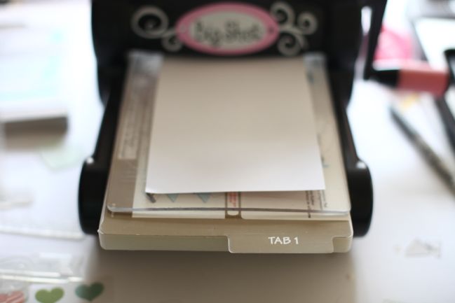
I set up the tabs and plates exactly the same as I would for thin metal dies: tab one on the base, one cutting plate, and the paper.

how to use letterpress plates with the big shot @ shimelle.com
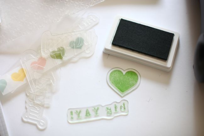
Then ink the plates. The trick is to make sure there is no ink on that bordering edge, because it will hit the paper. I found dye ink easier for this because my pigment ink pads were all a bit spongy so made a real mess of the edges, but you could use pigment ink applied with a brayer or brush to keep the edges clean.

how to use letterpress plates with the big shot @ shimelle.com
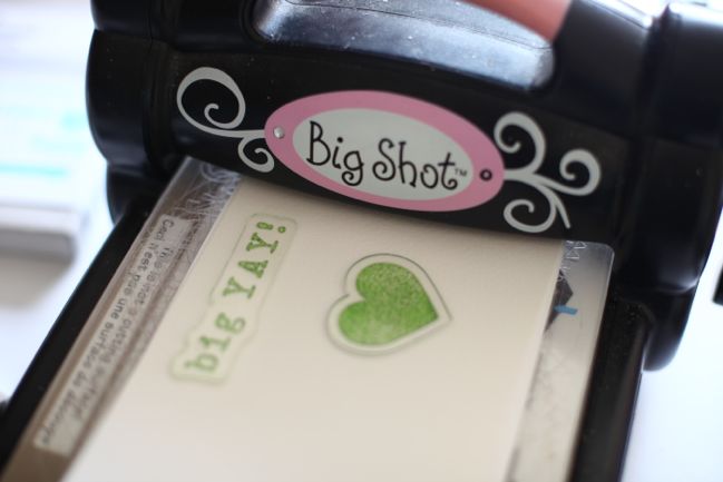
Place the plates onto the watercolour paper. Make sure nothing moves so you get a clean impression.

how to use letterpress plates with the big shot @ shimelle.com
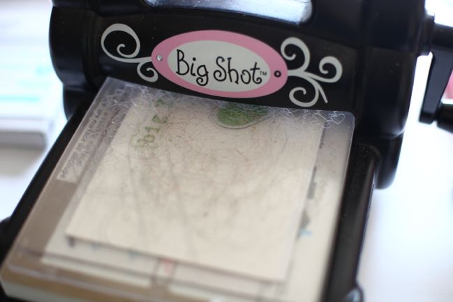
Top with the second cutting plate and run it through.

how to use letterpress plates with the big shot @ shimelle.com
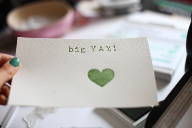
You’ll end up with a beautifully inked and debossed accent for your project!

scrapbook page with letterpress plates @ shimelle.com
The plates can also be used without ink for a textured embellishment, like this heart.

Admittedly, it’s not quite how the system was designed to be used, but it works for me and I love the added detail on my page. I need to try that background plate next!

You can find the True Stories collection – including the letterpress plates – at Blue Moon Scrapbooking, Scrapbook.com, or your favourite crafting retailer.

Ready Set Scrapbook: A new video workshop

ready set scrapbook :: online scrapbooking workshop @ shimelle.com
While trying to find the right balance in living life first and scrapbooking it second (and possibly remembering to do the laundry third), I’ve found myself very grateful for a few strategies that have always helped me get the most from my scrapbooking supplies and my scrapbooking time. I’ve long wanted to avoid those creative moments of just staring at a piece of paper and willing it to tell me exactly what to do, but now I am so aware of any time I spend standing still at my scrapping desk. I need to move, I need to cut paper, I need to stick things together with glue and write things down with my pen and all those basic things that we know are at the heart of this craft but can often put to the side while we scroll through another hundred ideas on Pinterest, looking for the very best technique to try on our next page.

Ready Set Scrapbook is an online video workshop designed to help you stop staring at the paper and start your scrapping engine. In three videos, it covers three quick composition strategies that help me work quickly while making use of the supplies I love (rather than saving them for a rainy day) and still making sure my photos and writing are at the heart of my designs, even though I love my embellishment. I hope you will find it useful in creating pages that are filled with love and made with whatever time you have to scrapbook right now.

ready set scrapbook :: online scrapbooking workshop @ shimelle.com
The full course is 82 minutes of video divided into three episodes, and also includes a PDF with six page examples – the three pages shown from start to finish as well as three additional designs following the same steps. All six examples feature the True Stories scrapbooking collection, but the tips are not specific to these papers and are designed to allow you to work with any supplies you select. There is also a forum to discuss and share your work (or you can share your pages on social media via a class hashtag), and you’re also welcome to email me with any questions as you work through the course at your own pace.

This class is just £5 or $8, and if you have watched many of my videos, there will certainly be some familiarity here as I’m sharing the process that is tried and true for me! But the pages are all new and I have not presented these design steps as one complete process before, right through from a new supply purchase through to three completed layouts. You do not need special tools to follow along – I do use a heart punch on one page, but nothing is cut with a Silhouette or other fancy gizmo. The pages are all 12×12 and feature either one or two photos each, using 4×4 or 4×6 prints, but the number and size of the photos could be varied for your needs.

Students who came to my classes at Chocolate Quente in Portugal, don’t sign up! You will have access to this as part of the class you attended and do not need to pay. Thank you so much for coming to class.

You’re welcome to pay in dollars or pounds by clicking the corresponding image above. This will take you to Paypal, where you can either log in and pay from your Paypal account OR complete your purchase with a debit or credit card without logging into any account. All class registrations are processed by hand, so this is not an instant access item. You will receive your receipt email instantly then a class welcome email, which I always aim to process within twenty-four hours. If you don’t receive that welcome, do check your spam folder and then don’t hesitate to email me to make sure everything is all clear for you!

Thanks so much for your continued support, and whether you join the class or not, I hope you find yourself scrapping more than staring when it comes to all that pretty paper in your collection!

Cut, Stick, Stamp :: Card & Scrapbooking Ideas for a Springtime Kite Stamp Set

Cut, Stick, Stamp :: Card & Scrapbooking Ideas for a Springtime Kite Stamp Set @ shimelle.com

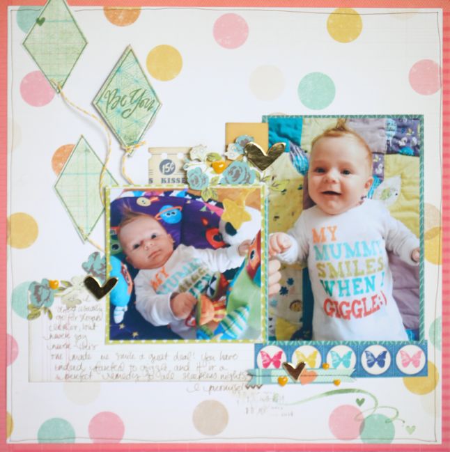
With a mix of sunshine and showers but warmer temperatures, it definitely feels like spring in my neighbourhood, and suddenly I’m in the mood to scrapbook with flowers and sunshines and… kites. I mean, I own a kite. It’s here somewhere. I can tell you it’s red even though I can’t tell you the last time I attempted to fly it or exactly where it’s stashed away. But I loved these kite stamps designed by Lindsay Letters for Studio Calico, so I needed to figure out how to put them to use on something quicker than I could locate a kite in the cupboard!

Cut, Stick, Stamp :: Card & Scrapbooking Ideas for a Springtime Kite Stamp Set @ shimelle.com
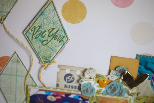
For the kites at the top of this page, I wanted to try using one colour of ink but in two shades, so the text and the outline are stamped with a freshly inked stamp, but the solid block of colour is first stamped on scrap paper so a second stamping gives the paler colour. I love this with stamp sets that have the separate pieces for the outline and the block!


Other supplies for this layout include an older sheet of Cosmo Cricket paper for the background and a mix of Crate Paper designs for the other paper elements. The gold chipboard hearts were in the Studio Calico Essentials line and the enamel dots were from a Prima collection many moons ago.

Cut, Stick, Stamp :: Card & Scrapbooking Ideas for a Springtime Kite Stamp Set @ shimelle.com

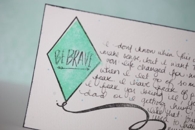
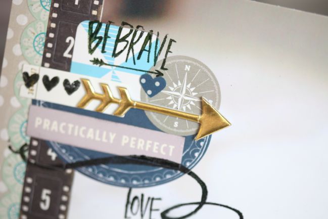
The ‘Be Brave’ sentiment stamp in this set encouraged me to transfer a journal entry to a few 4×6 cards in Wonder Boy’s baby book. Forgive the sappy writing, but basically I wanted to share a very specific memory I have of when I remember that I needed to stop being scared of everything in the world, and how it made a big difference to my life. (Don’t get me wrong: I am still scared of a great many things, but I just remember a very philosophical moment when I was twelve when I let some of the sillier fears go!) Anyway, the stamping: If I use water and Distress Inks for a painted effect, I usually do all the black stamping first then fill in with the colour. I wondered if changing the order would make any difference to the look, and it does. I stamped the solid shape in Cracked Pistachio Distress Ink and then softened it with a paintbrush and plain water. Once that was dry, I stamped the outline and sentiment in black dye ink over the top. It’s a softer look where the watercolour paper had already soaked up all the colour. Not a huge difference, but sometimes little differences are lovely.

Cut, Stick, Stamp :: Card & Scrapbooking Ideas for a Springtime Kite Stamp Set @ shimelle.com

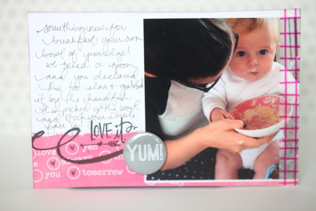
This stamp set also has a lovely ‘string’ for the kites that can be used on its own. It’s a good size for a 4×6 card and adds a nice little flourish to the divide between journaling and pattern on a card for a Project Life album. There are cute words too! (The flair badge is from Hey Little Magpie, the washi tape is from a Studio Calico kit.)

Cut, Stick, Stamp :: Card & Scrapbooking Ideas for a Springtime Kite Stamp Set @ shimelle.com

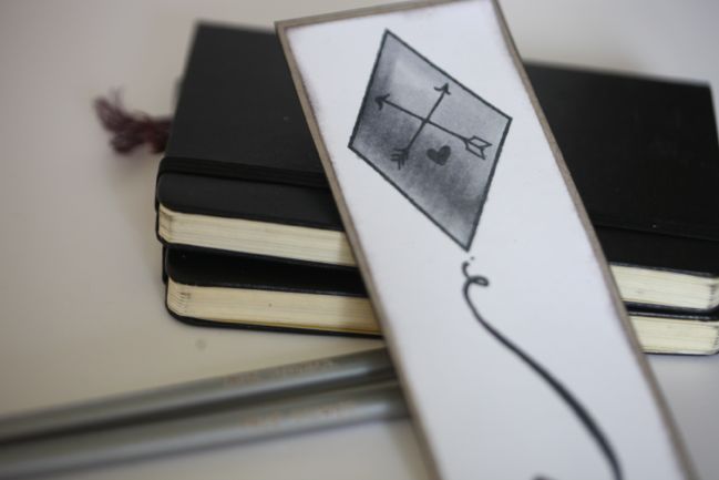
I recently added a few grey Copic markers to my collection, mostly purchased for shading and adding shadows, but I wondered how they would look on their own for something very simple. A quick bookmark with the kite coloured in with those pens plus a generous spray of shimmer let me see how they were blending, but I guess I really shouldn’t use a shimmer-topped bookmark in a library book, now that I think about it.

Cut, Stick, Stamp :: Card & Scrapbooking Ideas for a Springtime Kite Stamp Set @ shimelle.com

Cut, Stick, Stamp :: Card & Scrapbooking Ideas for a Springtime Kite Stamp Set @ shimelle.com

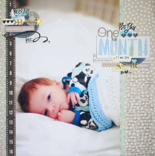
Another scrapbook page! I’m working on a series of pages like this with Wonder Boy’s monthly portraits printed at 8×12, with a description of him at that particular age. I love how the string from the kite and the sentiments worked on a layout like this, where it feels like the areas of embellishment deserve to be extra dressy since the photo takes up the majority of the page. In that detail shot, you can see how my scrapping process makes this a little imperfect, where there is that gap in the stamped image because I’m stamping over the various layers. If this sort of thing really bothers you, just stamp twice – once on the flattest layer (so the photo in this case) and once on your layered embellishment, not yet attached to the photo. Then put the two together so they fit and the image will be seamless. One day I will learn to think ahead rather than just adding things as I go, but that day was not this day and those layers were already stuck in place. Also handy to know: if you’re using a photographic print and stamping with staz-on ink, you can use the staz-on cleaner to remove just the ink from your photo and stamp again. Obviously that will not work with paper, and will not necessarily work with images printed rather than being exposed on photo paper, but you could always test on off-cut or under a layer if you’re not sure. (The difference in those printing methods is something we talked about on the Story-Centered Albums course and I found myself stuck for the names of the different processes. Turns out there is a decent explanation of the two ways to print photos on Wikipedia. I prefer the second option, though I do print some photos at home as well.)

The large stamp set I used here is the alphabet that comes with the Make it Big online class Paige Evans is teaching at Studio Calico. I contributed another page in this series of big photo pages to her class.

Cut, Stick, Stamp :: Card & Scrapbooking Ideas for a Springtime Kite Stamp Set @ shimelle.com

Cut, Stick, Stamp :: Card & Scrapbooking Ideas for a Springtime Kite Stamp Set @ shimelle.com

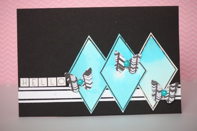
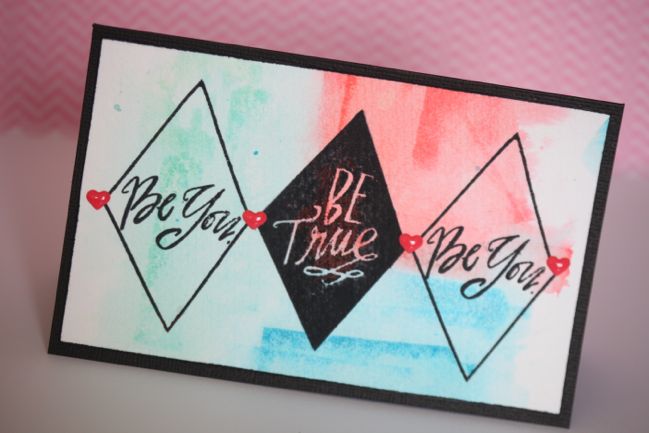
And two quick cards to finish, using Distress Inks as watercolours. Taking some of the other elements away, these stamps take on a bit of an argyle feel that made me want to use just a few diamonds together for simple designs. For the blue card, I stamped the black kite outline on watercolour paper, filled in the shape with water, then added colour from the Mermaid Lagoon Distress ink pad by stamping the ink onto my acrylic block and applying it with a paint brush. Very simple! For the second card, I put the colour in the background by again stamping the ink right onto my acrylic block, but then applying that to wet watercolour paper and just continuing to add ink and water until the three shades blended together. (I used Mermaid Lagoon, Abandoned Coral, and Cracked Pistachio.) Once it was definitely completely dry, I stamped the kites and sentiments on top in black ink. The middle kite with the text in negative needed some cleaning up with a pen because the watercolour paper is quite textured, but it didn’t take much to clean up those lines in the centre. The enamel hearts are from this True Stories pack.

Phew. In the time it took to read all that, I could probably find the kite in the cupboard. Hope you have a high-flying weekend!

The Story-Centered Album - A Scrapbooking Course for Listening

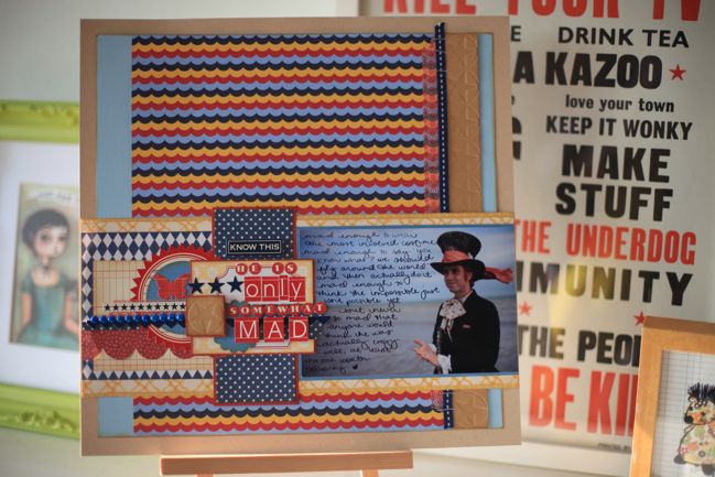
mad hatter scrapbook page by shimelle laine @ shimelle.com

The first time I was a guest on the Paperclipping Roundtable, I sat in the basement of my grandparents’ house, and I distinctly remember my feet bouncing on the floor the entire time from nerves. Somehow I don’t remember how we planned that particular date, as it fell during a visit to my family that I now refer to as ‘the summer my life became an episode of Glee’, because I booked a trip home and then my mother told me I had a part in a musical. Because that is the kind of stuff that happens in my family. I digress. That summer was many years ago now and that first episode of the PRT for me was their thirty-eighth recording: A Metaphysical Bandwagon. Since then, I’ve joined the panel on a total of twenty-three episodes, most recently the CHA report, which is the only episode where we all sit in one room and can actually see each other’s faces. After that recording, Noell asked if I could stick around and discuss something, and she had a great idea that I’m now thrilled to share with you: an all-audio scrapbooking class.

Noell and I recorded about six hours of discussion on a theme: how albums can tell a specific story. This is mostly the two of us discussing our album philosophies in detail with concrete examples, so we share what does and does not work for us, but we also share how it works so you get an idea of all the different page themes and journaling ideas that help us create albums we feel can be read like a story. This is something that inspires both of us creatively and also something that helps the people in our lives who are not scrapbookers to understand our passion for this hobby, because the album makes sense to them even if they have no idea what paper collection is on trend or how to operate a manual die cutter. Izzy also makes a few appearances, getting us to clarify things and sharing ideas for how he sees the story concept working, as someone who isn’t sticking pretty paper together all the time. (He also did the audio production for this course, which is something he does all the time, so the sound quality is professional.)

You can download all the audio files and listen to them on your iPod, phone, computer, or whatever other gadget you use (sorry, don’t think we’re releasing this on vinyl record but otherwise you’re good), and there’s a thread on the Paperclipping forum for discussion if you want to chat about anything. We’re also hosting a webinar for those who sign up straight away, so if you have any questions, we can answer them easily.

You can find all the details and sign up for The Story Centered Album – A Deep Dive Audio Course here.

Those of you who follow my classes here may know I have a more visual course on my own album philosophy, and that continues to be available! It’s called Cover to Cover and includes twenty-five colour PDFs and a series of videos to complement the reading. Cover to Cover discusses more than just my story-centred ‘upgrade’ albums, and really outlines my whole process of all my albums, my photo storage, how I add more photos to my albums, and so forth. Cover to Cover also includes a video workshop I originally taught for True Scrap called “Go with the Flow”, about designing with continuity in embellishment, colour, and other visual cues throughout one album. The early feedback from those who have taken both courses is that they are a good set together, since they each have some ideas in common (the album that tells a specific story) but plenty of different material too (Cover to Cover is just my own process, so you’re not hearing from Noell or anyone else; Story-Centered Albums is focusing on a single type of album, not the entire process). I hope you find that to be true if you’re interested in taking both – it was certainly our aim.

Other things you might find interesting as a complement to the audio course:
The Perfect Collection and Return to the Collection – video workshops on creating stacks of pages (for one album or many) from one collection pack of paper. The first is more focused on stretching the paper to many pages; the second looks more specifically at embellishments.
This post with a look at my ‘early years’ album.
This Glitter Girl episode that shares the Alice album and some title pages from albums we discuss in the new course
The Story Albums episode of the PRT, with Noell and I but also Stacy Julian and Ashli Oliver for a shorter audio discussion but with more voices.

Thanks so much to Noell and Izzy for inviting me along on their new innovation, and thanks to you for checking out this latest scrapbooking course!