Scrapbooking with Watercolours
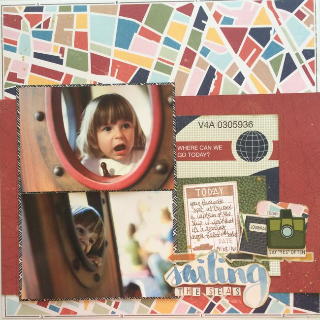
Be honest with me: have you put some sort of paint on your desk this week yet? Acrylic paint, watercolour, a bottle of mist? Anything? Today we have two more ways to splash paint on your page, and we promise it isn’t really that scary at all!
Lately I’m using paint for lettering more and more. It’s something that started when I was working on The Scrapbook Process and it showed up in my Olympic album there in particular. Then it kept appearing while I worked on The 20 Project and I think it’s here to stay for a while now. I love that this feels like a full circle for me. I fell into scrapbooking because a group of us wanted to make a book about a particular event (without knowing that ‘scrapbooking’ was a word) and was given the project because I liked doodling words and writing things with pretty pens. I fell for the hobby when I picked up my first Lindsay Ostrom book of letters and doodles. In my early days of working with Creating Keepsakes and Paperkuts magazine, I was hand lettering so many of my page titles, and we often talked in the assignment process about how this was really catering for the part of the scrapbooking audience who weren’t able to spend constant cash on letter stickers and didn’t want to use lots of computer-generated lettering on their pages. But then handmade titles went a bit out of fashion in print and of course I fell in love with Thickers, so I didn’t really miss the lettering on my pages so much as I was having fun with something different. Now I’m not giving up my Thickers in the slightest, but I am just enjoying the freedom of mixing in painted titles that can be just the right size and colour for the space available. And while accepting your own handwriting is its own creative challenge, this isn’t a scary technique because I always paint the title on another sheet of paper and cut it out to put it on the page. I have zero worry that I will mess up the rest of the layout since I’m not working directly there and I can write the same word three or twenty times until I get one I really like. Not scary!
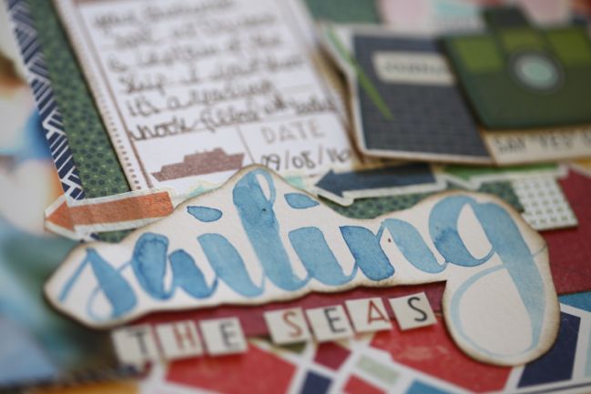
(By the way, I really hope you’ll embrace the fun of Go Now Go for things close to home as well as far away. I find it funny how many of the same phrases apply to life on the road or life at home with a toddler. It’s definitely down to perspective when we classify what’s an adventure!)
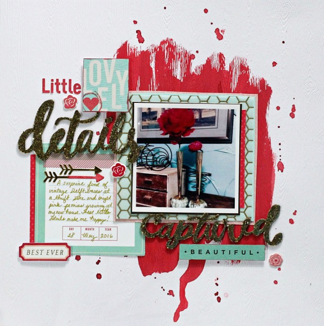
Now, if you do want paint on the background but you still want to veer far from the scary, guest artist Valerie Bishop is here to help! Her beautiful page was made by doing the painting first, so there’s no worry about spilling paint on your favourite pack of embellishments… provided you keep your desk relatively tidy. Though where is the fun in that?
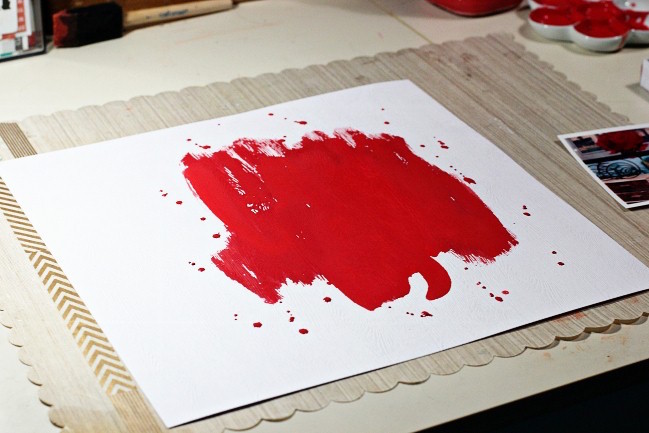
I love using watercolors because I can create a background color that matches my photo if I can’t find any patterned paper that will match it! I used a heavy weight cardstock as my base of this layout to keep it from buckling from the watercolor. I simply estimated where I wanted my to photo to be on the layout and swiped some watercolor that I mixed to highlight the flower in my photo across my cardstock.
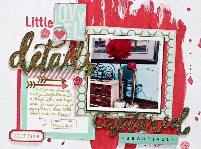
After it was dry, I used complementary colors of embellishments and papers to layer under my photo and around my page. I also used the watercolor paint to change the color of one of the arrow shapes and to edge a couple of the Shimelle die cut cardstock shapes the I used to embellish my layout.
I used embellishments and patterned papers from Shimelle’s first collection as well as items from American Crafts, Elle’s Studio, We R Memory Keepers, and Chickaniddy.
Today’s Guest Artist: Valerie Bishop loves making memories with her family, bicycling, and creating layouts about both activities. You can find more from Valerie on Instagram, Twitter, and her blog.
![]() Read more about:
Read more about:
Next post: Scrapbook a nature walk with Go Now Go
Previous post: Stamping with Watercolours


