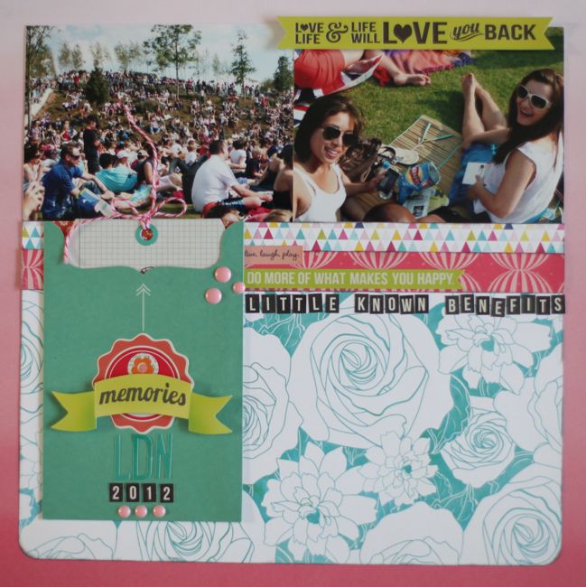
pretty paper. true stories. {and scrapbooking classes with cupcakes.}

lovely to meet you Twitter Facebook Pinterest YouTube

Take a Scrapbooking Class

online scrapbooking classes

Shop Shimelle Products

scrapbook.com simon says stamp shimelle scrapbooking products @ amazon.com shimelle scrapbooking products @ amazon.co.uk

Reading Material

travel

Best of Both Worlds Kit Category

Scrapbooking in triplicate
scrapbook page by shimelle laine @ shimelle.com
I always run out of paper in a kit before I run out of embellishments. I think somewhere along the line I tell myself to ration the embellishments, but I don’t say that about paper, so there I go, layering it all up, when I get to a point where I have a few measly scraps of patterned paper and a preserved cache of badges, die-cuts, sparkles, and stickers. Time to redress the balance.
scrapbook page by shimelle laine @ shimelle.com
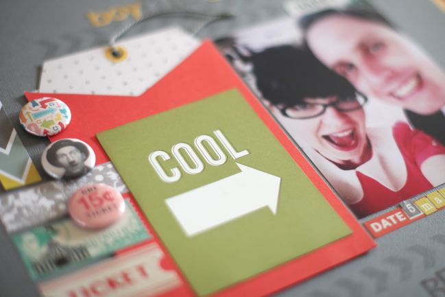
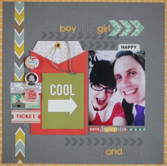
At this point with my June kit, I started with an additional sheet of grey cardstock then just moved around all the different elements I had remaining. I cut the part-used sticker sheets into pieces so I could try different placements without commitment, and eventually something started to come together, so I started by adhering the largest elements (the pocket and the photo) and built the page out from there. There are quite a few different colours going on here, but I tried to give them a bit of rhyme and reason, like three shots of turquoise arranged in a triangle around the photo (chevron stickers at top right, ticket at the left, enamel dots below right of the picture). I almost always find it designs like this there will be more groups of three than I even did on purpose – the balance of threes just seems to happen once you have a few (!) in place. Three tickets (well, one is a tape sticker but it’s the same size), three badges, three words in the title and subtitle, three chevron pieces, the same chevron stamped three times (that is the stamp from the May kit, by the way). Of course there are a few things that are not threes, I promise – one photo, one journaling box, one 3×4 die-cut, four enamel dots, two pieces to the border at the left – but there is plenty of triplicate happening too. And that helps go from a giant stack of embellishments on the desk to a somewhat more depleted stash to go with the last few scraps of paper.

Again I got to the end and wished for some colour and pattern around the outside edge, so this yellow honeycomb pattern from Simple Stories is an addition, as were the enamel dots. The title is a running theme that goes throughout our albums. You know those sorts of things you say so often you don’t really remember how it started? It’s one of those. At some point we were playing a game in teams or something and the numbers didn’t work out right with the group so there were teams of girls and teams of boys and then the team of the two of us, so we called ourselves Team Boy Plus Girl, and it stuck. The funny thing is that neither of us remember what the game was or who was on the other teams and we can’t really pinpoint when all this happened more than a vague six month window of time. But every so often I use it as a title on pages with a picture of us both, and it’s almost always a very silly picture like this, because that is a bit of a Team Boy Plus Girl ethos on life, really.

Your challenge is to put your embellishments to work and see how many groups of three you can include on your next project! When you’re finished, upload it to your blog or a scrapbooking gallery, and share a link here.


PS: I was quite tempted to make this challenge ‘be kind to yourself’, because yes, I did just use a 3×4 card that says ‘cool’ with an arrow pointing to us making ridiculous faces. I figure photos like this will eventually be the equivalent of looking at my photos from the eighties and wondering why I felt it necessary to deplete the ozone layer with so much Aquanet every day, but we did think that was cool then too, so I’m just going with it.

Scrapbooking with a supply you've been saving

scrapbook page by shimelle laine @ shimelle.com
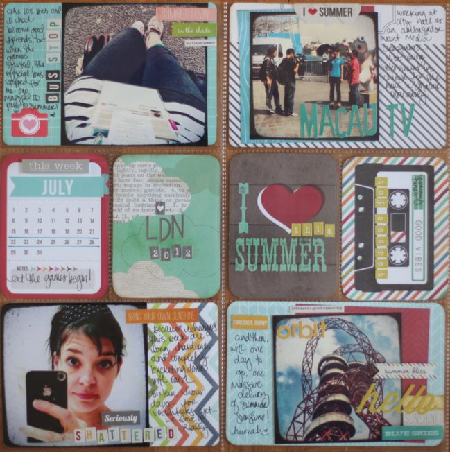
I’m not currently keeping an everyday documentation type of album – no Project Life, no daily anything really – but because I file my pages chronologically, sometimes I find gaps that need a few events on one page to give a bit of perspective. We are currently one year on from the London Olympics, and I’ve had a new energy to revisit all those memories and make more pages for my Olympic album. One thing I really wanted to capture was the feeling of just how much everything seemed to hit all systems go in that last week of July. A divided page protector with photos of different elements of the same week helps convey that feeling – or so I would like to believe!

But the real point of this page and this challenge is just one single 3×4 card: the clouds.

scrapbook page by shimelle laine @ shimelle.com
Are there certain supplies that grab your eye then make you second guess yourself every time you consider using them? You know those supplies that are too good for your everyday photos and need to be saved for something special. I can get on a soapbox and tell you why you shouldn’t fall into that mindset, but the truth is I sometimes fall into it too, and that cloud card is exactly that. It was my favourite of all the 3×4 elements in this kit and every time I started a page I considered it, and every time I put it back.

Finally I decided to start with that card and choose everything else to go with it, so I could get over that block. Otherwise I feared I would finish with pretty much everything else in the kit and it would still be sat there, lonely! So here’s your next challenge: pick something you really like and build your page from there, so you don’t have the excuse of the page not being worthy. Plus sometimes it helps to keep that element pretty simple, so you can still see it in the form that caught your eye. I often add lots of layers on top of cards like this but this time, I kept it all simple so I could see all the pretty clouds.

For this page, I worked with the June Best of Both Worlds Kit for plenty of 3×4 cards and stickers, and added four 4×6 kits from various Project Life core kits. (I arranged to split kits with a group of friends so we each have a portion of all the different kits we liked rather than quite so many duplicates. If you want more variety, I definitely recommend that school of thought.)

You can choose any supply you would like and work in any style. When you finish your project, upload it to your blog or a scrapbooking page gallery and share a link here.


PS: just be glad the challenge wasn’t ‘include a really unflattering self-portrait’. Oh well: sometimes these pictures tell the stories, right?

Scrapbooking with stickers. So many stickers.

scrapbook page by shimelle laine @ shimelle.com
I think stickers take a great deal of flak from the world. Maybe because they are something we associate with childhood learning, like Crayolas. Maybe because mass-market stickers are flimsy or a bit random. But in the scrapbook world, our stickers are pretty fancy and high-quality and nothing like the scratch and sniff smiley face earned by learning your spelling words when you were age six. Though I have a pretty eternal love for Crayolas, so it may well be that if scratch and sniff smileys appear in the scrapbook world, I’ll embrace that too. I have no intention of growing out of using stickers on my scrapbook pages.

When I first started scrapbooking, I heard the term ‘sticker sneeze’ often. It was one of the only design pointers given in the nineties, it seemed: don’t just spray your page with stickers in all the gaps surrounding your matted photos. My very first pages completely embody the sticker sneeze. Then with a bit of development, I recovered from that cold on my own. A year or so later I attended my first informal scrapbooking class, and the teacher took us through a page step by step: mat the photos and adhere them. Add letter stickers for the title. Write in the date and place and any relevant names. Now take these small stickers and sprinkle them in all the gaps. It turned out there were plenty of people who loved their pages like this and there were others trying to talk them out of it. All that really mattered was that you enjoyed your own pages, so I say sneeze all you want, be that a little or a lot. Sometimes the gaps on my pages are still made happier with small stickers, even though my style has changed from then to now.

scrapbook page by shimelle laine @ shimelle.com
Starting with square and rectangular stickers can help build a page from plenty of stickers without it bringing to mind any symptoms of hayfever. I started this page with the three blocky stickers at the top, and matted them on contrasting colours for a frame, which also made it easier to move them around the page while I decided where things should go. They were very grey and neutral and I wanted more colour, so I brought in that yellow die-cut with the red heart, but trimmed it down to place it on a 3×4 card with a rainbow stripe. That was a bridge to all the other colours I could include without it feeling like too much. The zig-zag tape sticker at either side is actually one short sticker cut in half to stretch it across the full page width. There are really two repeating motifs at play here – the hearts, but also the combination of chevrons and arrows, pointing your eye to different parts of the page. There are stickers stacked on stickers stacked on stickers, with plenty of pop dots to hold it all together, and the ease of stickers makes all those layers go together so quickly because there is nothing to cut or punch or build. This is one of my favourite ways to build a design over a longer span of time. Leave it out on the desk and take five minutes now and then to find something else that fits in the space and move it around like a jigsaw. Eventually it all balances and then the trick is to just stop and leave it be!

Again, I had plain white cardstock in the background and decided to cut that away on the edges and add it to a patterned paper for the full 12×12 background. Everything except the cardstock, the gems, and the spray mist is from the June kit. Well, then there’s that red background. That is from the July kit and I accidentally put it in the wrong spot on my desk and now it’s on this layout. Had I done that on purpose, I could have just called that working ahead.

Your third challenge (and your final challenge for this evening – more tomorrow morning!) is to create a page where you go to town with plenty of stickers. It can be any style and any theme, but we’re not just talking a couple little stickers over here in the corner. Use stickers for as much of the embellishment as you can! It can be blocky and orgainsed; it can be stickers that fill the space between photos. Whatever you enjoy when making your page! Upload your finished project to your blog or a scrapbook page gallery, and share a link here.


PS: Yep, that’s two pages about The Boy in a row. I’m just going to warn you: there are more to come. You know how sometimes when something sad happens to someone else, it makes you take everything dear to you and hold it closer? You’re fine, but yet you can’t keep something out of your mind because it just brings things too close to home and you imagine it hitting your life. Lately that has been taking the form of scrapbook pages for me. I make no apologies, and to the contrary, I will actually say it really helped me to not get too bogged down and overwhelmed by something that I had no power to change. Just saying that in case it helps anyone else out there. There is sometimes more to the way I scrapbook than just rules of three and 4×6 photos, I promise.

Scrapbooking with three 3x4 cards

scrapbook page by shimelle laine @ shimelle.com
In every Best of Both Worlds kit, I include at least one cut-apart sheet with either 3×4 or 4×6 cards, and June’s kit had not just a sheet but also an additional booklet of 3×4 cards, and I only make the odd divided page here and there! Time to get cracking on ways to use 3×4 cards on a 12×12 page then.

scrapbook page by shimelle laine @ shimelle.com
I think Noell’s flexible template must have stayed in my mind a bit, because again the photos are at the top and everything else is lined up in the space below that, but indeed this page looks different to the other. Everything on this page is from the June Best of Both Worlds kit, except the date stamp, a sheet of white cardstock, white paint, and turquoise spray mist in the bottom right corner.

Everything on this page started with that line of three 3×4 cards, then I built outward from there, which was a little different to how I started with the photos and worked down on the previous page. Lately I’m finding whenever I start working on a page with a sheet of cardstock, I will be almost finished with the layout and decide I don’t like the entirely plain background. Trimming it down and adding it to patterned paper is improving those pages to my eye right now and you’ll see a few more examples of that this weekend. In this case I felt the white cardstock to the delicate yellow pattern of the background was just too harsh, so adding a bit of white paint around the edge softened that. I think without that there would be so many straight lines on this page that it could be quite jarring in my albums. I find graphical styles work best if they are consistent from page to page in an album, and just the odd linear design here and there mixed in with pages that have slight angles and plenty of layering feels a bit off. But it doesn’t take much to bridge the gap between the two styles: a little paint, a few droplets of mist, and allowing three stickers to cross over the edge of the white cardstock was enough here.

Now the challenge is yours: choose three 3×4 cards and line them up. Start there and finish your page in your own style, with any photos or anything theme. Upload your finished project to your blog or a scrapbook page gallery, and leave a link here to share! Happy scrapping.


Scrapbooking with a Flexible Template

scrapbook page by shimelle laine @ shimelle.com
You might remember when I posted the last Sketch to Scrapbook Page video that it was a little something different – trying a sketch by someone else. This video is the follow-up to that, creating a page that is not strictly a sketch but what Noell Hyman calls a flexible template.


Noell often shares flexible template designs in her Paperclipping Membership videos, but I wanted to work with one that all of you could see rather than just members, so I’m afraid I had to pick an older template. Like I mentioned on the episode of PRT when we discussed all this, I was a little nervous that she might kill me for that. But the design advice she gives is still perfectly sound – it’s just that when you usually work with current collections, it does make older products date unnaturally fast! Noell uses a variety of products and you can see her more current pages on her blog if you’re looking for inspiration in her style with something you’ve just ordered. It may make the most sense if you watch Noell explaining this flexible template first – it’s about five minutes.


Here’s my interpretation, taking it from an 8.5×11 to a 12×12 page, so working with squares rather than rectangles. Almost everything here is from the June Best of Both Worlds kit, with the exception of some enamel dots and the corner rounder.

scrapbook page by shimelle laine @ shimelle.com
And with that, welcome to a weekend of Best of Both Worlds inspiration! I’m not following a set schedule throughout this weekend, but there will be a variety of posts starting now and going through till Sunday night. Some have videos, some do not, but everything links in some way to the Best of Both Worlds kits. You’re welcome to participate in the challenges with any supplies you want (though I do hope you consider a kit at some time!) and all the challenges will stay open till the end of next weekend, so you have a bit more time than just these three days. So let’s call this challenge one then, shall we? Give Noell’s Flexible Template a try in your own style, upload it to your blog or a scrapbook page gallery, and leave a link here. You’re welcome to apply any of these weekend’s challenges to cards rather than scrapbook pages if you would like – whatever you prefer.


Best of Both Worlds :: My scrapbooking product picks for August 2013

Best of Both Worlds scrapbooking kit :: August 2013

Welcome to August! I think this month just may explode on my calendar – there is a crazy amount of stuff happening here this month. Some of you who have been reading for a while know that when I go a bit on the quiet side, it means there are big projects afoot. One of those I can share with you today, as part of the Best of Both Worlds product picks for August: this is the first month that the kit includes something actually designed by me! I thought we might have to wait till next month, but it arrived at Two Peas yesterday, so I’ve included it this month, which explains why it makes its debut at the very end of this video, after it seems like the kit is complete! Can it be a debut if I don’t even have a set to show you? Well, at any rate, it doesn’t get mentioned until the very end.


Yes, that means there are two stamp sets on the shopping list. I’ll show examples from both, and the Travel/Everyday Adventure set is on sale right now, so if that takes your fancy, this is a great time to pick it up, but I realise that means the kit is now a crazy price if you add one of each item to your shopping cart. Just know that the price comes back into line if you drop one set of stamps, and of course, if you’re not a stamper at all then leave both out and you’re down to a very affordable kit.

Click here to shop for the August 2013 Best of Both Worlds Scrapbooking Kit

The Nailed It stamps are my response to the six different stamps (I counted!) and countless papers and die-cuts (so not counting) that say Best Day Ever! or something along those lines. I actually love stamps like that and I love scrapping the happy things so it’s no wonder that I am drawn to them, but my days are definitely not all in the ‘best ever’ category and I wanted something with a bit more bite because sometimes those stories are still fabulous to record. So this set has lots of simple, short phrases to sum up plenty of those days that don’t deserve the ‘best ever’ label. And they’ve all been designed with the size of 3×4 and 4×6 cards in mind, so you can use them with Project Life and other divided page protector systems as well as traditional 12×12 pages and cards.

paper b-sides
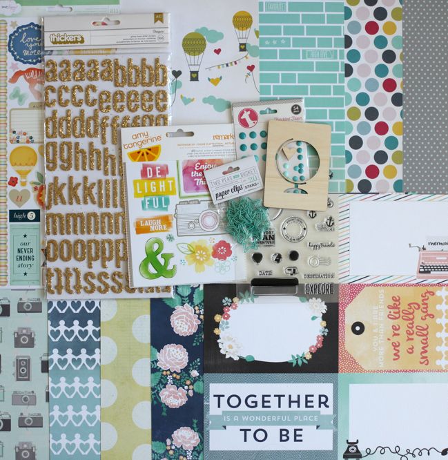
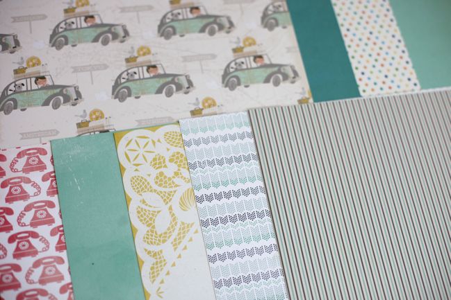
In regard to the rest of the kit, this month I’ve gone full-out on the aqua. Perfect for the beach, perfect for travel, perfect for sunny skies, and it works equally well for both girls and boys. So there is just aqua all over this kit and I love it like that.

If you are looking to change it up or add more to this month’s kit, think about what other colour you like best with aqua. There is a tiny bit of pink, orange, and yellow in this kit as accent colours – if one or more of those speaks to you, then add more of that! I’m also quite fond of red with aqua, so that might be another option. The star clips and the enamel dots are available in colours other than aqua if you want a bit more variety. There are other designs of the wood veneer cards if the globe is not your style. (If it is your style, it’s also available in this new stamp set).

Gold accents look beautiful with these colours, so I’ve pulled out Heidi Swapp colour shine mist in gold and gold embossing powder. On at least one page I’m going to add in some metallic gold rub-ons by Jenni Bowlin (her rub-ons are such fabulous quality, if you’ve never tried them. They are a class above the rest.) and I’m thinking gold sequins here and there too.

I went with gold glitter Thickers for the alphabet, and there is also this gold glitter in a smaller font or this swirly font if you prefer. If you hate the idea of actual glitter on your page (shock! horror!) then try this metallic gold foil alphabet instead. Same colour effect; no loose glitter.

If you’re thinking more in collections than single sheets, then the three you’ll want to check out this month are Hello Again by Carta Bella, What a Wonderful Day by Fancy Pants, and Travel Girl by October Afternoon.

As always, there is no subscription to this kit and everything is first come, first served. Items are not reserved in your shopping cart – if you decide to come back in a few days, they may be sold out, I’m afraid. But there is a good stock of all the items on the kit list right now. If the items you want are sold out by the time you click, you can click the ‘request and notify me’ button, which will register that more people want that item and send you an email as soon as it returns to the shop so you have the first chance to get it. International orders, if the shipping on your box is different to the amount you paid at check out, open a customer service ticket within thirty days and the excess will be refunded. All of the links in this post are affiliate links to Two Peas in a Bucket, which support this blog and allow for prizes, guest artists, and all that sort of stuff. I just ask that if you want to share this kit with others, please direct them to this post rather than directly to the store. (Any questions about any of this? Just let me know!)

Click here to shop for the August 2013 Best of Both Worlds Scrapbooking Kit

online scrapbooking weekend
I told you August’s calendar had lots in store! If you have any spare time this weekend, you are cordially invited to an online scrapbooking weekend right here. I’ve called this one the ‘Best of Both Worlds’ weekend because all the projects involve the eight kits from 2013 in some way, but kits are not a requirement to participate. You’re welcome to jump right in with any supplies you like! But if you have one or many of the kits waiting to go from just paper to finished projects, then this is your chance to blitz through with plenty of ideas and examples. Call it a catch-up weekend if you like! Posts start Friday evening and go through Sunday evening, and the challenges will remain open until the end of the following weekend, so there is more time to participate if you can’t join in during this particular weekend.

I look forward to sharing all those layouts and other ideas with you starting tomorrow night!

Sketch to Scrapbook Page, featuring a sketch by Allison Davis

scrapbook page @ shimelle.com
This week I was guest on the Paperclipping Roundtable podcast, in an episode all about ways to start a page, like sketches, starting points, and flexible templates. (You can listen to the episode here, or find it on iTunes. It’s free.) Allison Davis also joined the panel and if you know Allison’s work, you’ll know our sketches are quite different: she often does double pages, she tends to include many photographs, and her sketches include lots of little details and measurements for making it all fit together. Noell, the PRT host, uses a system she calls Flexible Templates, which is something different yet again: there is no sketch drawn on paper or screen, and instead she keeps a general idea of page structure in her mind as she works, then makes changes as she goes to make each page unique. So in preparation for recording the show, I decided to do a little homework: I tried one of Allison’s sketches and one of Noell’s flexible templates and filmed both so I could share how those concepts worked when combined with my own scrapbooking process.

You can find this sketch in Allison’s post on the Simple Stories blog. There is a link right under the image of the sketch that takes you to a full PDF with all the measurements and details, which scarily means you can also see all the extra photos and details I didn’t include on my page!


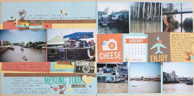
The supplies for this layout are mostly from the June Best of Both Worlds kit, plus a few extras from the supplies I’ve used several times throughout my backpacking albums, to help add a little continuity. I added a second sheet of the camera patterned paper from the kit to make a double page layout, but in the end there is so little of it showing that I think you could omit that sheet of paper without any trouble if whatever paper you wanted on the left didn’t have a twin in your collection. (Of course, you can also create the right side with a divided page protector and forego the 12×12 background completely.)

scrapbook page by shimelle laine @ shimelle.com
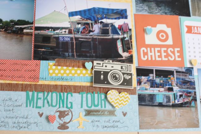
The original sketch includes nineteen photographs, and that’s just a bit too far for me, so I went with eight in the end. Six of these are just shy of 4×4 and two are 4×6, and it’s those 4×6 images that led me to make some bigger changes on the left side of the layout than I first imagined, but it worked its way out I think! Neither of those photos were images I wanted to crop, and that led to my first big realisation with working with this sketch: I prefer the composition of photos in the 4×6 set up. I certainly have square photos! But they tend to be just an image or two of any given event, as I will always use my traditional camera, not my phone, for the more photogenic stuff of life. I’ve spent years trying to improve my composition in that format, especially trying to find a good shot quickly, as all the photos on this layout were taken from the side of a relatively speedy boat. I looked at several different sets of photos trying to find images that would be improved by cropping to a square, and they were hard to find, so in the end I kept two of the images at their full size. I felt bad that I was cheating Allison’s sketch in what was supposed to be my homework, but at least it came with a little caveat that I was happy with how my photos were coming out, straight from the camera. I know that when I put a sketch together, I’d always be okay with changes like photo size or number, so I hoped Allison would be the same, knowing the sketch was still tremendously useful in putting everything together! (If you listen to the show, I think we’re on the same path with that one. Fabulous!)

One thing I really liked from this sketch that I don’t think I would have put together without it was the balance of the large, simple motifs on the cards on the right side with the smaller, more detailed embellishments on the left side. It’s the kind of balance that depends on something being the same but different, and also that several small somethings can add up to equal one big something. That’s definitely something I want to remember for future designs, as this is a bit different to the double pages I tend to create without a sketch, and I really like this look. Plus I have plenty of 3×4 cards, especially for a scrapper who doesn’t keep a regular Project Life album or anything! I’m all for bookmarking different ways to include 3×4 cards on a 12×12 (or 24×12) page.

As this sketch isn’t my own, there’s no guest or link up here, but you can find Allison’s interpretation of the sketch, complete with thorough notes, on the Simple Stories blog, and if you give this sketch a go, I know Allison would love to hear from your in the comments there. And see more of Allison’s work on her blog.

Next up, I give one of Noell’s templates a try! And you can hear us all talk about this entire process on PRT episode 166. I hope you enjoy!

Sketch to Scrapbook Page :: Starting with mist

scrapbook page @ shimelle.com
After a few sketches that focused on bringing square and rectangular photos together on the same scrapbook page, it was time to move on to something else, and the next four sketches all have something in common: they start with mist.

scrapbooking sketch @ shimelle.com
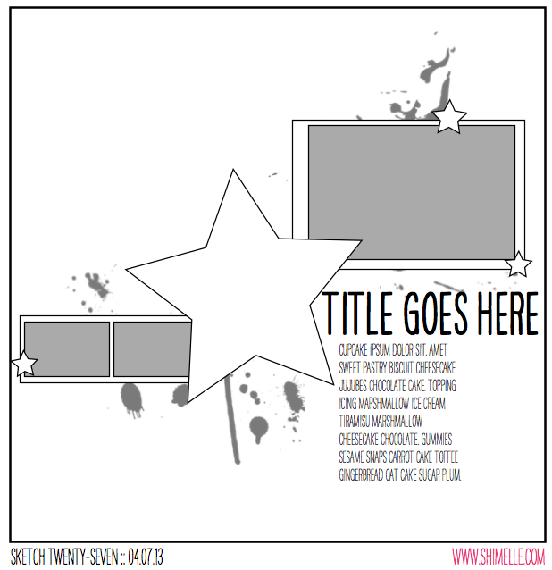
Of course there is no way to accurately depict the random splatters of mist on a sketch! So do please excuse my artistic limitations when it comes to drawing things like this, but the general idea of where to aim with droplets of mist is there somewhere! In this case, it also comes with a large embellishment in the middle of the page as a bit of a different design to what we’ve tried so far.


The supplies for this page came from the June Best of Both Worlds product picks, plus two shades of mist, some enamel dots, and a date stamp.

scrapbook page by shimelle laine @ shimelle.com
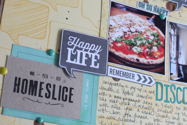
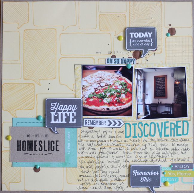
Early in 2013, I made a conscious decision to start scrapbooking more about the places we eat. I’ve photographed food off and on for quite a while, but one thing I liked seeing pop up in friends’ Project Life albums was the record of going out to eat somewhere lovely. I don’t necessarily want to record every place like that, and if I tried to make a page from everywhere I’ve photographed the food, I would be looking at a very long to do list. Instead I wanted to focus on the stories of these places, and I’ve found this to be quite a rewarding addition to my albums this year. I’ve recorded our appreciation for the unique flavour choices at our favourite ice cream gelato place, documented my habit of going to three specific places nearby whenever I decide to make the trip to the far side of town to visit my favourite coffee shop, and on this page I wanted to tell the story of a place we discovered just before it was discovered by the media, and how we managed to go there and walk right up to a table, no problem, and a week later there was an hour long wait because it had been featured with great reviews in all the papers. I read a lot of those reviews, and it’s a pretty rare occasion to just stumble upon a great find before it’s well and truly found by everyone. So that seemed story enough!

scrapbook page by Ewa @ shimelle.com
Please welcome a very talented lady who goes by just one name! Ewa comes to us from Norway, and I love her bold and artistic style, perfect for showing us what we can really do with a sketch that starts with mist.

scrapbook page by Ewa @ shimelle.com
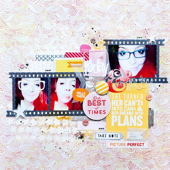
When I start to work with a sketch I like to take it seriously. I try to imitate what I see in the sketch with what I see on my work. I also love to throw in a lot of embellishments, tags, and additives, so I usually go beyond what is in the sketch. These photos allude to my first glasses, which I started wearing a few days ago so I tried to make this theme in different ways.

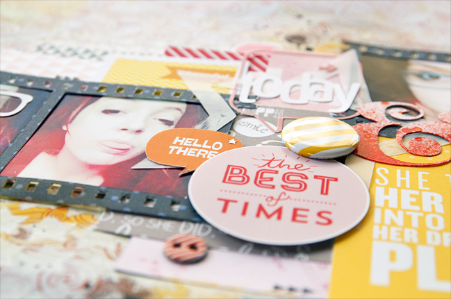
I started working on this scrapbook page by making a choice of photos and paper background. Then I chose the rest of the papers, which I looked through making sure that the colors fit together. When I have selected all the papers which I wanted to use on my work and I had the initial composition I prepared a background. In this work I used gesso and star mask from The Crafter’s Workshop. I cut the title, film strip frame, and the ampersand with a Silhouette Cameo, which I splashed with Overdue Mister Huey’s mist. I decided to gently cover up the main star from the sketch so that it was not the main element of the layout and I decided to do that with vellum. When I glued all the papers I looked through all my embellishments and chose anything to fit. I tried to create a lot of interesting places on the page which catch the eye – including My Mind’s Eye’s buttons, star-shaped mistable Thickers, flair badges and printable journaling cards from Studio Calico, and washi tape. At the end I splashed the whole page with different shades of Mister Huey’s mist, and added some yellow paints and stamps from Scrapperin, called ‘Form & Feder’.

I encourage you to experiment with the amount of additives – do not be afraid of extra embellishments – they look much better at work than on the bottom of your drawer!


Ewa currently living in Oslo, Norway with her husband. She is a kindergarten teacher who loves all things crafty but scrapbooking forever stole her heart. She began scrapbooks in 2011 because of her love for paper and cute embellishments. She creates mainly layouts, and 12 × 12 inch is an ideal working size for her. Ewa’s style is bright with lots of colors and embellishments. She has been on several design teams and now she currently serves on teams at Sketchbook365 and Scrap It Now. You will find her at her blog.