ScrapbookIndustryNews: pretty paper. true stories. {and scrapbooking classes with cupcakes.}

lovely to meet you Twitter Facebook Pinterest YouTube

Take a Scrapbooking Class

online scrapbooking classes

Shop Shimelle Products

scrapbook.com simon says stamp shimelle scrapbooking products @ amazon.com shimelle scrapbooking products @ amazon.co.uk

Reading Material

travel

10 Things :: February 2012

10 Things on the Tenth :: February 2012
CHA
On the tenth of the month, a bunch of us share ten things. Any ten things. All different kinds of ten things. And you’re welcome to join us.

For February, I’m running late. I have a sort of megadeadline for a big project staring at me right now and I’m still trying to wrap up all the CHA posts (look for the rest of those through the weekend – I really want to be all done with that by Sunday and get back to other posts on Monday!) and I’m also wanting to get those boxes from earlier today out the door and into the post as soon as possible. So we can do basic things like… walk to the kitchen. It will be awesome.

I also wanted to write a sort of wrap-up post with my overall notes from CHA so in terms of efficiency, it’s time for two birds and one stone. Except I don’t want to throw stones at birds. Not ever. But I do want to tell you ten things that struck me at CHA this year.
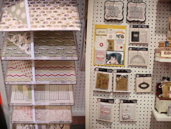
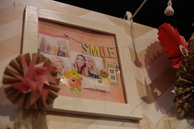
chevron paper
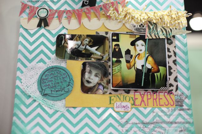
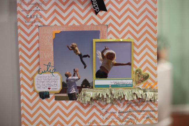
1. Everybody loves a chevron.
This was the most obvious trend and it appeared at almost every booth, and it cracked me up that it was unanimously termed the ‘chevron’ and never the ‘zig-zag’, though if someone said ‘what’s a chevron?’ the answer was invariably ‘you know, a zig-zag’. Love it. And clearly I’m loving this trend as I really didn’t see a single chevron paper that I didn’t want to add to my shopping list. Look for 2012 to be the year of the zig-zag layouts.

2. Tape and twine must have an awesome profit margin.
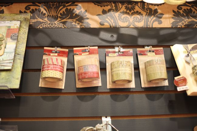
I only say that because nearly every manufacturer added washi tape and coloured twine to their collections this year. (Trust me, nothing really has an ‘awesome’ profit margin in scrapbooking. But it did make me giggle that so many companies must have looked at those two products and thought they made good business sense.) And when I was working for Jenni Bowlin, who didn’t add tape and twine to her collections? Buyers specifically said ‘and where is the tape and twine?’. In a serious tone. Not sarcasm. And this happened multiple times throughout the day. That’s just how much tape and twine was scattered around the show floor.

3. Hype marketing is gone.
The show takes up physically less space now than a few years ago. I think the non-paper craft manufacturers have really decreased in exhibitors – I’m sure two years ago we were still seeing a lot of cake decorating and wood blanks and more yarn companies on the floor, and of course we’ve lost many companies in the scrapbook world too. The show used to include the basement, but everyone is on the same floor these days. There used to be so many exhibitors that it was difficult to see the full show in three or four days, so companies really tried to hype their booth so you would seek it out. They would give away t-shirts and badges and bags and hats and all sorts of things with their name and booth number so you would see it and be reminded that you needed to get there and check out their new stuff. To encourage people to wear all that branding, there were lots of on-the-spot prizes given to random people wearing the free stuff. Sometimes enough companies would do this sort of thing that it seemed like people were walking billboards! And really, there wasn’t much of that this year at all. Just an observation. My guess is that if the show is small enough to see everything, the expense of the hype marketing goods and giveaways just isn’t worthwhile. (But that’s my guess, of course.)
clever handmade
4. We like a good comeback.
There was a lot of good discussion about the return of Heidi Grace Kress and Heidi Swapp. Literally every single comment I heard about both designers and their respective lines was positive. There was good buzz about some other things that made a return after a bit of an absence too – like the new Dear Lizzy line (which just hit Two Peas here by the way!), the return of BasicGrey after their decision to skip the summer show and Margie Romney-Aslett now happily designing at Bazzill.

5. Some companies are sorely missed.
We all have our favourites who aren’t in this game any more. Mine is Sassafras. I’m sure I’ll get over it some day, but it’s not now. KI Memories were missing from the floor but haven’t closed their doors – they recently launched a new digital set-up and shipped the Hot Date paper line to stores. Let’s hope this is a successful regrouping and we see them back very soon.

6. This isn’t the time for new exhibitors.
Newer names in scrapbooking, like Ormolu and Elle’s Studio, are following a very different business model these days. Is it possible to become a major player and never sell at CHA? Possibly – if the company is happy to grow at a steadier pace rather than go to the show in hopes of becoming a major player straight away. But really, there were very few new exhibitors and many that were technically ‘new’ were comebacks of some sort. So we can still have new in the industry without new at the show… which is a shift.
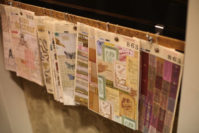
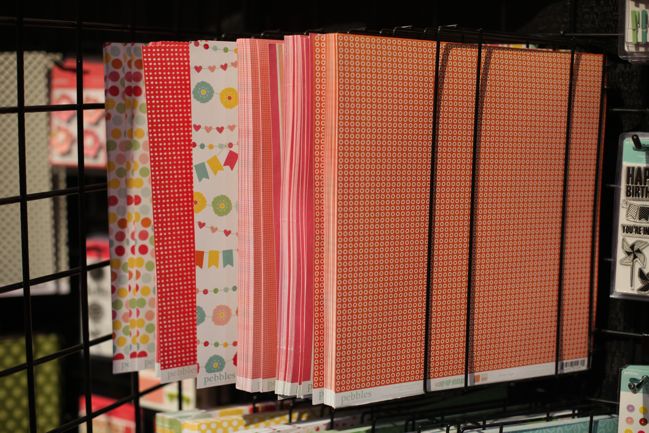
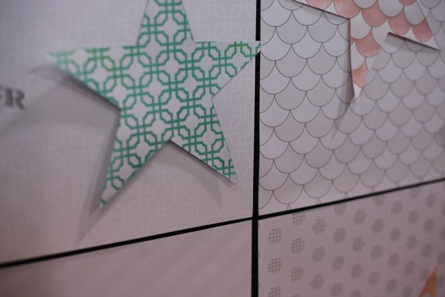
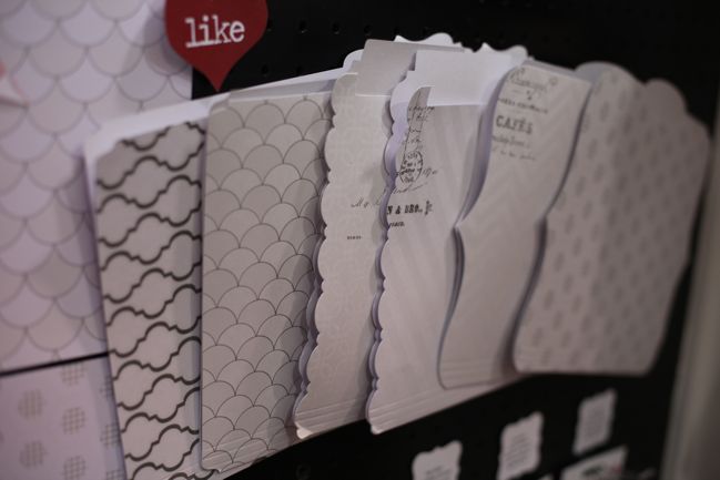
patterned paper display
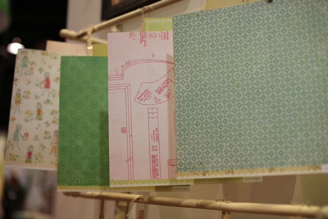
7. Things are simpler.
This show is expensive enough when it comes to paying for the booth space and fixtures, shipping everything in giant crates, employees, travel and so on and so forth. It appears that manufacturers have chosen to reserve the extra expense that comes in commissioning huge booth endeavours with custom carpentry and so forth. Instead, we see companies using displays they can use at multiple shows, with simple branding and products and project samples easy to see. Not so many layouts blown up to four feet square, not so many walls in crazy accent colours or anything like that. That said, in general there were fewer sample projects and in talking to store owners (and sometimes just listening to store owners as they shopped), I think there are certain products that would have been better sold with examples that effectively showed a product in use. Simple booths can be great, but not at the expense of letting buyers see just how awesome it would be to have this amazing piece of paper that will let you make this fabulous project. I do wonder how many manufacturers are aware of which projects on their booth did and didn’t sell product. (I know, if I didn’t have things like that on my mind, combined with a lifetime of random song lyrics, I could totally find the cure for the common cold or something. But sadly, this is what plays on my mind.)

Of course, we’re also seeing simpler innovations rather than big risk products. In almost every case, I think that’s a good thing for this point in the market. There were a few things out there that confused me a little, but by and large the floor was filled with products that will be attractive to the scrapping masses rather than something totally oddball that will only appear to a select few.
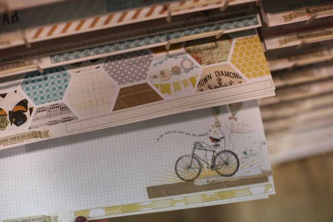
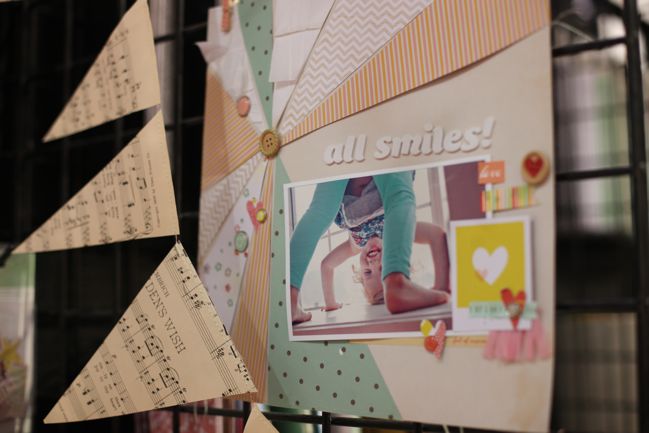
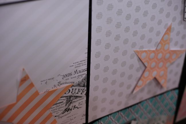
hexagon paper
8. Hexagons are cool.
They are. They aren’t circles. Nor rectangles. Nor squares. So we can throw them into layering as something new. Simple, but different. Hexagons were big with Jenni Bowlin Studios and Rhonna’s line for My Mind’s Eye and a few bits and pieces elsewhere too.

9. If my normal life were like CHA, I would be exhausted and not fit into any of my clothes.
I am never prepared for the crazy hours that happen at CHA. It seems like you can get so much done in four days, but it’s almost every hour of those four days. At the end, no one has slept properly for at least a week, as the last few days of preparation are usually a bit mad too. And all the big meetings happen over food. CHA is basically the only time in my life when I schedule every single meal for several days. I love the energy and the ideas and the getting to talk to people I don’t see the rest of the year, but oh my goodness, at the end my body is seriously asking me to lay off the cheesecake and go to bed. (In fact, after the show closed, I meant to just sit and veg for a couple minutes while I went through my notebook, at about 6:30pm. I still needed to book my ride to the airport the next day. Next thing I knew it was 6:30am and I still had my notebook on my lap. Oh wow, that was not the plan.)

10. I never get tired of looking at paper.
A few of you have commented on things like ‘doesn’t it all blur into one?’ and I’m sure it does for some, because there really is a lot of stuff entering the brain at once. But I really do have a childlike love of paper and every new line that I like still makes me exclaim. I talk to paper at trade shows. Not like an actual conversation, I hope. I assure the paper doesn’t usually talk back. But all those words I overuse in life? Lovely, amazing, cute, lush, brilliant, fab? I find myself saying them time and time again. So every year when I decide if this trip will be worthwhile, I finish the show thinking it has been more worthwhile than ever. Looking at paper is almost as awesome as making things from paper.

And if you’ll excuse me, I think it’s about time I go do that now.


CHA Winter 2012 :: Doodlebug

CHA Winter 2012 :: Doodlebug
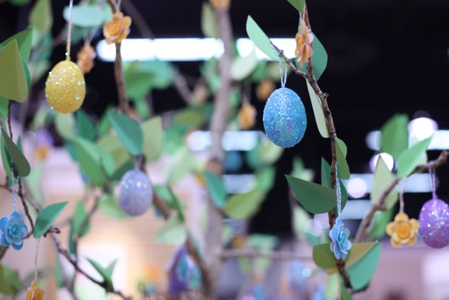
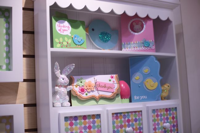
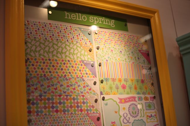
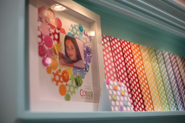
If you don’t love colour, then don’t come anywhere near the candy-coated rainbow that is Doodlebug Designs! But colour is definitely good in my book, so a closer look indeed! You know, once I get past the idea of a tree that sprouts glittery Easter eggs. Because that puts trees, glitter and chocolate all the same object and I’m totally excited for that idea. Tree scientists, feel free to make this a reality. Please and thank you.

CHA Winter 2012 :: Doodlebug
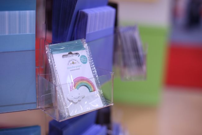
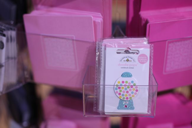
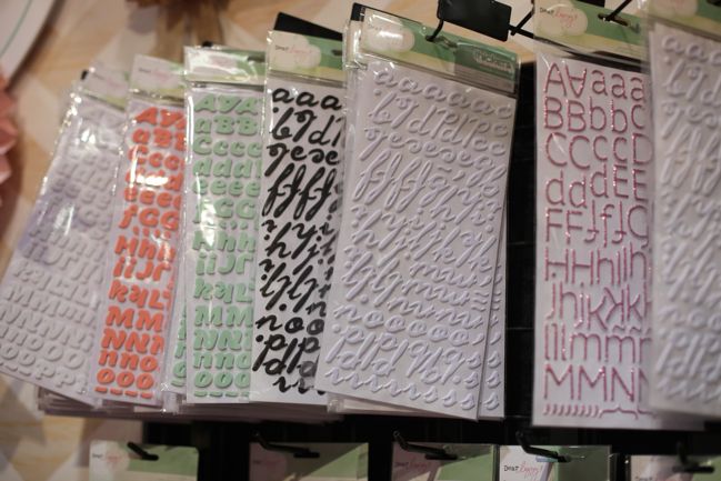
Cardmaking is more and more evident at the Doodlebug stand with each show, and the Doodlepops sticker line is perfect for that. 3D layered stickers sold individually, so you can grab just the design you want rather than trying to compromise with a sheet filled with a dozen designs at a higher price. I’ve used a couple of these and they are very sturdy for a layered sticker, so that does make them excellent for cards.

CHA Winter 2012 :: Doodlebug
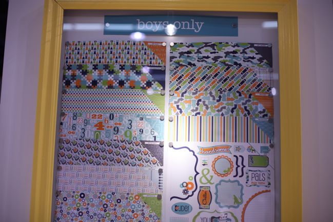
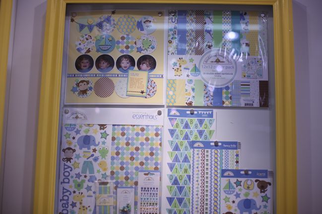
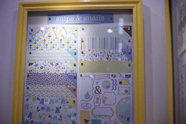
Two boy-themed lines cover babies and growing up years – with coordinating blues to make the more versatile patterns cross over the two.

CHA Winter 2012 :: Doodlebug
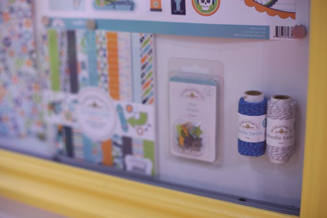
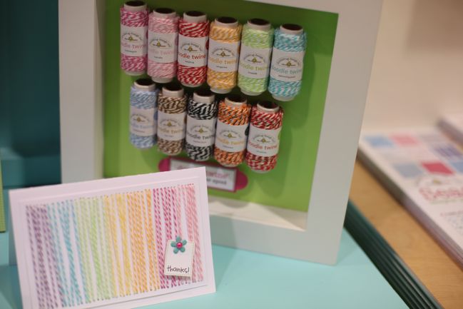
I wonder if the shop-owners noticed this. Because this next to the till in a scrapbook shop would make me completely and totally powerless at staying away from baker’s twine. It would all be in my basket in under sixty seconds. Even if I didn’t know I needed it at all.

CHA Winter 2012 :: Doodlebug
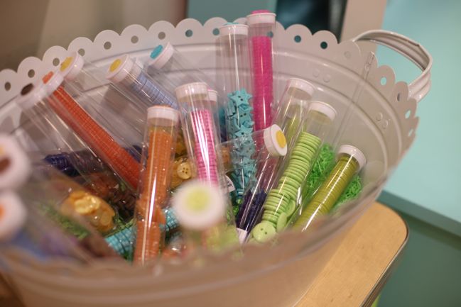
And I love how they package these buttons too, though this is probably something that works best for a retail store. It’s how I shop for buttons in the haberdashery department, so it makes sense in the papercraft world too. But the colours are extra lush, of course!

CHA Winter 2012 :: Doodlebug
A little something new for the Doodlebug glittered papers: coloured backgrounds, white spots. I get a few of these each time and they look so fab in an album. Adhesive and the glitter can be a bit tricky, but it stitches really well, so that works a treat!

CHA Winter 2012 :: Doodlebug
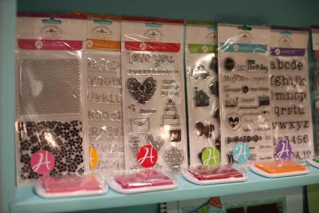
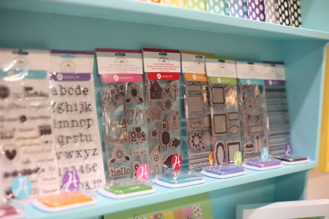
New clear and rubber cling stamps, including backgrounds and an alphabet, plus ink pads to coordinate with the Doodlebug colour palette.

Pretty much everything here ships in early March, so be ready to grab your favourites very soon!

Click here to shop for Doodlebug products!

CHA Winter 2012 :: Dear Lizzy Neapolitan

CHA Winter 2012 :: DearLizzy
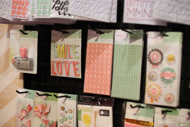
After three collections in 2010 but nothing new in 2011, a new addition to the Dear Lizzy + American Crafts partnership is a bit exciting. It’s one of the first collections from the entire show to hit stores, as it’s shipping straight away, and it’s filled with watercolour washes, ice cream cones and well… Thickers. Of course.

CHA Winter 2012 :: DearLizzy
And a rolling date stamp that includes a selection of sweet phrases to accompany the date, larger word embellishments that could also work for party decor, two smaller flat alphabets and paper rosettes.

CHA Winter 2012 :: DearLizzy
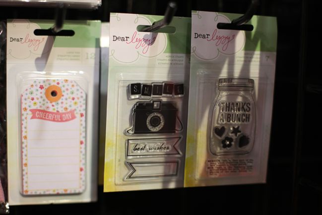
Two sets of clear stamps include a camera and bunting flags in one set and a jar to fill with wishes in the other. (Or if not wishes, your choice of hearts, stars, flowers or strawberries. Same thing.)

CHA Winter 2012 :: DearLizzy
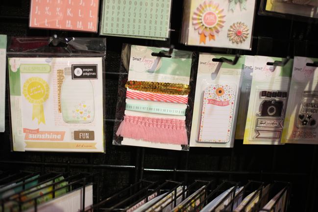
My favourite is probably the sticker book – I love these in every AC collection and use them to the very last sticker. And the ribbon card includes sequins!

CHA Winter 2012 :: DearLizzy
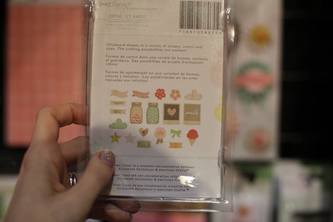
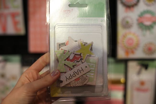
Printed chipboard collection is quite delish!

CHA Winter 2012 :: DearLizzy
One of the paper releases is a ruffle paper – 12×12 with several ruffles of crepe paper attached to the background. It can be used on its own as a 12×12 sheet or cut apart to create separate ruffles, ready to be added to any project with just standard adhesive. (It also looks very nice stitched!)

CHA Winter 2012 :: DearLizzy
Oh, the window dressing here! So lovely! So making me want to sit down for a tea party on a blanket in the middle of the aisle. But unfortunately, that sort of things is generally frowned upon at the trade show. Also, I did not bring a tea pot. So that plan is ruined quite quickly and instead I just looked at the pages and took plenty of photos.

CHA Winter 2012 :: DearLizzy
Including a couple of Liz(zy) herself, of course. It’s only polite!

Click here to shop for Dear Lizzy products, already in stock!

CHA Winter 2012 :: 7gypsies

CHA Winter 2012 :: 7gypsies
7gypsies is another company that has been in the swing here and there going from independent to a parent company, but they have continued to stay true to their brand and their booth never fails to inspire. They keep their new releases on the small side and always make sure they work well with the existing products in the line, so if you’re a fan of their products, you will probably be a fan for life. I love that consistency in their work, and think they have benefitted from not trying to grow to double or triple the size of their collections. Everything has a lovely boutique feel and seems very right as a package.

CHA Winter 2012 :: 7gypsies
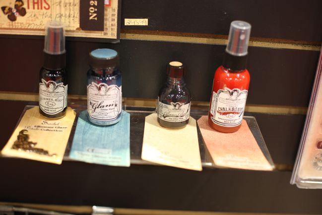
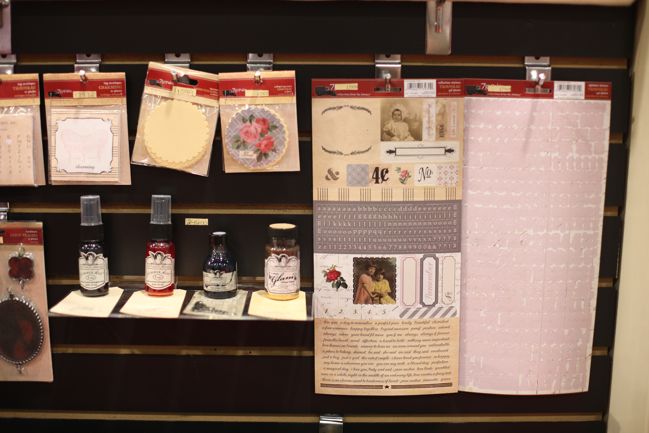
There is some new cross-branding here too, with special edition colours of Tattered Angels products in colours to match the 7gypsies collections – and they are more colourful than you might first expect.

CHA Winter 2012 :: 7gypsies
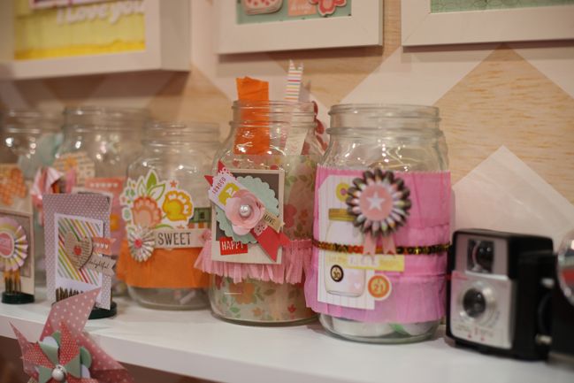
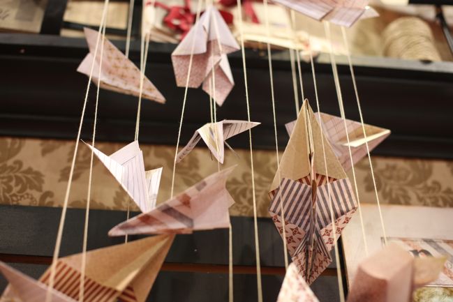
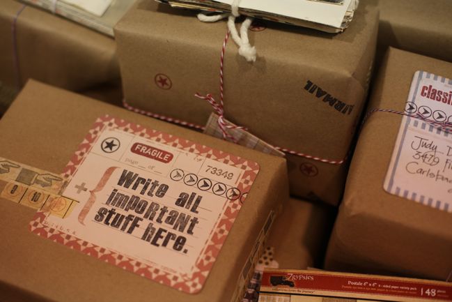
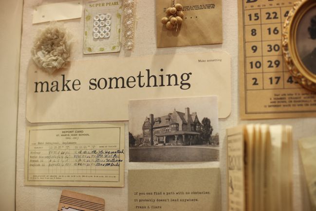
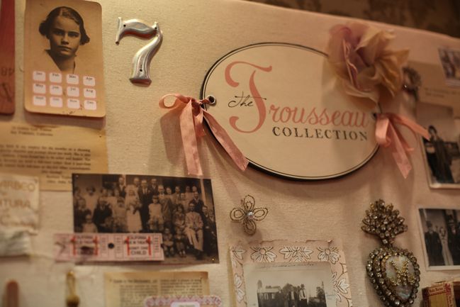
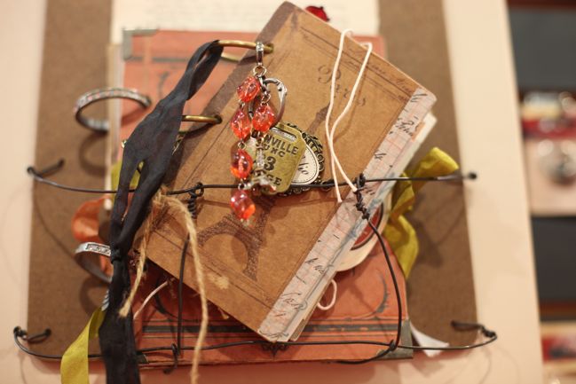
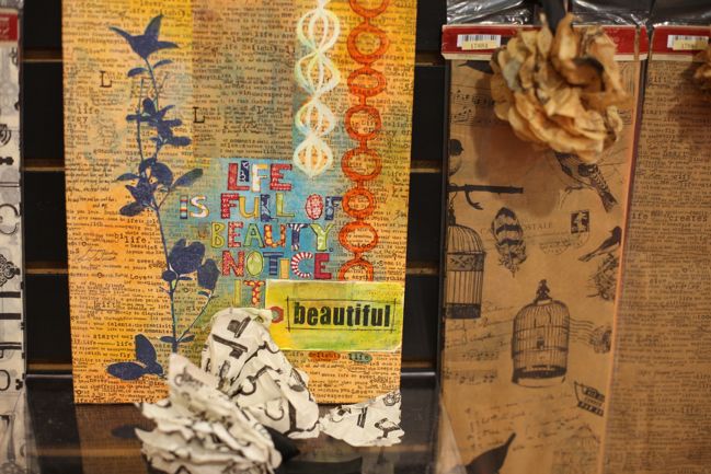
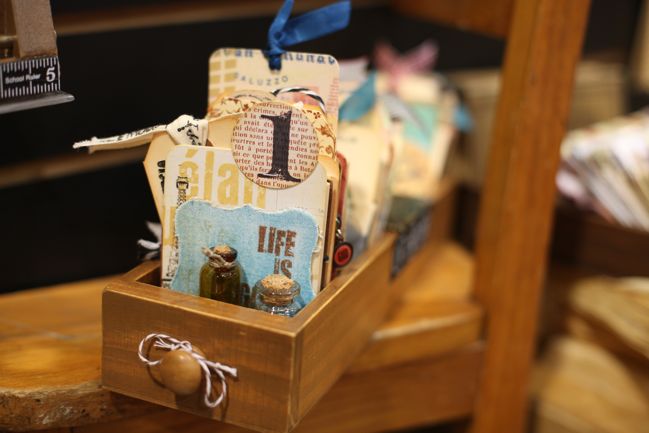
But I have to admit that half the fun of walking around the 7gypsies booth is just looking at all the pretty things tucked away. It’s sometimes hard to tell what is display and what is product – but in a very fun way!

CHA Winter 2012 :: 7gypsies
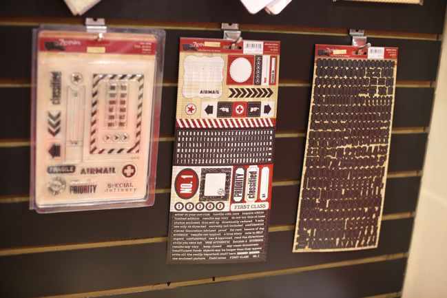
I’m long a fan of the 7gypsies 97% Complete sticker sheets, and these are a new twist on that mix, with a mini alphabet in there along with the word stickers I’ve used so many times.

CHA Winter 2012 :: 7gypsies
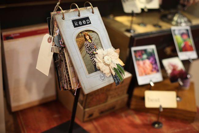
This is what I mean about it being hard to tell the difference. If that flash card were to be marketed, we would all find a place to display it, right?

CHA Winter 2012 :: 7gypsies
This is the softest and most antique-fair of the new collections…

CHA Winter 2012 :: 7gypsies
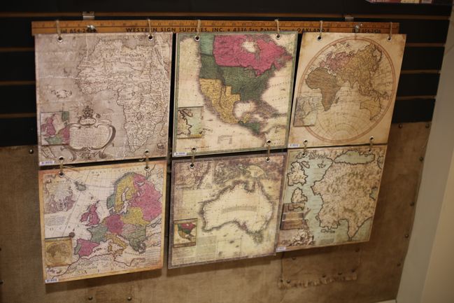
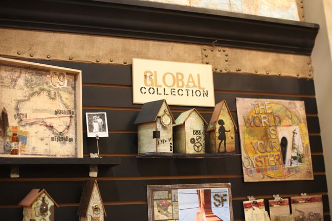
with darker tones and plenty of maps in the Global collection.

CHA Winter 2012 :: 7gypsies
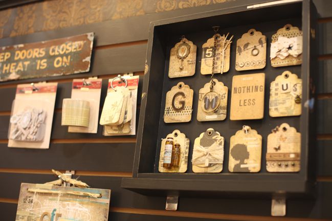
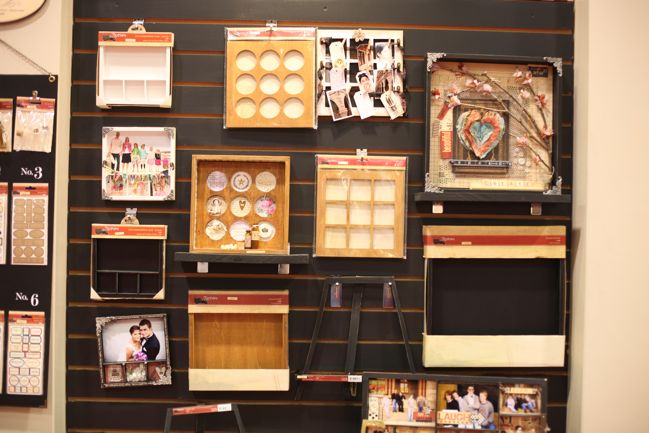
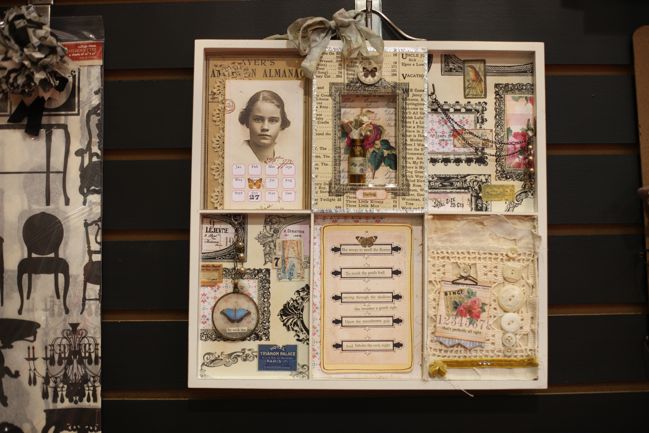
Love this shadowbox. So much.

CHA Winter 2012 :: 7gypsies
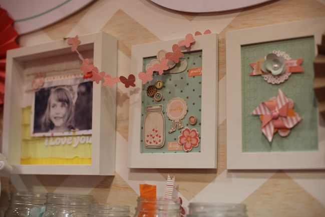
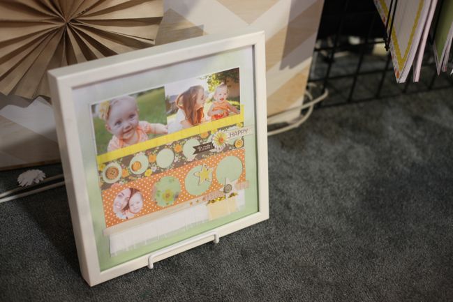
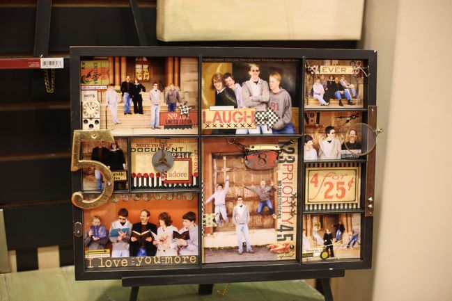
So many examples of what you can do with the alterable bases from 7gypsies – but of course you can use these with any paper collection for so many more looks too. I think these make a great gift for a crafty friend to make something special but they also work as a way to make something yourself and gift finished to someone who would appreciate something pretty for the wall but wouldn’t know what to do with just a scrapbook page or two.

I think I’ll need to pick up that easel too, as I have a couple of the older shadowboxes balancing a bit precariously on the counter. Not sure why I didn’t think of an easel before, but now that’s an easy addition to the line-up.

CHA Winter 2012 :: 7gypsies
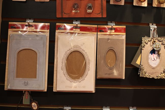
The vintage chipboard book covers are a huge value and I’ve used them on a couple projects and always loved how they really do look like an old photo album, but now there are more options including frame styles that look like they would hold an old tintype photo.

CHA Winter 2012 :: 7gypsies
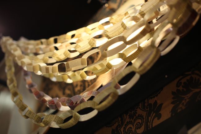
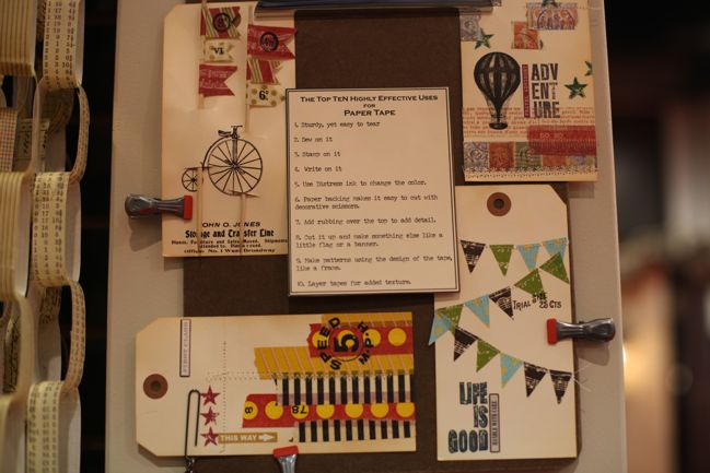
You wanted to see the tape. I knew you did.

CHA Winter 2012 :: 7gypsies
Just so much prettiness everywhere!

Click here to shop for 7gypsies products. Global and the paper tape have already arrived in the store, with other products to come throughout the spring.

CHA Winter 2012 :: My Little Shoebox

CHA Winter 2012 :: MyLittleShoebox
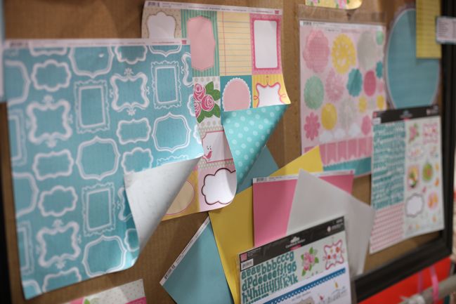
My Little Shoebox is does cute better than pretty much anybody, so if you embrace the cute, they won’t disappoint this season! But what I really love is how there are always a few things in the mix that will work with non-cutesy styles too – so don’t overlook this brand just because you don’t think cute is your thing.

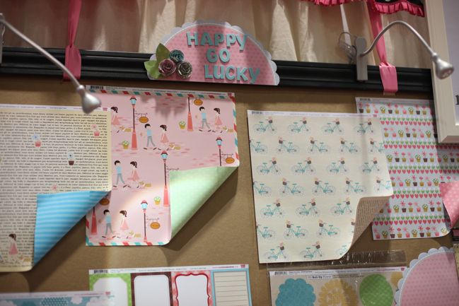
Happy Go Lucky includes a great bicycle print and a nice twist on book text with the small flowerpots added to the page.

CHA Winter 2012 :: MyLittleShoebox
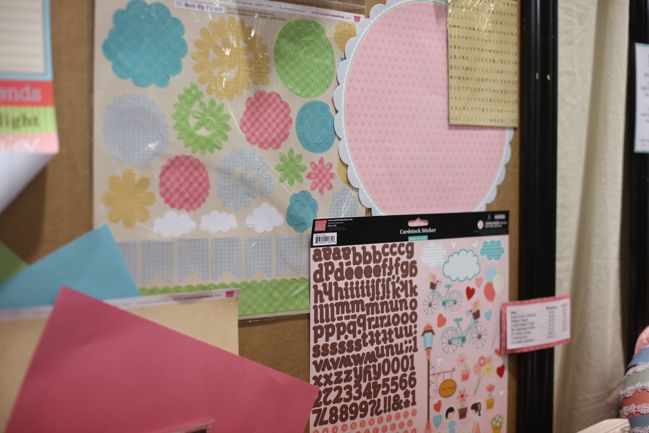
Each collection includes a die-cut sheet (including 3D spiral flowers), a die-cut paper, a 12×12 sticker sheet including a large alphabet and a separate mini alphabet in a coordinating colour.

CHA Winter 2012 :: MyLittleShoebox
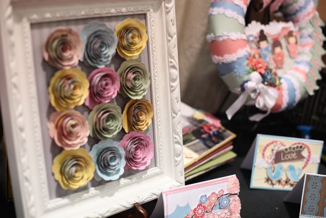
Those are the spiral flowers – they are so lovely! But I’ve flattened them a bit and included them on a normal page without any trouble too, so definitely workable for a range of projects.

CHA Winter 2012 :: MyLittleShoebox
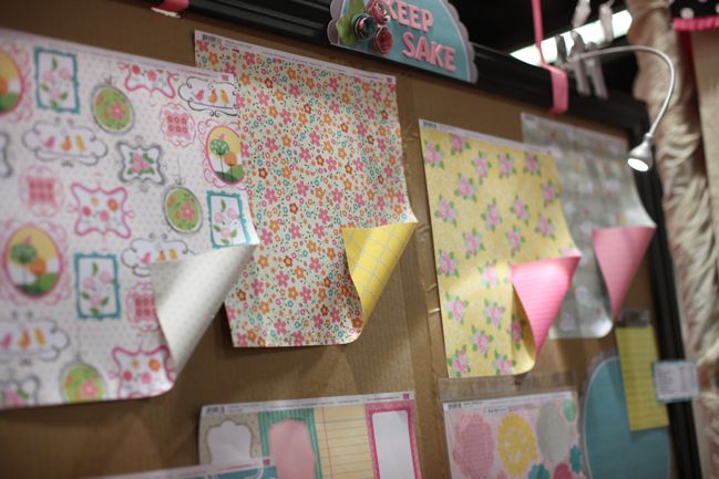
The Keepsake collection features bright florals and little frames.

CHA Winter 2012 :: MyLittleShoebox
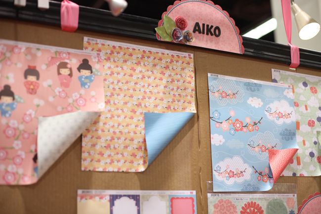
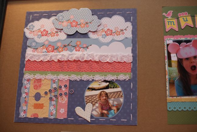
Aiko includes pretty pink cherry blossoms. (Love that blue sky background.)

CHA Winter 2012 :: MyLittleShoebox
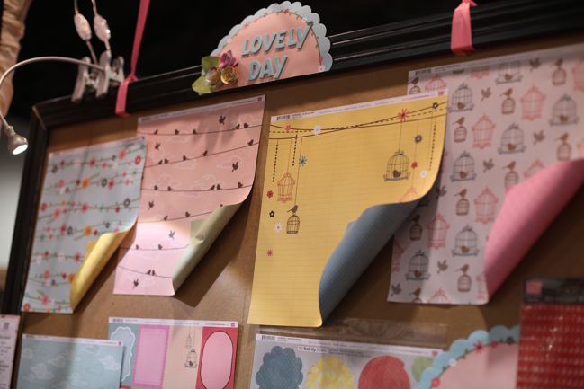
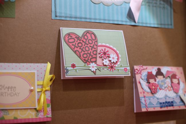
Lovely Day lets you put a bird on it – ‘it’ being any scrapbook page or card you fancy, of course.

CHA Winter 2012 :: MyLittleShoebox
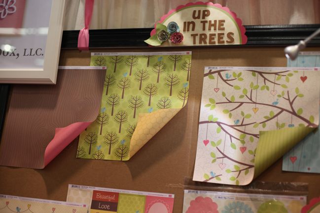
Up in the Trees includes my favourite of all their new papers: a tree-trunk style woodgrain with a heart-shaped knot in the wood. (I am nothing if not predictable, I know.)

CHA Winter 2012 :: MyLittleShoebox
Then My Little Shoebox totally brings on the inspiration by covering the outside of their booth with gorgeous samples from their design team. Soak it in!

CHA Winter 2012 :: MyLittleShoebox

Click here to shop for My Little Shoebox products. Everything except Happy Go Lucky is already in the store, so shop away!

CHA Winter 2012 :: Technique Tuesday

CHA Winter 2012 :: TechniqueTuesday
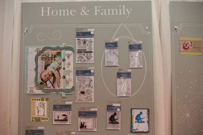
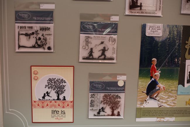
A quick look at the clear stamp world of Technique Tuesday this afternoon! Their booth made me discover some looks I hadn’t noticed from their brand before, like the silhouette series…

CHA Winter 2012 :: TechniqueTuesday
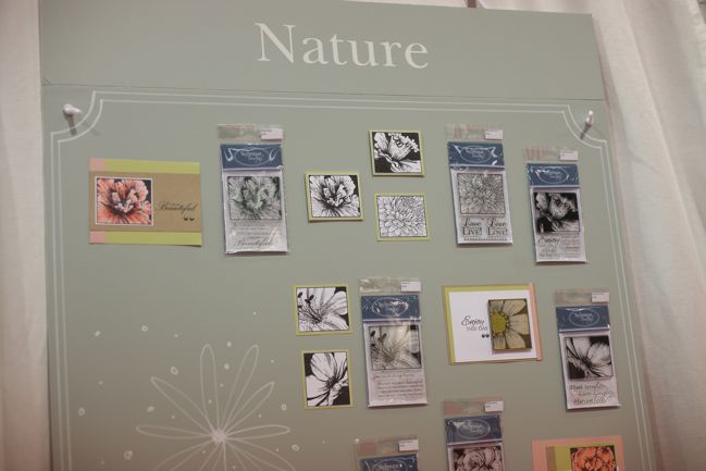
…and a selection of detailed florals. Definitely good for cardmakers… is there a way to make these look lovely on a scrapbook page? I’m curious!

CHA Winter 2012 :: TechniqueTuesday
These sets with the silhouettes and a coordinating set of words would definitely work for scrapbook adventures.

CHA Winter 2012 :: TechniqueTuesday
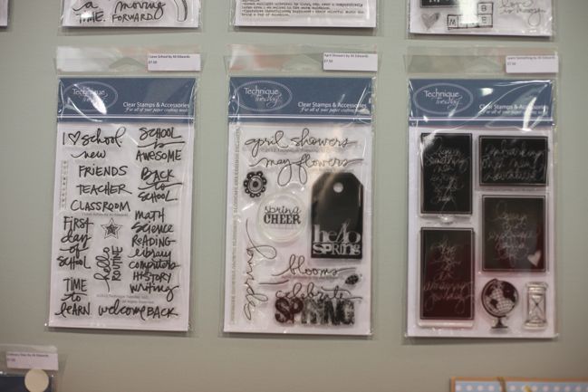
And of course, new stamp sets from Ali Edwards! That set on the right would be perfect for a certain class in September: it includes a stamp that says ‘Learn something new every single day’!

CHA Winter 2012 :: TechniqueTuesday
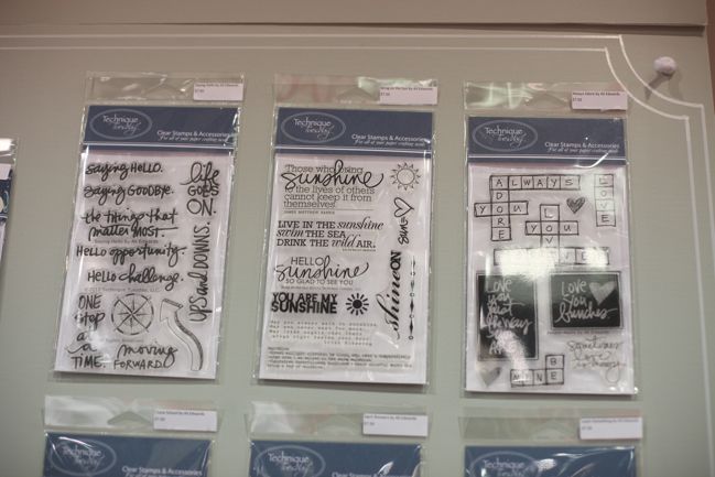
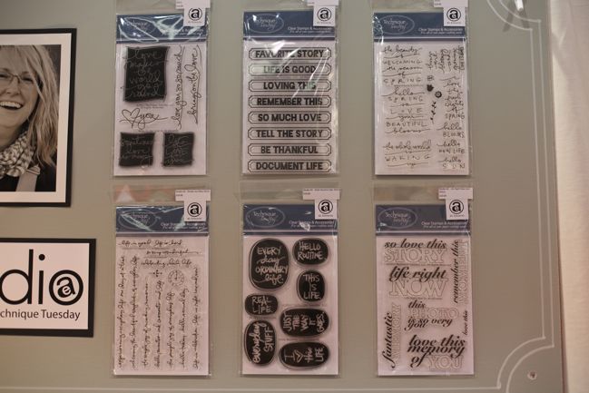
There’s a lovely balance of styles across this collection – good to see a mix of playful and formal, handwritten and some font work.

Sadly not a lot in the way of example pieces to show you from this booth, but since these stamps are hitting stores pretty quickly, there will examples aplenty very soon!

Click here to shop for Technique Tuesday stamps – many of these designs are already in stock!

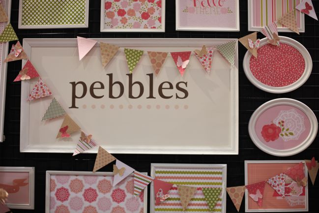
CHA Winter 2012 :: Pebbles

CHA Winter 2012 :: Pebbles
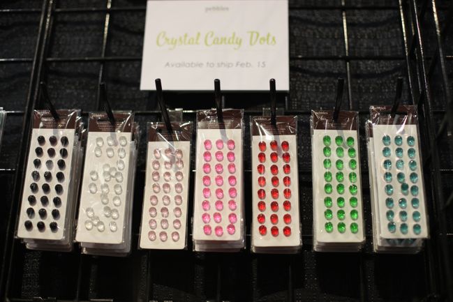
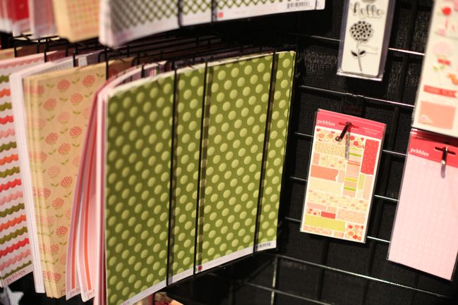
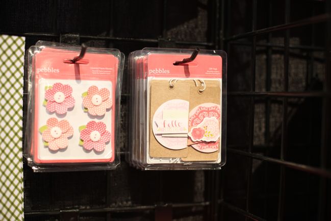
Next on the list, Pebbles, who make those candy dots embellishments I love so!

CHA Winter 2012 :: Pebbles
They added these crystal dots to that line up, for lots of sparkle in a tiny little embellishment – just peel and stick to your layering for that finishing touch. But don’t worry – there is plenty of paper on offer too!

CHA Winter 2012 :: Pebbles
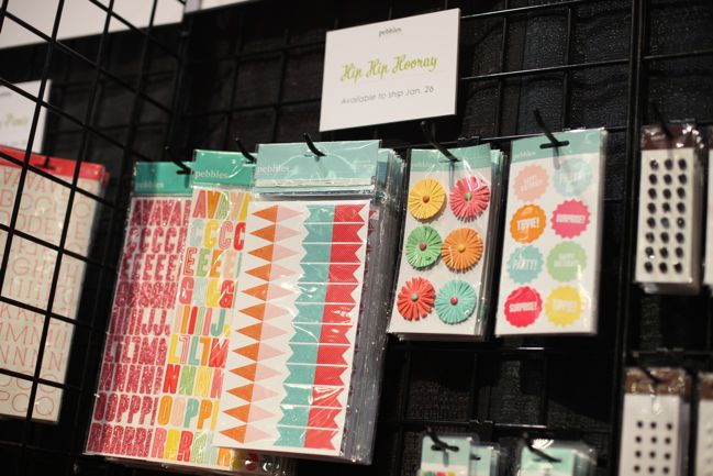
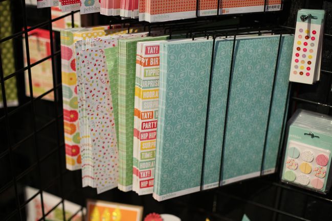
Hip Hip Hooray is shipping now (and it’s available as of today at Two Peas!) Summery party colours abound. In fact, looking at these pictures are a bit of an antidote to the snow falling outside my window.

CHA Winter 2012 :: Pebbles
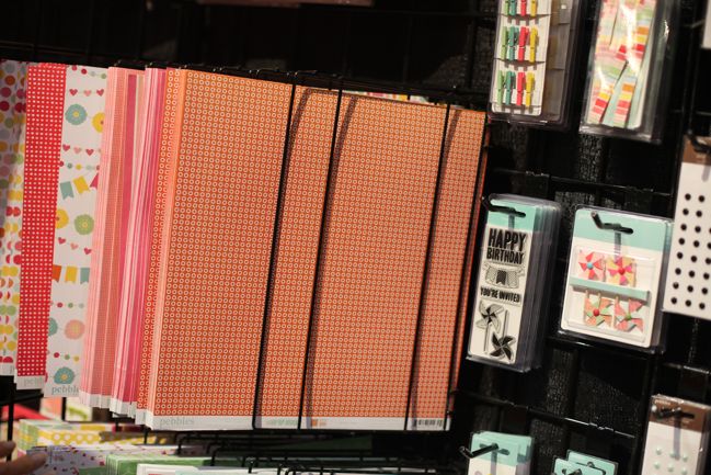
Many of the papers have these small repeating patterns making them great additions to your stash (something Glitter Girl discussed this week, by the way!)
(Apologies for the shadow – busy busy in this booth!)

CHA Winter 2012 :: Pebbles
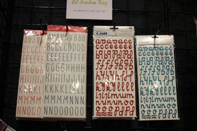
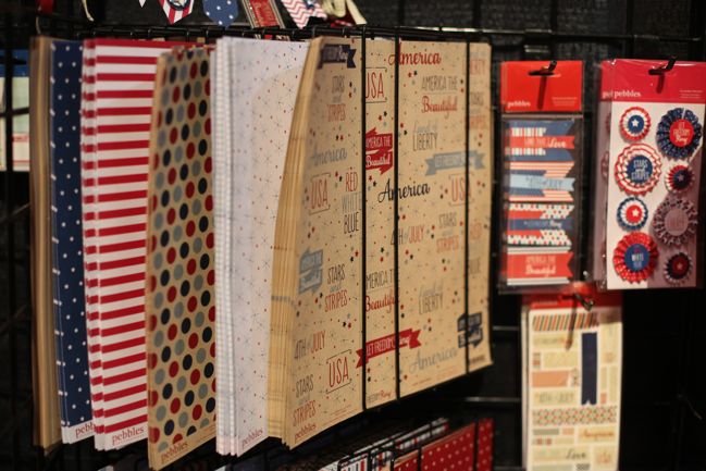
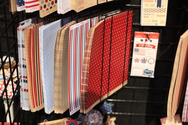
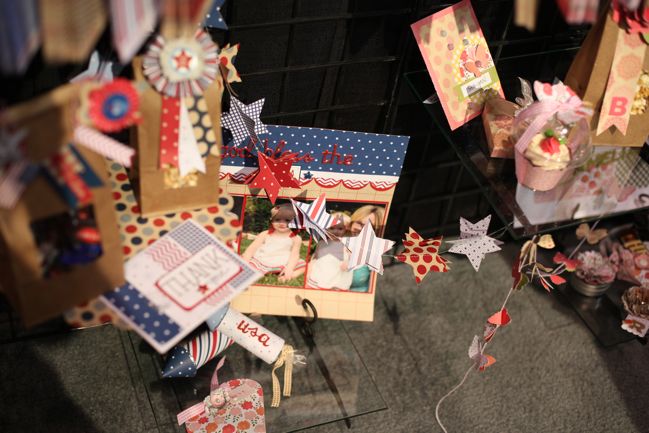
Let it Ring is a patriotic American collection shipping in late April. Stars and stripes abound, but the lettering is something we might use the world over!

CHA Winter 2012 :: Pebbles
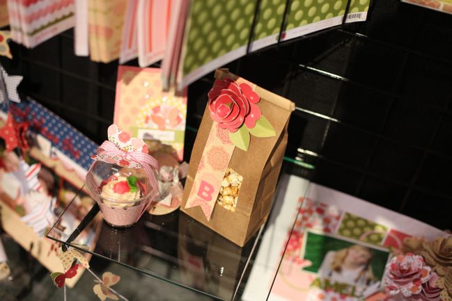
Love the idea of printing a collection like this on kraft (something we’re seeing more of from various manufacturers), and the paper rosettes are so very election-year, right? And actually some of those papers needn’t be specifically USA, should you need a good navy or red for a less-specific theme.

CHA Winter 2012 :: Pebbles
After coincidentally spending the last two July fourths stateside after a great many years without such an event, I think I shall be here in London for the day of Yankee Independence for 2012 – but that star garland actually makes me tempted to throw some sort of party. Pre-olympics, perhaps?

CHA Winter 2012 :: Pebbles
Country Picnic is also hitting stores right now, with plenty of soft spring florals in the traditional Pebbles style.

CHA Winter 2012 :: Pebbles
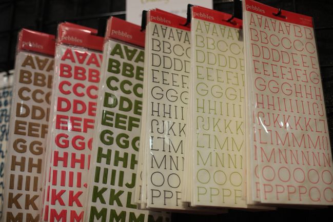
Something a little different in the lettering: a corrugated alphabet in several colours. I don’t always like corrugated card but this was small enough that it looked quite nice! (Find both lettering styles here should they take your fancy!)

CHA Winter 2012 :: Pebbles
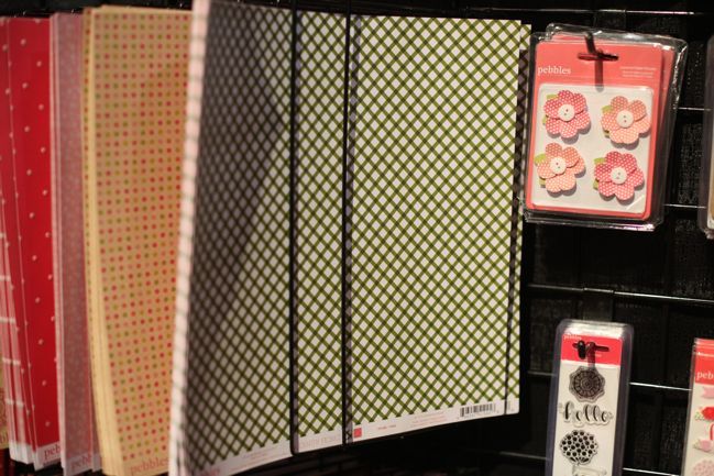
Lots of green and pink and dots and flowers. Love this updated look at the classic Pebbles designs. (Did you know Pebbles is one of the oldest companies in the scrapbooking industry? Yep! Years ago we knew them by the much longer name ‘Pebbles in my Pocket’ and they were abbreviated as PIMP on message boards! They still have a retail store in Orem, Utah.)

CHA Winter 2012 :: Pebbles

CHA Winter 2012 :: Pebbles
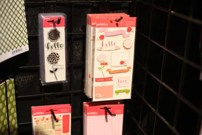
The addition of handwriting to the embellishments and stamps is quite sweet.

CHA Winter 2012 :: Pebbles
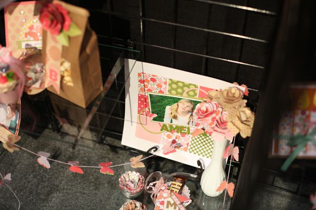
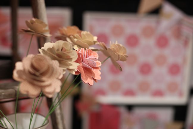
Some inspiration for a Valentine bouquet? (Someone teach The Boy to make paper flowers, quick!)

But the best bit is two of the lines are already shipping to stores, so this is one that won’t make you wait! Click here to shop for Pebbles products, including the new Hip Hip Hooray and Country Picnic collections, plus more than 150 products on sale.

(And by the way, American Crafts Gardenia from the post a few days ago is now available too. Happy shopping!)

CHA Winter 2012 :: Heidi Swapp

CHA Winter 2012 :: Heidi Swapp
2012 may be the year of the chevron, but it was also marked the return of the Heidis – not just Heidi Grace Kress, but also Heidi Swapp. This Heidi started designing product first for Making Memories, then under her own branding for Advantus, then came work with both Tattered Angels and House of 3, the latter selling digital and printable designs online but then also releasing paper products through Pink Paislee. Caught all that?

And now Heidi is back with her own branding again, but with the orders being fulfilled by Pink Paislee. I think this is a good step we’ve seen with a few brands now: let the creative folks really focus on strong product development rather than trying to carry the burden of everything else about the company too. Surely that option would lead to creative burnout sooner or later? Anyway, let’s look at products, shall we?

CHA Winter 2012 :: Heidi Swapp
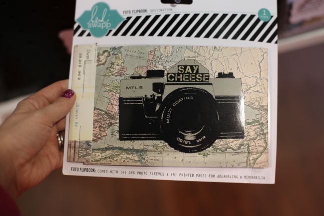
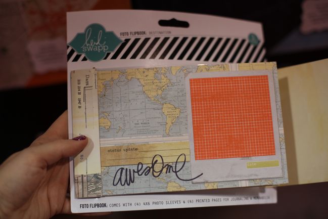
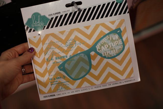
First is this, the Foto Flipbook, which is a bit like a minibook redefined – not like a Smashbook or a Daybook but like its very own design with a mix of page designs and sleeves for 4×6 photos.

CHA Winter 2012 :: Heidi Swapp
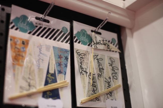
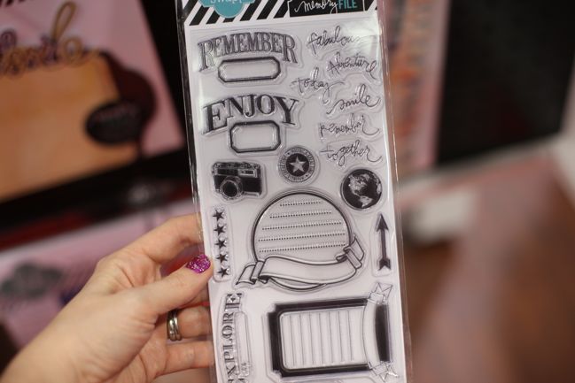
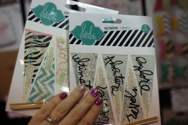
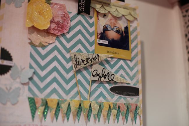
Even Heidi’s very first product releases showcased her handwriting as their trademark, so long-time fans won’t be disappointed by pennants and stamps that continue that tradition.

CHA Winter 2012 :: Heidi Swapp
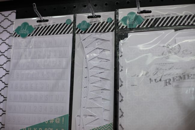
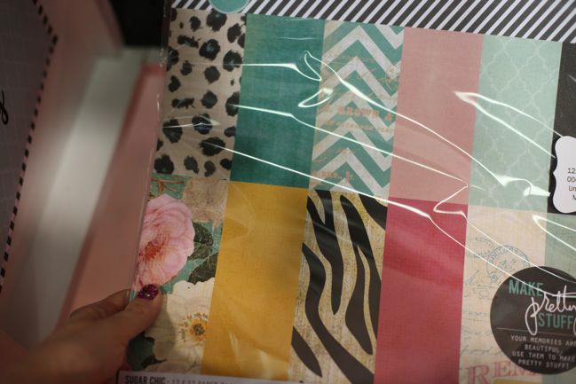
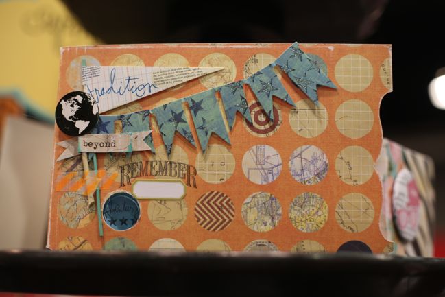
Mistable papers are something Heidi has worked with possibly more than anyone else over the last few years, so there are designs of those to match plus file folders to customise too. The file folder concept is part of Heidi’s Memory File system – making a file box an alternative to an album with page protectors. Check out this post on Heidi’s blog for a look at how she scrapbooks on these folders then tucks them away in the Memory File box for safekeeping. But back to mistables:

CHA Winter 2012 :: Heidi Swapp
Spot the goodness at the left: those block letter stickers from before, but now colours are customisable with mists or paints. Definitely ordering those.

CHA Winter 2012 :: Heidi Swapp
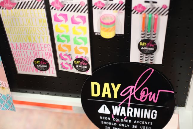
A bit of day-glo neon! With the idea that like in fashion, if you use it at all, you’ll just use a bit. This seemed hit or miss with buyers – but I think that’s much the same as neon on fashion. Either it catches your eye or it annoys you. Fair enough: take it or leave it as suits your style.

CHA Winter 2012 :: Heidi Swapp
A closer look at the glitteryness on the various pennant options.

CHA Winter 2012 :: Heidi Swapp
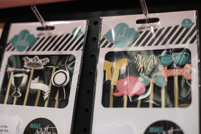
Something a little different: the Stix embellishments. An embellishment… on a stick. Indeed! I’m sure we’ll see these on party table displays soon, but I’m interested to see how they end up on papercrafting projects.

CHA Winter 2012 :: Heidi Swapp
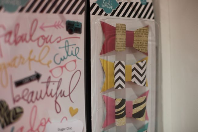
Handwritten epoxy stickers and paper bows – Heidi loves paper bows on her projects!

CHA Winter 2012 :: Heidi Swapp
Another option in the flip book design – perfect for a summery getaway!

CHA Winter 2012 :: Heidi Swapp
That Polaroid-style photo frame? That’s actually part of the product line-up! It’s a frame that snaps around the picture to make it look and feel like an instant photo even though it’s a regular print. They are called Instaframes and are perfect for square photos, so extra fun for those who use Instagram.

CHA Winter 2012 :: Heidi Swapp
Between glitter and travelesque papers, I was pretty much at home here!

Look for this line to hit stores in late spring. Will be this be one for your wish list?