CHA Winter 2012 :: Heidi Swapp

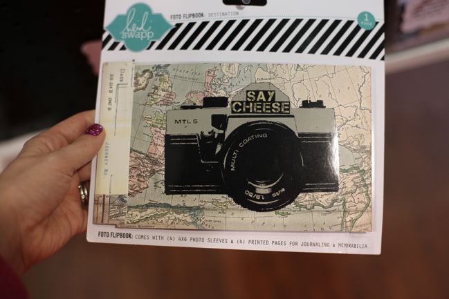
2012 may be the year of the chevron, but it was also marked the return of the Heidis – not just Heidi Grace Kress, but also Heidi Swapp. This Heidi started designing product first for Making Memories, then under her own branding for Advantus, then came work with both Tattered Angels and House of 3, the latter selling digital and printable designs online but then also releasing paper products through Pink Paislee. Caught all that?
And now Heidi is back with her own branding again, but with the orders being fulfilled by Pink Paislee. I think this is a good step we’ve seen with a few brands now: let the creative folks really focus on strong product development rather than trying to carry the burden of everything else about the company too. Surely that option would lead to creative burnout sooner or later? Anyway, let’s look at products, shall we?
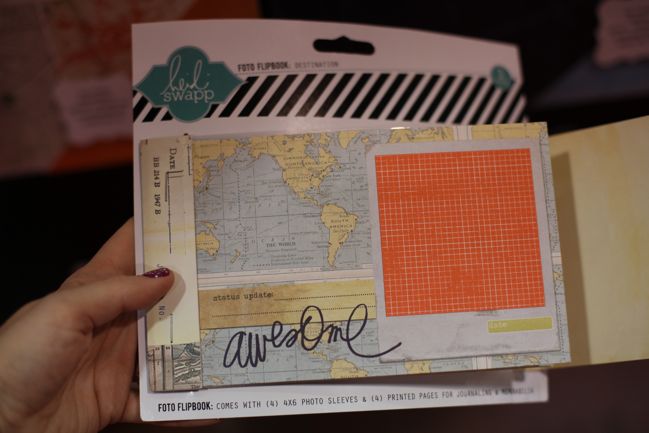
First is this, the Foto Flipbook, which is a bit like a minibook redefined – not like a Smashbook or a Daybook but like its very own design with a mix of page designs and sleeves for 4×6 photos.
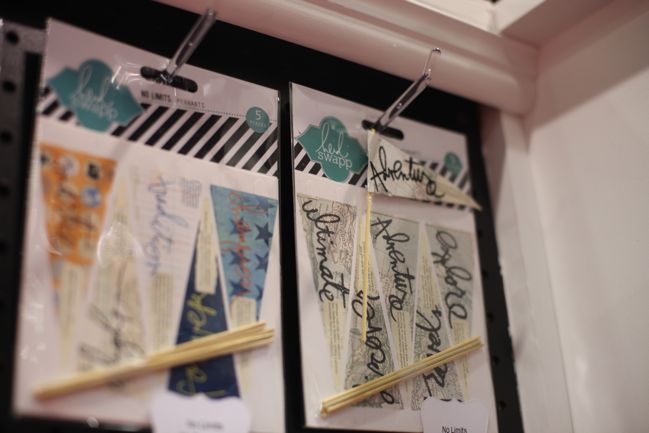
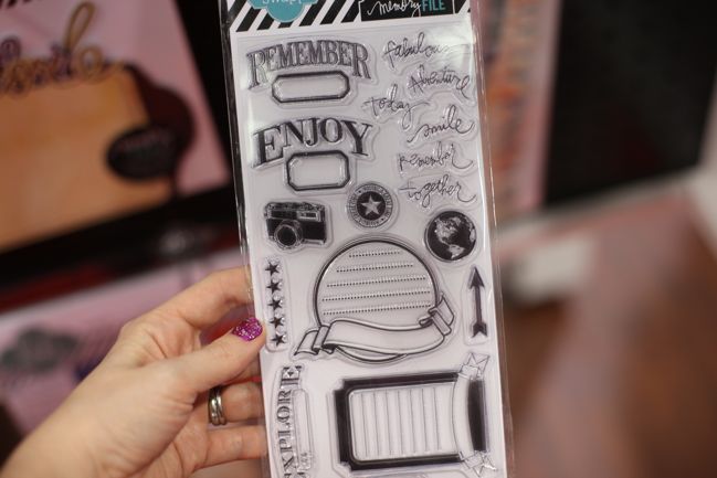
Even Heidi’s very first product releases showcased her handwriting as their trademark, so long-time fans won’t be disappointed by pennants and stamps that continue that tradition.
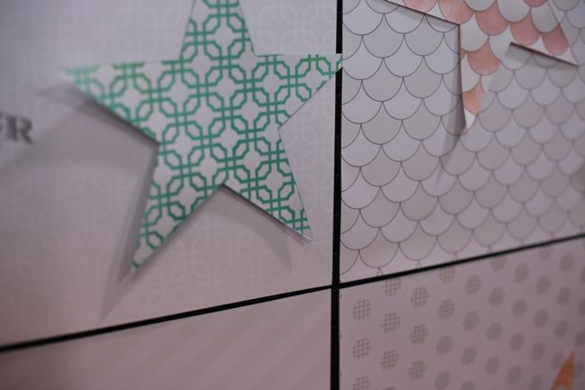
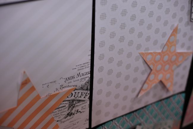
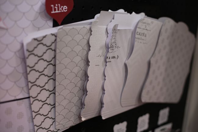
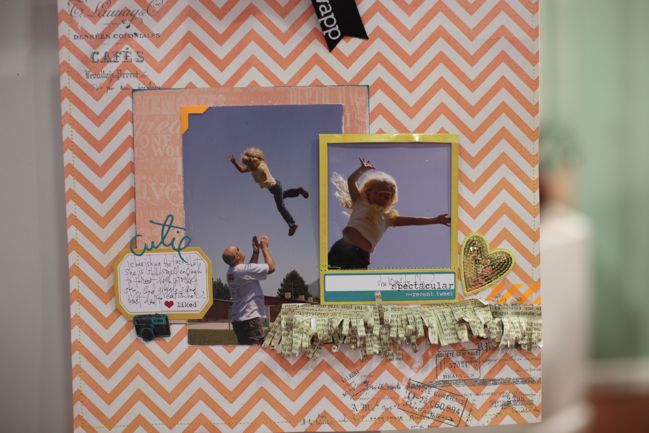
Mistable papers are something Heidi has worked with possibly more than anyone else over the last few years, so there are designs of those to match plus file folders to customise too. The file folder concept is part of Heidi’s Memory File system – making a file box an alternative to an album with page protectors. Check out this post on Heidi’s blog for a look at how she scrapbooks on these folders then tucks them away in the Memory File box for safekeeping. But back to mistables:
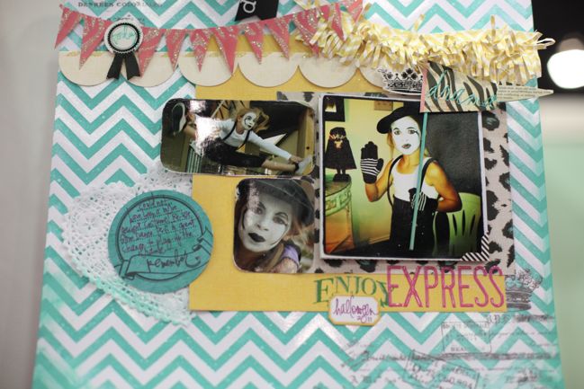
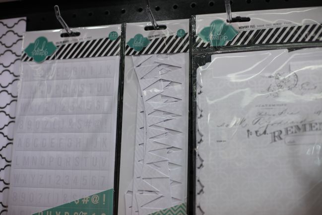
Spot the goodness at the left: those block letter stickers from before, but now colours are customisable with mists or paints. Definitely ordering those.
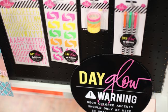
A bit of day-glo neon! With the idea that like in fashion, if you use it at all, you’ll just use a bit. This seemed hit or miss with buyers – but I think that’s much the same as neon on fashion. Either it catches your eye or it annoys you. Fair enough: take it or leave it as suits your style.
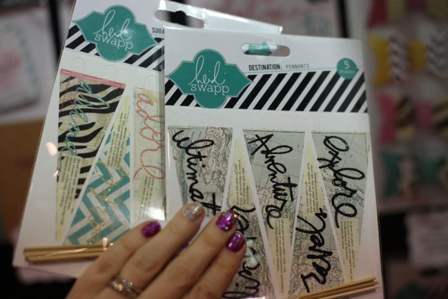
A closer look at the glitteryness on the various pennant options.
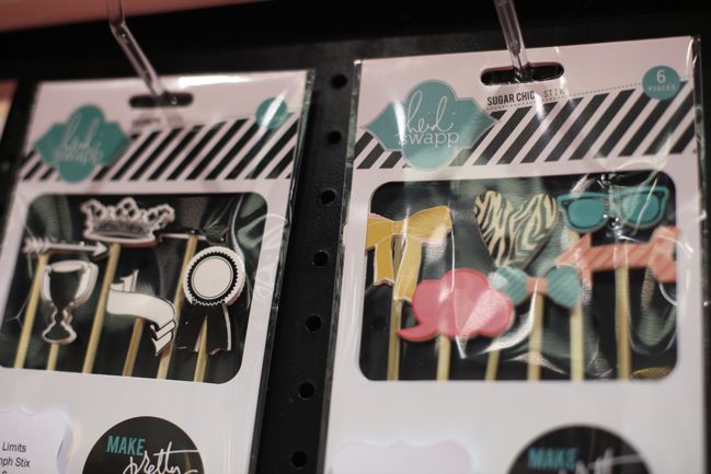
Something a little different: the Stix embellishments. An embellishment… on a stick. Indeed! I’m sure we’ll see these on party table displays soon, but I’m interested to see how they end up on papercrafting projects.
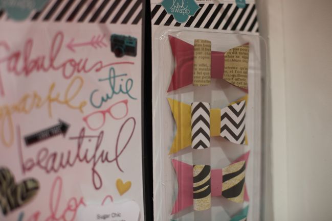
Handwritten epoxy stickers and paper bows – Heidi loves paper bows on her projects!
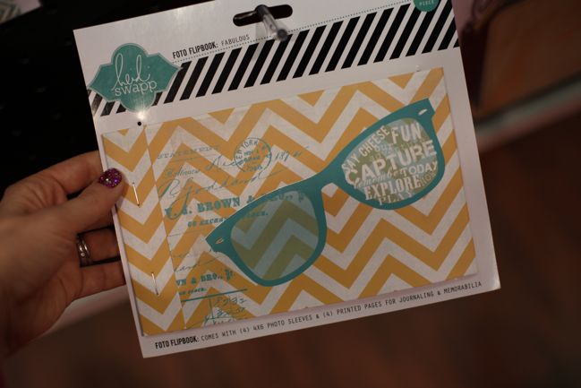
Another option in the flip book design – perfect for a summery getaway!
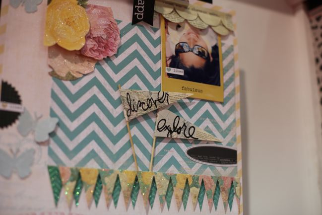
That Polaroid-style photo frame? That’s actually part of the product line-up! It’s a frame that snaps around the picture to make it look and feel like an instant photo even though it’s a regular print. They are called Instaframes and are perfect for square photos, so extra fun for those who use Instagram.
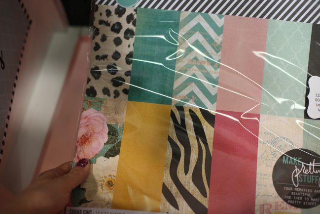
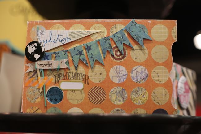
Between glitter and travelesque papers, I was pretty much at home here!
Look for this line to hit stores in late spring. Will be this be one for your wish list?
![]() Read more about:
Read more about:
Next post: CHA Winter 2012 :: Pebbles
Previous post: CHA Winter 2012 :: Creative Imaginations


