A Scrapbooking Colour Story of Blues, Greens, and Rose
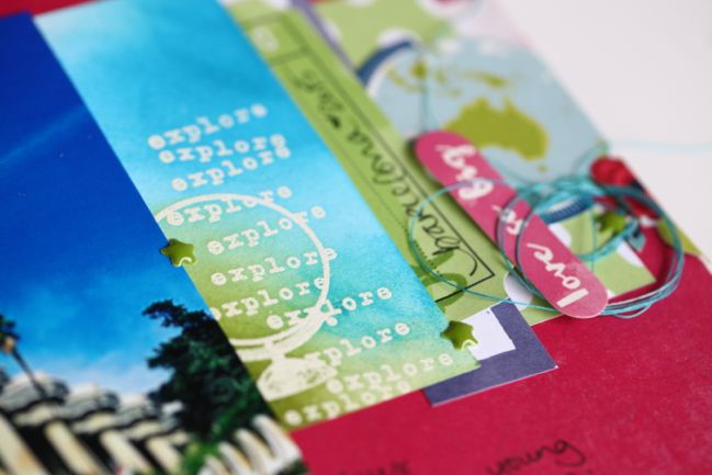
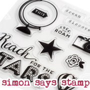
(made with the globe and explore text stamps from the Starshine stamp set. Stamped on plain white cardstock in Versamark ink and heat embossed with white detail powder, then coloured with Distress Inks and a foam ink applicator.)
‘Blue and green should never be seen’ is such an old phrase, the internet seems incapable of telling me who said it in the first place. But it was able to tell me that it’s actually not a stand alone phrase like I have always heard, but some sort of colour rhyme involving red and yellow as a good combination to wear to ‘catch a fellow’ and pink and green should be worn by a queen. Suddenly I have far less worry about breaking this guideline on a regular basis.
My logic has always been that blues and greens work well together because it’s a combination we see so many times in nature. Green grass or trees topped by a blue sky. The way tropical waters look blue one moment, green the next, and back to blue. Blue and green are next to each other in the rainbow. So all this ‘should never be seen’ is definitely rubbish, no matter where it originated.
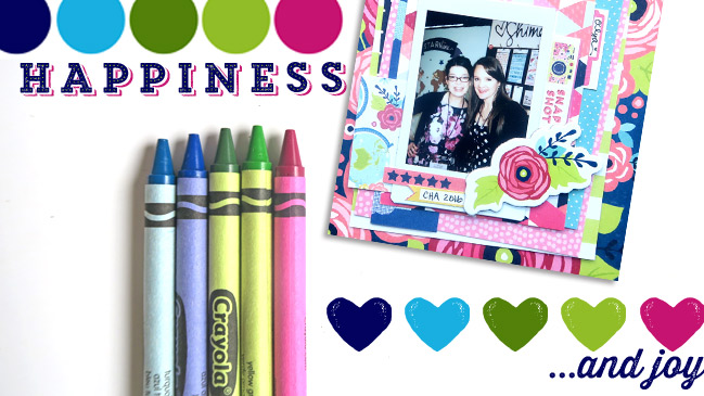
That rainbow thing holds more value though: blue and green are next to each other in the rainbow because they are next to each other in the colour spectrum when it comes to all things light. That means they are right there together on the colour wheel – blue… blue-green… green -right in a row. If you want to be more official about colour theory, that would make those three analogous colours. Analogous colours are any three in a row on the colour wheel and those sets of three will always look lovely to our eyes. But you don’t need to talk about it in official terms to be able to spot that those colours next to each other make lovely little sets. Blue and green definitely make me happy.
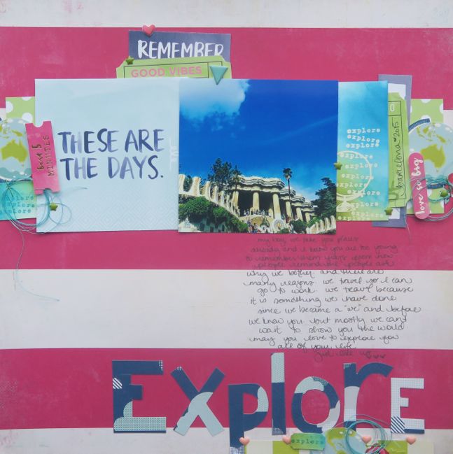
Blues and greens aside, I once had an epiphany while scrapping that made it so much easier to use my supplies. I’d been scrapping about two years when Bazzill announced their new line up of scrapbooking cardstock. It came in sixty-four colours. Sixty-four colours blew our minds because previous cardstock options were really only like the small box of Crayolas and this was the big box with the sharpener build in on the back! We were allowed the 64 box with the sharpener in fourth grade at my school. I have many specific memories about opening new boxes of Crayolas, but that one is my favourite. I digress. Shades of one colour, like choosing a colour of paint then slowing mixing in more and more black paint to create a whole set of new tones, made it so much easier for me to use my supplies because I could let go of the mindset that came with just a dozen colours. With a dozen colours (and even with sixty-four, if I’m honest), we seemed to spend hours of our scrapbooking time trying to find just the right paper to match the exact colour and shade of an embellishment. Then something hit me that actually, all the shades of one pink look lovely together and all the shades of one blue look lovely together, and so on… and that meant instead of having one correct combination in all of my stash, there was far more freedom in this dark pink embellishment goes with this much lighter pink paper, and I tell you, it was like a children’s choir appeared in the corner of my craft space and sang hallelujah. Instant relief of stress. Zero pressure to make everything match to the exact tone.
This set of colours was on my desk every day as we worked on Starshine. The blues and greens with that inspiration from nature backed up by a bit of colour theory; the rose that offers a stark contrast while staying so soft. Without the rose, it’s not nearly so feminine, but by using different quantities, like just a tiny bit of the rose, then it’s still very possible to use this set of colours without having some sort of pink Lelli Kelly explosion on your project. It’s most obvious in the globe paper with every globe filled in with shades of blue and shades or green, and quite a few globes accented with a rose-coloured floral detail.
After loving them but looking at them on screen for ages, it was time to try this combination in terms of paper rather than pixels. I still love those colour together. And so I asked special guest Zinia Amoiridou to also give it a go.
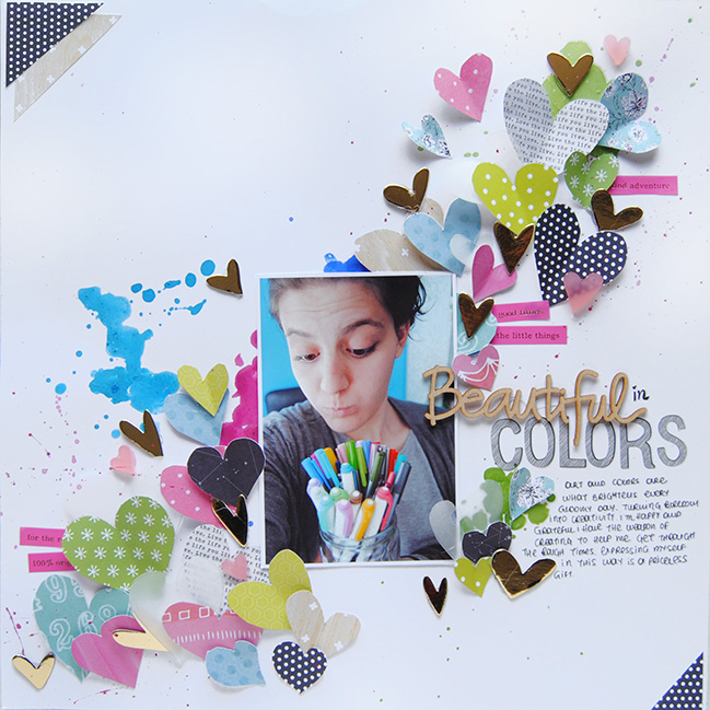
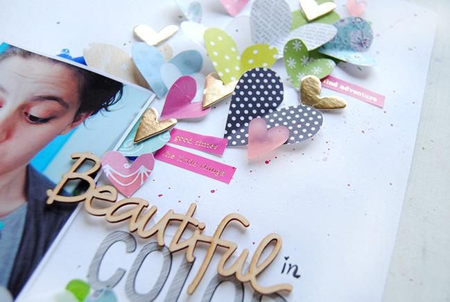
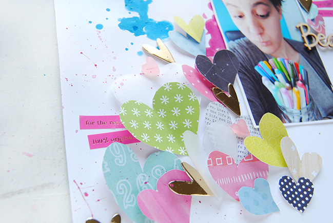
My biggest challenge was where to start, since I looked at the products on my desk and nothing included this colour combination. After digging through my stash, I found some paper scraps and partial patterns thin shades of blue, green, and rose, so I decided to use them and hand-cut some heart shapes to use as embellishments. I placed the hearts diagonally on the page and I though it would be a nice distraction from my messy cutting to make them a bit more dimensional. So I folded them in the middle and stuck them with some hot glue, making them look as if they want to “fly” out of the page. To finish the layout I added a few more heart embellishments and word stickers to bring everything together.
-Zinia
Today’s Guest Artist: Zinia Amoiridou loves ice cream, colours and her little family. You can find more from Zinia on Instagram, Twitter, Youtube, and her blog.
![]() Read more about: colour
Read more about: colour
Next post: This weekend only: scrapbooking workshop sale!
Previous post: Glitter Girl Adventure 127: The Handmade Implementation


