What You've Been Making!
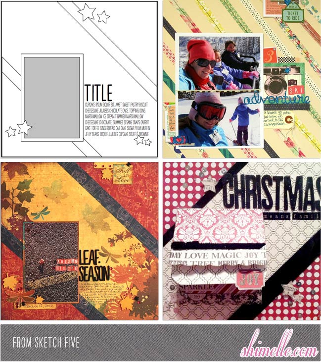
Time to take another look at what all of you have been making for your scrapbooks. We are now moving onto the first two sketches in February, Simple Designs for Patterns on the Diagonal and Adapting a Sketch Page for Project Life .
I love how Katie Scott’s layout clearly took inspiration from guest artist Paige’s beautiful layout with the sketch, and yet made it her own with different colours and a different theme. This page proves how that stitched stripe background can be so versatile, and it can be made with scraps, so it’s an efficient use of supplies too. Snow White’s Layout shows an innovative way to use a sketch. Replacing the photo block with a fold-out journaling booklet is a great twist on the design and gives her writing quite a special treatment, and the diagonal stripes take on a candy cane motif when paired with a Christmas theme. The warm colours in Mel’s Layout are gorgeous, but it’s that central paper that made me spot something that I definitely need to try: using a border or corner printed paper with this sketch. Her placement of the papers in the corners makes great use of a tricky pattern, since those corner printed papers can be so pretty but rather a challenge to use well.
If you’d like to see more of the responses for this sketch, take a look here.

Sketch six (Adapting a Page Sketch for Project Life) is much more elaborate than the previous sketch, which resulted in more detailed layouts.
The colours on Christy’s layout are gorgeous! This is a great example of a page that keeps the focus on the photos, but still has a sense of fun with the theme. Kate Taylor took on a very different perspective of the “
sketch. Her page uses the style of a divided page protector and keeps things blocked away in tidy, even portions of the page. The Simple Stories papers are a great choice for this, and I like how the embellishment appears in a large triangle along the edge of the page. The last page takes a very similar theme, but showcases it in such a different style. Kerry’s layout has s a very sophisticated look, with more open space in the background. The choice to separate the four photos works really well as there are really two different styles of picture here. I think I would have been tempted to put them on separate layouts, but this design proves they can work really well on the same page.
Thank you for joining me this week and please, keep your responses coming in! Take a look here at all the sketches you can still work on. I hope they inspire you to get crafty.
Happy Scrapping!
![]() Read more about:
Read more about:
Next post: Best of Both Worlds :: My scrapbooking product picks for August 2013
Previous post: Reserve your Christmas in a Box scrapbooking kit for 2013


