pretty paper. true stories. {and scrapbooking classes with cupcakes.}

lovely to meet you Twitter Facebook Pinterest YouTube

Take a Scrapbooking Class

online scrapbooking classes

Shop Shimelle Products

scrapbook.com simon says stamp shimelle scrapbooking products @ amazon.com shimelle scrapbooking products @ amazon.co.uk

Reading Material

travel

colour Category

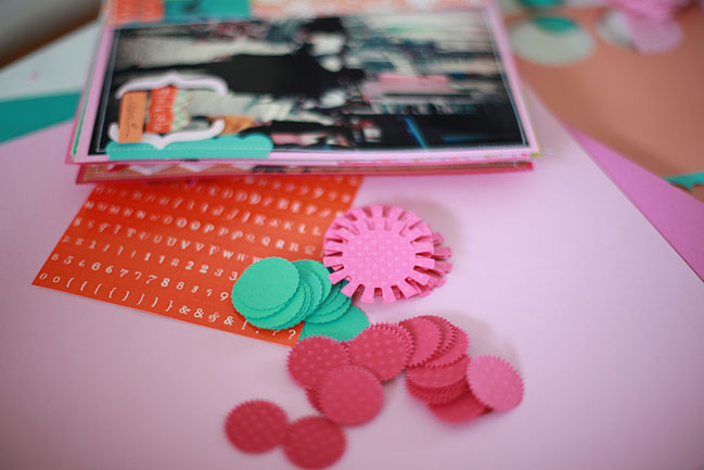
Symbols, sales and challenges

Take Note scrapbook

I’ve just finished a short return to the world of teaching English to help a group get ready for their final exams and I promise I didn’t talk scrapbooking to them. But we did talk about colour—colour and its symbolism in the poems they had to study for their tests. They may have had the hard task of writing about symbolism and being graded for it…but as crafters we can just have the fun part: we can use colours as symbols, just like poets, without fear of being graded in any way. We’re making the rules, so that means we can break them too. Still, it’s interesting to think about the traditional meanings of the colours we see and use every day.

White stands for hope, innocence, surrender, peace, purity, brides, babies, communions and all things new.

Red symbolises both danger (like a warning sign) and help (like the Red Cross). It also represents both love and anger. Many cultures also identify red with happiness and prosperity. It’s one of the most dominant colours in product packaging and advertising…and it seems to have paid off rather well for Ferrari.

Green represents money to some and the environment to others. Lighter shades make us think of spring, planting and new life; darker shades look like winter pine needles. For many years it was labelled as a weak colour for advertising and rarely adopted by companies or campaigns, but in recent years eco-concerns and the success of the green branding of Starbucks Coffee, though completely unrelated, have seen this colour gain popularity in media.

Blue is a traditional colour of good luck and good health. Its richest shades were once reserved for the royalty and most wealthy, as the dyes were some of the most expensive.

Yellow has links to youth and energy on the positive side. Like red, it has some contradictions: its high visibility makes it a natural choice for warnings (rather than a care-free youth) and it commonly means someone looks rather ill (despite also aligning with energy like sunshine).

scrapbooking colour challenge

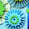
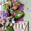
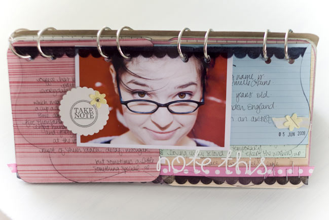
Today’s challenge is to use colour in a symbolic way on a card, layout or other craft project. Upload it before the end of the month and link it up in the comments – one lucky participant will win an art print for this challenge. Entries close at 11:59pm UK time on the 30th of June.

and….this weekend only:
Online Class Sale!!!

This weekend only, archived online classes are sale priced in the shop so you can catch a class you have missed before and access all the class materials so you can work through at your own pace. Purchase a class during the sale and you’ll receive all the details by email on or before Tuesday (9th June). This is a very rare thing in the shop, so take advantage while you can!

Happy weekend and happy colouring!

xlovesx

PS: No, I’m not too sure what is up with the dates displaying a day off. I’ll try to find a way to fix that when I am back home on Monday.

Colours of tomorrow

scrapbooking workshop

Just packing up for GoGoGetaway, and these are the colours I’ll be seeing all day tomorrow. I’m teaching a minibook class with some of my favourite summer supplies, and lots of machine stitching. See some of you there!

While I’m packing the car, I have three colourful links to share with you:

The ABCs of Color Inspiration by Ali Edwards is a beautiful read that will remind you of all the colour that surrounds you constantly, in places you may otherwise ignore.

The Kitschy Digitals Blog is a pure explosion of colour and features paper and fabric projects in addition to digital scrapbook pages, so don’t dismiss it just because you’re not on the digi side.

Color Inspiration, a regular series of colour challenges from Kristina Werner. Kristina posts a colour combination and hundreds of crafty types play along, so the past challenges may be closed to new entries but they are still amazing inspiration, as you can click through to see what everyone made with the same colour combo.

Have a beautiful Friday and I’ll see you again this evening with today’s colour challenge!

xlovesx

Cracking the colour wheel, part two

using the colour wheel in scrapbooking

So now that were are all set with the terminology and structure of the colour wheel, today’s the day we’re going to spin the wheel into use for our pages! And of course, there’s another colour challenge to be had!

monochromatic scrapbook page

Monochromatic combinations
Super easy, even without a wheel in front of you. Pick one colour and use that same colour in lighter shades (add white) and darker shades (add black) and that’s it – no other colours. But you knew that already. That was just too easy.

analogous scrapbook page

Analogous combinations
Fancy name, but actually still easy. These combinations come from picking the colours that are next to each other on the colour wheel. If you pick colours that are touching, they will coordinate. Magic! Red + yellow and blue + green are both analogous combinations.

Complementary combinations
This one at least has a name that makes sense. Pick a point on the colour wheel and draw a straight line across to the other side of the wheel: those are complementary colours. They will always coordinate too – magic yet again. Many school or team colour combinations are complementary: blue + orange, violet + yellow…and also the very Christmassy red + green. This layout uses the complementary combo.

split complementary colours in scrapbooking

Split complementary combinations
If analogous colours and complementary colours had a baby, the baby would be split complementary colours. Or maybe that’s not scientifically viable. Pick a colour on the wheel. Now draw a line straight across, just like you did with complementary. Except instead of just two colours, pick the colours either side of the complementary – hence the split. Violet + yellow green + yellow orange = split complementary. Blue + red orange + yellow orange = split complementary.

Want to see all of these (and a few more) illustrated on your screen? Choose a colour here and presto! magico!

Although there are many more ways to make combinations, these four are pretty magical indeed and they can get you through at least an album’s worth of pages before you start repeating combinations. So this is where we’ll start for now…after all, it’s only week one of colour week!

scrapbooking challenge

Today’s colour challenge: use the colour wheel and one of these combinations to choose the colours for your next crafty project. Share it online and link it up in the comments on this post. One lucky commenter will be win a place in Learn Something New Every Day, an online class that runs throughout September. Entries close at 11:59pm on the 30th of June!

Happy scrapping!

xlovesx

Inspiring colours for scrapbook pages

scrapbook page by heatherm scrapbook page by niksmom scrapbook page by bluestardesign scrapbook page by candimandi scrapbook page by nancyd scrapbook page by malind

...click any layout to see larger

A little rainbow of beautiful pages this morning – to wish you a beautiful day!

xlovesx

Today's colour challenge

handmade card
Supplies: Bazzill cardstock, Scenic Route paper, Prima trim (both the paper + trim are non-current, sorry!), tree stamp from Colorbok.

So that colour combination I got on the spinner this morning? Here’s what it looks like on paper. Hoping to get a chance to work with these colours with a bit more detail on a layout soon.

But of course, now it’s your turn!

The third challenge of the month: make something with a three-colour combination that pops up when you spin the colour wheel here. Get it online somewhere and link it up in the comments so you have a chance to win: the winner of this challenge gets a set of letter stamps! Same drill as normal—you have all month to complete the challenge and entries close at 11:59pm on the 30th of June 2009.

You can make whatever you fancy…a scrapbook page, a card, a quilt, a cupcake…ready, steady, GO!

xlovesx

Cracking the colour wheel, part one

I know some scrapbookers who swear by the colour wheel and keep one in their crop bag at all times. I know them…but I am not one of them. My own default system is one of gut feeling…of looking at combinations and thinking ‘something lighter’, ‘something darker’, ‘something warmer’, ‘something cooler’ until I finally settle on something that seems to work. But the colour wheel intrigues me for all it seems to hold: it seems a bit unnatural to my brain that there could be a mathematical way to discuss colour. Essentially that’s what the colour wheel is: a construction that has already done all the maths for you and leaves you with something that is shockingly easy to use. That’s what those scrapbookers promised me. So here’s what I’ve learned on my quest to crack the colour wheel…for scrapbooking purposes, of course! Today, we’ll get started with the basics.

Primary Colours
Apparently, the colours you learned at school will show your age. I learned the primary colours were red, blue and yellow: the colours you couldn’t create by combining the other crayons in the pack. I’m hoping some of you also learned this set of primary colours because otherwise…I am going to feel old all on my own.

Red, blue and yellow give us a sort of spiky colour wheel that looks something like this:

using the colour wheel for scrapbooking

If we keep thinking of crayons, this version of the colour wheel starts to make sense: mix red + yellow, get orange; mix blue + yellow, get green; mix red + blue, get violet. That seems simple enough, and moves us easily to the next element of the colour wheel.

Secondary Colours
Ahem. Secondary colours is the official name for the colours you get when you mix the primaries. So if your primaries are red, blue and yellow, your secondaries are green, orange and violet. I have no idea why I learned primary colours as a definition at school and never, ever heard the term secondary colours until I got into scrapbooking. (And if you learned secondary colours when you were 6, then you are fabulous and had cool teachers!)

Slot the primary colours in a triangle shape, add the secondary colours in their relevant spot and then adjust the spots in between to show the transition from one colour to the next, and suddenly the colour wheel’s construction makes total sense:

using the colour wheel for scrapbooking

and those extra colours that were added in have a name too: tertiary colours. Presto—now I know what everything is called. But I still don’t know how to use the darned thing!

One last thing before we move on to using the colour wheel for our pages: you know how I said the red/blue/yellow primary combination could show your age? Well, it turns out that what works for crayons doesn’t work for the entire world. Like it doesn’t work particularly well for light, and this funny little invention called the colour television set made people spend huge amounts of time trying to get the colour science just right so we could move away from the colour tv that showed everything in a muted yellow haze and up to those scarily lifelike plasma screens that exist now. The same science also goes for cameras and why you can see a different quality from film to digital. So now there are many people who refer to the primary colours as red, green and blue. But the same science for those applications doesn’t apply to the technology of printing, where the primary colours are a slightly funky cyan, magenta and yellow (something that might look familiar from putting coloured inks in your printer). But it turns out, no matter which combination you use as the primary colours, the wheel works exactly the same way, and since we are not building a plasma screen television, inventing a new digital camera or constructing a printer from scratch…we don’t have to worry at all about the science of which colours are the ‘real’ primary colours. (But hey – it’s interesting and it might earn you points in a pub quiz some day!)

So part one has us cracked on the terminology…part two – coming up tomorrow – goes from this trivia to actually put the wheel into action on our pages.

And coming up in just a bit: today’s colour challenge and prize!

xlovesx

Spin the colour wheel

colour combination for scrapbooking

Today is all about the magic (or science) behind the colour wheel! Something fun to get the day started? Go here to spin the colour wheel then leave a comment here describing the colour combo you loved! You can even take a screenshot and share it with us. (Click here for instructions on taking a screenshot if you don’t know how.) That’s my spin above.

Coming up later today:
...going from a spin of the wheel to finished project
...cracking the colour wheel

Have a fabulously colourful day!

xlovesx

{Want to be sure not to miss a post during this month of colour? Add the RSS feed to your reader.}

A rainbow tutorial + a digital challenge

digital scrapbook page

Carrying on our rainbow theme today, I have some pixelated love for you!

First, here’s a step by step tutorial for making the page above. It starts with a digital page template but customises it to make it a bit different so you can get more unique pages from each page template.

And second, a new challenge with a prize! Your challenge is to use this rainbow border and/or this digital page template for a layout anytime this month. They are 99 cents each and reusable of course. The rainbow border can be printed out, so you can complete this challenge with a paper or digital layout as you prefer. Once you’ve made your project, upload it and leave a link in the comments here—entries close at 11:59pm UK time on the 30th of June. The winner will receive $15 to shop with at Two Peas (and you can spend that on digital or paper items as you fancy).

Tomorrow: more paper goodness coming your way!

xlovesx