pretty paper. true stories. {and scrapbooking classes with cupcakes.}

lovely to meet you Twitter Facebook Pinterest YouTube

Take a Scrapbooking Class

online scrapbooking classes

Shop Shimelle Products

scrapbook.com simon says stamp shimelle scrapbooking products @ amazon.com shimelle scrapbooking products @ amazon.co.uk

Reading Material

travel

Best of Both Worlds Kit Category

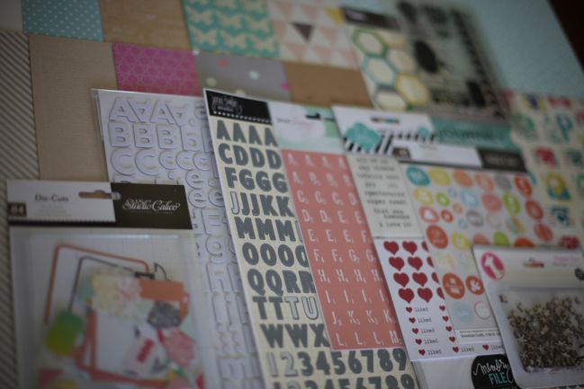
Best of Both Worlds :: My scrapbooking product picks for June 2013
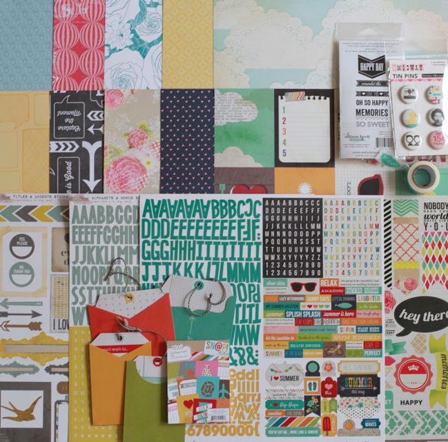
June 2013 Best of Both Worlds scrapbooking kit @ shimelle.com
Welcome to June! To kick off the month, I’d love to share my product picks for a very summery edition of the Best of Both Worlds scrapbooking kit. You can jump right to the shopping list if you prefer, or carry on if you want to see the kit contents in video form or take a look at some of my shopping thoughts for this month.


Best of Both Worlds is a selection of supplies that can be used as a kit, announced here on the first of each month. It’s called the Best of Both Worlds because it has the ease of a monthly kit, with a set of supplies chosen to work well together, but there is no subscription, no minimum purchase, and you can customise the kit to work with your style by eliminating duplicates or items you won’t use, increasing papers you would use more than once or over a double page layout, and replacing things like swapping a 3×4 set of cards for 4×6, for example. I select the products for each month’s kit and post it here on the first of the month. Ordering is all done through Two Peas in a Bucket.

Click here to purchase the June 2013 Best of Both Worlds product picks!

Need to bring the price down a bit?
The stamp set is the most expensive item in the kit, so if you don’t stamp, that’s your quickest savings straight away. If you do stamp, I will say these stamps are really high quality for that $6.99 price.
Another way to savings would be to choose just two of the four sticker sheets: if your style is quite colourful, keep the Simple Stories alphabet and the My Mind’s Eye accent sheet; if your style is more muted, keep the two from Glitz Design. Choose just two instead of all four sticker sheets will bring the kit down by just shy of six dollars.
The third option would be to make your savings in the embellishments, omitting the tape if you already have one or more that you’re happy to use with these colours, or the tin pins if you have other flair badges you need to use or you would like to make your own embellishments with a circle punch or die.

Want to add-on more to the kit to reach the $50 free shipping level?
I always go to paper first when I have more room in my budget. With this kit, I would ask which colour suits your scrapping style most: navy, yellow, turquoise, or pink? Then I would add more sheets in those colours to get the most of the kit. Choose anything you fancy! My suggestions include…
to add more navy: numbers, stripes, floral, large dot, mini dot, script, chevron.
to add more yellow: hearts, feathers, text, die-cuts, confetti, herringbone, anchors, chevron.
to add more turquoise: triangles, dots, clouds, ledger, vintage, cameras, butterflies, chevron.
to add more pink: chalkboard, plaid, doilies, numbers, chevron.
If you prefer collection kits or 6×6 paper pads, the collections represented include Echo Park Here & Now, My Mind’s Eye Find your Wings and Fly, and Simple Stories I Heart Summer.

For those who love more embellishments, I’ve pulled together this list of all sorts of things that would coordinate well with the kit. I don’t have any plans to show you how I would use each of these things – that’s just too many ideas to think straight! But I thought it might help to narrow down from the whole store and let you see a list that is still quite extensive but would let you pick the things that appeal most to your style, be that brads or wood veneer or flowers or whatever! (Let me know if you find it useful and I’ll see if I can make this a normal thing.)

If you keep a Project Life album or use lots of divided page protectors, I would definitely suggest the cut-apart sheets from Echo Park Here & Now, available in 3×4 cards or 4×6 cards. There are also additional 3×4 and 4×6 tablets from Simple Stories (plus this specific summer tablet) that would help extend this kit to a full summer of Project Life documentation if you so desired!

Love washi tape and happy to spend a little more on a set of two rather than one on its own? The second option I showed in the video is this set, and both tapes are absolutely lovely.
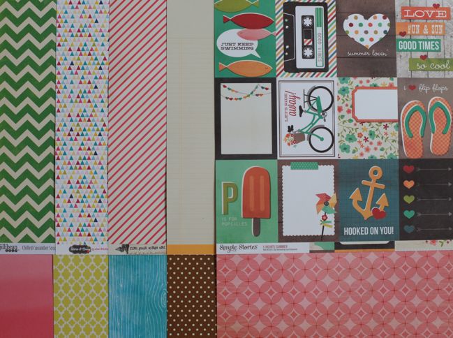
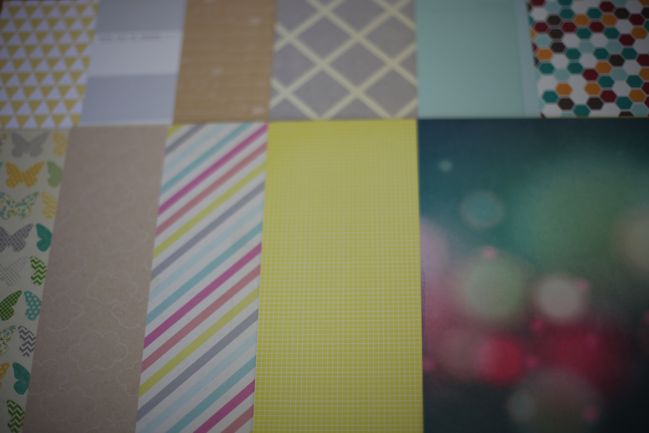
June 2013 Best of Both Worlds scrapbooking kit @ shimelle.com A look at the b-sides of the patterned papers.

Curious about shipping prices and times?
For free US shipping on orders over $50, you will need to enter the discount code for this month found in the newsletter. That link also includes the fine print on how to qualify for the discount, for your reference.
If you are ordering just the items on the kit shopping list, the shipping cost would be $7.40 for US addresses, $13.28 to Canada, and $20.07 to many other countries, including the UK, Australia, Germany, and France. When you check out, international orders may quote high on the shipping (it quoted $26.08 for me here in the UK). If you open a ticket within thirty days, Two Peas will make sure you get the rest back. (I know I’ve been reporting for several months that Two Peas is working on improving this. They really are, and I will be thrilled to let you know when a change happens!)
I placed an order early this morning, and my order is scheduled to ship from the warehouse on Monday, so the turnaround time is pretty quick right now!

What about projects with the previous kits?
I have not forgotten! In fact, I have a big stack of projects to share with you – it’s the video editing and uploading that has smacked me in the face this month. My big project this weekend is to get as much of that posted as possible, but it may take Monday to get videos uploaded. While I love nearly everything about moving back to the flat we never wanted to leave, I have to be honest and say the internet here is rubbish for uploading videos! They take about a day and a half to upload here, while the same file will take fifteen or twenty minutes at the office on Monday. I will see how we go and do my best to get them all online as quickly as possible. If I can get them all edited this weekend, then I can upload them on Monday and have a little video explosion! But I’ll be posting some non-video inspiration from both the April and May kits here this weekend so I hope that’s a little helpful.

Just to clear up some confusion – the upcoming Scrapbook Concentration masterclass video on layering does not use the kits – you never need to pay to see the projects I make with the kits. But Scrapbook Concentration is to blame… that two hour video (and figuring out this new video-on-demand format) and the nearly-an-hour NSD video just took up a bit too much of my time this May and that’s why I’m behind. I’ll be all caught up with everything posted by the time your June kit arrives, and we can carry on from there, which I hope sounds like great news.

For those wondering on the release date for Scrapbook Concentration, we’ve fixed some technical things requested by the video hosts, and I’ve been given an estimated date of release for Monday! Oh goodness: Monday is starting to look like it’s going to keep me on my toes for sure. I’ll be sure to let you know as soon as they have released it for viewing! Thanks for your interest in that new project.

Are previous kits still available?
Well, yes and no. In order to get the best value for money in each kit, I tend to pick a few things that are on sale – and those tend to be items that won’t be restocked once they are sold out. But the full price items are often restocked and available, so that means the older kits are just missing a few things here and there, and they will have just disappeared off the list entirely. But you can still find them in the store: January, February, March, April, and May. And all the posts related to Best of Both Worlds in some way (shopping lists, finished pages, videos) can be found here. (That’s the same link that appears at the end of any Best of Both Worlds post after ‘filed under’, and it lets you navigate just one category of posts at a time.)

Any other questions?
As always, there is no subscription to this kit and everything is first come, first served. Items are not reserved in your shopping cart – if you decide to come back in a few days, they may be sold out, I’m afraid. But there is a good stock of all the items on the kit list right now as I post this, and we have increased the numbers from previous kits. (The items I suggested in the extras have varying inventory.) If the items still sell very quickly and it looks as though not everyone who wanted a kit could get everything in time, I will look into the possibility of having somewhere you could express an interest so we can get a more accurate number of how many of you would like to join in each month. Sound like a plan?

Anything else I haven’t answered, feel free to ask in the comments. Leave a valid email address and I’ll get an answer back to you wherever possible!

Thanks so much for your continued support and I hope you enjoy this month’s Best of Both Worlds product picks!

NSD 2013 :: How I Used My NSD Sale Scrapbooking Kit

scrapbook page by shimelle laine @ shimelle.com
Over National Scrapbooking Day weekend, Two Peas offered a huge sale to celebrate and I put together a special sale kit with the idea that you might have some of these items in your stash already or if you were planning to shop, you could consider these items to take advantage of the great discounts. The slightly confusing bit is that when older items reach the end of their inventory at Two Peas and will not be restocked, they disappear from the shopping list and the store, so while you can still see the shopping list for the kit now, it is a bit depleted from its original state as a result of sold out items. Never fear: you are more than welcome to assemble something similar from what you have on hand, or to just take a bit of inspiration here or there and ignore the entire idea of starting from a kit.

If you remember the video I did for NSD 2012, you might expect that I’m on a mission to use every single scrap of the kit, but this year’s adventure is a little different. This time I set out not only to stick to just to sale items, but also to see how much I could make without adding any other products to the kit supplies. I haven’t added gems or plain cardstock or too many tools. I wasn’t super strict, and I did include some mist, sewing thread, and a favourite punch or two, but my goal was to stick to the kit alone as much as possible. The result is five finished pages from a kit that cost less than $25, and I’m pretty happy with that.


This is a long video – almost an hour! So you may want to watch in smaller segments. The first nine minutes take you through supplies and my process for dividing the kit into different potential pages, so the first layout starts around nine minutes, the second layout at eighteen, the third at twenty-seven, the fourth at thirty-five and the fifth at forty-four. So you can fast forward or stop and start as needed, but everything is there in one place so you don’t need to track down multiple videos. I hope that’s a good compromise!

scrapbook page by shimelle laine @ shimelle.com
There are a few things that surprised me as I got to the finished state of these pages, like how I didn’t use any of those die-cut frames to actually frame a photo. Because I hadn’t pulled out square photos nor anything I particularly wanted to crop smaller, they just didn’t work that way for me on these pages. But once I had accepted that, it was quite freeing to use them as embellishments only, and not be afraid to remove the square frame element at times, like on this page.

scrapbook page by shimelle laine @ shimelle.com
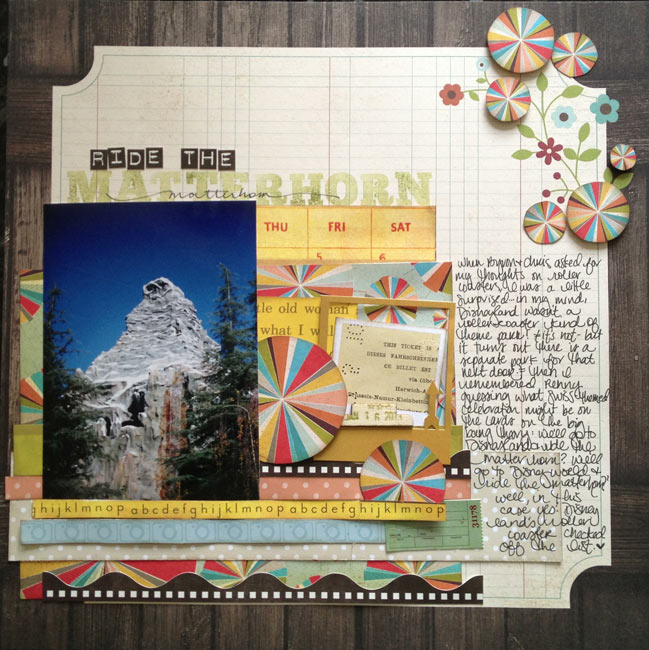
I wonder how many of you will be slightly bothered by the single turquoise letter sticker in that first line of the title. I didn’t have a choice really, and I did tie in the turquoise letters again at the bottom of the page, but I know it’s a little unexpected. It has grown on me and now I like it quite a bit, but it wasn’t instant love. If that makes you feel better! (The rainbow striped card in the middle of the page with the frame over the top? That was instant love, and I can’t put into words how much I like that look!)

scrapbook page by shimelle laine @ shimelle.com
I know there are many of you who feel covering up part of a corner design is cheating, but I really do prefer how it works with just one corner printed instead of two. And this makes me want to experiment with other types of embellishments that replace flower shapes with pie-chart motifs – I think there’s more potential in this.

scrapbook page by shimelle laine @ shimelle.com
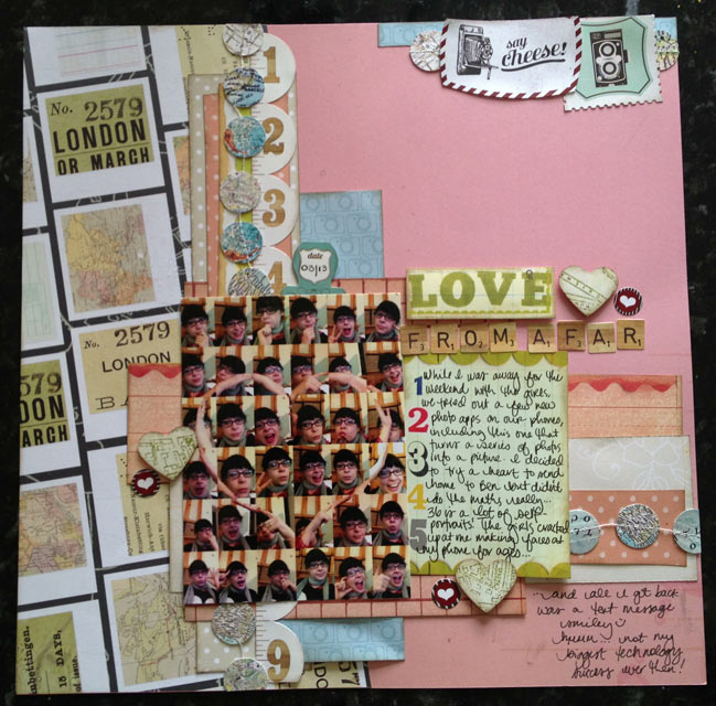
The app for making shapes within photos is called Body Symbol, by the way. Which I never would have guessed by searching in the App Store, but there you go. Now you too can be free to look silly taking thirty-six self-portraits to get the heart (or some other shape) in the middle of the image. Modern technology does wonderful things, right?

scrapbook page by shimelle laine @ shimelle.com
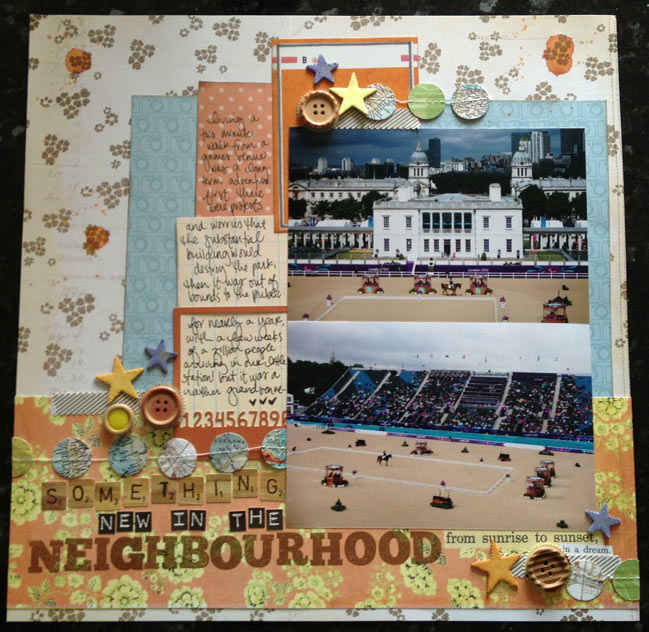
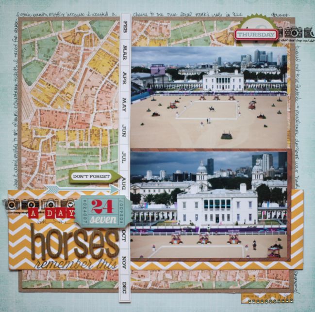
Oh dear. This photo makes me twitch a bit, as I’m not a fan of unstitched buttons! They have been stitched now, if that helps anyone similarly afflicted relax their shoulders. I also know I have recently scrapped very similar photos from this same day, but there was a different story I wanted to tell that was still a good match to these pictures. They aren’t the exact same photos, but rather I took plenty of pictures that day so I have far more than I would use to document simply that I went to see this event at the Paralympic games. In this case, it worked out well to have additional prints to hand so I had something to illustrate this other angle I wanted to include, about the long-term story of how our neighbourhood changed before, during, and after the games.

This was an interesting challenge myself to stick so strictly to the kit and it wasn’t easy! I really wanted to add a few bits here or there – and I do still have quite a few scraps left, although not enough to make another page unless I add in a sheet of background cardstock or a divided page protector. Perhaps I’ll give that a try next and see what the leftovers come together to make! This week I’ll also be sharing the remaining pages from my April Best of Both Worlds kit and starting in on the projects with the May product picks!

Best of Both Worlds :: My scrapbooking product picks for May 2013

Best of Both Worlds Scrapbooking Kit - May 2013
And just like that, it is May already! I’m finishing up my projects with my April kit, and ready to dive into a new set of goodies for the month ahead. You’re welcome to join me, and customise the kit to suit you!

Click here to shop the May 2013 Best of Both Worlds scrapbooking kit!

This month the colour scheme has a few bright and obvious colours – plenty of turquoise, pink, and yellow that mix and match well together – but also two specific neutrals in the mix. I’m looking forward to sharing a few notes on why I love kraft and grey as neutral colours for projects that can still have plenty of energetic colour too.

Best of Both Worlds Scrapbooking Kit - May 2013
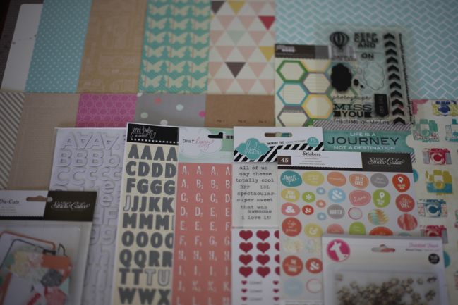
As always, there is total freedom to pick and choose what you would like from the kit or substitute different items – from the store or your existing collection of supplies – but I have a few suggestions to make sense of the list. First, I can’t believe I’m saying this, but… the Thickers are optional. (Okay, everything is optional, obviously! But still.) I started with the pink and grey combination of smaller and larger letter stickers, but they are both flat. For a long time I thought maybe I could do a whole month without Thickers. And then I realised I have these mistable Thickers that I need to use! I think I tend to push them to the side because it’s quicker and easier to go to a colour that matches, but if you already have a few mists (and I may have more than a few!) then really these Thickers can be any colour. So… I wondered if anyone else out there was in the same boat – either already having the Thickers and needing a push to use them, or having plenty of mists that could do with another use! If either of those describe you, then consider the Thickers! If that doesn’t sound up your street at all, give it a miss.

There are a few different options for the Instaframes from Heidi Swapp. I actually prefer the brightly coloured set, but I have the more neutral set here. They are used exactly the same way, so you can pick! There is also a new patterned set and a mini-sized set if you tend to use smaller photos.

This month I’ve picked one set of clear stamps, this set, which is currently 50% off. If you don’t stamp, then that’s something to leave out straight away. But if you really love stamps, this set was my second choice, and it’s also on sale at the moment.

There is a cut-apart sheet this month – it’s a white print on kraft cardstock from Amy Tangerine. The cut-apart boxes are 4×6, great for journaling, and there’s an all-over print on the back too, also in white ink. So it’s subtle and not really obvious on the screen, but lovely and delicate in person.

Best of Both Worlds Scrapbooking Kit - May 2013
A look at the b-sides of the patterned papers.

I know in the last two months especially, there has been some frustration when items sell out quickly. I’ve been working with Two Peas over the past month to come up with some solutions and those will go into action for next month’s June kit. That’s happy news, I hope! It is to me, anyway!

Of course, this Saturday is a rather special day in the scrapbooking world – it’s NSD! Or ISD, I suppose? National or International Scrapbooking Day. A day just for scrapbooking – hurrah. There is quite a lot set to go on right here, and one of those elements includes a special project I’ve put together just from items on sale. It may be that you have plenty of those items already in your stash, or it might be a great chance to treat yourself to some bargains. I’ll be sharing that list a little later today, so I just wanted to give you that little bit of info in case you would want to look at both lists before finalising your order. That shopping list is now available here. I don’t want to give the whole idea away, but every single thing on that list is currently in the sale section, and I’ll be seeing just how far I can stretch that purchase of about $25 while staying true to my own style. The rest you’ll have to wait for Saturday to see!

Thanks so much for all your support, and not to worry if you still have supplies left from your April kit – I have more finished pages to share with you, including ideas for those chipboard pieces we haven’t discussed yet!

Click here to shop the May 2013 Best of Both Worlds scrapbooking kit!

Batch Scrapbooking - and following Glitter Girl's advice to use my kit

scrapbook pages by shimelle laine @ shimelle.com
Recently my sparkly friend Glitter Girl shared a process she uses for limiting her scrapbooking supplies to combat any feeling of being overwhelmed by too many options. Of course her strategy can work with plenty of combinations of papers, so I wanted to give them a try and share the looks I created following the same plan of action but with a different selection of papers and photos.


This will make the most sense if you start by watching Glitter Girl’s Adventure if you haven’t seen in yet. You can find more details (and all the products and the three finished scrapbook pages) here at Two Peas in a Bucket.

And though my voice is currently a husky mystery that fades in and out of existence by the word, I happened to have filmed a little something more on this topic before it went away!


There are two significant differences between this video and Glitter Girl’s original: the supplies and the order in which things are done. The supplies are easy: I used the April product picks for the Best of Both Worlds kit. The process is something that takes just slightly more explanation.

scrapbook page by shimelle laine @ shimelle.com
I call this style of creating Batch Scrapping – and it’s something I do when I have a lot of ideas in my head or a bunch of pages to get done before a set deadline. Instead of doing one full layout from start to finish, I work on a few at a time, laying down all the papers and photos, then coming back to do titles and writing on each page, then working through the set again for embellishment. I don’t scrap like this all the time, and it’s part of my process in the same way that many things are a some-of-the-time process for me: varying between things like ornate layouts or simple layouts, photos first or supplies first, sketch or no sketch – having all those different options keeps me productive because I never fall into one set routine. Batch scrapping falls into that too. Sometimes I am just more motivated to work in that slightly disjointed process, but not always. I know several friends who have to do multiple pages for a deadline for design teams or similar commitments that work in this fashion, and it’s especially useful if you want to use a kit each month and make sure you spread all the embellishments and papers around for several pages. Interestingly, making these three pages actually used more paper than I would ordinarily use from a kit, I feel. It could be a misconception, but it seems like I have relatively little left after three pages. We’ll see how far I can stretch the rest – there is after all a lot of paper in the 6×6 paper pad.

scrapbook page by shimelle laine @ shimelle.com
By the way, if mixing all these patterns is still something you wish came a little more easily for you, you might be interested in Scrapbook Remix. This class originally ran last autumn, but after the recent episode of Paperclipping Roundtable, I’ve been persuaded to run it once again on a live schedule. That starts TOMORROW! So go sign up now if you would like to join in with all that fun. If you participated before (or indeed signed up at any time) and would like to receive the live emails, you are welcome to do so and there is no charge for that, but you do need to request them. For that, please see the details toward the end of this post. (It’s just before the last photo in that post.)

scrapbook page by shimelle laine @ shimelle.com
And you may have looked at your calendar and realised April is marching steadily on, which means May will be here soon. May is the month with a SCRAPBOOKING HOLIDAY. How fabulous is that? National – or International – Scrapbook Day is Saturday the 4th of May this year, and I can give you a big nod that there will be lots of exciting stuff at Two Peas and here at shimelle.com, so I hope you have some scrapping time to join us!

This coming week I’m hoping to be up to using the rest of my April kit, though it remains to be seen whether I can manage to speak in a video or if it will be better just to write out some notes to show you how things come together. We shall see! Take care, and have a fabulous week.

What I made with the March scrapbooking kit

scrapbook pages by shimelle laine @ shimelle.com
I’m ready to call my March kit done, with a total of nine scrapbook pages and two cards from those supplies – but this marks a little change from what I’ve done so far this year. I added more from my stash this time around than previously – three sheets of cardstock and two sheets of patterned paper for full 12×12 backgrounds, plus two partial patterned papers. I also used some enamel dots and adhesive pearls, mists, and baker’s twine. I think I still stayed quite to the ‘spirit’ of the kit, but does it feel like cheating to have added so much? Or is that just being resourceful? I’m curious as to what you find most useful, if you have an opinion. I have a feeling it will just be a month-to-month decision based on what I fancy scrapping and the balance of paper to embellishments.


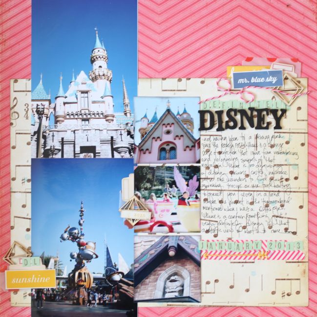
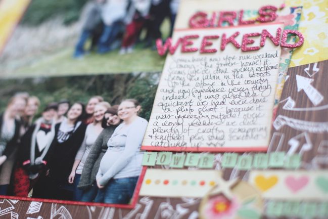
Here’s a look at everything I made and what I had left over at the end, if you prefer things in video form! But you can see everything here on the blog too. I’ve posted five already: Dance All Summer Long, with two photos, All Over, with a single photo, Girls’ Weekend, with two photos, Definitely Disney, with five photos, and Talk Amongst Yourselves, with three photos.

scrapbook page by shimelle laine @ shimelle.com
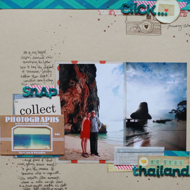
This page required a sheet of kraft cardstock for the background, and a dark brown Mister Huey ink, but everything else is from the kit. I hadn’t been quite sure how to scrapbook this slightly odd photo of us on the beach in Thailand. It looks very distorted because it was taken by someone else with my camera, but I was using my wide angle lens at the time, which isn’t really meant for this kind of picture. In the end I decided to just tell that story as it is – that sometimes an odd photo of us together is better than no photo at all!

scrapbook page by shimelle laine @ shimelle.com
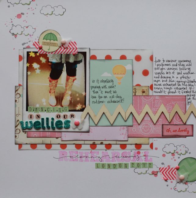
This page was created in an almost identical format as the fox page from the February kit – by taking all the scraps left on my desk, and cutting most of them into rectangles to layer onto a sheet of white cardstock. I really love this vellum over white, and there are many shades of pink and many shades of white, off-white, and cream, which is a different look for me but with so many shades together, I really like it. I added the Amy Tangerine cloud stamp to the diagonal line of ink droplets to emphasise the rainy day theme – just to try something a little different. This page is for my Olympic album, and tells the story of how we had not a single rehearsal in dry weather. Not one.

scrapbook page by shimelle laine @ shimelle.com
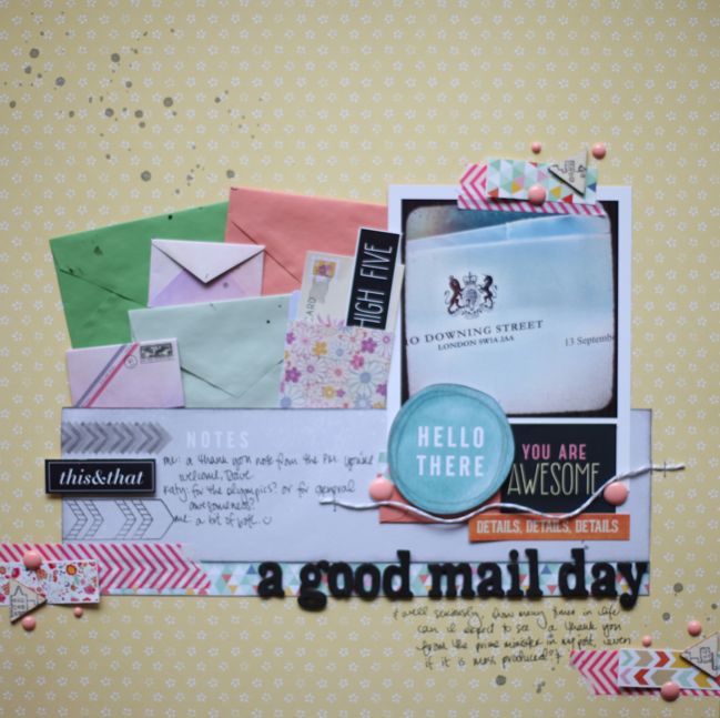
Sometimes my pages go so wrong by sheer stupidity. I had this page all designed in my head, with the cluster of envelopes to go along with the photo of the letter (a thank you note from the Prime Minister – sent to thousands of people, but still: I somehow doubt there will be many other times that letter head appears in my post!) and a bit more embellishment in a triangle around the page. When making it, the envelopes all went together politely and the skyline stamp even worked on the triangle wood veneer pieces even though they were quite small. Then I went away and left the finished page on my desk for a couple days, and in unpacking something else, I may have stacked something on top of it and well… there is a giant mess of spilled ink right below the photo. I had to go back and add more embellishment and try to balance it and cover it and make it work. So while the ‘you are awesome’ sticker is from the kit, as are a few small paper scraps, the hello die-cut, the label sticker, the twine and the enamel dots are all outside elements brought in to save the day. I’m not sure about this yet… but mostly I think that’s because it was finished in my mind and having to add more to it to cover a minor disaster has just changed the composition and it’s hard for me to figure out if it’s okay or not! But at this point, I’m living with it and getting it into a page protector before anything else happens! This page will be opposite an A4 page protector to hold the letter itself, which I want in my album but I don’t want to embellish.

scrapbook page by shimelle laine @ shimelle.com
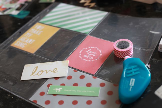
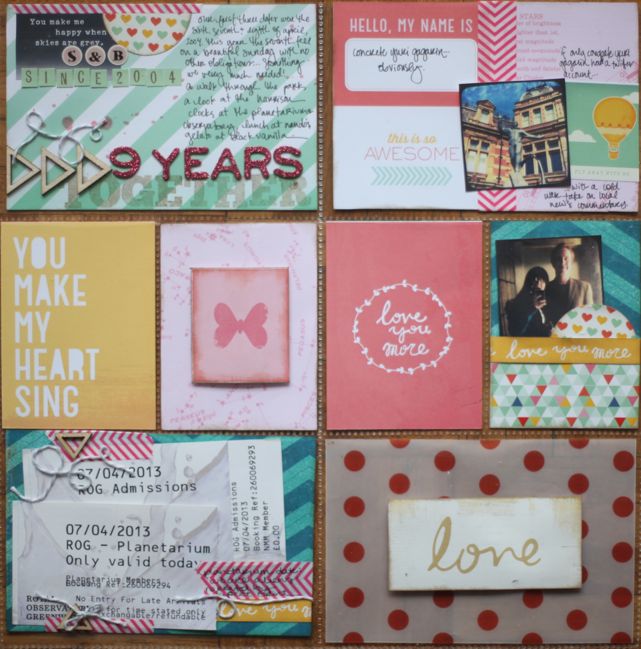
Then I started working on a little something that looks like this, which might start rumours. But before anyone worries that I’m giving up my 12×12 pages for a daily documentation album such as Project Life, rest assured I still love my 12×12 very dearly.

scrapbook pages by shimelle laine @ shimelle.com
For one, if I did the traditional weekly double page about daily life, quite a lot of my daily life is… scrapbooking. At how many levels can one scrapbook about scrapbooking? That seems a little over the top for me, as well as a sure-fire way to create a never-ending spiral of stuff that ‘needs’ to be scrapbooked! That’s not the point of Project Life at all. Instead of keeping that sort of regular everyday album, I like to include divided page protectors just here and there amongst the rest of my 12×12 pages, as they are perfect for making a page from a few random items plus some pretty paper to tell a story of any particular day or activity. This past weekend marked nine years since The Boy and I went on our first date, and this Sunday we had a lovely if simple day that included lunch out along the river, an exhibit about how clocks were invented, and a planetarium show. I included a couple phone photos from the day and my ticket stubs, then plenty of pretty paper and some random notes about the day. The photo at the top right is of a new statue at the observatory, of Yuri Gagarin. I really, really wish someone clever would start a comedy Twitter account for ConcreteYuriGagarin, with local news and updates written through the voice of a cosmonaut, but sadly I don’t think anyone other than me would find it funny. And I don’t even think the statue is concrete – it must be granite or something, but that just doesn’t sound as comical as Concrete Yuri Gagarin. See, this is the sort of stuff I record on everyday type pages. I’m not sure I want to leave a complete record of that level of things only Shimelle could ever find funny.

handmade cards by shimelle laine @ shimelle.com
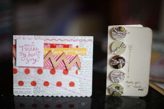
With the final pieces of the kit, I made two cards: one very pink (with a card base from an old Making Memories Valentine set) and one more vintage (with the Jenni Bowlin button stickers on a cream cardstock base).

And that’s that – nine pages and two cards! The March kit is still available, by the way – as I write this, many items that sold out earlier are back in stock and the only thing currently out of stock is the turquoise option for the letter stickers (the pink and black styles are in stock, and the letter stamps are half price). If you have posted your projects for the March kit somewhere and would like to share a link, do leave one in the comments so we can see what you’ve created!

Now I’ll start working with the April product picks, and I’ll have projects and videos to share with you very soon!

Sketch to Scrapbook Page :: Scrapbooking with three 4x6 photos

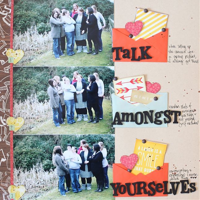
scrapbook page by shimelle laine @ shimelle.com
In case you haven’t noticed by now, I love coming back to a few old standby designs and just changing a few small elements to the general outline of the page to make something new. This sketch is one of those examples.

It’s also an example of having zero problem with taking my page titles from Saturday Night Live sketches. (I’ll give you a topic.)

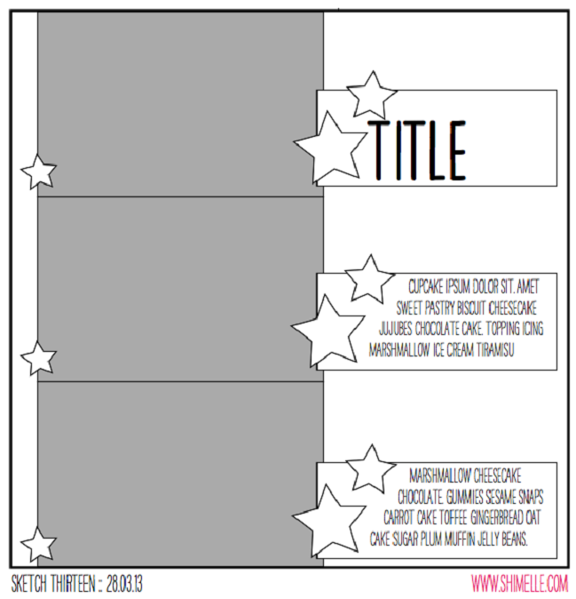
scrapbooking sketch by shimelle laine @ shimelle.com
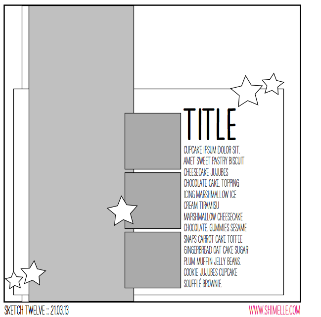
This sketch is designed for three 4×6 photos all facing the same direction, making it particularly useful for action shots in a sequence, but I’ve used the all-in-a-row concept for plenty of pages that just happen to include three portraits or three landscapes too. In fact, there’s a whole video from the 4×6 Photo Love series just about scrapping three photos, and that was the basis for the most recent Glitter Girl Adventure too. This time, instead of running a long border to connect the three photos, the sketch uses three separate elements to fill the page with repetition, providing plenty of room for journaling and embellishment.


The supplies here are a bit of a mix: the embellishments come from the March Best of Both Worlds product picks, but the papers include a sheet of kraft cardstock and scraps of the two non-kit papers I used for this page, which is the facing page in the album. And just a bit of that yellow patterned paper that forms the background of that page, stolen with a punch from the part that is covered by another layer. There is also some dark brown Mister Huey’s ink and some brown candy dots by Pebbles – they are much like the enamel dots but with a matte finish instead of glossy.

I know that’s a bit of a liberal use of the kit but almost all of us have other things in our stash aside from what we order one month, right? This month it turned out that I used my papers quicker than my embellishments, so I have a few more things to share with you about how I got to the end of the March kit!

scrapbook page by shimelle laine @ shimelle.com
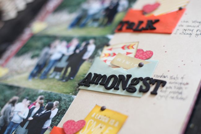
These photos are the type of pictures I find on my camera when I’ve been setting up a shot – the sort of thing where everyone gets in the right spot, but someone has to set up the camera to frame it and get the focus, then click the self-timer and run into the shot just in time. I always just tell people to talk amongst themselves while I’m messing with the camera, but secretly I love these shots because they are always so natural and show everyone just being themselves and interacting as they really would, like the camera isn’t even there. So I never delete pictures like this really – and I like how they can sit on the facing page in my album to show a behind-the-scenes glimpse at getting an ‘official’ group picture. There’s a slightly more extended version of this idea shown here, with a much bigger group of crafty girls too. Too many shots there to fit into this sketch though!

Scrapbook Page by Kristina Nicolai-White @ shimelle.com
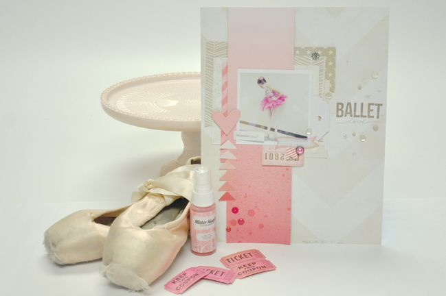
Today’s guest creates beautiful scrapbook pages, but almost always in the 8.5×11 size, so I was interested to see what Kristina Nicolai-White would do with a sketch that is so mathematically aligned to the 12×12 page. I love her result, with a delicate page and a single square photo, and really enjoyed hearing what she had to say about her creative process in getting from the sketch to her finished scrapbook page.

Scrapbook Page by Kristina Nicolai-White @ shimelle.com
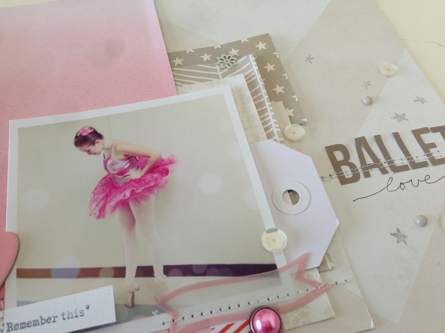
As busy as my life is these days – with three active teenage kids – I don’t find a lot of time to actually scrapbook. But when I do, it is usually about a moment. A brief moment in time that I don’t want to forget. I don’t take a lot of time to record the “firsts” or main events anymore. Because of this, I don’t usually have more than one photo that I want to actually use on a page, if any at all. However, this sketch is obviously made for three photos. I weighed out repeating my photo three times and popping up the middle for emphasis, or putting a layer of vellum over two of the three. I am an 8.5×11 scrapbooker, rather than a 12×12, so this also makes it more difficult for three 4×6 photos, unless they are smaller than a standard 4×6 print. In the end I decided to use the grey area in the sketch as more of a composition guideline rather than a rule for where the photos should lie in the composition. The grey area became the main design area for me, and instead of it being a stack of photos I used one wide piece of paper and took it from the top to the bottom as seen in the sketch. Within this area I placed my photo with the idea that my title would lie approximately in the same space shown on the sketch, in the right upper 1/3 of the composition.

I really wanted to emphasise the pink in this photo, but in trying not to take it too over the top, I used a cream/white wide chevron paper (from this pack by Crate Paper) as the background and left most of it as free space. I used a pink ombre paper from Dear Lizzy for that main greyed area where the sketch intends to be photos. The rest of the patterned papers and scraps that I used to lift up and create focus around the photo are shades of white and gray. I wanted to create a more dreamy quality to the layout as it already exists in the photo. I had edited this photo previously with several layers of filters and bokeh treatments. I really wanted the colors and papers to further convey the dreamy love feeling in the layout. The direction of the layout is almost all leading down, my daughter in the photo is looking down at her pointe shoes, the pink ombre paper is going from light to dark while the white chevron is pointing down. And then the pink triangle stack on the left side is leading up to the heart. I used few embellishments, only some Studio Calico Mister Huey mist to add depth to the pink ombre paper, a few die cuts thrown in to the paper layers, a single brad, some white sequins and a few enamel dots from My Mind’s Eye. I finished this layout with a simple title using bot letter stickers and a pen, and a date stamp.


Kristina Nicolai-White has been scrapbooking and memory keeping in various forms for most of her life. Founding and owning the online scrapbooking company Two Peas in a Bucket has kept her active and part of the scrapbooking industry for more than 15 years. Kristina loves using her iPhone to document the craziness of her everyday life with three active teenage children, two giant dogs and her high school sweetheart husband. Her work is usually full of color, products and blurry photos. You can find more of Kristina’s work in her Two Peas gallery, of course.

And now it’s your turn! Create a page in your style with this sketch, post it online, and share it with us. You can upload to your blog or to a scrapbooking gallery like Two Peas or UKScrappers, then just follow the steps to link to your project wherever it can be found online!


Sketch to Scrapbook Page :: Scrapbooking with both square and standard photos

scrapbook page by Shimelle Laine @ shimelle.com
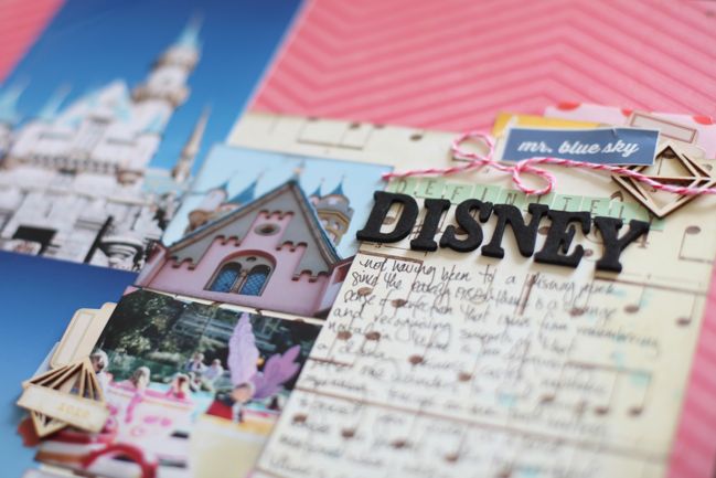
Time to return to Disneyland photos! And still not a Mickey Mouse embellishment in sight. I know some of you may be smashing your head against the desk for that, but my train of thought is that I don’t own any licensed products like that and I would really like to scrapbook these photos without adding products to my pages that are so far removed from what I use on most of my layouts – so just like I haven’t used Harry Potter products on my Harry Potter scrapbook pages, I’m not planning to use Disney products on my Disney scrapbook pages. I hope that seems sensible – to use what I have and love – and if you love patterned papers and embellishments with the Disney characters, then I would be right there cheering for you to use them! (Which leads me a bit to a recent treatise I wrote on scrapbook storytelling here, which leads to what is often my overwhelming cheer to the scrapbooking world: All hail variety!)

scrapbooking sketch by shimelle laine @ shimelle.com
This page sketch was originally designed with a panoramic portrait photo in mind – a 4×12 inch column taken from a single image. But the truth is I always have grand ideas for prints like that but actually have thousands of 4×6 prints to hand and little motivation to print special sizes like 4×12! So I used two portrait photos stacked to create that column, then three smaller square photos. On the sketch they are more like two inches square, and I imagined this as a good way to mix ‘proper’ photos with phone photos, but in truth I didn’t take any phone pictures at Disneyland and instead cropped the squares from standard prints, choosing a few nice details from photos that I didn’t feel fabulous enough to warrant their own pages in my album.


This page uses mostly supplies taken from my March Best of Both Worlds product picks, but I added a sheet of pink chevron by Crate Paper for the 12×12 background and some pink baker’s twine.

scrapbook page by Shimelle Laine @ shimelle.com
If you’re just reading and not watching the video, I can tell you I already know that embellishment grouping in the middle of the photos is going to be a love/hate choice. On the sketch, it’s a much simpler, smaller embellishment, and I think it would be less jarring that way, but I chose to make it almost as heavy in weight as the other two embellishment groupings, and it is a little unexpected in the middle of the page. I decided to go with it anyway and lightened it by using a small bit of text cut from a larger sticker instead of the same size rectangle as the other two clusters. I’m also okay with it because I looked carefully at what I was covering up on the photos and there is nothing covered that I really wanted to be visible. This is a prime example of when I decide to just try something on camera and see what I think. Is it my favourite embellishment of all time? No. But it didn’t upset me either: I’m quite happy with how it gives the page quite a whimsical look, like it’s not taking Disney too seriously. And now you know exactly how much I over-analyse my design choices!

scrapbook page by Sophie Crespy @ shimelle.com
Today’s guest artist, Sophie Crespy, has a less literal interpretation of the sketch, and a beautiful page to share with you. I hope it sparks your creativity!

scrapbook page by Sophie Crespy @ shimelle.com
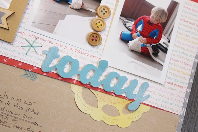
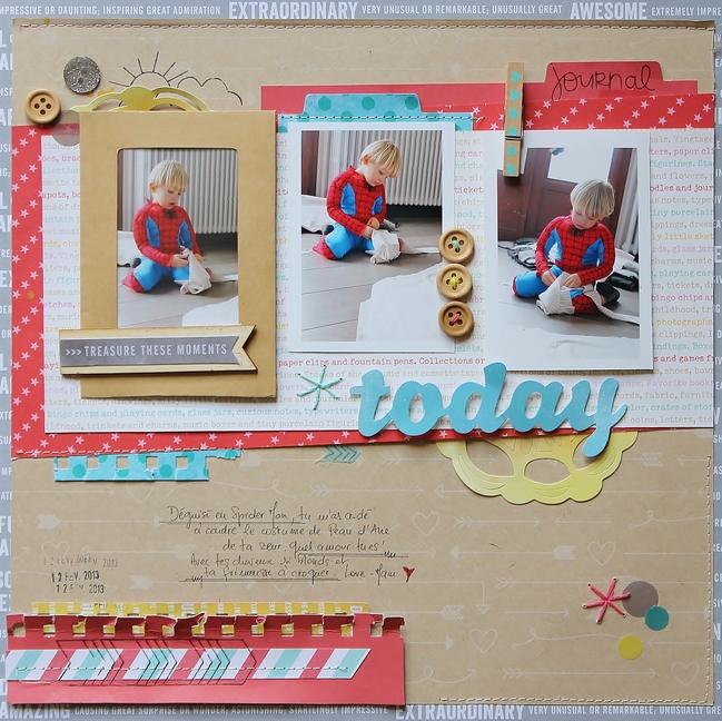
I love this sketch because of its simple lines and multiple photos: typically my type of design! I changed the square photos for a rectangle one and turned the sketch around into a horizontal layout: that way the vertical photos are balanced by the horizontal pieces of patterned papers. I love the visual triangle created by the stars on the sketch: it brings balance to the page. A visual triangle is a design tactic I use often: you can find a visual triangle on my layout created by the colours? I placed three yellow elements on my page: can you spot them? The two pieces of doily and the piece of yellow paper on the bottom left. It helps the eyes to travel on the page, from the photos to the journaling. I also replaced the stars by some stitched elements on my page, created with the new Amy Tangerine Embroidery Stencil kits. It matches the theme of my photos: my son helping me to sew a costume for his sister. I like to mix textures on my layouts: here and there is hand and machine stitching, rub-ons and buttons. The kraft envelope adds interest and creates a frame for the first photo. The photos are mounted on dimensional adhesive and the peg also adds depth to the overall design.


Sophie is a part-time teacher from France. She lives in the Alps with her husband and two children. She started scrapbooking five years ago in order to document her daily life. During those years, her style changed tremendously until she found her own style: fresh, bold and colorful, clean with a whimsical twist!
She is currently a member of American Crafts and Crate Paper design teams. She also writes articles for French and International magazines such as Entreartistes magazine. She writes about her creative adventures on her blog.

And now it’s your turn! Create a page in your style with this sketch, post it online, and share it with us. You can upload to your blog or to a scrapbooking gallery like Two Peas or UKScrappers, then just follow the steps to link to your project wherever it can be found online!


Sketch to Scrapbook Page :: Scrapbooking on the diagonal

scrapbook page by shimelle laine @ shimelle.com
Those of you who subscribe over on YouTube got an earlier glimpse of three Sketch to Scrapbook Page videos this week. I’m almost caught up to the dates on the sketches, and when I really do reach that point I may dance around my studio in joy! But now it’s far time for me to get these sketches on the blog so you can see not just the videos, but also the sketches, pages, and unique interpretations by the sketch guests. First up is a two photo layout to document a recent weekend away with friends.

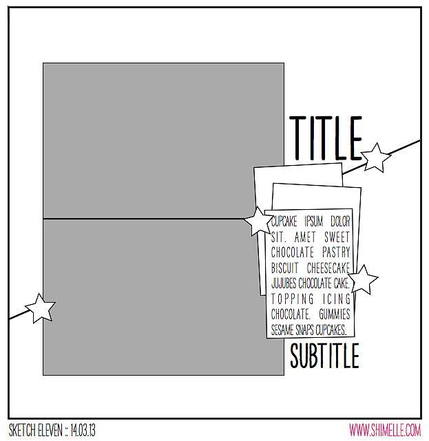
scrapbooking sketch by shimelle laine @ shimelle.com
This sketch is designed for my favourite combination of photos – two standard 4×6 prints in the same direction. This time, that’s landscape. Then two patterned papers to make up the background, with one cut on the diagonal to add a quick and easy twist on a really simple page design. I just cut the diagonal with my paper trimmer, angling the paper on its side instead of lining up all tidy like normal. I’m sure there’s some amazing way you can measure this and work it out if there is an exact angle you want to achieve across your page, but I was just going for an angled line and didn’t need to be precise about that.


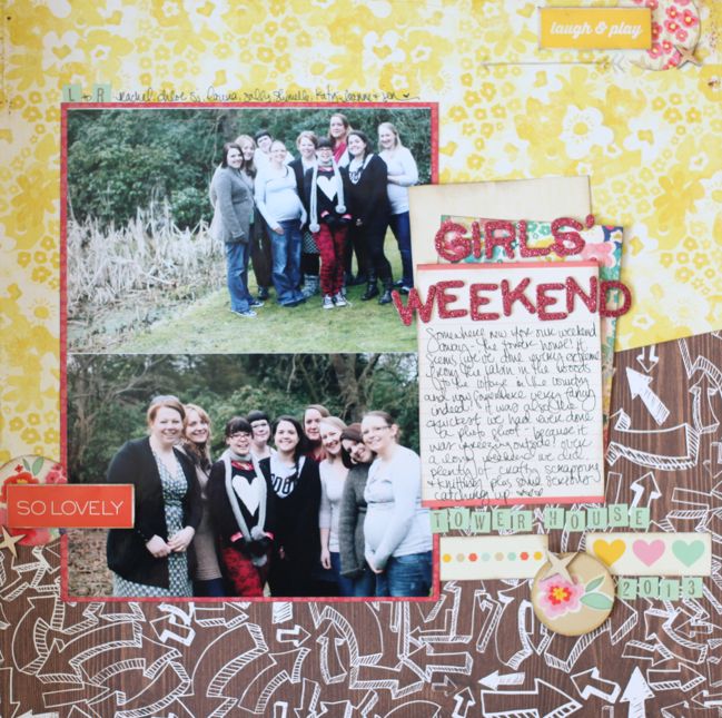
Most of the supplies here are from my March Best of Both Worlds product picks, but I added in the woodgrain arrow paper and some red patterned paper for the photo mat.

scrapbook page by shimelle laine @ shimelle.com
These photos were actually taken at the beginning of March, but it was freezing and definitely felt like the middle of winter. We always have a group photo session when we go away for a weekend now and then, but this one was finished in record time because we couldn’t wait to get back inside to the warm. They will forever make me laugh because I was so cold, I didn’t bother to tie my shoes for wasting time once the door was open. I love these getaways with such lovely and creative girls I’m so lucky to call friends, and I tend to scrap most of the photos we take on our little escapes – so you’ll see a page soon that goes opposite this one in my 2013 album.

scrapbook page by Leslie Ashe @ shimelle.com
Today’s guest, Leslie Ashe, has a different twist on this sketch, having taken her inspiration from different parts of the design that what I first noticed. If the diagonal line isn’t your thing or you don’t want to use two landscape photos, check out how Leslie took her inspiration from the two stacked elements on the left and the stars as embellishments.

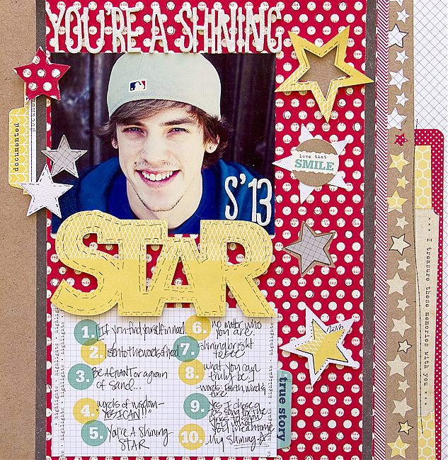
scrapbook page by Leslie Ashe @ shimelle.com
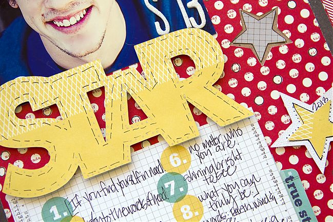
This sketch was so fun! It let me be creative in my own way, with keeping with some of the details of the sketch itself. I decided to stay with the rectangle shape by using a 4×6 photo and a journaling card. I wanted to separate the two, so I cut a title with my Silhouette Cameo and placed as a border. I used that as my main title and my subtitle is my note card with numbers and journaling. I love stars so of course I had to use them on this layout about my sweet son! I was inspired by the Elle’s Studio paper and tags (from the Day To Day collection) I used and built my layout from there. Punching several stars to embellish my title really made my project stand out and draw you to my subject.


Leslie Ashe is a born & bred Texan girl who loves to create memories with her family & put them on paper to remember always. She began scrapbooking over sixteen years ago after going to a craft party with friends. She’s blessed to have work published in Scrapbook Trends, Cards, Simply Handmade, Create: Idea Books, and Creating Keepsakes magazines. She designs for American Crafts, Pink Paislee, Lily Bee Design, Prima and Noel Mignon Kit Club. You can see more of her work on her blog, or follow her on Twitter, Facebook, Pinterest or Instagram.

And now it’s your turn! Create a page in your style with this sketch, post it online, and share it with us. You can upload to your blog or to a scrapbooking gallery like Two Peas or UKScrappers, then just follow the steps to link to your project wherever it can be found online!