pretty paper. true stories. {and scrapbooking classes with cupcakes.}

lovely to meet you Twitter Facebook Pinterest YouTube

Take a Scrapbooking Class

online scrapbooking classes

Shop Shimelle Products

scrapbook.com simon says stamp shimelle scrapbooking products @ amazon.com shimelle scrapbooking products @ amazon.co.uk

Reading Material

travel

Best of Both Worlds Kit Category

Sketch to Scrapbook Page :: Scrapbooking with a favourite patterned paper
scrapbook page @ shimelle.com
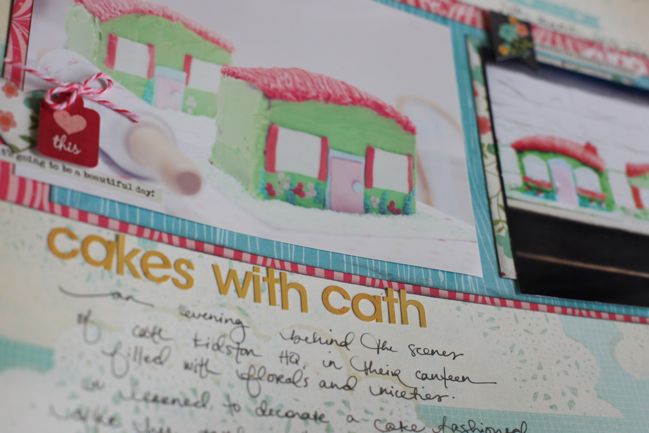
I’ll be honest: my scrapbooks as a whole are certainly about the stories. I refer back to my albums as I make each and every page to see how the story unfolds, and that is my long-term love with this craft. But my short term love is patterned paper, and when I find a design I love, I don’t always want to cover it with other page elements. I fall back to a handful of designs that work as some sort of compromise between those two points – room to tell a story, but also a place to include much of a pretty paper design.
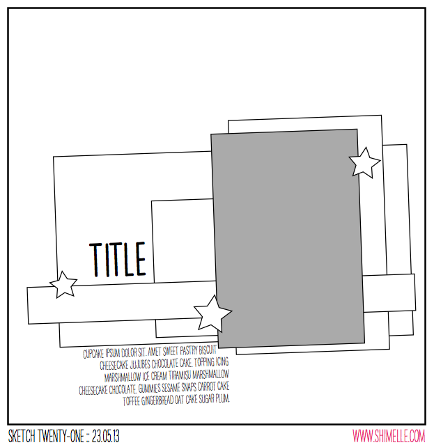
scrapbooking sketch @ shimelle.com
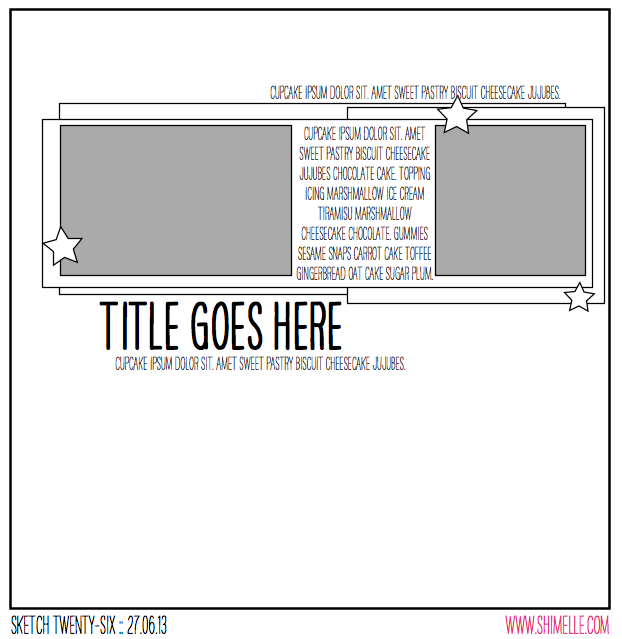
This sketch is another intended to mix a rectangle and square photo, but this time at 4×6 and 4×4, so it could work well for two photos that both started at 4×6 and one just looked better cropped to a square. This design also works perfectly for patterned papers you don’t really want to cover entirely, as there is plenty of open space to let a pretty pattern appear without interfering with your photos.


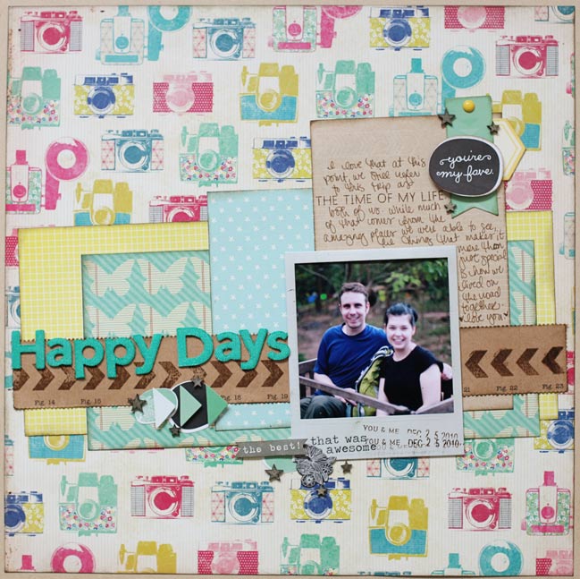
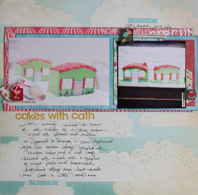
The supplies for this page come from the June Best of Both Worlds kit, and I’m still a little amazed at how much I like this title with just small, flat letter stickers and not Thickers. My love for Thickers has not gone away, but given the challenge, I like how this title is a bit more delicate and understated, though not in any way script or fancy.
scrapbook page by shimelle laine @ shimelle.com
And yes, this page is about making cottage-inspired cakes at Cath Kidston headquarters! Workshops are something new at Cath Kidston, and something tells me this was a bit of a research and rehearsal opportunity for their upcoming flagship store on Regent Street, reported to include a classroom space. I’m saving my pennies now, because I’m not sure how often I’ll be able to say no to crafting and baking workshops in the land of pretty fabric and flowers.
scrapbook page by Mendi Yoshikawa @ shimelle.com
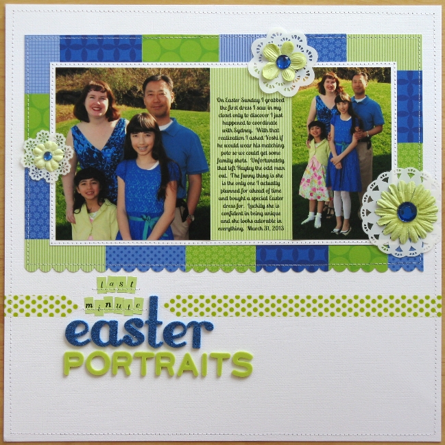
Please welcome Mendi Yoshikawa as today’s guest. Mendi has some great ideas for adapting a sketch to work with your photos when they don’t fit the design exactly, and she was able to make that journaling-between-the-photos element work too.
scrapbook page by Mendi Yoshikawa @ shimelle.com
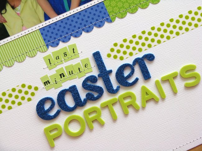
As soon as I saw this great sketch I immediately thought of some recent family photos my family had taken this past Easter. Unfortunately when pulling them out I realized unlike the sketch my photos were vertical and square. With a little creativity I was able to alter the design to fit my needs by enlarging my square photo and making my vertical photo the same height. In the sketch the mats which framed the photos in varying sizes inspired me to cut small strips of Doodlebug papers in a fresh blue and green color scheme to compliment my photos. In my planning I had originally planned for this to be a border made up of washi tape, but in the end my tapes weren’t quite the right hue and I went in a different direction. To add a bit of frill and softness to my intense color palette I decided to cut some doilies from KI Memories Doily Transparency sheet using them in place of the stars in the sketch to form my visual triangle. For my title, it somehow felt like it was floating out there all alone so in an effort to ground it I created a washi tape border cut into pointed arrow tips to tie it all together. To complete my layout I stitched a simple white on white border around the perimeter of my page for a small subtle finishing touch.


Mendi Yoshikawa lives in Washington state with her husband and two girls. She has a passion for using sketches, loves linear designs and brightly colored tone-on-tone patterned papers, and has a self-described addiction to her sewing machine. You can find her at her blog , pinterest , and see more of her work at her online gallery at Two Peas In A Bucket.


Sketch to Scrapbook Page :: Scrapbooking with a title on the photo

scrapbook page @ shimelle.com
Since making the transition into sharing most of my pages through video, I’ve found I get feedback on things in a slightly different way, since it’s easier to see what I was thinking when I made a decision to add this here or that there. Maybe before it was more likely to look at something unexpected on a page and just say What was she thinking? but now it’s all there, readily explained! One thing I didn’t realise was just how many scrappers squirm at the idea of putting anything on top of a photo. On my own pages, it’s been rare for me to not have some element of the page overlap a photo somewhere in the design. Sometimes more, sometimes less, but it’s always a stylistic choice of how to connect the different parts of the page and have less separation between paper and pictures. I like the flow of one to the other, without a straight line of division between the two. I understand the idea of wanting the entire photo on show and I wouldn’t start sticking pop dots on top of a one-of-a-kind photo from a hundred years ago, but maybe digital photos have just made me brave! But with this next sketch, I decided it was time to just embrace the over-the-photo idea in a pretty direct way.

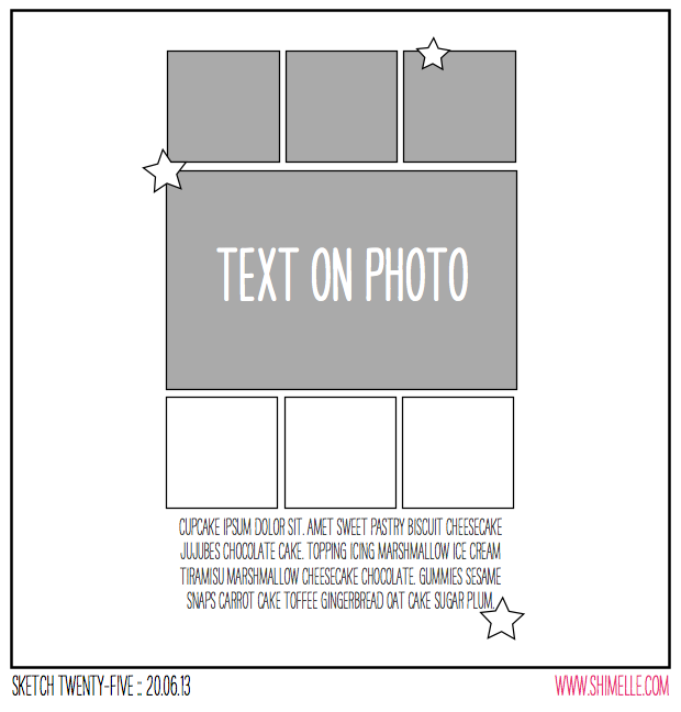
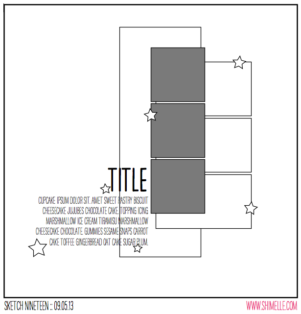
scrapbooking sketch @ shimelle.com
This sketch is another that can be used with a mix of square and rectangular photos – so the square photos are from my phone and the 4×6 photo is from my standard camera. The squares below the photo are shown as patterned paper, but if you had additional square photos, you could add them here. Likewise, this sketch could be followed directly with just the one photo in the centre and all the boxes from paper.


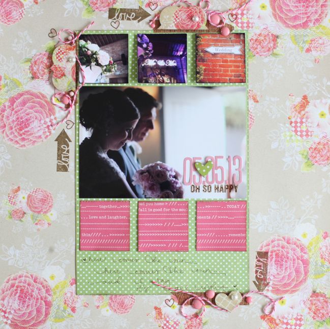
The supplies for this page are mostly from the June Best of Both Worlds product picks. If you haven’t seen other pages from this album, Glitter Girl’s Wedding Album Answers episode covers the set-up for this book, including picking the colour scheme and supplies.

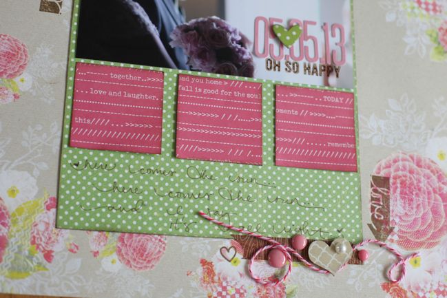
wedding scrapbook page by shimelle laine @ shimelle.com
One thing I think I would do with this sketch in a second interpretation is to dress up those three squares of patterned paper. Perhaps keeping the embellishment around the edges simpler, this would be a great place to stack up layers of punches and labels or add something dressy like flowers, but with the smaller details and textures included in those three areas of embellishment around the edge, I felt extra embellishment on the squares would just be too much, especially for the feel of this particular album. But I do like the lettering right on top of the photo, and pictures that have space for that like this image work really well. I can also imagine placing the title in the centre of a 4×6 photo of a beautiful sky, surrounded by six square snaps from a hike perhaps. What type of image would you be happy to use as a base for the title?

Sketch to Scrapbook Page:: Angular Squares by Shanna Noel @ shimelle.com
Please welcome Shanna Noel as today’s guest artist. I love how she added an unexpected twist to this sketch, and the more varied embellishment she included has such lovely detail.

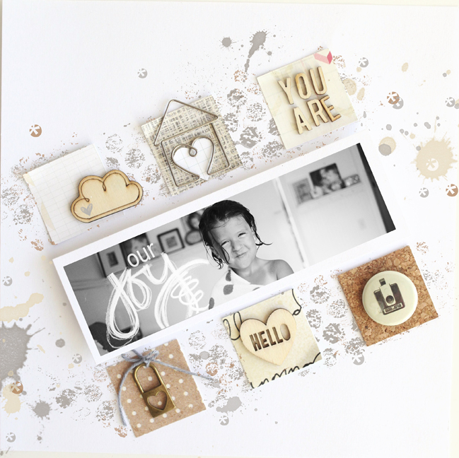
Sketch to Scrapbook Page:: Angular Squares by Shanna Noel @ shimelle.com
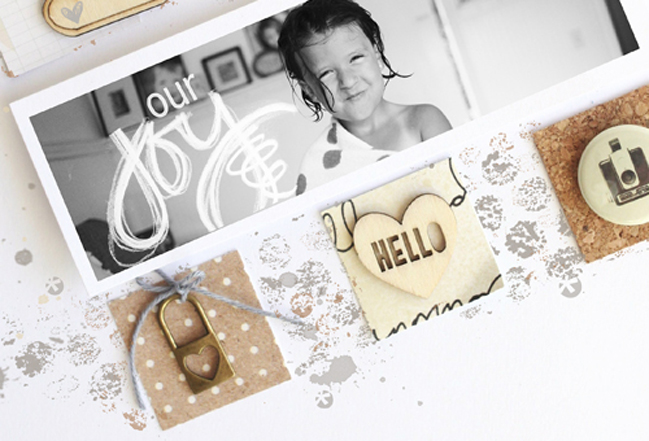
I have a difficult time working in graph designs and always look forward to pushing myself to work ‘outside the box’ and work in ways that I wouldn’t naturally. Many of you might feel very comfortable working in graph designs and if that is the case I challenge you to find a way to mix it up a bit to work outside your box! To get started, I got out my square punch and punched six squares from random papers in my stash. I found myself going for some browns and greys and decided to continue that theme throughout the layout. From there I laid the squares on my layout and decided on my photo size from there. I work mostly with 8 × 8 pages and chose a long and lean photo space. Gathering some of my favorite products from around the room, I paid attention to texture and weight of my elements I was adding, making sure to keep it all as balanced as needed. I like that the alpha, cloud, and heart are all wood and form a triangle on the page. I then added some metal with the locket and metal paper clip, and I finished off that triangle with a piece of flair. At this point I decided that straight on design was just not cutting it for me and this layout, so I decided to put it all on an angle. Now that I had the bones of my layout, I wanted to add some mess to it! I made the base of my layout in Photoshop using some elements from CD Muckosky and Amy Martin to match the colors I had already put together. I love how paper and digital elements come together in such a customizable way! I can’t wait to see what you all do with the sketch.


Shanna Noel lives in Northern California with her high school sweetheart and husband of 14 years. They are loving having a house full of laughter that includes their two children Jaden (11) and Addison (6). She discovered digital scrapbooking when she was pregnant with Addison and just loved capturing her families memories in such a creative way. In June 2011 she ordered her first paper kit, and never looked back! You can now find her work in the gallery at Studio Calico as well as a peek into her daily life on her blog and instagram.


Best of Both Worlds :: My scrapbooking product picks for July 2013

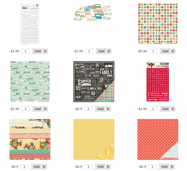
Best of Both Worlds Scrapbooking Kit July 2013
Ooooh, what an eventful day. This is the first month that I had to do some major changes to my plan for the Best of Both Worlds kit because some of the items I had ready to highlight as of last Friday ended up jumping in too many shopping carts over this past weekend! But items replenished and switched around just a little, and now I’m back to a kit that we have in stock and I’m happy with the choices!

But… it means my video and photos are wrongedy wrong wrong. So I’m going to take new pictures and make a new video. Huzzah. (ETA Video is below now! Yay!) I don’t want you to have to wait to shop, so you can find the kit online now and shop right away if you prefer. Click here to shop for the May Best of Both Worlds scrapbooking product picks.

That small set of letter stickers seems expensive because it looks like you get one sheet. You get way more. If you want to see these in use, Glitter Girl showed the whole pack in this video.

A couple items are at big discounts – these won’t be restocked, so if you want them, grab them at that bargain price. Items that are in newer inventory tend to be restocked if they sell out, so if you’re reading this post a few days later and items have run out, click the ‘request and notify’ button to make sure you get the first chance to grab them when they return to the shop.

It’s a very paper-based kit this month – the embellishments are paper die-cuts. If you want to mix it up with some other items, I would recommend the Freckled Fawn paper clips and enamel dots for a different texture available in great colours!

Right: I will be back soon with actual photos and the normal introduction post for this month’s kit, and I look forward to scrapping with these goodies and sharing all that with you!

Sketch to Scrapbook Page :: Adding an angle

scrapbook page by shimelle laine @ shimelle.com
Having successfully managed the spelling of Hong Kong, I may have rediscovered a bit of creative energy and furthered this quest to get up to date with all my sketch and kit pages! Catching up feels pretty rad… as long as I only focus on the things where I’m making progress and don’t turn around and realise there are eleventy other elements in life that need some catching up too. Right? Onward, at any speed.

scrapbooking sketch @ shimelle.com
This sketch was designed for one portrait 4×6 photo, but I changed that slightly for my page. The idea here is to take a group of paper boxes that are layered in a nice and orderly fashion, then take the whole lot and angle it ever so slightly to create a different look. Easy enough, and perfect for the last 12×12 sheet I’ve been saving (that pretty camera print by Maggie Holmes for Crate Paper) and a stack of scraps cut down to nice box shapes instead of the random off-cuts they had become.


Again the products for this page are from my May Product Picks, and I think that makes for six layouts from the May kit so far. I’m now out of full sheets for the backgrounds, but I have paper scraps, letter stickers, and embellishments remaining, so I’ll mix those with some additional papers to finish off the May kit. I’ve also done a few cards with this kit, as out of character as that may seem!

scrapbook page by shimelle laine @ shimelle.com
This is one of those pages where the journaling becomes more reflective – not trying to tell the story of what happened in that photo, but reflecting on that occasion from the present point of view. Recently The Boy and I were in a discussion and someone asked us about our backpacking adventure in the sort of way that implied it was one of those things you would be happy to have over and done with and not want to return to living from a library bag once we had reacclimatised to living in one place. That’s really not our perspective at all and we both wish it was something we could do all the time, so please excuse the slightly mushy journaling!

scrapbook page by lisa dickinson @ shimelle.com
Today I’m humbled by the gorgeous page Lisa Dickinson has created from this sketch. Lisa’s work is always beautiful, but this page has me in total awe! Lisa, can I scrapbook like you when I grow up?

scrapbook page by lisa dickinson @ shimelle.com
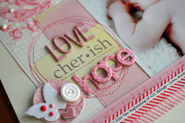
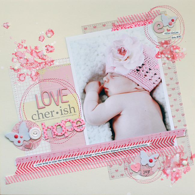
The large photo takes center stage in this sketch and knew it would be a great design to feature one of the many newborn portraits I had taken of my niece. I printed mine at 5×7 (slightly larger than the photo in the sketch) and then gathered lots of pink supplies, everything from soft pink to brighter fuchsia. I used larger blocks of paper behind my photo, layering strips of wash tape at the top and bottom of the tilted design. Three embellishment clusters form a visual triangle around my photo and I added circles of stitching to reinforce their groupings. Because there was some empty space above the title, I splattered on pink and white inks. I added additional, smaller ink splatters to form another triangle. Once the ink dried, a few white enamel dots add dimension to these accents. Rather than block my journaling below the design, I incorporated it into a journaling strip that I adhered atop the washi tape.


Lisa Dickinson is a graphic designer living in Colorado with her husband, Mike, and children, Hayden and Riely. She started scrapbooking in 1998 and it grew from a part-time hobby to a full-time job. Her scrapbook pages have been published in various magazines and she is the author of the ebook Design Workshop from Ella Publishing. In addition to being a Garden Girl at Two Peas in a Bucket, Lisa also designs for Jenni Bowlin, Basic Grey, and Lily Bee Design. You can catch up with her at Gettin’ By, where she blogs about scrapbooking, motherhood, running, and her deep-seated hatred for the Comic Sans font. .


Sketch to Scrapbook Page :: A Twist on Patterned Paper Quadrants

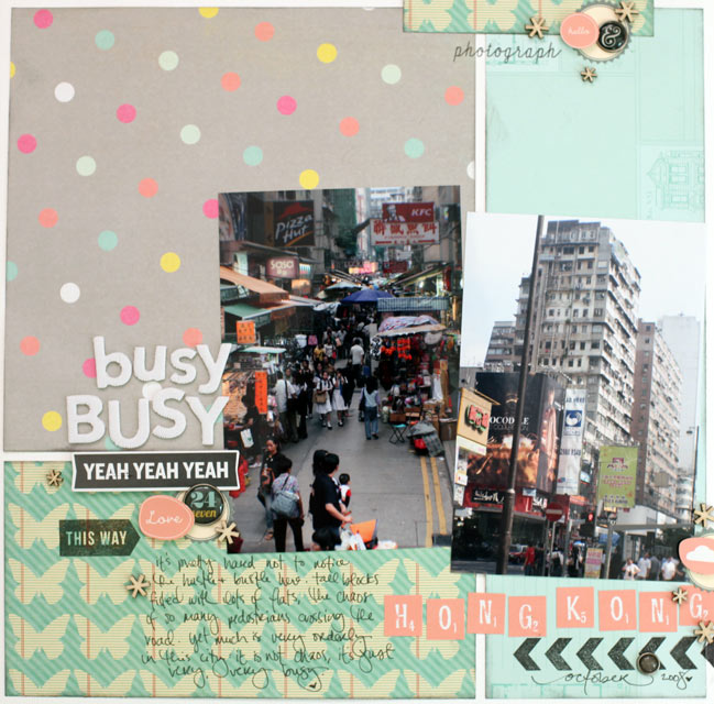
scrapbook page by shimelle laine @ shimelle.com
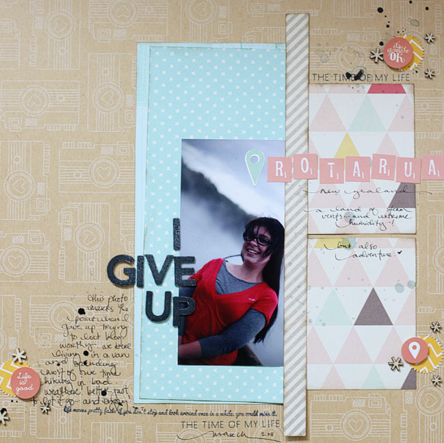
Trying another travel page, and this time with a location I may have a better chance of spelling correctly. One can hope. (I’ve fixed the Rotorua layout and issued an apology to all of New Zealand on Twitter and Facebook, if it helps. I need to take a new picture and edit the post. Darned spelling upside down!)

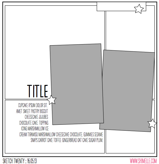
scrapbooking sketch by shimelle laine @ shimelle.com
This sketch is a twist on quadrant design: instead of dividing the page into four equal quadrants, it’s divided into four boxes that are different sizes, with the join of the papers covered by two portrait photographs. I used standard 4×6 prints.


The supplies are all from my May product picks with the exception of the Simple Stories brads I added right at the end to finish the embellishment, and a sheet of white cardstock for the background.

scrapbook page by shimelle laine @ shimelle.com
I’m hoping some of you will try this sketch with a similar look but adding mats to the photos. I like pictures both matted and unmatted, but I am in such a habit of two portrait photos side by side sharing one photo mat that I felt I needed to change it up a bit, so that’s what I added to the sketch and this layout. The photos are from 2008, on a short stay in Hong Kong. (It’s not from the backpacking trip so no need for the kraft cardstock in the background. The album for this trip started well before I thought of such simple ideas as having a colour in common throughout the entire book!)

scrapbook page by Sam Ball @ shimelle.com
Today I’m delighted to welcome UK Scrapper Sam Ball to share her interpretation of the sketch. And don’t you know that in the video I say you could use this design with two, three, or four patterned papers in the background… and Sam made it work beautifully with one! The thought never even entered my mind. Now you know why I invite guests!

scrapbook page by Sam Ball @ shimelle.com
Staying fairly true to the sketch, I was keen to repeat the grid background element. But as a scrapper whose style is more eclectic than graphic, I distressed cut lines to reveal slithers of the dotty paper from Glitz, along with other papers and embellishments from Prima, Websters and My Mind’s Eye.

Guilty of always leaving the title until last, I’ve recently invested in a Silhouette Cameo. Now my title is committed to from the start and the layout evolves around it rather than me finishing a layout and wondering where best to site it!

The photos, taken last year on holiday are of my middle stepdaughter as we enjoyed one of the last days of our Mediterranean cruise.


Having tried her hand at many other crafty hobbies, including stained glass, pottery and needlecraft, Sam Ball discovered scrapbooking in 2007 and has never looked back! “Nothing has gripped me as much as scrapbooking has” says Sam “and over the years I’ve made many, many friends, who like me share this passion for paper.” Her style could be described as arty eclectic and Sam loves nothing more than taking a piece of paper and cutting out the intricate elements to layer in pages.
Over the years she has had her work published by magazines in the UK and has been a DT member of both the successful scrapbooking kit company ScrapaGoGo, the Pencillines sketch team and Scrapbook Inspirations. She currently teaches at the popular GoGoGetaway.
For more of Sam’s work, be sure to check out her blog.


Sketch to Scrapbook Page :: A design for photo booth strips

getting more from your patterned paper @ shimelle.com
I’ve had a few discussions recently about something known by the delicate name of ‘paper gutting’. It’s rare that I show paper gutting in my videos, because I don’t think it makes very riveting viewing and I had – wrongly perhaps! – assumed if you wanted to gut your paper you were already on top of that and didn’t need me to show you what that was.

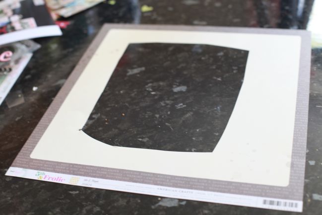
It turned out there were a few of you left completely confused when we discussed this on the Paperclipping Roundtable, so this week I wanted to share the simple process of paper gutting so you don’t find yourself with such a sharp intake of breath the next time I layer two papers on my page to show just a quarter inch border of your favourite patterned paper of all time.

Just cut a big section out of the middle and leave the edges intact. You can use a trimmer and make it all nice and tidy; I tend to opt for quick and untidy by using scissors. It doesn’t matter, since you’re going to cover it up anyway!

making a scrapbook page @ shimelle.com
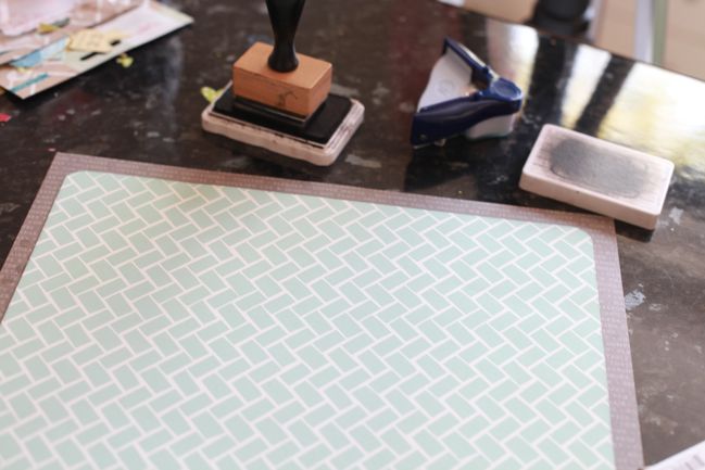
Then place your smaller-than-12×12 paper over the top and adhere around the edges so you’re not just gluing that top sheet straight to your table. Presto: the glory of the second colour peeking around the edge of the page without the heart attack of using a full 12×12 sheet for it. If you’re scrapping on a budget or trying to get the most from a kit or you just love a paper but only have one sheet of it, this can come in terrifically handy so you can add embellishment or photo mats in the same pattern as your outside frame.

scrapbook page by shimelle laine @ shimelle.com
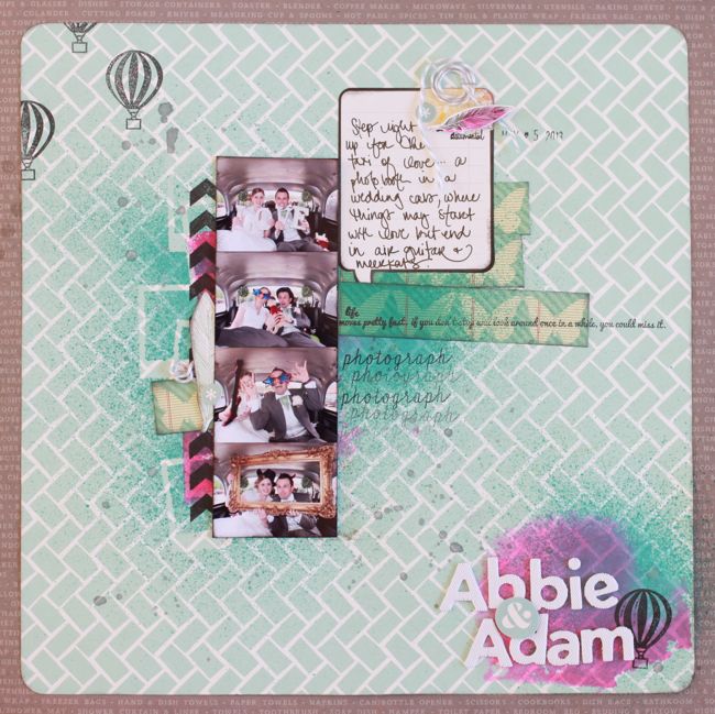
But then all measure of sensibility went out the window and I put together something entirely devoid of the idea of neat and tidy. I really wanted a splash of bright colour, and this seemed to be one way to get it: hot pink ink applied to the page with the acrylic block rather than a stamp. Everything here aside from the inks, mask, and twine is from the May Best of Both Worlds kit. I’ve actually already scrapped these photos in black and white for the wedding album, but I had them in colour too and wanted to give them a try with a messier look. I’m not convinced with the stark black and white of the journaling block, but there are other details I really like and want to rework on future pages too.

scrapbook page sketch by shimelle laine @ shimelle.com
This scrapbook page was inspired by this sketch, which is perfect for a strip of pictures from a photo booth, but could be small photos of any subject or indeed one taller, thinner photo, which I also gave a try.


Sadly I got a bit ahead of myself when I said there were two versions plus a guest. No guest today, I’m afraid. Just a one-off, and I’m sorry for the mis-statement in the video.

Again the supplies come from the May kit, and I’m thinking this page will really feel more finished with some machine stitching, but I can’t add that till next week. Right now my machine is completely inaccessible while we build some furniture! But this sketch is a bit of a departure from my normal page process and it shows in both versions.

scrapbook page by shimelle laine @ shimelle.com
I can’t tell you how many times I have picked up this photo to scrap it then put it back. It’s so not flattering. And I very specifically remember how I felt that day and that was anything but flattering too. This is from our New Zealand adventure, living in a bright orange van, and my hair was a state, my clothes were a state, and for a few days I just decided to not care about it any more. It wasn’t a permanent thing, even while living in the van, and about a week later I went to a different extreme and bought scissors and hair dye for a campsite makeover whilst The Boy was spending his days scuba diving beautiful ship wrecks. But I decided the story would win out and I would go ahead and get this in my album, unflattering photo and all. Who knows: this may be like when I look at photos from my high school yearbook and wish that I had appreciated my teenage look rather than telling myself I was a total mess. Maybe not that extreme, but a bit of reality, anyway.

Now it’s your turn! I’d love to see your interpretation of this sketch!


Sketch to Scrapbook Page :: Adding a Sunburst to your page

Sketch to Scrapbook Page :: Adding a Sunburst to your page  @ shimelle.com
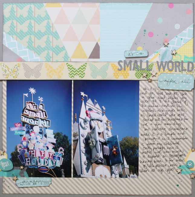
Lately on my table, things are getting very sketchy. And I’ve been trying to decide if it’s okay to scrapbook pictures from a Christmassy It’s a Small World ride without using the vaguest bit of Christmas embellishment or colour. I’ve decided yes, it’s okay.

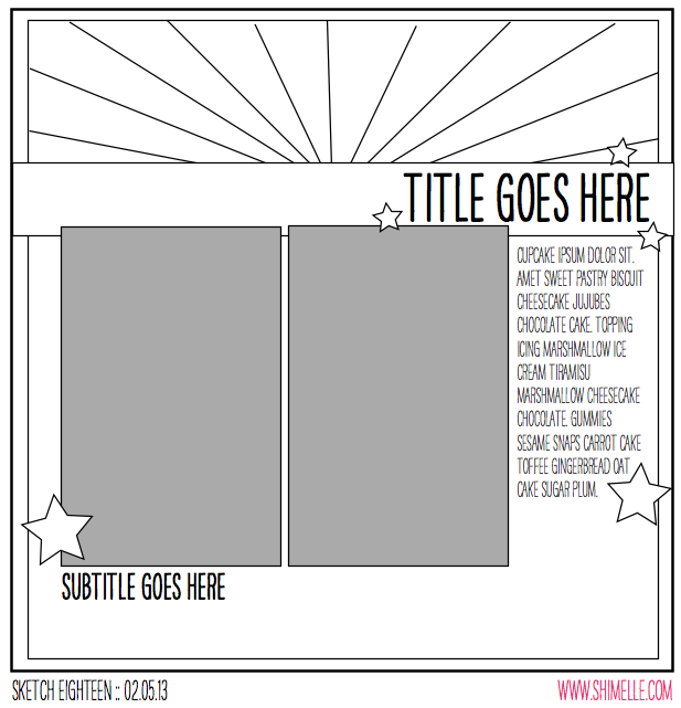
scrapbooking sketch by shimelle laine @ shimelle.com
Yes, I am shamefully behind on sketches, as you can tell from the date. Yes, I am trying to do something about that! Starting now. But moving on…

This sketch features two portrait photos in a standard print size (I used 4×6 prints), plus one large block of patterned paper and a smaller block made up of a sunburst of various patterned papers. For a step-by-step tutorial on putting a sunburst together, check out this post from a few weeks back.


All the supplies were from my May Best of Both Worlds list, and though in the video I mentioned that I might use other paper scraps in the sunburst, I didn’t in the end. I think the only extras I added were the 12×12 sheet of grey cardstock for the background, a bit of washi tape from the June shopping list, and the Heidi Swapp Color Shine mist.

scrapbook page by shimelle laine @ shimelle.com
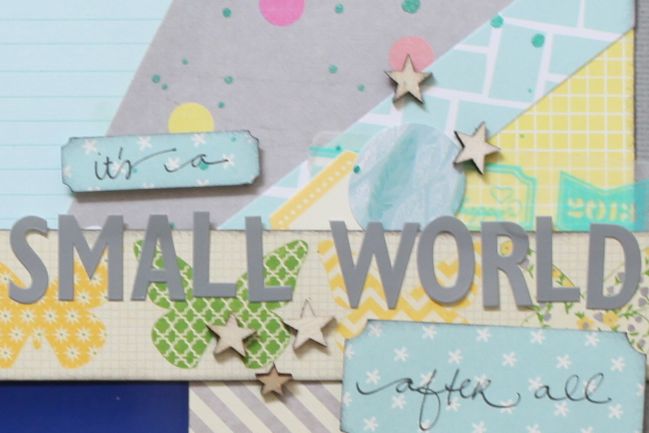
You may be surprised to see I actually didn’t put the two prints completely next to each other! Shocking, I know. But in this case I preferred them with the margin. I also tucked the tops under the butterfly border rather than placing them on top like the sketch, because I felt you could still read the photos well but the butterflies lost their delicate look with the heaviness of another layer like the photos.

Sketch to Scrapbook Page by Marcy Penner @ shimelle.com
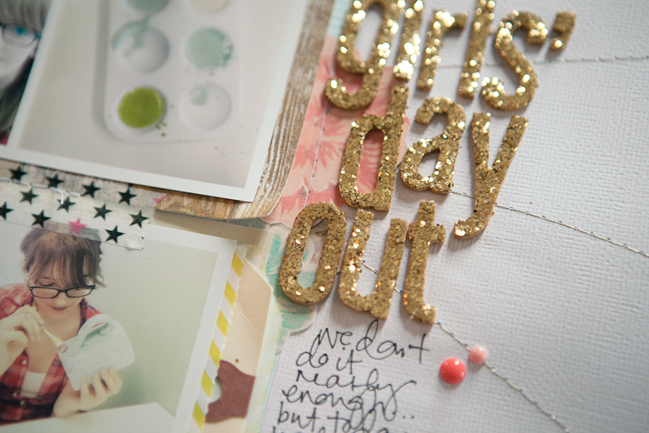
Today I’m delighted to share with you a second interpretation of this sketch, trading all that colour and pattern in the background for beautiful textures and white cardstock, with this page by Marcy Penner.

I love using sketches, but truth be told, I don’t often think of it. By the time I can sneak in any amount of time in my studio I just have to get cracking! So, working with this sketch was a real treat.

I started with my photos. I decided on a grid of four small photos that I printed out with my Selphy and substituted those for the two from the sketch. From there I matted each set of photos with patterned paper from the Crate DIY Shop line. I love the subtle colours from that line and thought they went well with our girly afternoon. To add a pop of colour I snuck in a striped lime pocket and a small strip of red and pink polka dot paper from Dear Lizzy. I’ll often throw in a splash of random colour on my pages. So, now that I have my patterned papers positioned and a few major embellishments like the pocket and tag where I want them, I take everything off and prepare to add my first background layer.

Knowing approximately where everything will go, I used pink watercolors to paint a random portion of the paper. Unfortunately this didn’t translate well in the photo, but it’s mostly peeking out beneath the photos and under the journaling. Once my watercolor was dry I added some random paint splatters. Usually I use black, but because this was a more feminine page I decided on gold.

Sketch to Scrapbook Page by Marcy Penner @ shimelle.com

Knowing approximately where everything will go, I used pink watercolors to paint a random portion of the paper. Unfortunately this didn’t translate well in the photo, but it’s mostly peeking out beneath the photos and under the journaling. Once my watercolor was dry I added some random paint splatters. Usually I use black, but because this was a more feminine page I decided on gold.

Now for the sunburst. Knowing approximately where my photos and layers would be, I start sewing random lines with gold thread. I rotated the sunburst from the sketch a quarter turn which is why they’re off to the right. Once that was done I began putting my layout back together.

I adhered my major elements and sewed them down. From there I added my title with gold Thickers to play off of the gold spray paint and thread. At this point I also added in a few embellishments. I compensated for the weight of the gold Thickers by adding an additional pop of colour on the opposite side, this time with a reddish (coral?) Dear Lizzy badge. To make sure that I had a bit of that red colour on the other side I added a couple of My Mind’s Eye enamel dots in the same colour.

A little journaling and some notes and we’re all done.


Scrapbook Starting Points :: Life with the Pink Backpack

scrapbooking starting point @ shimelle.com
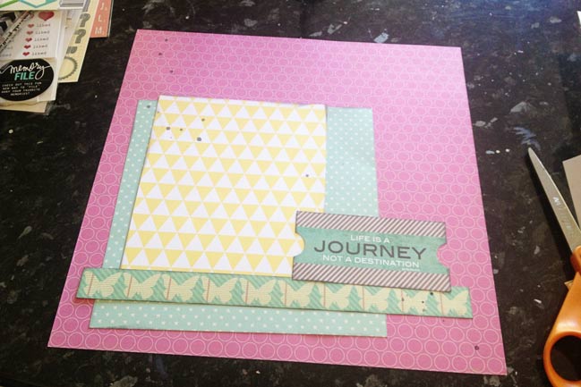
If you open a box of new supplies and are filled with a small terror that there is no easy place to start, you are not alone. I often find I look at all those fresh paper sheets and I’m not sure exactly where to go from there – perhaps for fear of messing up a much-loved sheet of paper, but more likely for an overrun of ideas and the worry that if I cut into a sheet that could be perfect for a background, I’m not sure where I’ll go after that. Usually I just have to start something, anything, and then go from there, living with the consequences of whatever pieces are left from the papers after they are cut. And this starting point is just that sort of project.

Select one patterned paper as the background and keep it 12×12. Cut another to 8×8, and attach in one corner. Choose a paper with a design that can be cut into a horizontal strip to run across the bottom of the 8×8 block. Cut a block from another patterned paper in a size that will be slightly larger than your photo, and run that vertically, above your horizontal strip. Add a die-cut to the mix at the spot where those different paper elements join. Find the diagonal across your page design and add a few droplets of mist at the ends of that imaginary diagonal line. From here you can add anything you want: photos, title, writing, more embellishment… take it as you would like!

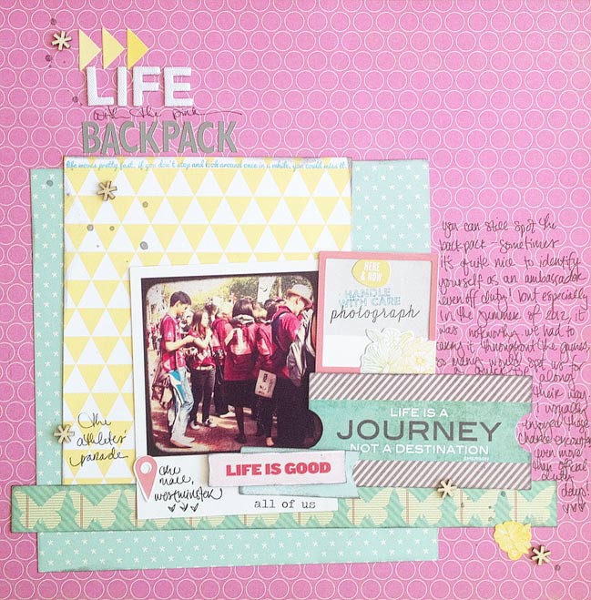
scrapbook page by shimelle laine @ shimelle.com
My finished version includes some of the die-cuts from the Sundrifter pack in the kit – which turns out to include stickers really. There was no mention of that on the packaging that I could see, so I was somewhat surprised. The mistable Thickers can be sprayed to any colour you would like, but I wanted to add a bit more white to lighten the top of the page, so I just used them as they were. I used three of the different sentiments from the stamp set, and the ‘all of us’ below the photo is a rub-on from the Instaframes pack.

This page is a great example of a warm-up. When I’ve taken a little break from scrapping (which in my world is often a couple days, but the same principle works for much longer breaks too), I need something that is simple, colourful, and lets me get all the important elements onto the page without a huge element of creative challenge. I think this is honestly a really important part of my creative process, and it really helps me scrapbook in the morning specifically, as I am not a morning person, but that’s often when my scrapping time is found. Your warm-up page design might be a very different look, but the same concept can apply if you find a design that you love and you could almost put together without looking. Just something to keep in mind. If you get that new paper paralysis, jump in somewhere and remember there is always more pretty paper in your world, so there’s no need to panic if you cut into a sheet that could have been a fabulous 12×12 background. There are plenty more fabulous 12×12 backgrounds, I promise.

A very happy Monday to you, and may the sun be shining at least a little bit in your part of the world! I have a variety of projects to share with you over the next few days with the May Best of Both Worlds kit, and thought we might start with a starting point! As good a place as any, right?


break it down scrapbooking project from shimelle laine
Today also marks the start of a six week scrapbooking project I’m leading at UKScrappers. You can find that project here, including the first prompt and a thread to introduce yourself. There’s no charge to join UKScrappers or to participate in the project. Though the site is certainly about scrapbooking for those in the UK, any scrapper is welcome to join and participate, regardless of where you live. Find all the details about Break It Down at UKS.