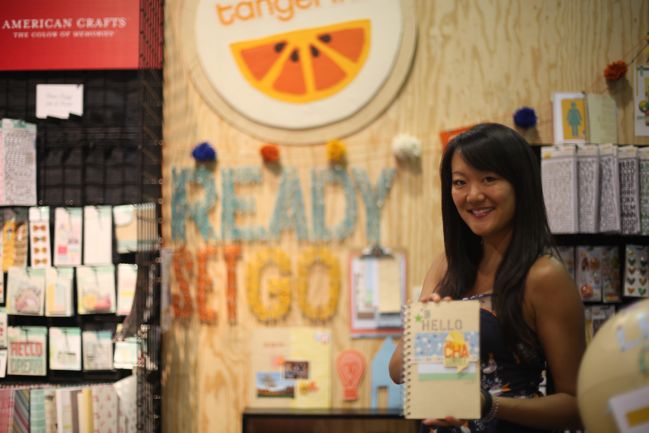
pretty paper. true stories. {and scrapbooking classes with cupcakes.}

lovely to meet you Twitter Facebook Pinterest YouTube

Take a Scrapbooking Class

online scrapbooking classes

Shop Shimelle Products

scrapbook.com simon says stamp shimelle scrapbooking products @ amazon.com shimelle scrapbooking products @ amazon.co.uk

Reading Material

travel

american crafts Category

Scrapbooking Starting Point :: All Smiles wedding scrapbook page

Scrapbooking Starting Point :: All Smiles wedding scrapbook page
scrapbooking starting point
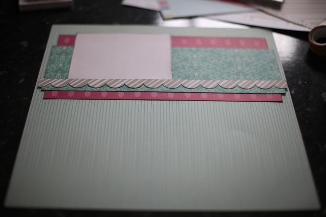
Are you ready to be amazed? I have not completely abandoned starting points! I had just a tiny bit of time to do some just-for-fun scrapping before the moving boxes arrived, so I started with this starting point for a new page: one full sheet of a subtle single-colour patterned paper, like a stripe for the background. Then everything else is arranged on the top third of the page – one 4×11 inch box, one 2.5×11.5, a smaller 4×5 box and a border-punched strip just shy of the full page width. I used my dwindling stash of Garden Cafe for this start – I love all those turquoise tones in that collection from last autumn.

wedding scrapbook page
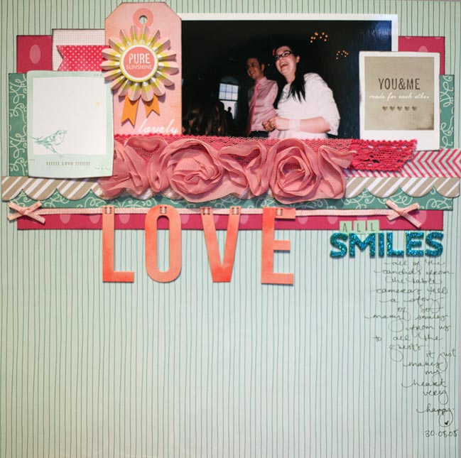
Finished, it looks a bit like this! Some crocheted trim, that lovely rose ribbon from the first Dear Lizzy collection (I’ll admit it: I was afraid to use it and now I’m slightly ashamed that it’s still in my ribbon drawer. It may appear on a few more projects soon to make me feel much better about that situation!) and lots of paper elements from Dear Lizzy Neapolitan and 5th & Frolic (out soon!). Very pink Bella Blvd chevron tape. Plus those turquoise Amy Tangerine letters I’m using on pretty much anything that stands still at the moment.

New to Scrapbook Starting Points? You can find more here.


A farewell blog hop for the American Crafts 2011-2012 scrapbooking team

American Crafts Scrapbooking Blog Hop
Today I officially say farewell to the American Crafts design team, as my term has ended and the new team will spring into action. It’s been such a pleasure to work with these talented ladies and some of my very favourite products on the market. (Hello? I cannot possibly scrapbook without Thickers. You know this.) You can see a variety of projects I’ve created for American Crafts over the past year in these posts.

minibook
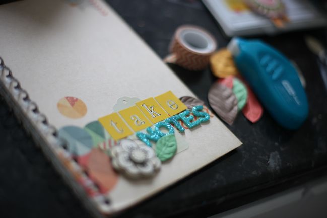
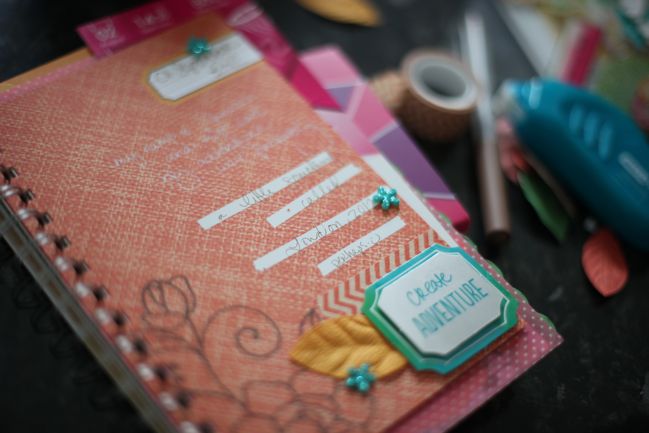
If you’ve just hopped over from Amy Heller’s blog, then welcome! You can find further details about the full hop on the American Crafts blog. For my stop on the hop, I wanted to show you my notebook I’m keeping for Learn Something New, a little project I work on every September. This year I’m really focused on using materials I have and really should use for this project. The sorts of things we buy because we love them, but we don’t get them onto a project straight away so they can sit for quite a while until we forget about them. So an Amy Tangerine daybook is part of that for me. I have one of each daybook Amy has designed. I have used… two. One for a travel mini and one for a personal collection of tickets, notes and daily ephemera. That still leaves me several that need a purpose in life! So I grabbed this one and dressed it up just a bit so it can be my place for thinking on paper for the next thirty days. (And no, it wasn’t complete without washi tape and Thickers. Obviously.)

minibook
I’m not actually using it as a completed minibook for my album. Instead, it’s a bit of a playground for thoughts. It will go everywhere with me for the next thirty days. I’ll use it to answer daily questions from the Learn Something New prompts and to work my way from the goings on of each day to some perfect bit of learning I can take away from that day. Those thirty lessons will be recorded separately somewhere just a bit more dressy. But this is the perfect place to have no fear of making mistakes, crossing things out and thinking things through. That two part process is so very good for my soul. (Definitely worth trying some time if you’re not usually a journal-keeper. These books make it possible to keep a journal for just a short time rather than getting intimidating by something big and formal!)

american crafts design team
Your next stop on the blog hop is Paige Evans, our fearless leader! She’s the hostess at the AC blog and keeps us all in check, which is not always easy with lots of creative people! She kept everything running smoothly this summer even though she delivered a brand new baby in the middle of it! So much appreciation goes to Paige, I tell you. Visit her and hop along to say hello to all the team members in this day of farewell.

AND HOW ABOUT A PRIZE? Leave a comment on this post and one randomly selected commenter will win an American Crafts prize pack. Entries close at the end of next Thursday, and the winner will be posted Friday.

Scrapbooking with the new Amy Tangerine and Dear Lizzy collections

Scrapbooking with the new Amy Tangerine and Dear Lizzy collections
At every trade show, the big question is always Have you seen anything really new? and there’s this assumed ruling that for things to be deemed very successful, there should be some sort of huge innovation on the show floor. Admittedly, every once in a while an innovative product changes the game for papercraft, but the clue is right there in the name: to me, a season’s new releases are successful if there is plenty of paper I can’t wait to use.

By that measure, the new collections that will hit stores over the next six months are definitely a success.

The other thing I try to keep in mind is whether papers will work with what we already have. I don’t want to have more supplies building up because each collection only works on its own. It makes my heart much happier for new collections to work well with things that already exist. Not too similar, but a few colours or motifs that carry over from one thing to the next can make a huge difference in how well the supplies mix. That was my very first question with the two featured designers at American Crafts: would the new Amy Tangerine and Dear Lizzy collections work well with the existing papers. I am here to report very good news.

scrapbook page with amy tangerine supplies
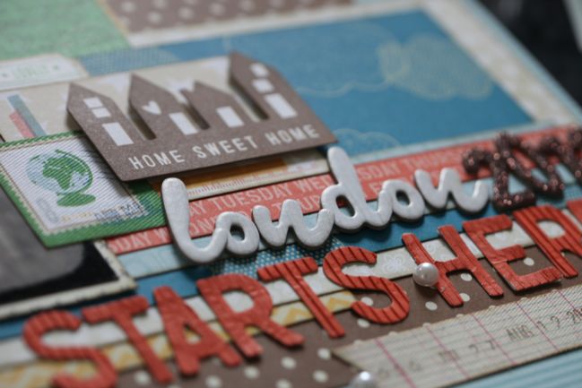
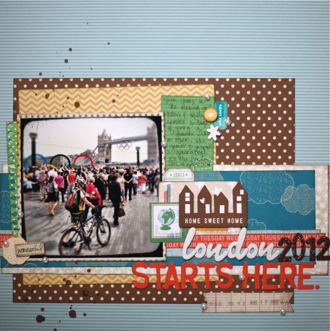
It’s not too early to start my London 2012 album, is it? This is the title page. It’s a mix of all three Amy Tangerine collections – the original eponymous line, last spring’s Sketchbook range and the forthcoming Ready Set Go collection due to hit stores next month. When Amy said she was designing an autumn collection, I wasn’t sure if the colours would blend with the existing lines, but they definitely do. They aren’t the same colours as either of the others, but there’s just enough in common to make it work. The paler blue in the striped background and the camera-printed strip across the middle is actually a great match to the rich blue from the original line, just a less-saturated shade. The brown in the new collection is a good tone match for the brown in the other two collections, and the yellow is slightly different, but it is a little warmer than the original collection and a little cooler than the yellow-orange in Sketchbook, so all three look quite nice together really. The kelly green in Sketchbook is a good match for the green in Ready, Set, Go too. Wow: that’s a lot of colours and shades to compare. But it does work well! Where Sketchbook does have some brighter prints with a shot of neon, it also had a lot of good neutrals – cream-coloured ledgers, black and cream asterisks, black and white cameras… so it can work, even though the initial impression of Sketchbook is a very different look to Ready, Set, Go.

The only things here that aren’t from one of the three Amy lines are the glittery brown Thickers, the brown ink and the white adhesive pearls. Oh… and the date stamp is from Dear Lizzy, bringing us to experiment two!

scrapbook page with dear lizzy supplies
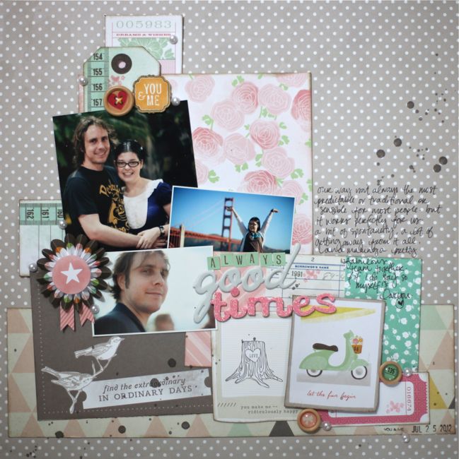
The new collection from Dear Lizzy is called 5th & Frolic, and on first glance it’s a much closer match to the existing lines, especially Neapolitan. But I just have three sheets of paper from 5th & Frolic – I’ll have to wait until the rest hits stores in a couple months – but I summoned all my bravery and cut into all three sheets to give them a try. The grey polka dot background and the rose print here are from Neapolitan, while the triangle print across the bottom, the birds on grey and the set of three cards under the title and writing are from 5th & Frolic, as is the Polaroid-style print with the tree-stump… but the Vespa Polaroid is from Neapolitan. So these definitely have some things in common! I was even able to find a few little pieces I’ve saved from an earlier line, Enchanted, including that little ticket at the very top and near the bottom and the pink Thickers, plus I threw in a tiny heart and flower stamp from the debut Dear Lizzy Spring line. Which means I think the only Dear Lizzy I didn’t cover here was Christmas! Fair enough. Again it’s ink and pearls that aren’t from this line – everything else is Dear Lizzy in some way!

I hope that’s a bit of good news to share just how easily these two new collections will mix with what you might already have on hand. Anything that makes us able to enjoy a new little splurge whilst using what we already purchased is a win in my book! Of course, you still have a little time to work through your existing stash of papers, but these will hit stores pretty soon!

xlovesx

CHA Summer 2012 :: Amy Tangerine

CHA Summer 2012 :: Amy Tangerine
It’s hard to believe Amy Tan launched her first scrapbooking collection with American Crafts just a year ago, but that’s exactly true as her original collection debuted here in Chicago last year. Then she added brighter colours and whiter whites in her sophomore Sketchbook collection last winter and now Amy introduces an autumn colour palette for collection number three: Ready Set Go.
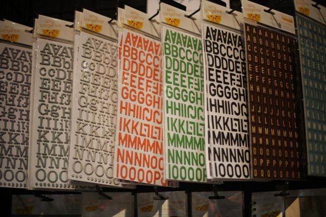
CHA Summer 2012 :: Amy Tangerine
This collection includes bright (but not too bright!) greens, glassy blues and warm yellows all grounded by rich brown tones. Some of the Thickers styles are easy to customise with ink and two come in a new shape – square tiles.
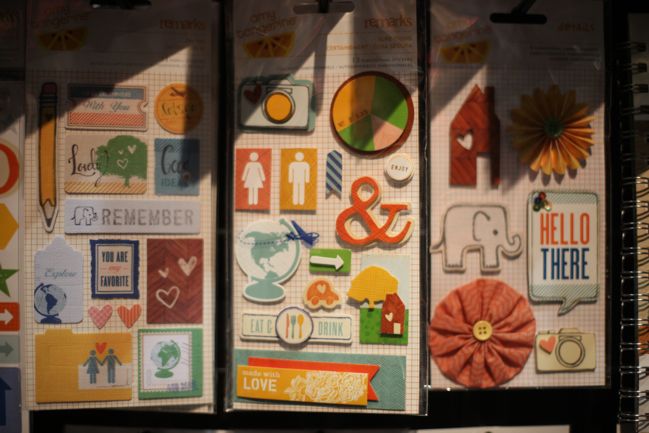
CHA Summer 2012 :: Amy Tangerine
Motifs in this collection include cameras, globes and arrows plus the occasional cheeky elephant. Why not?
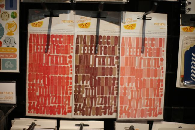
CHA Summer 2012 :: Amy Tangerine
These letter stickers are more than meets the eye: they are sheer! Each card has two colours and they look gorgeous layered over a subtle patterned paper (which shows through) or overlapped to create a darker shade wherever there are two layers of sticker.
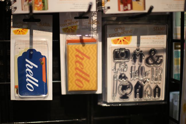
CHA Summer 2012 :: Amy Tangerine
Hello is a big theme throughout!

CHA Summer 2012 :: Amy Tangerine
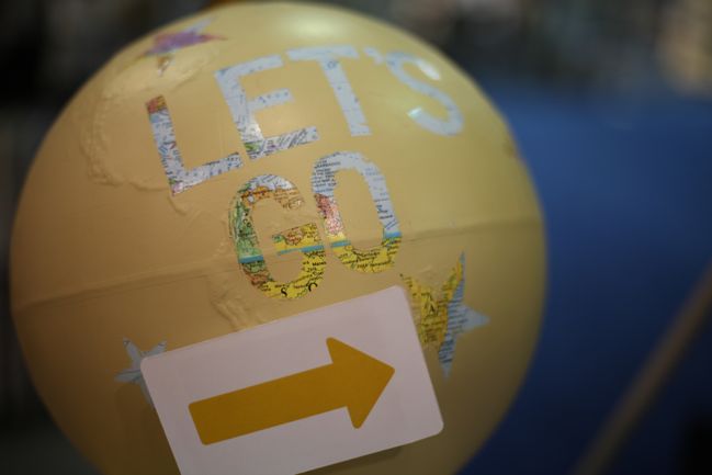
Such perfect DIY elements, with lots of paint and yarn to customise Amy’s displays. Spray-painted globe: check!
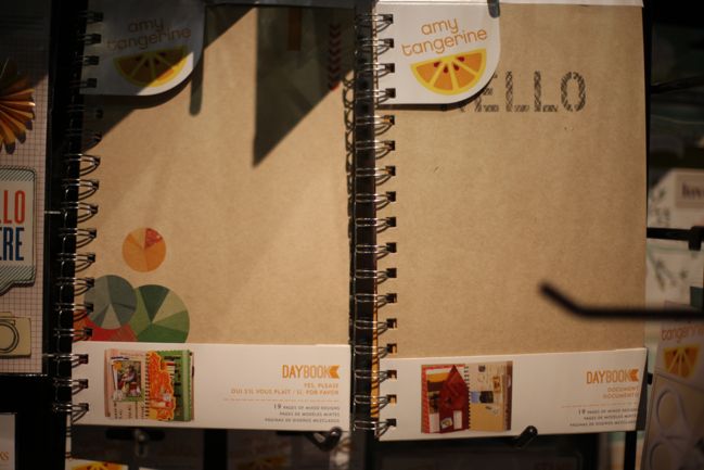
CHA Summer 2012 :: Amy Tangerine
Two new spiral daybooks in the large size, with mixed pages…
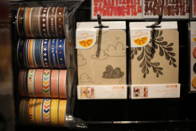
CHA Summer 2012 :: Amy Tangerine
…and stitched daybooks in a new mini size, with matching pages. (Plus a big ribbon value pack at the left.)
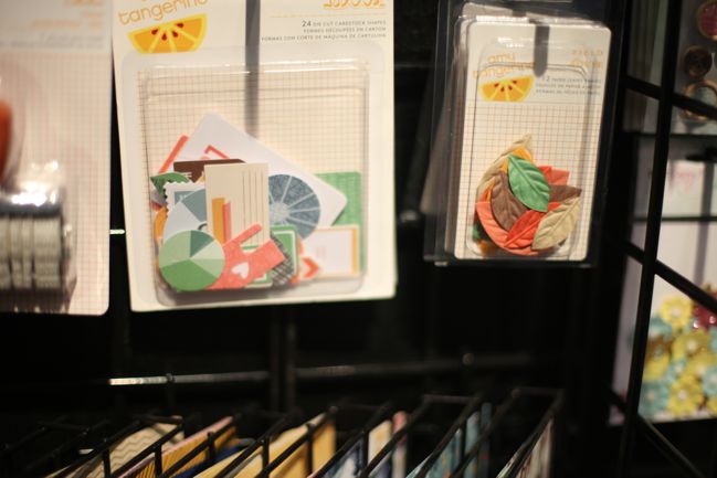
CHA Summer 2012 :: Amy Tangerine
The die-cut pack has so many versatile shapes, and the leaves from the first collection are back in the new colours, and possibly just slightly smaller. Could be my imagination. Not my imagination that I really liked using these when they came out in the first collection. I used two whole packs!
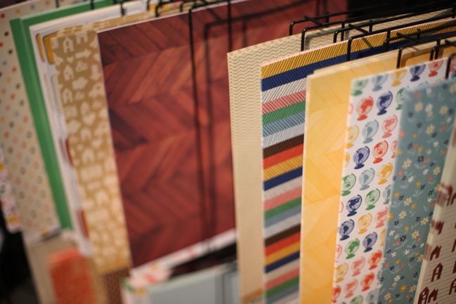
CHA Summer 2012 :: Amy Tangerine
Onto the papers, my favourites include the parquet flooring, the spinning globes…
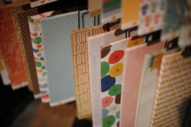
CHA Summer 2012 :: Amy Tangerine
and the LOVE LOVE LOVE print of white ink on kraft. It makes me sing Beatles’ songs and recite lines about Blue Meanies. I’m not sure if that’s intentional or just a coincidental side effect.
CHA Summer 2012 :: Amy Tangerine
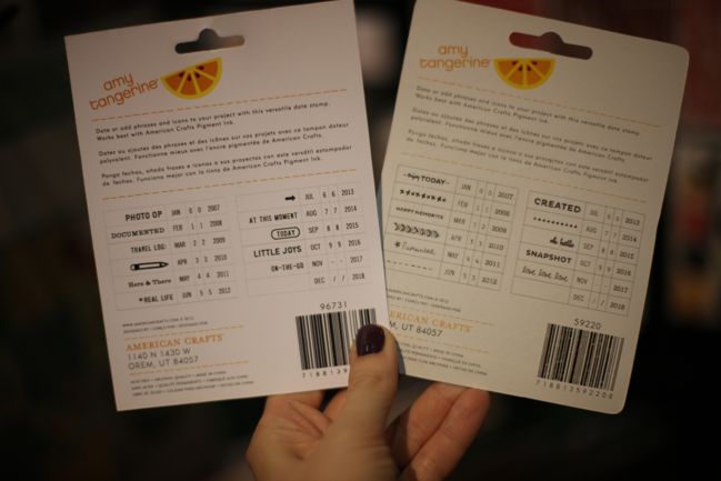
Not one but TWO date stamps in this collection, and the years go back to 2007! Huzzah. I am forever putting my Dear Lizzy date stamps away when I remember the photos predate the rolling date stamp. (There are a bunch of new date stamps from the American Crafts family of brands. Like half a dozen new date stamps. Everyone needs six more, right? If a little is good, a lot must be better!)
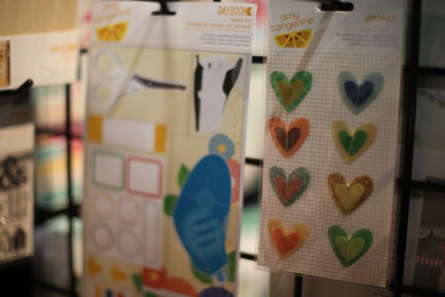
CHA Summer 2012 :: Amy Tangerine
On the left, a product very near and dear to Amy’s heart: a travel scrapping kit that includes all the basic tools and necessities in a perfectly sized zip pouch. On the right, beautiful layered heart embellishments with vellum and stitching.
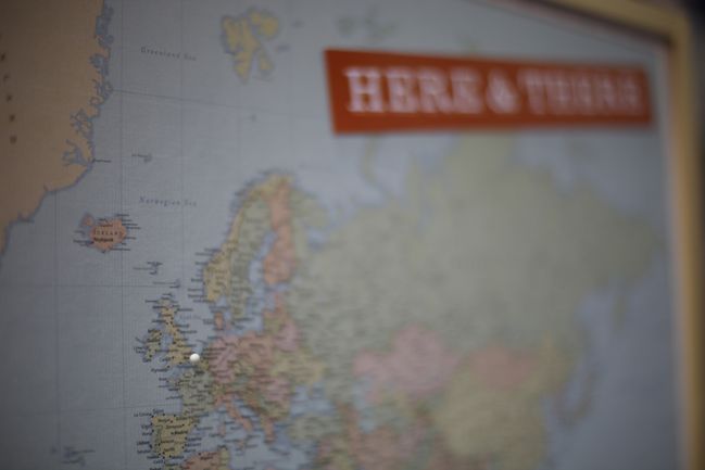
CHA Summer 2012 :: Amy Tangerine
As you left Amy’s booth, you could pin the map with your location. I got to pin a new space on the board, which was very exciting! (I share this because it might be a good idea for scrapping your own travels – add mini brads or other markings to a map patterned paper as a background design element, perhaps!)

Really looking forward to working with this range, and planning an update soon of how these products mix and match with the two existing collections – always one of my favourite things to try with signature style collections like this.

Click here to shop for Amy Tangerine products.

Introducing Amy Tangerine's new scrapbooking collection :: Ready Set Go!

Introducing Amy Tangerine's new scrapbooking collection :: Ready Set Go!
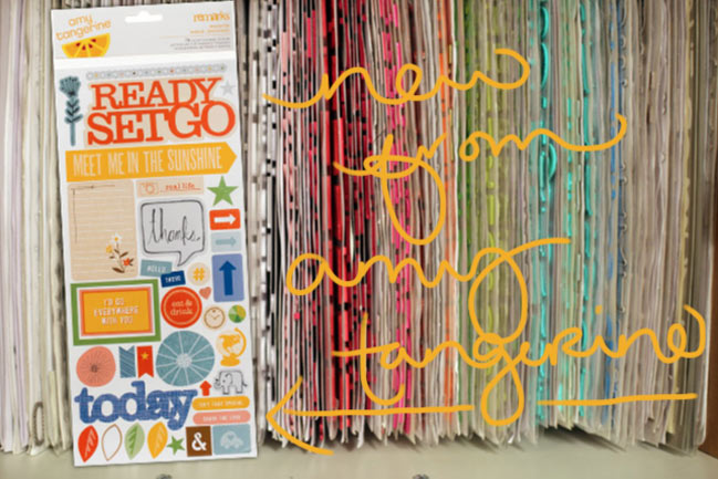
new stickers from amy tangerine
It’s not long now till the summer CHA trade show, where this year’s autumn, winter and Christmas lines debut to retailers, and with that comes a few sneak peeks at what we can expect to see in stores throughout the rest of the year. As a big fan of her first two collections, I’m very excited to see the new autumn collection by Amy Tangerine for American Crafts, and the name has me hooked already: Ready Set Go! Bring on the globes and arrows and catchy travel/life phrases!

Here’s a little look at the Remarks sticker sheet for Ready Set Go, and you can get an idea for the colours of this new collection. Reds and warm yellows, with pops of blue and pink, making me think it will be quite versatile for scrapping photos of boys or girls and possibly even more importantly, it will look fabulous with kraft cardstock. That little ‘real life’ camera sticker kills me – love it!

ready set go :: amy tangerine and american crafts
Today you can hop around a few scrapping blogs to get a look at this new collection, piece by piece… and you might even win something. Once you hop through all the sneak peeks, you can enter at both Amy’s blog and the American Crafts blog for two chances to win the full line of Ready Set Go scrapbooking goodness. Your next stop on the hop is the lovely Kelly Purkey so go see what she has to share today!

And while you’re here, what new things are you hoping to see from your favourite scrapbooking brands? I’ll be attending the show and bringing you my tour of all the booths and new products, so you can mark your calendar if you like! CHA starts on the seventeenth of this month!

xlovesx

True Scrap 3 :: Now available as individual classes

true scrap 3 online scrapbooking classes
scrapbook page detail
Last spring I shared my workshop for getting the most out of a collection pack with the crowd at True Scrap 3 – which is always great fun and a sort of online scrapbooking convention with so many different classes and ideas to take in. I know the whole shebang is a rather big purchase and not everyone’s style, so if you really fancied just a few classes, then now is the time for you! All the True Scrap 3 classes are now available individually.

My workshop, The Perfect Collection, is all about taking one collection pack and using it until it’s all gone – and I walk you through my process for making a full album from a collection pack. The video is just shy of forty minutes, plus there is a PDF with cutting guide diagrams and pictures of how those pieces of paper became the finished scrapbook pages. Other workshops available cover all sorts of topics, from embellishment and page design to writing, photography, creativity, stamping, symbolism, Project Life, digital and hybrid crafting and mixed media art techniques. You can sign up for any number of classes you like.

There are two ways to sign up for my True Scrap 3 class, The Perfect Collection. You can purchase it here at the True Scrap site. This includes quick access to the class and allows you to pick out additional classes from other teachers at the event. Or you can purchase it directly from me using the button below. This method only works for my class, gives you access within twenty-four hours from purchase and is handy if you want to add this class to your account at shimelle.com with other classes you have taken here. The price is the same at both sites, so you can simply pick the option that is best for you. From now until the 7th of July, individual classes from True Scrap 3 are $9.99. After that they will remain available, but the price will go up to $12.95. (That’s in US dollars. To give you an estimate in British pounds, that’s £6.40 today, increasing to £8.30 on the 8th of July. The payment will automatically exchange the currency for you at the rate of exchange for the time of your purchase, so it may change slightly of course.)


(Clicking this button will only let you purchase this class and it will be added to your shimelle.com account within twenty-four hours. If you would like quicker access or to shop for multiple classes, please use this link to shop at True Scrap.)

scrapbook page
In other news, American Crafts just published a tutorial of my minibook using 4×6 photos and the new Shoreline collection. Find it here.

xlovesx

Three Sketches for Handmade Cards

three sketches for handmade cards
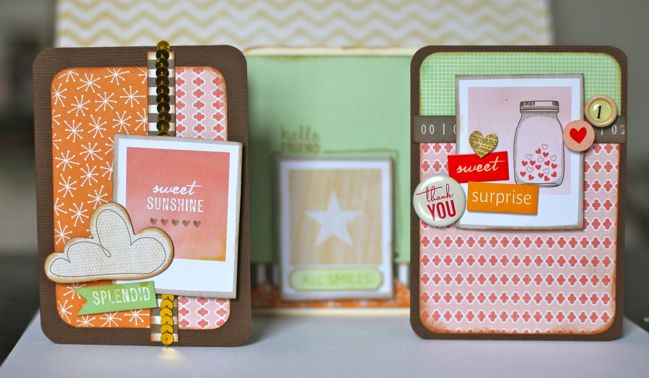
three handmade cards
Oh I do love a good patterned paper that can be cut into pieces and used for pretty much anything. Like the dreamy days paper in the Dear Lizzy Neapolitan collection, which has plenty of little Polaroid-style frames, each with something different in the centre. There are also a few in the chipboard pack, but with the sheet of paper there are so many just for the sheet of a single piece of paper, so that wins my vote. So when American Crafts asked me to come up with a way to use one of their products for a series of different handmade cards, they probably expected me to pick a pack of embellishments or a 6×6 paper pad or a sticker book. Instead I chose that single sheet of paper. Whatever works, right?

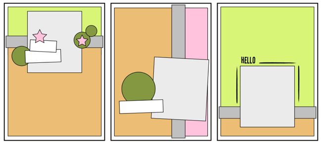
sketches for cardmaking
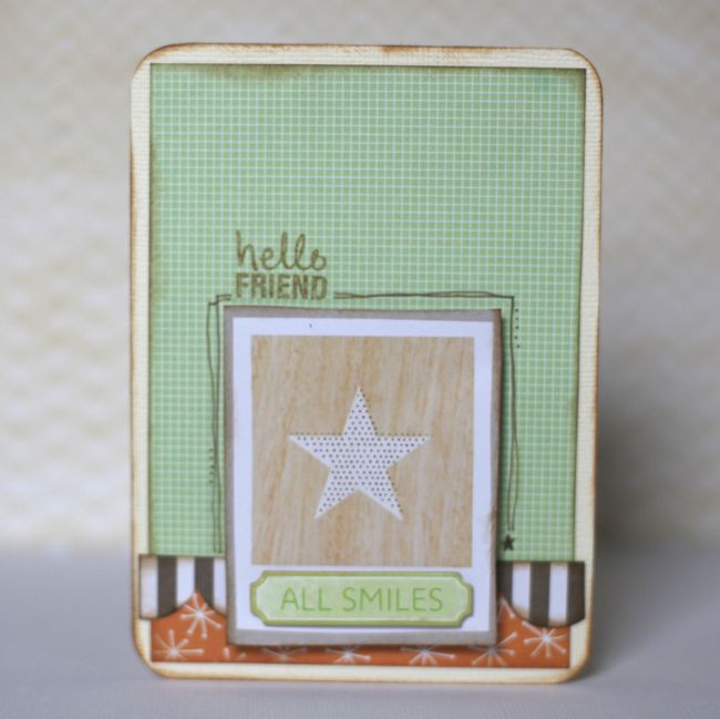
Here’s my answer to three cards that would be similar in design but each unique: each one uses that not-quite-a-square rectangle as a central feature, then has a different arrangement of other papers and embellishments. I used Neapolitan for all these cards, but you could certainly use the same sketches with plenty of other collections.

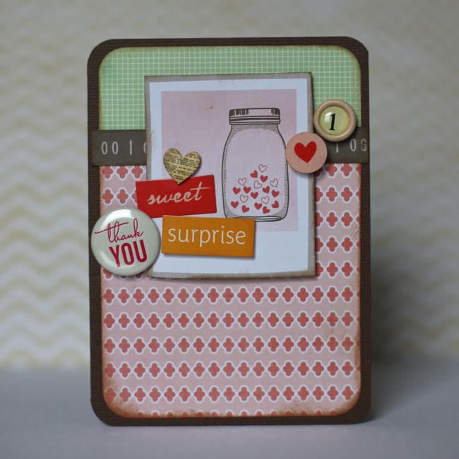
handmade thank you card
For this one, the repetition of circle embellishments, plus some little heart motifs and word blocks. If you like the idea of more scattered-yet-small embellishments, you might like this post from May Flaum, by the way. She uses sequins and I’m looking forward to giving her tips a try.

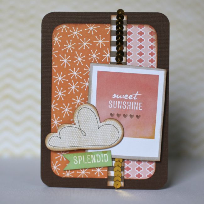
handmade card
Speaking of sequins! These come on the ribbon card in the Neapolitan collection. And a chipboard piece adds texture and dimension. Plus this card is a flash to create, so a great sketch to keep handy for emergency cards!

handmade card
And something a bit more plain that can be easily worked to be more masculine than the other two or just less embellished for a recipient who is a bit no-nonsense! That greeting stamp is from one of the Amy Tangerine collections and works great for non-specific cards.

Any favourite cards you’ve made recently? Or do you have a patterned paper you love cutting into pieces to make all sorts of goodies? I’d love to hear!

xlovesx

Scrapbooking Starting Point :: Hard Rock Birthday Cake

scrapbooking starting point
scrapbooking starting point :: american crafts gardenia
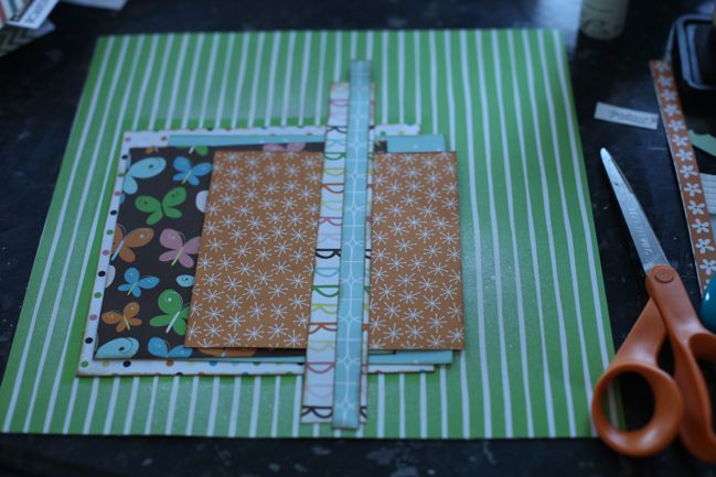
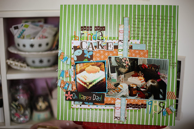
Happy Monday! How about a new scrapbooking starting point to start a crafty week? This week I started with the Gardenia collection and cut a bunch of squares from patterned paper, each a half-inch smaller than the previous. The white polka-dot print is 7×7” and then smaller from there. Plus an extra layer in the background: I cut a 7.5” square from plain typing paper and used that as a mask to spray white mist onto the green striped background. Then there are two vertical elements – one is the branding strip from one of the patterned papers I had already used and the other is an off-cut of the b-side of one of those papers. So surprise surprise: another layout that could come together with scraps!

scrapbook page
I finished my page with letter stickers and a tag from the Gardenia collection, plus some Amy Tangerine washi tape, tiny letter stickers from My Little Shoebox and gems by Queen & Co. The tiny banner pieces are actually the ribbon portion of this rosette punch by Jenni Bowlin for Fiskars. I just punched it from the little pieces left over by my trimmer and then used a zillion tiny pop dots to put them all in place, and topped them with a bit of baker’s twine.

I actually had both of these photos as 4×6 prints but they are originals and I don’t have the negatives, but things just didn’t work with the cake picture at the 4×6 size, and although the other shot is quite busy, I loved all the little bits and pieces that were in the photo, so I didn’t want to crop that. So I took a picture of the cake photo with my phone and processed it with the Camera+ app so I could get a good balance of quality plus the retro feel and then printed it at 3×3, which was a better size for all things concerned, and no original photos were harmed! (By the way, something you might appreciate in the busier photo: obviously there is cake and ice cream, but there are also birthday presents, cards and some dollar bills that I presume came from the cards… and that week’s sale ad for the local craft store. I think I was actually planning where to go spend my birthday money before we had even had cake and ice cream!)

A note about the writing: this has been coming up in various comments often recently – what exactly do I write about if things are pretty obvious in the picture? Nothing in the writing here says anything like ‘this is my twelfth birthday and we had a family party at my grandparents’ house with cake and ice cream’. It doesn’t need to say that, because that is obvious. I am really, really not a who-what-when-where-why writer. I mean, I understand what those concepts are and that they are basically what is important in creating a timeline of events, sure. That is the sort of thing I want to see in a news report, and I want the most important things to come first, filtering down to the lesser important parts of the news story and so forth. But my scrapbooks are not a newspaper. I reserve the right to ignore those basic keys of journalism. I reserve the right to ramble. I reserve the right to talk about things that are only slightly in the picture or possibly not in the picture at all. I reserve the right to put the most important thing at the end, and maybe even create a little suspense along the way to get there. That’s the kind of writing I enjoy. Journaling is not a task for me. It is an indulgence.

This week, I’m going to work on explaining my thoughts on scrapbook writing a little more each day, but I’ll start with this layout. Although it doesn’t contain the obvious bits about what birthday and where I am, it does explain something that could otherwise be quite a mystery in the photos: why on earth was my birthday cake shaped like a drive-in burger joint with a sign reading ‘Spring Hill Hard Rock Cafe’? And the truth is from around age ten or so, I was strangely fascinated by the very idea of the Hard Rock Cafe. I had never been to one, nor even been near one to my knowledge. I had no idea what was inside such a cafe. But whenever I saw someone with a Hard Rock Cafe shirt, I thought they were completely glamorous and probably a worldwide adventurer with page after page of stamps in their passport. Of course, if you remember the sheer volume of Hard Rock Cafe shirts in the late eighties and early nineties, you will no doubt be completely aware that there was absolutely zero glamour involved in these shirts. But alas, I was a kid and I was convinced. So word got around and my souvenir from family and friends who did venture out of Kansas often became a Hard Rock Cafe t-shirt. I think I owned about a dozen of them at one point, despite never going to one myself. And so my grandparents created this birthday cake as a team effort I think – constructing a cafe out of cake and marshmallows and making a sign to label it as the very own Hard Rock Cafe of the tiny little town where I lived.

And I’m so much happier to have recorded that in my album rather than just ‘this is my twelfth birthday and we had a family party at my grandparents’ house with cake and ice cream’. It is not from ‘news in brief’ and in truth is newsworthy in no one’s life but my very own, but that is what makes it valuable to me. I hope that makes a little sense. But also, the story of my Hard Rock Cafe love is not something that is difficult to tell. It’s just the idea of looking at all the details and remembering that stage of life and thinking what is really worth telling about that. Other things I could have written on the very same page include the detail about spending my birthday money on craft supplies or an explanation of why I’m wearing something different in nearly every photo from that day, as I would want to try on each new outfit before opening the next gift. But for now, the Hard Rock Cafe will do.

I promise I eventually made it to a real Hard Rock. I was twenty and on spring break in Las Vegas (which is as ridiculous as it seems as Vegas is very much a twenty-one-and-over town). I ate a ridiculously overpriced veggie burger and sat next to a collection of Michael Jackson action figures. And did not buy a t-shirt.

scrapbook pages
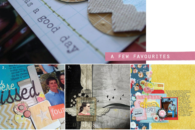
Here are a few of my favourites from last week’s starting point. Go take a closer look and say hello to these four scrappers: 1. Nancy. 2. Jennifer. 3. Lehtipollo. 4. Daphne.

Should you like to give this starting point a try, I would love for you to share! And of course you can write whatever suits you and your page. Of course!