CHA Winter 2012 :: BasicGrey

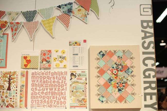
After staying home from the summer show, I was intrigued to see what BasicGrey would bring on their return to the show floor. And I’ll just say they brought the good stuff. Four lines releasing this spring – look for two in stores in February and the other two in April – and I’ll warn you from the beginning: these collections are about looking past the obvious and seeing the amazing.
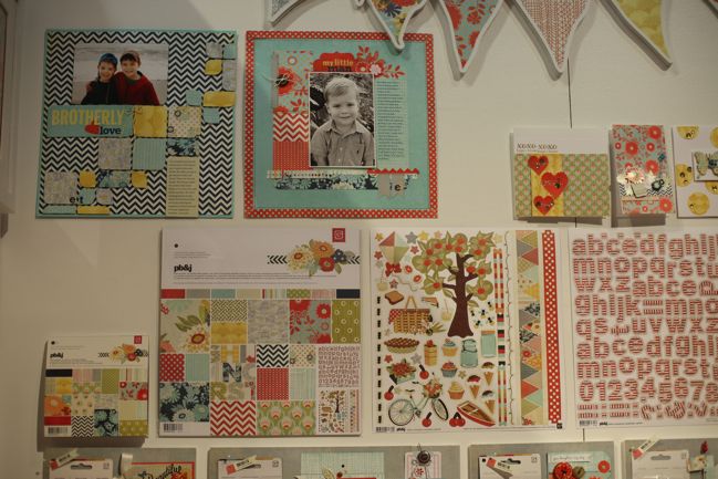
First up is PB&J, which I would say is the most traditional of the four collections. Lots of red and blue and summer colours and motifs. Bunting, bicycles and chevron – all popular and versatile. Of course there are plenty of papers and a range of embellishments. Take a look:
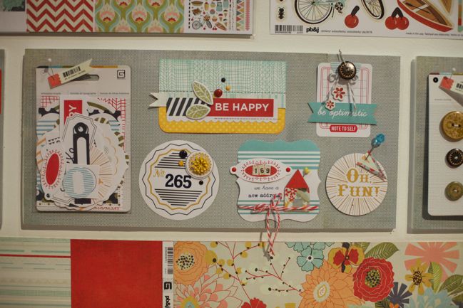
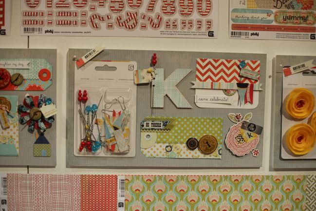
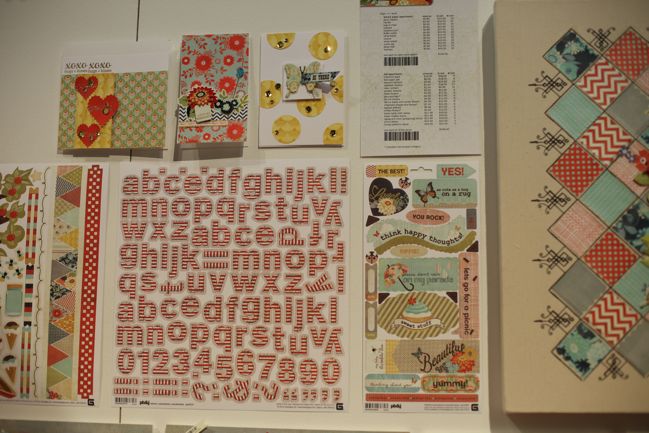
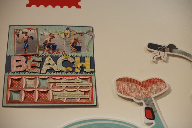
Love those big patterned letters!
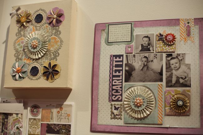
Then we have something softer: Plumeria. BasicGrey is one of a very few companies that make purple tones work, and I think it’s because their papers give you the option of using lots or a little of purple while still having the feel of the collection.
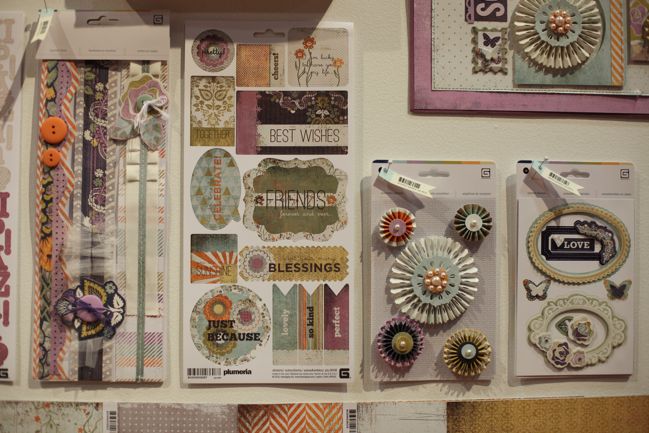
Those detailed rosettes are an extra-pretty twist on the pinwheel trend.
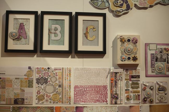
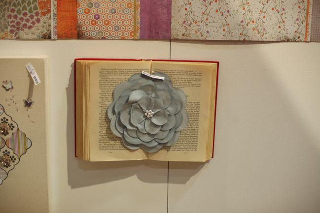
These gorgeous blossoms are BIG and come in a few colours. But I don’t know where they would be prettier than here on a book!
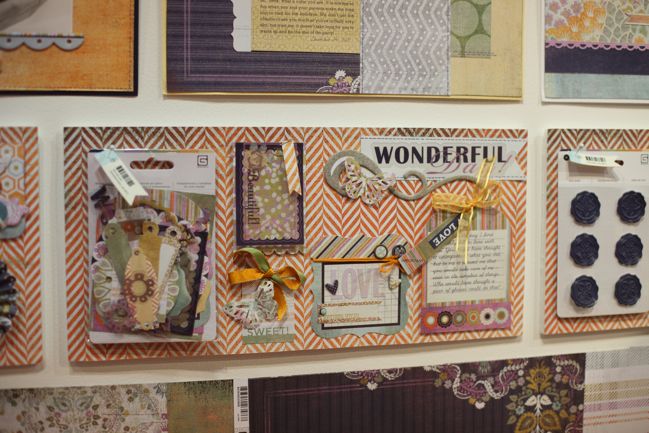
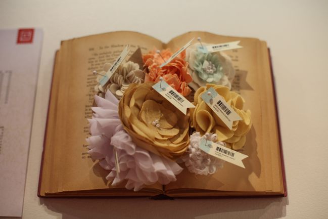
Plenty of smaller (but still significant) flowers in this collection too.
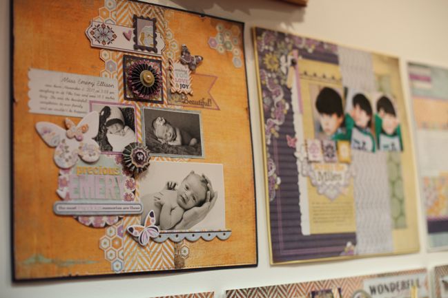
I love this layout – and it shows that it-doesn’t-have-to-be-really-purple idea too. (But also the booth was busy so forgive the crazy angle to this picture!)
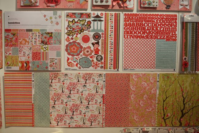
Konnichiwa will hit stores very soon with this burst of happy pink. It does have Japanese-themed motifs, but not a single example project included photos from or about Japan in any way, going to show you have to look past the obvious and onto the creative potential. I love this line.
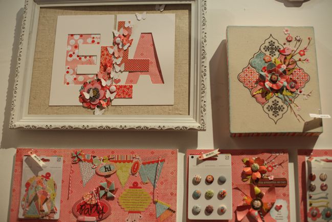
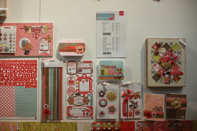
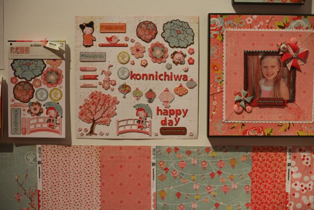
As someone who gets so excited when the cherry blossom trees are in bloom, the pink floral pieces in this line make me very happy. They don’t have to be about Japan – but they do feel very much about spring to me. And delicate prettiness. But all approached in a way that isn’t overly dramatic, serious florals. This is light-hearted and energetic and doesn’t feel old (but isn’t too cartoony either).
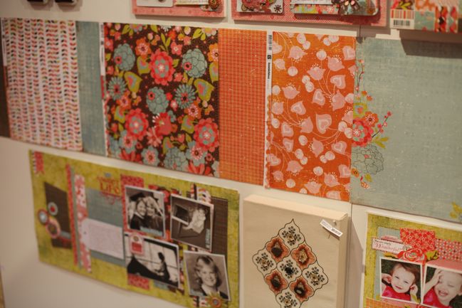
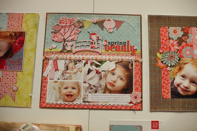
Gorgeous page from the BasicGrey team.
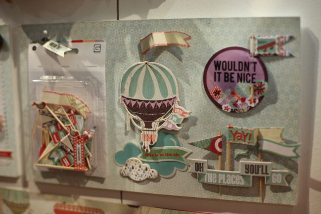
And the final April release – What’s Up! Again, look past that gut instinct of What do I scrapbook with hot air balloons from the 1937 World’s Fair? and onto the good stuff: How can I use clouds and balloons as a metaphor for good things, flying hight and happy times?
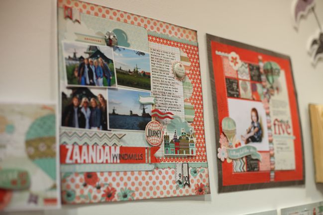
I thought these two layouts were interesting because without them I hadn’t really noticed the infusion of red in this collection. But it’s definitely there!
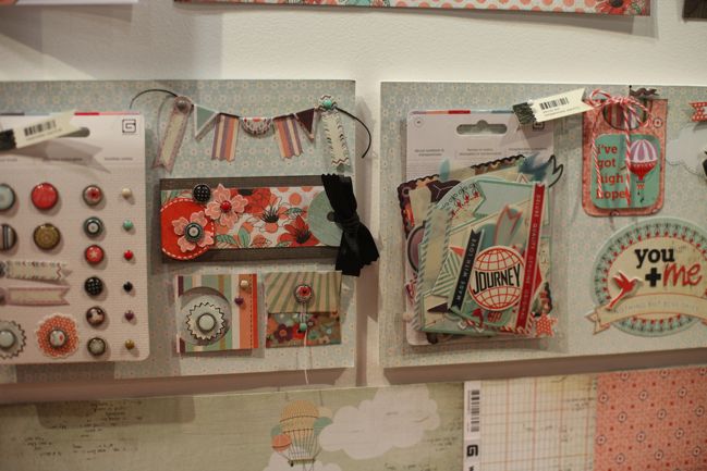
I think this line is going to mix and match beautifully with the new line from Rhonna Farrer for My Mind’s Eye – I’ll show that to you soon!
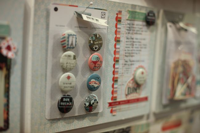
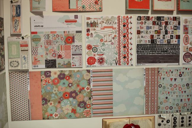
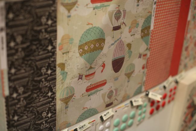
Maybe this is an odd-ball call, but I think I will use every little bit of the What’s Up collection pack. It’s a good mix of less quirky, easy-to-use patterns with some bold statement prints thrown in to keep crafters courageous. Sounds like BasicGrey are totally in the game.
Click here to shop for BasicGrey products.
If you are attending the show, find BasicGrey at booth 1757.
Tonight I’ll be doing a one hour live chat to wrap up the show (though I still have plenty to post here with pictures!) at 7pm CST/5pm PST. When it’s live, I’ll post a link on Twitter and Facebook. Or just head to the CHA board at Two Peas if that’s easier.
And now – back to the show for the final day!
![]() Read more about:
Read more about:
Next post: CHA Winter 2012 :: My Mind's Eye
Previous post: CHA Winter 2012 :: Lily Bee Studio


