Layout ideas to stretch your scrapbooking supplies

I’m convinced that whether you have a tiny stash of crafting supplies or a whole room filled with so much paper you’re not sure how you’ll ever use it all, there is a certain satisfaction that comes from stretching our scrapbooking supplies and getting plenty of projects without a refuel. Right? Whether you’re a fan of getting a monthly kit or like me, you like to choose your own supplies to make sure you love everything in the mix, stretching your supplies to multiple layouts can help you get the most for your crafting budget and also help avoid the ongoing struggle of how to practically store all those half-used sheets of patterned paper. Plus it’s a great way to be productive when scrapping with friends, if you find the conversation distracts you from remembering the great plans you had for your scrapbook pages — though that could just me with that problem!
I have four formulas that I love for taking one set of supplies and making a variety of different layouts without needing to unpack any extras. I started with three sheets of cardstock, six sheets of patterned paper, one set of Thickers letter stickers, one sheet of themed stickers and a small selection of journaling cards, adhesive gems and a tiny bit of ribbon. For tools, I added a border punch, a mask (like a stencil, but in negative) and spray ink to the usual line up of paper trimmer, scissors, adhesive and black journaling pen. All the papers are older designs that had been sitting in my stash – I loved the designs but it was time the went from the shelf to the scrapbook, I do believe!
With all that ready to go, I sat down to create four scrapbook pages using easy formulas – all designs you could reinvent with your own style.
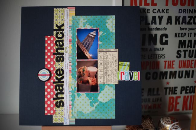
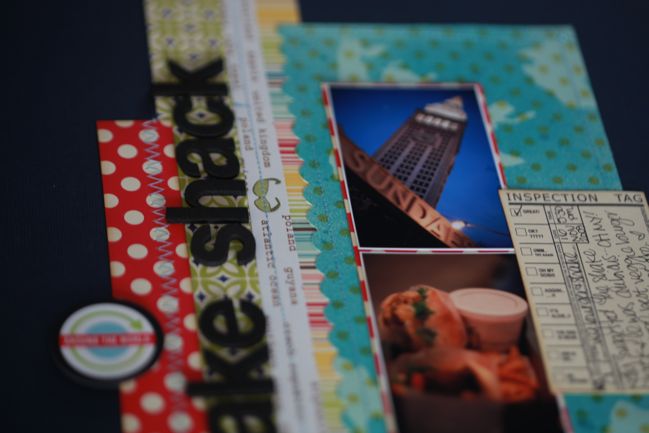
The first formula is Several Strips. It’s just as simple as that really: start with a sheet of cardstock as the background and cut strips of several patterned papers. Trim them into different lengths and overlap them in a group in the middle of the page. One one half of the page, add your photos and journaling; on the other add the title. I love vertical titles for something just a little different, and easy-to-read fonts help them work. And for the record? Shake Shack in NYC serves the best veggie burger possibly ever. Sigh.
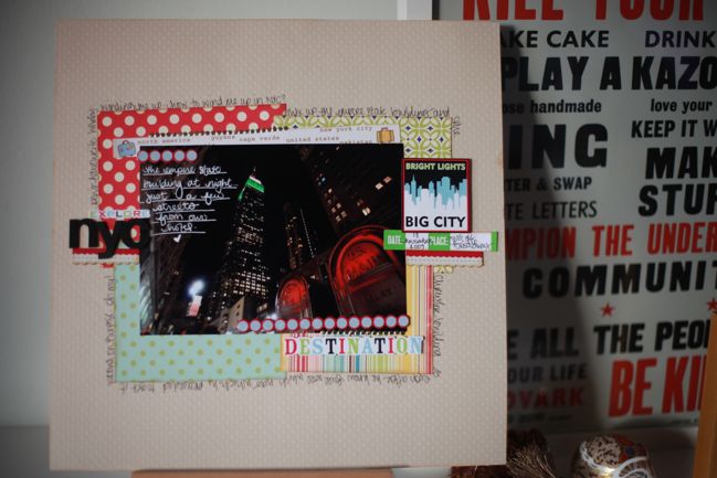
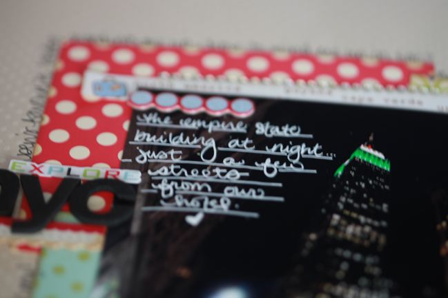
For one photo, 4×6 or larger, I move away from the strips to go for a Bunch of Blocks. I love scrapbooking with quadrants but sometimes that’s a little too formal or I want to use a bit less of each patterned paper. So for this look, the size of each block is less important, since they will be a bit more haphazard than the equally spaced quadrants. Overlap all the blocks and place the photo on top of the pile. The edge of the patterned papers gives you room to journal and it’s easy to add just a bit of embellishment in three spots around to the photo to hit a balance of look-at-the-photo-but-appreciate-the-crafty. And I love white ink on a dark photo too!
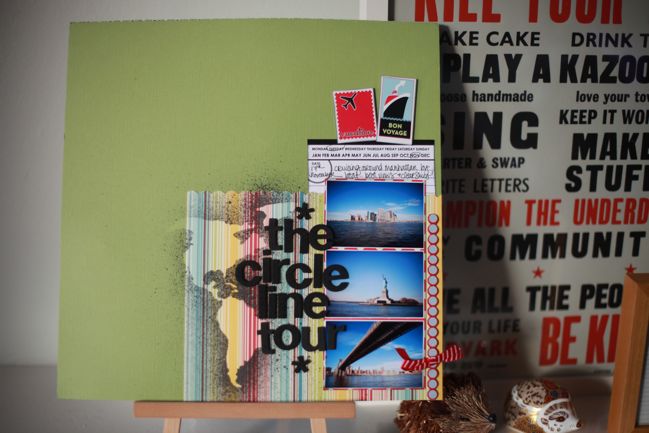
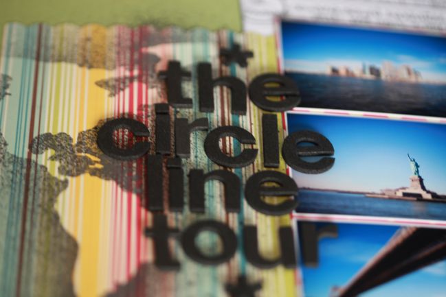
If you have three photos – especially printed at a small size – you can stack them up to create a Totem Pole. Just think of how a totem pole is designed: several figures, roughly the same size, stacked on top of one another, with some sort of extra flourish at the top, and usually something somewhere on the sides. So stack up the photos by placing them in a column, and your flourishes can be a title on the side and a journaling card and accents at the top! I like to anchor the totem pole design by placing it in the corner of the page, and use the mask and ink on this page to go just over the edge of the patterned paper so everything sat just right on the cardstock background.
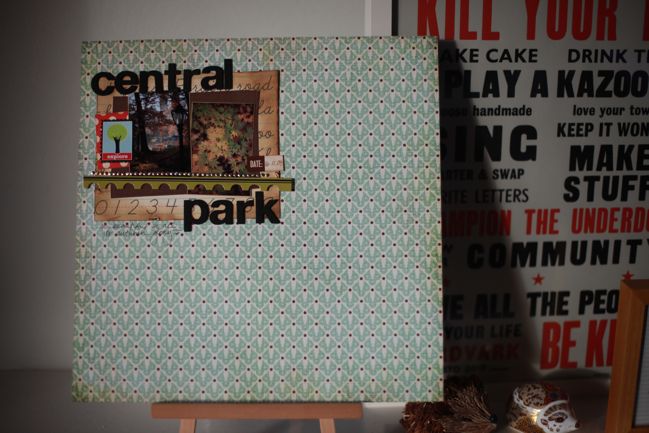
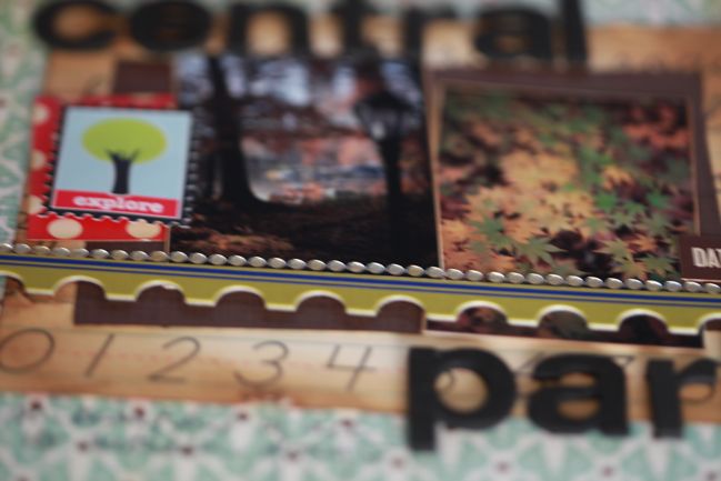
As for the last page? Now concentrate. Layouts with a concentrated design style always help to stretch your supplies, because they simply don’t need as many things to be added before you call it done. This is the only layout I didn’t start on a plain cardstock background: instead, I chose my favourite pattern from the six sheets and kept it as a whole sheet, then chose one quarter of the page as the scrapping canvas and just left the rest of the page alone. Admittedly, concentrated designs are a bit of a love/hate issue perhaps – but if you’ve never given it a shot, you might be surprised with the variety they can add to your albums. I wouldn’t want every page to be so sparse but i love the look just now and then.
One last little suggestion: I find it easiest to stretch one set of supplies to multiple pages when the photos have something in common, so the theme looks like a choice rather than turning the pages of my albums and suddenly thinking ‘Oh, and I made all these pages when that paper collection came out’. These photos are all from a trip to New York on the way home for Thanksgiving 2009. These four layouts used the majority of the supplies I started with, but I have some scraps left over so I can carry those into other layouts from that same trip perhaps – and stretch the scraps even further.
Okay, so now I’m curious: what’s your opinion on stretching one set of supplies? Do you love the look you get over multiple pages from one kit of supplies (either purchased as a kit or assembled from your own stash collection) or do you prefer that every page in your albums have a different combination? Like it’s okay for the red polka dot paper to appear on more than one layout, but the next time you used it, it would be with other papers entirely? Is it something you actively think about when you scrap? Ooooh… discussion time! Let me know what you think.
xlovesx
![]() Read more about:
Read more about:
Next post: Scrapbooking giveaway day
Previous post: Travel Notes from Thailand's Ancient City


