Another week in the Project Life Baby Book
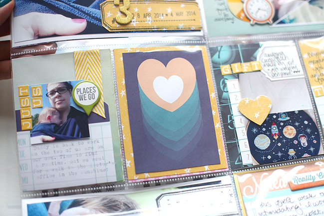
Keeping with that idea of choosing two colours per week for Wonder Boy’s album, week three is blue and yellow. I started with the Dreamy collection from WRMK, which I think may be exclusive to Target. I picked it up there when I was at CHA and searching online, I don’t seem to see it in stock at any specialist scrapbook stores. It caught my eye because the colours weren’t particularly girly, but it wasn’t the standard baby blue either. Not that it’s baby themed in anyway, but it just seemed like a versatile set with a different colour scheme to my usual.

I knew when it came to scrapping this week, I would want to beat myself up about the photos, but I think I waited long enough to just have a bit of perspective about it. By this point in Wonder Boy’s life, he had plenty of energy, and I was trying to keep up with him but I was nowhere near back to health. I think I was only just starting to process what had happened, because although I knew our labour experience looked rather scary on paper, it felt relatively calm and collected. Just getting from one hour to the next kept me from realising how much strength I had really lost, and it just caught up with me. The evidence is how someone who photographs seemingly everything took remarkably few photos in this third week of Wonder Boy’s life. These things happen! This resulted in a week wherein the entire right side is just from the weekend, and indeed all but one photo there is from Saturday. As that was his first big night out, I think that really worked out okay in the space, and this week can just be a reminder to me that I’d like to take a few more shots of the everyday too.
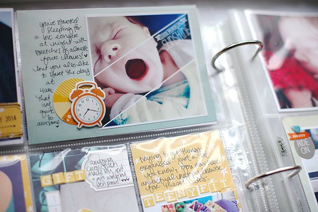
That divided photo was the result of some tinkering with the Fuzel app on the iPhone. It has all sorts of templates (some plain squares and rectangles, some filled with fancier shapes) so I just picked one and filled it with my photos. To get the split image effect, I needed three copies of the photo in my library, so I edited it slightly to have a different colour cast to each section of the image. I’m not sure it’s a look I would use as a highlighted photo on a 12×12 page, but with so many photos going into this album, I like the idea of worrying a bit less and giving new things a whirl. The white text on the images on the right hand side was also done in the Fuzel app, under the ‘stickers’ tab.
Thanks for taking a look!
![]() Read more about:
Read more about:
Next post: The Shimelle collection from American Crafts is now available at...
Previous post: My first project with the Shimelle collection!


