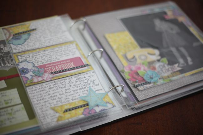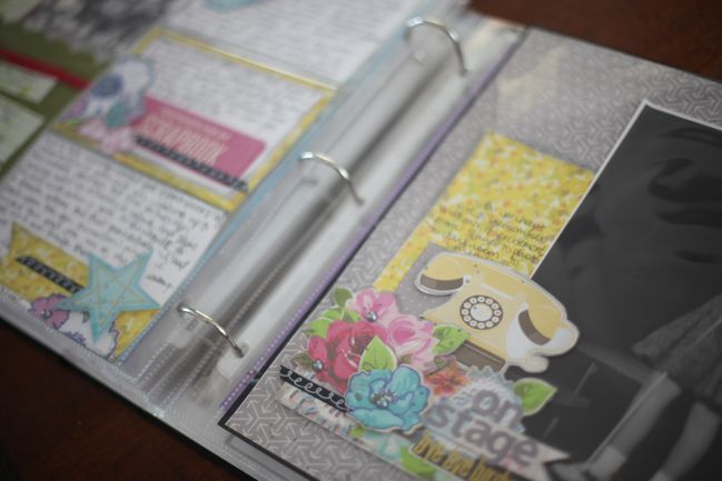
After the discussion of albums in two recent posts (here and here), this particular album became the topic of several discussions over the past week. I’ve said I don’t create in chronological order but I do store my pages in chronological order in albums, and that I have yearly albums (and often multiple volumes per year) for my scrapbooks from the year 2004 to the present. But what about older photos that predate 2004? And how does it affect the look of an album if the pages are created many years apart?
I do keep pages that predate 2004 in chronological order, in an album titled ‘The Early Years’. It’s certainly not everything pre-2004, but rather some highlights from growing up. Some pages are very new, others are ten (or more) years old. I haven’t added all of my old pages here nor is it the only album that has pre-2004 photos, but it is an album I’m happy to share with anyone who would want to have a look at something other than our yearly albums. I’m actually at the point where I’m going to split this album into two volumes, so before I added half of these pages to their new home, I photographed the whole album in order so you can see how it all ends up together. Heads up: there are a lot of photos in this post! You can also scroll down to the end for the answers to questions that came up in the comments.
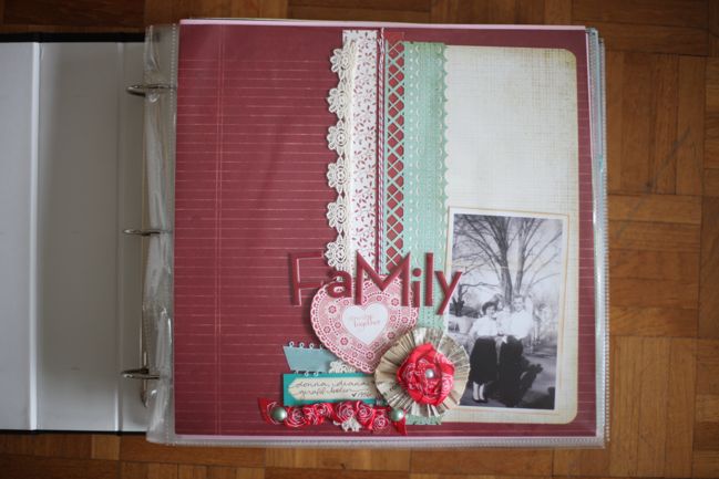
The page above starts the album and it’s not really a title page – it’s there because it’s in chronological order. I’ve only scrapbooked a few layouts with photos that predate me, and this is one and it’s a single page. So it became the first page in the album, at least for now. I made this layout in early 2010. (That photo is grandparents and my mum as a baby.)
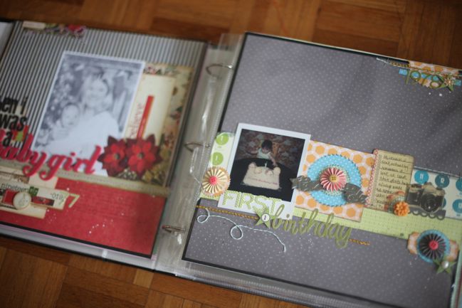
These two pages are recently created, but old photos – my first Christmas and first birthday. The photo on the left page was scanned and I printed it in black and white on my home printer. The photo on the right is an actual old Polaroid.
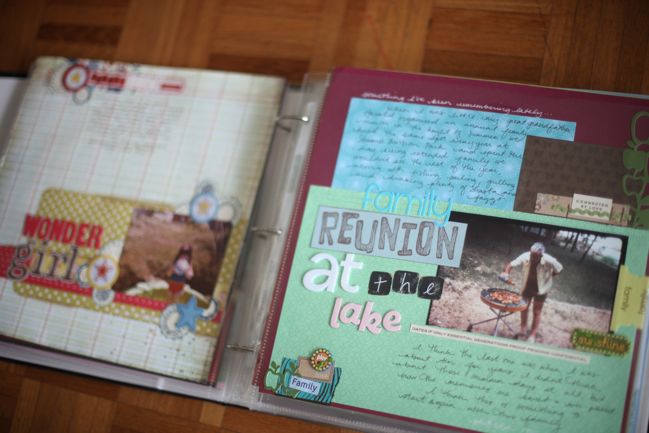
The page on the left is recently created, with an original print (rounded corners and all!) from 1980. The page on the right I made in 2008, and that photo was printed on my home printer from a disc of scanned family pictures.
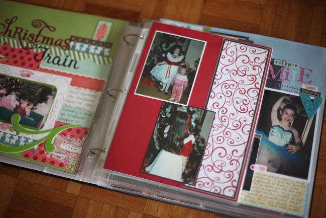
The 12×12 page on the left I made in 2008. The page on the right is a bit of an oddball – it’s 8.5×11 and part of a two page spread but I have somehow misplaced the facing page! This is a much older layout – I made this is about 1999 I should think.
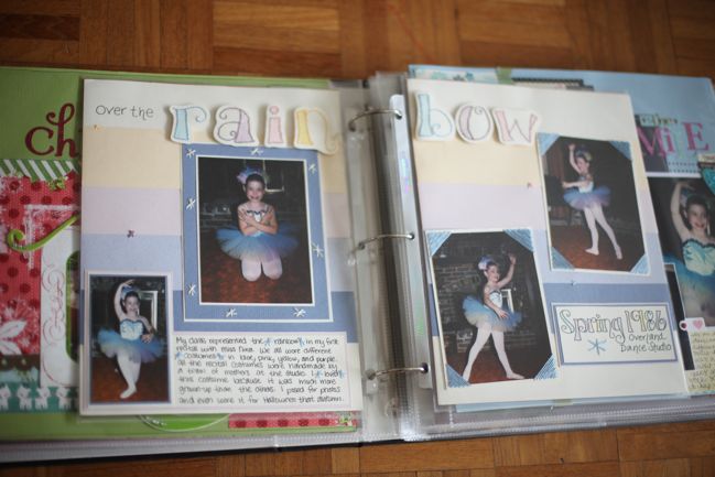
These are actual prints and I created these pages for an article in Creating Keepsakes in 2000 or 2001. These are some of the only pages from that point in time that I still actually like – but I think it’s because I did this in my own handwriting and so many of my layouts at that point had all the words printed on the computer. I’m not a huge fan of that element of my older pages. In this case, the title is hand-lettered too, then I handstitched each letter in a different colour and the letters are on pop-dots – so there are several things evident on this older layout that have come through to my current style.
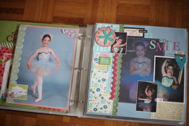
Here I ended up with an awkward pairing so added something to fill the gap. The previous pages are 8.5×11 but I also have a 12×12 page with the same photos. So I added a very simple page that is mostly one photo to fill that empty 8.5×11 space in between. That picture was originally much smaller, and then it was scanned and ended up on that same disc of family pictures. I printed it at A4 on my home printer, and although it’s not as sharp as the original, it’s just fine.
Something else to note – when I created the 12×12 page on the right, I had already scrapped the originals on the previous layout, but I needed those pictures for an assignment. So I photographed the layout, cropped down to the pictures and printed them that way. Worked just fine, and even the large photo printed on the transparency actually came from a photo of the layout. This page was made in 2009, I think? It was for an article in Scrapbook Inspirations.
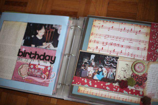
These layouts were both made in 2009 with photos printed at home. I’ve realised this week that the date on the right hand page is definitely out – I had guessed but now I think it is more like 1986 than 1989! So perhaps I can just turn the sticker upside down? They weren’t made at the same time and weren’t planned to go together or anything – they just ended up there by way of chronological order. The page on the right became a sketch challenge for UKScrappers, with a free template to download here.
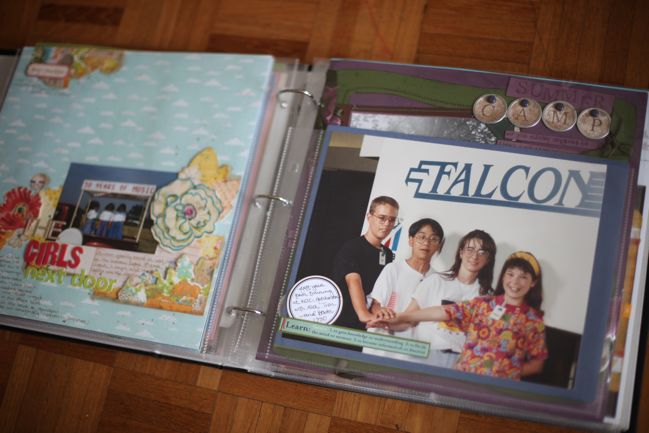
The layout on the left is one one made recently, then there’s a landscape 8.5×11 page protector that holds two oddball photos. I have two formal 8×10 portraits from… well… space camp, basically. I haven’t really scrapbooked any of my hilarious experience of spending my summers on multi-axis trainers and studying rocket science. It’s something I need to do, obviously! But so far I just have these two photos in the album so they are safe and protected. This was my flight team in my first year…
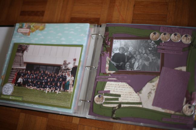
…and this was our full crew in my second year. In NASA jackets. Next to various rocket parts. So those are just attached to 8.5×11 cardstock and there’s a journaling spot to name and date them, but the rest of that entire adventure is on the to-do list. Then back to 12×12 on the right, with an older layout. The photo is from 1993 and I made the page in 2003. The picture was in colour but I had it reprinted in black and white from the negative because the colour was pretty washed out anyway. It was taken on my instamatic so not exactly the height of photographic technology.
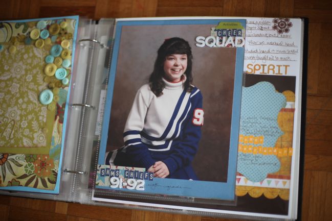
12×12 on the left, with a layout I made in 2007 and on the right, and 8.5×11 page to hold an 8×10 picture from middle school. This had just been sitting in the page protector, so a few weeks ago I added just that little bit of embellishment with some leftovers from another page. I have scrapbooked quite a few pages about cheerleading in high school but nothing other than this about middle school – mostly because I don’t have anything other than the formal photos (and they are pretty cheesy).
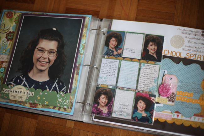
This one makes me laugh so very much. The picture on the left is my school photo from my first year of high school – the autumn of 1992. Now actually that means this picture is out of chronological order, because the pictures on the right are from August of 1992, but I wanted them to be side by side like this so forgive the calendar confusion just this once. It’s the Glamour Shots that make me laugh. Apparently Glamour Shots still exists? And they have changed their game a little now. But in the early 90s, they had a very strict formula: they would make your hair as big as possible and add tons of make-up (no matter what your age) then photograph you in soft focus with these crazy outfits that no one would ever wear in public. In fact, the outfits were so crazy and the hair was so big you couldn’t wear them like regular clothes. You wore a tube top and they draped clothes over you, so it was either jackets or wraps in every single picture. That pink thing that looks like a prom dress was really just sparkly fabric that they kept wrapping around me then two big baubles they tied to my arms. The end result was everyone they photographed seemed to become the same age! So those pictures were taken one month before the school picture (with significantly less make up and hairspray). I don’t really have any amazing story other than thinking these photos are funny. That page protector is from the Pink Paislee portfolio album (and the holes fit in the 12×12 book just fine).
This is the point where this album will be broken into two volumes – I have more high school stuff than earlier, so the beginning of high school is a good break to separate the pages and have the freedom to add more to the story.
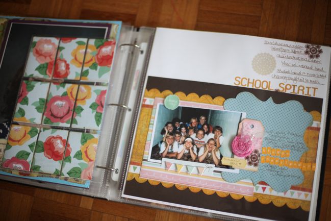
At the moment I don’t have any other small photos to fill the back of that page protector, so I just cut a piece of patterned paper to fit and chose something that would coordinate with the page on the right, which I made last year.
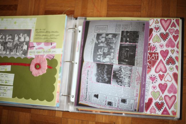
Much older page on the left – and a page I don’t love. This was a photo from our high school yearbook and I managed to salvage the original print when they came back the following year. But apparently I was in a quite minimalist phase when I made this page (2006, I think) as there’s not even a title. At some point I think I will rework this page. And the page protector on the right is something a little different – I photographed the cheerleading spread from my high school yearbook, including all the notes we had written over those two pages, and just printed it at A4 and cropped it to add to an 8.5×11 sheet of cardstock. No real scrapbooking elements but a lot of storytelling.
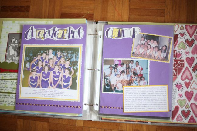
Oh hello there, old pages! These were for an assignment with PaperKuts magazine in 2001 with pictures from 1993. I had these reprinted from the negatives (and they are from that same instamatic that didn’t do so well with colour). Hand-lettering in the title but everything else is typed and printed, which I don’t love. But I do love that I still had a notebook with all my bits and pieces from this point in life so I had written various factoids about camp and the prizes we won, routines we performed and so on. The deckle scissors really date this, but I don’t think I will rework this page. Though the cardstock on this is really fading (it is not nearly the quality we have available today), especially at the far right.
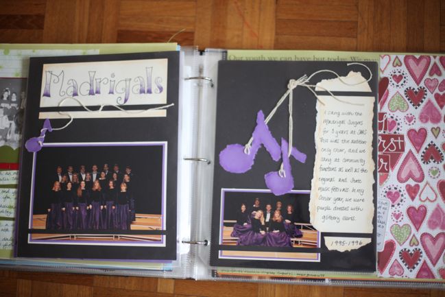
Again, old pages here – made around 2001, for an article on how to tear paper! Amazing, I’m sure. These photos are of my school’s version of glee club. We didn’t have nearly as many amazing costumes as they do on television!
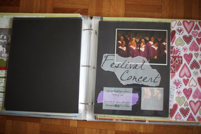
More singing pictures from the same time frame, but awkward in that I ended up with an empty page, so I’ve just added a sheet of plain black cardstock there for now. I’m planning to fill that with journaling and glee-filled memories of our high school choir, as I didn’t really write much on these older pages. Also, gotta love the trendy vellum. This window effect was for an article on multi-page layouts, I think.
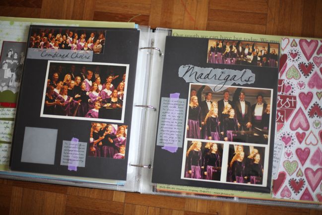
…same event, continued.
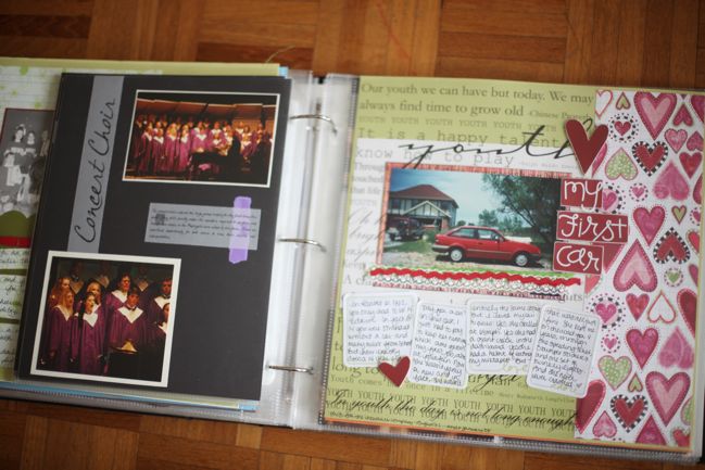
…and it finally concludes. Then back to 12×12 on the right, with a page about my first car. Very different styles from the left to the right, and I do have photos that fall between these two in dates, so maybe that will help to bridge the styles. But I don’t really mind too much. I think I made this layout around 2006.
By the way – for a long time I thought I didn’t have any photos of my first car for some reason. Then we realised there were quite a few, as we had to photograph it from several angles for the car insurance policy! Handy tip if you’re looking for old pictures that might be in your household records rather than your photo files.
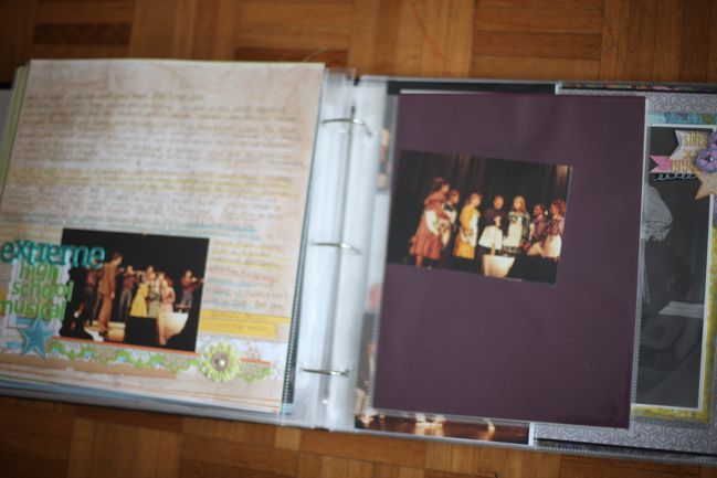
12×12 with lots of journaling on the left (made last year) and then an empty page with some photos set aside to go there. That means it’s on my to-do list! But it needs to be photos from that event because the following pages…
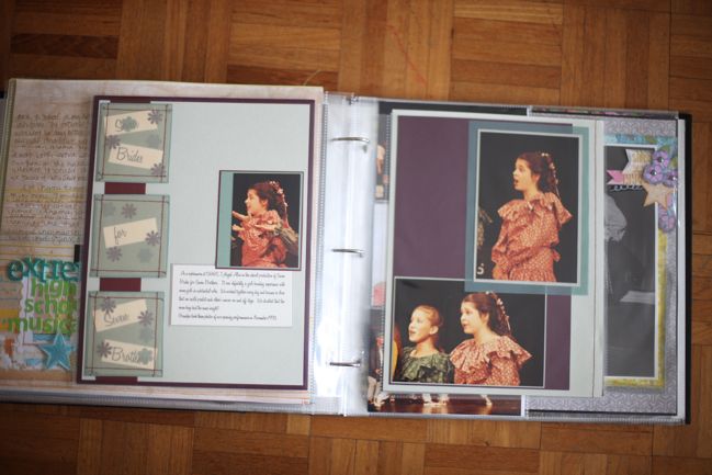
…are also from that. But made many years ago! This layout was part of my hall of fame entry in 2001.
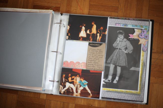
And then a big gap, really! Nothing but plain cardstock on the left, and a couple photos plus a journaling card on the right but they aren’t really scrapbooked – they are just added here because it’s the right spot in the timeline. I actually have several layouts about those photos, but they are in a much older album that I don’t have out on display right now. I came across these two photos and put them here as a reminder to go through that particular older album and pull out what I would like to include here. Some of those pages will be things I don’t want to include – lots of photos cut into shapes with no journaling. But others will be more in keeping with the narrative, even though I know they are all very minimal, all in red and black and all have typed journaling. That’s okay.
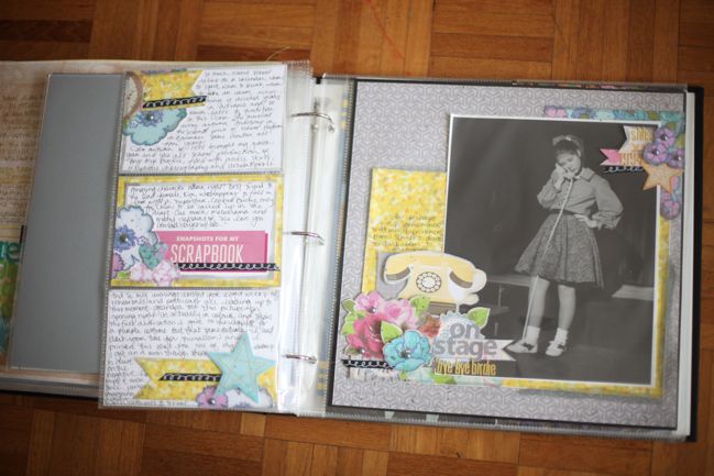
This very recent layout with the additional journaling in a 6×12 photo protector, which I wrote about last week.
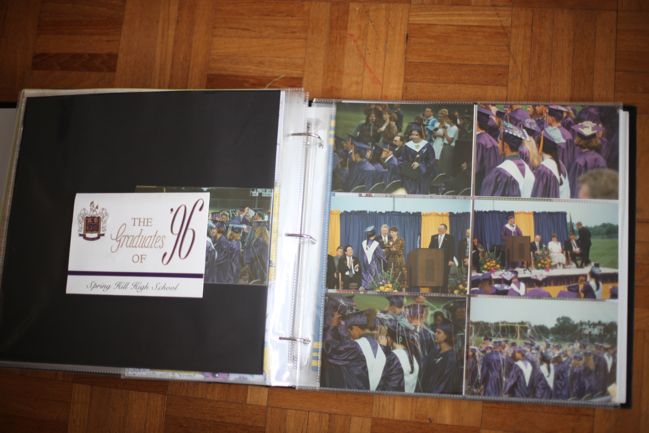
Pages that really aren’t done at all – but I had fourteen 4×6 photos from my high school graduation, so I added them all to a photo protector for now and included my graduation announcement here too, but I haven’t done anything else creative with these just yet.
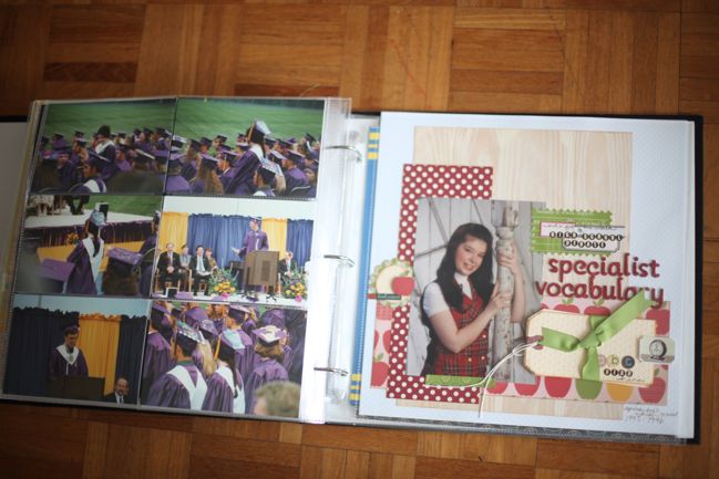
And one last layout here that I made last summer about all the strange phrases and abbreviations used in high school debate. This one is out of sorts with the timeline and I need to find a good place for it to go – but it’s not from a specific date and debate was something that was part of my entire four years in high school (and actually university too) so it’s not one that is easy to pick a date.
Some questions and answers on the subject of album organisation:
Don’t albums cost so much that it’s hard to keep up with lots of layouts?
As albums are a higher priced item, I take advantage of sales and stock up whenever there is a good price. Two Peas has run the black album at 50% off at times and the red albums have been on sale lately too. If you’re really short of albums compared to your stack of homeless albums, count up your pages and figure out how many albums you need and stock up when you can find a discount – that would be my best advice! I love that albums make it easy to look back at the pages and the stories, and definitely think albums are worth the investment for keeping pages secure and shareable. I also automatically buy a second pack of page protectors to add to an album whenever possible, so I start with twenty instead of ten. I try not to have more than twenty 12×12 page protectors in one album (though my pages are often quite bulky, so more could fit with flat pages).
Why do you prefer 3-ring over postbound albums?
A little background – I started with ring binders way back at the beginning and then I moved over to postbound albums when I started making 12×12 pages. For about four years, everything was postbound and I saved up for fancy fabric-covered albums that were £30 to £40, because that was what was available. At first, I thought they were great quality and I added the extender posts to make the most of each album. But by the end of those four years, I was disenchanted as the expensive albums fell apart, and I found it so difficult to arrange the pages since taking one page protector out meant taking the spine apart. So although some pages might look prettier without the rings in the middle, I’ve just had much better luck with making ring binders work for me. The ring binders available today are much higher quality than the first few I bought way back in the late 90s and I just find they are the best solution for the way I scrapbook.
Are there any 3-ring binder albums that don’t require page protectors?
Well, yes and no. Binders usually come with page protectors and it’s assumed you’ll put your pages in protectors. But the rings in a 3-ring binder are a standard dimension and in the US you can buy a three-hole punch used for adding pages to notebooks (like at school). If you don’t like page protectors I don’t see why you would have to use them when you could use a three-hole punch with cardstock or chipboard to make your pages instead. Or you could cut your own paper from large sheets down to 12×13 or so to add a margin to the centre edge and punch the holes there? I definitely like page protectors, so I hadn’t really thought of it before you asked!
How do you deal with two page layouts in a 3-ring binder? Isn’t it hard to read if the title or journaling goes across the join of the two pages?
It depends on the layout. Sometimes it just doesn’t bother me at all. Other times it can be hard to read, so I’ll sew two page protectors together so the pages don’t separate when the page is turned. If you don’t sew, you could use double-sided tape to attach the page protectors.
How many albums do you have? And how are they stored?
Okay, I’ve counted my 12×12 albums in my studio and there are forty-six of them. They are stored in the cubes of an Expedit bookshelf (I have the large 5×5 unit). I used to have them on top of the unit but I am enjoying them far more now they are within reach on the bottom two rows of the shelf. (But keep in mind that I live in an upstairs flat so I do not have to worry about flooding. I wouldn’t keep albums on a bottom shelf of the ground floor and I would try to keep them away from any pipes or anything else that could cause horrible damage if something went awry.)
Where did you get the metal-edged circle tags?
Metal-edged circle tags are tremendously easy to find in the US, as they are stocked in most office-supply stores. In the UK, not so much. There are a few shops that import the Avery office tags but put a ridiculous price on them. And for several years, Making Memories and EK Success sold them as a scrapbooking product. If you’re looking for them in the UK, it’s worth having a look at some of the older stores that may still have that in stock. Otherwise sweet-talk a friend who is visiting stateside if it’s something you don’t need immediately!
Do other people suffer from the page protectors ‘falling out’ the bottom when the album’s not full yet?
Do you mean the page protectors tend to hang at an angle? I’ve seen this in some albums at crops but I’ve never really experienced any trouble with it in my own albums. I store all my albums standing upright, so I would think there would be that extra pressure on the top hole of the page protector but everything seems to be holding up okay.
What do you do with the thick pages?
Most of the time, I just try not to face something really bulky against something it could damage – like no giant resin flowers pressed against a photo on the opposite page. There are always two full sheets of cardstock in each page protector (if I make a page on patterned paper, I will back it with cardstock when it goes in the album) so the pages themselves are quite sturdy. Occasionally if something is really problematic, I’ll add a chipboard page opposite and just cover that with a piece of patterned paper rather than a layout. And in the case of layouts on cardboard, like this one, I attach them to the outside of a page protector with a fair helping of super tacky double-sided tape.
Who makes the divided page protectors and 6×12 page protectors?
They are made by American Crafts, who do several types of divided page protectors they call photo protectors. The 6×12 protectors can be found here – look below on that page and you’ll see several other sizes, like the 10×12 and 12×12 options.
How do you store your negatives?
I’m afraid they aren’t very organised – just safe. They are kept in a metal photo filing box that seals and that lives tucked away in a cupboard. So they are dry and cool and out of any light. Once I open the box, they are all just in there and most of them came in sleeves from the developers, so I labelled those and although it’s not super organised, it is easy enough to find something usually!
Have you scrapbooked older photos of The Boy?
No. Not that I don’t want to – but more that he’s not really interested in that right now and I’d rather work on that when he feels there are stories to tell. If the timing is right, I think it would be a really fun project, actually. But for now, it’s just me.
Album organisation is a topic that’s coming up in a few places recently, so if this has you thinking, you might also want to check out this post where Ali Edwards takes you through her daughter’s baby album or this post from Melissa Stinson, which collects several different scrapbookers’ album organisation processes into one place.
I really don’t think there’s any one way to make album organisation work – it’s just a case of finding what makes you happy. For me, that has meant editing from hundreds of old layouts to finding the pages that really help tell the story and mixing the old and the new pages together, but telling the story in chronological order when you look at any particular album. That might not be the right system for you at all – but it is what I love. So thanks for making it this far through a marathon of a blog post about this particular album!
xlovesx
![]() Comment [7]
Comment [7]











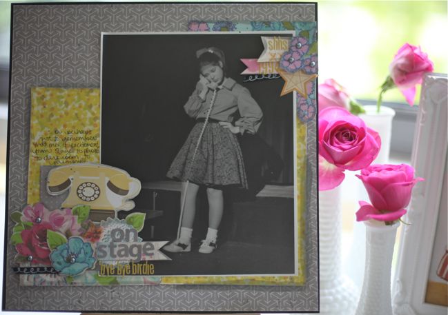 Supplies include the