paper: pretty paper. true stories. {and scrapbooking classes with cupcakes.}

lovely to meet you Twitter Facebook Pinterest YouTube

Take a Scrapbooking Class

online scrapbooking classes

Shop Shimelle Products

scrapbook.com simon says stamp shimelle scrapbooking products @ amazon.com shimelle scrapbooking products @ amazon.co.uk

Reading Material

travel

Scrapbook starting points :: This Place is Magical To Me

scrapbooking starting points
scrapbook starting points :: this place is magical to me
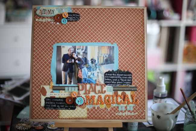
From this starting point to this final page. I stayed with even more from Nightfall (including those blackboard label stickers that are just beyond cool) and added a bit more of the blue paint. It’s Speckled Egg, which is one of the new colours in the Jenni Bowlin collection of paints and inks for Ranger. (It hasn’t arrived at Two Peas yet but I would think it would be there soon.)

I’m not sure why this photo really said autumn to me since it was taken indoors, but it was an autumn day and we’re wearing what is very much our autumn uniform, so perhaps that is it. I’m not sure if you can make it out from the photo so small, but this silly self-portrait is in a hall of mirrors so it’s a bit like we’re on repeat ad infinitum! A big group of school kids had just stepped out and for about thirty seconds we were the only people in the mirror so we grabbed a shot quickly before the next group came in the door.

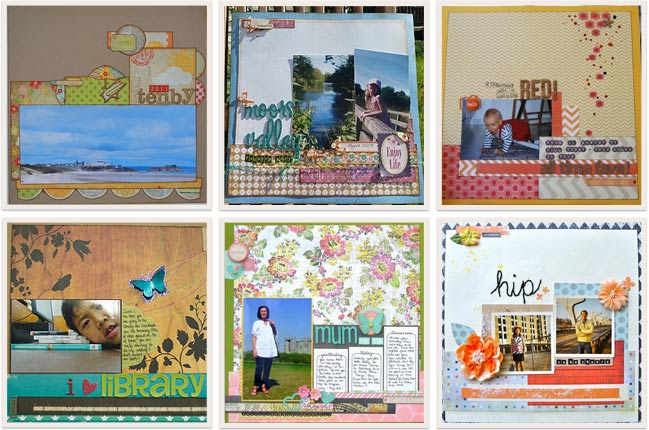
scrapbook page ideas Top row, L to R: one, two and three. Bottom row, L to R: four, five and six. Click the corresponding link to see the page in more detail.

Thirty-five pages posted so far for last week’s starting point and they are all so very different! Anywhere from one to four photographs, some have lots of writing and others just a little. These six are just a few of my favourites. See all the pages here.

Find more Scrapbook Starting Points here or follow the board on Pinterest here.

Happy scrapping!
xlovesx

Scrapbooking Starting Point

scrapbooking starting points
scrapbooking starting point
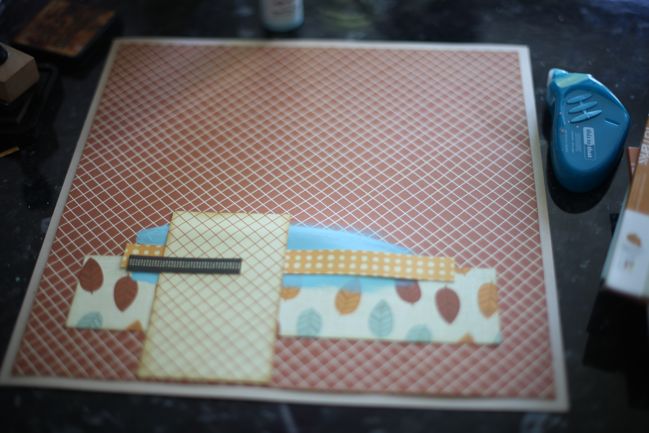
Happy Saturday! Here’s a new starting point for a scrapbook page. I threw in a layer of paint this week, but obviously you can leave that out if you prefer. But if you have plenty of paint and you’re not using it, consider this a kick to give it a try!

This week I’ve started my page with the Nightfall collection and I’m thinking of something autumnal, despite the sudden burst of summer weather we’ve had in London this week. (Definitely not complaining – it has been lovely to leave my jacket on the coat rack for a few more days!) What colours and themes are speaking you you lately?

You can definitely put your scraps to use, and perhaps show off one full sheet of patterned paper you particularly like. If you like to follow measurements, this starting point uses papers cut to 11.5×11.5, 2.5×9.5, 3×5, .5×8.5, .25×3 (all in inches). Or you can estimate and use what seems to work.

I’m curious to see if you add lots of photos to the empty space of focus on one or two photos right in the middle of the page. If you create a page this week, please link it up below and share it with everyone!

Tomorrow I’ll be back with my finished page from this Starting Point plus some favourites from last week’s challenge. There is still time today to add your layout there.

Have a beautiful weekend! Oh, and don’t miss this weekend’s giveaway either!


Scrapbook Starting Points is a weekly challenge. Click here for more Starting Points inspiration.

Scrapbook Giveaway Day

scrapbooking giveaway day
Digi Angels
This weekend, one commenter will win a set of Digital Angel Stamps from Little Musings. These printable delights are just right for Journal your Christmas and could make beautiful page numbers for your December album. Little Musings angels recently graced the cover of Simply Cards & Papercrafts magazine.

Little Musings is the adorable online store from the lovely SJ Dowsett, selling both clear and digital stamps. SJ offers snippets of life and scrapping on her blog. SJ also creates hand-drawn logos and branding for crafters and other small businesses looking for a unique look. (Plus she is extra superduper cool for drawing this portrait of me which I think is quite magical!)

These angel stamps are perfect for Chrstmas cards, so to enter, just leave a comment on this post telling us who is first on your Christmas card list this year.

Entries close at midnight Sunday UK time and the winner will be posted Monday evening, so be sure to check back to see if it’s your lucky day!

Good luck!

xlovesx

4x6 Photo Love :: September 2011

free scrapbooking class :: 4x6 photo love september 2011
free online scrapbooking class :: 4x6 photo love All class content ©twopeasinabucket.com. Click here to view supplies and download this month’s PDF.

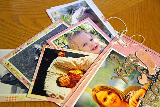
It’s the thirtieth of the month, so that means it’s time for a brand new edition of 4×6 Photo Love! Since it’s the ninth month of the year, we’re scrapbooking nine 4×6 prints on one scrapbook page. Grab some photos and join in the fun!

scrapbook page :: 4x6 photo love
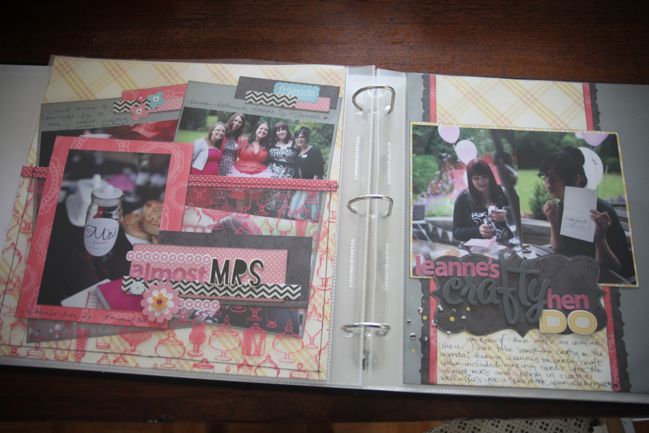
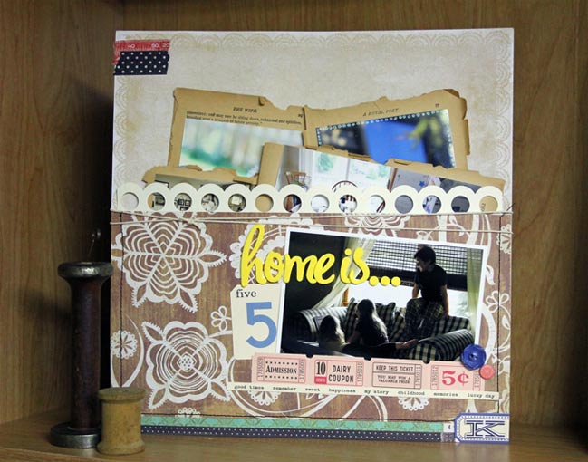
This month’s design principle is a pocket page, perfect for a transparency! Eight of the photos are adhered to cardstock and they can easily be removed from the pocket through the top of the page protector, so there’s no need for customisation this time. Of course, the pocket can hold more things if you like – more space for writing or even more pictures.

scrapbook page :: 4x6 photo love
You might recognise that layout on the right from a recent sketch. It turned out that I had nine photos remaining from that event, so it seemed the perfect pick – plus I could take my inspiration from the colours and patterns from that page I had already created. It’s not a true double-page spread but a happy circumstance that the two can look coordinated across the page divide. You can see how I picked the supplies and how I made the layout in this month’s video.

scrapbook page :: 4x6 photo love
This month I’m delighted to be joined by special guest Mandy Koeppen. Mandy has created two pages this month – one in 8.5×11 and one in 12×12 – so there is something for everybody! Find her first page here...

scrapbook page :: 4x6 photo love
…and her second page here. I love how Mandy incorporated her favourite border punch into the design and got creative with the papers to hold her photos inside the pocket.

Now it’s your turn…
Every month, there are two ways to win a prize for participating in 4×6 Photo Love! The first is at Two Peas: create your page and upload it to the gallery. Be sure to tick the box for this challenge in step four of the upload process. One participant will win a gift certificate to Two Peas to go shopping for whatever you like. But there’s a second chance to win right here: on this post, leave a comment with a link to your page (in the gallery at Two Peas or on your blog, whatever you prefer) and one of those links will win Two Peas shopping money too! The deadline for both is the 29th of October.

Congratulations to Lisa for winning the draw for last month’s eight photo class! (Lisa, you will receive your gift certificate by email.) Will you be next? Just choose nine 4×6 photos to scrap and follow along with this month’s class prompt.

xlovesx

PS: Feel free to grab the button there on the left for your blog or to share this class with a friend – since it’s free, the more the merrier! And you’re welcome to use any supplies and any photos, so there’s no boundaries to your scrapping with this year-long project.


Scrapbooking Sketch of the Week

scrapbooking sketches and scrapbook page ideas
scrapbooking sketch and scrapbook page ideas
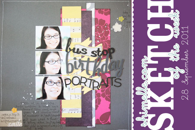
One of the dangers of really showing you a layout as it comes together is that sometimes things really don’t go the same way they are planned in my head. That happened with this week’s sketch page. But for as much as I may stumble in this week’s video as a result, it reminded me why I love the creativity of this craft. Why I love something that is so flexible and doesn’t require following a pattern to the letter. Why I love to design on the fly more than being penned in with rules and measurements and guidelines.

So this doesn’t look anything like how I imagined. I imagined all matching, small letter stickers. But that was before I realised I didn’t have a single T left in that set. (I thought I was being smart because I had run out of the letter E and this was a nice long title with no Es. Then the T had to throw a spanner in the works!) I imagined a line of brads down the right side. I imagined this pesky little flower sticker that partly inspired the colour scheme but in the end there was no nice place for it to live, so it is still in my stash and the page is in my album. But I love the problem-solving element of making a page and realising the masterplan isn’t working – find other letters, mix up the fonts, deal with the changed size and in general just make it work. I love that process.

And there was one thing I had no plan for at the beginning. In a bit of an unlike-me turn, I really had no idea what I would write about these photos. They were taken on my birthday while we waited for the bus and The Boy was generally being a bit silly with the camera. On that day, I didn’t really feel anything special about the pictures, but two years later there was just something from that made me realise this captured a very real moment of life and it really did have its place in my albums. And by the end, I knew what to write. Just another little creative challenge along the way.

scrapbooking sketch
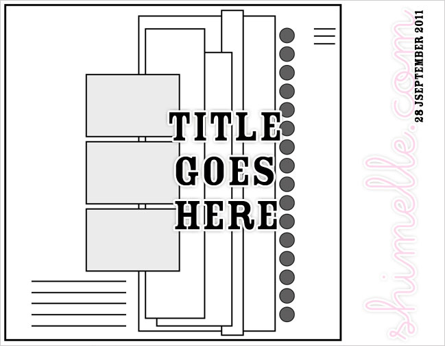
This week’s sketch includes three 2×3 photos, which could be swapped for a photobooth-style strip or perhaps one portrait 4×6 photo. This sketch should be easily adjusted to 8.5×11 since there is a great deal of white space at the left side. Although I left the row of brads (or other circle embellishments) off in the end, I’ve included them here. Use them or don’t use them as you see fit. And you can add the banner back in for the title or you can just add a big, blocky title in that same space.


Julie has been blogging about purple lately and had me thinking about purple in my stash. Before I started looking, I thought I had a fair amount of purple, but it turned out to be the least represented colour in my supplies! I have been loving the deep wine-tinted purple shade (somewhere between burgundy and violet… so much so that I almost typed ‘purgundy’ but just… no.) from the Garden Cafe collection, so I like the idea of pairing that with a more obvious purple (from BasicGrey Eerie) and that pairing I love so much – yellow and grey. So that meant a mixed palette of grey, yellow, purple and fuchsia. In the light of day, I still liked it! I’m intrigued to try some of Julie’s purple palettes a bit more completely soon.

Also, I realise I make a ridiculous hand gesture in the beginning of the video. Nice one, Shim. You can forevermore use this hand gesture to mock me. In fact, I do believe it should become a night-club dance move named The Shimelle, of course.

As always, the weekly sketch is no-stress and just for fun! If you use it, I’d love to see, so please leave a link if you post your page online.

scrapbook page ideas
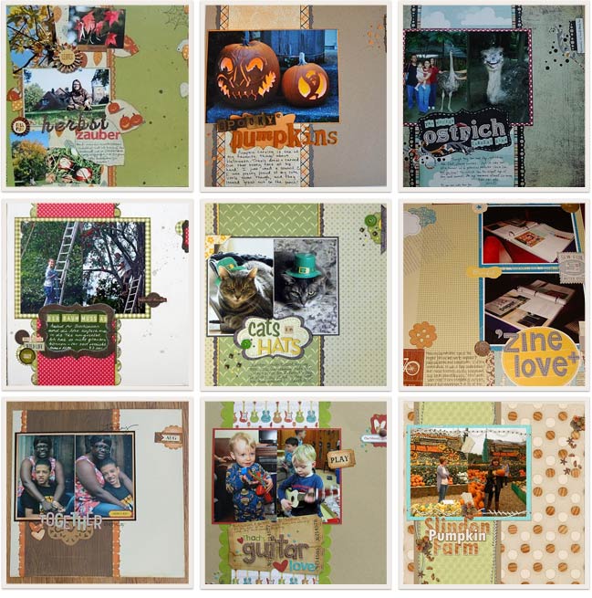
Last week was possibly the simplest sketch I’ve posted, but I love the freedom it gave everyone to make it their own. And I giggled at the comments on so many blog posts that sticking confetti to a layout is a bit pesky! Yes… it really is. But worth a try now and then! Thank you to everyone who gave the sketch a try. This is just a sampling of nine favourites. Click the corresponding link to see any of these layouts in more detail and get to know the scrappers behind the pages.
Top Row, L to R: one, two, three (bonus points for scrapbooking an OSTRICH).
Middle Row, L to R: four, five, six.
Bottom row, L to R: seven, eight and nine.

Now… are you up for some sketchy scrapping this week? Let’s see how you adapt this idea of vertical strips and a big banner of a title. Give it a go and share it with us!


RTW Travel Photobook Progress

rtw travel photobook progress
making a photobook from travel photos
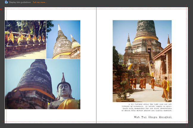
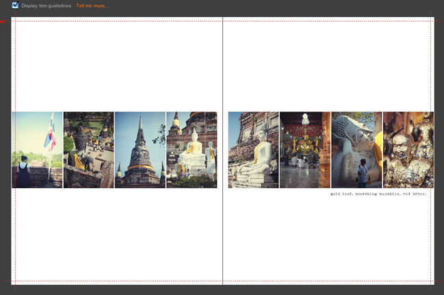
By the time we returned home from our crazy backpacking adventure, I knew I wanted to make a photobook in addition to a crafty scrapbook. Something classic and minimal. No embellishment. Just the photos and writing, hardbound with lush paper and coffee-table worthy. Something we could keep for ages and point to and remember you know that year we just dropped everything and hit the road? Let’s look at that again. And so, that book is coming to be.

making a photobook from travel photos
When I exported all the photos from the drive we used on the road to the computer I use at home, I accidentally didn’t import all the organisation I had kept along the way. Gone were all my lovely divided events and tags and all that stuff. (I have since figured out what I did wrong but it just wasn’t worth doing all that again.) Instead of everything divided by noteworthy event and location, it was just one big batch of 9000 photographs in chronological order.

And actually, that is working tremendously well.

making a photobook from travel photos
I’m using the same album format that Liz of Paislee Press used for this book, mostly because I loved her book so much that I instantly knew that was what I wanted. Originally I figured I could create all the templates myself, but then I kept putting it off. Now I’m using the templates from Paislee Press and I’m actually getting this done. I love that I can just open a double page spread of templates, go over to iPhoto and choose the right number of pictures and drag them over to make the pages. Because I have all the photos in one big batch, the number of photos on the templates is helping me edit which pictures to include. If there are eight photos on the next set of templates, then I look at my library and pick the next eight I want to share, in chronological order. I’m using plain white page backgrounds and one font throughout the entire book. The words are coming from a mix of my blog posts from the road, the handwritten journal I kept along the trip and my reflections now. The writing is quite therapeutic and calming, though at times it really makes me wish we were on the road again soon. In a wistful sort of way.

making a photobook from travel photos
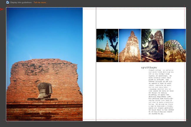
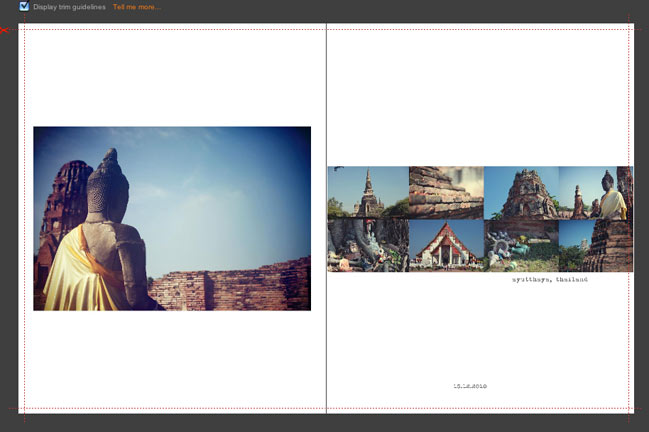
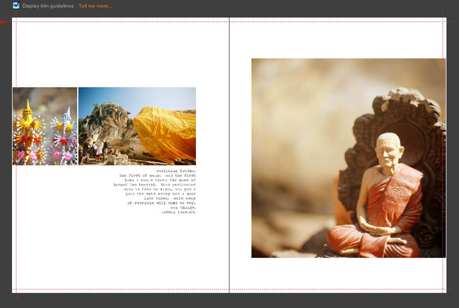
I’m making the pages one double-page spread at the time, then importing them to Blurb’s BookSmart book builder. I save each page as both a PSD and a JPG (just in case I catch a typo or want to change something later) and then I just upload the JPG to BookSmart, click to add a new page (1 photo – full bleed) and drag the JPG page onto the right page in the book. There may be some more efficient way of building the book, but this is pretty quick and I like being able to see it come together page by page. (The images here are the first five double-page spreads in the book.)

making a photobook from travel photos
The completed book will be 8×10 and hardback, and Blurb will go to a maximum of 160 pages with their premium paper in that size. That’s what Liz used and I am totally doing the same. I’ve used the premium paper in smaller hardback books from Blurb and I love it – but I haven’t made a book quite this epic yet, so I am tremendously excited to see it become real. It’s definitely getting there now and I’m really enjoying putting it together and revisiting all those amazing places by looking through all the pictures.

And by posting it here, you can keep me accountable and make sure I get this completed sooner rather than later! You’ll hold me to that, right?

…something that just might be useful
If you’ve been meaning to make a photo book yourself, this week is a fab time to do that because Blurb are offering 20% off the book prices with code BLURB20 but that expires at the end of the month, which isn’t very long now! But with a set of templates – be they from a digital scrapbooking site or the drop-in templates at Blurb – you can make a photobook in just an hour or two. It just depends on how decisive you can be as you add photos and elements! If you like pages with a bit more ‘stuff’ than the templates I’m using, there are several options in different styles here – especially if you scroll to the bottom half of the page. You can also create notebooks with your favourite images on the cover and plenty of space to write. Could be a lovely Christmas gift if you’re already thinking of December! (Oh my!)

xlovesx

Camera School 06 :: Making it to Manual

camera school 06 :: making it to manual
For whatever reason, someone, somewhere decided to make the manual mode on a camera seem difficult. It’s not difficult in the slightest. It’s just not automatic. You have to rotate some dials and click some buttons now and then. But they aren’t difficult dials and complicated buttons.

For everyday photography, I use manual to set just one thing. I only think about one thing for each shot – because I’ve already finished thinking about the other stuff. That really doesn’t follow the rules of amazing photography, and I’m fine with that. I don’t need amazing for everyday pictures. I want that balance of photography that’s fun and photos with a unified style.

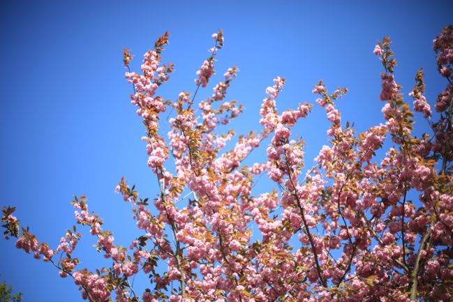
I only think about one thing because I set the ISO and the aperture once, then I can just focus on shutter speed. Because at the most basic level, there are three things that determine how light or dark a photo will be: the sensitivity of the sensor (ISO), the size of the lens opening (aperture) and how long the lens stays open – that’s shutter speed. When I pull out my camera, I set the ISO using 100-400-800 (which you can tweak to the specifics of your camera once you’re used to it) and set the aperture according to how much of the scene I want in focus. I shoot at the widest aperture the majority of the time because that’s the look I like, though there are times when that has to change to accommodate a group of people, for example. So say I am going to photograph a flower on a sunny day. I would go right to the 100 ISO and the lowest number for the aperture – on my 50mm lens, that would be 1.4. Then I stop thinking about those two things. From here on out, I only worry about shutter speed.
camera school :: making it to manual mode
On an SLR, part of looking through the viewfinder is seeing the light meter. Except if you weren’t looking for it, you might not even notice it’s there. The light meter is what made photography make sense to me when I first learned my way around a camera as a kid and it’s what makes it work for me now. It’s just that the light meter today is a little more high tech – but it tells me the same exact information. On an old Canon AE-1 series, the light meter was activated with a half-press – just like the half-press to auto-focus now… except this was still the times of all manual focus. The half-press was just for measuring the light, and a tiny arm would ping up on the side. If it was in the middle, then things were good. If it went to way to one side, the picture would be too dark and way to the other side would mean too light. The reason I noticed it more was partly because it actually moved inside the viewfinder, so it was pretty obvious! But also because a fully manual camera like that required you to look or to know every single setting on your lens… and I found it easier to look.

What’s shown in my viewfinder now is exactly the same information, just more precise and without something flicking around to get my attention. It’s more subtle, but the mechanics are the same: a half-press on the shutter button will read the light and mark a spot along a line. If the spot is near the middle, then the camera things you’re good to go. If the spot moves to the left, the shot will be dark and if it moves to the right, it will be light. Seriously, if you’ve never noticed this before, go get your camera and look through the viewfinder now. I will still be here once you’ve found it.
camera school :: making it to manual mode
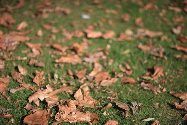
So your first step once you’ve moved to M on your dial is realising that light meter is there and being able to set the ISO and the aperture and then adjust the shutter speed with its help. At first, start dialling the shutter speed up or down until you get the marker right at the middle point, then take your picture. Get used to that process, just taking pictures of all sorts of things. Walk around your house or walk around the garden or down the street and focus on adjusting the shutter speed with that dial. Soon you’ll come to remember which way you need to dial. When I looked at the preview screen, I was forever thinking if it’s too light, dial right, and I knew I need to dial left if the opposite is the case. Eventually you will dial without thinking about which way you need to go – it will just come naturally – but it takes time for that to happen. That time is so very much worth it.

But here’s the kicker: if you’re always lining it up with the middle point then you’re really not shooting in manual after all. You’re doing the work of manual, but you’re adjusting the camera to exactly what it would do in aperture priority – because it would adjust the shutter speed until the marker was in the middle. So why not just shoot in aperture priority all the time?

First of all, you can, if you really want to. I use aperture priority for certain things. Some people use it all of the time and get great pictures; some people use it none of the time and get great pictures. There are as many methods as there are photographers.

Secondly – and this is the important part – going against what the camera tells you is how you develop a style for your pictures. It makes sense if you think about it: if you shoot in automatic modes, your pictures will look essentially like all the other photos taken on all the other cameras in automatic modes, and that’s a huge number of photos. If you come up with your own combination of settings that speaks to you, then your photos will look like just your photos because most of the other photos will be in those automatic settings you abandoned. Do you see where this is going?
camera school :: making it to manual
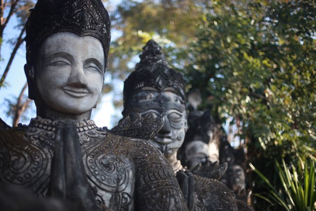
So when I look through the viewfinder, I never aim for the marker in the middle. I tend to like my pictures around two stops to the right – which means the camera things I’m overexposing my photos, just a bit. To me, it lets more light in and creates more glow and softer colours. I don’t always go with the two stops to the right (if I did, I could just set that as a custom automatic setting! How’s that for blowing your mind?) but it’s where I start. Then I go through a little process that couldn’t be done with that beloved Canon AE-1. I look at the picture on the preview screen and check for various things. I can make adjustments and shoot again if needed – provided it’s a subject that is possible to shoot again. Which is why it’s good to try this method on things that don’t move or melt or wilt rather than say… a wedding. There are no do-overs at weddings. Stacks of books allow for endless reshoots.

If you want to give this a try, you will need something like a stack of books (or something that won’t move, melt or wilt while you’re learning) and some time to put your camera through its paces. Even though setting that marker in the middle isn’t getting fully advantage of manual mode, I think it’s an important place to start. It will let you see what your camera ‘thinks’ is right – and part of taking consistent photos is learning exactly what your camera will do in any given situation. (To the point where I think I would choose sticking with an older camera I know really well over upgrading just to have the latest and greatest… but we’ll talk more about that another day.) So start by shooting with the marker right in the middle, then try moving it to the right or the left and see what happens. If you really want to be able to keep track, you can even write notes on cards and put them in the photo so you can later compare and see everything in the shot. (Though you can see pretty much all the information you ever wanted to know about a photo through the digital file, but sometimes post-it notes are just the way forward, right?)

camera school :: making it to manual mode Not to worry: there’s an entire camera school post on photographing water coming soon. We’ll get there.

This isn’t an assignment you can do in a day. This is an on-going process of learning how something works, discovering your preferred style and refining it. Photographers continue to refine their style as they work. Even real photographers. So it’s not something you’ll finish tonight and move on to something new tomorrow morning. Taking the time to really look at your images (both big on your computer screen and printed) will help you find what you like. Your style may be slightly over-exposed because you like light or slightly under-exposed because you like rich colour. You may love shooting at wide apertures with lots of blur or it may drive you crazy and make you feel you need glasses! You may like the colours very cool and crisp or you might prefer warmth to your images – just a tad or a full-on vintage look. Your style will be true to you when you choose it yourself rather than looking at something else and replicating it. Replicating can teach so many things, and it’s very useful in its place, but replicating alone cannot develop your style. Looking at your own pictures and pointing out what you do and do not like about them? That will develop your style.

So no single assignment today. More a collection of things to keep in mind. Find that light meter in your viewfinder and embrace it as a tool that can help you in such a simple and essential way. Remember manual isn’t difficult – it can be just one dial. And look at your very favourite images to see if there is a certain style already starting to emerge. If so, embrace it. If not, don’t sweat it.

It’s only a camera. You’ll be fine.

click here for more camera school posts

Scrapbooking Giveaway Winner

scrapbooking giveaway winner
LiliPopo
We have two winners today! First up is Dogmatix who wins the Lilipopo giveaway.
And secondly…..
AC winner
Amy Baldwin, who wins the American Crafts giveaway prize!

Congratulations to you both, please email me (shimelle at gmail dot com) with your address.

There’s a new giveaway every Friday night, so check back next week for another chance to win just by leaving a comment.

Have a great week!

xlovesx