pretty paper. true stories. {and scrapbooking classes with cupcakes.}

lovely to meet you Twitter Facebook Pinterest YouTube

Take a Scrapbooking Class

online scrapbooking classes

Shop Shimelle Products

scrapbook.com simon says stamp shimelle scrapbooking products @ amazon.com shimelle scrapbooking products @ amazon.co.uk

Reading Material

travel

CHA Summer 2012 :: October Afternoon

CHA Summer 2012 :: October Afternoon
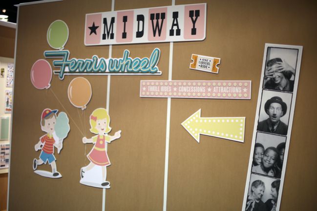
I wonder what scrapbooking goodness could be around this corner? Could it be October Afternoon?
CHA Summer 2012 :: October Afternoon
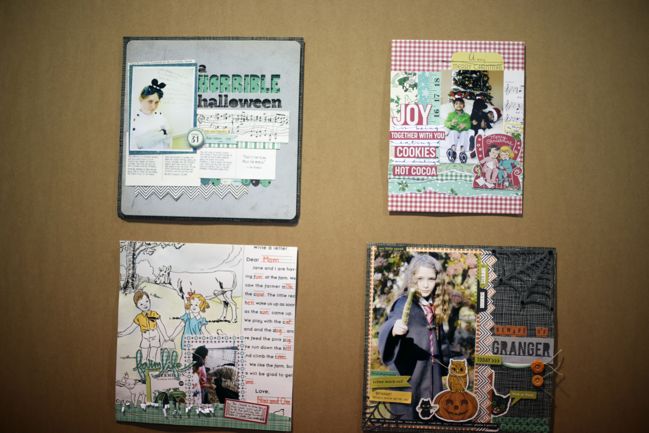
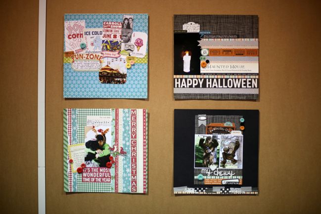
Greeted by some of these gorgeous layouts, I venture that’s a yes!
CHA Summer 2012 :: October Afternoon
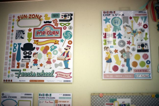
October Afternoon debuted four new releases: Midway and Witch Hazel scheduled to ship in late summer; Make it Merry and Farm Girl scheduled for the end of September.

And yes: Midway includes stickers and chipboard versions of a rainbow-trimmed Polaroid camera. Indeed.
CHA Summer 2012 :: October Afternoon
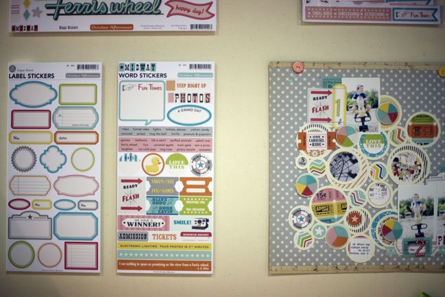
Bright shades but true to the October Afternoon look of bright meets vintage. They have stayed with tried and true products that work for so many scrappers, like the label and word stickers.
CHA Summer 2012 :: October Afternoon
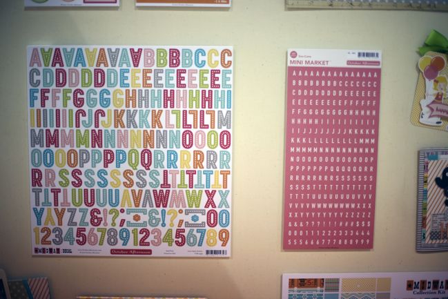
I am joyous at the addition of a great hot pink shade in the Mini Market letter stickers.
CHA Summer 2012 :: October Afternoon
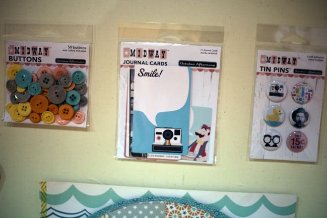
All the Midway designs are cute, but hands up: who is seriously considering buying the journaling cards and the tin pins purely based on the camera? Surely I am not alone? Maybe I will have to challenge myself to find the perfect page for all the others, but that design is certainly my favourite.
CHA Summer 2012 :: October Afternoon
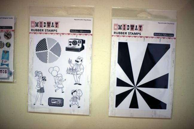
Two stamp sets – one with multiple designs and one large background image. Pie-charts and starburst shapes are definitely popular at this show.
CHA Summer 2012 :: October Afternoon
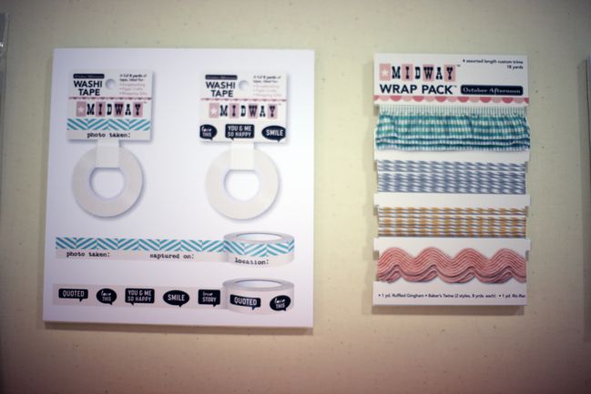
Love this washi! The top option is like the green date tape from 9 to 5 but with a variety in the wording and a brighter tone to the colour. The bottom option is just crazily cute. I can’t stand word bubble stickers on their own and yet I am remarkably drawn to them on washi tape. Who knew?
CHA Summer 2012 :: October Afternoon
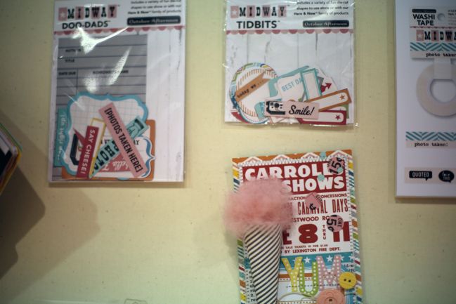
Lots of happy die-cuts. I really like that [photos taken here!] caption.
CHA Summer 2012 :: October Afternoon
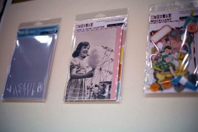
The minibook pieces for this range are photo-inspired with pretty vintage scenes (there are some non-photo patterns in the mix too).
CHA Summer 2012 :: October Afternoon
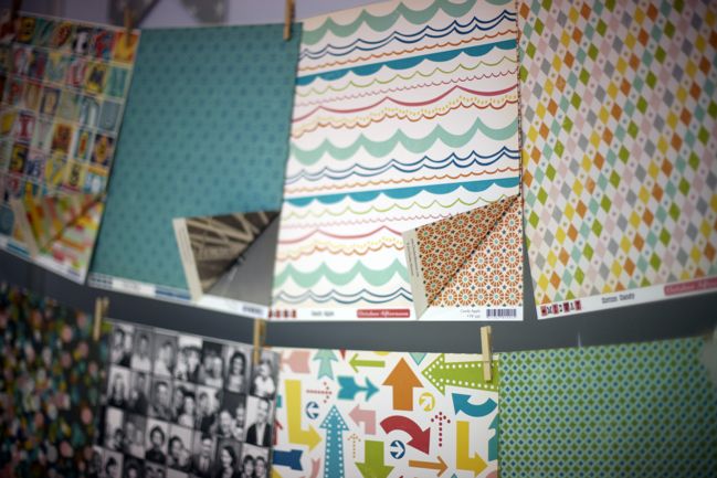
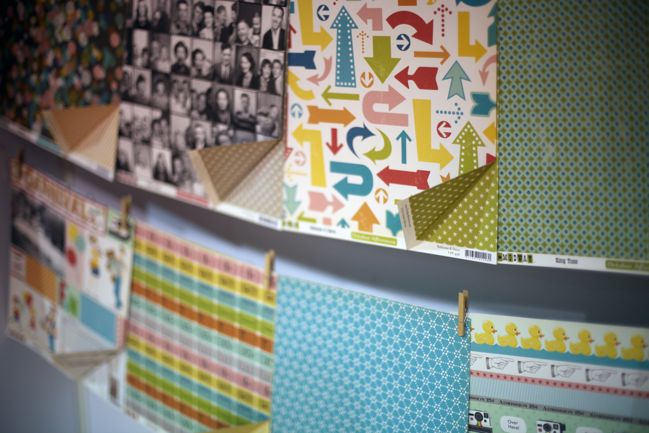
The papers are a great mix of bold, bright patterns that will challenge you to come up with something creative and small, repeating prints that are amongst the most versatile around. (There’s a ferris wheel paper that might work with the same tactic that Glitter Girl is up to in her adventure later today, by the way.)
CHA Summer 2012 :: October Afternoon
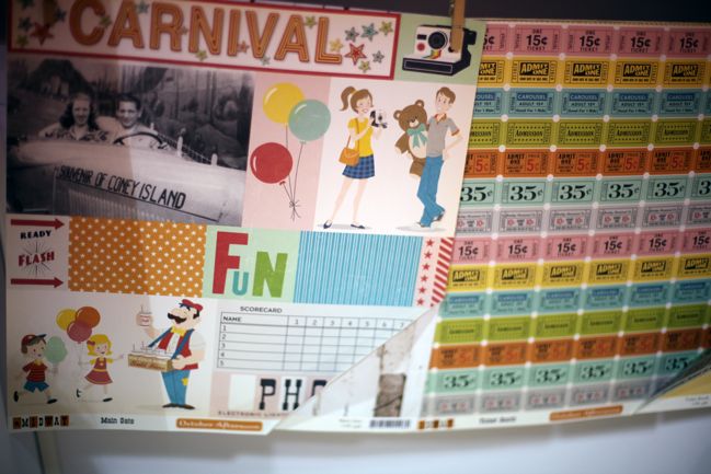
Cut-apart sheets are always a favourite for me – great for layering and embellishments without the added cost of dimensional stickers and such. So that’s Midway!
CHA Summer 2012 :: October Afternoon
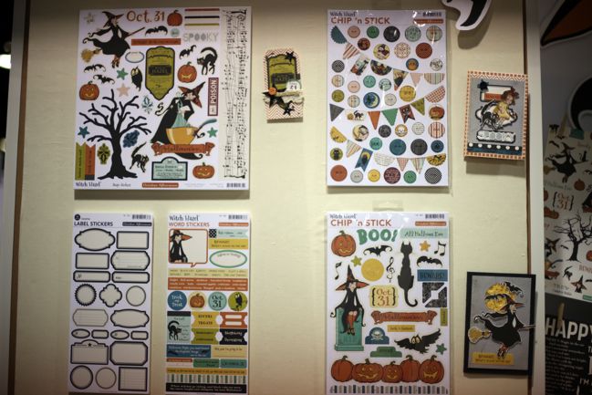
Witch Hazel is up next, for Halloween. The wonky sheet music pattern comes up a few times and it’s an interesting Halloween twist I haven’t seen elsewhere. The banners and buttons chipboard stickers would make a good choice for scrapping Halloween without young kids, while the other designs are more youthful. And check out what they did with the label sticker sheet: all in black! Definitely something for everyone, even if you have no plans to ever scrapbook Halloween.
CHA Summer 2012 :: October Afternoon
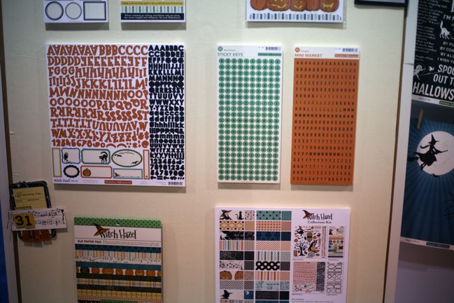
Halloween always brings out the twisty, Gothic-inspired fonts, and this one is new to the OA line-up. Plus the stand-by Sticky Keys and Mini Market letters in new Halloween-inspired colours.
CHA Summer 2012 :: October Afternoon
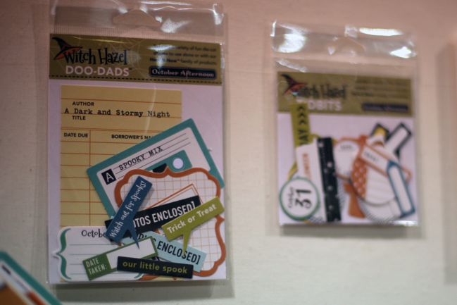
Die-cut captions, with the cassette tape shape reading ‘spooky mix’, which made me giggle for reasons I really couldn’t fathom, other than it doesn’t take much to make me laugh.
CHA Summer 2012 :: October Afternoon
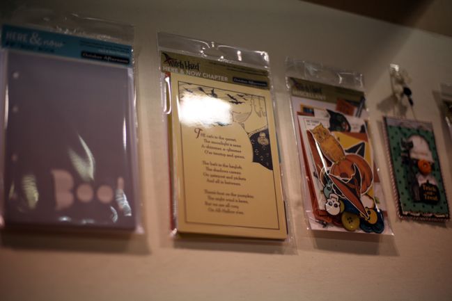
A storybook look to the minibook sheets and plenty of vintage Halloween art evidence in the miscellany.
CHA Summer 2012 :: October Afternoon
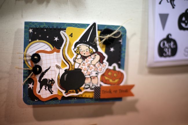
This makes me want to send Halloween cards this year! Have you ever sent Halloween cards? (Who am I kidding? I never finish the Christmas cards really.)
CHA Summer 2012 :: October Afternoon
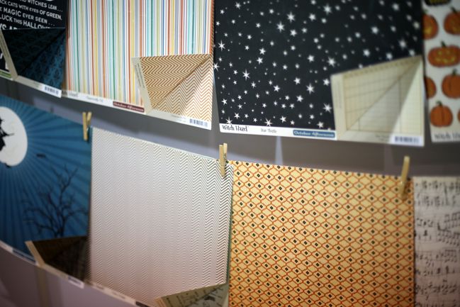
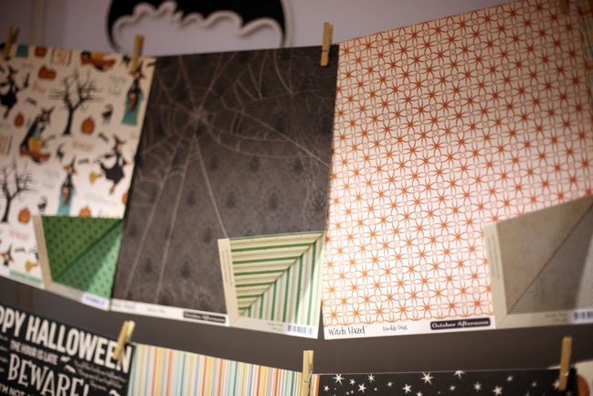
The papers are a mix of Halloween-specific and more versatile – plenty of stripes and chevrons and repeating patterns in there to balance the spider webs and scary trees. Don’t overlook Witch Hazel if you’re not all ghosts and goblins in October!
CHA Summer 2012 :: October Afternoon
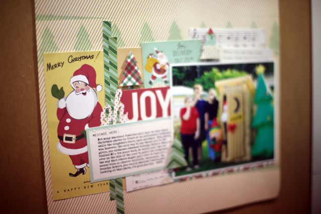
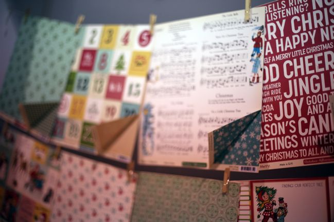
Then we move on to Christmas with Make it Merry. That large text print at the right? Remember that when we look through some more booths. Big letterpress-inspired text prints are big this Christmas.
CHA Summer 2012 :: October Afternoon
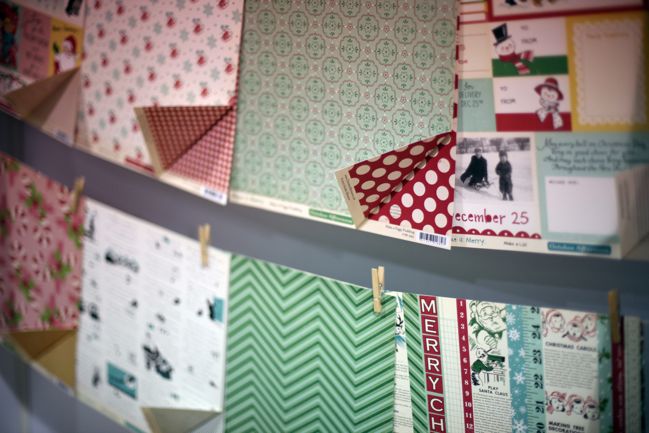
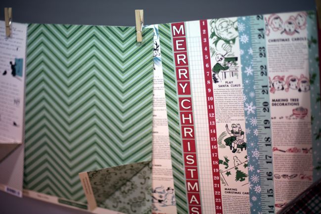
There’s something about the border strip page that reminds me of Monopoly. And I love it.
CHA Summer 2012 :: October Afternoon
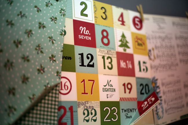
Everyone has Advent countdown numbers this year! These are lovely – variety in colour and pattern but continuity in size and shape.
CHA Summer 2012 :: October Afternoon
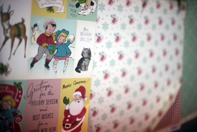
I love the vintage lettering style on the cut-apart sheet.
CHA Summer 2012 :: October Afternoon
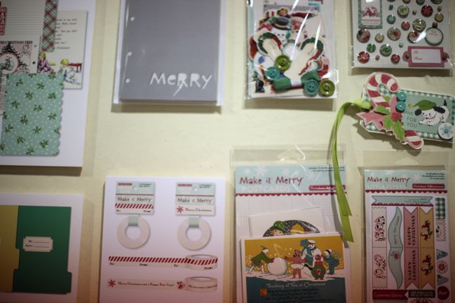
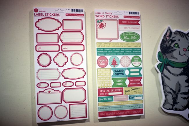
Again being clever with classic label stickers: all in red! I’ll take six. At least.
CHA Summer 2012 :: October Afternoon
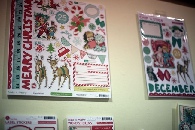
Like Witch Hazel, some of the pieces have grouped the more youthful designs together, which is handy for deciding whether each piece in the collection is right for you.
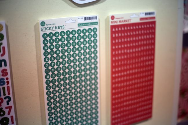
CHA Summer 2012 :: October Afternoon
Classic small letter stickers in red and green. Perfect for small format albums at Christmastime, as well as full size scrapbook pages.
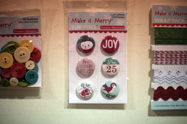
CHA Summer 2012 :: October Afternoon
A mix of vintage and modern with the Tin Pins badge designs.
CHA Summer 2012 :: October Afternoon
Plenty of happy embellishments, of course.
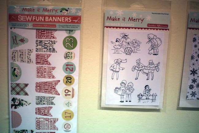
CHA Summer 2012 :: October Afternoon
Stitched or stitchable banners are something popping up in a few places. First at American Crafts last year, now in the current collections at BasicGrey and here at October Afternoon (and a few others too). These are described as ‘sewable’ so I’m pretty sure they come as a punch apart sheet then you stitch them yourself. The Christmas version includes another countdown option, should you opt for Advent bunting.
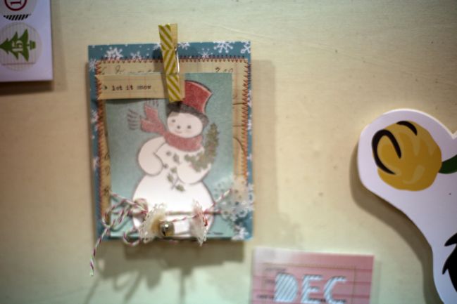
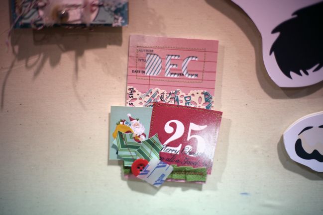
CHA Summer 2012 :: October Afternoon
Tough to get great pictures of these two examples as the booth started to get crowded, but I just wanted to include them as two things really inspired me – the dimension from using the snowflake pieces in the banner on the first card and the snowy effect on both cards from an off-centred application of white mist. Great ideas to file away.
CHA Summer 2012 :: October Afternoon
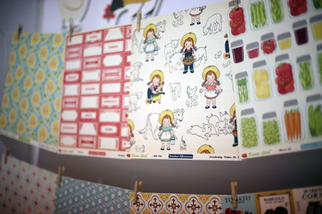
And finally, Farm Girl. The OA Farm Girl herself reminds me a bit of the Campbell Soup Kids from my youth. Of course, if my youth had been today, there would be a photo of the crazy stacking Campbell’s soup bowls with faces… but alas I’m sure that image is just in my memory and not on film. I’m ashamed to say I just spent ten minutes trying to search for an example online because I’m sure it’s one of those things that shows up in every antique mall in the midwest, but I’ve come up empty-handed. Shall we talk less of soup and more of scrapbooking? Oh yes.
CHA Summer 2012 :: October Afternoon
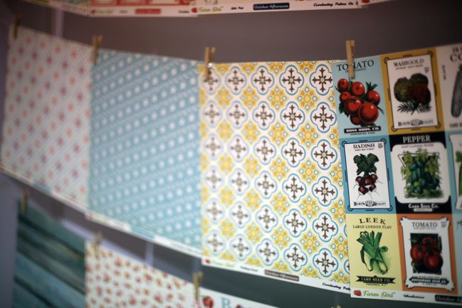
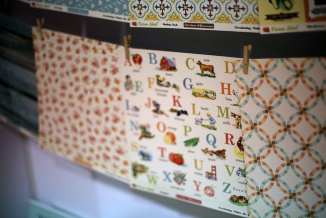
The papers bring out two things even this city girl likes: the yellow and blue combination and the potential in that wedding ring quilt pattern at the bottom right.
CHA Summer 2012 :: October Afternoon
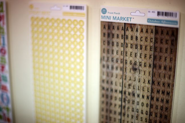
BUT WAIT! I mean I was excited about hot pink Mini Market letters. I have LEAPT WITH JOY over woodgrain Mini Market letters. Do you hear me, October Afternoon? LEAPT. WITH. JOY.
CHA Summer 2012 :: October Afternoon
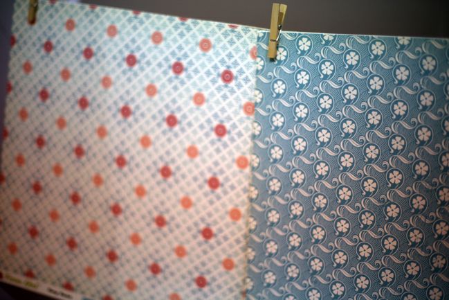
But speaking of those hot pink letters from Midway, I’d love to use them with these two blue patterns from Farm Girl. Note to self there.
CHA Summer 2012 :: October Afternoon
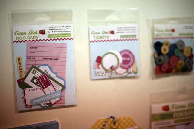
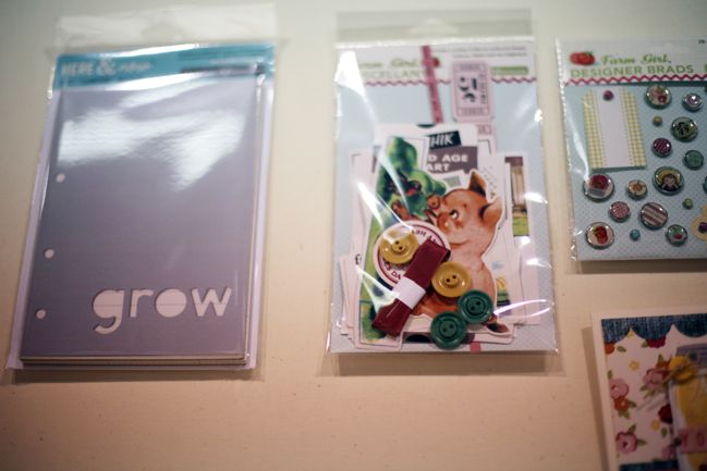
On to embellishments. The cassette tape does not say ‘tractor mix’ or ‘combine harvester remix’ but I’m thinking it might need to. Because living in London gives me many opportunities to scrapbook combine harvesters… but still. (Okay – it’s blank and in a good colour: what I’m really saying is you can use it for anything and not just farm pictures. But seriously, someone scrapbook a combine harvester. Thanks.)
CHA Summer 2012 :: October Afternoon
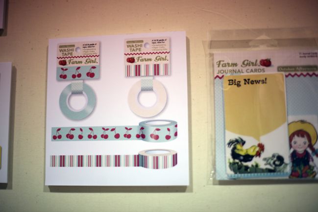
Stripes and cherries on the washi tape. Roosters with the power of speech on the journaling cards. All good things.
CHA Summer 2012 :: October Afternoon
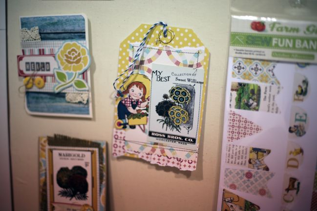
SewFun Banners in this collection too.
CHA Summer 2012 :: October Afternoon
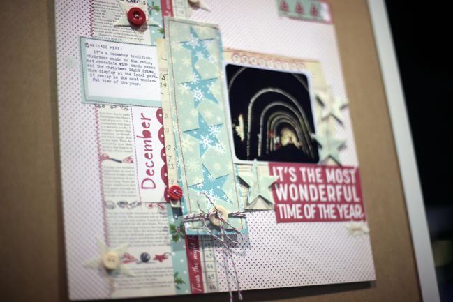
And two more gorgeous layouts as I exit. So pretty – absolutely loving that vellum star layering!

Does anything float your boat at October Afternoon? What made you LEAP WITH JOY, I ask?

Click here to shop for October Afternoon products.

xlovesx

PS: Looking for something? This might be it:
uks cybercrop
(Don’t worry if that makes zero sense to you at all. It’s a game and will make sense to those playing!)

CHA Summer 2012 :: Jenni Bowlin Studio

CHA Summer 2012 :: Jenni Bowlin Studio
CHA Summer 2012 is officially open for business, so I’m going to jump right in with booth-by-booth coverage for the next couple days, starting with my favourite in the scrapbooking world: Jenni Bowlin Studio.

CHA Summer 2012 :: Jenni Bowlin Studio
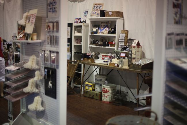
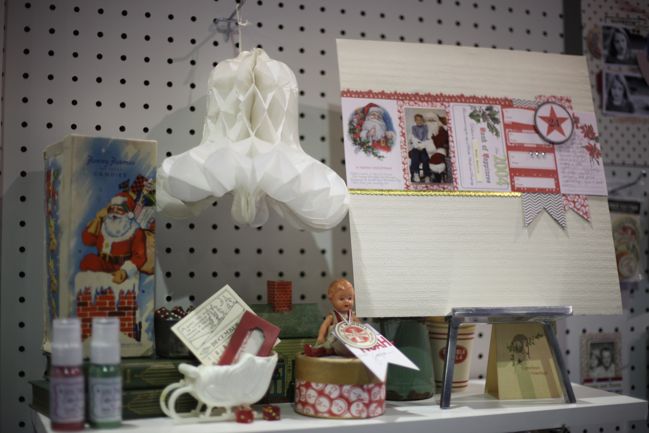
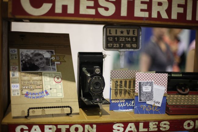
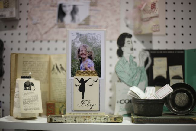
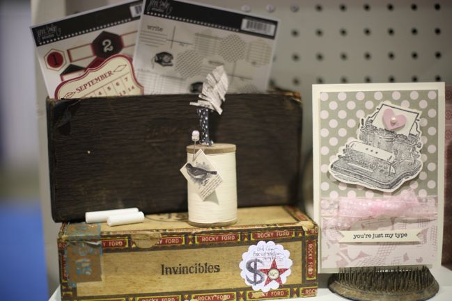
I always love how Jenni displays all the supplies and samples with her beautiful vintage finds. It’s like a little treasure trove and no one else has this kind of vintage detail to their styling. But let’s look at the products, shall we?

CHA Summer 2012 :: Jenni Bowlin Studio
Some Christmas gorgeousness to start! If you haven’t created a page with a row of JBS journaling cards, put it on your to-do list now. It always looks so delicate and perfect!

CHA Summer 2012 :: Jenni Bowlin Studio
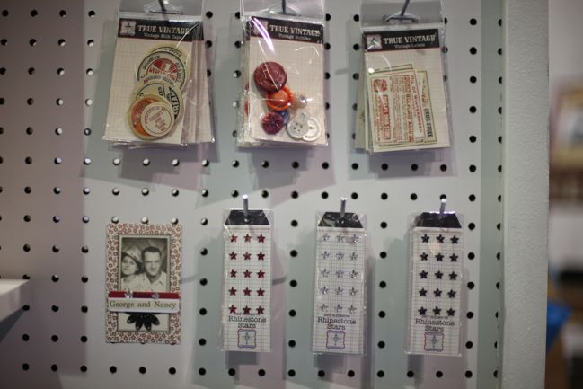
Two groups of tiny things that I love: the True Vintage collection at the top – small packs of actual vintage goods including milk caps, buttons and labels. Then in the non-vintage side, tiny adhesive rhinestone stars in three colours. Definitely need these for my Christmas journal this year, and probably for everything else too.

CHA Summer 2012 :: Jenni Bowlin Studio
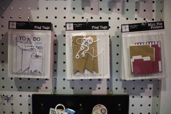
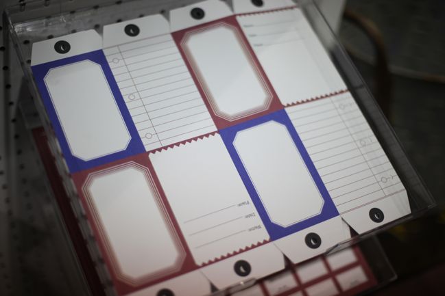
New paper embellishments include the flag tags in white and kraft (to coordinate with the tags and pockets released earlier this year) and mini file folders, complete with tiny coordinating labels.

CHA Summer 2012 :: Jenni Bowlin Studio
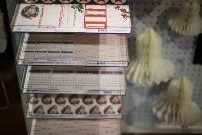
The Christmas 2012 papers include a cut-apart sheet with journaling cards, a sheet with 6×6 patterns on a 12×12 sheet, a page of December 2012 calendars (perfect for journal accents or for cardmaking), and full-page 12×12 designs.

CHA Summer 2012 :: Jenni Bowlin Studio
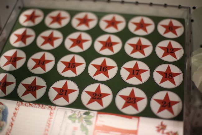
The top of the journaling card sheet has countdown numbers for Advent. Love these bold stars!

CHA Summer 2012 :: Jenni Bowlin Studio
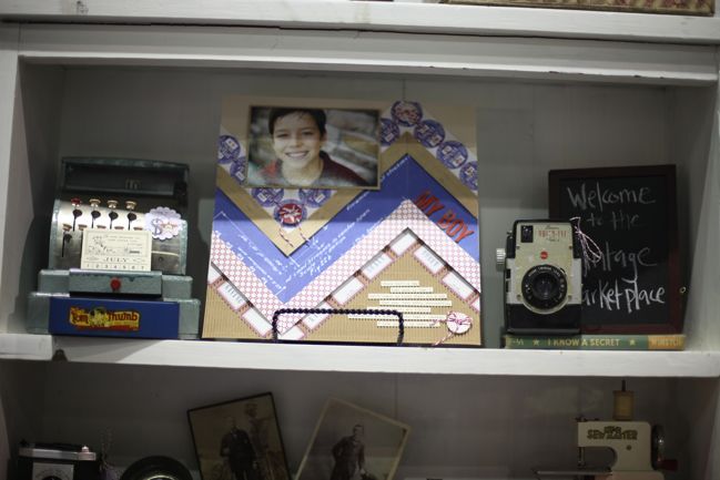
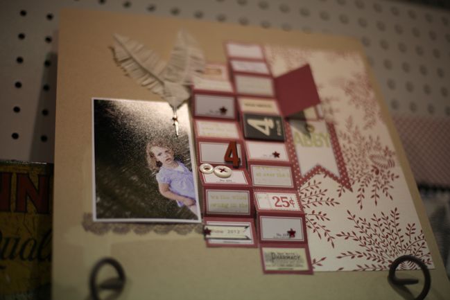
See what I mean about the detail in Jenni’s styling? Gorgeous pages from the design team, gorgeous scenes for the display. Sigh.

CHA Summer 2012 :: Jenni Bowlin Studio
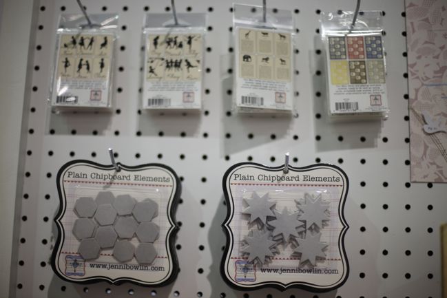
Four new mini card packs and two new chipboard shapes: hexagons (to match the stickers released earlier this year) and eight-pointed stars.

CHA Summer 2012 :: Jenni Bowlin Studio
Here are the mini card designs actually in focus!

CHA Summer 2012 :: Jenni Bowlin Studio
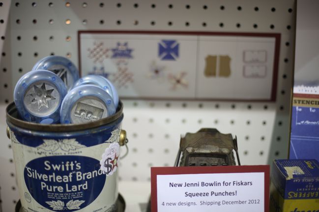
Jenni has also added four new Fiskars punches to the line-up, all in the squeeze variety this time around.

CHA Summer 2012 :: Jenni Bowlin Studio
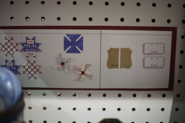
The designs include that same star in the chipboard, a split square that makes perfect pinwheels, an artisan label and an index card. Keep in mind these are small designs – perfect for tiny details.

CHA Summer 2012 :: Jenni Bowlin Studio
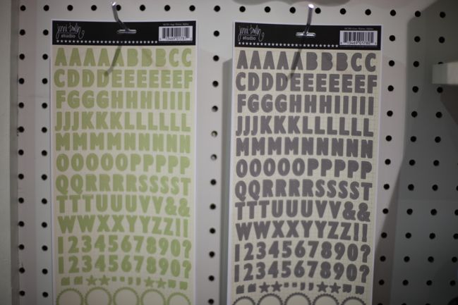
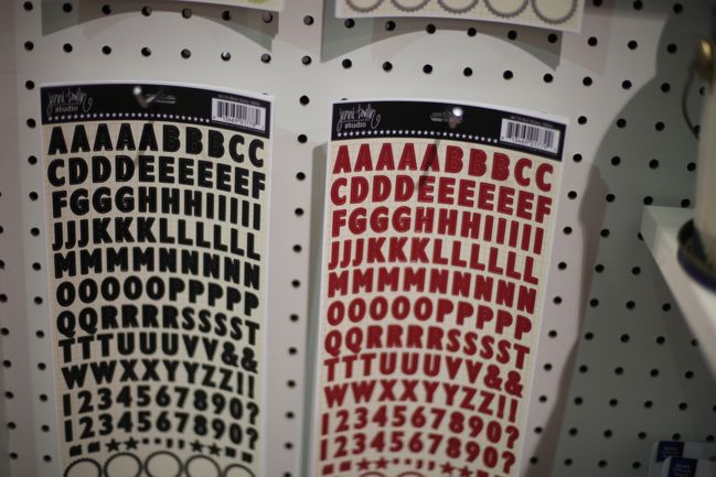
But you know it is sometimes the simplest things that make me the happiest, which is why I gasped in delight at this: grey JBS letter stickers!

CHA Summer 2012 :: Jenni Bowlin Studio
Also in red and black, of course. Love these. Great size, they include numbers and they have cute labels at the bottom of the sheet. Sold.

CHA Summer 2012 :: Jenni Bowlin Studio
I can’t add commentary to this. It’s just so very pretty.

CHA Summer 2012 :: Jenni Bowlin Studio
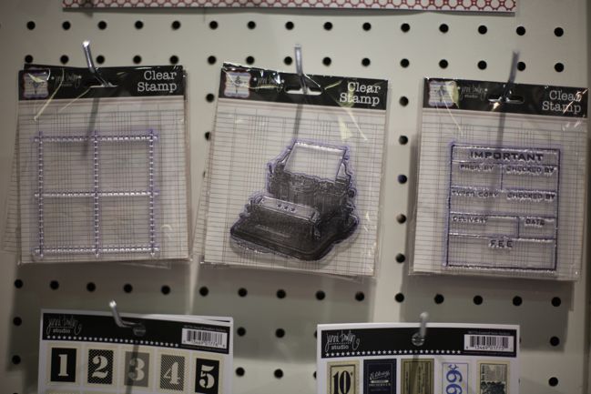
New stamps include this stitched grid (amazing for adding your own tiny embellishments inside), a typewriter and an important memo.

CHA Summer 2012 :: Jenni Bowlin Studio
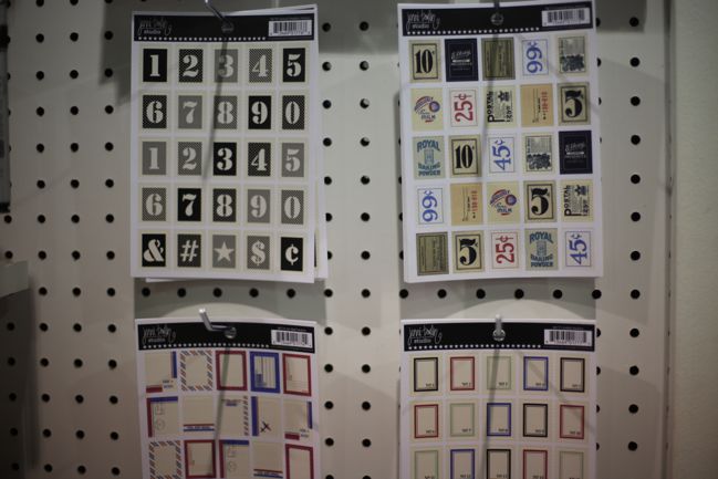
A new shape to Jenni’s sticker line-up: postage stamps! In four designs. Love the airmail look of the red and blue.

CHA Summer 2012 :: Jenni Bowlin Studio
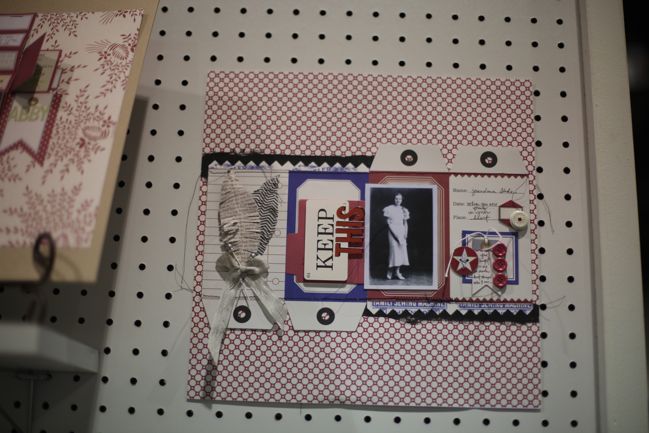
Here’s the paper from that pretty page above. It’s a red and blue print in the die-cut paper line. Cut it apart or keep it together and fold it up to create a mini project. Can’t really go wrong with this – very classic and clean in design.

CHA Summer 2012 :: Jenni Bowlin Studio
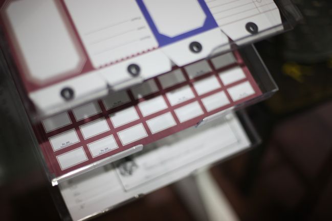
Love the red label sheet in the die-cut paper line too. An entire sheet of labels to embellish anything that will sit still. Sounds good to me!

CHA Summer 2012 :: Jenni Bowlin Studio
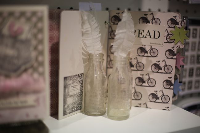
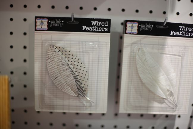
Pretty paper feathers!

CHA Summer 2012 :: Jenni Bowlin Studio
Love that typewriter stamped – doesn’t take much to go from that stamped image to a perfectly finished card.

CHA Summer 2012 :: Jenni Bowlin Studio
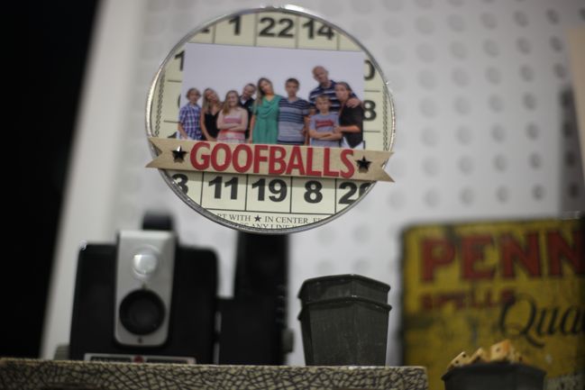
This made me giggle in its fabulousness: a photo displayed in the flashbulb of an old camera! Love it.

CHA Summer 2012 :: Jenni Bowlin Studio
A look at those red perforated labels in use, with plenty of pop dots.

CHA Summer 2012 :: Jenni Bowlin Studio
The paper feathers look like this up close – in prints or plain.

CHA Summer 2012 :: Jenni Bowlin Studio
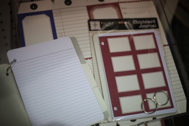
There are lots of new journal products on the show floor, and Jenni has one too: the chipboard journal comes as a pack with chipboard covers, tabbed index pages and paper pages in a variety of lines, ledgers and grids. Plus the two rings to hold it all together.

CHA Summer 2012 :: Jenni Bowlin Studio
This hotel key holder was released at the winter show but just started appearing in stores and it’s so pretty, I figured I could show you again!

One stand down, a bunch more to go… what’s your favourite item from Jenni’s new release?

Click here to shop for Jenni Bowlin Studio products or here to join Jenni’s monthly kit club, JBS Mercantile.

xlovesx

Reserve your Christmas Scrapbooking Kit

christmas scrapbooking kit
christmas scrapbook
I know this subject sounds ridiculous, but I promise I haven’t lost my mind. I’m quickly going to discuss Christmas scrapbooking supplies and then we’ll get back to it being July straight away.

What does happen in July is the CHA summer trade show, and I’m writing this from Chicago as the conference opens today and the show floor opens tomorrow. I’ll be posting a booth-by-booth rundown of what’s here at the show and Glitter Girl is reporting for Two Peas with a special series of product picks chosen to answer the sorts of questions that come up on the message boards there. But that’s not all: the summer show is also where I choose what I’ll be working with for Journal your Christmas, and I place all my orders to be able to share that with you through an optional Christmas scrapping kit.

I’ve been offering Christmas kits (called Christmas in a Box) to UK addresses for the past five years or so, and last year I worked with Two Peas to also be able to offer the same supplies from their shop, shipping to anywhere in the world. That will continue this year. Every year the UK supply of these kits has sold out on the first day, and I’ve had requests every year saying I wish I could have reserved a kit… so that’s what I’m offering this year.

Here’s the deal: if you would be ordering to a UK address and would like to reserve a kit, you can do so by paying a £5 deposit today. Kits will ship by the first of November (earlier if possible – manufacturers’ shipping dates are an important part of picking what will go in the kits). The £5 will be deducted from the total price of your kit. In past years, the kits have been priced at £40 to £45, including first class postage, and that is the same price range I will use this year: it will be no less than £40 and no more than £45, including first class post to a UK address. So you would simply pay £5 now to guarantee your kit, then the £35 to £40 balance will be due when the kit is ready to ship to you. If you choose not to pay the remaining balance for your kit, the £5 will not be refunded and you will not receive the kit, but that’s all: no further action will be taken.

Yes, I definitely realise it’s a bit different to consider paying a deposit to reserve a kit sight unseen, and by no means do I feel you have to do that! There will be a very (very!) limited number of kits further available to UK addresses at the time should you wish to see the kit in full. Or there is the option of ordering the kit contents from Two Peas, which requires no deposit (and Two Peas ships internationally). But every year I’ve had the same request, so I’m offering that to make sure I order a kit just for you while I’m here at the show and you will not have to worry about being online at just the right time to grab a beautiful box of Christmas goodness. It’s totally up to you which option is best.

To get an idea of the value of scrapbooking supplies packed into the kits, you can see last year’s kit as an example. There will be a similar balance: plenty of paper, letter stickers in a range of sizes, versatile pieces for layering and writing, quick-to-use embellishments and pieces with dimension. The kit does not include an album and can be used easily for different sizes of scrapbook, from a tiny mini album to a full 12×12 book. I always look to create a kit that can be used to the very end, so instead of everything being loudly Christmas in nature, you’ll find Christmas prints with simpler b-side prints (polka dots, stripes, ledgers) and elements that are Christmas in colour rather than pattern, so you can easily use those papers for non-Christmas projects by mixing and matching with other elements from your stash.

You don’t need to participate in Journal your Christmas to purchase the kit, and the kit is not required to participate in Journal your Christmas. It’s just for fun, and it can be a great way to treat yourself to a lovely mix of brand new products for Christmas crafting when the calendar is extra busy with holiday celebration leaving you little time to shop. By the way, after many years of just small changes here and there, Journal your Christmas is having a big refresh in 2012. But we’ll talk about that more when it’s closer to the holidays. (Rest assured, all previous participants are still welcome to join in at no extra cost.)

Okay, I think that is everything! If you are ordering to a UK address and would like to reserve your Christmas in a Box now, click to pay the £5 deposit and you’ll be all set! All other addresses, hold tight until we get closer to Christmas and I’ll have more information for you then.
Thanks – reservations are now closed! If you reserved a kit, I’ll email you when it’s time to pay the balance and receive your box!

I’ll take reservations until Wednesday, so I can make sure to order your kit here at the show. After that, no other reservations – just see if you can grab one of the few extras when they are ready to go. So don’t put it off if you want to reserve your kit!

And with that, let’s get back to July! And be ready for so MANY posts this week, live from CHA!

xlovesx

Scrapbooking Giveaway Day

scrapbooking giveaway day
Nancy Class Pass
This weekend, one commenter will win a class pass to Nancy Damiano’s new Scrapbooking Family Vacations workshop, worth $25 held over at Two Peas In A Bucket.

“Relive the magical memories you’ve shared with loved ones as Garden Girl Nancy Damiano takes you on a creative journey documenting your family vacations. From America’s favorite theme parks, cruises, road trips to day trips – we’ve got you covered! (Note: This workshop covers domestic travel only – we’ll tackle Europe & the world in a future workshop.)

So whether you’re still in the planning stages of this year’s vacation or sitting on stacks of old photos, Nancy’s got a plan for you! Join her as she guides you through a step-by-step process to divide, conquer and scrapbook those vacation photos.”

Included in the workshop are 50 brand-new scrapbook pages showcasing a variety of family destinations, helpful, printable PDF’s and 5 brand new videos to walk you through the ins and outs of organizing and scrapbooking your vacation. Each video covers Nancy’s approach to tackling vacation layouts, her perspective on using design on your pages and the creation of a layout from start to finish.

To enter, just leave a comment on this post along with your Two peas in a bucket username.

Entries close at midnight Thursday UK time and the winner will be posted Friday evening, so be sure to check back to see if it’s your lucky day!

Good luck!


scrapbooking giveaway winner
winner of Black Baroque Print comment photo

Congratulations to Rose, who wins a beautiful print from Black Baroque.

Rose, please email me (shimelle at gmail dot com) with your address.

We also have a winner for the UKS bloghop:
UKS blog hop winner
Well done Kat!

And – last but not least, the winner for Amy Heller’s Colour Class Pass
Amy Colour winner
Well done Sandy!

There’s a new giveaway every Friday night, so check back next week for another chance to win just by leaving a comment.

Glitter Girl and scrapbooking with ribbon and washi tape

Glitter Girl and scrapbooking with ribbon and washi tape
Glitter Girl and scrapbooking with ribbon and washi tape Series content ©twopeasinabucket.com.

This week Glitter Girl read this discussion and thought surely there are plenty of ideas already out there for scrapbooking with ribbon, so she ran a trusty little search in places like Google and Pinterest. She found far, far more examples of how to store your scrapbooking ribbon than to use your scrapbooking ribbon, so she decided it might be best to start simply: a little washi, a little ribbon and a challenge to get you to use both on a layout this week.

This week Glitter Girl was quite excited to start working with BasicGrey’s new collection, Paper Cottage. You can find all that plus plenty of options for ribbon and washi tape here – just scroll to the bottom of the page to shop! Thank you BG for this great collection in colours I love.

scrapbook page
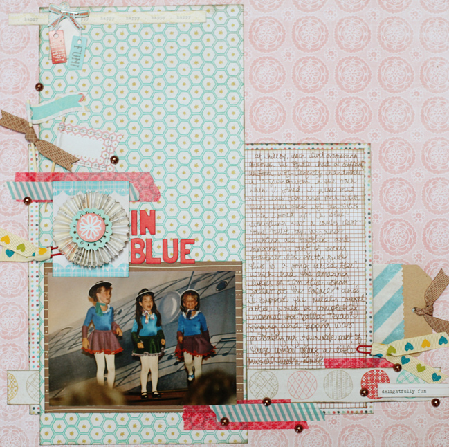
After a little break from this album, I finally got my thoughts in order enough for this picture. The ‘In Blue’ title comes from the uniform colour – each level or grade or whatever they called the different divisions had a different uniform, with leotards handmade at the studio. So I can tell exactly where this fits in the timeline due to the leotard on its own, but the mismatched skirts and such do make me laugh! I decided to put some of the writing on show (and it is easier – but not completely easy – to read in person) and some additional writing tucked away in the pocket for my own personal notes but not really for public consumption. This album is filled with so much writing and I’m loving it, piecing together the story with so many fewer photos than I take now. It’s a good creative challenge and good for the mind to get all those memories filed away in a sensible way. Plus I’m giving myself permission to use pink on every layout. As if I need permission.

This week, Glitter Girl challenges you to use both ribbon and washi tape on your project, then share the results in the gallery! If you don’t have both, you can cheat and use what you have, but if you own both, use both! You can also leave a link in the comments here if you like.

Onward, covered in glitter, my dear scrapbookers!

adventures of glitter girl

The Adventures of Glitter Girl is a weekly series on Two Peas in a Bucket, and goes live every Wednesday. I’ll share each adventure here shortly after that. I hope you enjoy her quests for crafting happiness, and if you ever have a scrapbooking dilemma yourself, you can always call her to action on the message board.

10 Things :: July (10 Signs the Olympics are coming to London)

10 Things
Tower Bridge with Olympic Rings
It’s the tenth of the month, which means two things: the preparation notes are now ready for my monthly scrapbooking challenge at UKScrappers, and it’s time for 10 Things: a blogging project filled with lists of anything, as long as there are ten things i the list. And with that, I bring you Ten signs the Olympics are coming to Londontown.

1. There are giant Olympic rings hanging from Tower Bridge. Huge. Can’t miss ‘em. There is a set at St Pancras international too, if you’re doing any channel crossing by train. Perhaps more impressive, the biggest set of Olympic rings ever has been mown into the grass at Richmond Park so they are visible from the air. I have a flight from Heathrow this Saturday, so I’m hoping for a window seat and a peek for the full effect.

2. Boris Johnson’s voice can now be heard on the loudspeaker of many train and tube stations. The first time I heard this at my local station was ridiculously early last Saturday morning and it nearly made me jump out of my skin, as all the other announcements are done by a robot voice rather than a recording of an actual person. Now I get a little nervous with the reminder that my usually quiet little station is an official Olympic route stop, and will likely be absolutely packed to the brim. (Locals, if you’re coming to Blackheath, be advised there are no ticket barriers on our station, and if you don’t remember to touch in and out on Oyster, you’ll be fined. We have all learnt this the hard way.)

london letterpressed cards
3. We have Olympic-themed bunting in the village and some flags on the heath. In the bright colours of this year’s branding – pink, purple, orange and turquoise. It went up a week or so after the Jubilee and it clearly has the Olympic and Paralympic logos alongside the 2012 design (of which I am so not a fan, but no one really asked me). I was standing at the road crossing when a lady looked up and remarked, ‘Oh, it’s nice they finally put something up for the Jubilee.’ Proof that some of the London population are applying the denial rule to all things Olympic this summer.

4. Everything that normally happens in a London summer is still happening, just on a much bigger scale. This past weekend, I watched some performances as part of the Big Dance, which happens every summer. Except this year it was everywhere! Circus tents at the Royal Naval College! At St Pancras Station! City Hall! (Actually, this is on-going at the moment and it’s not just in London, so have a look here for their full programme.) Speaking to a friend with an interest in independent film-making, she reported there have been so many more opportunities to collaborate or take a class as people get excited about how the city will change for these few months. So I’m thinking the same is happening across so many topics.

trooping the colour
5. The tourist groups are already bigger than usual. I’m not sure any of us can imagine what this is going to be like during the games themselves. Our local park is a pretty big tourist attraction anyway (hey, who doesn’t want to stand in both the eastern and western hemispheres AT THE SAME TIME I ask you?) but in the days before the park closed, the tourist groups ballooned in size. The same is in full effect in the West End and on the South Bank. I’m used to seeing tour groups of twenty or so, with a leader holding a random flag or umbrella to guide them, but in the past week I’ve seen multiple groups that are in the fifty to a hundred size. They move more slowly and take up so much more room. Yesterday I ran into such a group in a stairwell and I was of course going the opposite direction. I can’t say it was the most pleasant situation of all time really.

greenwich park sunset
6. The park is closed. We have known this was coming for a very long time, but it doesn’t make it any less sad. Much of the park has been closed for some time now as the equestrian arena, stabling and security is constructed, but now it is completely closed, and that goes for the Royal Observatory and the Planetarium too, which I know sounds like a random thing to lose from your everyday life, but we are actually members there so it’s more everyday than you might think. (Everyday but clearly not every day, yes?) On the flip side, the National Maritime Museum is not closed and has been recently kitted out with a swish new wing. I highly recommend the current special exhibition on the Royal River: it includes actual musical notebooks from Purcell and Handel, scrapbooks of royals from the early days of civilian photography, and some amazing revelations in the long tradition of trinkets made to commemorate coronations and royal marriages. Plus a full history of the Thames and many amazing paintings of its various incarnations (including the frozen Thames turned into a street carnival).

7. There are now little pink signs on tube maps that indicate which lines you need to get to the different event sites. Actually quite handy for not going to an event too, as this is a time when I’m sure I will be taking the longer route if getting from A to B means I can avoid the traffic of those going to an event.

8. Our Olympic tickets arrived! We have a set of cheap seats for round one of Men’s Basketball, and I also have a ticket to go be an audience stand-in for a day of testing things in the stadium before the games actually open, which sounds like it could be quite the mysterious adventure.

london ambassadors uniform
9. I have been to no fewer than three official interviews to verify my identity and good intentions so I can be trusted to guide tourists as a London Ambassador (that uniform is rather amazing, I tell you) and be part of another rather large event during games time (still can’t tell you about that part). Relieved to say I have passed all three security interviews and now been granted all sorts of large photo ID cards to hang around my neck, a pin that indicates I can speak a tiny bit of Spanish, and one particularly stylish trilby hat.

team GB
10. People are either EXCITED!!!! or grumpy. I wanted to say there is not much in between, but that would be wrong. Londoners do things in between. It is not a city of extreme emotion. We do not talk to strangers here and we do not make eye contact. It takes a while to understand that it’s not a rude thing – it’s a case of I don’t know you and I don’t want to intrude in your space/mind/life. In many cases, anyway. (There are rude people here of course. There are rude people everywhere, just like there are amazingly kind people everywhere. Thank goodness.) So I think it is merely more visible that people are EXCITED!!!!! or grumpy, because any sort of emotion on show is pretty radical here. But the EXCITED!!!!! people? They make me exceptionally giddy.

By the way, I do have some scrapbooking projects up my sleeve for games time. And I’m mostly concerned at how slow the internet will be with all the extra online streaming of live footage. I will keep reminding myself of dial-up in the countryside circa 1994 to get through it all, and that should keep me in good perspective!

Have ten things you want to share with the world? Blog it and then link it up here! Ten things, no matter what they are, just as long as they are ten!


Scrapbooking with Studio Calico :: Four Square

Scrapbooking with Studio Calico :: Four Square
studio calico scrapbook page
I can’t tell you how many times I got confused over how add-on three was called Four Square, but that’s where I’m up to with this video series for Studio Calico. Using this add-on and the main kit, Elmwood Park, I decided to pretty much ignore the patterns on the papers and think purely in terms of colour. This was a bit of a twist on how I normally scrapbook, but I really enjoyed the process of not worrying about whether things went with letters or pie charts or butterflies or hearts or anything else. Sometimes things can be all about colour if that’s the strongest part of a particular memory.


I’m afraid there are no more of those pie chart stamps since this kit is sold out, but you can find many of the items from Four Square on this shopping list if there’s something you love!

studio calico scrapbook page
And yes, if you caught the date, that was part of Christmas day not so long ago. Such an amazing day that there is no shortage of scrapbook pages about it and yet I still haven’t written down everything about that day.

My goodness, I love scrapbooking.

xlovesx

Scrapbooking Starting Point :: The Colour of Matsuri Days

Scrapbooking starting points
scrapbook starting points
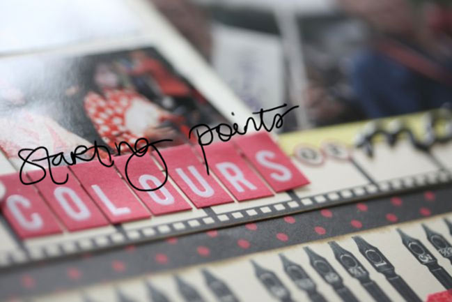
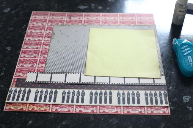
I’ve started this week drawn to red and black, so I’ve pulled out some always lovely red and black patterns from Jenni Bowlin and added a little splash of yellow from the Studio Calico Heyday collection.

scrapbooking starting points
I started by masking and misting that red patterned background, and I covered up what I didn’t like and left what I did like on show (the polka dots at the top left, misted in Pinstripe Mister Huey spray). Then I just started at the bottom of the page and piled toward the top – three border strips, one large block and a contrasting 6×6 paper on top of the stack. Everything is edged in a dark brown, to be a bit less harsh than black ink.

scrapbooking cropped photos
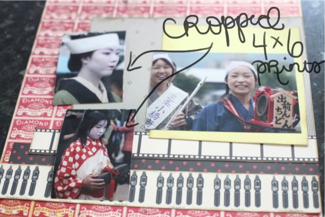
And now for a little tangent: I get a great many questions about why I don’t include more photos per page, and the most direct answer is just because I don’t like it. I like my photos at 4×6, and for the most part I like one to three of them per 4×6 page. I have plenty of exceptions to that, but that size is what works best for me. I have two connotations with page designs that really focus on including lots of images: my eyes can’t take them all in with so many images per page, which makes me feel a bit uneasy (even with significantly less embellishment than usual) and it reminds me of the sort of scrapbooking that involved a triangle of paper in the corner and competing for how many pages you could complete at a crop. I know that is fun for some scrappers – I’ve seen them relish it! It is not fun for me. It is stressful and foreign and uncomfortable for me. Just like ink droplets might make you twitch or covering up most of a layer of patterned paper might make you shout at me through your computer screen, too many photos on a page can just make my head spin because it’s not what I love. And I’m not going to make things I don’t love for the sake of a blog post or a video – so I’m afraid you’re stuck with a hefty dose of pages featuring one to three 4×6 prints! Since I print pretty much everything at 4×6, I have had a few commenters follow up the multi-photo discussion with the idea of cropping those 4×6 pictures. I rarely do, and today I tried it just to see if it would work. It didn’t, so this works perfectly to explain.

I knew I wanted to use that landscape 4×6 print with the smiling girls, but I also wanted to include some other photos from this same festival parade in Kyoto. They were all 4×6 landscape prints and there was no cute way to feature all three at full size with this starting point, so I needed to change something. I tried cropping those two images, and cut them so they were not only smaller, but now a portrait orientation, taller than they are wide. Especially with the top photo, it seems like this is a sensible solution because she’s the only person in focus in the picture, and the landscape image has lots of ‘wasted’ space to either side of her face. The cropped version is a disaster to me: losing that calming space to either side of her made the image harsh and awkward. It doesn’t look natural or fluid, and in both pictures it makes the people look somewhat out of proportion. These cropped images were not going to make me happy in the slightest, so I went back to the original files and printed them in their horizontal style with the original cropping of the image, but just at a smaller size. Immediately the images appeared calmer, more natural and gave a more honest depiction of the memory in my mind.

End of tangent, I promise.

scrapbook page
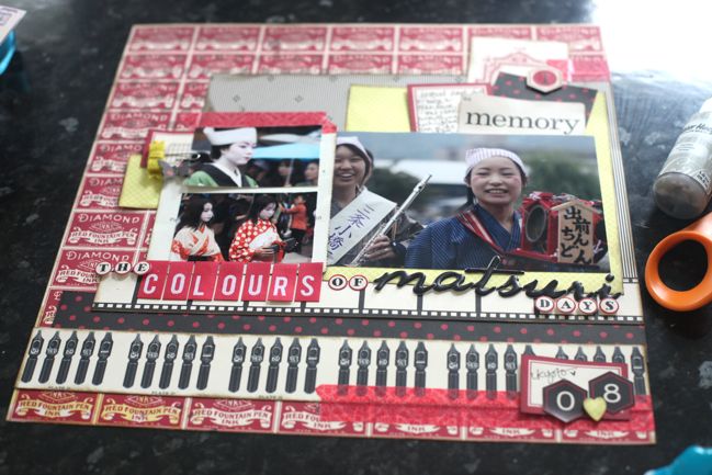
Here’s the finished version, with those two photos printed in their original orientation but at 2×3 inches instead of 4×6, and I’m much happier with that. I built the embellishment at the top right first, then replicated many of those layers over to the left, but also added a felt bow clip for dimension and texture and a little butterfly to keep it from being too boxy with all those squares and rectangles. The bottom right corner came last and it’s far more minimal, with the hexagon numbers for the date and a little punched heart, which is allowed both because I really do love Japan and because it was our honeymoon. As if you need permission to use a heart punch. Heart punches are always allowed in my world.

Other supplies include Jenni Bowlin stickers, Dear Lizzy and Heidi Swapp letter stickers, and My Mind’s Eye washi tape.

scrapbook pages
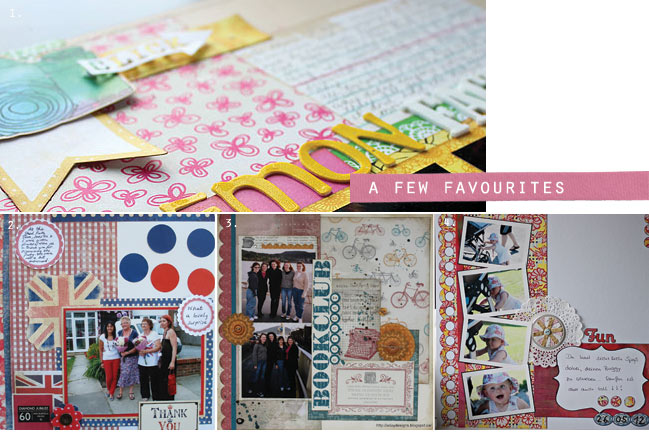
And a few favourite pages from the last starting point, which created all sorts of multi-photo pages, by the way. For a closer look at these pages, check out the posts from Kelly, Jacky, Alison and Katja.

If you give this starting point a try, I’d love for you to share your work – you might find your layout in the favourites next time!