pretty paper. true stories. {and scrapbooking classes with cupcakes.}

lovely to meet you Twitter Facebook Pinterest YouTube

Take a Scrapbooking Class

online scrapbooking classes

Shop Shimelle Products

scrapbook.com simon says stamp shimelle scrapbooking products @ amazon.com shimelle scrapbooking products @ amazon.co.uk

Reading Material

travel

Sketch to Scrapbook Page :: Making a Banner with Photos

scrapbook page by shimelle laine @ shimelle.com
I’ve been meaning to discuss a little something with all of you about how my philosophy has changed since so much of my teaching now comes in the form of videos. There is one really big idea I hope you will take on board: some times I try things so you don’t have to. I scrap so much and I share almost all of it with the world in some way or another – either in blog posts, in Glitter Girl videos at Two Peas, or in my class content for those of you who sign up for my online scrapbooking workshops. In the past year, I can count the pages I have kept to myself on a single hand.

That doesn’t bother me in the slightest: it is my choice to share with all of you, and if I didn’t want to, then this would not be the right job for me! But it does mean that there isn’t a nice, safe, secluded place for me to go through random ideas without sharing it with you as it happens. If I make every page in a style that’s too similar, you’ll get bored, and some will let me know. If I make every page wildly different from the rest, I won’t be happy with my albums and those of you who like the style I’ve shown you up to now may not be big fans, and some will let me know. So I try different things and I show you right there on the video as it goes. Sometimes I find a real win; sometimes I get the page to a point where I’m happy with it, but I make a big note to self about whatever particular element I probably won’t try again.

When you watch, you can make that decision from what you see, and if you want, you can essentially learn from that in the same way that you learn from a mistake. If I run my title up the side of the page and you don’t like it, you know not to run your title up the side of your page – and you don’t have to go through the stress of moving your title and trying not to ruin your letter stickers to figure it out. Maybe you look at my layout and think you don’t like that patterned paper. Perfect: don’t buy or use that patterned paper. What you see that you don’t like can be just as useful as what you do. But whatever you see? I like it for me and I’m happy to have it in my album – or I would keep working on it or start over!

With this sketch and video, I wanted to really demonstrate what I mean by this process. I wanted to take an idea I have used many times and try it in a way that I hadn’t used before and I wasn’t completely sure would work. I gave it a try and I kept working on the page until I got to a point where I was happy with the layout – but now I know the difference between the way I used this technique on this page and the way I’ve used it before, and I know what I will take forward from there. You can simply look and see what you like and take that forward for your own process without the frustration of discovering it for yourself. I think that’s what I mean. Of course, I also know some of you are stubborn like me and will want to try it for yourself. That’s totally okay too.

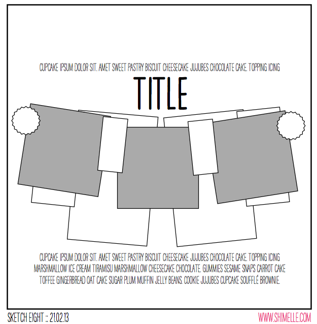
scrapbook page sketch by shimelle laine @ shimelle.com
Getting on with it then, here’s the sketch. It’s a bunting-inspired banner design across the whole page, on a quite large scale. I’ve used this idea in the past but always on a much smaller scale for the banner, and this time I wanted to use it as a big element that would take up most of the page. Of course, that makes it quite different from the usual way I start my pages with a bunch of different boxes of patterned paper in the background!


This page was made with supplies from the February Best of Both Worlds kit. (And the next sketch video moves to the March kit, by the way.) Of course you can try it with any papers you like! I added some eyelets and twine too, and for those of you who have requested eyelets on pages – I’m afraid this is pretty much the only time I use them these days. I passed my giant jar of eyelets to another scrapper many years ago and haven’t looked back. I just prefer brads, rhinestones, enamel dots, and other simple little embellishments like that to the extra steps of eyelets. But they do add a lovely bit of polish to banners!

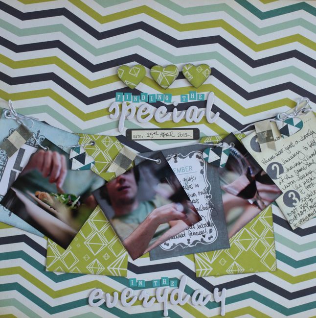
scrapbook page by shimelle laine @ shimelle.com
Here’s my resulting layout with the idea of banners gone big! But how does it compare to when I’ve used banners on a smaller scale? You can see three different examples in videos when I’ve used them as a smaller part of the page: the Glitter Girl episodes on breaking through scrapper’s block and using scenic patterned paper designs, plus this video when I guested for Studio Calico. But I ask you that in a way that it’s useful for you to figure out for your style! I’m happy with all four layouts in my albums and they all have a different look. If you like one more than the others, then you might want to remember that if you use this sketch but in your own style. All part of the learning process, and drawing those conclusions for yourself can be really important in defining your own style, if that’s something that interests you.

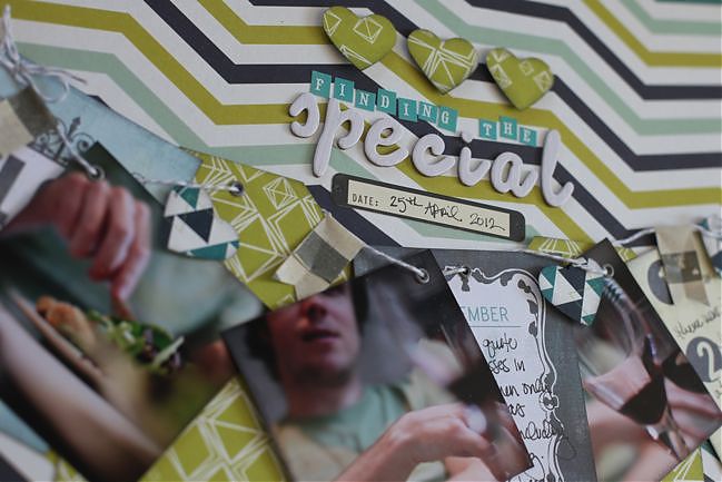
scrapbook page detail by julie kirk @ shimelle.com
But of course I’m also delighted to include another version from this same page so you can compare already and keep those notes to self in your own mind. So much good stuff with this page by Julie Kirk!

scrapbook page by julie kirk @ shimelle.com
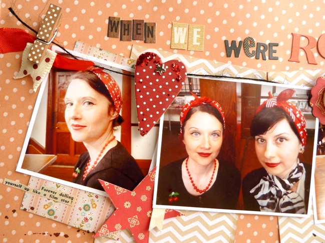
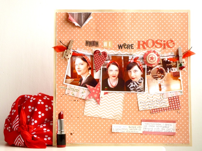
If scrapbook sketches can feel theatrical then this one, with its title taking centre stage and the photos stretched out like a banner, certainly fits the bill making it easy for me to decide which photos to use with it. My sister and I recently spent the day at a ‘Rockabilly Rosie’ workshop where we tried out glamorous vintage-style make up, hairstyles and dance steps. Not all at the same time I might add … although we would have had fun trying! And the retro results seemed just perfect for this style of sketch.

I adapted a few things to help me tell this particular tale such as adding a narrow frame around my background paper as a way to pull in another colour which, like all the shades of papers I chose, was drawn from the colours within the photographs. I also added in a few vintage themed touches like the rip in the top corner and a snippet of text [beneath the left hand photo] which I cut from a 1950s magazine. I couldn’t settle on a way to write my journaling across the page, like the sketch, so I just used a couple of journaling blocks instead. But overall, looking back at my version I realise I’ve stuck fairly closely to the original, which is a bit surprising really as I didn’t think I was that obedient!
Julie Kirk documents everyday stories through her scrapbooking often in combination with vintage supplies and lots of patterned paper. She is regular designer for Papercraft Inspirations and Creativity! Magazines and contributes to the 3DJean design team blog. Through her own blog, ‘notes on paper’ and her Facebook page she shares creative projects, hints and tips, stories, and anything which might raise a smile. Meanwhile she shares her love of vintage supplies through her Etsy shop.

And now it’s your turn! Create a page in your style with this sketch, post it online, and share it with us. You can upload to your blog or to a scrapbooking gallery like Two Peas or UKScrappers, then just follow the steps to link to your project wherever it can be found online!


Using Handmade Frames on your Scrapbook Layouts by Mandy Koeppen

scrapbook tutorial by Mandy Koeppen @ shimelle.com
Three is the magic number, right? And that’s why I wanted to share this tutorial from Mandy Koeppen with you today – to present a third look at this entire idea of Polaroid-inspired frames. (Then we’ll move on to something else, I promise – and there is something else coming right up later today.) Not only do I like the different look Mandy created with her perspective on something that both Kirsty and I have had on the brain – I also like this deeper idea of just how infinitely you can take one idea and pull it apart and put it back together again to make all sorts of different things for your scrapbook pages. There’s a little deep thought for your morning!

I don’t consider myself a real ‘techniquey’ scrapbooker because usually techniques involve time and mess. Don’t get me wrong: I love the crazy, cool, messy look, but it’s just not my style and I’m a bit impatient. When I create, I need that instant gratification., I can’t wait overnight for mist or paint to dry, so I look for other fast creative ways to incorporate fun new things on my projects. That’s where my love for frames has come in. I love frames in all shapes and sizes. I hunt my local vintage shops for cool frames for home décor, I scribble little frames in my journals, and lately I’ve been using frames a lot on my scrapbook layouts.

Today I’m going to share a fun, simple, and fast way to create your own one of a kind embellished frames that will give your paper projects a unique look.

To create theses frames you will need:

Adhesive backed canvas, a craft knife, patterned paper, small embellishments like stickers and brads, sewing machine, adhesive, and your scissors.

scrapbooking tutorial by Mandy Koeppen @ shimelle.com

scrapbooking tutorial by Mandy Koeppen @shimelle.com
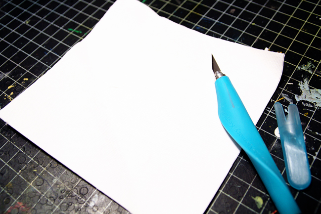
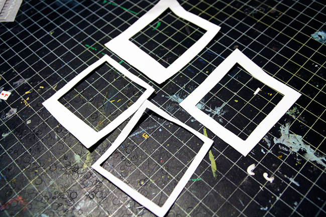
Using a craft knife or sharp pair of scissors cut frames out of adhesive backed canvas. Also if you don’t have canvas you can use vellum, pattern paper, stiff fabric etc. I cut the frames freehand but you can use a template or ruler. I love the wonky style frames I get without lining and measuring.

scrapbooking tutorial by Mandy Koeppen @ shimelle.com
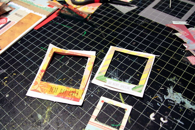
Using your knife or scissors, cut frames from patterned paper. Then layer the paper frames onto the canvas frames. This is another good way to use up your scraps from other projects. Again I cut the pattern paper freehand because I like the fun look it gives the frame, but you can use your ruler or template here too.

scrapbooking tutorial by Mandy Koeppen @ shimelle.com
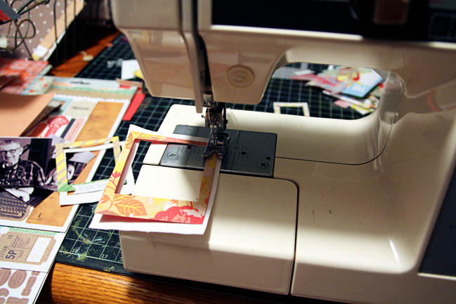
Stitch the patterned paper to the canvas frames using a sewing machine. You can always adhere the layers of your frames with adhesive if you don’t want to use a sewing machine.

scrapbooking tutorial by Mandy Koeppen @ shimelle.com
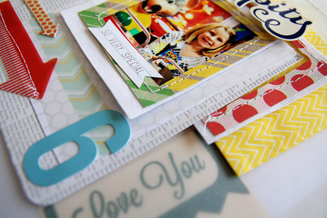
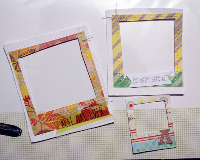
Embellish your frames. I used stickers and transparency sayings on my frames. You could also use brads, stamps, banners, border stickers, labels, alpha stickers, chipboard – whatever you have on hand really.

scrapbooking tutorial by Mandy Koeppen @ shimelle.com
Use your embellished frames on your paper projects. Here I have used two of the frames on this layout.
Your frames don’t have to be perfect! Have fun creating them and remember a little wonkiness gives your project a fun look. Frames aren’t just for framing photos. You can layer your canvas frames with vellum and paper like I did on the layout in this post or you could use the frames for journaling, and much more. So, give it a go and try creating your own frames next time you scrapbook!

With three posts all about paper frames in one way or another, we wonder if this condition is a bit contagious. If you have evidence to prove a frame outbreak in the scrapping world, do be sure to leave a link so we can see your version!


Mandy Koeppen is a 30 something mom of 3 who juggles many job titles in her everyday life from chauffeuring family accountant to zoo-keeping therapist. She lives a small town, country girl life in Michigan with her Mr. K, raising their three children Teagan, Mavrick, and Avery. When she has time, Mandy loves to get creative with paper, browse her local antique shops, raise autism awareness for sweet Mav, and have fun with family & friends. Mandy’s work has been published in Creating Keepsakes, Scrapbook Trends, Scrapbooks Etc, and Somerset Memories. Mandy currently designs for Cocoa Daisy Kits. To see more of Mandy’s work or to get to know her better you can visit her blog or follow her on Twitter or Instagram.

Using a Polaroid frame stamp on a scrapbook page

scrapbook page by shimelle laine @ shimelle.com
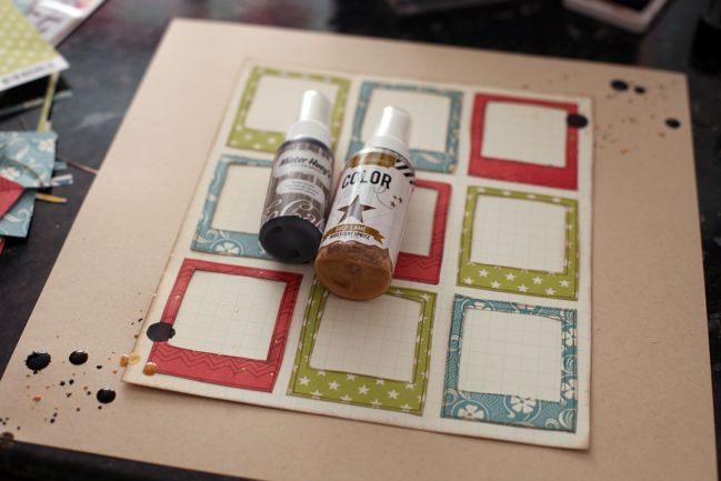
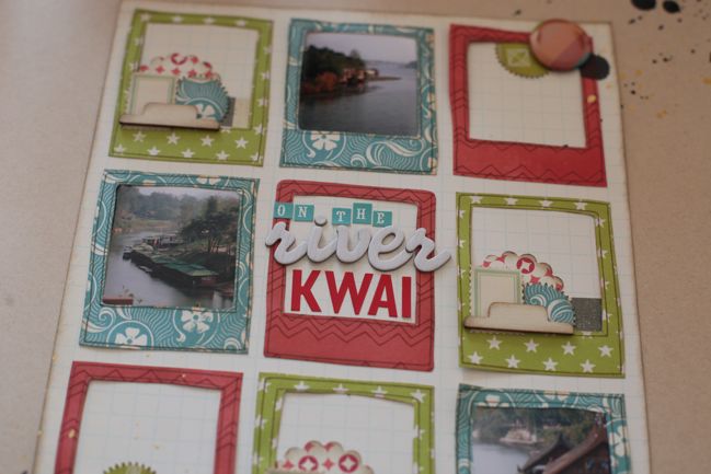
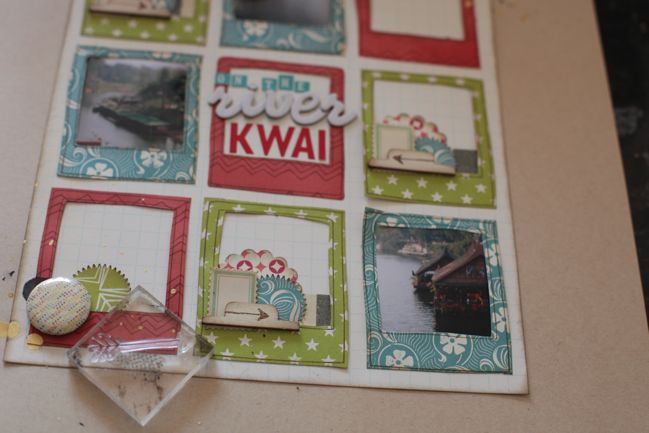
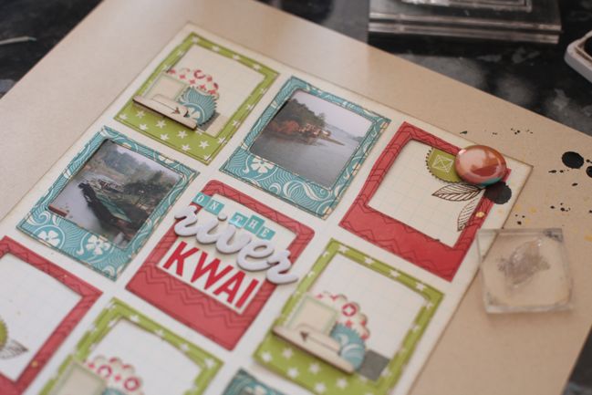
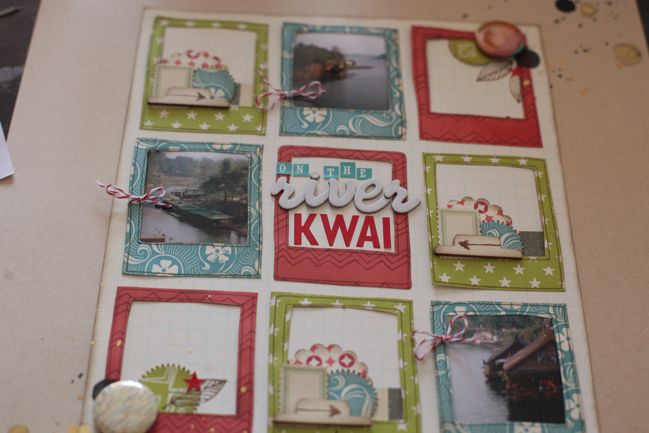
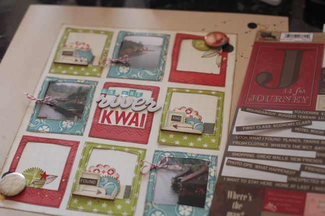
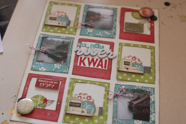
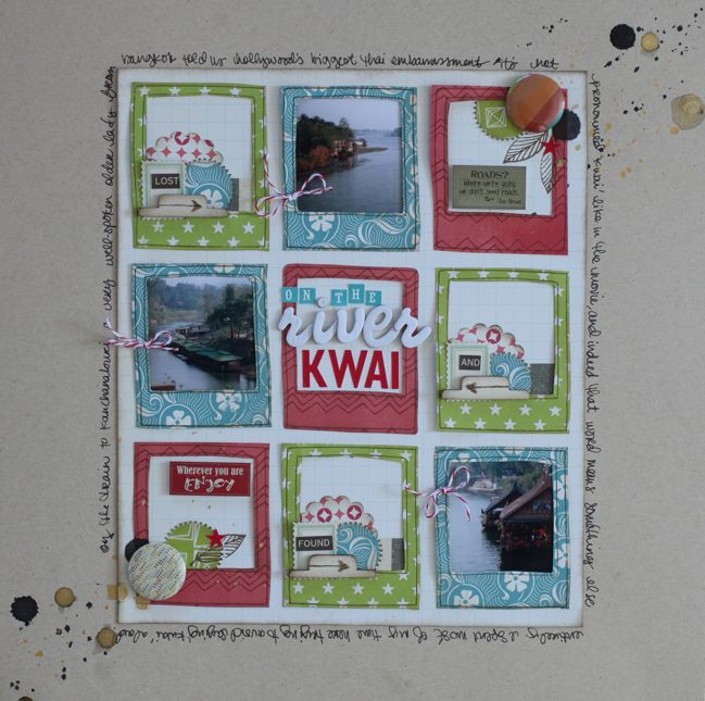
Oh, how I love it when inspiration comes along at just the right time. That beautiful scrapbook page tutorial by Kirsty Smith went live at just the same time when the Dear Lizzy 5th & Frolic stamps were sitting on my desk. I’d been using the word stamps in that set a lot more than the image stamps in this set, so Kirsty’s page quickly reminded me how easy it would be to make something lovely with the Polaroid-style frame. I put it together with a sheet of kraft cardstock and scraps from my February Best of Both Worlds kit.

scrapbooking tutorial by shimelle laine @ shimelle.com
First I stamped the Polaroid frame in brown dye ink…

scrapbooking tutorial by shimelle laine @ shimelle.com
…three times on each of three patterned papers, for a total of nine frames.

scrapbooking tutorial by shimelle laine @ shimelle.com
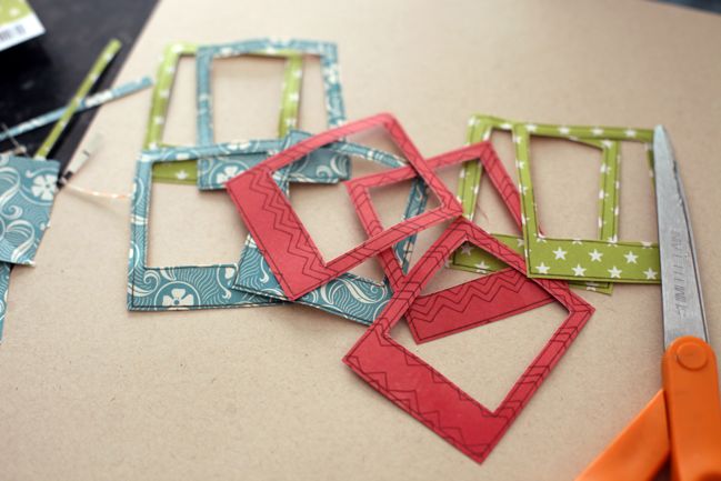
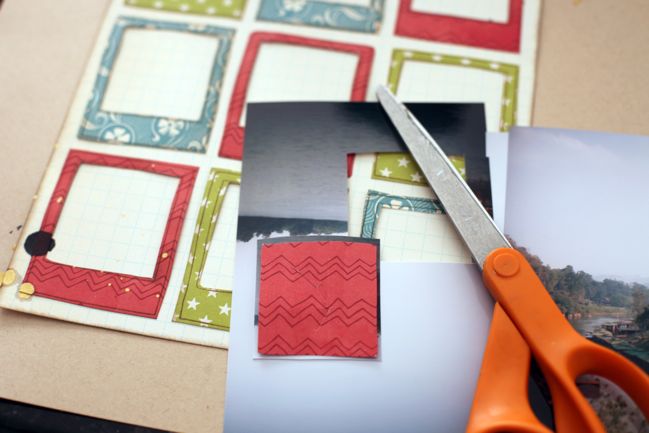
Then cut out all those frames with scissors. Easy enough.

scrapbooking tutorial by shimelle laine @ shimelle.com
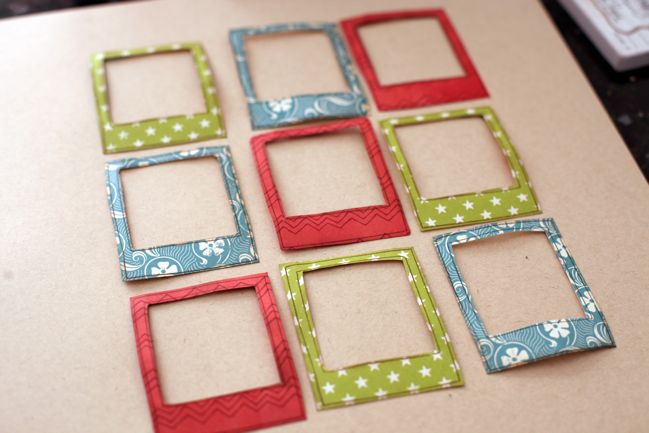
Spend twenty minutes moving the patterns around in a grid until finally settling on this arrangement. Then spend the next twenty minutes wondering why that took twenty minutes to decide. This is a slippery slope.

scrapbooking tutorial by shimelle laine @ shimelle.com
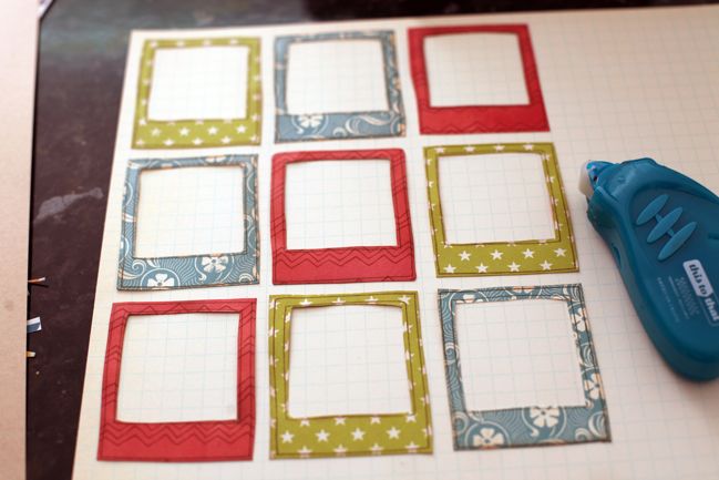
Transfer the frames – in that much pondered order – to a sheet of neutral patterned paper. Kirsty’s pages often remind me to use all that grid paper in stash. Attach with adhesive that allows for things to be moved about – or just be way more graceful than I am and not knock the frames onto the floor six times while you’re trying to figure out the rest of the design. Your choice.

scrapbooking tutorial by shimelle laine @ shimelle.com
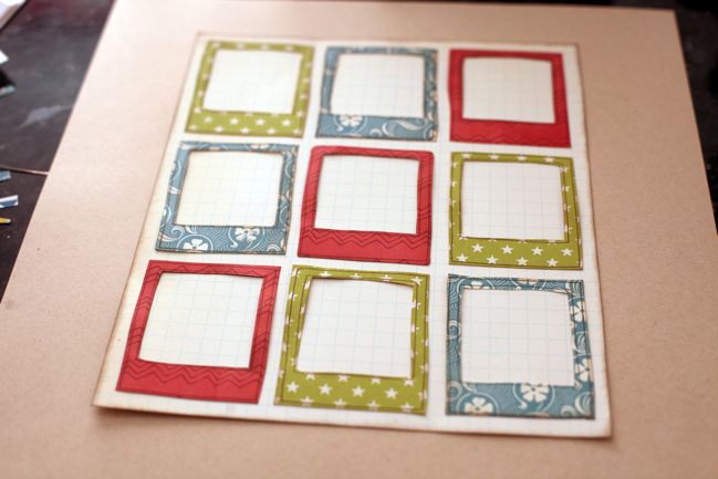
Cut the grid paper to frame the frames, ink the edges, and attach it to the centre of the kraft cardstock background. Exhale happily that this step had significantly fewer opportunities to derail for another twenty minutes.

scrapbooking tutorial by shimelle laine @ shimelle.com
Use the spray tube and an eye dropper to splatter mist on two corners of the page to form a diagonal line. I used gold lame color shine spray by Heidi Swapp and Studio Calico Mister Huey’s spray in Dark Calico (that one is on sale at the moment if you’re looking for a dark neutral shade, by the way). Be completely impatient and refuse to wait for the larger droplets to dry, and enjoy the feeling of living dangerously throughout the rest of the creative process as a result.

scrapbooking tutorial by shimelle laine @ shimelle.com
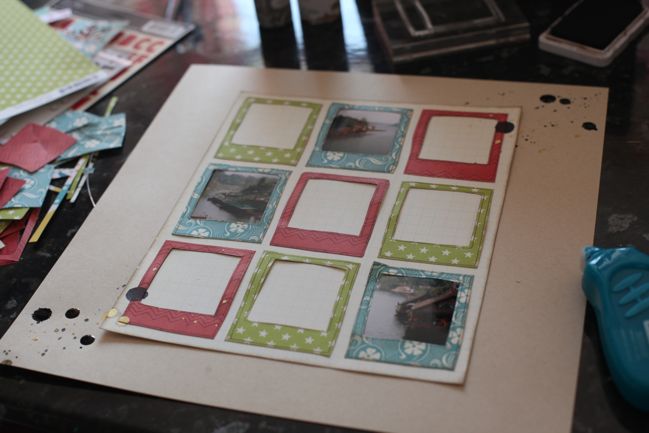
Use the scraps from cutting out the centre of the stamped frames to cut three photographs to a size that will sit nicely behind three frames. I picked photos that had some nice details that were otherwise lost in a larger image when printed at 4×6.

scrapbooking tutorial by shimelle laine @ shimelle.com
Realise it might be simplest to make all the red frames match, all the green frames match, and all the turquoise frame match. Spend another twenty minutes deciding which colour would be best for the photographs. Eventually choose turquoise. Live the rest of my entire life wondering if this was the right decision.

scrapbooking tutorial by shimelle laine @ shimelle.com
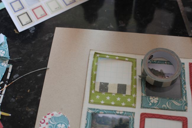
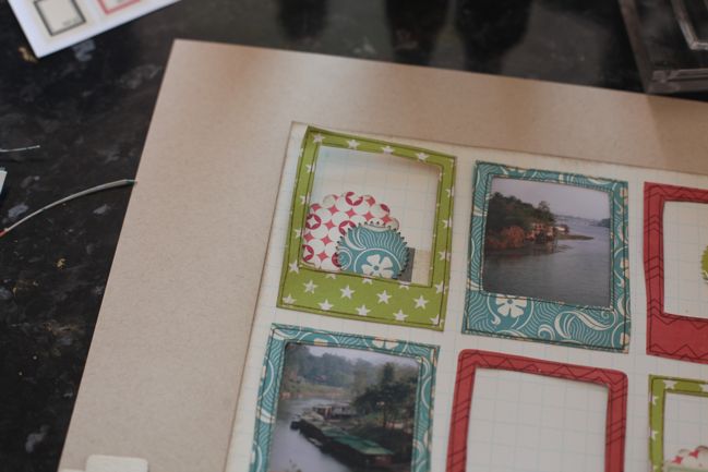
Start the green frames with a stripe of tape inside the window.

scrapbooking tutorial by shimelle laine @ shimelle.com
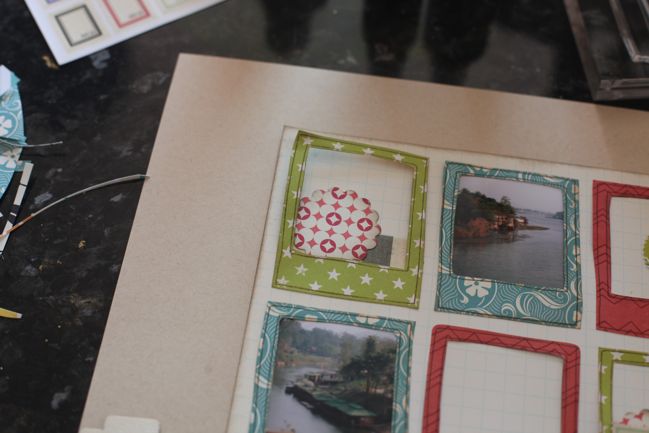
Then a punched circle in the corner…

scrapbooking tutorial by shimelle laine @ shimelle.com
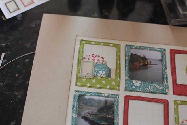
…and a smaller punched circle over the top. Feel like I just won house points for Hufflepuff by managing to get all three patterned paper colours into this embellishment grouping.

scrapbooking tutorial by shimelle laine @ shimelle.com
Top with a postage stamp sticker from Jenni Bowlin Studio.

scrapbooking tutorial by shimelle laine @ shimelle.com
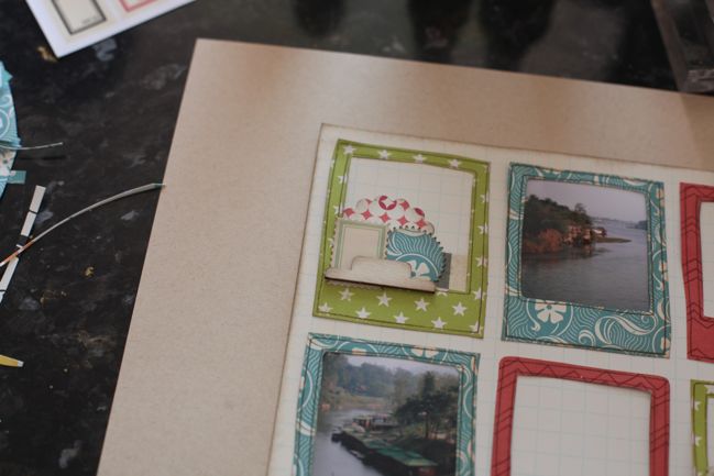
Add dimension with a wood veneer file tab by Studio Calico.

scrapbooking tutorial by shimelle laine @ shimelle.com
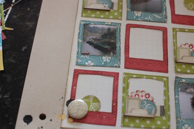
Realise the red frames are now looking very naked by comparison. On the two corner frames, add a punched circle and a Studio Calico badge embellishment. Ten points to Hufflepuff for the group of three formed by the circle shapes in the punched piece, the badge, and the closest large droplet of ink, all overlapped.

scrapbooking tutorial by shimelle laine @ shimelle.com
Title gets the centre square. The white woodgrain Thickers and the red Jenni Bowlin letters are both from the kit, plus those tiny turquoise letter stickers are an older set in my stash by Cosmo Cricket. Congratulate self that ‘Kwai’ fits so perfectly in the frame, since I didn’t think to check that before this step.

scrapbooking tutorial by shimelle laine @ shimelle.com
Use the arrow stamp in brown ink on top of the wood veneer tabs, mostly because I’ve fallen in love with the look of stamped veneer. Point the arrows toward the nearest photo to help direct the eye to the photos, which is extra helpful with the combination of small photos and plenty of embellishment.

scrapbooking tutorial by shimelle laine @ shimelle.com
Add some leaf stamps to the corners of the two red frames.

scrapbooking tutorial by shimelle laine @ shimelle.com
And some little red star stickers too. Then I noticed the turquoise frames started to feel too plain, so I added red baker’s twine to the edges. Award ten points to whatever house baker’s twine belongs to for its amazing ability to be a perfect little detail on pretty much anything.

scrapbooking tutorial by shimelle laine @ shimelle.com
At this point, I headed to my ‘use it or lose it’ box. I constantly go through supplies and try to clear out the things I will not use. Sometimes I end up with items that I still like but they are old enough that I haven’t been using them as much and I need a little push to grow up and choose a side: use them or lose them. I write a deadline somewhere on the product and whatever I don’t use by that date heads to the donation box. Right now there are a few sheets of these 7gypsies stickers, which are fab for cutting into little word blocks…

scrapbooking tutorial by shimelle laine @ shimelle.com
…and also has a few labels with phrases that will fit this page.

scrapbooking tutorial by shimelle laine @ shimelle.com
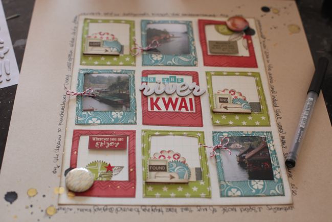
Then finish with writing around the grid paper, and make a serious note to self that Kirsty’s layered page idea would allow for significantly more writing than this.

scrapbooking tutorial by shimelle laine @ shimelle.com
Award Kirsty at least fifty house points for her inspiration that lead to this new page whilst feeling a sudden urge to go through my entire basket of scrap papers and stamp them all with Polaroid frames.

Decide that would take way, way too long.

Two Sides to Every Story: a Scrapbook Tutorial by Kirsty Smith

scrapbooking tutorial by Kirsty Smith @ shimelle.com
Today I am delighted to welcome a local scrapbooker to the blog! (Bonus points if you just heard the words ‘a local blog for local people’ in your head, by the way. And sorry.) Kirsty Smith is immensely talented and I pretty much love everything she makes. Or writes. Or says on a podcast. She is awesome. But she’s also very British, so I somehow doubt she would go around saying ‘awesome’. So I just did that part for her. I hope you enjoy her story-telling scrapbooking tutorial, and do be sure to check out the great workshop she is offering.

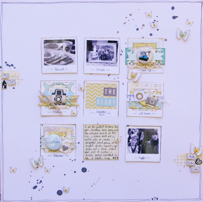
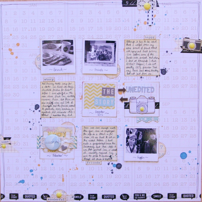
It’s often said that there are two sides to any story. For example, there’s the story of a recent weekend I spent with my friends, when I took them out in London for the day, cooked them all dinner and was generally the hostess with the mostess, right down to freshly-baked cinnamon rolls for breakfast. As a story, it’s technically true, but it lacks, shall we say, the whole truth. The other side to the story is missing. For instance, that story doesn’t explain that I served dessert before the main course, lost ungraciously at board games (and I do NOT lose at Articulate) and accidentally made alcoholic cinnamon rolls.

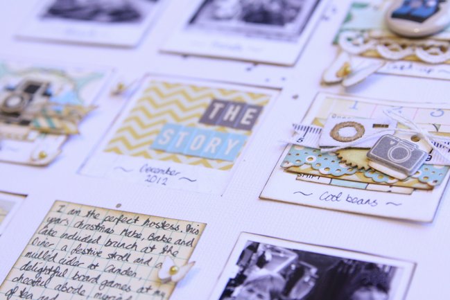
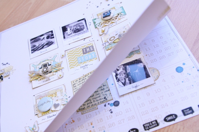
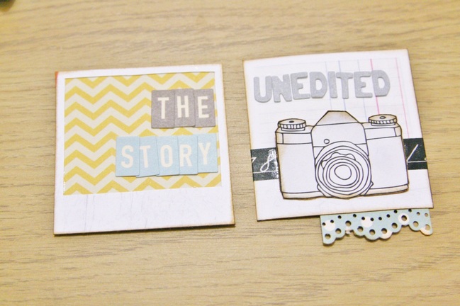
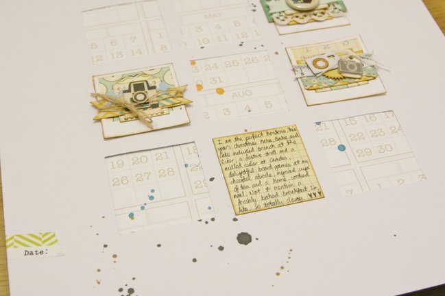
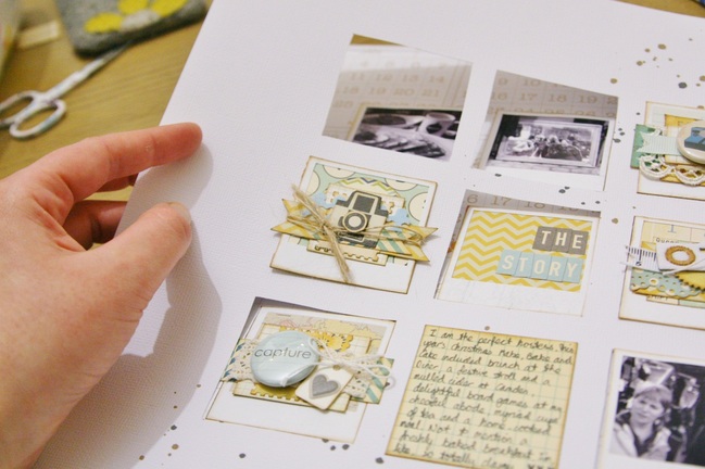
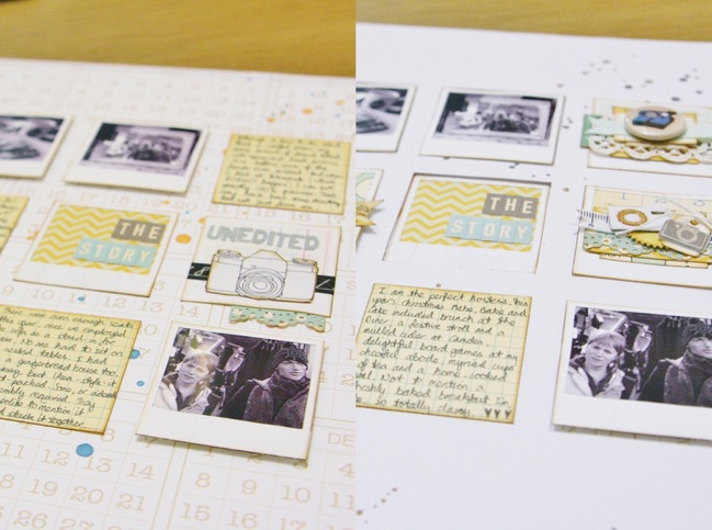
This tutorial shows you how to put together an interactive page that allows you to share more than one perspective on a memory. The top layer shows the ‘nice’ version of the story of the perfect hostess. It’s lighter and more delicate with pretty little details. There are holes cut into the top layer which show aspects of the page underneath including the photos and the title ‘The Story’.

However remove the top page and beneath, on the base page, we find the complete title ‘The Unedited Story’ and different journaling that gives a different interpretation of the same pictures. The basic design is the unaltered but it’‘s a little darker with a touch of grunginess to create a different impression; it’s a little more rough around the edges.

One page unlocks to become two pages with two different angles.

scrapbooking tutorial by Kirsty Smith @ shimelle.com

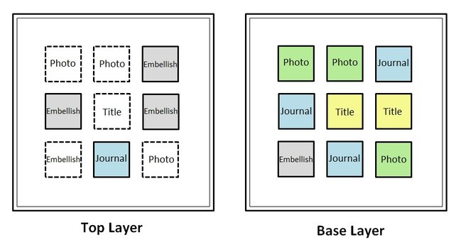
The plan for the two pages is as follows:
scrapbooking tutorial by Kirsty Smith @ shimelle.com

To follow the grid design above, you’ll need three photos, although you can obviously take this idea and vary it to suit your needs! Most important however, is having two different tales to tell drawn from the same pictures. It may be that you have two perspectives of your own, or you may want to ask someone to write down their thoughts when they look at your pictures. You could get the family involved, or ask a friend what your pictures remind them of. You’ll also need two full 12×12 sheets and some assorted patterned papers – a great chance to use up the scraps.

scrapbooking tutorial by Kirsty Smith @ shimelle.com
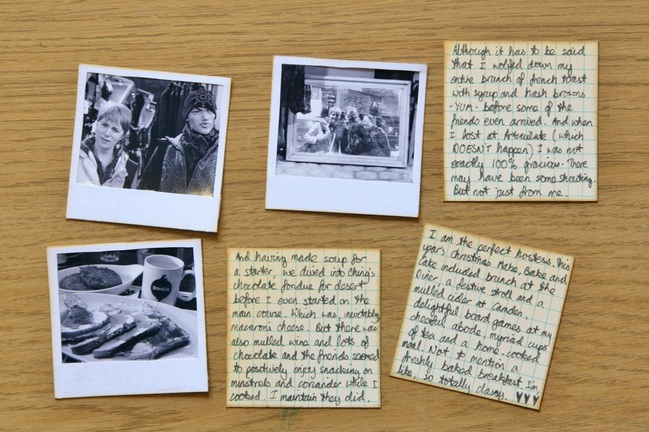
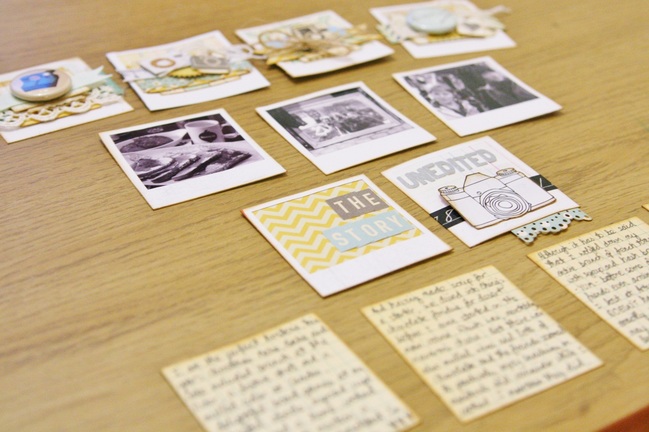
I printed my photos in black and white to ensure that they all matched and mounted them in little polaroid-style frames cut from a sheet of patterned paper.
Then, I used grid-patterned paper to write my journaling: one block for the top layer with the ‘nice’ version of events, and three blocks for the ‘real’ version of the story on the base layer.

scrapbooking tutorial by Kirsty Smith @ shimelle.com
To match the photos, I constructed all the other elements of the page on little polaroid-style squares too. However, any patterned paper squares would work! The title is made up of two blocks: the one that shows through to the top layer which reads simply ‘The Story’. The other is hidden until the top layer is removed to reveal the full page title: “The Unedited Story”.

scrapbooking tutorial by Kirsty Smith @ shimelle.com

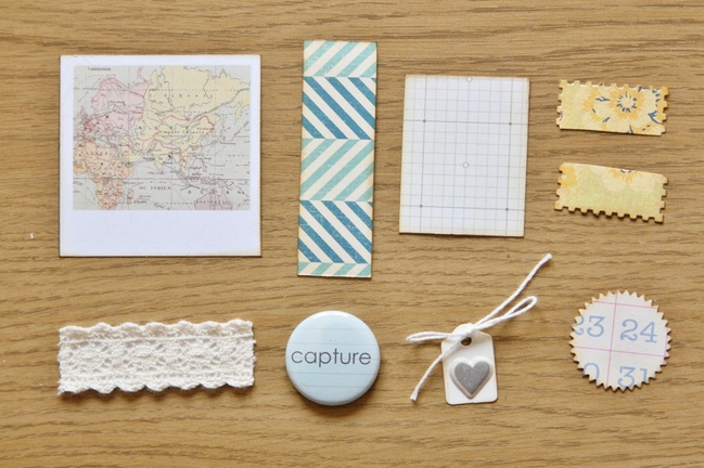
To construct the layered embellishment blocks, I used little bits and pieces left over from other projects. Apart from the backgrounds, I only used scraps to make this page, and punches can be a great way to help you make the most of those little bits you can’t bear to throw away! Mixing the paper with scraps of ribbon and material, and topping with little tags, stickers and buttons creates dimension and texture. It also makes the grid design seem a little less blocky and more fluid.

scrapbooking tutorial by Kirsty Smith @ shimelle.com

If you’re following the sketch above, when all the blocks are complete, you should have four embellishment blocks, three photos, two title blocks and four journaling blocks. It’s worth remembering that blocks that are on the base layer and won’t show through to the top should be as flat as possible. Then the two pages will fit together and not have lots of bulky lumps and bumps.

scrapbooking tutorial by Kirsty Smith @ shimelle.com

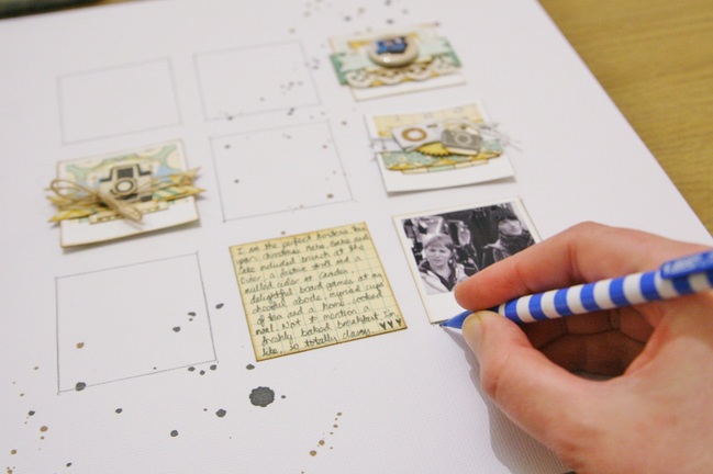
Begin assembling the page by starting with the top layer, and place the relevant blocks in place, including the ones which will show through from the bottom layer. (These are marked with dotted lines on the sketch) If you’re happy with the arrangement, note where everything goes and draw around the ones that will eventually be on the base layer.

scrapbooking tutorial by Kirsty Smith @ shimelle.com
If you’re handy with a craft knife, you now need to cut out the five holes where the base layer will show through onto the top layer. If, like me, you aren’t handy with a craft knife, a pair of scissors will work perfectly well.

scrapbooking tutorial by Kirsty Smith @ shimelle.com
Once your holes are made, attach the relevant blocks to the top page – that’s three embellishments and one block of journaling if you’re following the sketch.

scrapbooking tutorial by Kirsty Smith @ shimelle.com
To ensure the two pages will slot together well, make sure that the blocks on the base layer will fit through the holes in the top layer. If you’re happy, position the top layer over the base and attached the blocks through the holes in the top to the base. (That’s three photos, the title and an embellishment). This will enable you to correctly position these blocks on the base layer. You may also wish to pop up the photos on foam squares – they then appear to be part of the top layer rather than seeming to be below the level of the page. Attaching the two layers with something like washi tape first will mean that they stay in place, and you can simply peel off the tape once you’re done.

Remove the top layer and you can complete the base. Adhere the remaining blocks and check one last time that you can combine the two pages into one.

scrapbooking tutorial by Kirsty Smith @ shimelle.com
All that remains is to add finishing touches to both pages. For example, I used the same colour scheme on each page, both feature cameras and polaroid frames, and the same grid design. But the top layer has a clean, white background, mist splattered in dark brown and black, and butterflies popped up on foam and embellished with pearls. The soft yellow and blue are emphasized. The base layer has a patterned background, ink splattered in blue, yellow and black, punched shapes and washi-tape. There’s more emphasis on the black and bright yellow in the colour scheme.

scrapbooking tutorial by Kirsty Smith @ shimelle.com

scrapbooking tutorial by Kirsty Smith @ shimelle.com

And now get creative! There’s no need to stick to a grid design and there are myriad combinations of stories and pages to tell. All you need is a bit of perspective: remember there are two sides to any story.


Kirsty is a maths teacher living in North London and she loves to scrapbook and drink tea. If you enjoyed this tutorial, you’d also like her new Scrapbooking class Telling Tales, which is all about sharing memories and getting stories into our scrapbooks. Every penny raised will go towards fundraising for Girlguiding UK and you can find full details here on her blog. You can see more of Kirsty’s projects on her blog journalofcuriousthings.co.uk and she also hosts a scrapbooking podcast, Journal of Curious Things, which can be downloaded from iTunes. And if you’re so inclined, send her an email to journalofcuriousthings@gmail.com. Who doesn’t love getting mail?

Sketch to Scrapbook Page :: Scrapbooking with a patterned paper you don't want to hide

scrapbook page by shimelle laine @ shimelle.com
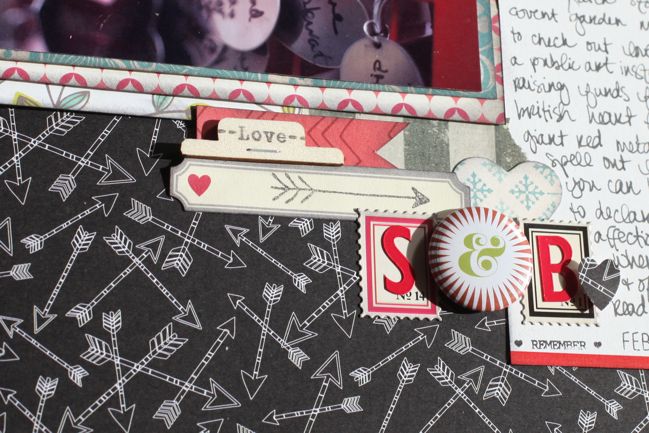
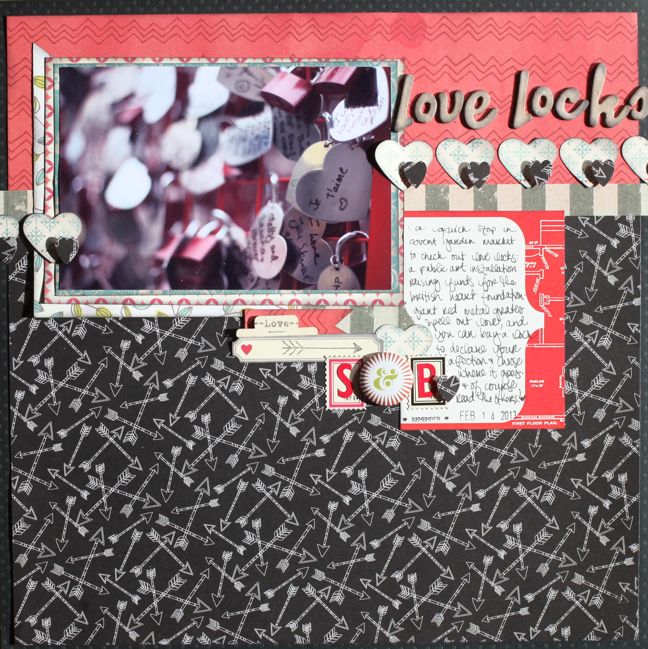
I love little groups of random items from my desk that can come together to make some sort of lovely embellishment on a scrapbook page. Well, I guess you knew that. But when it does honestly happen from just bits and pieces sat on the desk – remainders of a kit or cast-offs from other projects – it makes me happier than searching out all those pieces for ages. This was one of those times when the pieces were all there and they just fit into the space to finish the page. A journaling card, then washi tape, a strip of paper to bring in some colour, a label to bring in something lighter, letter stickers for initials, postage stamps with the right numbers to back those, something round to add a bit of variety (and an ampersand), and some stamping to pull everything together. That’s how I finished this most recent Sketch to Scrapbook Page project.

scrapbook page sketch by shimelle laine @ shimelle.com
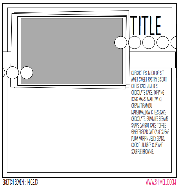
This sketch is designed for those patterned papers you don’t want to cover up. Something with a print you really like to see or a pattern that doesn’t read well in small amounts. It gives you plenty of room for writing and the chance to showcase a 4×6 landscape photo with some repeated embellishment – perfect for punching shapes from papers to make your own accents.


All the supplies used for this project are from the February product picks for Best of Both Worlds, with the addition of a sheet of 12×12 black cardstock for the background and a date stamp at the bottom of the journaling card. I used an embossing stylus for the dotting tool with the mist – that’s a quite general craft supply that you might already have on hand, but if not they aren’t too hard to find.

scrapbook page by shimelle laine @ shimelle.com
Love locks are something you can see on bridges all over the world, but just in time for Valentine’s Day, there were some special love locks in Covent Garden in support of the British Heart Foundation. It was just as interesting to look at all the other locks as to leave your own. And so pretty through the lens.

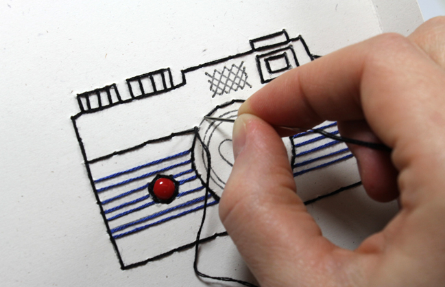
stitched camera by Julie Campbell @ shimelle.com
Because I was cheeky and running behind, I’ve already shared the guest project for this sketch. It’s a Valentine card by Julie Campbell, and in addition to making a card from the sketch, she shares a clever trick for using rub-ons with stitches to amaze your friends with your hand-sewing skills! Perfect.

And now it’s your turn! Create a page in your style with this sketch, post it online, and share it with us. You can upload to your blog or to a scrapbooking gallery like Two Peas or UKScrappers, then just follow the steps to link to your project wherever it can be found online!


Best of Both Worlds :: My scrapbooking product picks for March 2013

March is the time when I do most of my on-the-road scrapping for the season, and pretty much every weekend this month will see me lugging my scrapbooking things near and far. This week not too far, but then a few trips long enough to require a passport – I’m off to Germany and Italy to teach. (If you’re reading in Italy and would like to come along, let me know! The event in Germany is sold out but there may be a few seats for you in Italy.) But long train journeys or no, it is now March! And that means a new set of scrapbooking product kits for the Best of Both Worlds!

Click here for the March 2013 Best of Both Worlds shopping list.

If you’re new to this idea, the basic principle works like this… throughout March, I’ll be using this set of supplies to make pages. You’ll see them in Sketch to Scrapbook page videos and other posts, like Starting Points. If you want to have the kit just like I do, click that link and add one of each thing (well, almost – more on that in a moment) and check out your order! BUT this set-up gives you the freedom to make changes for whatever reason: maybe you already have some items or some really similar items in your stash and you don’t need duplicates, maybe I’ve picked something that you would never use and you can substitute it for something you would love. Plus of course there is no subscription – you can join in on the months you want to and leave others out with no obligation, though of course it does take a little more effort on your part to check this post and click over and add the items. But it’s another option if you like the idea of a subscription kit but in practice it turns out not to be your favourite thing in the world. That’s the general idea!

Now, there is one thing to note about this month’s shopping list. I’ve included some options for the large set of letters, and I don’t expect you to order them all! With this kit, I really wanted to put something together that could be very feminine or by turning the papers to the other side, could be quite neutral or even masculine. It was an interesting challenge! But lettering is something you can’t just turn over and find the perfect set on the back, so I added some options and you can choose the set that is the best balance to your style: black if you prefer quite neutral titles, turquoise if you want something colourful that can work toward either masculine or feminine pages, or a rose-coloured glitter alpha if you want to fully embrace the most girly looks this kit can provide. There’s also a set of letter stamps on the list – it’s a set that is exclusive to Two Peas and is currently half off, which makes it a great bargain. If you like letter stamps, then this is a great time to add it to your collection and if you’ve wanted to try letter stamps but haven’t so far, this is a great way to add a good set at a fab price. It’s a really versatile alphabet in a size that works great for titles, subtitles, and embellishments. During March, I’ll be sharing a few different techniques for letter stamps, and they work specifically well with something that has some weight to the letters like this set. But the general idea with all that lettering is that you would choose one or maybe two from those options rather than all of them!

Of course you can also do other shopping while you’re picking up your kit. There are hundreds of new items, including the lines from Amy Tangerine, Dear Lizzy, Maggie Holmes, Studio Calico, My Mind’s Eye, Echo Park, Bella Blvd, and Jenni Bowlin! Lots of great things to add to your stash, and don’t forget Two Peas offers free domestic shipping to orders over $50 or $5 off international orders at the same level. You need a code to claim that discount – it can be found at the bottom of the Two Peas newsletters.

Have a great weekend, wherever you may be!

xlovesx

Five Different Ways to Use Stencils on Paper Projects by May Flaum

scrapbooking tutorial by May Flaum @ shimelle.com
Looking for the March Edition of the Best of Both Worlds kit? A post and video is coming up today, but if you really want to run now, you can find it here. Please note this list is longer than usual – it’s designed for you to choose which large alphabet is best for you rather than add them all. More about that later today!

Today I am delighted to welcome dear friend and crafty wonderment May Flaum to the blog to share her take on a supply I know I need to get more use from: stencils. I’m already taking notes, May!

Stencils used to be really limited in designs and sizes available, and if you had told me five years ago that they would become used as much as stamps in my layouts I would have told you that it was impossible. Now with more designs available in a better variety of styles, not to mention more size choices stencils have become an absolute must in my Scrapbooking stash.

Today I am going to share five projects with you, showing five different ways to use stencils on your scrapbook pages and other paper crafting projects. To get things started, I created a seven minute video where I discuss the five ways I like to use stencils on my projects, as well as my top five tips for stencils.

I want to let you know that all of the stencils I showed both in the video and here in this article are made by The Crafter’s Workshop. I don’t work for them – I just adore their 6×6 stencils and think they are truly the best. That said, let’s dig in!

scrapbooking tutorial by May Flaum @ shimelle.com

1. As a Background
Perhaps the most obvious way to use a stencil is as a background. You can repeat the pattern, just make splotches of pattern, or even layer more than one stencil. It allows you to This works best on cardstock or a subtly patterned paper. In this layout I used Heidi Swapp color shine mist on my stencil for a subtle design to compliment my photos.

scrapbooking tutorial by May Flaum @ shimelle.com

My tip for coloring – if you want a solid color inks or paint works better and if you want a more splattered or more sporadic amount of color I recommend mists. I like inks for solid color on a background because there is less liquid being used, and your paper won’t warp or take as much time to dry.

scrapbooking tutorial by May Flaum @ shimelle.com 2.Outline and Color

This is the most time consuming, and one I don’t do often. First I outline the stencil with a thin black pen, and then I go back and color with markers, watercolor pencils, or anything else that works for the design. In this layout featuring Amy Tangerine papers my title is stenciled, colored, and coated with glossy accents to really help it pop.

scrapbooking tutorial by May Flaum @ shimelle.com

3.Partial Stencils to Finish or Accent a Page
This is fast becoming my favorite! I’ve always loved using flourish stamps to finish off my layouts, and now I can use stencils in this way too. In this layout (featuring Elle’s Studio papers and tags) I used two different stencils with ink (applied with a foam blending tool) to add little accents to my neutral background. I love all of the detail it adds – and with no bulk!

scrapbooking tutorial by May Flaum @ shimelle.com

4. Stencil onto a Die Cut
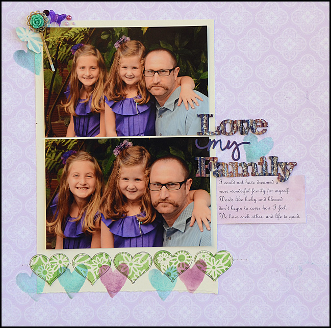
Whether it is a die cut, punched shape, alphabet sticker, or piece of chipboard don’t forget you can stencil onto more than just your layout directly. For this layout I knew I wanted to use my Webster’s Pages background paper but I didn’t really have much that went with it. I pulled out my flower stencil and colored a number of hearts and a butterfly punch that I then added to the page.

scrapbooking tutorial by May Flaum @ shimelle.com

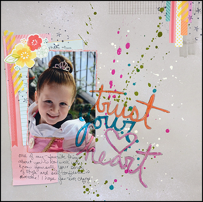
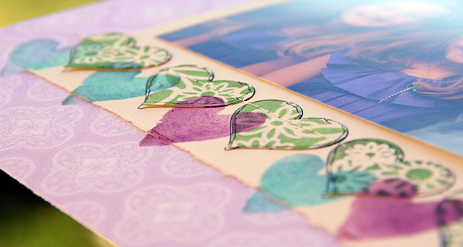
This layout also features hearts that were stenciled on in peacock and purple. To do this I used scotch tape to mask off my stencil so that when I used my foam blending tool on the stencil I would only be able to color one heart. Scotch tape is a great tool when it comes to stencils – it doesn’t stick or make a mess as long as you don’t let the sticky side touch your paper.

scrapbooking tutorial by May Flaum @ shimelle.com

5. The Shaped Stencil
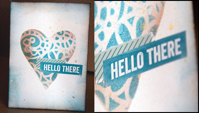
In the layout above you saw how I used a single heart (in a stencil that had many) on my layout by utilizing a good amount of tape. Another approach to doing something like this is to create a second stencil as I did in the video. For this card I did just that! I placed a heart shaped (homemade) stencil on top of a patterned stencil and colored a heart onto a blank card. The effect is stunning – and at first glance it looks a lot more complicated than it really is which always makes me smile.

Whether you go bold and finish layouts with a spritz of mist over your stencil or keep things more in control with a bit of ink on a stencil for a particular project element, know that there are a lot of ways that you can use those stencils. With intense techniques or simple applications, my stencils help me customize my projects and allow me the creative play that I always crave. I hope I’ve inspired you to try out a stencil on your next project. Oh, and one last note – if you have a punch, die cut, or electronic die cutting machine you can make stencils of your own! Oh yes, the possibilities are endless!


When it comes to crafting May Flaum has one rule: it’s gotta make her happy. She’s not afraid to get super grungy or work with bright colors, dabble in lace and doilies then make something more splattered and wild. If she’s not in her studio (aka ‘the bat cave’) then she’s probably out running around having fun with her family or cooking up a storm. May has been working in the Scrapbooking industry for a decade and currently blogs her crafty adventures, teaches online classes, and works with amazing companies sharing her projects and ideas. She just released a new eBook Fashionably Fast with Big Picture Classes that includes twenty layouts and three bonus video tutorials. If she has one piece of advice to share, it’s always to be true to your creative heart.

Using Color Wheels as a Motif: a Scrapbook Tutorial by Leah Farquharson

scrapbooking tutorial by Leah Farquharson @ shimelle.com
This morning I’m so happy to welcome scrapbooker Leah Farquharson to share a tutorial. When I hear the phrase ‘use a colour wheel’, I imagine the tool for choosing and combining colours. Leah was inspired to take that idea to a motif, and even has a free cutting file for you to download so you can give it a try.

Color wheels are one of my favorite emerging trends in scrapbooking at the moment. They’re such a great way to include multiple types of patterned paper without overwhelming a layout. And the circle shape can become a great way to anchor embellishments, a title, or photos on a layout.

I’ve included a cutting file (click here to download) for a simple color wheel/pie chart for today’s post, and I wanted to include a few tips on incorporating the shape in your layout. I also want to talk a bit about how I’m learning to use my die-cutting machine in my Scrapbooking. I recently received my silhouette cameo for my birthday from my husband, but you could also apply these tips to any die-cutter that you can use to make shapes or letters.

Most of the time when I’m using my die-cutter, it helps me to sketch out a plan for my layout. Since I have my Ipad on hand most of the time, I like using a drawing app to create my sketches, but of course, good old fashioned pencil and paper is great, too!

scrapbooking tutorial by Leah Farquharson @ shimelle.com

After my bit of planning, I knew that I wanted to include some of my title text on a banner, one large and two smaller color wheels. I already knew that I had two photos to include. I opened my silhouette software and sketched out both shapes, with the banner piece including my title. You can see that I make adjustments along the way – I had already caught the misspelling of my main title!

scrapbooking tutorial by Leah Farquharson @ shimelle.com

My next step is to cut a sample for size. I’m usually pretty close, but I do sometimes make changes. For this layout, I decided that the color wheels needed to be bigger, but the title was great.

scrapbooking tutorial by Leah Farquharson @ shimelle.com

After I had settled on my sizes, I cut the shapes from three different patterned papers. I layered them on my page along with my title and a few embellishments to get a feel for how it was coming together.

scrapbooking tutorial by Leah Farquharson @ shimelle.com

scrapbooking tutorial by Leah Farquharson @ shimelle.com

Once I was happy with the placement, I glued things down and added stitching, the photos and title layered over, and topped off with embellishments and journaling.

scrapbooking tutorial by Leah Farquharson @ shimelle.com
One of the very best things about using the color wheel in your scrapbook pages is that it’s infinitely you! It’s all about choosing your favorite patterned papers to suit the subject matter of your page!


Leah Farquharson resides in the greater Miami/Ft. Lauderdale area with her husband of eleven years and their two sons. As a scrapbooker, she’s had the privilege of working with some of her favorite companies in the industry, including Glitz Designs, Nikki Sivils, Fancy Pants Designs, and Hambly Screenprints. She currently designs for American Crafts, Jenni Bowlin Studios, and Maya Road among others. She’s been published in Scrapbook Trends, Cards, The Scrapbook Magazine, Entrartiste, and Die Scrapperin. As the owner of bluebird chic, llc, she’s had the privilege of contributing articles to Mollie Makes Magazine, and having her handmade items featured on multiple websites including Chic Critique, Prop Insanity, and the Etsy front page. You can see more of her papercrafting on her blog a musing to create or bookmark her projects in her gallery.