pretty paper. true stories. {and scrapbooking classes with cupcakes.}

lovely to meet you Twitter Facebook Pinterest YouTube

Take a Scrapbooking Class

online scrapbooking classes

Shop Shimelle Products

scrapbook.com simon says stamp shimelle scrapbooking products @ amazon.com shimelle scrapbooking products @ amazon.co.uk

Reading Material

travel

Scrapbooking with 4x6 photos

scrapbook page by shimelle laine @ shimelle.com
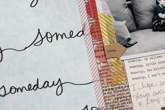
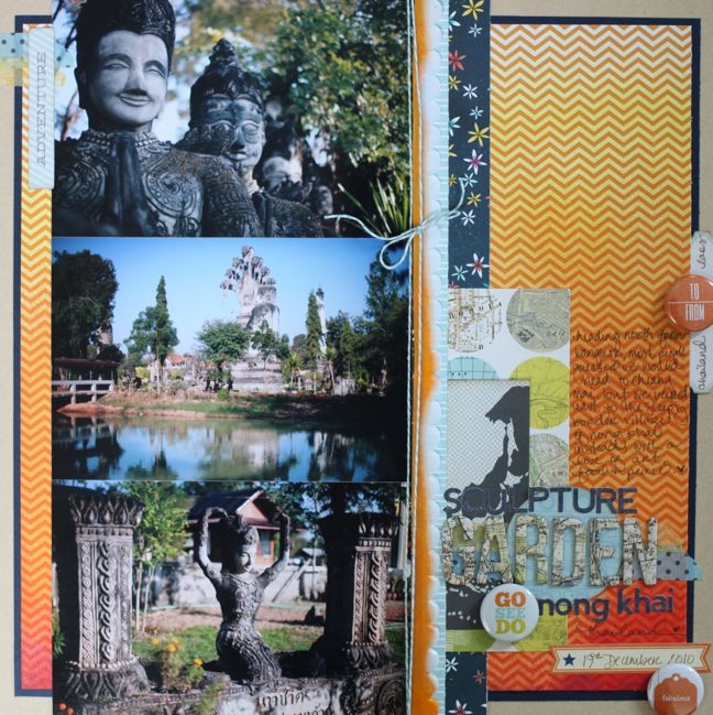
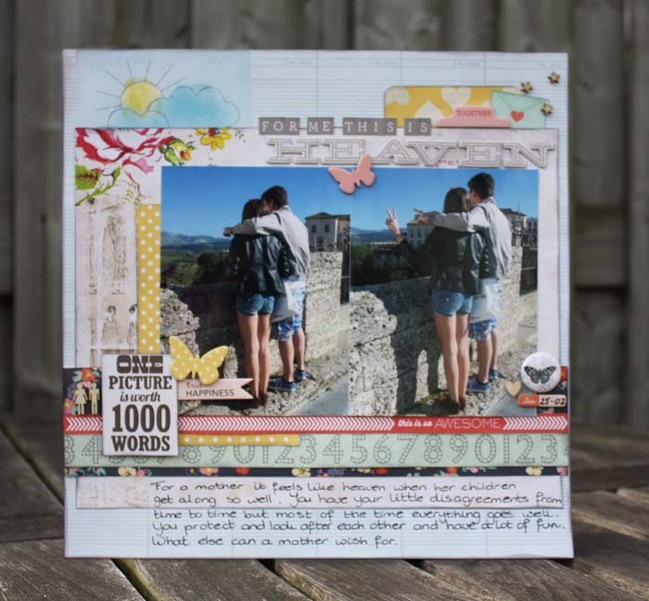
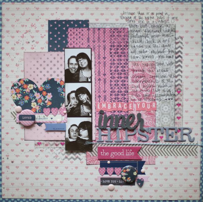
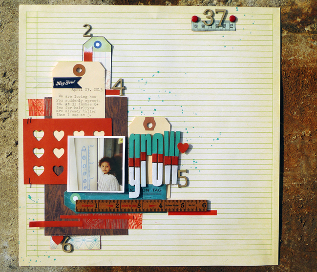
Maybe I’m a little old fashioned, but I still prefer 4×6 prints. I love printed photos and really don’t think you can have too many! I love this size for scrapbooking and it appears on my pages more than any other size – so much so that I have a twelve step programme for scrapbooking with 4×6 pictures – or a free class, if you prefer. But it does have twelve lessons, really.

scrapbook page by shimelle laine @ shimelle.com
I order photos every two to four weeks by uploading everything to Photobox and ordering it all in 4×6 prints. They work out an excellent price in bulk and they are printed ‘properly’ as in with photo paper and development, not just a fancier version of a home photo printer. I prefer the gloss finish for the colour clarity, but they certainly offer matt finish as well and they do plenty of sizes. I order most of my square photos printed as 4×6 images too – I just check the ‘shrink to fit’ box so they come as a 4×4 image on a 4×6 photo card, and I crop the excess. (Photobox does square prints at 5×5, but I prefer the smaller and even-numbered 4×4 size. Welcome to my world.) Then I store all my 4×6 prints in the drawers of a dresser divided by index cards so I have all my scrappable events ready and waiting for inspiration to strike. It’s a key part of my process because going to the computer at any point in making a layout spells disaster for me. It spells ‘you should be doing something other than crafting’ and my email and other to-do list items suddenly fill my head. Going straight to the prints rather than the printer helps me get things done.


I had to choose just one video from the 4×6 Photo Love series and it’s the eight-photo project that won out. I love page-and-a-half designs and I need to remember to make them more often. They are far more fun to me than standard two page layouts and yet still have plenty of room for more photos. (See this page for further details and a printable PDF for this edition of 4×6 Photo Love, or the entire series is always available by scrolling to the bottom of this screen.)

And now for our guest artist, Diana Besemer, who has much in common with me for all things 4×6.

Scrapbooking with 4x6 Photos by Diana Besemer @ shimelle.com
For me, this size is the easiest to work with because two pictures are in the correct proportion of 1/3 of the whole layout. And with only one picture there is enough space to get some extra use of your favourite paper, an extra long title or journaling. Every two months I‘’ll order all my new pictures in this same size so I’‘ll always have a stack of pictures ready to scrap. My new favourite paper and embelisshment is also right next to me. I‘’ll like to use them right away, because I love how they look on my layouts more then how they look in my closet.

Scrapbooking with 4x6 Photos by Diana Besemer @ shimelle.com
About the Artist
Diana, who is married and a mother of two children, lives in a small village in The Netherlands.
For the last ten years scrapbooking has a big part of her life. Occasionally she loves to make cards with the scraps laying around on her desk. She designs for Card and Scrap, and has a blog where she posts on a regularly basis.

Your second challenge is to use 4×6 photos! Entries close at the end of next Sunday, the 12th of May. Please check back on the 14th of May to see if you have won a prize.


Scrapbooking in Pink

scrapbook page by Shimelle Laine @ shimelle.com
And it’s officially here: a very happy NSD to you! That’s National Scrapbooking Day, of course. Of which nation is completely up to you at this point! I’m celebrating on this time zone, so it’s officially the 4th of May and that means all systems go – and that will be the way right through to the end of the day! There are plenty of challenges and guest artists to share their ideas with you, and the challenges are open until the end of next weekend so you have more time to participate than just NSD itself. A prize winner will be drawn from the participants on each challenge, so by enjoying some crafting in honour of NSD, you might find yourself with a gift certificate to go shopping, a class pass, or a box of scrapping goodies on your doorstep. Sound fair enough?

There are a range of challenges to take us through the day, and they are designed so they can be followed in one of two ways: if you are so inspired, you can pick and choose from each challenge and create one page per challenge for as many challenges as you like, or you can follow them in order, with four challenges per layout. The challenges follow an order that takes you through supplies, design, technique, and theme, so you can take the first four challenges and put them together to get a complete page, then start on the second four challenges for layout two and so on. I hope that provides a happy medium of creative freedom or practical structure, whichever suits your crafting personality!

scrapbook page by Shimelle Laine @ shimelle.com
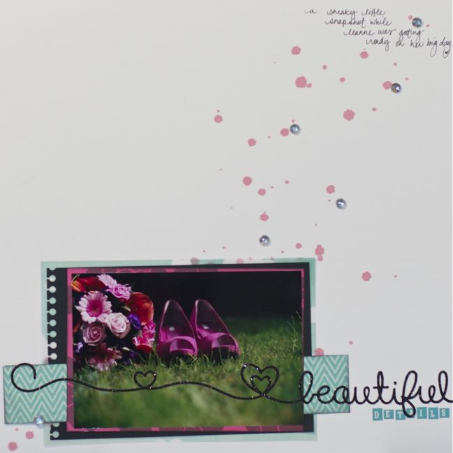
I don’t think it’s a secret that I like to scrapbook with pink. I haven’t exactly tried to hide this fact, and I’m more than a little aware that some scrapbookers would like to hurl a tomato at Glitter Girl with a shout of ‘enough with the pink and turquoise!’ but pink still inspires me to create. As such, it appears on plenty of pages! I wanted to start us off with something relatively simple, so here we go – pretty in pink!


In truth, there are plenty of videos I could have chosen for this pink theme, but just one with hot pink right there in the title! Brightly coloured Cosmo Cricket from their Upcycle collection. I’ve realised in putting my papers away that I still have a few sheets of that… perhaps it needs to come out and get put to use in something very pink indeed!

And now for our guest artist, Louise Fortune! She may have found pink a somewhat greater challenge.

Using Pink Supplies by Louise Fortune @ shimelle.com
The dictionary definition of a challenge is ‘a task or situation that tests someone’s abilities’. It is also an invitation to work outside of your comfort zone. so when that is related to scrapbooking that could be using a supply, a style or a subject matter that you would never normally use, exactly why I opted for the ‘using pink supplies’ as my Shimelle NSD challenge. I am not a girly girl and since my entire household is male (including the dog) I very rarely use pink in any of my projects, I can in fact be heard to groan, very loudly, when my scrapbook kits arrive and they are pink and/or floral. My scrapbooking style is very simple, usually quite graphic and type orientated and I usually use more than one photo and I normally put a design together and then leave it unstuck on my desk, for several days, coming back and looking at it, a lot, before I commit to sticking everything down and calling it done.

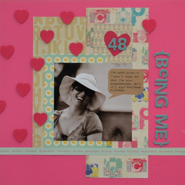
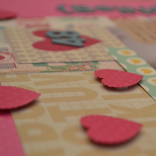
This layout was done in 90 minutes. I began with the photo, converting it to black and white to eliminate any colour clashes, then I picked the cardstock and papers, straight in there with the bright pink swiss dot card, next the papers. With no time to faff I opted to cut all three of my paper choices down to four inch strips, enough to play with, not too much to be overwhelmed by. These were placed more or less centrally. Next letter stickers, I was limited in choice here as I tend to cut most of mine on my cricut, luckly I had some that were the right co-ordinating colour and size. Got to have the title going sideways, a quirk of mine. finally embellishments always used sparingly, I don’t do fussy, I chose a kraft sticky speech bubble, great place for my token gesture journalling, the manufactures strip from my patterned paper (thank you manufacturers for making these usable) adds another typographic element. some punched out cardstock hearts, in a darker pink (more pink !) randomly placed, something else I don’t normally do. Ta Da its done in record time without compromise!

Using Pink Supplies by Louise Fortune @ shimelle.com
About the Artist
Louise has been familiar with scrapbooking as a hobby since 1996; when she was introduced to it by a friend in the states and has been scrapping seriously since 2004. She is a work-from-home-mum who puts her “drawing and colouring-in degree” to good use designing simple graphic printables. She regularly designs cards for Papercraft Inspirations and has been published in Scrapbook Inspirations. She was a member of the scrapagogo design team and also designed the bespoke GoGo kit hybrids and stamps. Louise also has a blog where she shares some of her freebie printables.When she isn’t scrapping, taking photos, designing or eating chocolate, Louise can be found working in an admin capacity for an association of private school doctors.

Your first challenge is to scrap in pink! Entries close at the end of next Sunday, the 12th of May. Please check back on the 14th of May to see if you have won a prize.


5 Ways to Finish Raw Chipboard by Michelle Hernandez

5 Ways to Finish Raw Chipboard by Michelle Hernandez @ shimelle.com
Hello! Over the years my scrap style has changed from romantic and detailed to clean and modern and back again. One thing has stayed constant – I love unfinished chipboard.
My favorite manufacturers have always been Scrap FX (Australia), Maya Road and American Crafts. I am lucky to be part of the scrap FX design team and will now show you some of my favorite ways to incorporate chipboard into my scrapping.

5 Ways to Finish Raw Chipboard by Michelle Hernandez @ shimelle.com
Spray Paint
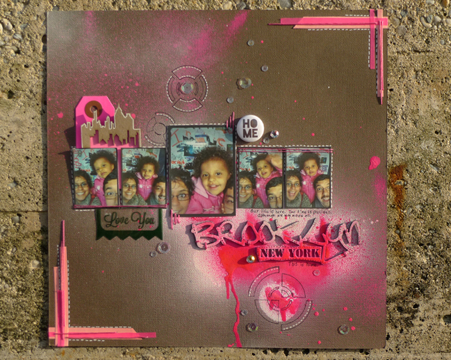
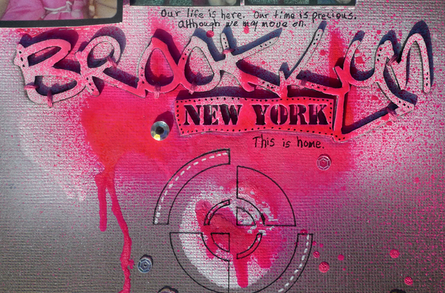
The biggest complaint about using unfinished chipboard is that it adds extra steps to the scrap process. As the Mom of a three year old I understand the need optimize your time by using pre-printed materials but I also love the funky look of hand finished embellishments and I like that they make my projects unique. When I don’t have a lot of time I reach for my Liquitex spray paint- it goes on crazy fast and leaves a smooth surface I don’t have to alter further. The colors are amazing- I used Magenta in this project.

5 Ways to Finish Raw Chipboard by Michelle Hernandez @ shimelle.com
Gesso and Acrylic Paints
Gesso is basically white (or black) paint with a thickening agent such as chalk, used to prepare canvas, wood, or in my case- chipboard- for other finishes. I am a super messy scrapper so I use my fingers or an old ID card to slather the paint on. I use an old piece of paper to clean paint off edges and give the piece about half an hour to dry. More time is recommended but that’s the limit of my patience. I don’t recommend you point the heat tool at the drying gesso as that can lead to cracks. That’s fine if you like that look- I really don’t.

5 Ways to Finish Raw Chipboard by Michelle Hernandez @ shimelle.com
Spray Gesso
I recently started using spray gesso on my chipboard. Application is fast and the finish much smoother than gesso in a jar. I keep my chipboard in place with super tacky tape, place it in an old box and spray away to my heart’s content.

5 Ways to Finish Raw Chipboard by Michelle Hernandez @ shimelle.com
Easel Thickers
If you are lazy (like me) you avoid the “finishing” step entirely and just use the chipboard naked. Chipboard colors are usually neutral grey (Maya Road), brown (Scrap FX) or even black like the old chipboard packs from Cosmo Cricket (which I HOARD like the lunatic I am). If I want to add color I just pick my favorite thread and either machine sew or hand stitch the piece onto the page- believe it or not- this is faster than trying to paint the chipboard!

5 Ways to Finish Raw Chipboard by Michelle Hernandez @ shimelle.com
Washi tape and Stamps
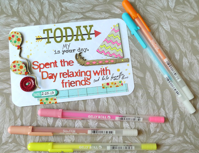
I tend to use smaller chipboard designs so I don’t often stamp on them but washi tape can be cut into small pieces and added to your chipboard. In this previously seen Project Life pocket insert, I’ve used Glitz Bokeh print washi tape to cover two chipboard birthday balloons. Washi is thinner and more flexible than scrapbook paper and goes over the chipboard edge cleanly. I use scissors or my trusty old ID card to burnish the edges of my chipboard and get sharp well covered corners.

5 Ways to Finish Raw Chipboard by Michelle Hernandez @ shimelle.com
Gel Pens
Sakura Souffle gel pens are a great way to quickly add color to chipboard. The ink goes on like any other pen but gets lighter as it dries and the resulting color really stands out against the neutral background. Bonus? This gel ink dries fairly slowly so you can hit it with embossing powder and really make it pop.


Michelle Hernandez has been scrapbooking since 2009 when her first daughter, Lola, was born. Her favorite things are writing for her blog My Analog Life, taking photos, visiting museums, reading Terry Pratchett novels, riding her bike and finding new pizza spots.
She’s been fortunate to be published in Scrapbook Trends and Scrap 365 Magazines. Michelle’s currently in the design teams for Scrap Fx Australia, A Flair For Buttons, Inspiration Elevator and True Xoxo Scrapbooking.

Best of Both Worlds :: My scrapbooking product picks for May 2013

Best of Both Worlds Scrapbooking Kit - May 2013
And just like that, it is May already! I’m finishing up my projects with my April kit, and ready to dive into a new set of goodies for the month ahead. You’re welcome to join me, and customise the kit to suit you!

Click here to shop the May 2013 Best of Both Worlds scrapbooking kit!

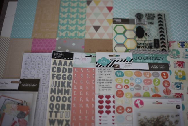
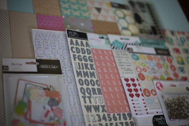
This month the colour scheme has a few bright and obvious colours – plenty of turquoise, pink, and yellow that mix and match well together – but also two specific neutrals in the mix. I’m looking forward to sharing a few notes on why I love kraft and grey as neutral colours for projects that can still have plenty of energetic colour too.

Best of Both Worlds Scrapbooking Kit - May 2013
As always, there is total freedom to pick and choose what you would like from the kit or substitute different items – from the store or your existing collection of supplies – but I have a few suggestions to make sense of the list. First, I can’t believe I’m saying this, but… the Thickers are optional. (Okay, everything is optional, obviously! But still.) I started with the pink and grey combination of smaller and larger letter stickers, but they are both flat. For a long time I thought maybe I could do a whole month without Thickers. And then I realised I have these mistable Thickers that I need to use! I think I tend to push them to the side because it’s quicker and easier to go to a colour that matches, but if you already have a few mists (and I may have more than a few!) then really these Thickers can be any colour. So… I wondered if anyone else out there was in the same boat – either already having the Thickers and needing a push to use them, or having plenty of mists that could do with another use! If either of those describe you, then consider the Thickers! If that doesn’t sound up your street at all, give it a miss.

There are a few different options for the Instaframes from Heidi Swapp. I actually prefer the brightly coloured set, but I have the more neutral set here. They are used exactly the same way, so you can pick! There is also a new patterned set and a mini-sized set if you tend to use smaller photos.

This month I’ve picked one set of clear stamps, this set, which is currently 50% off. If you don’t stamp, then that’s something to leave out straight away. But if you really love stamps, this set was my second choice, and it’s also on sale at the moment.

There is a cut-apart sheet this month – it’s a white print on kraft cardstock from Amy Tangerine. The cut-apart boxes are 4×6, great for journaling, and there’s an all-over print on the back too, also in white ink. So it’s subtle and not really obvious on the screen, but lovely and delicate in person.

Best of Both Worlds Scrapbooking Kit - May 2013
A look at the b-sides of the patterned papers.

I know in the last two months especially, there has been some frustration when items sell out quickly. I’ve been working with Two Peas over the past month to come up with some solutions and those will go into action for next month’s June kit. That’s happy news, I hope! It is to me, anyway!

Of course, this Saturday is a rather special day in the scrapbooking world – it’s NSD! Or ISD, I suppose? National or International Scrapbooking Day. A day just for scrapbooking – hurrah. There is quite a lot set to go on right here, and one of those elements includes a special project I’ve put together just from items on sale. It may be that you have plenty of those items already in your stash, or it might be a great chance to treat yourself to some bargains. I’ll be sharing that list a little later today, so I just wanted to give you that little bit of info in case you would want to look at both lists before finalising your order. That shopping list is now available here. I don’t want to give the whole idea away, but every single thing on that list is currently in the sale section, and I’ll be seeing just how far I can stretch that purchase of about $25 while staying true to my own style. The rest you’ll have to wait for Saturday to see!

Thanks so much for all your support, and not to worry if you still have supplies left from your April kit – I have more finished pages to share with you, including ideas for those chipboard pieces we haven’t discussed yet!

Click here to shop the May 2013 Best of Both Worlds scrapbooking kit!

Simple Sunburst:: A Scrapbook Tutorial by Michelle Deleon

Simple Sunburst: A scrapbook tutorial by Michelle Deleon @ shimelle.com
A technique that reminds of of spring and summer is the sunburst. Most of the time, I enjoy layering on my layouts, so using a large sunburst as the main element is a fun way to change things up. This tutorial will show you an easy way to incorporate the sunburst into your layouts.

Simple Sunburst: A scrapbook tutorial by Michelle Deleon @ shimelle.com
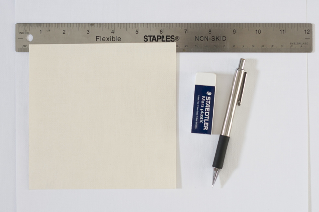
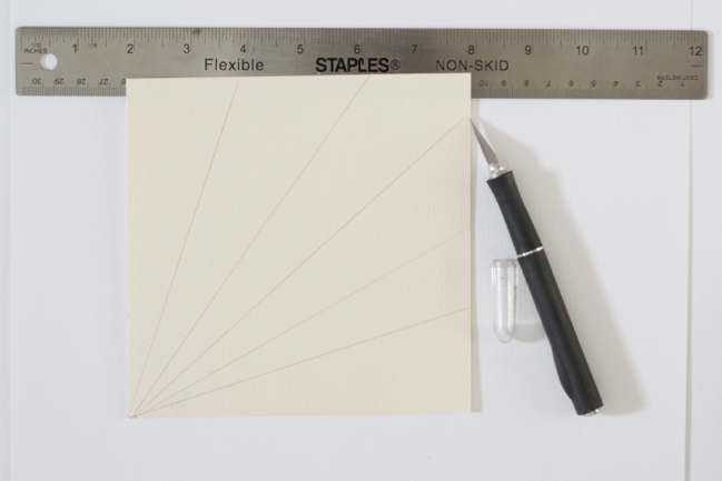
The first step is deciding what size to make the sunburst. Since I wanted to use a 6×6 pad for my patterned paper, any size 6×6 or smaller would work. I knew that I wanted the sunburst to be the main design element on the page, so I went with a 6×6 size. You can use any scrap piece of paper or cardstock for this step as it will only serve as the template.

Simple Sunburst:A scrapbook tutorial by Michelle Deleon @ shimelle.com
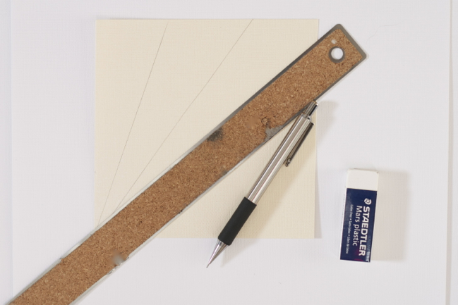
To create the rays, use a ruler and a pencil to draw straight lines starting from the same point. For ease, I like to have this starting point be a corner of the page. I am not very concerned about having exactly the same angle for each ray, so I just eyeball how large I want each section to be. I wanted the base of the sunburst to meet at the bottom left corner, so that is the point where I drew each line from (please excuse the sad state of my ruler in the photo!).

Simple Sunburst: A scrapbook tutorial by Michelle Deleon @ shimelle.com
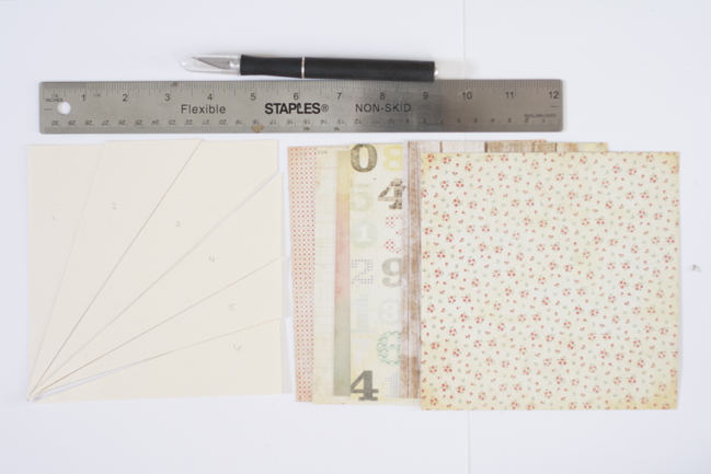
Next, use a ruler and a craft knife (or your desired cutting tool) to cut out each ray. Before starting to cut the rays out, I would recommend numbering them so that it’s easier to piece everything back together afterwards.

Simple Sunburst: A scrapbook tutorial by Michelle Deleon @ shimelle.com
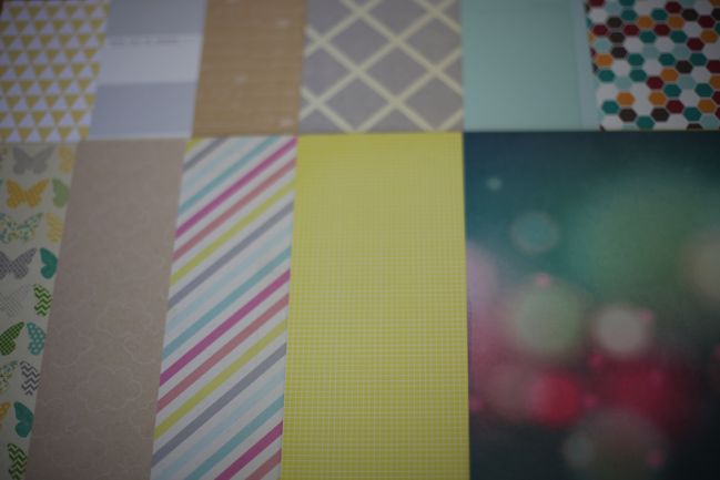
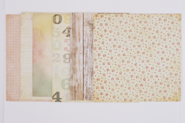
Now it’s time to select your patterned paper. This step takes me the longest because I like to shuffle the sheets around to see which patterns and colors look best next to each other. For this page, I decided that I wanted the sunburst to be subdued and muted. I chose papers from Crate Paper DIY since the collection has a lot of neutrals with distressed details. If you want your sunburst to stand out more, you can select brighter, bolder colors and patterns. I would recommend mixing up the patterns with some less busy prints so that the papers do not compete with each other.

Simple Sunburst: A scrapbook tutorial by Michelle Deleon @ shimelle.com
After you selected your papers, you simply match each template ray to the patterned papers. Again, I would recommend numbering the rays. I usually use pencil so I that can easily erase any unwanted markings.

Simple Sunburst: A scrapbook tutorial by Michelle Deleon @ shimelle.com
Cut each patterned paper out using the template rays.

Simple Sunburst: A scrapbook tutorial by Michelle Deleon @ shimelle.com
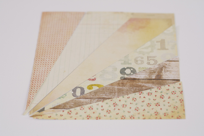
Piece together your completed sunburst. If you are not certain where you want to place your sunburst, it’s a good idea to glue the sunburst down on a scrap piece of paper and cut away the edges. This way, you do not have to move each individual ray every time you shift it around your page.

Simple Sunburst: A scrapbook tutorial by Michelle Deleon @ shimelle.com
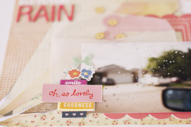
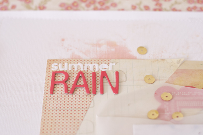
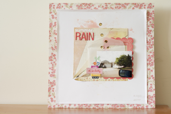
Finish off your layout with your desired embellishments. For this page, I didn’t want to add too many layers to cover the sunburst, so I used a small vellum envelope and a bright coral frame. I wanted to emphasize the round rain drops, so I added gold sequins falling out of the top of the envelope. To balance the bright pop of coral from the frame, I used bright pink/coral thickers on the opposite side for my title. I also added some splashes of mist and backed the cardstock on a pink patterned paper.

Simple Sunburst: A scrapbook tutorial by Michelle Deleon @ shimelle.com
If you do not want the sunburst to be the main focus, you can always make it smaller to be more of an accent on your page . Another way to tone down the sunburst is to use the template rays to cut out vellum to overlay the patterned paper. Large or small, I hope this tutorial inspires you to give the sunburst a try!


Michelle De Leon is a university student from Alberta, Canada. When she is not busy with school or work, she can be found volunteering, catching up on movies, and enjoying quality time with friends and family. Having discovered the scrapbooking world last May, Michelle is happy to have found a hobby that acts as a creative outlet while documenting everyday moments. She shares her scrapbooking creations on her blog at The Scrapbooking Chronicles of Portable Michelle

5 Ways Other than Journaling to Incorporate Pen Work in Your Scrapbooking by Ashli Oliver

5 Ways Other than Journaling to Incorporate Pen Work in Your Scrapbooking by Ashli Oliver @ shimelle.com

Ahh, the pen. A simple tool with endless possibilities. I just love that with one simple stroke, an outline here, or a doodle there… a project can be completely transformed! Oh yes, and personalized too. There is something so unique about your own mark. It can’t be replicated or duplicated. It is yours and yours alone. What a great way to add something extra to your memory keeping! One of the best things about incorporating pens into your crafting is how familiar they already are. Chances are that if you have scrapbooked or made cards, you have used pens to write your date, journal your story, or compose a heartfelt sentiment. Today, I am going to share with you five ways, other than the tried and true journaling, to incorporate pen work into your scrapbooking. Here we go!

5 ways other than Journaling to Incorporate Pen Work in Your Scrapbooking by Ashli Oliver @ shimelle.com
Enhance an already existing pattern
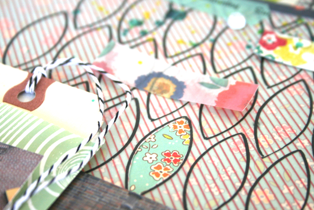
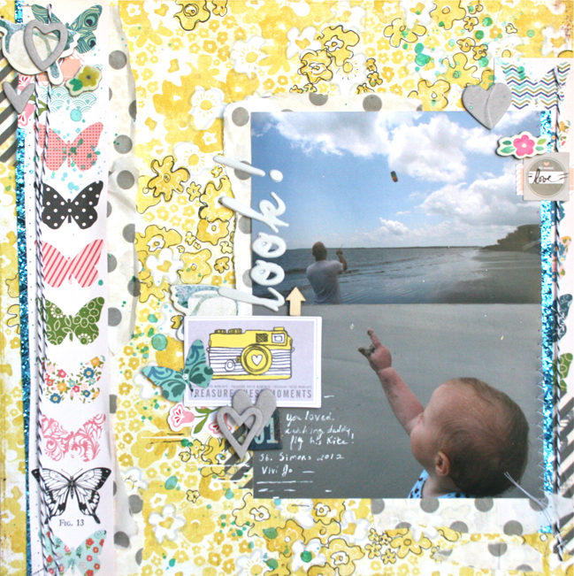
In addition to my beloved pens, another one of my must-have scrapbooking supplies is patterned paper. Most of my layouts start with a patterned base. A fun and simple way to personalize a gorgeous pattern, is to simply outline various parts. For the layout above, I used a fine tip black pen to loosely outline various flowers within the yellow background paper. I love the handmade look and playful texture this lends to the layout! You can find a few more examples of this here , here , and here

5 Ways Other Than Journaling to Incorporate Pen Work in Your Scrapbooking @ shimele.com
Add a Subtle Shadow to Make an Element Pop
Sometimes an area of embellishment could use a little more emphasis. But, perhaps you don’t want to add too much else to your layout? A little bit of gray shading might be just the thing! In this layout, I had lots of fun with stencils and white paint. Oh yeah – and pie charts too! When I had all of my elements in place, I felt like the pie charts and some of my stenciled circles needed something a little extra…

To add the subtle gray outline, I just drew around the elements I wanted to enhance with the larger tip on my Platinum Zig Pen. I went around a couple of extra times in certain spots for a darker gray. This is so easy to customize and is virtually fool proof! In fact I use this technique almost every time I use paint. A simply gray outline really does make it pop! You can take a look at some examples of that here and here .

5 Ways Other than Journaling to Incorporate Pen Work in Your Scrapbooking by Ashli Oliver @ shimelle.com
Fill in that “White” Space
If you are familiar with my style, you have certainly seen this before! I use this technique on almost everything I make . I suppose it is a bit of a signature for me. But, I will let you in on a little secret… it’s because I am lazy! Yep, that’s right. Every scrapper knows about that dreaded “white” space. Those awkward areas in a layout that leave you rummaging through your stash to find the perfect little bit to fill it. Well, I just grab my pens and go to town making lines all throughout those spaces! Not only does this solve that “white” space dilemma, but it also adds some lovely visual interest and can help lead the eye throughout the page.

5 Ways Other than Journaling to Incorporate Pen Work in Your Scrapbooking by Ashli Oliver @ shimelle.com
Use Your Stencils in a New Way
Instead of using mist, paint, or paste in your stencils, try outlining the shapes with your pens. On this layout I have used a Balzer Designs stencil to trace on a pattern. For added interest, I cut out some of the shapes to let the background peek through. Another fun and favorite combination to try is white on Kraft.

The combinations and possibilites with this technique are endless!

5 Ways Other than Journaling to Incorporate Pen Work in Your Scrapbooking by Ashli Oliver @ shimelle.com
Doodling
Yep, good ole’ fashioned doodling! This could be as simple as the kind of doodling you do while on the phone to a more elaborate, art-journal style of pen work. I usually opt for the former, creating lots of circle clusters, squigly lines, or random shapes. My favorite way to add this into a layout, and the one I find to be most successful is to start my cluster of doodles near an already existing area of embellishment. In the layout below, I also incorporated an already doodled SMASH page. This allowed me to add to this look and easily create cohesion with the rest of my page. For a few more examples of doodling on layouts, take a look here , here , and here

Hooray for the mighty pen! I hope this has given you many fun and easy ideas for getting the most out of your pens. Any pen will do, but my go-to stand bys are: Faber Castell Pitt Pens in all sizes, Copic Multiliner 1.0, Signo Uni-ball White, and Zig Platinum. So, on your next layout, I encourage you to pick one of the above techniques and play with your pens. You might be surprised how fun it is and what a personalized look it will give to your scrapbook page!


Ashli Oliver (aka soapHOUSEmama) is a recovering graphic designer, a homeschooling mother, wife, daughter, coffee addict, knitter and gardener with an extreme passion for mixed media paper crafting and memory keeping. Ashli finds great joy in both the creative process and the final piece. Most of her craft time is found in the wee hours of the evening when all of her kiddos are in dream land. Although, Ashli never misses an opportunity to grab a snippet of time during the day to shuffle some paper around.

Ashli has been an artist her entire life. She followed her dreams and attended art college. While Ashli mostly wanted to play with paint and glue, she chose a more sensible major of Digital Multi-Media and Photography. After working in that industry on and off, Ashli put her computer and brushes aside to start her family. Never in a million years did she think that scrapbooking and the paper craft industry would re-awaken her inner artist that she had put away so many years ago. Thanks to a good friend who showed her the ropes just a little more than a year ago, Ashli has jumped into a pile of pretty paper and is never looking back!

When Ashli is not blogging, you can also find her on Pinterest , Instagram , and Twitter

Working with Watercolour:: A Scrapbook Tutorial by Lilith Eeckels

Working with Watercolours by Lilith Eeckels @ shimelle.com
I have always loved watercolour paintings with soft and subtle colours. I wanted to recreate this softness on my layouts and lately I have been using my twist to a watercolour look a lot. It can add an extra hint of colour and detail to a project which is really important to me. It also enables me to create my own backgrounds adding uniqueness to a project! Using art in scrapbooking is such fun and I love incorporating artistic elements into my layouts and projects. ( You make my heart sing )

Today I am going to share a technique I use to create a watercolour look. I used to have some watercolours but they were savagely abducted by little 4 boys. As I was too lazy to buy some new ones I had a look at my supplies on hand to see if I had anything that could create the same look. I decided to try and use my mists and gelatos.

Working with Watercolour by Lilith Eeckels @ shimelle.com
To create this look you will need: gelatos, mists, some recycled plastic bowls, water, an acrylic block and a paint brush.

Working with Watercolour by Lilith Eeckels @ shimelle.com

Working with Watercolour by Lilith Eeckels @ shimelle.com
Put some of the gelato paste onto the acrylic block and add some water. The paste will start to dissolve. Adding more water will make the colour lighter.

Working with Watercolour by Lilith Eeckels @ shimelle.com

Working with Watercolour by Lilith Eeckels @ shimelle.com
Dab your paint brush into the liquid and apply to the paper using circular brush strokes. You can use watercolour paper, cardstock or patterned paper. The latter two will warp a bit but once dry you can place the paper beneath some dictionaries to flatten it. I like the look and don’t mind if the paper isn’t flat as it adds character and dimension to the project.

Working with Watercolour by Lilith Eeckels @ shimelle.com

Working with Watercolour by Lilith Eeckels @ shimelle.com
Once the paper is dry add splatters to it. I diluted some mist with water and used my paint brush to create the splatters. Adding water will help create splatters with a softer watercolour look. If you want a really subtle feel add more water. You can always test on some scrap paper before applying the colour to your paper.

Working with Watercolour by Lilith Eeckels @ shimelle.com
Once the paper has dried you can use it on your projects. On my layout I also added a watercolour look to the butterflies and the title. I cut the title out on my cameo using the offset function to create a backing for it. I used the diluted mist to colour the offset image and adhered the die cut word on top of it. The butterflies were lightly coloured around the edges using the same mist solution which I watered down a little.

I hope you’ll try this technique and please share as I would love to see your creations.


Lilith Eeckels lives with her family in the south of Belgium. She is South African by heart and hopes to return to this amazing country where she grew up as child. By day she is an English and Dutch foreign language teacher in a high school as well as mother to 4 mischievous boys who keep her very busy. By night you’ll find her in her scrapbook nook playing with pretty papers and embellishments. Currently she is designing for American Crafts, Esprit Scrapbooking (a French scrapbooking magazine) and Scraptastic Kit club. She is also a Garden Girl at TwoPeasInABucket. She shares her passion for scrapbooking on her blog , Twitter , Facebook and Instagram

Batch Scrapbooking - and following Glitter Girl's advice to use my kit

scrapbook pages by shimelle laine @ shimelle.com
Recently my sparkly friend Glitter Girl shared a process she uses for limiting her scrapbooking supplies to combat any feeling of being overwhelmed by too many options. Of course her strategy can work with plenty of combinations of papers, so I wanted to give them a try and share the looks I created following the same plan of action but with a different selection of papers and photos.


This will make the most sense if you start by watching Glitter Girl’s Adventure if you haven’t seen in yet. You can find more details (and all the products and the three finished scrapbook pages) here at Two Peas in a Bucket.

And though my voice is currently a husky mystery that fades in and out of existence by the word, I happened to have filmed a little something more on this topic before it went away!


There are two significant differences between this video and Glitter Girl’s original: the supplies and the order in which things are done. The supplies are easy: I used the April product picks for the Best of Both Worlds kit. The process is something that takes just slightly more explanation.

scrapbook page by shimelle laine @ shimelle.com
I call this style of creating Batch Scrapping – and it’s something I do when I have a lot of ideas in my head or a bunch of pages to get done before a set deadline. Instead of doing one full layout from start to finish, I work on a few at a time, laying down all the papers and photos, then coming back to do titles and writing on each page, then working through the set again for embellishment. I don’t scrap like this all the time, and it’s part of my process in the same way that many things are a some-of-the-time process for me: varying between things like ornate layouts or simple layouts, photos first or supplies first, sketch or no sketch – having all those different options keeps me productive because I never fall into one set routine. Batch scrapping falls into that too. Sometimes I am just more motivated to work in that slightly disjointed process, but not always. I know several friends who have to do multiple pages for a deadline for design teams or similar commitments that work in this fashion, and it’s especially useful if you want to use a kit each month and make sure you spread all the embellishments and papers around for several pages. Interestingly, making these three pages actually used more paper than I would ordinarily use from a kit, I feel. It could be a misconception, but it seems like I have relatively little left after three pages. We’ll see how far I can stretch the rest – there is after all a lot of paper in the 6×6 paper pad.

scrapbook page by shimelle laine @ shimelle.com
By the way, if mixing all these patterns is still something you wish came a little more easily for you, you might be interested in Scrapbook Remix. This class originally ran last autumn, but after the recent episode of Paperclipping Roundtable, I’ve been persuaded to run it once again on a live schedule. That starts TOMORROW! So go sign up now if you would like to join in with all that fun. If you participated before (or indeed signed up at any time) and would like to receive the live emails, you are welcome to do so and there is no charge for that, but you do need to request them. For that, please see the details toward the end of this post. (It’s just before the last photo in that post.)

scrapbook page by shimelle laine @ shimelle.com
And you may have looked at your calendar and realised April is marching steadily on, which means May will be here soon. May is the month with a SCRAPBOOKING HOLIDAY. How fabulous is that? National – or International – Scrapbook Day is Saturday the 4th of May this year, and I can give you a big nod that there will be lots of exciting stuff at Two Peas and here at shimelle.com, so I hope you have some scrapping time to join us!

This coming week I’m hoping to be up to using the rest of my April kit, though it remains to be seen whether I can manage to speak in a video or if it will be better just to write out some notes to show you how things come together. We shall see! Take care, and have a fabulous week.