




pretty paper. true stories. {and scrapbooking classes with cupcakes.}

lovely to meet you Twitter Facebook Pinterest YouTube

Take a Scrapbooking Class

online scrapbooking classes

Shop Shimelle Products

scrapbook.com simon says stamp shimelle scrapbooking products @ amazon.com shimelle scrapbooking products @ amazon.co.uk

Reading Material

travel

CHA Winter 2012 :: American Crafts

CHA Winter 2012 :: American Crafts
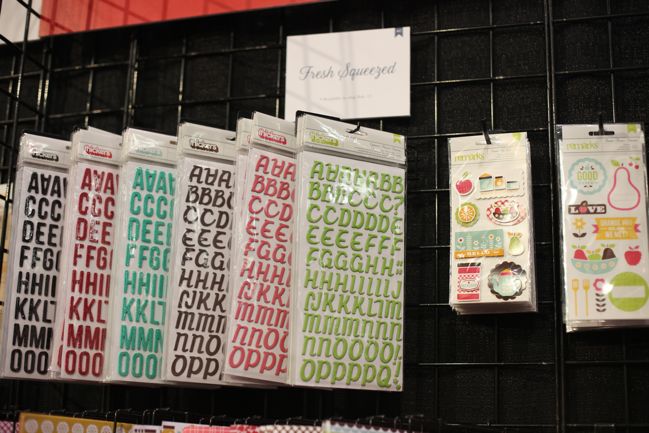
In addition to their designer brands Amy Tangerine and Dear Lizzy, American Crafts had quite a few new products in their classic branding, so let’s start today with a look at all that, shall we?
CHA Winter 2012 :: American Crafts
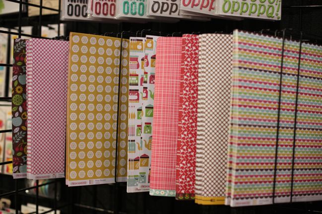
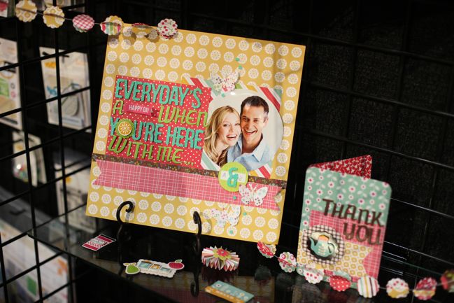
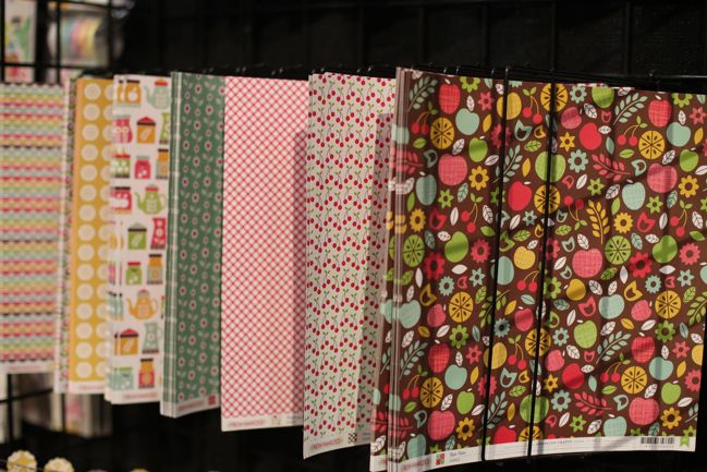
Fresh Squeezed is a summery home-themed line, with plenty of kitchen and fruit motifs mixed with a Scandinavian vibe.
CHA Winter 2012 :: American Crafts
Lots of red, brown, yellow and turquoise.
CHA Winter 2012 :: American Crafts
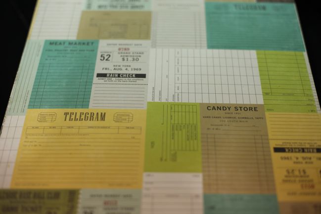
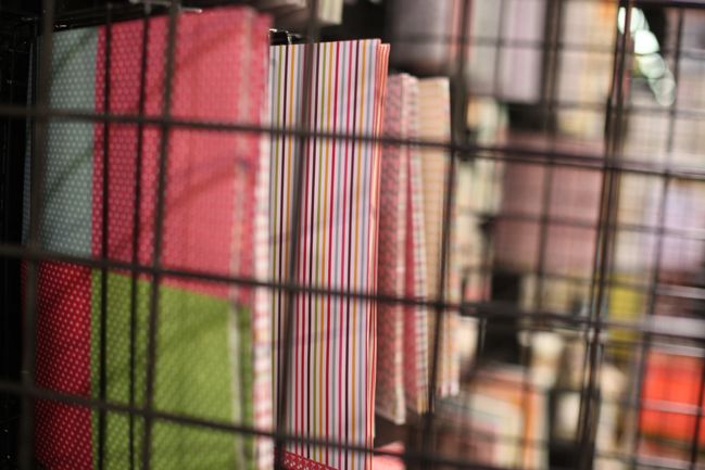
Sorry about this slightly rubbish photo, but I wanted to show you that last b-side paper – patterned quadrants! One of my favourite ways to mix patterned papers except now it’s already done. Perfect for quick scrapping.
CHA Winter 2012 :: American Crafts
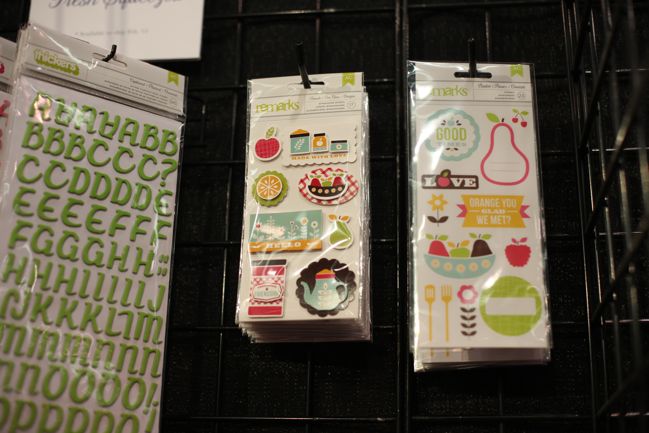
Thickers in a lush spring green, plus layered and flat stickers. The phrases on the flat stickers would be particularly useful for cards, as the reverse includes quite a few things that would work well as greetings.
CHA Winter 2012 :: American Crafts
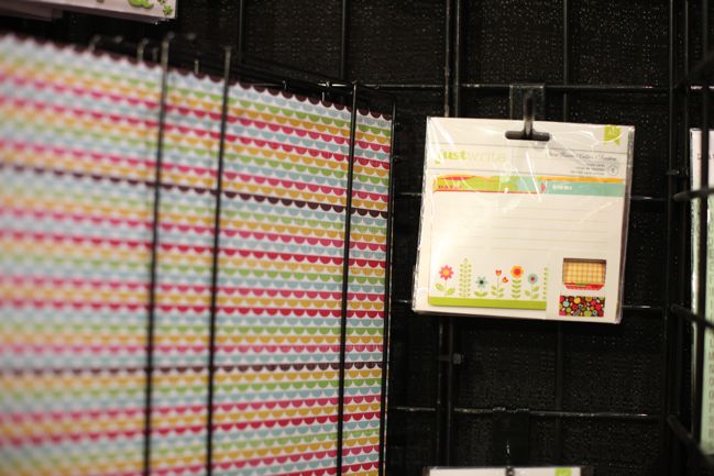
Recipe cards. Quite pretty and could make a lovely gift.
CHA Winter 2012 :: American Crafts
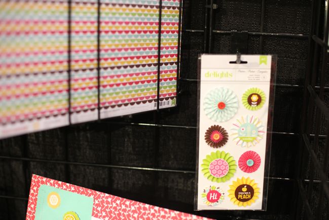
And hurrah: paper pinwheels are still here. Even if even lighting is not. Win some, lose some.
CHA Winter 2012 :: American Crafts
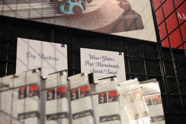
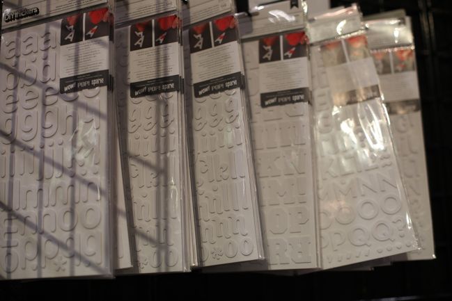
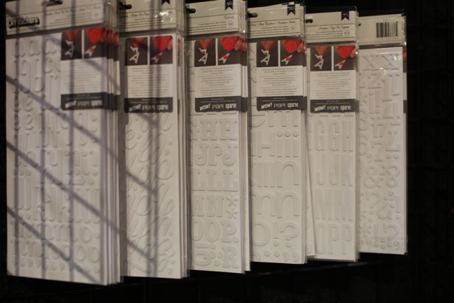
AC’s new DIY line is something for anyone who ever wanted Thickers in a particular colour or style that wasn’t in the line up… now you can make them yourself.
CHA Winter 2012 :: American Crafts
Start with your choice of font – these are all styles we know from previous Thickers collections.
CHA Winter 2012 :: American Crafts
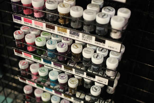
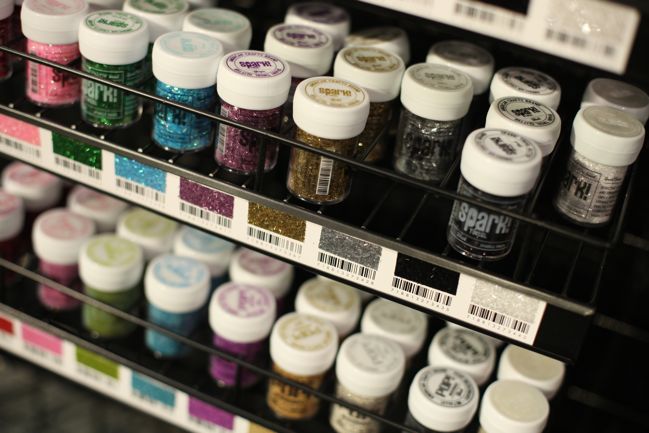
Then customise with your choice of sparkle, including extra-fine and chunky glitters, tinsel (like glitter in little strips) and microbeads. There were also samples that were heat embossed with embossing powders and coloured with markers, though I’m not completely sure how the colouring with markers works if there is an adhesive layer on the top. Will investigate that further sometime soon.
CHA Winter 2012 :: American Crafts
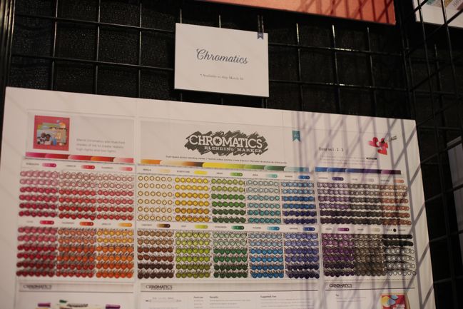
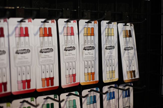
Chromatics is a new marker line out this spring, and basically American Crafts’ answer to Copics and Promarkers. Chromatics are alcohol-based inks that blend gorgeously with ease. I gave these a try and they do shading and faded colour so very well on the very first try, so these are promising if you’re in the market for markers. Plus there is something they have done that is oh so smart:
CHA Winter 2012 :: American Crafts
They come packed in threes of perfectly picked shades for fading from one colour to the next. No more looking at a zillion markers and wondering which ones will work best or where to start. Choose a colour of the rainbow and then the shades are already ready for you. Smart.
CHA Winter 2012 :: American Crafts
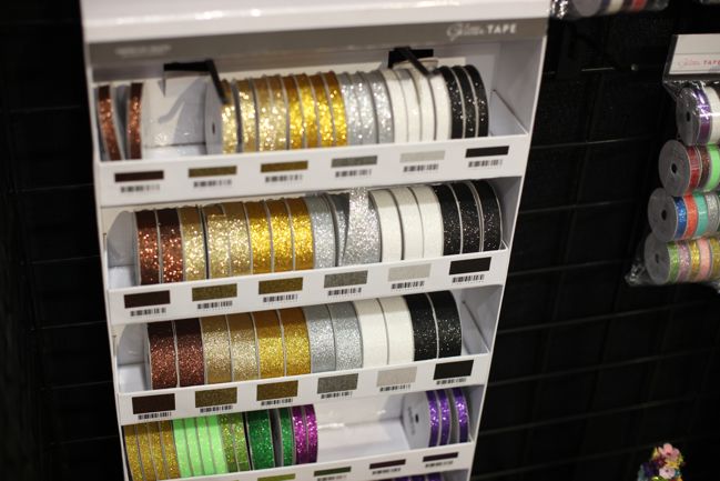
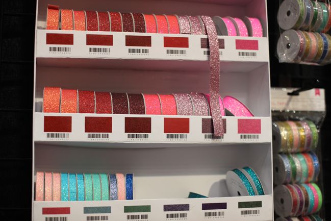
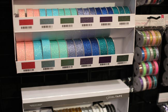
Glitter Tape was a new focus where American Crafts would usually have an entire new section of ribbon. Perfect for adding sparkle that won’t fall apart on the page and has no mess. It comes in half-inch and quarter-inch widths and the colours, like those in the bottles of glitter, match the American Crafts cardstock colours.

Which of course led me to ask ‘is there kraft glitter?’ to which I was looked at with bemusement. Um… apparently if you make kraft metallic, it’s essentially gold.

I may not have thought of that when I asked.
CHA Winter 2012 :: American Crafts
There are, at least, shades of gold and silver so there really is one that is perfect for kraft and not overly yellow. Disaster averted.
CHA Winter 2012 :: American Crafts
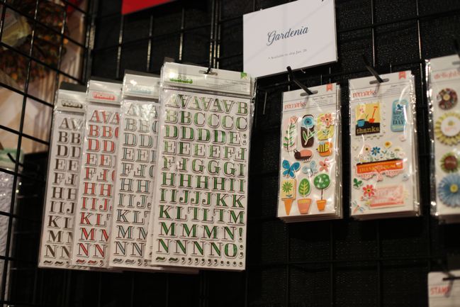
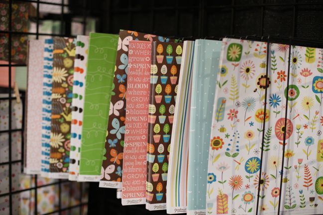
Then we have Gardenia, a garden-themed spring that doesn’t go anywhere near the pastel shades. The Thickers for this collection have a new hand-drawn look.
CHA Winter 2012 :: American Crafts
I especially love that green swirl! I must admit gardening lines make me a little wistful from my little flat with no grass to call our own, but on closer inspection these aren’t overly themed and can be used for any number of topics. Just treat them as any other floral or polka dot or butterfly.

CHA Winter 2012 :: American Crafts
Plenty of layers in the embellishments, and again one particular pack that seems well-suited to cards.
CHA Winter 2012 :: American Crafts
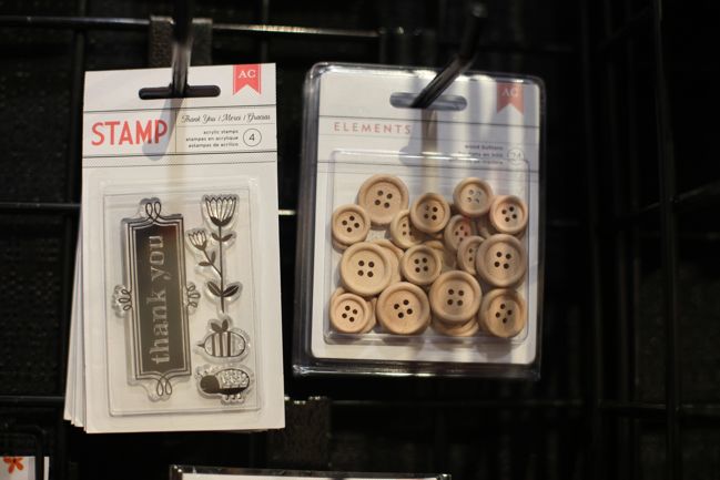
These two are must-haves: a really versatile thank you stamp and plain wooden buttons that can be left as-is and look great tied with brightly coloured threads or you can paint them to match your project. You can even sparkle them with some glimmer mist.
CHA Winter 2012 :: American Crafts
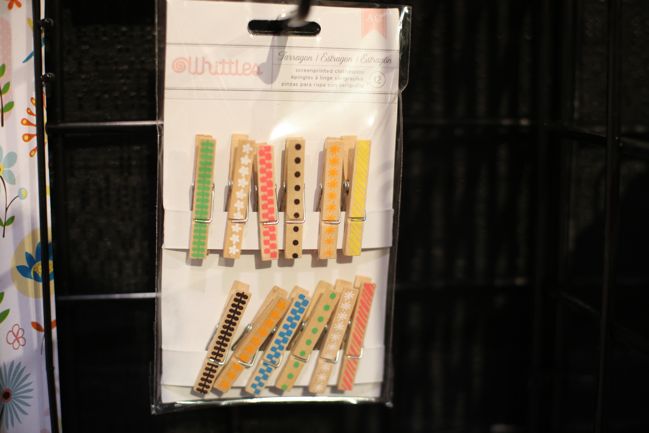
Cute printed clothes pegs, but a bit big for most scrapbook pages. Handy for mini books and all other sorts of things that don’t require packing into a page protector. Or break them in half to use them on a layout for the illusion of a whole peg.
CHA Winter 2012 :: American Crafts
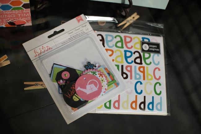
The printed die-cut shapes from the original Amy Tangerine collection were so popular the idea is now cropping up in several AC collections. Plus there’s an additional flat alphabet sticker set in the right colours for these papers.
CHA Winter 2012 :: American Crafts
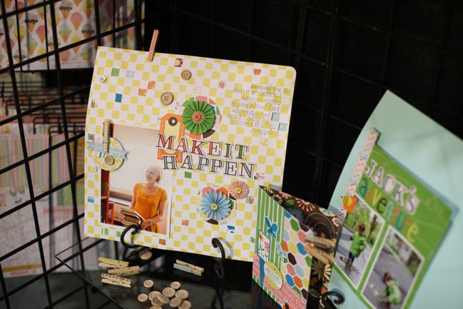
And a few projects from the AC in-house designers to illustrate that Gardenia is useful for far more than gardening photos!

Ship dates: The glitters (called Wow, Pop and Spark) and DIY Thickers ship right now. Glitter tapes and Fresh Squeezed ship later in February. Chromatics markers and Gardenia ship in March.

Click here to shop for American Crafts products.

CHA Winter 2012 :: Echo Park

CHA Winter 2012 :: Echo Park
Echo Park is an interesting one. They have a different business model than most every other company out there. A new collection ships to stores every six weeks, and it’s almost entirely paper. Each collection has a 12×12 sheet of stickers and one of letters, and then some collections have a small group of embellishments like these – but that’s just for something special. And for the past year, we’ve seen so many styles from Echo Park as they introduced new designers for almost every collection, meaning the look could change dramatically from month to month.

Let’s keep that in mind and see what you think about their release here at the winter show.

CHA Winter 2012 :: Echo Park
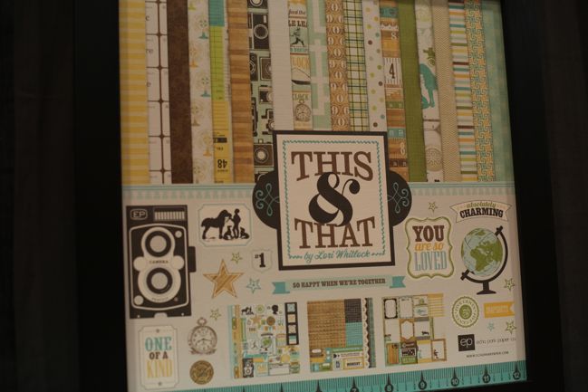
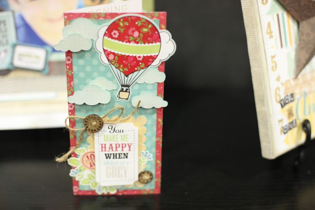
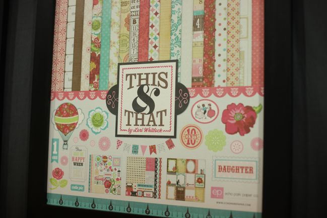
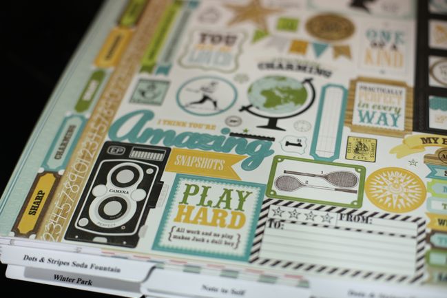
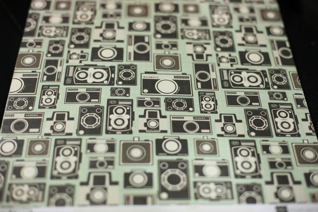
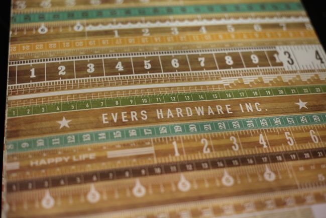
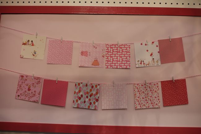
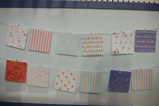
This & That is actually two collections – this colourway is called ‘Charming’ and there’s a more feminine colour scheme called ‘Graceful’. But I’m not going to pay any mind to this being a boy and a girl collection, because look at this! Vintage cameras and globes? I’m totally in.

CHA Winter 2012 :: Echo Park
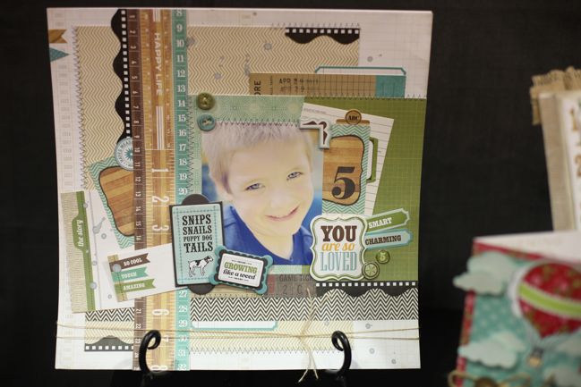
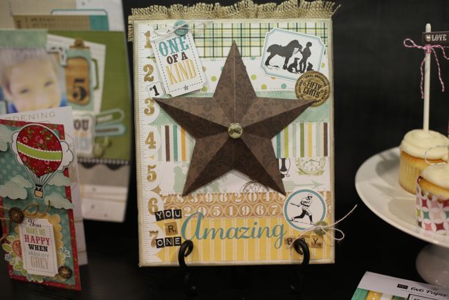
Echo Park only feature a few projects on their booth each show. I would love to see more! But what they do have is really lovely. This layout is by Amy Heller. So here’s an example of Charming…

CHA Winter 2012 :: Echo Park
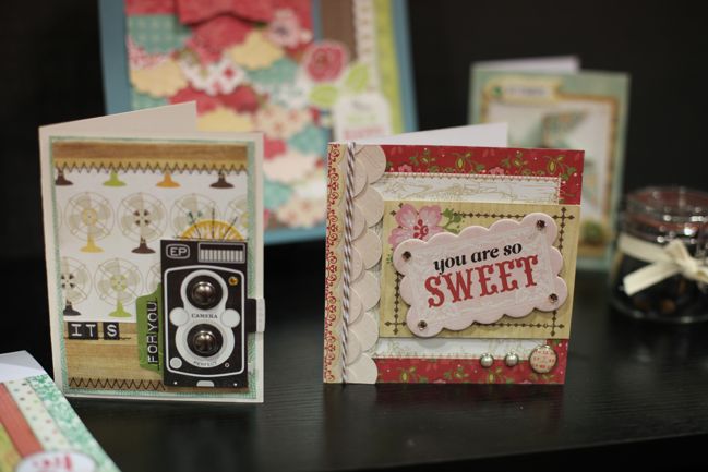
…and this is from Graceful. Pretty rose tones with plenty of aqua.

CHA Winter 2012 :: Echo Park
And that’s mostly it in terms of example projects!

CHA Winter 2012 :: Echo Park
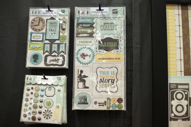
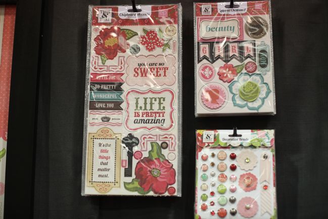
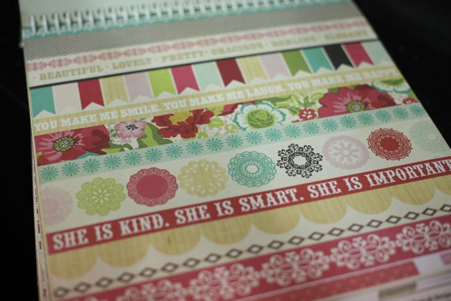
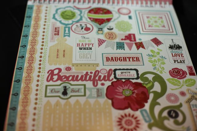
Embellishments and papers from the Graceful version of This & That include florals, silhouettes and hot air balloons. I like this but I would have loved more cameras with the pink too… but then I never tire of camera images.

CHA Winter 2012 :: Echo Park
So let’s take a closer look at stickers and paper, shall we?

CHA Winter 2012 :: Echo Park
Yes, that is definitely my favourite. I’ll take a whole pack of twenty-five, thanks.

CHA Winter 2012 :: Echo Park
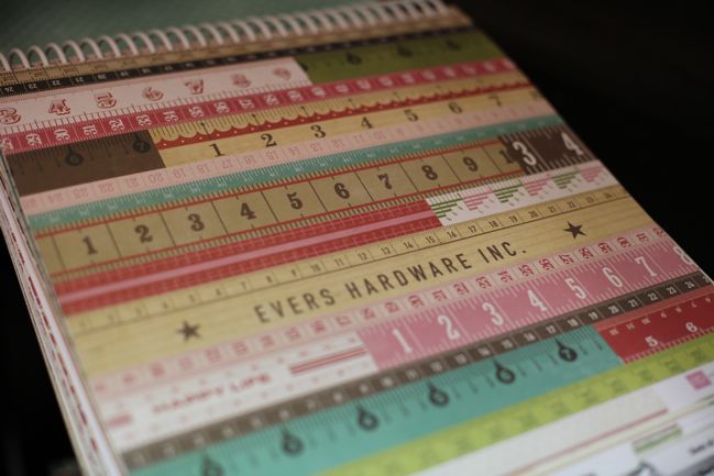
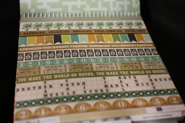
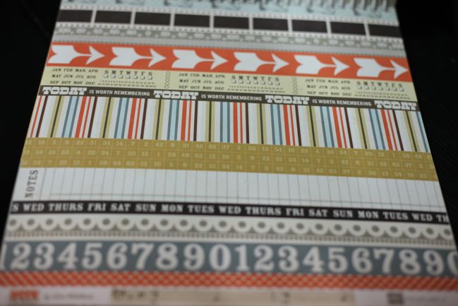
The border sheet is quite lush too! Love the same motifs but all lined up in a row. I am easily pleased.

CHA Winter 2012 :: Echo Park
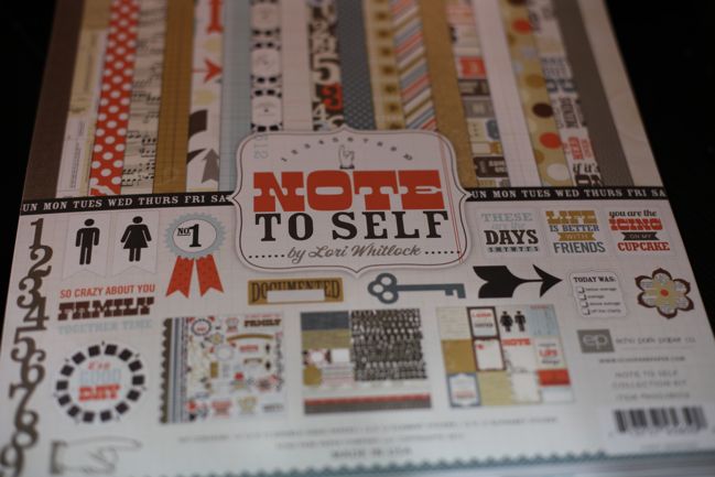
Then there’s a third collection: Note to Self. Just one colour scheme with this no embellishments – just 12×12 papers plus two 12×12 sticker sheets. But I can sum up my excitement for this collection with one photo.

This:
CHA Winter 2012 :: Echo Park
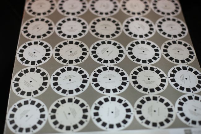
View.Master.Reels.

It’s one of those things I never knew I needed, but I instantly loved. Viewmaster reels on a patterned paper make me very happy indeed, and I have no intention of staging a photo session with my Viewmaster just to use this paper, but rather plan to just use it as a vaguely photographic-themed paper to go with pretty much anything.

CHA Winter 2012 :: Echo Park
Don’t worry: there is far more to this collection than Viewmasters, I promise. Lots of themes that would work well with all sorts of everyday scrapping.

CHA Winter 2012 :: Echo Park
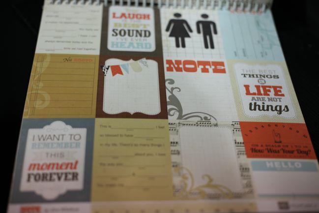
Cut-apart cards for writing and captions.

CHA Winter 2012 :: Echo Park
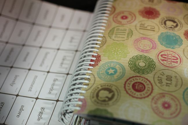
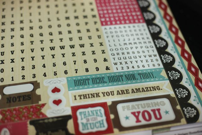
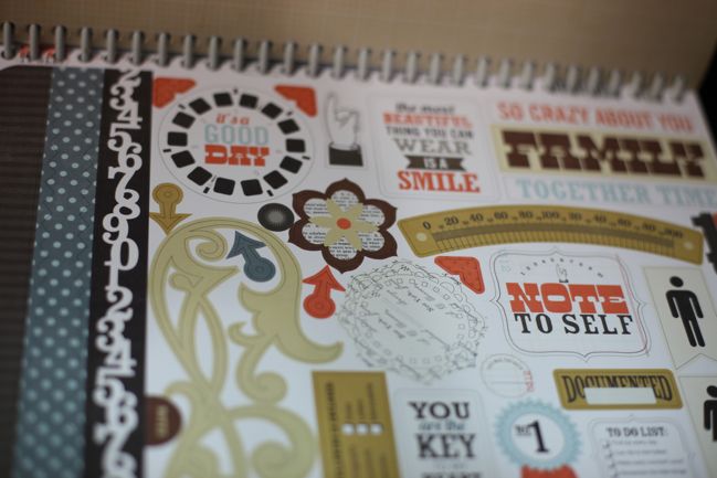
The two sticker sets include motifs on this sheetand another with alphabets.

CHA Winter 2012 :: Echo Park
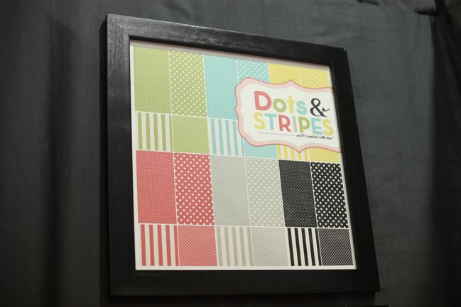
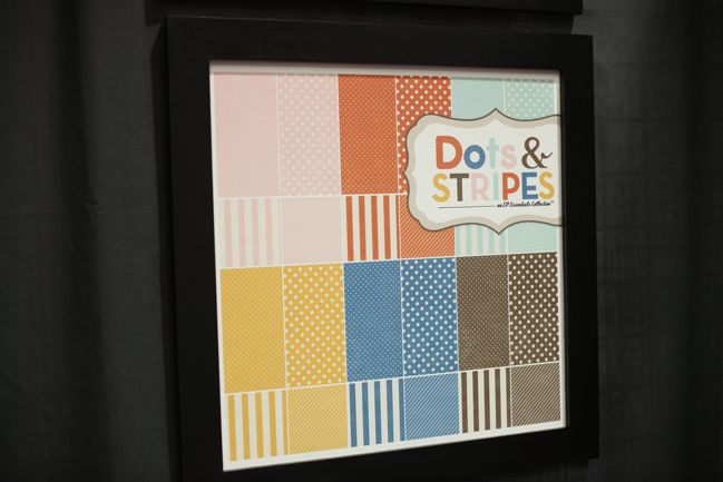
Echo Park have also added two new colour schemes to their dots and stripes collections, which are great packs for getting more pages from your other favourite collections, provided you can find a good colour to coordinate. So this should add to that library of options.

Now here’s what came of those thoughts from the very beginning. Throughout the past year, Echo Park featured many different designers with many different styles. Although they made the same types of products with each collection, the look wasn’t particularly similar from collection to collection. Yet at this show, the designs on the floor look very consistent. But that’s an easy explanation: the three collections all share the same designer in Lori Whitlock. Whether this is something EP will continue with throughout 2012 I really don’t know, but I do think these lines are strong and form a recognisable look for the brand. I would love to see continued lines from Lori – but perhaps it is easier for me to say that when I’m not looking at their other collections at the same time. Is there another collection’s style that you’re missing from this line up?

EP also announced something called Mini Themes, but I couldn’t get photos of these as buyers needed to get pretty close to the display to get all the details – and every time I walked by there were plenty of buyers doing just that. There are sixteen different themes represented, and rather than the style of the big collections, these are very traditional themes like birthday, baby, dance, baseball and camping. Those are sold as packs with six 12×12 papers and one 6×12 (I think?) sticker sheet. You can have a look at those here.

Ship dates: This & That and Dots & Stripes ship to stores in February. Note to Self and the mini themes ship in March, and there’s a summer line to follow that in April.

Click here to shop for Echo Park products.

CHA Winter 2012 :: GCD Studios

CHA Winter 2012 :: GCD Studios
When I happened buy the GCD Studios booth, they had just greeted buyers from two of the biggest players in the retail market so I did my best to stay out of the way but it also meant I didn’t get to talk to anyone here so I don’t have lots of lovely back story on these collections. Instead you’ll just have to go with plenty of photos and a few quips on what I did and didn’t love!

CHA Winter 2012 :: GCD Studios
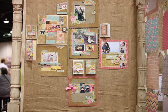
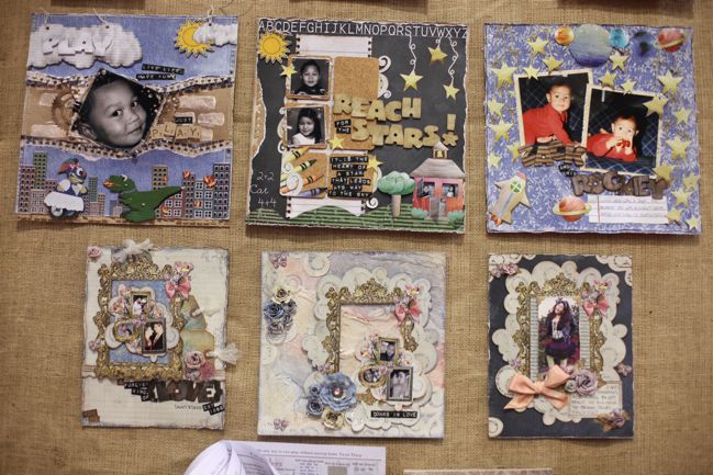
Since the last time I saw their booth, GCD have really stepped up the game with the quality of the layouts displayed on their booth. Not that they weren’t good before – but they were really lush this time and made me want to get off the show floor and back to cutting and sticking paper!

So how about a closer look at all that pretty?
CHA Winter 2012 :: GCD Studios
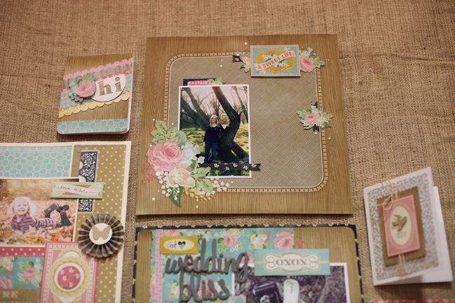
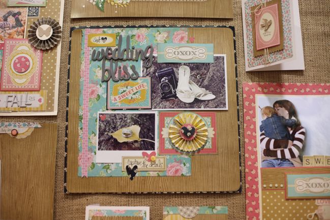
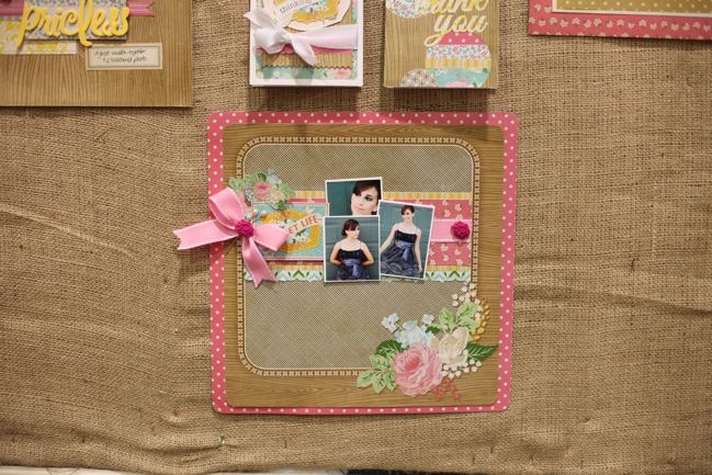
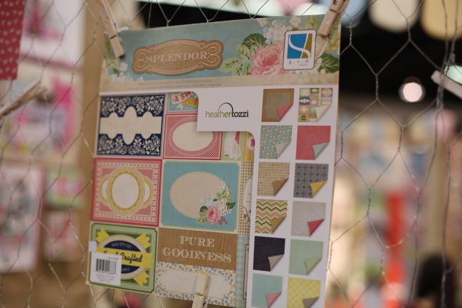
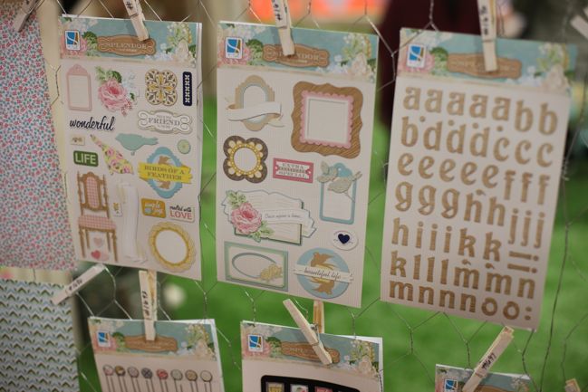
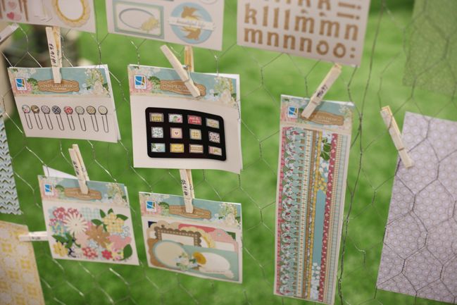
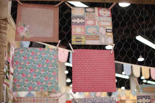
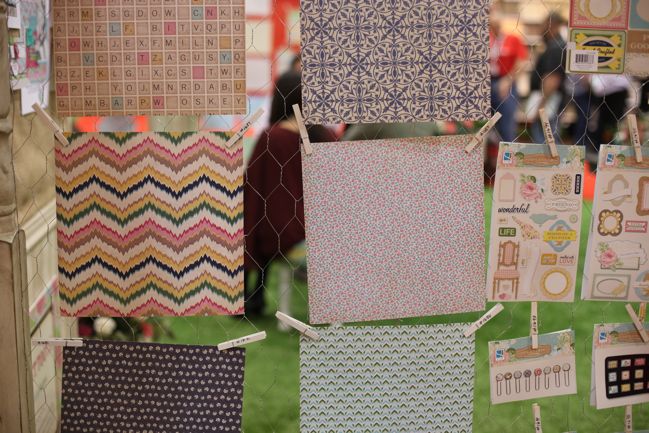
This is all from the Splendor line, designed by Heather Tozzi.

CHA Winter 2012 :: GCD Studios
Pinks, turquoises, birds and woodgrain. It wouldn’t be filed under brand new innovation, but it would be easy to use and like all those projects demonstrate, it’s very pretty in project form.

CHA Winter 2012 :: GCD Studios
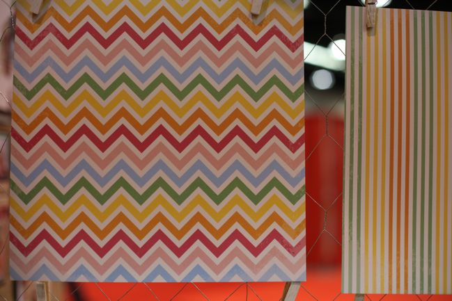
That zig-zag was a little different than all the others on the floor. It reminds me of the jersey fabrics a few years back that had a similar pattern – a sort of variegated chevron.

CHA Winter 2012 :: GCD Studios
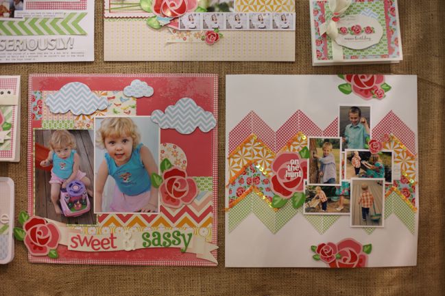
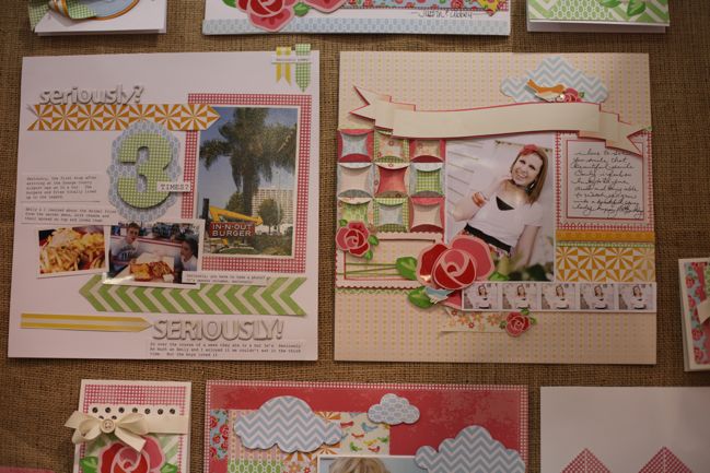
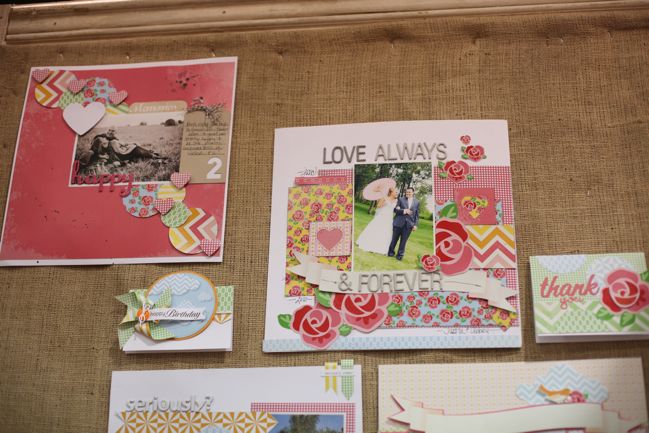
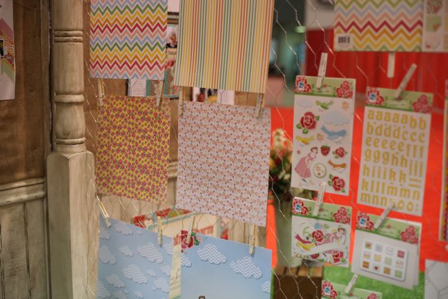
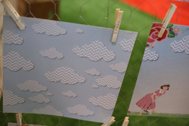
This bit of gorgeousness is the new Oh Happy Day line by Heidi Sonboul, with roses and clouds and chevrons.

CHA Winter 2012 :: GCD Studios
Sometimes at the same time!

CHA Winter 2012 :: GCD Studios
Such a pretty arrangement of colours. I love that the spring lines this year were all rich colours and no one felt compelled to work in sickly-sweet pastels. I find those colours look lovely in a sweet jar but it’s hard to make them work well with photographs. These colours, on the other hand, will work well with all sorts of pictures.

CHA Winter 2012 :: GCD Studios
Interestingly, there were several lines that had the same feel – a red and blue line called Flower Child, a green and blue line called Bonjour and a red and teal line called Country Charm, but then one line that was very different – Storytime, with a youthful focus. An interesting choice, and after much discussion at the show that themed products do well in the remaining traditional stores but are less popular with the online shopping audience, I wonder if this is one of those dividing lines. I shop online and would definitely go for Splendor or Oh Happy Day, but I wonder if this line sold well to traditional neighbourhood stores.

Curious minds want to know… but I can only guess of course!

See the GCD website for stockist information.

CHA Winter 2012 :: Making Memories

CHA Winter 2012 :: Making Memories
Forgive me if I was curious about Making Memories. Curious in a ‘so what is the game plan?’ kind of way. See, Making Memories has been a big industry player for a long time. They grew from a small store to a big chain of stores and a big percentage of the wholesale market as a manufacturer. And they were always very specialised in scrapbooking, hence the name of the company. The Slice portable cutting system seemed a big success. Then two years ago they debuted a jewelry line as a big part of their booth space, and buyers started to question – right there on the floor – if they were supposed to buy this for their scrapbook stores or whether it was for stores who specialised in that sort of thing. A year ago, they launched a line of paper rosettes and fancy prize ribbons, and again scrapbook store owners were a little confused about how this would sell in their shops when it seemed more in line with gift wrap. And then at the summer 2011 show? They just weren’t there at all.

But here they were, with a big booth on the show floor at CHA Winter 2012. The Slice was still a big item in the floor space, but there were new paper lines too. Paper lines that were definitely scrapbooking supplies. Though slightly different to things we have seen before. Let’s start with Children at Play.

CHA Winter 2012 :: Making Memories
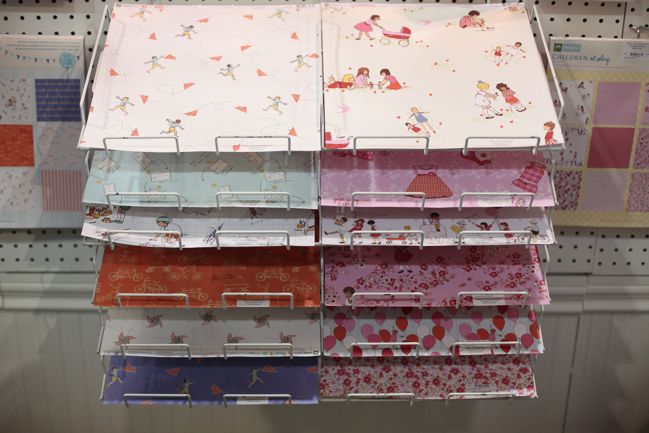
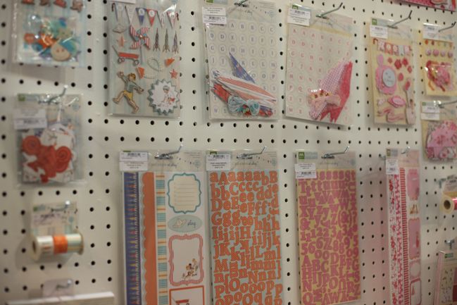
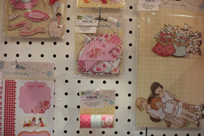
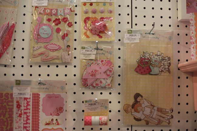
Rather than their in-house designers, this is a licensed collection with art from Sarah Jane Studios designed to fit the standard line-up of Making Memories products: 12×12 and 6×6 papers, letter stickers, tapes, layered stickers and die-cut shapes.

CHA Winter 2012 :: Making Memories
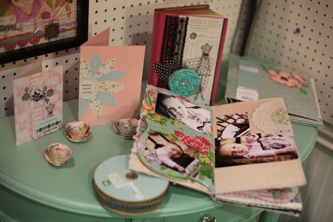
The paper dolls are an interesting choice. Not at all like the paper dolls that were all over the scrapbooking industry circa 2002 and more like the classic paper dolls that came in a punch-out or cut-out book from childhood. Those of you with little ones: something you would add to scrapbook pages or cards? (And if you are a paper doll fan, have you grabbed a copy of the Black Apple Paper Doll Primer – because that is enough to make me think maybe I do need paper dolls in my life after all. But anyway, back to Making Memories.)

CHA Winter 2012 :: Making Memories
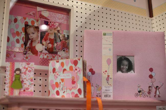
Lots and lots of pink in the girlish side of the collection of course. The album is especially sweet.

CHA Winter 2012 :: Making Memories
And everything also available in blue, with wagons and kites for a soft take on boy-themed scrapbooking. I’m wondering if the nostalgic design of these papers and embellishments make you think of scrapping current photos or older images? For anyone with a stack of mid-century black and white snapshots, this could be the most perfect collection ever – but most of us would have far more current pictures than those older treasures.

CHA Winter 2012 :: Making Memories
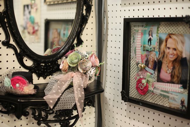
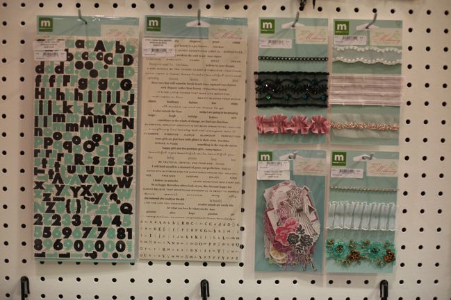
But it wasn’t all childhood nostalgia — how about Modern Millinery? A brighter collection with crisp black accents and inspiration from the world of textiles, florals and fascinators.

CHA Winter 2012 :: Making Memories
This reminds me more of the Making Memories collections from their most popular days, but with a touch more drama. Remember Noteworthy? I can see those same florals and mix of pinks, purples and turquoises here, and that was a collection I really loved.

CHA Winter 2012 :: Making Memories
Plenty of textile elements in this collection, plus those classic tiny letters are back at the bottom of a sheet that now includes words and phrases too.

CHA Winter 2012 :: Making Memories
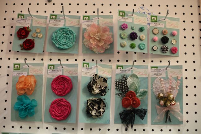
So many lush flowers – but will you put them in an album or on something you can wear or gift? I think this might be a safer move – those last few collections make it seem that Making Memories wants to get into other markets, but this collection could get that cross-over while still being relevant to papercrafters. Perhaps a bit more useful to the bottom line.

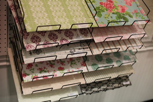
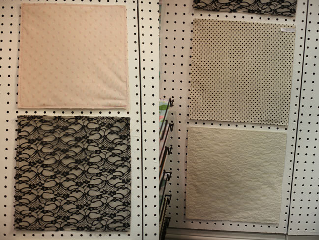
CHA Winter 2012 :: Making Memories lace papers
And saving the best for last, this was my favourite thing from the Making Memories release: 12×12 lace papers that include a layer of lace, tulle or netting stitched to a cardstock background. I can’t see they would be very useful in pieces, because it would probably be cheaper to buy just the fabric if you wanted to use it in smaller sizes, but as a 12×12 background it gives a new look to the base layer of a page with a lovely texture. Looking forward to giving this one a try!

Opinions then: is Making Memories back on form? Are you excited to see them back on the market?

Since it has been a while since Making Memories has released a new collection, there isn’t a lot of MM in stores now, but you can find a few big bargains here should you want to grab a bit of classic MM before it disappears.

CHA Winter 2012 :: Crate Paper

CHA Winter 2012 :: Crate Paper
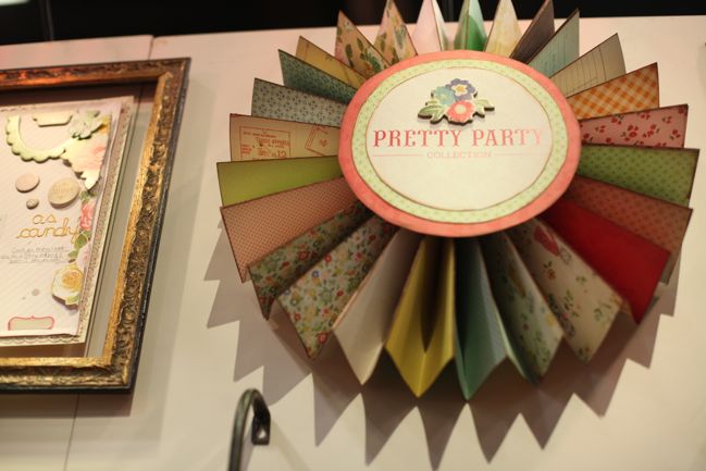
Crate Paper is up next, and their first collection has a name that certainly got my attention! I do love a Pretty Party, especially when it’s made from paper!

Since the last show, Crate Paper has been acquired by American Crafts – but the company has remained intact with its own product designers and its own design team and so forth, so there’s not any big difference to the experience you’ll have shopping for Crate and using their products. The differences are on the manufacturing and fulfillment side, and that shop owners can now order from Crate, American Crafts, Pebbles and Studio Calico all at once – which could mean some smaller shops will do what’s known as ‘cherry picking’ and choose just bits and pieces from all those companies rather than picking up full collections. But expect larger stores to still carry the full inventory. Right – that’s enough business talk – let’s look at pretty papers, shall we?

CHA Winter 2012 :: Crate Paper
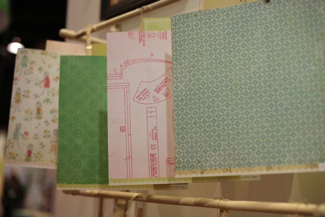
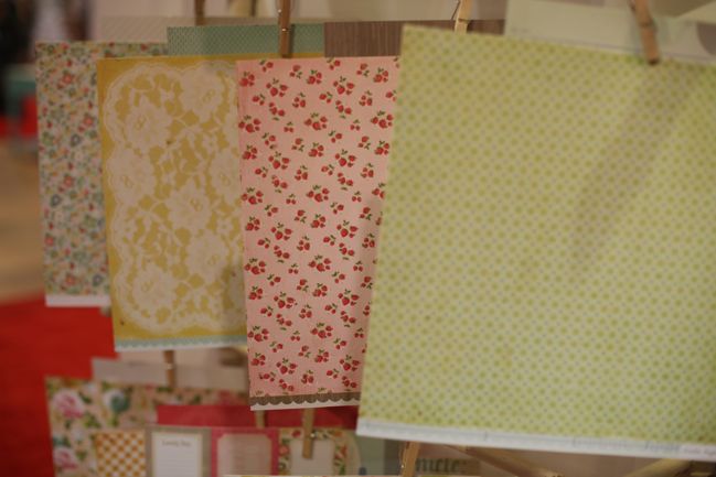
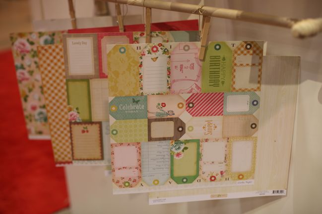
Lots of lush 12×12 Pretty Party papers. I love that they have gone with patterns that are easy to use. I love looking at Crate’s collections but sometimes I find them a bit of a challenge once they are on my table – only sometimes. This isn’t one of those times. Bring on the Crate goodness, I say!

CHA Winter 2012 :: Crate Paper
Pretties from the Crate design team – Rahel Menig on the left and Jaime Warren on the right, I do believe. (My apologies if I’m wrong!)

CHA Winter 2012 :: Crate Paper
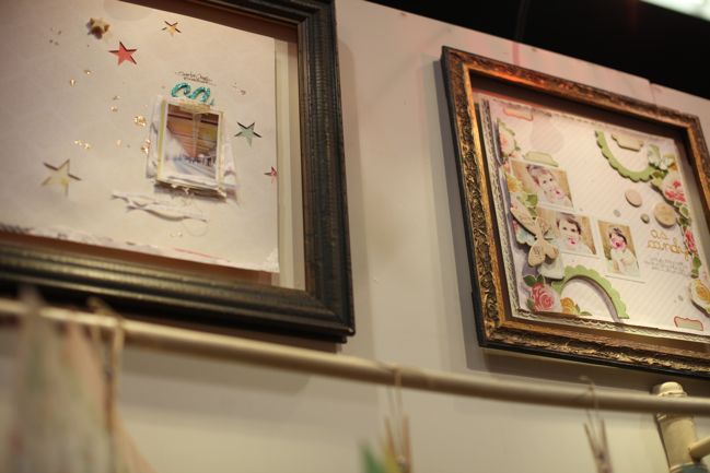
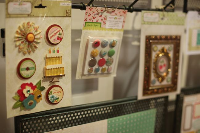
Embellishments include layered stickers (that have gems and buttons in the designs), brad assortments with fabric and epoxies and photo frames in interesting materials. More on that in a minute.

CHA Winter 2012 :: Crate Paper
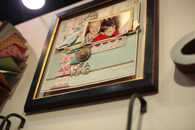
Beautiful layers from Christine Middlecamp.

CHA Winter 2012 :: Crate Paper
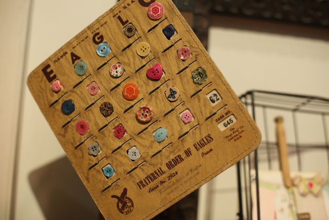
I wish they made this as something we could buy! Sadly no, it’s just part of the display. But what a pretty find and it displays the buttons so well I would be happy to hang it on my wall just like that. I wouldn’t mind if we saw this in reproduction form at the next show, would you?

CHA Winter 2012 :: Crate Paper
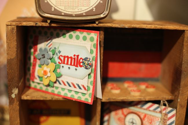
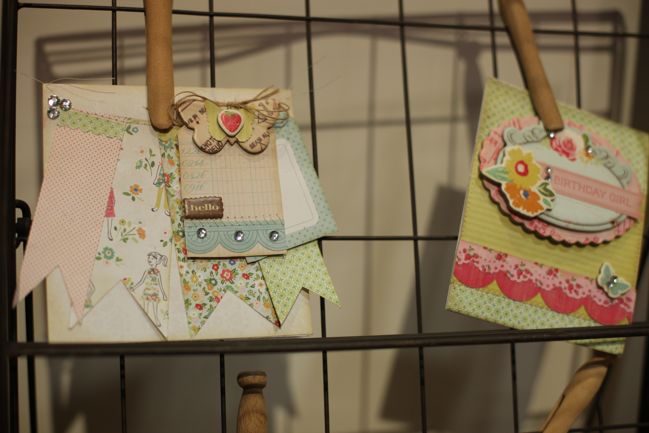
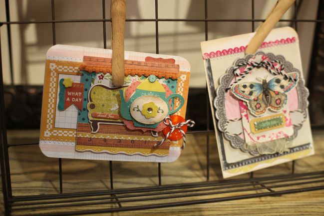
So many lovely layered cards – sorry I can’t identify the crafters here, but all from the Crate design team.

CHA Winter 2012 :: Crate Paper
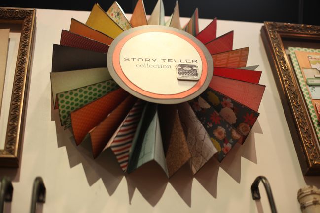
Crate’s second collection is darker in colours and called Story Teller. It has themes that fit general family life, with a vintage twist, and again a collection that will be easy to move from stash to completed pages. (In general, I think we saw a lot more of this at this show: a focus on papers and embellishments that will make great pages rather than the papers that are so ornately designed we don’t know where to start and they end up languishing in our stash because they are too special or too complicated. More crafting than collecting, which is good in my book. My lacking-in-storage-space book.)

CHA Winter 2012 :: Crate Paper
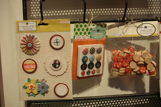
Again, layered stickers and a mix of brads, plus wooden bingo chips for all your numbering needs.

CHA Winter 2012 :: Crate Paper
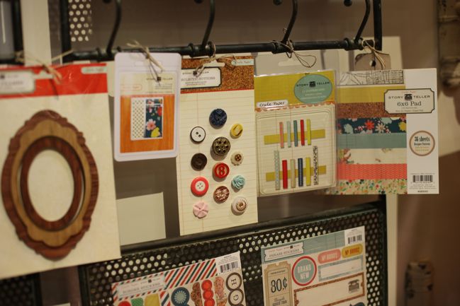
Though they didn’t have samples just yet, Crate added printed washi tapes to their collections, and that blue floral design definitely has my attention. Heading to the right, buttons, printed clothes pegs and 6×6 patterned paper sets.

CHA Winter 2012 :: Crate Paper
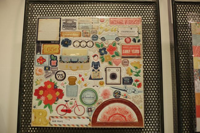
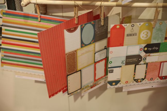
The 12×12 chipboard sheet gives the best feel for all the motifs in this collection. Lots of cameras and flowers plus typewriters, bicycles and luggage. I love that they added a date stamp as a chipboard piece – although many of us use a date stamp in our work, seeing the image of one was something a little new and I like the library feel it adds to Story Teller. (By the way, that’s the second time I spotted protractors at this show – JBS also had it as a stamp design. Geometry is the new cupcake?)

CHA Winter 2012 :: Crate Paper
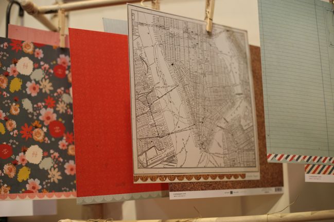
Paper designs include maps, florals and stripes, with a primary colour base that has been distressed just enough that it seems mature and perfectly worn.

CHA Winter 2012 :: Crate Paper
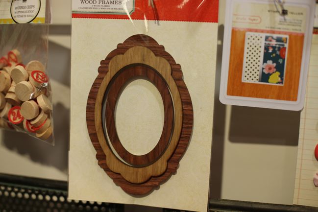
And I promised we would come back to frames! Here’s a better look at the Story Teller frames – in wood. The equivalent frame in the Pretty Party line up are in metal. Something a little different and perfect for a special page or an album cover, perhaps. These even made me think they would look lovely on a Christmas tree – but I promise it is officially WAY too early to be thinking of evergreens and baubles. Definitely.

Both collections ship to stores in February, so look for them to start appearing very soon.

Click here to shop for Crate Paper products. (By the way, they have a current collection that is vaguely Valentiney but would work for many topics, and it’s worth checking out before it disappears to make way for these two collections.)

CHA Winter 2012 :: My Mind's Eye

CHA Winter 2012 :: My Mind's Eye and Rhonna Farrer
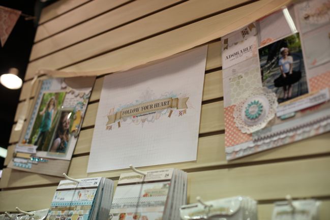
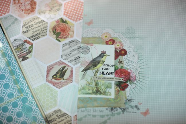
My Mind’s Eye always has a beautiful new release and although I’m glad they grew up and away from their cartoon-styled beginnings with Frame-Ups, I’m so happy they have stayed true to their idea of offering die-cuts and frames to match their paper collections. Those little extras always make their lines stand out for me, and what made me extra happy was Follow Your Heart – a new line by Rhonna Farrer. I’ve long loved Rhonna style as a designer and since then I’ve come to know Rhonna as a person and she inspires me at every turn. So do I want to scrap with all her new papers? Of course! And it doesn’t hurt that they are so very pretty, of course.

CHA Winter 2012 :: My Mind's Eye and Rhonna Farrer
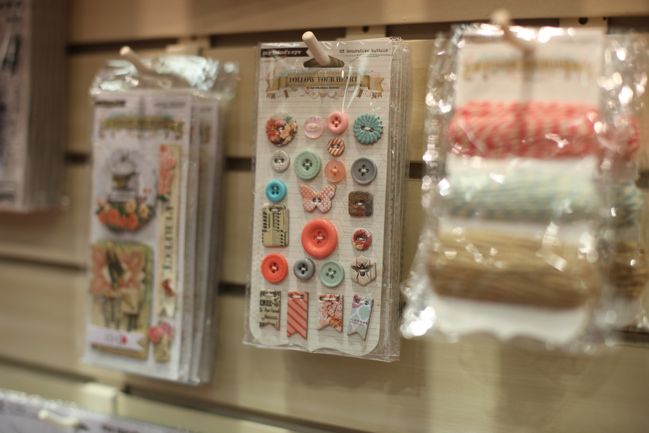
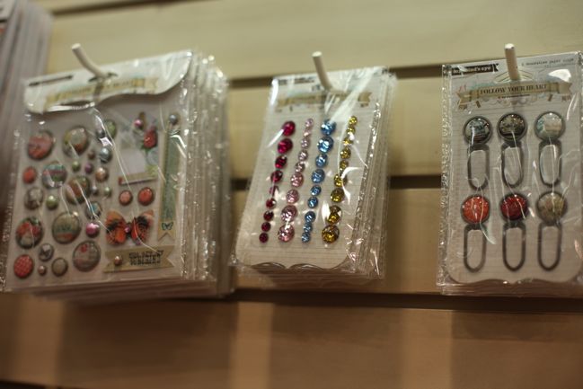
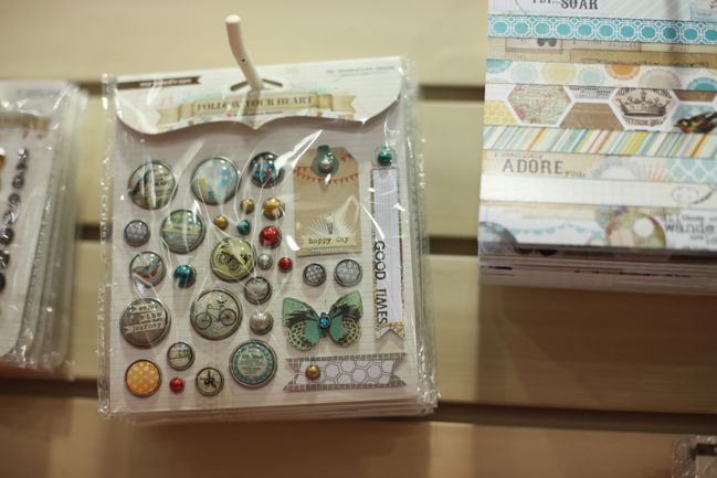
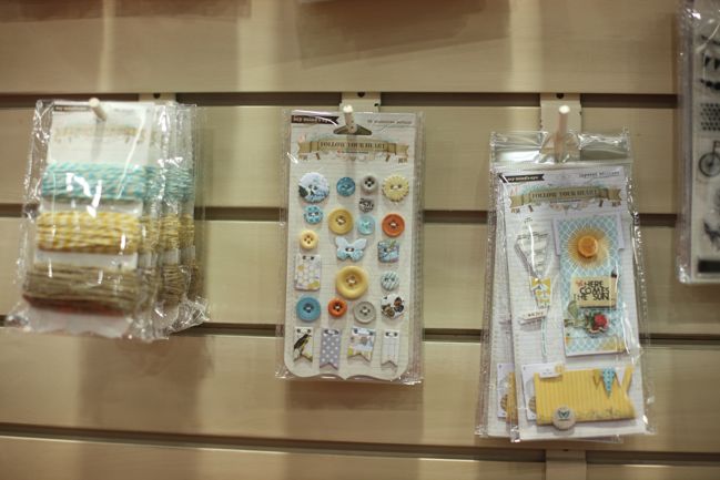
Follow your Heart comes in two parts – one line has more pinks and the other has more blues, but neither line really screams boy or girl. It’s merely a shift in the focus colours, and the two lines could be used together or separately. They both have plenty of lovely details, like brads, twine, gems, buttons and clips to coordinate with the papers, stickers and chipboard.

CHA Winter 2012 :: My Mind's Eye and Rhonna Farrer
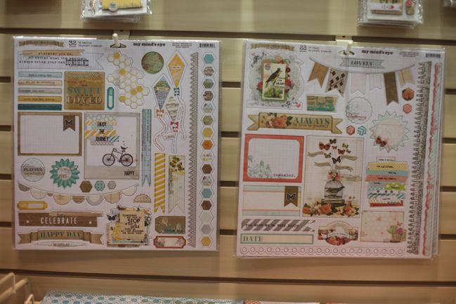
The chipboard accents come as full 12×12 sheets, packed with a variety of embellishments. This shows the two colour schemes side by side – the blue on the left is the ‘Be Amazing’ collection and the pink option on the right is ‘Be Happy’ – but I don’t think there is a definite masculine/feminine divide here, so just pick whatever you like!

CHA Winter 2012 :: My Mind's Eye and Rhonna Farrer
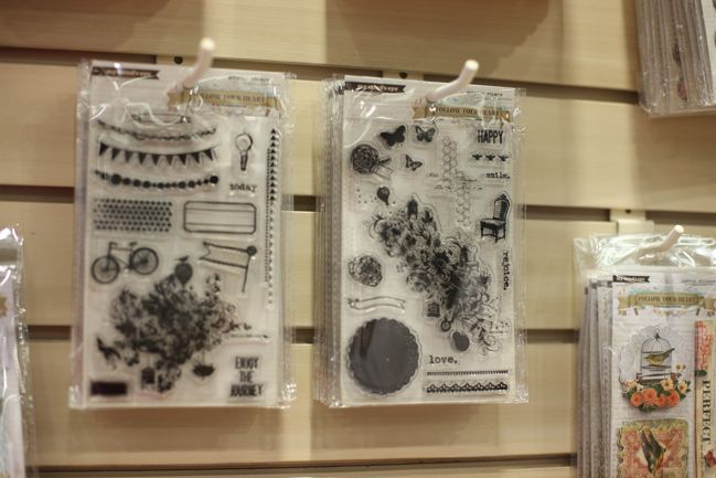
‘Enjoy the journey’ is something you’ll see throughout Rhonna’s work, and I love how she pairs it with symbolic motifs – bicycles, butterflies, balloons. Plus that means you can mix and match these elements with paper collections from other manufacturers that include those themes in the design.

CHA Winter 2012 :: My Mind's Eye and Rhonna Farrer
And clear stamps! I still have some of Rhonna’s earliest stamp sets from way back when, because her swirls, stars and hearts are so versatile they never go out of style. These sets have a mix of classic and right on trend – perfect for something that will last.

CHA Winter 2012 :: My Mind's Eye and Rhonna Farrer
Be Amazing has that teal and yellow that I loved at LilyBee – can’t wait to use these two lines together.

CHA Winter 2012 :: My Mind's Eye and Rhonna Farrer
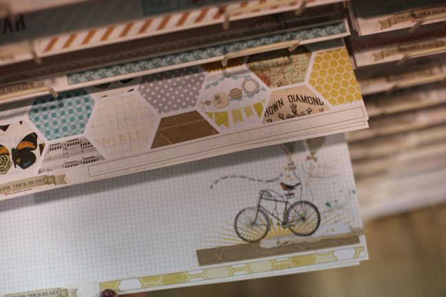
Hexagon patterns and pretty layers on the 12×12 papers. Rhonna put similar layers on her papers for the House of 3 lines at Pink Paislee a while back and I cut them out to move over the page and layer over the photos – and I’m pretty sure that’s exactly what I’ll do with this. Looking forward to it!

CHA Winter 2012 :: My Mind's Eye and Rhonna Farrer
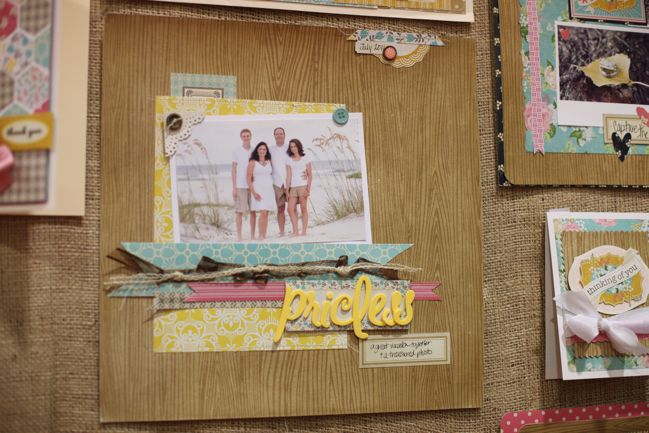
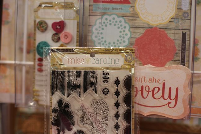
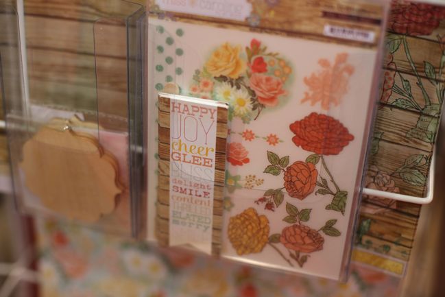
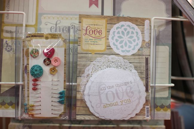
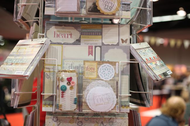
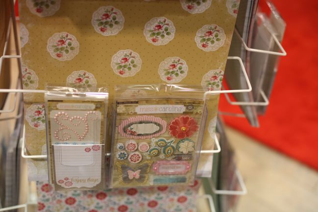
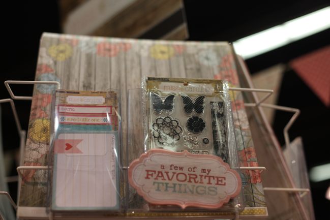
Then there are other collections at My Mind’s Eye – like Miss Caroline, by artist Jen Allyson. Let me just point out one thing as we start so you can get an idea of why I may have already ordered almost everything in this collection. See that stamp set? Why yes, that IS woodgrain bunting. Miss Caroline is a collection that takes a few very lovely things that are already popular in papercraft and gives them a remix to make them work together. Bunting + woodgrain = woodgrain bunting. There’s more of that to come.

CHA Winter 2012 :: My Mind's Eye and Rhonna Farrer
Loving these banner die-cuts with a stack of words in the middle, subway-art style, plus woodgrain trim and a bunting flag shape. It comes in a couple different options with different words and colours.

CHA Winter 2012 :: My Mind's Eye and Rhonna Farrer
There are doilies on both die-cuts and stickers. Great for layering or titles.

CHA Winter 2012 :: My Mind's Eye and Rhonna Farrer
I think this is a new step for My Mind’s Eye – a cut-apart sheet with boxes for writing and other embellishments. I use a lot of sheets like this from Jenni Bowlin Studio and Cosmo Cricket, but I don’t think MME have had them in the line-up before. This works out more affordable than lots of separate die-cuts if you have to make a choice.

CHA Winter 2012 :: My Mind's Eye and Rhonna Farrer
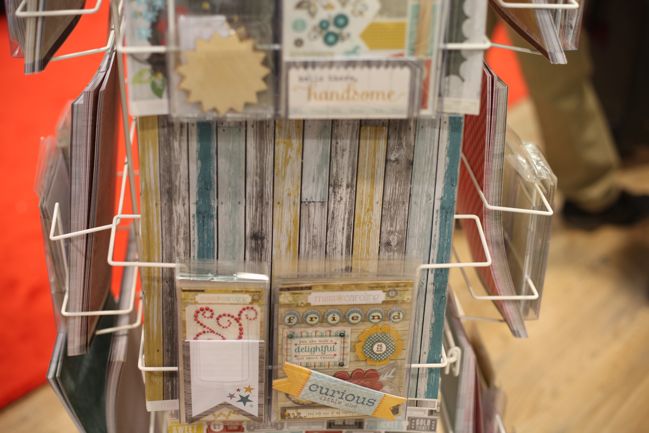
More teal and yellow popping up here. With woodgrain, of course.

CHA Winter 2012 :: My Mind's Eye and Rhonna Farrer
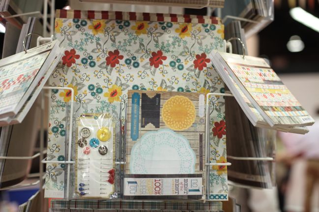
There are also florals in each colour scheme, so you could take this ultra-feminine by picking and choosing which pieces of paper you like.

CHA Winter 2012 :: My Mind's Eye and Rhonna Farrer
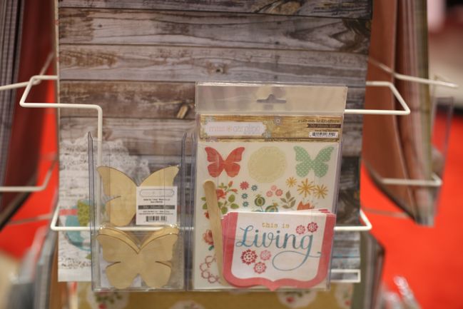
Wooden. Butterflies. Yep: already ordered them!

CHA Winter 2012 :: My Mind's Eye and Rhonna Farrer
The embellishments include layered stickers and adhesive pearl designs.

CHA Winter 2012 :: My Mind's Eye and Rhonna Farrer
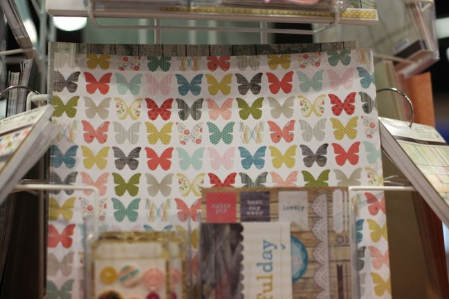
The ultimate statement paper for butterfly fans!

CHA Winter 2012 :: My Mind's Eye and Rhonna Farrer
And butterfly stamps in both woodgrain and polka dots. An entire line of taking things many of us love and putting them together. And the best bit?

All of the My Mind’s Eye release is already available to buy! I actually ordered yesterday. Click here to order My Mind’s Eye products, including Miss Caroline and Rhonna’s Follow your Heart collections. There’s even a special: orders with $25 or more in MME product receive a special gift. (No code or anything – it’s automatically added when you hit the $25 point. And as I only ordered yesterday I have no idea what the gift may be.)

CHA Winter 2012 :: Clever Handmade

CHA Winter 2012 :: Clever Handmade by Heidi Grace Kress
Clever Handmade was something I was so excited to see. It’s a new company from artist Heidi Grace Kress, who you might not know at all if you’re relatively new to the scrapbook world. Here’s the very abridged version of Heidi’s product history: she started by producing her own product. It was so lovely it was acquired by Fiskars. Except then Fiskars decided they didn’t want to be in the paper business any more and focus on tools. The Heidi Grace brand moved to Colorbok. That didn’t work out either. And the wording of all those deals meant Heidi couldn’t use her own name in future branding… even though it is her name. Oh, the legalities of things.

But now she is back. With her full name. And a new company name that doesn’t mention her at all, but is so very her. And that is Clever Handmade.

CHA Winter 2012 :: Clever Handmade by Heidi Grace Kress
Now, you need to keep in mind that Heidi’s style is very cute, and I understand that cute is not everyone’s thing when it comes to scrapbooking. But stay with me for a moment, because there may still be something valuable for you here. And of course, you might be all about cute!

CHA Winter 2012 :: Clever Handmade by Heidi Grace Kress
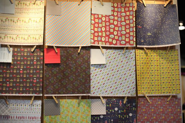
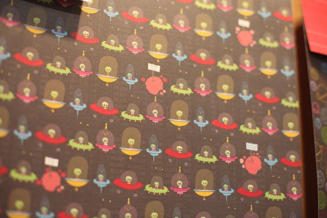
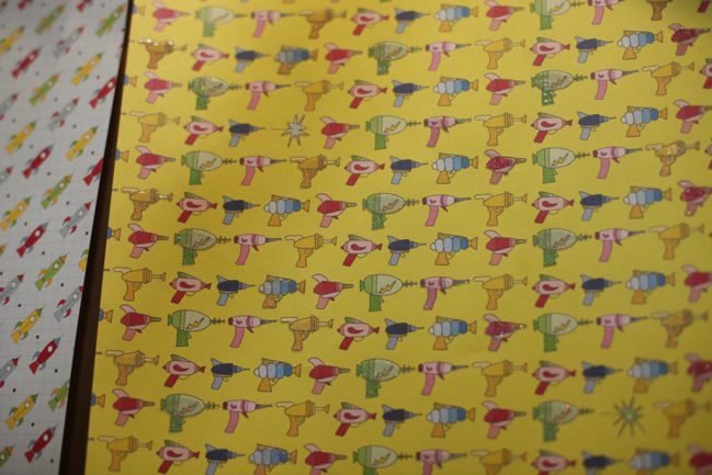
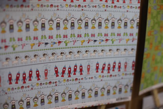
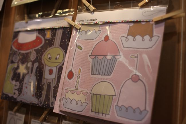
Cute like spaceships and ray guns.

CHA Winter 2012 :: Clever Handmade by Heidi Grace Kress
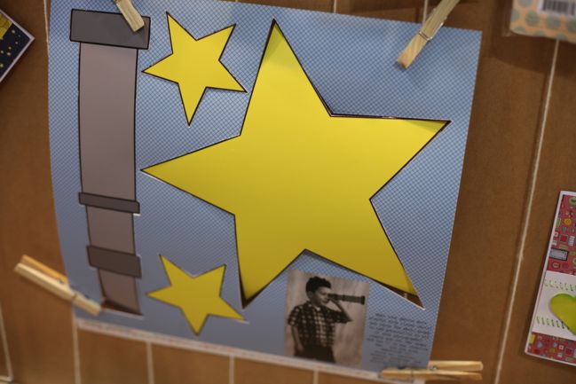
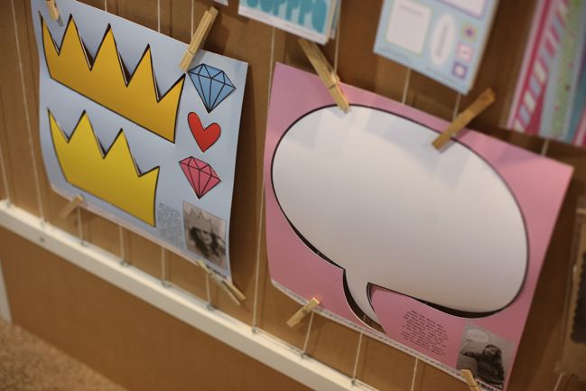
Cute like paper photo props! Yes: you punch these out of a 12×12 sheet and instead of putting them on a page, you use them as props in a photograph. In a DIY photo booth or just in a fun little photoshoot. They look so sweet in photos – cute with kids, quirky fun with adults. They come in several designs and were something completely different than any other company.

CHA Winter 2012 :: Clever Handmade by Heidi Grace Kress
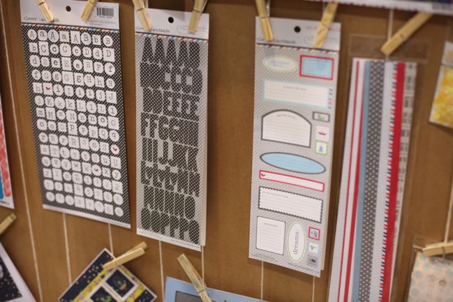
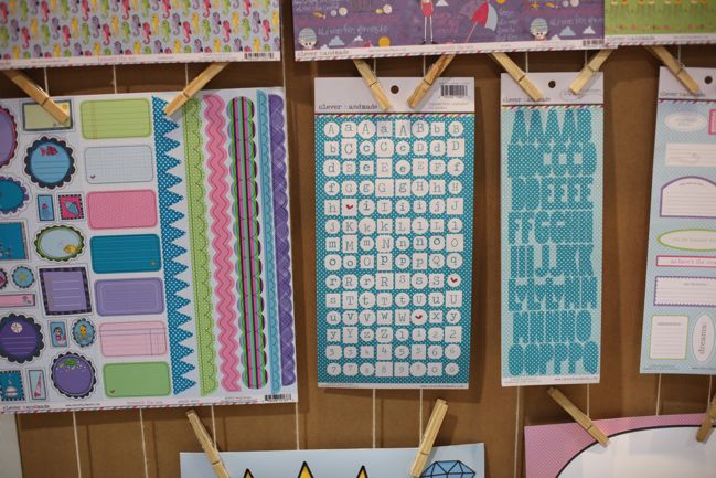
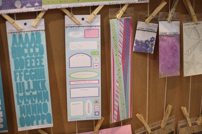
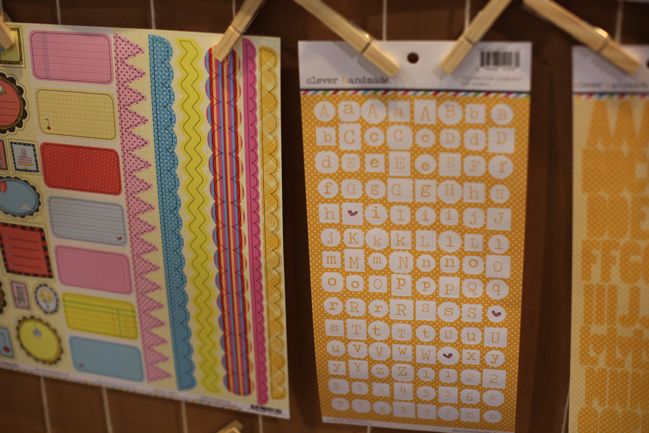
Cute like polka dotted letter stickers.

CHA Winter 2012 :: Clever Handmade by Heidi Grace Kress
Cute like dogs in space helmets.

CHA Winter 2012 :: Clever Handmade by Heidi Grace Kress
And more photo props – including some for captions. You can either write on the prop itself or leave it blank then write on the photo with your pen or in Photoshop. Clever.

CHA Winter 2012 :: Clever Handmade by Heidi Grace Kress
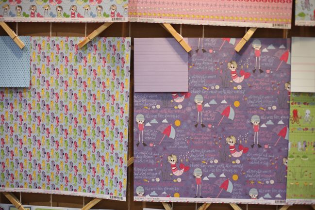
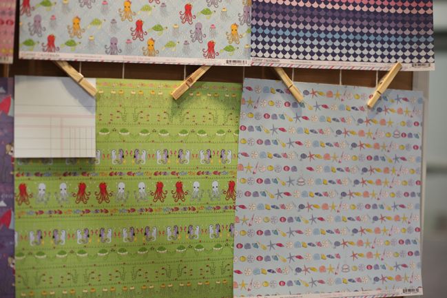
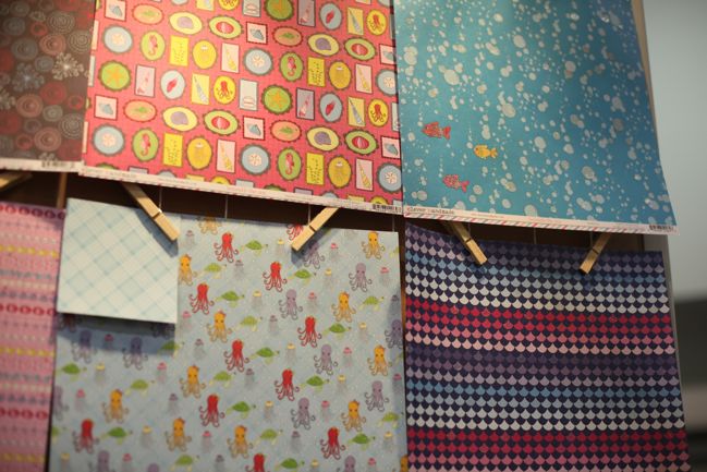
Space themes aren’t the only collection. There are also mermaids and sea creatures in the mix, with pretty turquoise hues.

CHA Winter 2012 :: Clever Handmade by Heidi Grace Kress
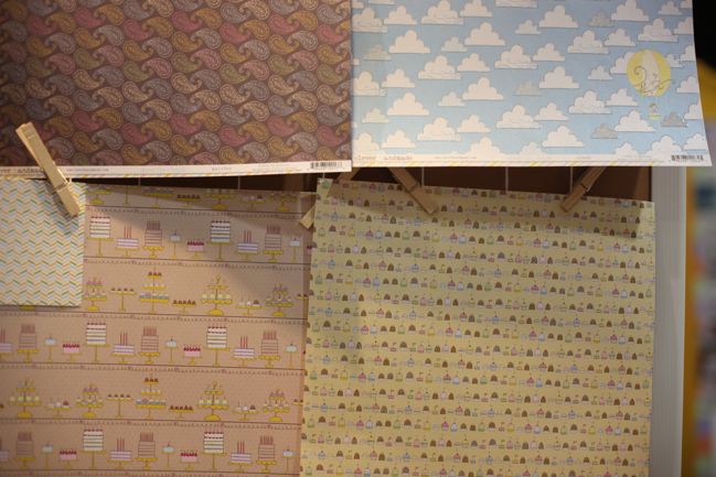
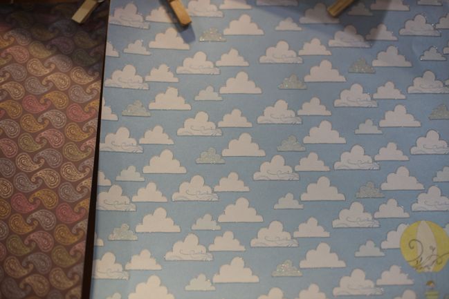
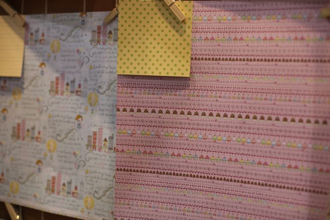
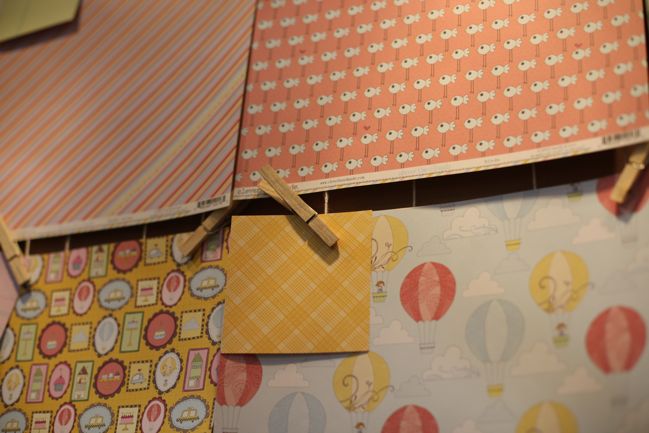
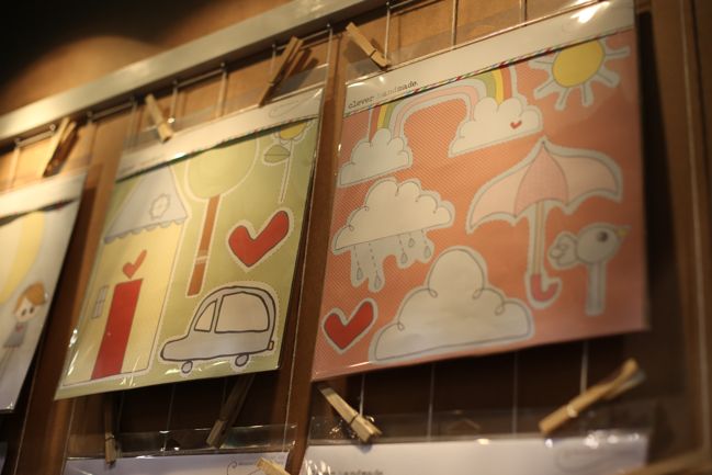
And cakes and clouds and balloons with an orange shade that makes me want a creamsicle. We don’t even have creamsicles in England. Sad times.

CHA Winter 2012 :: Clever Handmade by Heidi Grace Kress
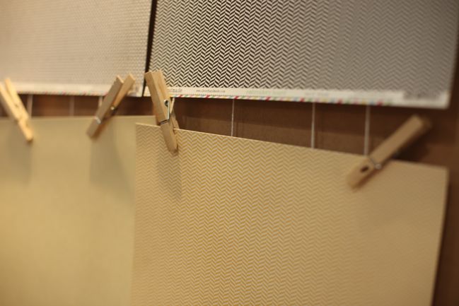
Here’s what I mean by you can love this company even if you don’t scrap ‘cute’. Check out these gorgeous mini patterns. No doodles, no mix of colour, just really versatile chevrons and grids that are timeless. (Did I just say chevrons are timeless? Maybe it’s wrong to label a trend as timeless. But before this current trend we called them ‘zig-zags’ and that is generally an accepted element over the ages, so I’m going to go with timeless.)

CHA Winter 2012 :: Clever Handmade by Heidi Grace Kress
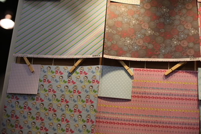
So now look at the cute patterns and check out those squares in the corner that show the b-sides of the papers. Every single cute pattern has a non-doodled background with an extremely versatile b-side. Things like ledger and notebook paper, plaids, stripes and polka-dots. The sorts of papers you can use right to the very last square inch. I value that so much in a patterned paper.

CHA Winter 2012 :: Clever Handmade by Heidi Grace Kress
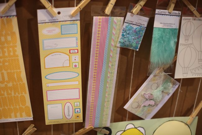
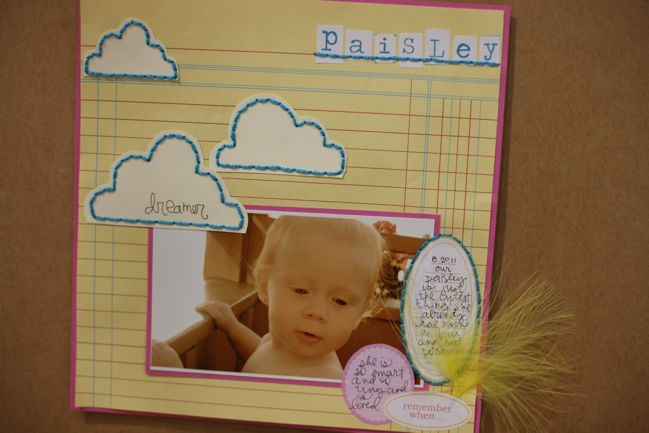
And the embellishments are themed by colour rather than by illustration, so things like labels and letters are joined by feathers and sequins and border stickers that will look great with these collections but will also be so easy to mix and match with the products you already have.

CHA Winter 2012 :: Clever Handmade by Heidi Grace Kress
Then we get to one of my favourite things of the entire show.
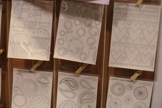
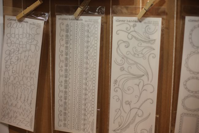
Say it with me: Rub-on. Embroidery. Patterns.

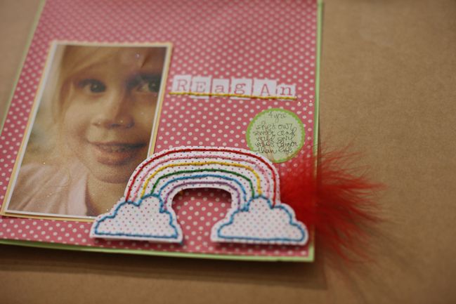
This is such a simple innovation that it is perfection. Say you have this layout almost complete but you think it needs a little something. Maybe some stitching would be great. But your layout is pretty much finished: are you brave enough to start poking holes in the page without being able to tell if you’ll get the shape just right?

I know there is a wheel-type tool for this but I’ve bought two of those things and I couldn’t get either one to do anything other than drive me to frustration. I wanted to love that. I didn’t. But this? THIS I LOVE.

Take your almost-finished layout. And something that looks like this:
CHA Winter 2012 :: Clever Handmade by Heidi Grace Kress
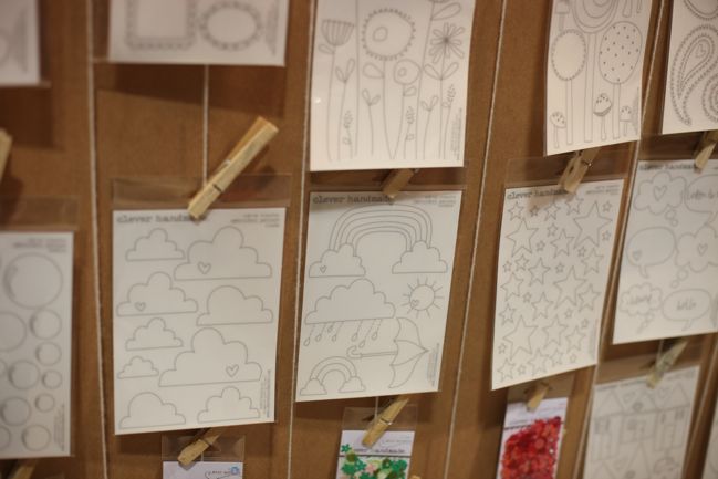
Cut out the rub-on and apply it to your page. You can see exactly where it’s going to go before you apply the design. It’s easy to control and it’s complicated like a wheel. And there are dozens of lovely images to choose, including doodle motifs but also borders and an alphabet. Use a paper piercer or a needle to punch holes that follow the dotted lines of the pattern. Stitch through that. Presto: your completely finished layout with beautifully stitched details and no frustration.

Seriously, why didn’t someone think of this before? But I am so happy Heidi thought of it now. I love it.

CHA Winter 2012 :: Clever Handmade by Heidi Grace Kress
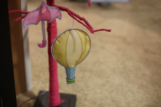
By the way, if that makes you really want to stitch more, she has also made these iron-on sewing patterns. For stuffed creatures and ornaments rather than scrapbooking, but still fun. Iron onto the fabric of your choice, cut out and sew along the lines. Easy enough for kids to do, so perfect if you want to scrap while your little ones craft with you.

CHA Winter 2012 :: Clever Handmade by Heidi Grace Kress
Clever Handmade will be shipping to stores very soon. In the mean time, go welcome Heidi back to the scrapbook world by checking out the Clever Handmade blog.

Scrapbooking Giveaway Day

scrapbooking giveaway day
little black heart

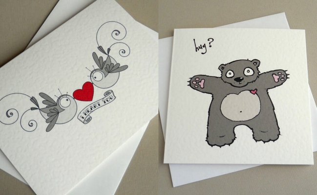
This week one lucky commenter will win two cards from Little Black Heart

Little black heart is the creation of Sal, who’s illustrations, I am sure you will agree are wonderfully unique! Sal describes her shop as “contemporary cards, stationery, prints and originals, featuring my quirky illustrations. I like all manner of things, from zombies to ninjas, birds to monsters, and lots of things in between”

To enter, just leave a comment on this post telling us who you think deserves a big old Bear hug and why.

Entries close at midnight Thursday UK time and the winner will be posted Friday evening.

scrapbooking giveaway winner
describe prize

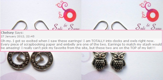
Congratulations to Chelsey, who wins her choice of earrings from Safi & Sasu

Chelsey, please email me (shimelle at gmail dot com) with your address.

Have a great week!

xlovesx