paper: pretty paper. true stories. {and scrapbooking classes with cupcakes.}

lovely to meet you Twitter Facebook Pinterest YouTube

Take a Scrapbooking Class

online scrapbooking classes

Shop Shimelle Products

scrapbook.com simon says stamp shimelle scrapbooking products @ amazon.com shimelle scrapbooking products @ amazon.co.uk

Reading Material

travel

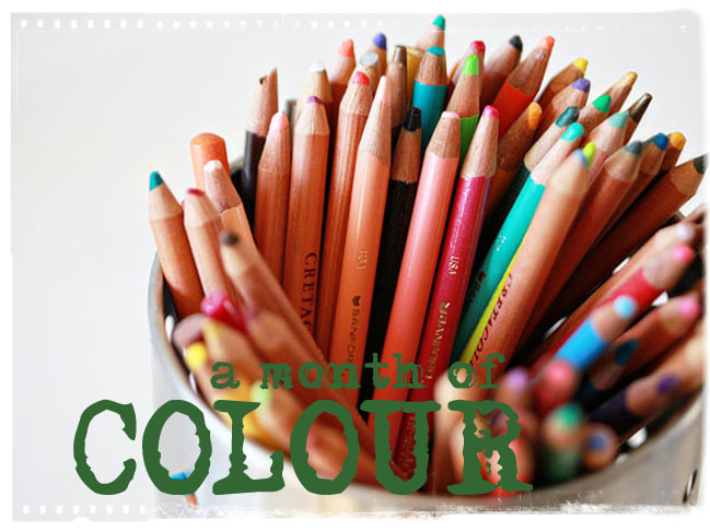
Colourful Guest Post :: Scrapping with Atypical colour combos

So happy that Miss Julie Kirk is joining us today for a look into her colourful creativity. Hope you enjoy Julie’s guest post!
-Shimelle

scrapbook page

Hi there, I’m Julie and, as anybody who has ever read my blog Notes on Paper will know, I have several main creative obsessions including: writing, scrapbooking and playing with colours. Anything which combines any of these brings me ridiculous amounts of pleasure … so you should probably imagine me smiling right now.

Whether it’s decorating my layouts, my home or myself through my clothes and accessories, I truly love to co-ordinate, combine, and clash colours trying to find interesting and unexpected combinations. At times I receive comments such as: “I’d never have combined those colours” or “those colours shouldn’t work together … but they do!”. Even when I was one of the Best of British Scrapbooking winners 2008, the judge described my colour choices being “right – but unexpected”. So, with all this in mind I thought I’d share the method I‘ve used when adding colour to my pages, the method which has acquired me comments such as those, which I’m almost 100% sure are meant to be complimentary! [Aren’t they?].

I attribute the success of some of my atypical colour combinations to two things:

always drawing upon the colours which already coexist within the photograph and
the subsequent repetition of these colours across the layout to achieve a varied yet cohesive colour-scheme across the page.

This photo, showing me battling through a crowd of fellow paper fanatics at a paper-craft show earlier this year, was the starting point for the colours I went on to use in the layout which I’ve photographed at various stages of development to show how I gradually built up a wide ranging colour scheme.

photo for a scrapbook page

1. I drew out the colour of the purse I’m clutching by using pink as my base colour and adding the pink vinyl ‘Rootbeer Float’ Thickers to the centre of my page. These matched the purse so utterly perfectly that they made this colour-matching obsessive very happy indeed!

scrapbook page

2. The bird-watching theme of my journaling led me to add the pink bird detail at the bottom of the page along with the snippet of bird / mushroom fabric. Seeing as this introduced several new colours to the page, I repeated the yellow and red in the tiny Adornit’s alpha stickers.

3. I’d now added three main colours to my page pink, red and yellow and while this may seem like plenty of shades for some … I always feel a little naked [or rather, I feel my pages are a little naked!!] until I’ve added at least one more. Which is where the bright teal came in:

scrapbook page

4. The strip of American Crafts ‘Teacher’s Pet’ was an indispensable addition which brought several elements together. Not only did it reflect the shade of teal from my bag strap and the birdcage fabric I’d included, its bright cerise reverse helped lift it from the pale pink backing and its leopard print design mirrored that of my scarf. A touch of animal print is welcomed both my wardrobe and my scrapbooking so it made an ideal paper choice for me!
5. The bird cage fabric had introduced more yellow which I balanced out with the further yellow touches of the button and the Sassafras Lass ‘Paper Whimsies’ duckling card. At this point the scheme was happily cohesive … but I wanted to push it a little bit further!

scrapbook page

6. I drew out yet another colour from the photo and do bear with me because this is an odd one. When I looked at the original photo, one colour that leapt out at me was the royal blue at the top right which, now I’ve had a closer look, appears to be a banner advertising Nestabilities dies! To satisfy my need for royal blue, I cut a cute little character from some Jon Burgerman designed wrapping paper and tucked her behind the fabric at the top then harmonised this with a strip of blue Dymo tape and blue Doodlebug ‘Simply Sweet’ alpha rub-ons in the bottom corner.

scrapbook page

7. Finally I grounded my colour scheme by adding two tiny touches of grey [one beneath the American Crafts paper and the other just above the teal button] to replicate the darker colours in the photo … in particular the grey of my jacket ..and here’s at how it all worked out:

scrapbook page

Yes there’s a bit of everything on there, yes some of the colours are less obvious choices than others …but it works for me. This is mainly due to the way in which many of the colours are drawn from the original photograph which is, after all, the main feature of the page. Then, as all of those colours were then repeated, no single item appears to be stranded or out of place.

Maybe next time you’re trying to find a colour combination for a layout you’ll give this method a try. If you’re already confident using colour, or are as obsessive as me, you could have great fun co-ordinating and clashing using your entire photo as your colour palette. If you’re not as convinced then perhaps select two or three colours initially and focus on repeating them until you achieve a balance across the page.
If you try this, and if your work starts attracting comments like ‘those colours really shouldn’t work …but they kind of, sort of do” then do give me a shout … us colour-crazies really should stick together!

Julie

A day for red, rose and pink...crafting

digital scrapbook page
©twopeasinabucket.com
Supplies: Old Boris papers, Naked Stamp Sheets, Strokes and Splatters, Peony Place borders, Peony Place Floral Fantasy embellishments all available at Two Peas.

Today’s colour challenge…craft with red, rose or pink. Scrap one of the photos you took last week or work on something completely different! But craft it up in shades of red and leave a link here to be entered for a chance to win.

Have a fabulous day! And check back later today for a colourful guest post!

xlovesx

A day for green...crafting

Kilauea Volcano

Forgive the late start to Monday…I’ve been a bit distracted by a volcano, it would appear. This picture has absolutely nothing to do with this post…I just couldn’t wait to share. Moving right along then…

This week we’ll be following the colour patterns we set last week with photographs…but this week we’ll be making things! And every day there is a challenge to make something in that particular colour or colour combination for a chance to win a prize. This week, each winner will get their choice of an online class.

monday felt green

Today’s craft colour challenge? GREEN. Use a lot, use a little, use some green pixels or use all the green papers you can find, but make sure it has something prominently green! Upload your project to your blog, your page gallery or flickr and link it up in the comments below for a chance to win. Entries close at the end of the month.

More to come throughout the week…with a few surprises thrown in for good measure!

xlovesx

A Month of Colour :: Week Two Recap

Week two of our month of colour has been all about photography. Here’s a quick list of all the week two posts and challenges.

This week’s colour challenges are all colour-themed art prints, so the randomly chosen winner for a day for green will win a green themed print and so on. Entries for all the challenges close at 11:59pm UK time on the 30th of June, so you still have time to join in!

Colour photography challenges:
A day for green
A day for red, rose and pink
A day for grey, shadows and black
A day for blues
A day for all things light
A day for earth tones
A day for cool pastels

I love this photo… guest posts:
Rhonna Farrer
Cathy Zielske
Kelly Purkey
Ali Edwards
Karen Russell
Kelli Crowe
Maria Grace Abuzman

I just want to send an extra thank you to these lovely ladies for sharing their photos with us!

xlovesx

I love this photo...with Maria Grace

I love this photo by Maria Grace Abuzman
© Maria Grace Abuzman

I am Maria Grace Abuzman and I love this photo because it reminds me of the value of surprises. For this particular shot, I asked two of my friends to run crazily toward me. What they ended up sharing in this single captured moment is their love story. I can see it. Can you? I am continually surprised with how much people share of themselves through photos and am honored that they share it with me.


The adorable Maria Grace has designed for Hambly Screen Prints, Two Peas in a Bucket and Fontwerks, as well as a featured album for a CK kit of the month designed by Ali Edwards. Her pages have appeared in books from Autumn Leaves as well as Creating Keepsakes magazine. She loves eating sushi, reading romances, and people watching. She is a wedding and portraiture photographer based in the San Francisco area and is undeniably in love with life right now. Read her blog, Momentary Bliss, here.


I love this photo… is a special series of posts this week, featuring favourite images from some fabulous scrapbookers and friends. I hope you have enjoyed the series! -S.

A day for cool pastels

pink

And to wrap up our seven days of colour-themed photography, snap cool colour combinations or creamy pastels today!

Leave a link in the comments below to be entered for today’s prize. You have until the end of June to enter!

xlovesx

I love this photo...with Kelli

I love this photo by Kelli Crowe
© Kelli Crowe

I am Kelli Crowe and I love this photo because of the texture on the dumpster behind Alex. (Yes, I photoshopped this one up real good) I love the colors and his eyes and his expression….and because it is of him:)


kellicrowe is a:
messy organizer
a homeschooling mommy
to 3 boys
a wife
an outgoing introvert
a reader
a Trekie
a scrapbooker
who lives a lovely little messy life
in Atlanta, GA

Kelli is a Garden Girl at Two Peas in a Bucket,
she has contributed to several Autumn Leaves Books such as:
Freestyle, Foofalife, Designing with Type and The Designing with Recipes Book.
You can see more of her and her craft space The Organized and Inspired Scrapbooker. Read her blog here.


I love this photo… is a special series of posts this week, featuring favourite images from some fabulous scrapbookers and friends. I hope you enjoy! -S.

A day for earth tones

a day for earth tones

Shaking it up just a teeny bit for the weekend as we go into colour combos rather than just single colours. Today, be on the look out for warm earth toned colours like browns, yellows and maybe more green too. See if you find them indoors or out!

Leave a link in the comments as per usual!

xlovesx