



pretty paper. true stories. {and scrapbooking classes with cupcakes.}

lovely to meet you Twitter Facebook Pinterest YouTube

Take a Scrapbooking Class

online scrapbooking classes

Shop Shimelle Products

scrapbook.com simon says stamp shimelle scrapbooking products @ amazon.com shimelle scrapbooking products @ amazon.co.uk

Reading Material

travel

We can Scrap a Rainbow - a new online scrapbooking class now open for registration!

Scrapbooking class all about colour! - shimelle.com

This scrapbooking class about colour – it’s a concept I have worked on so long, on and off, because I knew I wanted to say so much and I felt like every angle I chose left me with all these other elements I wanted to include. Fast forward through a lot of scribbled notebooks and I’ve come to my very happy conclusion: it’s not just one class.

Today I’m opening registration for We Can Scrap a Rainbow, which is what I’m calling the first class in my colour-based curriculum. There are at least two more classes to follow, each with their own angle, and the series will build one class to the next, so joining in now will make it easy to follow along as we move through an entire spectrum of colour conundrums, possibilities, and tangents.

I know you’ll be tempted to look at the layouts I’ve made over the last two years and assume ‘scrap a rainbow’ means pages with a literal rainbow of colours and literal rainbow motifs. But I’m keeping you on your toes: IT IS NOT THAT. Instead, this is a dive into each colour, one at a time. So we’ll look at red, then orange, then yellow and so on. I’m adding pink even though it’s not in the rainbow. There is a balance in each colour, so we’ll look at the colour on its own and then in several combinations, all with scrapbook page examples and process videos.

What you get:

*As soon as your registration is processed (which can take up to 48 hours after payment – it is not automated) you can watch a class I originally taught for Scrap Smarter. It’s all about making page kits and looking at the ways those colours work together.

*From Friday 25th of March to Friday 1st of April, we’ll work through a series of edited video lessons about quadrant page design and different ways to use colour in this set up. If you have taken Half and Half, you also get access to this on the same dates. This week of lessons bridges the last class, all about composition, to the new class focus on colour!

*From Monday 4th of April, we work our way through the rainbow! Each colour in the rainbow will include a brief prep session so you can gather your materials, an edited lesson video, and a live video session. These live sessions are not like my casual YouTube livestreams, but instead start and end with a brief Q&A session and have a structured lesson in the middle so you can scrap along with me in real time. I’ll save all the random rubbish chat for outside class! Each colour also includes printable lesson notes and a Pinterest board of resources.

Your access to all the class materials is permanent and all live videos can also be watched on replay. The quick prep session for each colour means you can post any questions you would like answered in the Q&A without needing to be there live, and then you can watch it back when it suits your schedule.

$20 USD
£15 GBP

You can choose US Dollars or UK Pounds to purchase the class, and if your currency is neither of those, you can just choose the one your prefer and it will automatically convert when you purchase. You can check currency exchange rates at xe.com if you need to translate it into number that will make sense for you! Once you click through, you’ll be given the option to pay by card or from your Paypal account – either option is fine. No transactions are done on my actual site – you can check the URL when it goes through and you’ll see the secure processing is done through Paypal’s servers and not here on my blog. I never see your payment details.

If you pay by Paypal account and your account there has a different email address than where you’d like to receive your class materials, please email me at shimelle@gmail.com and just let me know the two email addresses so I can sort that for you! You can use that email address to ask any questions as well!

If you are a pass holder, you don’t need to do anything – you receive this class automatically. If you purchased a class during the flash sale to get a discount on this class, do not purchase here at full price – you’ll get an email with your discount instructions. Thanks!

If you prefer to wait hear more than just what’s here, that’s fine! I’ll be talking more about the class on both my YouTube videos and Instagram posts in the time between now and the start of class!

Applying Distress Oxides with Petra De Vroege

Applying Distress Oxides with Petra De Vroege @ shimelle.com

Hello hello and please welcome Petra De Vroege, here to share a lovely idea for the sprays we collect. Do you have an air blower tool or could you try something similar with a straw? I’m curious what ideas you’ll have from Petra’s project today! A reminder that supplies are affiliate linked to make all this possible. Thanks! -Shimelle
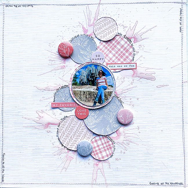
Hi creative friends! I’m so thrilled to be joining the 2022 Shimelle project to inspire other crafters. The layout I made was a growing project. Sometimes I start with an idea that suddenly turns out completely different, this time that was the case. I wanted to create half a circle, but it turned out “slightly” different ;) and that is also what I love about our hobby, get those creative juices flowing! Crafting gives me a way to get rid of stress and soothes me in many ways. Every project is different and every time it is a little adventure on its own.
Applying Distress Oxides with Petra De Vroege @ shimelle.com

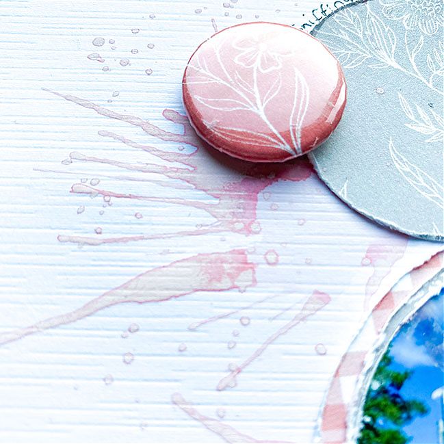
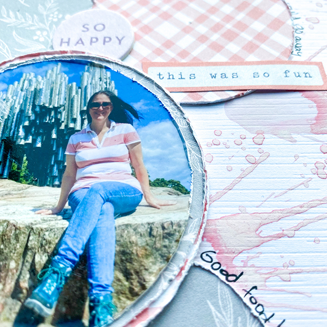
In almost all of my projects I use Distress Oxide inks. I love to create backgrounds with them and give my work a touch of mixed media. This time I wanted to try something different and used the Oxide spray in Spun Sugar. I made little puddles of ink on my page and used my Tim Holtz Air Blower to get that splattered look. I love how that turned out! It gives such a cool effect and you see the different shades of pink that are in that spray. I’ll try this technique again for sure!

Applying Distress Oxides with Petra De Vroege @ shimelle.com

Since I’m the only girl in our happy little family, I rarely use pink, and certainly not a lot. This photo of me on our very first “after COVID” vacation was the perfect excuse to use pink! I used The Best Day collection by Pinkfresh Studio, such pretty and soft papers! The flair buttons are made with the WRMK Button Press, and it was so cool to be able to create matching flair with the papers from the same collection!

Applying Distress Oxides with Petra De Vroege @ shimelle.com

So, to finish it off I wanted to add some black to make it stand out more, but… I also wanted to incorporate some journalling. I never do journalling on pages, but since this was a special vacation for us, I wanted to do it for the first time. I decided to follow the “lines” of the layout, so I journalled along the circles and along the stitching around the border. Not a complete story, but small phrases about what we did, ate and saw.

I hope I was able to inspire you in some way, perhaps to get creative with your inks, or different use of different colors, I would love to see your work! Get those creative juices flowing!

Petra de Vroege is a mother, wife, vocal coach and scrapbooker from the Netherlands. Scrapping for almost 20 years, she loves the creative freedom and amazing community. Crafting has given her so many beautiful friendships and she loves it most when we all can inspire each other. You can follow Petra’s work on her Instagram feed.

Off-Cut Scrapbooking with Jen Schow

Off-Cut Scrapbooking with Jen Schow @ shimelle.com

Today I am delighted to welcome a very special crafty friend to share a project with you: it’s Crafty Jen Schow! You might already know that I love her stamp designs but you might not know that we got to spend some excellent time together at ye old craft trade show in the before times and friends, I MISS HER. So this is my next best thing: getting to see her scrapbook. Enjoy. -Shimelle

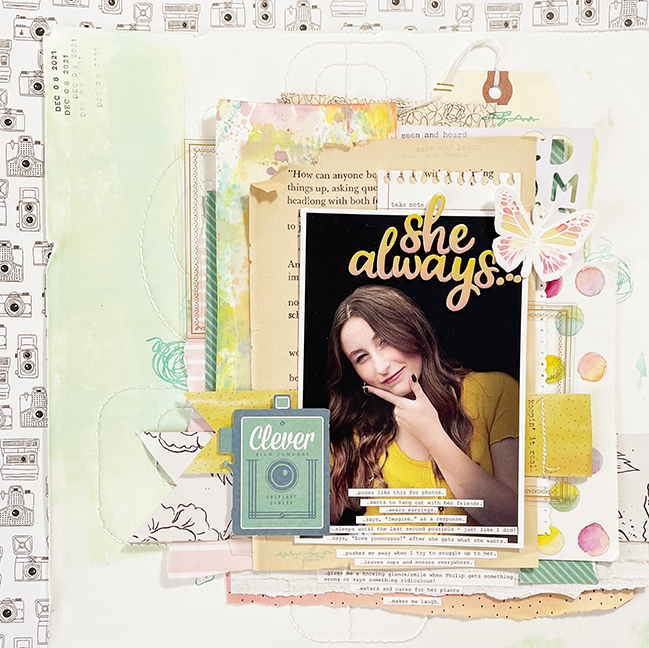
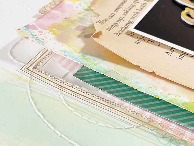
I love layers and textures to create interest on my layouts. One of my favorite things to do is create with leftovers and off-cuts from previous projects. I love the sort of “organic” look of torn edges and punched papers sticking out of a bunch of layers.

Off-Cut Scrapbooking with Jen Schow @ shimelle.com

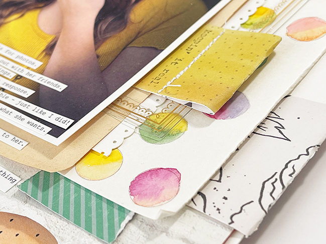
For this layout, I went through my stash of scraps and my bin where I keep interesting off-cuts, random inked or painted pieces, and embellishments that didn’t find homes on other pages. I layered them up behind my photo letting all of the interesting bits show. In order to keep the chaos contained, I like to add tight layers and keep them right around the photo. This allows room for your eye to rest on the outer edges. The other thing I like to do is make sure to add in lots of neutrals so the colors and patterns don’t become super overwhelming – book pages are a favorite! The last thing I really pay attention to when adding layers is to make sure none of the corners or edges line up – something that I’ve learned from Shimelle!

!Off-Cut Scrapbooking with Jen Schow @ shimelle.com

For texture, I’ve added stitching, roughed and curled up the edges of the papers, used embellishments with different finishes, and added in stamping, staples, and embossing. Simple things really do make a big difference, so if you feel like your next layout is missing something I encourage you to try some of these techniques!

Off-Cut Scrapbooking with Jen Schow @ shimelle.com

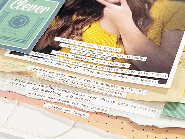
For me, the most important part of any layout is the story. I had this funny photo of my daughter and when I saw it I thought, “She always does this pose!” It was the perfect jumping off point for a list of the things she’s always doing right now – teenagers change so quickly!

I hope you’ve gathered some ideas for adding layers and texture to your next layout or maybe documenting the things that someone close to you is always doing!

Jen Schow loves documenting her most important everyday stories using words, photos, and pretty papers. She has been scrapbooking since age 12 and has worked in the industry in some capacity for about 12 years. She is most active on Instagram these days, but you can find her popular Use It or Lose It series on Youtube.

Colour Techniques with Dana Tatar

Colour Techniques with Dana Tatar @ shimelle.com

Happy March! Please welcome Dana Tatar to the blog today, and she has made a scrapbook page with three of my collections, which has really made me smile. I hope you find it inspiring too! Remember, supplies have affiliate links and shopping through those makes the guest artist project possible, so thank you for your support! -Shimelle

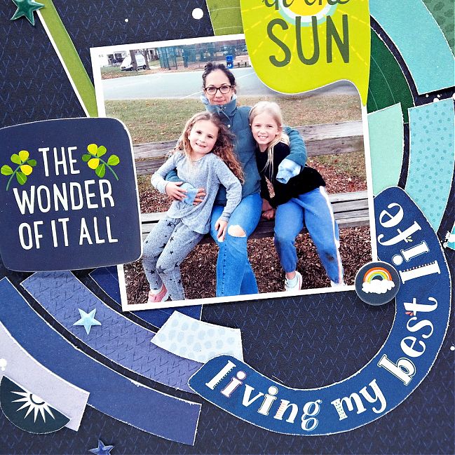
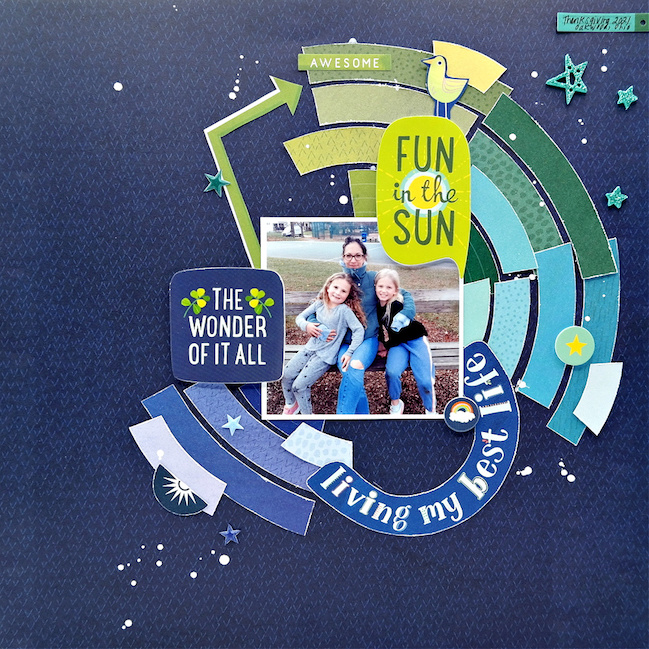
I’ve created a family themed scrapbook layout using a fun mix of Shimelle products and the color wheel as my guide. My sister and her four kids came to visit me over the Thanksgiving holiday, and we had an amazing time together. I took the photo of my sister with her two daughters at a local neighborhood park where we spent time enjoying the full palette of falling leaves, something that they don’t get to see living in central Texas.

Colour Techniques with Dana Tatar @ shimelle.com

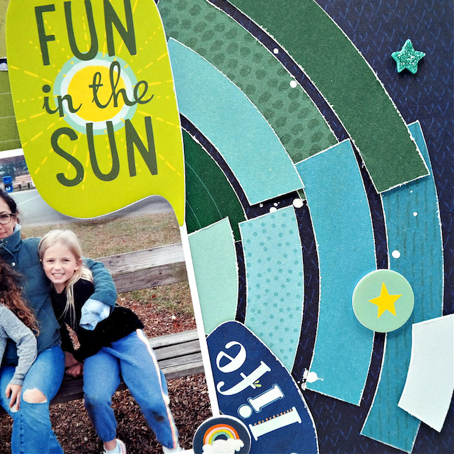
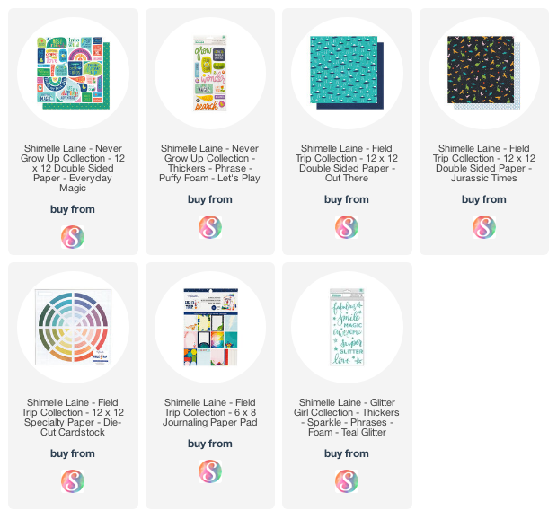
I always gravitate to specialty papers. The 12×12 Die-Cut Cardstock from the Field Trip Collection, with the rainbow of colorful punch-out segments, was the starting point for my page design. I popped out the cool tone die-cuts that matched the colors in my photo. After trimming away the white border from each die-cut and distressing the edges with scissors, I arranged the pieces of patterned paper by color onto the base patterned paper.

Colour Techniques with Dana Tatar @ shimelle.com

Once I had the bands of color secured to the page, it was time to embellish! Shimelle’s paper collections are full of color and fun designs that have a lot of texture and dimension, so I had plenty to choose from. I applied puffy and foam stickers, and small images that I cut from patterned papers, into the matching-colored sections on the page. I mixed elements from two collections to create this layout; Never Grow Up and Field Trip.

Colour Techniques with Dana Tatar @ shimelle.com

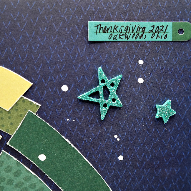
I applied teal glitter star stickers (from Shimelle’s Glitter Girl collection!) for a touch of sparkle and white chalk ink splatters for contrast before adding a small journaling sticker to finish the page.


Dana Tatar currently lives in Ohio with her husband and two teenage children. She started paper crafting about fifteen years ago and has expanded from scrapbooking since then, now creating a little of everything including cards, tags, mixed media pieces, and small gift and home décor items. Dana has an eclectic style in terms of what and how she designs. She frequently finds inspiration in music, poetry, and pop culture. When not creating art, Dana enjoys baking, reading, listening to music, and spending time outside with her family and basset hound Peach. You can find more of her work on her blog,They Call Me Tatar Salad, and her Instagram feed.

Mixing Scrapbooking Collections with Aline Martins

Mixing Scrapbooking Collections with Aline Martins @ shimelle.com

I love crafting and scrapbooking because it’s an activity that relaxes and reconnects me. Keeping memories through scrapbooking is magical and fun. What I like most is being able to mix different types of art and techniques, making that memory even more interactive and alive for my family and friends to remember the moments we spent together.

Mixing Scrapbooking Collections with Aline Martins @ shimelle.com

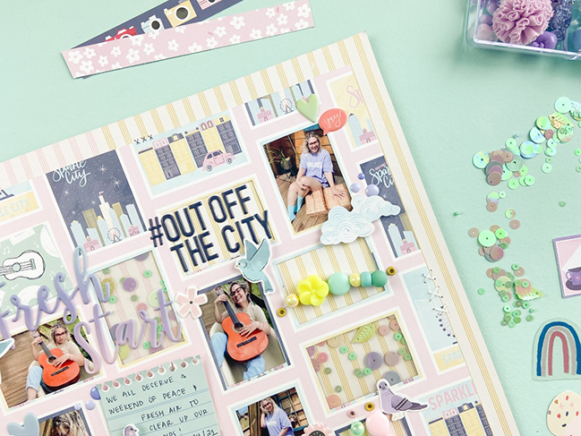
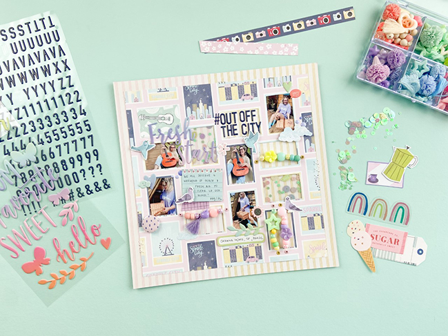
For this layout, I decided to challenge myself to do something I rarely do: mix products from different manufacturers. I selected a few collections that I thought had a similar color palette and that somehow would have elements which could support the photographed moment. I started with Shimelle’s Sparkle City and Paige Evans’ Bloom Street collections, then added a few other elements as well.

Mixing Scrapbooking Collections with Aline Martins @ shimelle.com

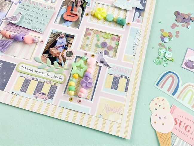
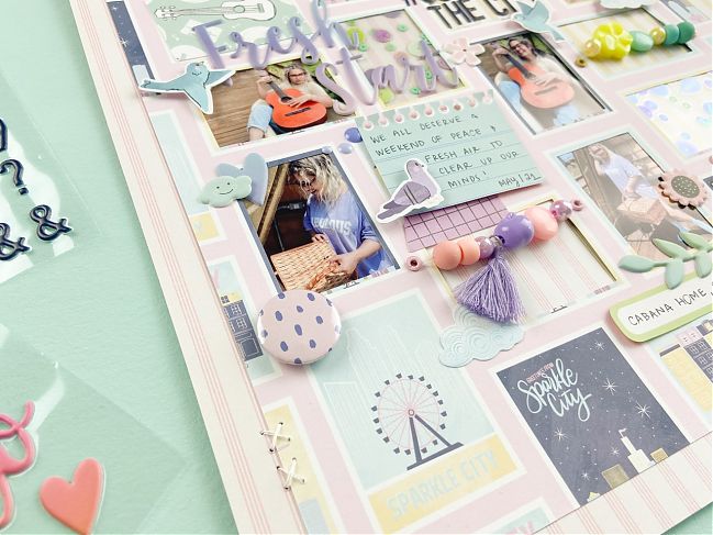
I like to choose my supplies and techniques first and let that guide my plan. I wanted to use sequins with Polaseal, which is very trendy here in Brazil. It’s a way of using laminating supplies to create windows of sparkle. I chose this patterned paper because the frames of the design let me create three kinds of windows: some filled with photographs, some filled with embellishment, and others left intact with the original travel-inspired design.

Mixing Scrapbooking Collections with Aline Martins @ shimelle.com

The photos I chose were from the last trip I took with my husband to a beautiful and peaceful place, in the middle of nature, so that we could rest and get out of our routine a little bit. This place is in the countryside of São Paulo, Brazil; a few hours by car from the big city.

If you enjoyed how this layout came up, my suggestion is that you find a patterned paper with frames or shapes printed on it, then carefully cut out the inside of some of the frames. Then you can fill each spot with photos, Polaseal, beads, journaling, and whatever else you find interesting… I love die cuts and mini puffy stickers too! See what special embellishments you can find that are frame-worthy to you!

Aline Martins, also known as A Scrapper, is from from Brazil, and scrapbooks full time as the owner of a scrapbooking store, teacher and designer. She holds a degree in Tourism and Pedagogy, and I found herself making scrapbooks when she was a kindergarten teacher. Aline loves the freedom of expression and the countless possibilities found in scrapbooking and art. Find more of Aline’s work on her Instagram feed.

Making a Minibook with Alena Grinchuk

Scrapbooking a mini album with Alena Grinchuk @ shimelle.com

One November day we were walking with the whole family, just like that, for no reason. We had fun, drank coffee, laughed. I took a lot of photos and decided that I must definitely keep the memories of this day!
The photos turned out to be different – dark and light, so I decided to make a mini album where the most favorite shots were included.

Organising craft supplies by colour with Alena Grinchuk @ shimelle.com

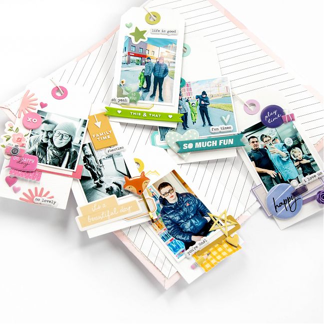
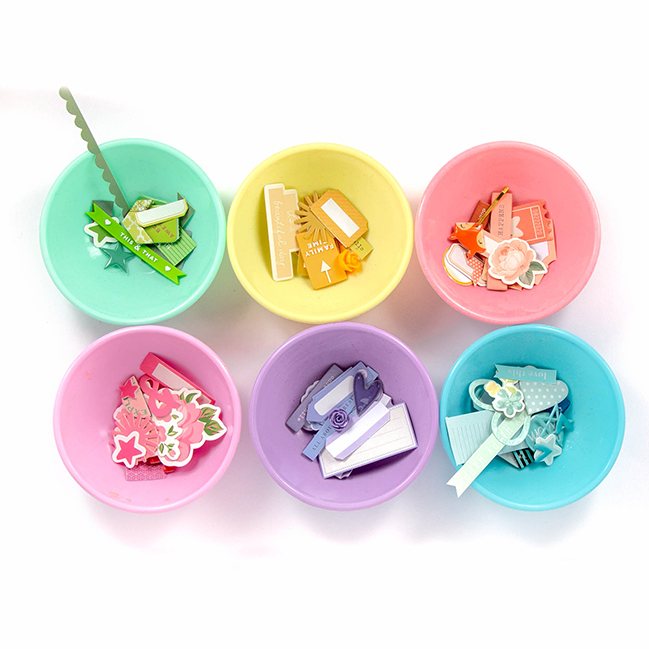
To begin with, I sorted by color the remnants of embellishments from different collections. Then I prepared the basics of white cardstock in the form of tags

Scrapbooking a mini album with Alena Grinchuk @ shimelle.com

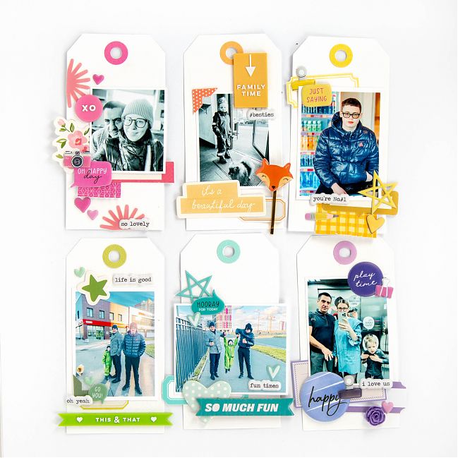
Each of the tags was embellished in one color surrounding one photo.

Journaling tags - Scrapbooking with Alena Grinchuk @ shimelle.com

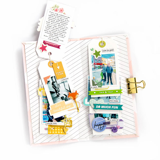
The back of each tag includes the journaling along with a bit more embellishment in the matching color. When each tag was complete, I added it to a string so it’s easy to see both sides of each tag.

Scrapbooking a mini album with Alena Grinchuk @ shimelle.com

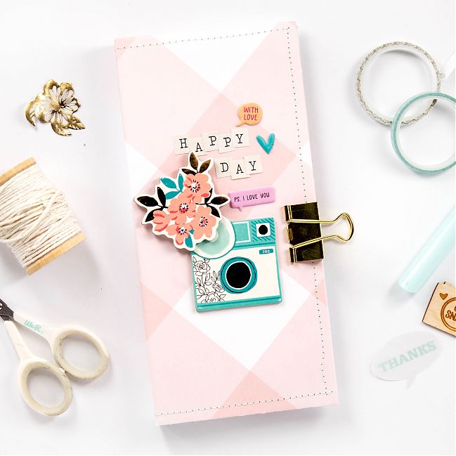
Next, the cover was made using thick cardboard and patterned paper, plus a few embellishments and letter stickers. It’s all held closed with a bulldog clip. I really like the result! I’d love to see what you enjoy making with tags when you’re scrapping your stories!

Alena Grinchuk lives in the beautiful city of Saint Petersburg, Russia, with her husband and two sons. She loves photography, scrapbooking, shopping, and travel. When not crafting, you can find Alena cooking and baking and cuddling up on the sofa listening to a good audiobook or watching Netflix. When it comes to scrapbooking, traditional layouts are her favorite but she also loves working in Life Crafted albums, creating mini-albums, and documenting in a Project Life style. Find more from Alena on her Instagram feed.

Scrapbooking with Vellum Pockets with Danielle Jensen

Scrapbooking with Vellum Pockets with Danielle Jensen @ shimelle.com

Happy Thursday! Today’s guest artist has made an adorable project that’s something a little different and just right for a gift, a mini book, or a journaling addition to a traditional page. Get your vellum at the ready and have a look at this project from Nelly & Clem’s Danielle Jensen. -Shimelle

(Supplies linked with affiliate links; thanks for supporting this project!)

Scrapbooking with Vellum Pockets with Danielle Jensen @ shimelle.com

Colour is very important to me. I’ve always been obsessed with mixing and matching my favourite shades to get cheerful results. There’s something very special about adding colour pops to a project that is mostly white too, it just really helps those bright shades to stand out if you have a neutral background, like white vellum.

Scrapbooking with Vellum Pockets with Danielle Jensen @ shimelle.com

Scrapbooking with Vellum Pockets with Danielle Jensen @ shimelle.com

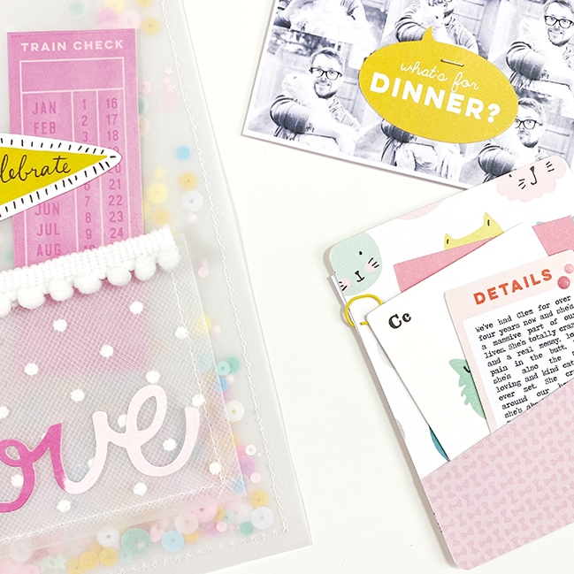
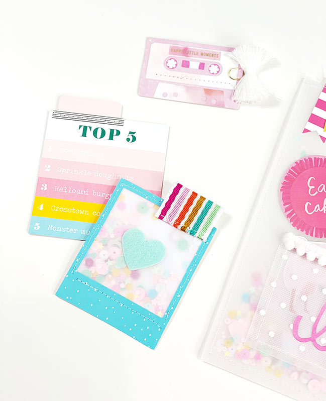
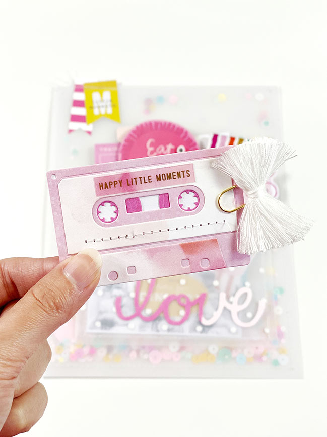
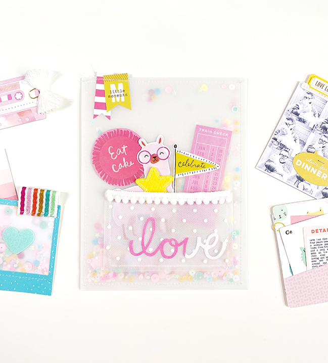
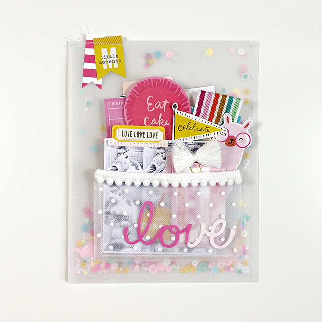
I’ve recently purchased a sewing machine, so every project I touch at the moment has some sort of stitching involved – this one is no different. I couldn’t resist creating a vellum pouch using a border of white thread. I then filled that pouch with a bunch of sequins in my favourite colours – pink, yellow, blue and turquoise to create a giant transparent shaker background.

Scrapbooking with Vellum Pockets with Danielle Jensen @ shimelle.com

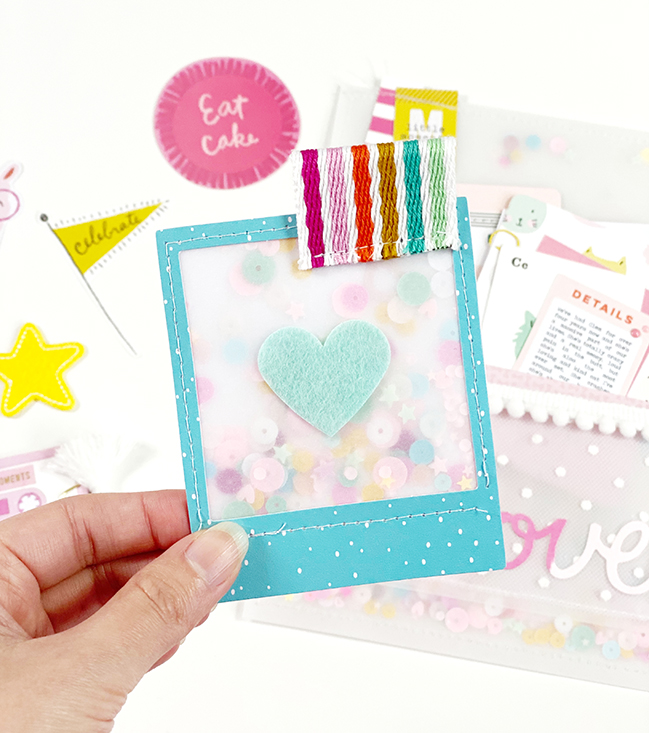
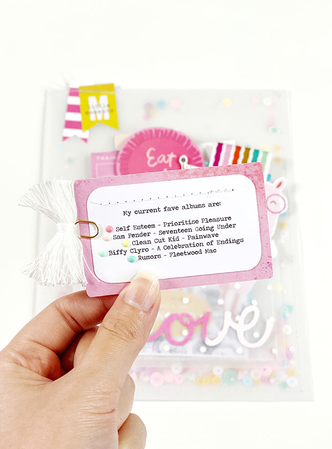
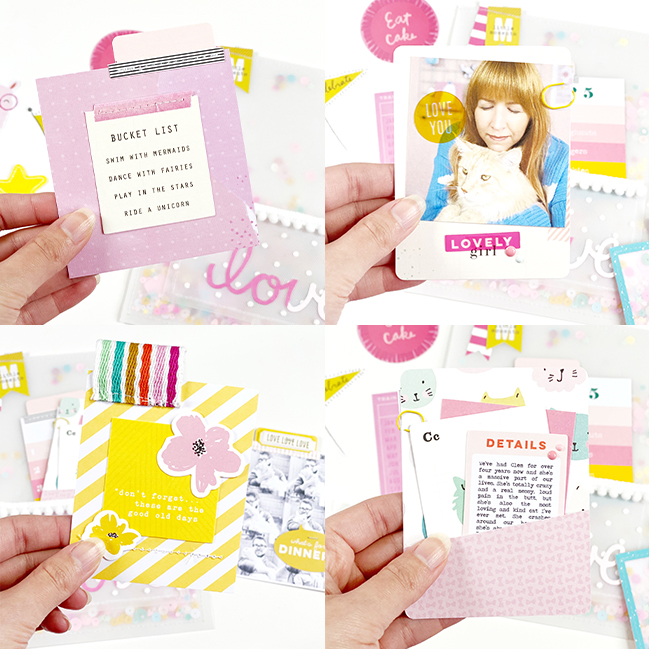
I went through all of the die cuts I own (stored by colour, of course) and dug out all the yummy bits in my top colour combo. I did the same thing with my papers and used the dies to embellish little lists, photos, and a shaker pocket. I found some polka dot tulle and created another vellum pocket on top of my pouch to hold all the little mini projects.

Scrapbooking Papers & Pockets with Danielle Jensen @ shimelle.com

Although this is just a super cute pocket I created to pop on my desk and make me smile, it could easily be replicated as a little happy mail gift to fill with treats and send to someone you love.

Scrapbooking Papers & Pockets with Danielle Jensen @ shimelle.com

Scrapbooking Papers & Pockets with Danielle Jensen @ shimelle.com

Scrapbooking Papers & Pockets with Danielle Jensen @ shimelle.com

Danielle, or Nelly to her friends lives in Sussex, England, with her husband Chris and their great big fluffball of a cat called Clem. Scrapbooking since Sept 2018, she’s obsessed with bright and cheery colours, candy stripe patterned papers, and enamel dots. By day she works at a law firm filing patents and designs to protect people’s Intellectual Property, and by night she sits in the tiny box room creating paper projects and designing and selling her own printables on her Etsy store. Find more of Danielle’s creations on her Instagram feed.

Using big inspiration for smaller layouts with Diane Williams

Using big inspiration for smaller layouts with Diane Williams @ shimelle.com

Today’s guest artist brings us a project that might inspire your next 12×12 page or might be something far smaller: this is actually a double page spread in a small notebook! Please welcome Diane Williams, and remember affiliate links are used at no extra cost to you and shopping through them makes this guest artist series possible. Thank you and enjoy! -Shimelle

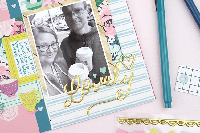
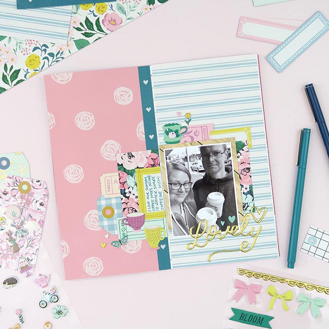
There is something so therapeutic about cutting paper and glueing it down with your photos and stories. I love all the colours and patterns. I also love working at the slightly smaller scale of Traveller’s Notebooks. Because these notebook layouts literally fold down the middle, I just adore any of Shimelle’s half and half layouts. They are almost perfect inspiration to be scaled down and added to the pages of my notebook. I especially loved the colours of this layout by Shimelle and wanted to translate it into my own style. You can watch Shimelle’s tips for creating her 12×12 page on the Scrapbook.com blog.

Using big inspiration for smaller layouts with Diane Williams @ shimelle.com

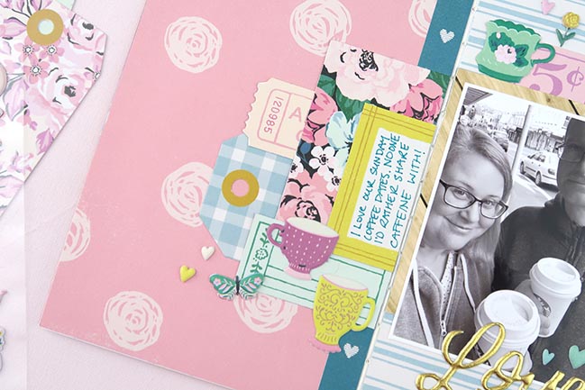
I started with two different patterned papers from the Garden Party collection from Maggie Holmes and Crate Paper. I added the darker pink polka dot piece to the left-hand side of my spread and then the lighter and simpler blue stripe to the right-hand side. To create the anchor point to build my photo layers, I added a strip of dark teal paper, making sure to add it to one side of the fold. It’s important with these notebooks to keep the fold free of paper and embellishments so the notebook continues to function properly.

The same goes for creating the layers under my photo. I made sure to add pieces of paper and die cuts without crossing the fold. If you want something to cross both sides of the spread, you can easily cut it and add one half to each side. I tried to balance out the colours by adding little pops of chartrese as well as the pink and blue.

Using big inspiration for smaller layouts with Diane Williams @ shimelle.com

My story and photo is all about my weekend coffee dates with my husband, so it made total sense to use a few little puffy sticker cups around my layers. As well as a few tiny little puffy stickers, I added a gold scripted word sticker as my title. I am terrible at making up titles for my pages so this is a super easy way to add a fun title and finish up my page! This fun and colourful layout took less than 20-minutes to put together and I know I’ll be able to use Shimelle’s layout as inspiration for many, many more pages in my Traveller’s Notebooks!

Diane is a paper-loving, coffee-drinking, designer from New Zealand. She lives with her husband and two pets. Scrapbooking since age fourteen, nine years ago Diane switched to Project Life and Traveller’s Notebooks and they remain her memory keeping style. Find more of Diane’s work on her Youtube Channel, Patreon, blog or Instagram feed.